MRisk - Contract Risk & Liability Management Platform

Ayan E.


MRisk - Contract Risk & Liability Management Platform: Access & Onboarding
MRisk is an enterprise platform used to track risk exposure and financial liability across large fleets of service contracts - built for an industrial equipment/turbine servicing business managing dozens of contracts across multiple regions and equipment frames. I designed the end-to-end product:
a risk visualization dashboard, a configurable risk-scoring engine, and financial liability tracking tools used by contract owners and risk managers to make faster, better-informed decisions.
The core design challenge was making a large, technical, multi-variable dataset - contracts, risk categories, financial caps, probability and impact scores - understandable and actionable at a glance, without stripping out the depth that risk managers actually need.
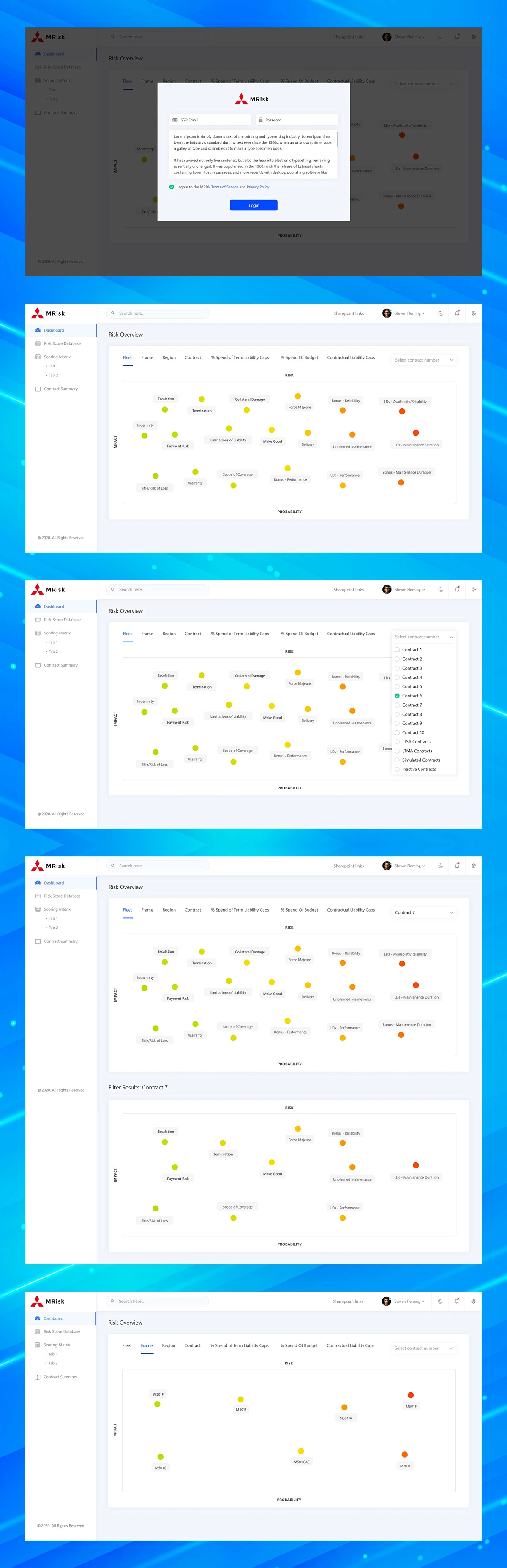
A clean, minimal login screen sets the tone for the platform: enterprise-grade but not intimidating. Kept deliberately simple so the product's complexity is reserved for where it adds value - inside the dashboard - not at the front door.
The Risk Overview - Probability vs. Impact at a Glance
The dashboard's core view plots every risk factor - from termination and escalation to payment risk and scope of coverage - on a single probability-vs-impact matrix. Colour coding (green through red) lets a risk manager scan the entire portfolio and immediately spot which risks need attention, instead of parsing rows in a spreadsheet. Filters across the top (Fleet, Frame, Region, Contract, % of Term Liability Caps, % of Budget, Contractual Liability Caps) let users pivot the same visual across any dimension of the business.
From Fleet-Wide View to a Single Contract, Without Losing Context
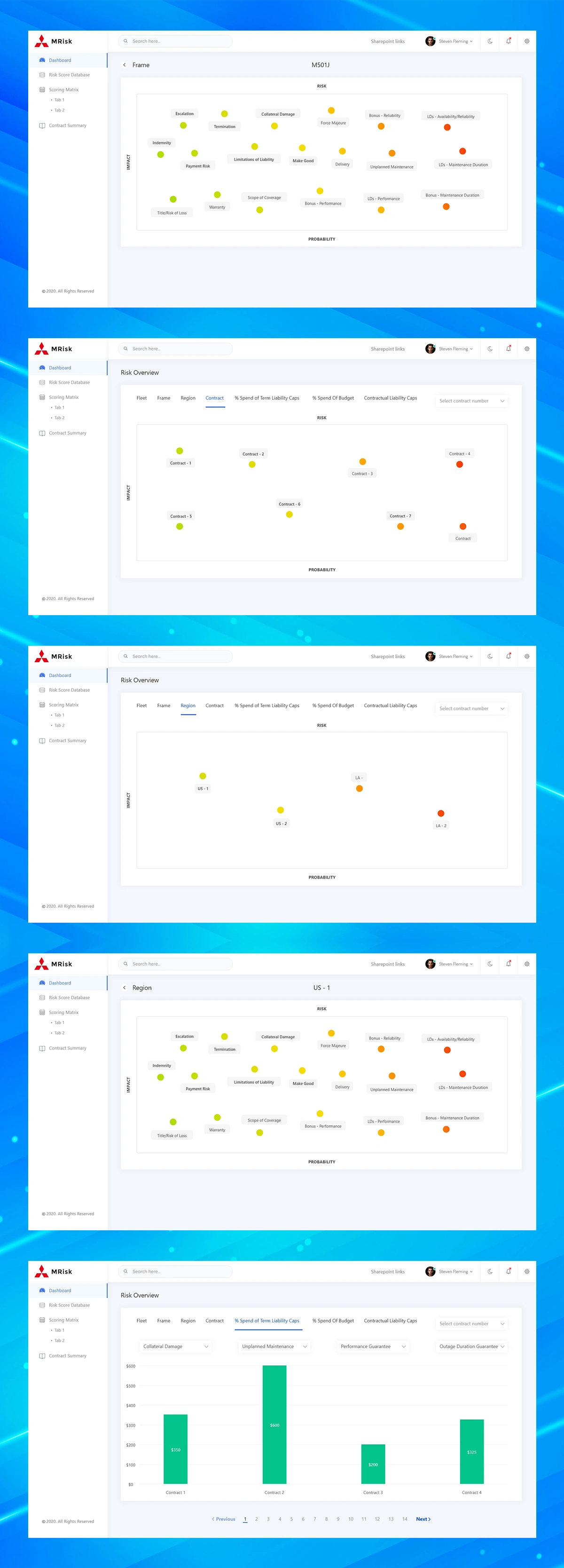
Rather than forcing users to rebuild their view from scratch at each level, I designed a breadcrumb- style drill-down: Fleet → Frame → Region → Contract. Each level keeps the same visual language (the same scatter plot, the same colour system), so users always know where they are in the hierarchy. Selecting a specific contract or region filters the exact same chart down to just that segment, keeping cognitive load low even as the underlying dataset gets more specific.
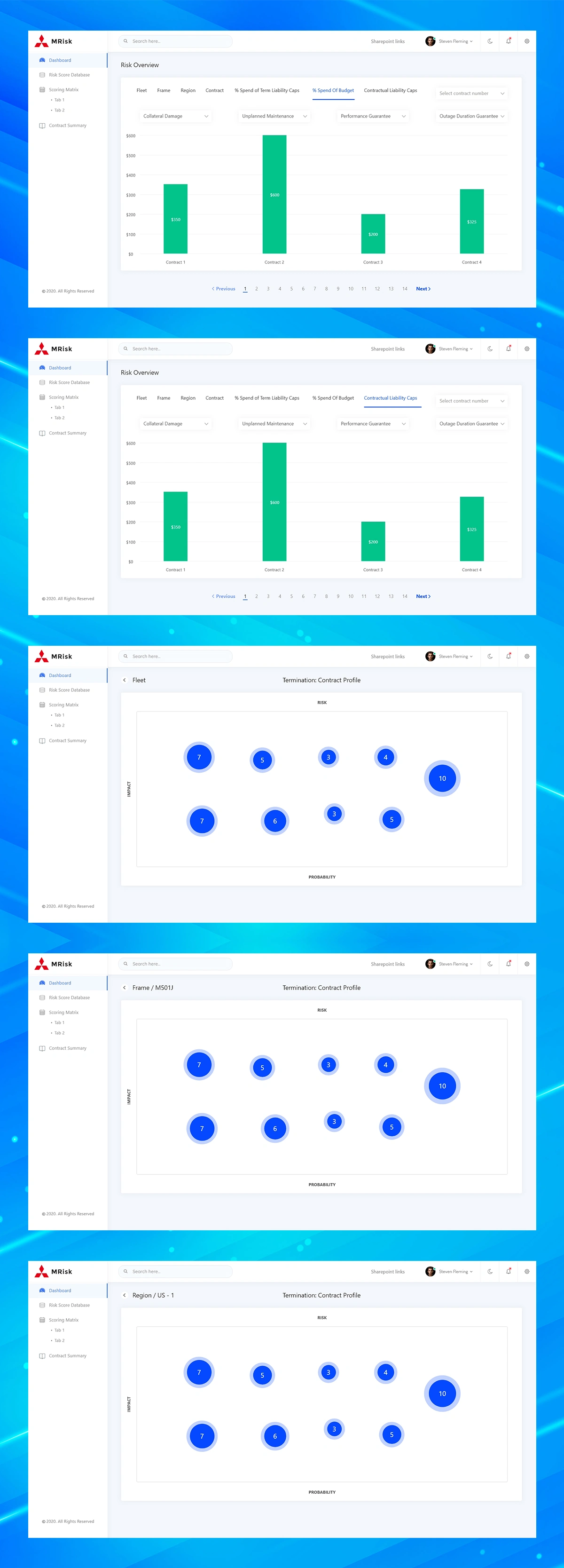
Turning Financial Exposure Into a Readable Chart
Beyond risk scoring, contract owners need to track how much of their liability cap and budget has already been spent. I designed a simple, consistent bar-chart pattern across four financial lenses - Collateral Damage, Unplanned Maintenance, Performance Guarantee, and Outage Duration Guarantee - so finance and risk teams can compare spend against caps without switching tools or exporting to Excel.
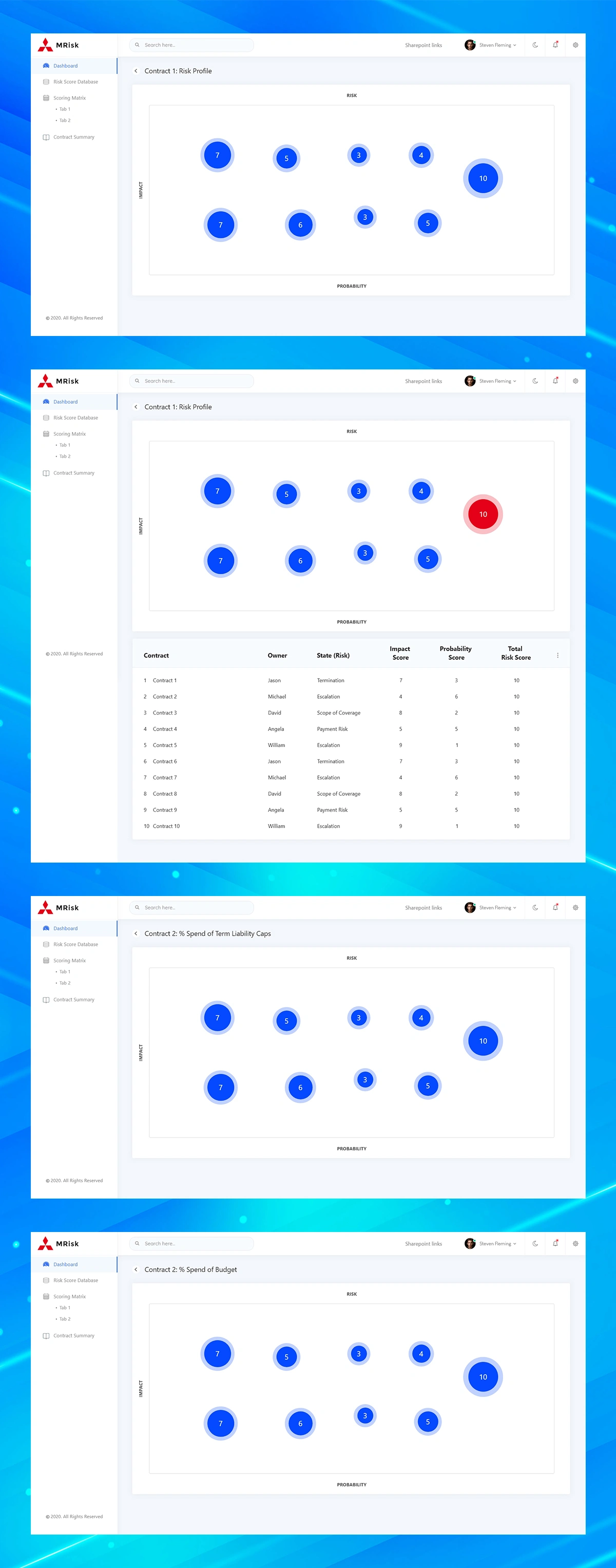
Sizing Risk by Severity, Not Just Position
For deeper contract-level analysis, I introduced a bubble variant of the risk matrix, where bubble size encodes total risk score alongside the existing probability/impact position. This makes outlier risks - like the "10" score bubble sitting apart from the cluster - visually impossible to miss. Selecting a bubble triggers a clear active state (shown here in red), confirming exactly which risk the user is inspecting before they act on it.
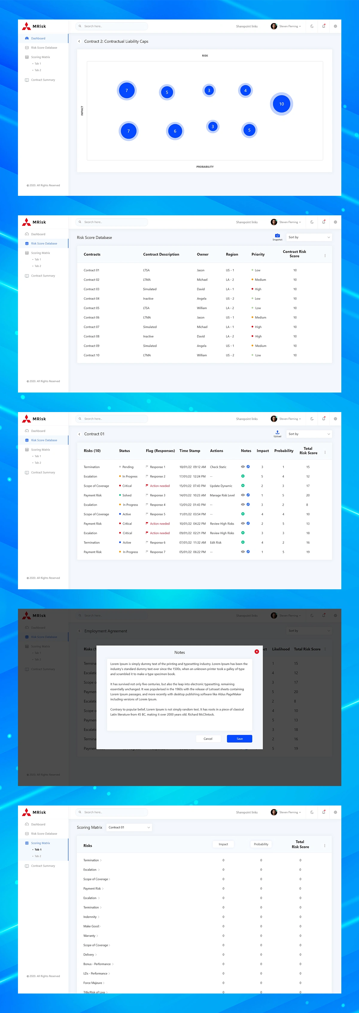
From Visualization to Actionable Detail
Charts are for spotting patterns; tables are for acting on them. Beneath every visual, I paired the chart with a structured data table - contract, owner, risk state, impact score, probability score, and total risk score - so a user who spots a problem in the chart can immediately see the underlying detail and owner responsible, without leaving the page.
Managing Individual Risks: Status, Notes, and Actions
Each contract contains up to a dozen individual risks (Termination, Escalation, Scope of Coverage, Payment Risk, and more), each needing its own status tracking. I designed a status-flag system (Pending, In Progress, Critical, Active, Solved) with colour-coded indicators for fast scanning, plus inline actions to view, edit, or annotate any risk. A lightweight notes modal keeps context and decisions attached directly to the risk they relate to, rather than buried in email or external docs.
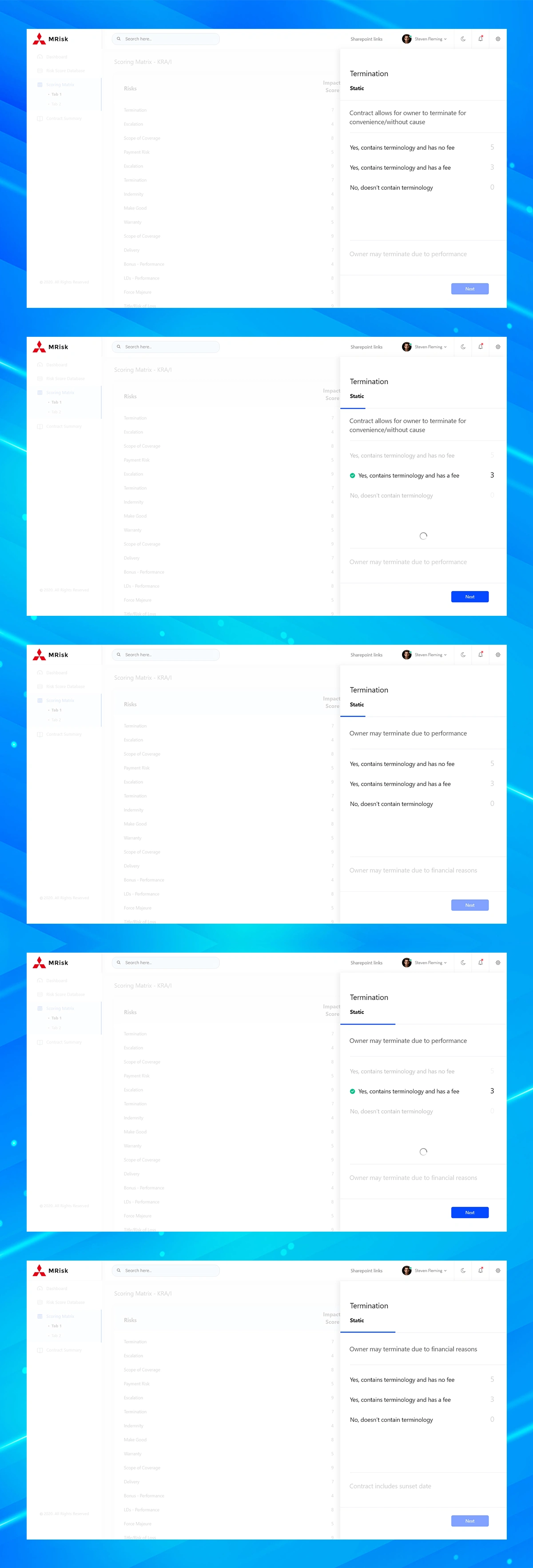
A Risk-Scoring Engine Built to Flex With Every Contract
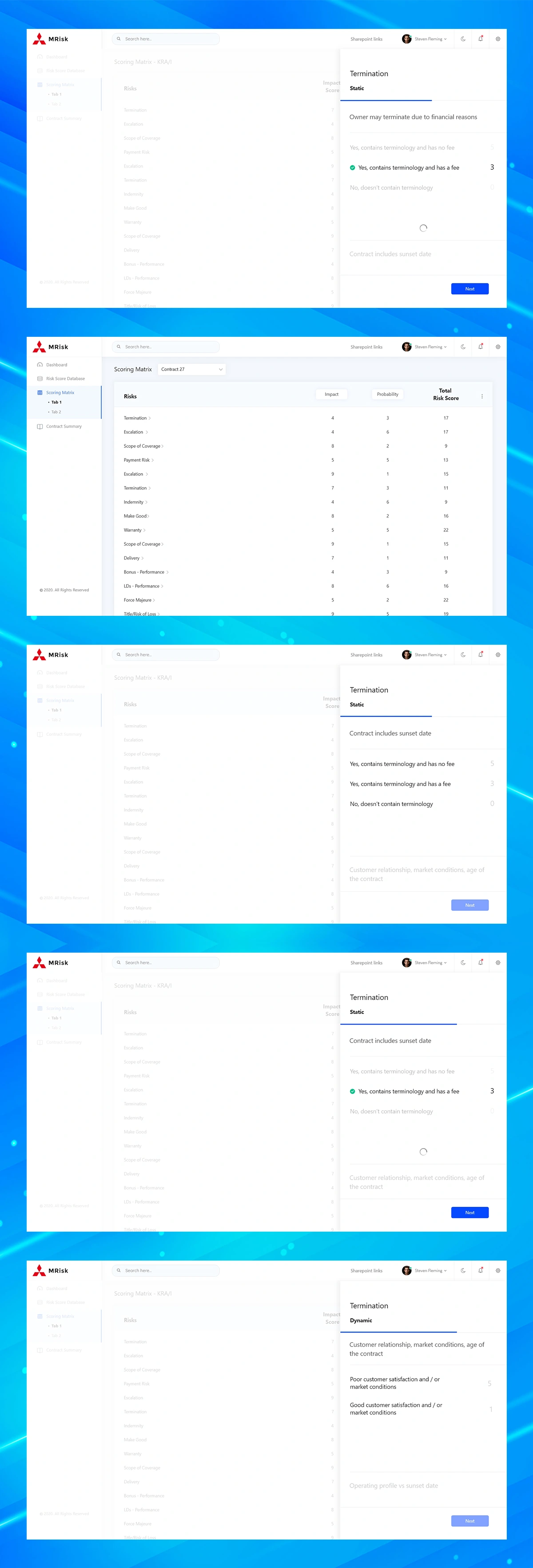
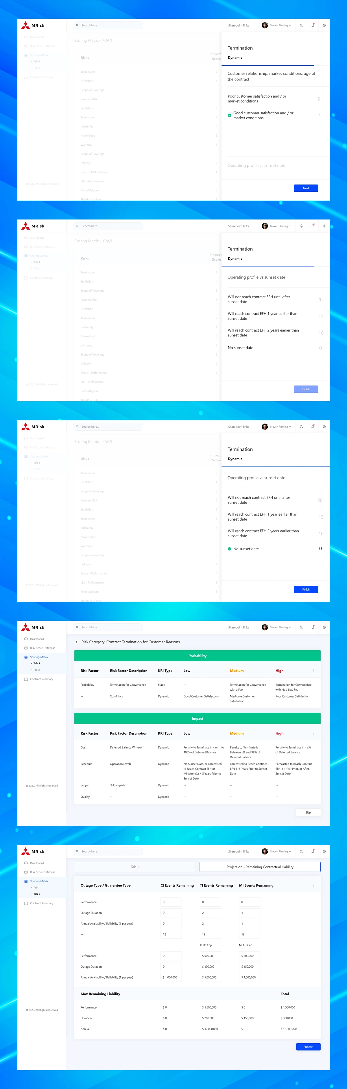
No two contracts score risk the same way, so I designed a step-by-step scoring wizard that lets risk managers configure how each risk category is weighted - separating Static factors (fixed contract terms, like termination clauses) from Dynamic factors (conditions that change over time, like customer satisfaction or market conditions). Each step presents a clear question, weighted answer options, and a running score, turning what could be a complex rules-configuration task into a guided, linear flow.
The Rules Behind the Score
For risk and compliance teams who need full transparency into how scores are calculated, I designed a factor-level configuration table breaking down every Probability and Impact driver - cost, schedule, scope, quality - by risk factor, description, KRI type, and severity band (Low/Medium/High). This gives power users the ability to audit or adjust the scoring logic itself, not just view the output.
Projecting Remaining Liability in Real Time
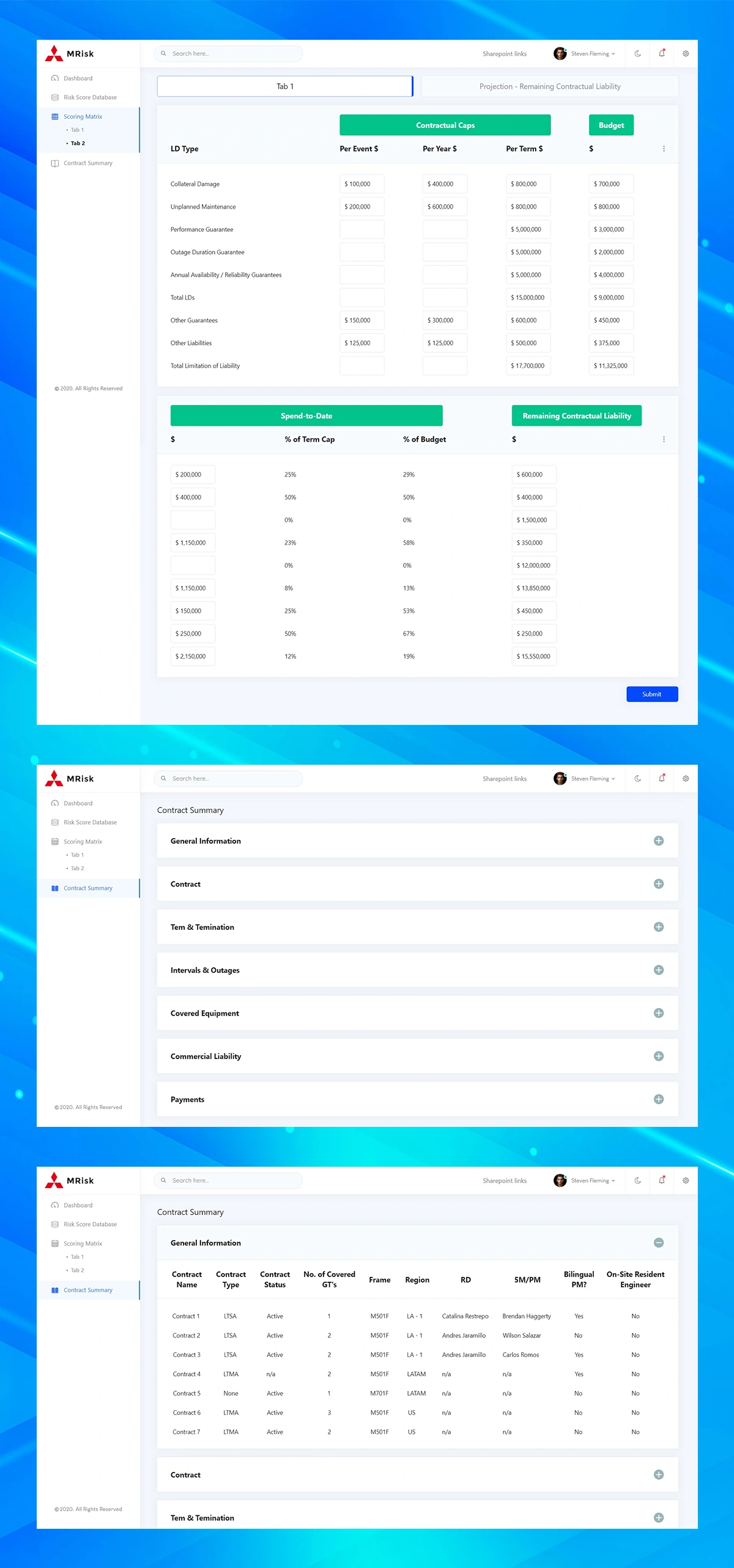
The most financially critical screen in the platform: a full breakdown of contractual liability caps against actual spend-to-date, calculated per event, per year, and per term, across every liability duration (LD) type. I designed this as a structured financial ledger rather than a dashboard widget, because at this level of financial exposure, clarity and auditability matter more than visual flourish. Percent-of-cap and percent-of-budget columns give an instant read on how much headroom remains on any given contract.
Structured Intake for Complex Contract Data
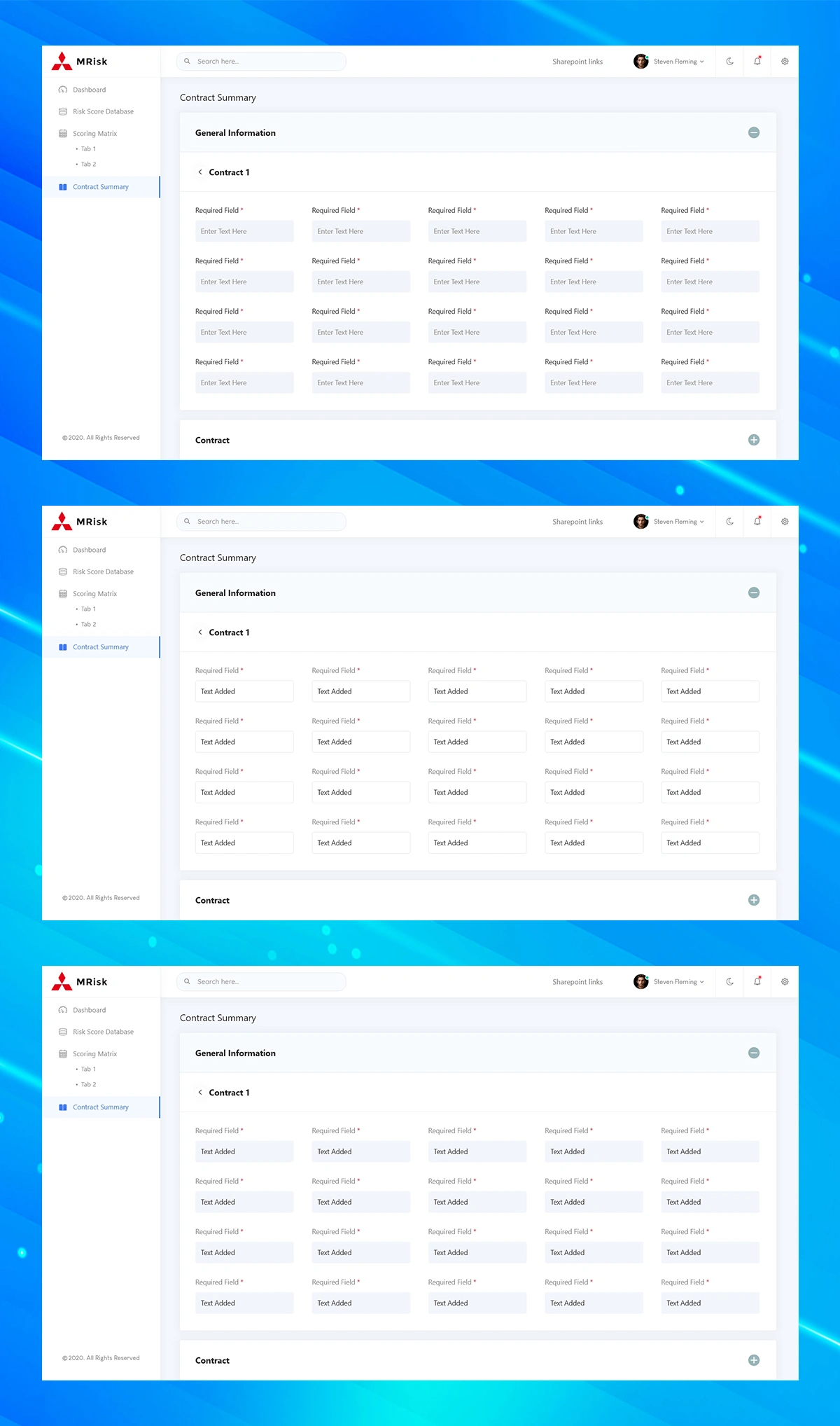
Every contract begins as a structured data-entry process across multiple categories - General Information, Term & Termination, Intervals & Outages, Covered Equipment, Commercial Liability, and Payments. I designed an accordion-based summary page so users can see the full shape of a contract's data at a glance, then expand only the section they need. The intake form itself uses clear empty, active, and completed states, reducing errors when contract administrators are entering data that directly feeds the risk-scoring engine downstream.
Like this project
Posted Sep 3, 2026
MRisk is an enterprise platform used to track risk exposure and financial liability across large fleets of service contracts.
Likes
0
Views
1