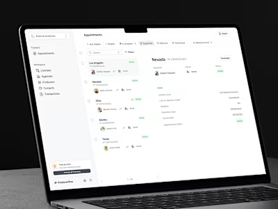
Shiftplanning for human resources platform
Key results
Enabled templates for 500 clients
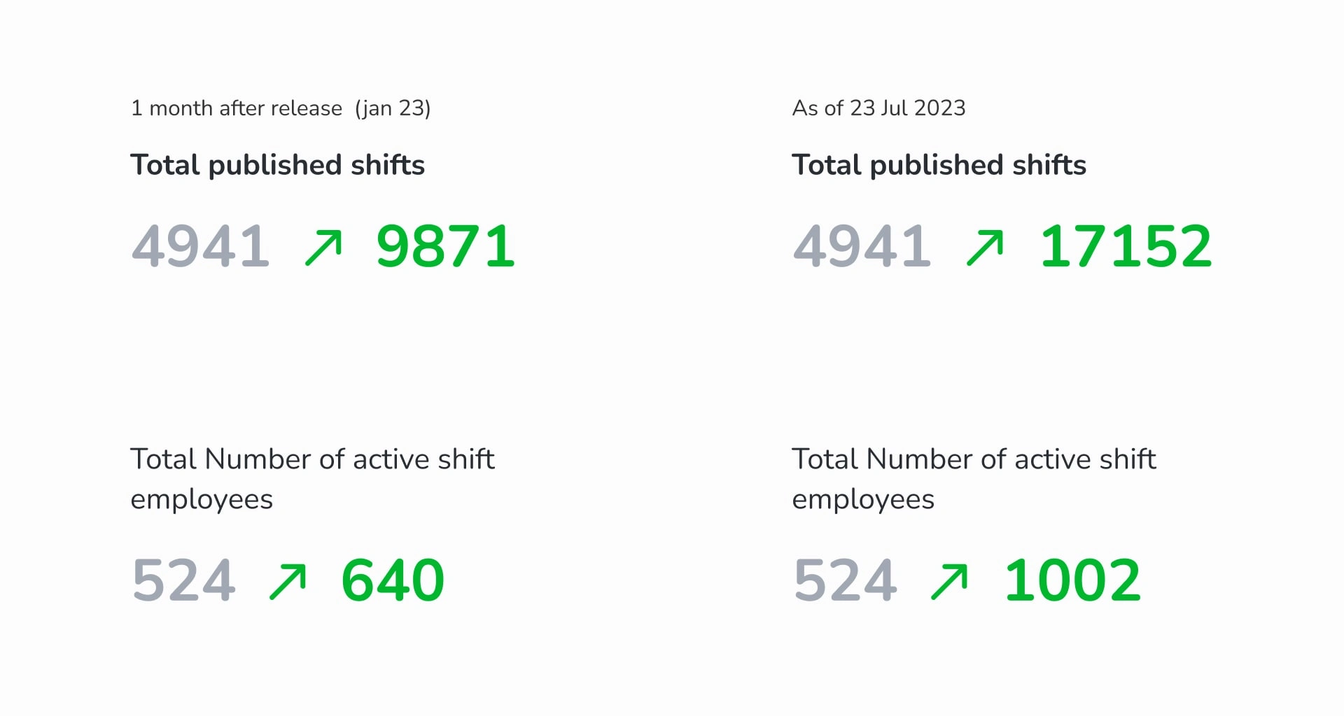
Doubled the north metric “shifts published” in the first month
22% increase in active employees in shiftplan module
Close the gap to Kenjo’s competitors
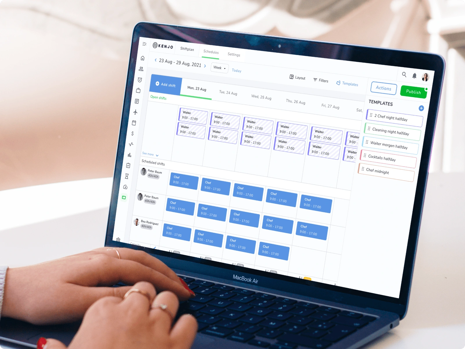
I led the product design process for an eight-month project aimed at implementing shift templates for Kenjo's shift planning module. The objective was to provide shift managers with the ability to save frequently used shifts and create new ones more quickly. This feature was crucial, as it would have an immediate impact on the product's main metric: the number of published shifts.
The Challenge
I was part of a crucial team tasked with closing the gap between our competition and us for Kenjo, a human resources platform for medium to large-sized businesses. As the Product Designer, I led the product design process for adding a templates feature to the shift planning software. Our challenge was to reduce the time users spent creating shifts and increase the number of published shifts.
Defining the problem/research
User Interviews
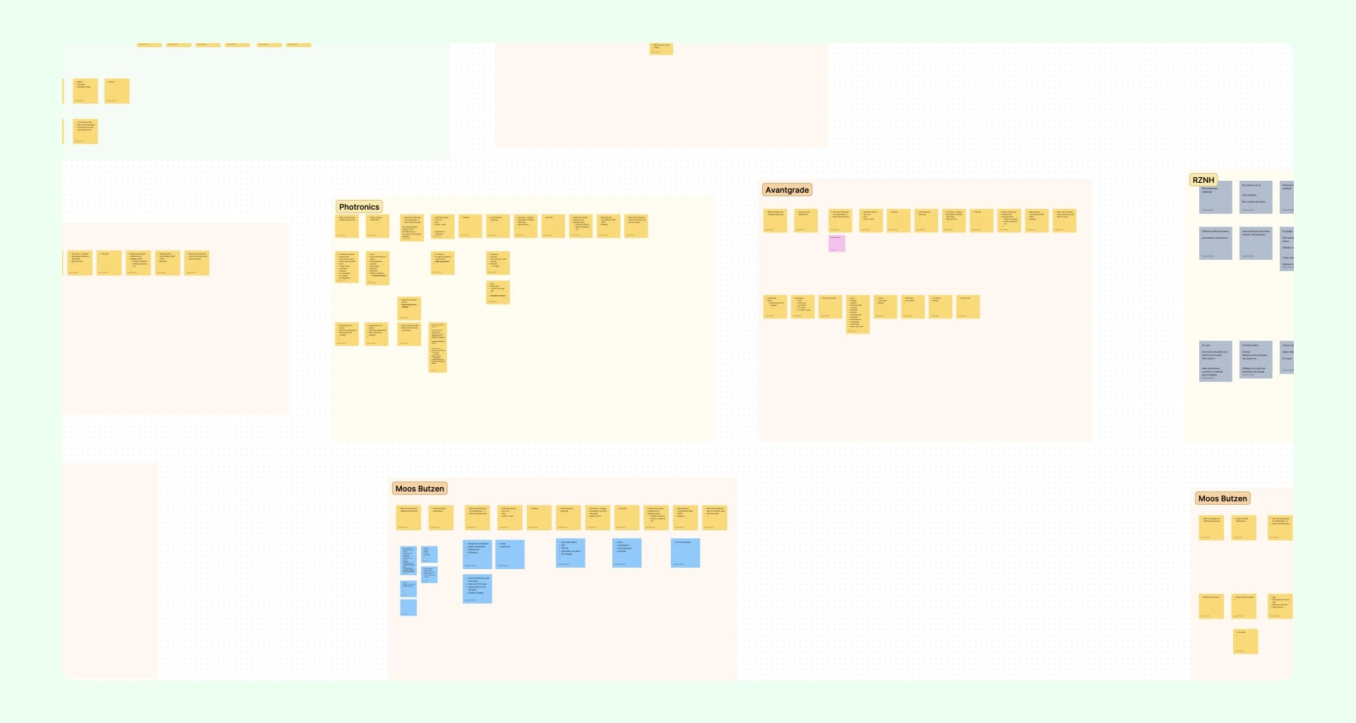
To better understand the problem, I took advantage of three meetings about recent releases that were already scheduled between product managers and clients who were already using the shift planning module. At the end of the call, we took 15 minutes to talk about their experience creating shifts in other platforms and what was missing. This allowed us to identify key differences between our competition and also pain points they were having in Kenjo's platform.
Key insights:
They take too long to create the same kind of shifts every week.
Platforms they were using before have a templates feature.
They would like to copy the same shift to another week.
They can't move shifts by drag and drop.
From this interview, we were able to validate the potential of a templates feature and also gather pain points for other features we could add in the future.
Competitive analysis
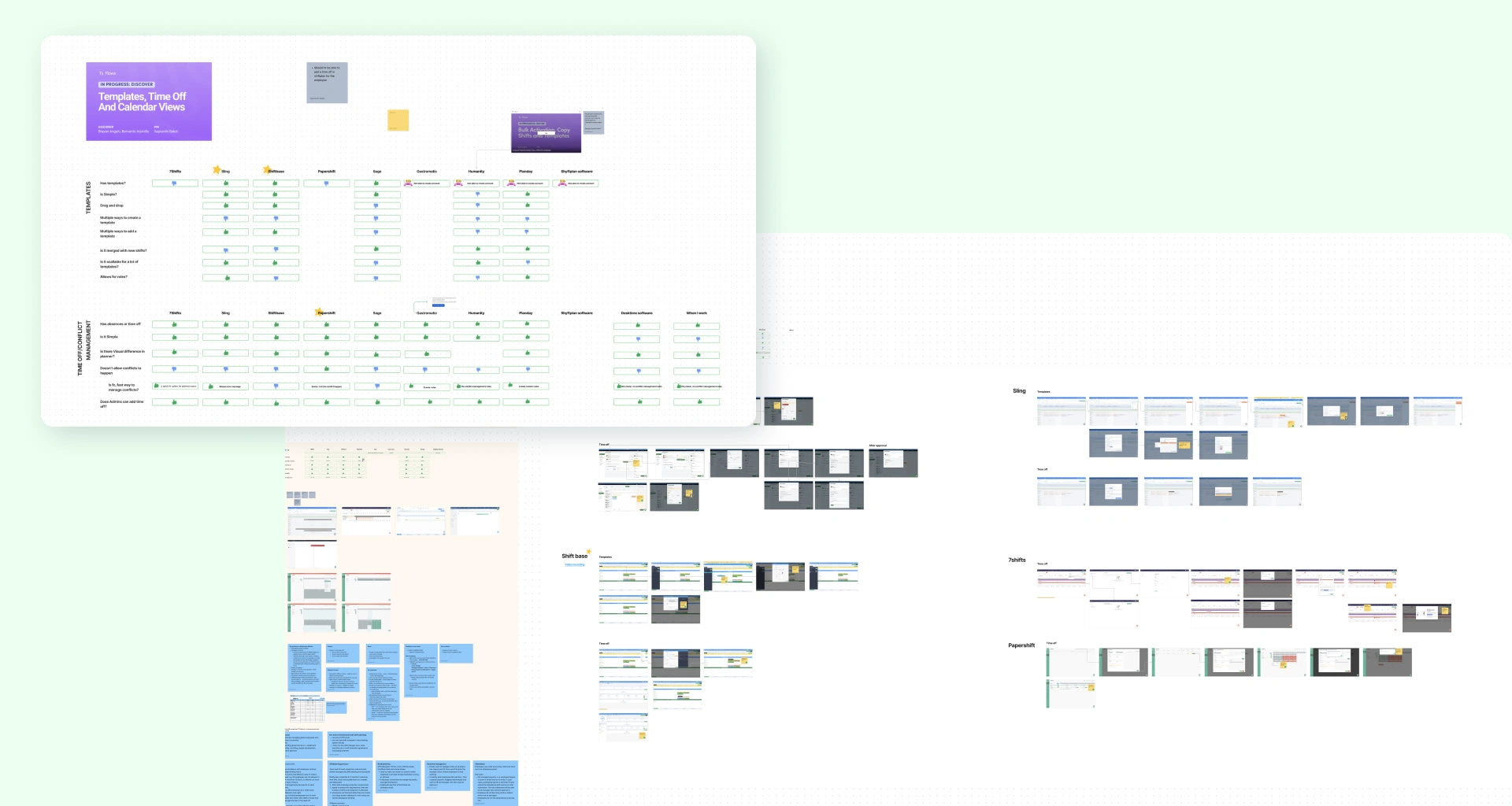
I conducted a competitive analysis to identify commonalities among our competitors and gather valuable insights for building our product. This research allowed us to differentiate ourselves and provided a basis for product development.
User journey mapping
After gathering the initial insights, I mapped a user journey based on the interviews. I also mapped the user flows from our competitors' templates and features. This helped me identify how the user experience could be optimized, as well as the gaps from our competition that we can take advantage of.
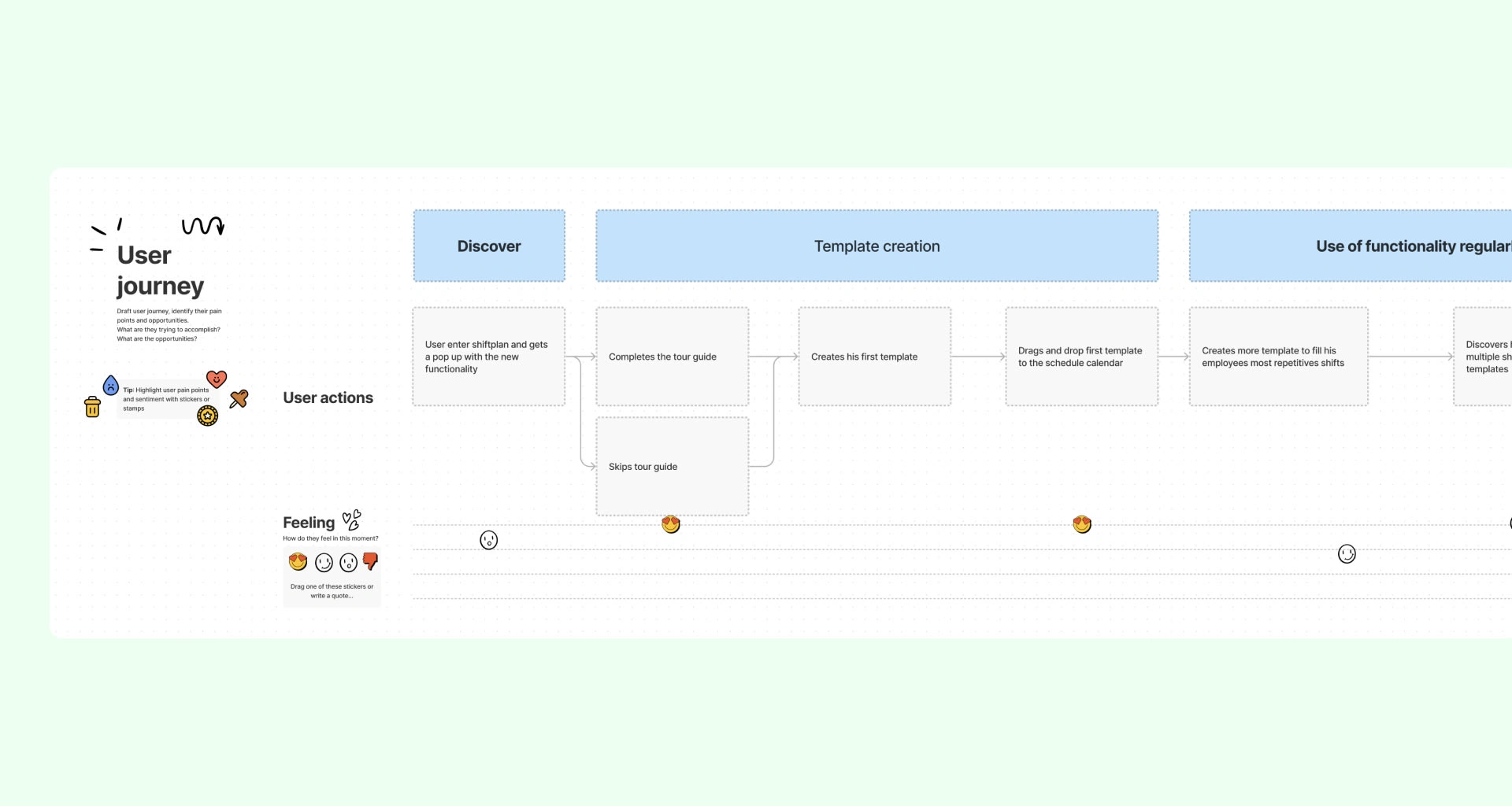
User Flow
I created a visual user flow to align with the team on feature functionality before designing the interface. This also contributes to a smoother navigation experience, helping users accomplish shift creation efficiently.
MVP
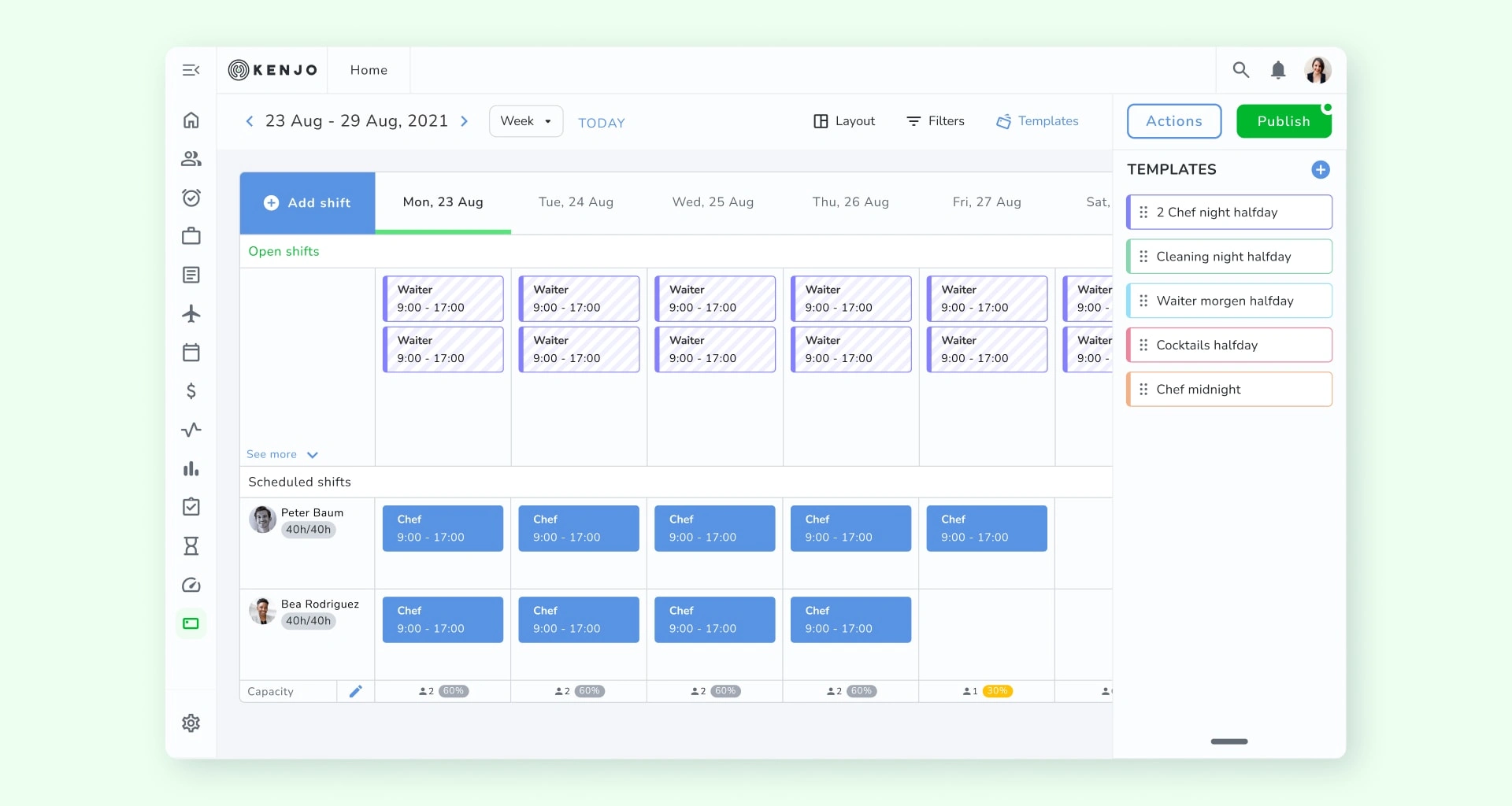
With all the necessary foundations, knowledge, and preparation in place, I began designing the interface for the templates. I started by making rough sketches with the key steps of the functionality and then designed a high-fidelity first approach. The design aimed to add drag and drop to the solution, as it was widely implemented by our competitors and was a highly requested feature.
All the new components I designed for this feature have Kenjo's design system style that was previously established.
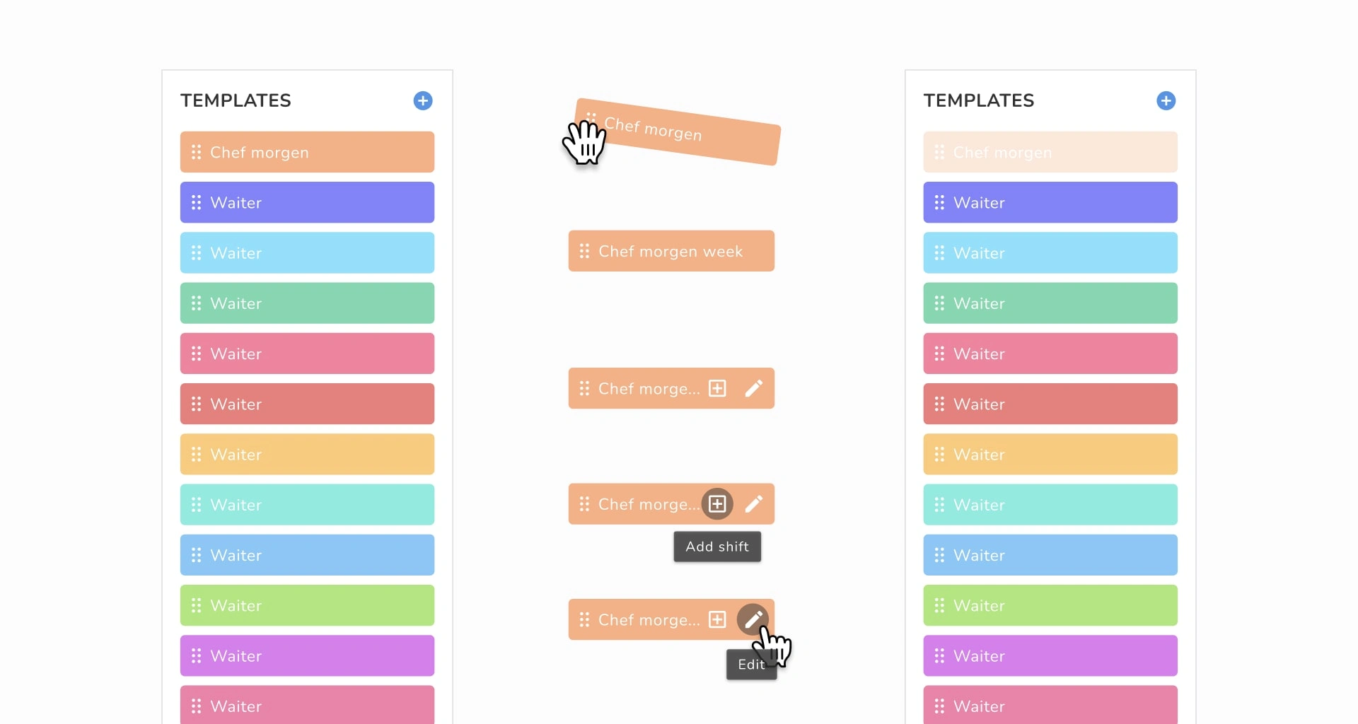
Template panel
In the first approach, I designed the template panel to be used alongside the schedule calendar. However, after several meetings with the development team to check technical feasibility, it became clear that this was not possible. To solve this new challenge and change the initial solution, I designed the template panel to appear on top of the calendar for selecting the template. Then, it would hide when dragged to the calendar. This helped to solve the technical problems, and there was no difference for the users in terms of achieving their goals.
First iteration
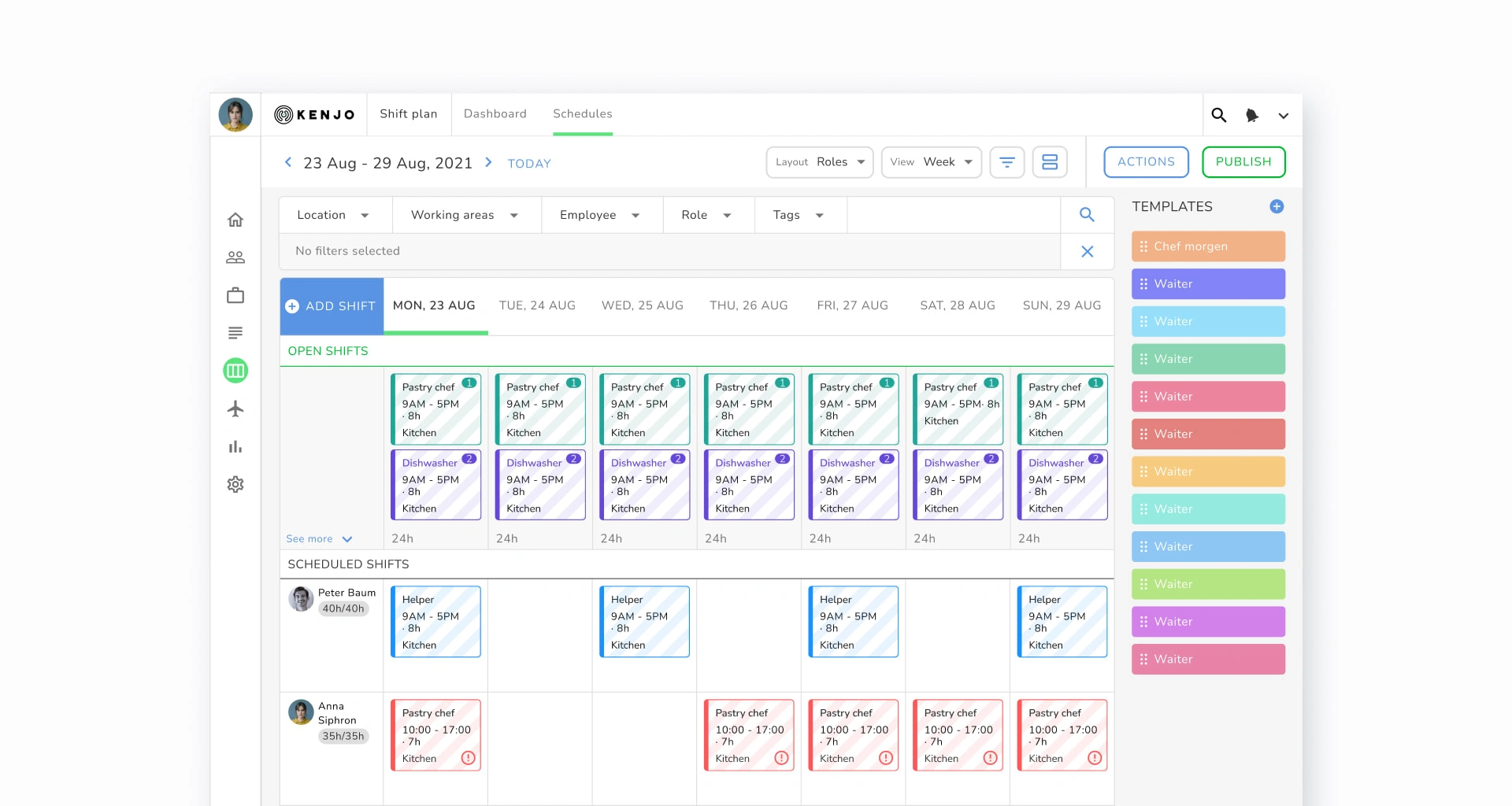
Final design
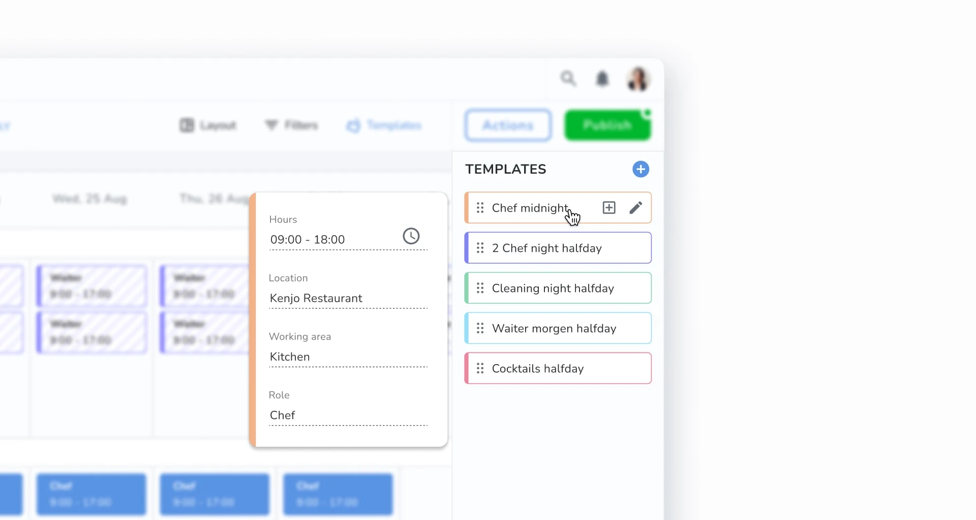
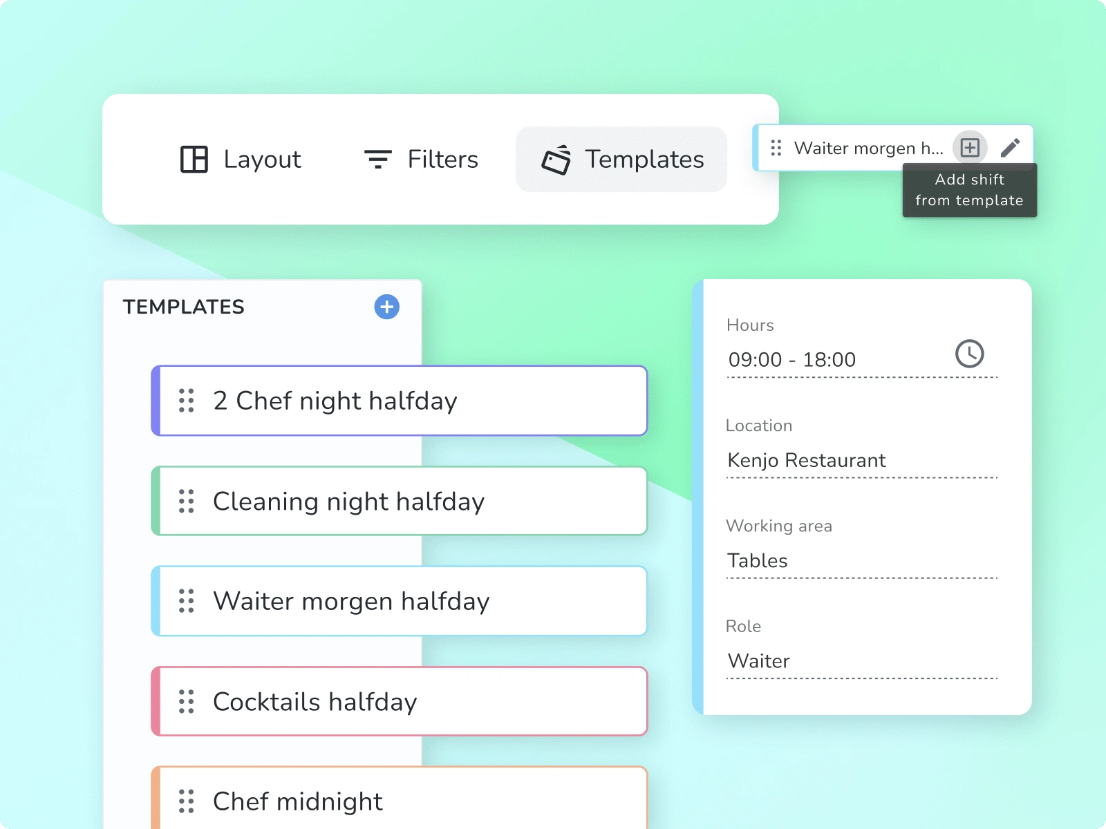
Templates shift cards
A shift has several important data points that need to be created to inform the user of the necessary information without having to enter each template. I designed the hover to showcase all the necessary data points for the user at first glance.
Drag and Drop
Drag and Drop is an important feature because it will also be used in the future for dragging already-created shifts. Therefore, all the basic development will be done first on the template to be replicated in future features across the whole platform. It is important to define the basics correctly.
To achieve this, I created several high-fidelity prototypes to illustrate how the interaction should behave. The main goal was to design it as close as possible to the end product. The prototype worked very well in illustrating to the development team how the Drag and Drop feature should work.
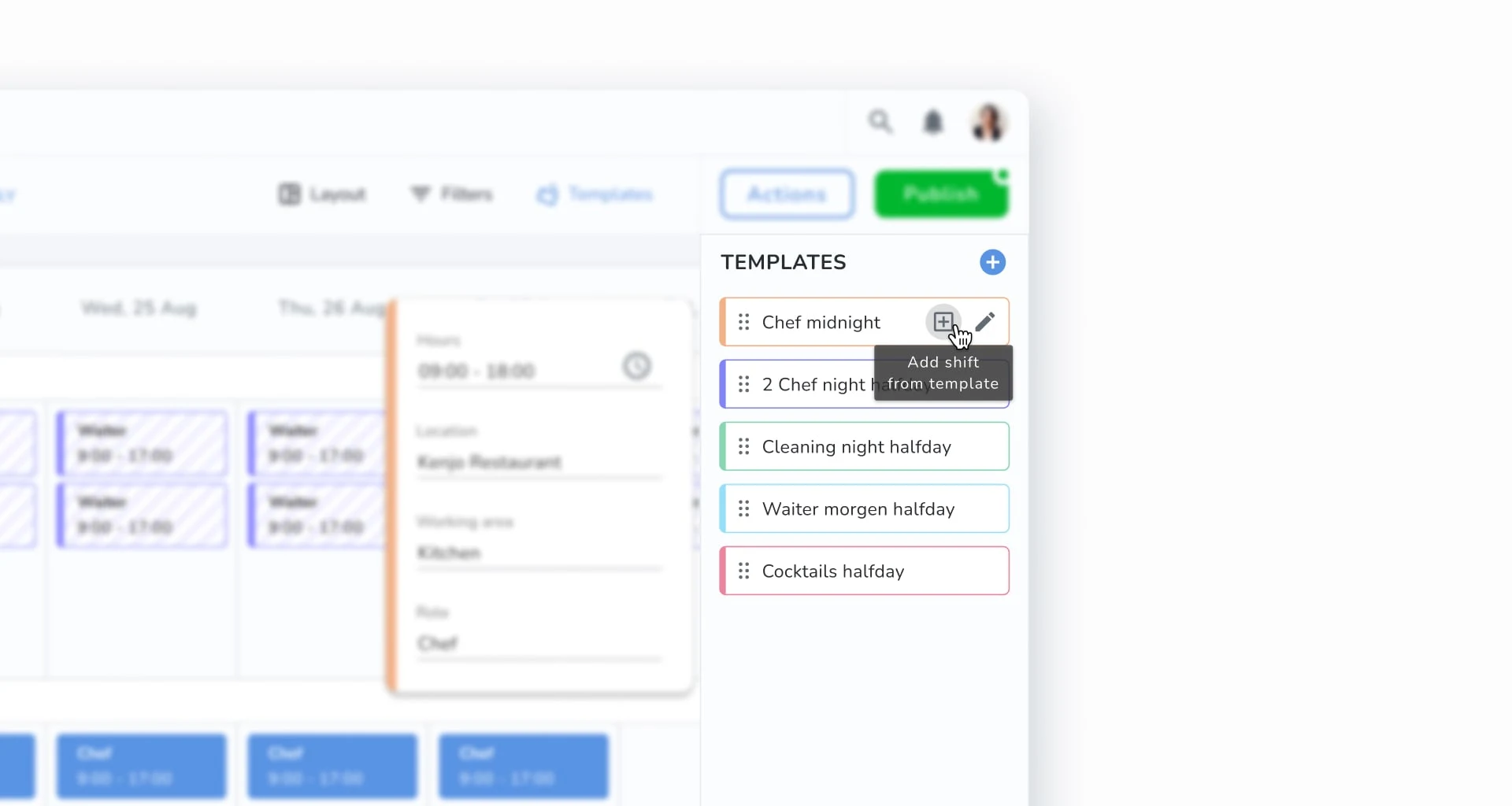
Add shift from template
In the last stages of design, I identified a gap between templates and the bulk creation feature. This consisted of the inability for the user to repeat a shift creation for several weeks using templates.
To close this gap, I designed a second flow to pre-populate the shift creation fields with templates. This means that the user can use a template to create a shift and repeat it for as long as one year. This addition proved to be very useful for the user to create a lot of shifts faster.
Testing
To ensure that the feature was easy to use and understand, I set up several unmoderated user testing sessions. I used usertesting.com to recruit testers who had experience working as managers in human resources. I set up screening questions to confirm if they were a good fit.
Examples of screening questions:
Have you worked as a shift manager?
Have you used shift planning software in the past?
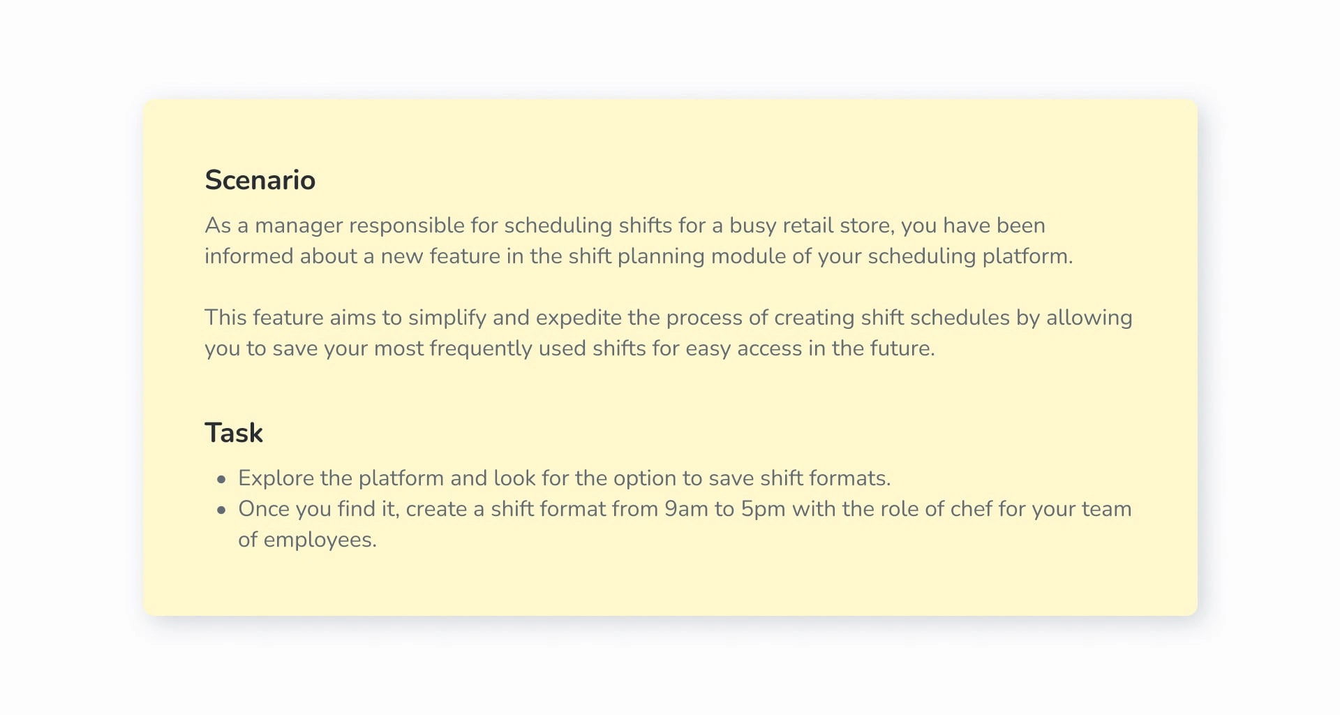
To reflect real user goals without influencing their path, I created tasks and scenarios that focused on shift creation and saving shift details.
Results
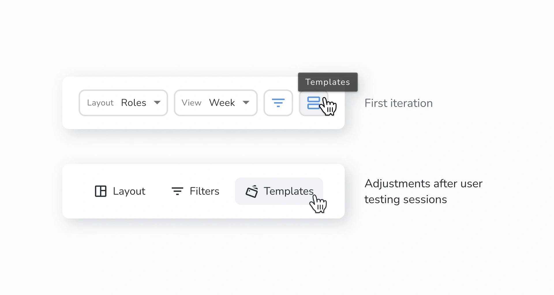
In the first sessions, the user didn’t find the templates feature at all, they were mostly lost and didn’t finish the task, fortunately, was really clear the reason why, the main problem was on the Icon used to showcase the template panel, to fix this I added a label to the feature and improve the Icon to better reflect the dragging and drop feature.
I launch a second test with different testers and this time 90% completed the task, making a big improvement in the discoverability of the feature.
Handoff
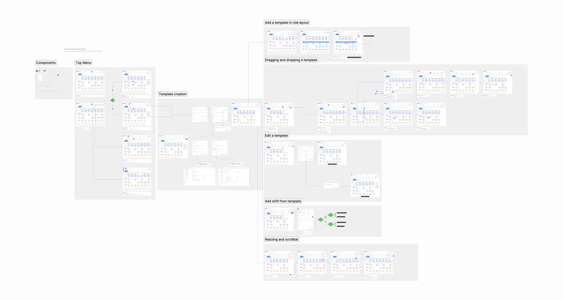
To ensure that all designs are implemented as intended, I prepared the Figma file for handoff. This file includes all final designs, user flows of the solution, the new components added to the library, and specifications for each one.
Impact
After the release to production, we used Amplitude to track and address any usability issues, ensuring the achievement of our business goals. We were able to track the adoption of the feature, which was initially low, and scheduled meetings with clients to determine the reason. We quickly realized that they were not aware of it. To address this situation, I used the tool Chameleon to set up an announcement of the feature and a tutorial on how to use it.
After implementing the tutorial and the announcement, the adoption of the feature increased significantly, and our north metric of published shifts also doubled, while the number of active shift employees increased by 22% in the first month, making the project a total success.
Next steps
Looking ahead, we are also considering ways to increase the number of published shifts while improving the user experience. Our research indicated that features such as copying shifts were important to our current user base and were added to the product roadmap.
Furthermore, the drag-and-drop template development was later used to improve the drag-and-drop feature for already created shifts.
Reflections & Learnings
This project, which implemented shift templates for Kenjo's shift planning software, taught us several important lessons. Firstly, it reminded us of the importance of conducting user research and testing to understand user needs and pain points. By conducting user interviews and competitive analysis, we identified a gap in our product and designed a feature that would give us an edge over competitors. Secondly, we learned that technical feasibility can pose a challenge in the product design process, but being flexible and iterating on designs can lead to successful solutions. Lastly, we found that tracking the impact of a feature post-launch is important in determining its success and identifying areas for improvement in the future.
In summary, this project demonstrated the value of a user-centered design approach and the importance of continuously improving and iterating on our product. We look forward to applying these lessons to future projects!
Like this project
Posted Jul 26, 2023
Design project for the shift templates feature that result in a 2x increase of published shifts and a 22% increase of active users after first month


