The Social Loft's Brand Identity & Web Design
The Drawline Design Studio
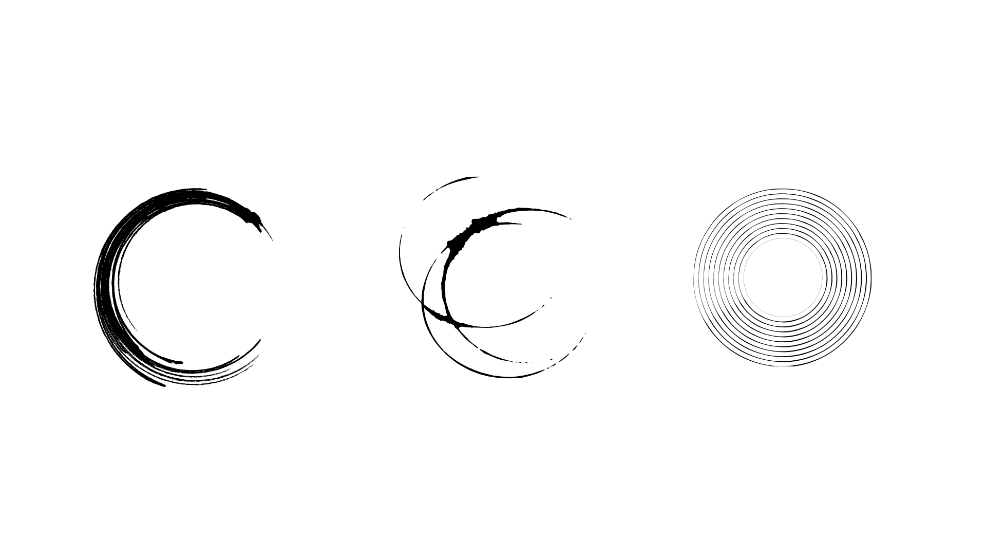
A Visual Story of Circles
The Heart of The Visual Story
At the heart of The Social Loft's visual identity lies a profound understanding of human connection. The design philosophy revolves around the circle—a timeless symbol of unity, wholeness, and continuous growth.
A Visual Foundation for Brand Identity
These carefully chosen symbols act as a powerful starting point for The Social Loft's branding strategy, encapsulating core values and mission in a visually compelling way. By intertwining these symbolic elements, the logo creates a rich tapestry of meaning that resonates with the brand's target audience. Each circle represents a key aspect of The Social Loft's ethos, providing a versatile foundation from which to build a cohesive brand narrative:
The Japanese Ensō symbol - representing enlightenment, strength, elegance, and the boundless universe. This speaks to the pursuit of knowledge, self-cultivation, and elevated discussion that happens at The Social Loft.
A wine glass ring - representing conviviality, openness, and the lively exchange of ideas that happens when formalities are relaxed. This reflects the club's goal to foster creativity and intellectual curiosity in a casual atmosphere.
A vinyl record - representing music, nostalgia, and the collective enjoyment that comes from sharing cultural experiences across generations. This nods to the club's eclectic interests and the way music and art are woven into its social events.
The Social Loft Branding Steps Values
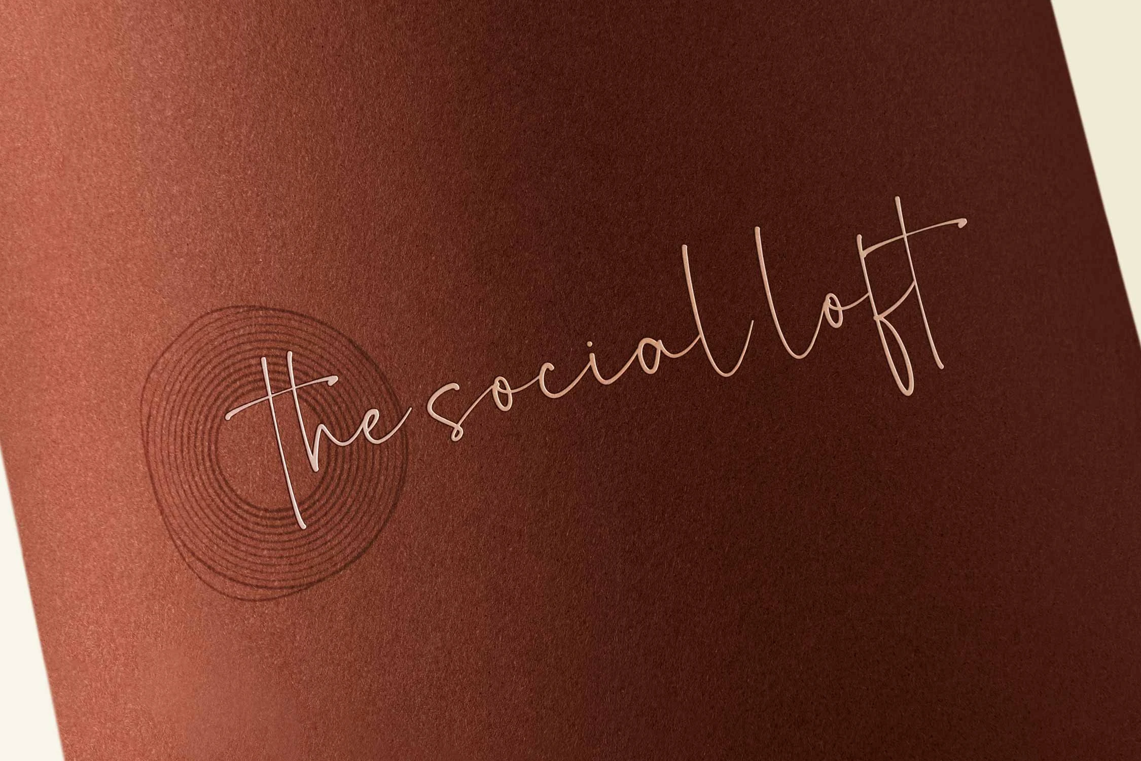
The full logo of The Social Loft consists of two main elements: a circular symbol and the brand name in handwritten typeface.

The Social Loft Logomark
The logomark of The Social Loft is rich in symbolism, blending concepts of harmony, individuality, and personal growth:
Musical Harmony and Completeness: The 12 concentric lines represent the 12 semitones in a musical octave, symbolizing harmony and completeness. This reflects The Social Loft's aim to create a well-rounded, harmonious community.
Individuality Within Community: Among these 12 lines, one stands out. This unique line represents the individuality that each person brings to The Social Loft community. It celebrates the distinctiveness of each member within the larger group..
Transcending Boundaries: As the outer line breaks away from the perfect circularity of the other lines, it symbolizes the potential for growth and exploration that goes beyond conventional boundaries. This represents The Social Loft's commitment to pushing limits, encouraging creativity, and fostering experiences that transcend the ordinary.
The Social Loft Full Logo
The use of handwritten-style text in The Social Loft's logo is a deliberate design choice that infuses the brand with distinct personality traits:
Authenticity and Human Touch: Handwriting is unique to each person, suggesting that The Social Loft values genuine connections over corporate formality, creating a warm atmosphere.
Intimacy and Personal Connection: By using handwritten style, The Social Loft fosters an intimate, close-knit community where meaningful relationships can thrive, similar to those with close friends.
Uniqueness and Individuality: Just as everyone's handwriting is unique, this stylistic choice in the logo reinforces the idea that The Social Loft values and celebrates individual differences within its community. It visually represents the brand's commitment to honoring each person's distinct personality and contributions, fostering an environment where diversity is not just accepted but embraced.
Color Palette: Grounded in Warmth
The carefully selected earth-toned palette does more than please the eye—it creates an atmosphere of sophistication and approachability.
The warm beige primary background evokes comfort and elegance, serving as a neutral canvas for other elements.
Dark brown adds depth and luxury, while black accents provide sharpness and elegance when used sparingly.
A terracotta accent color injects vibrancy and creativity, symbolizing the passion of the community.
Soft gray balances the warmer tones with a modern touch.
Together, these colors create a timeless, inviting aesthetic that reflects The Social Loft's mission of fostering intellectual and creative pursuits in a refined setting.
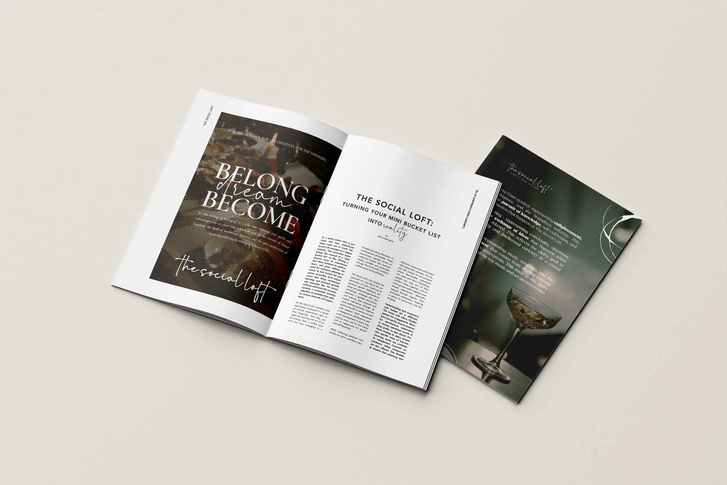
The Social Loft - Mockup - Magazine
Typography: Where Classic Meets Contemporary
Font choices strike a delicate balance between classic and contemporary styles. Clean lines speak to a modern approach, ensuring clarity and sophistication, while subtle serifs gently nod to the timeless wisdom of traditional typography. Adding a script font introduces a unique touch of personality, infusing the overall design with a sense of warmth and individuality that resonates with the audience.
Before Rebranding
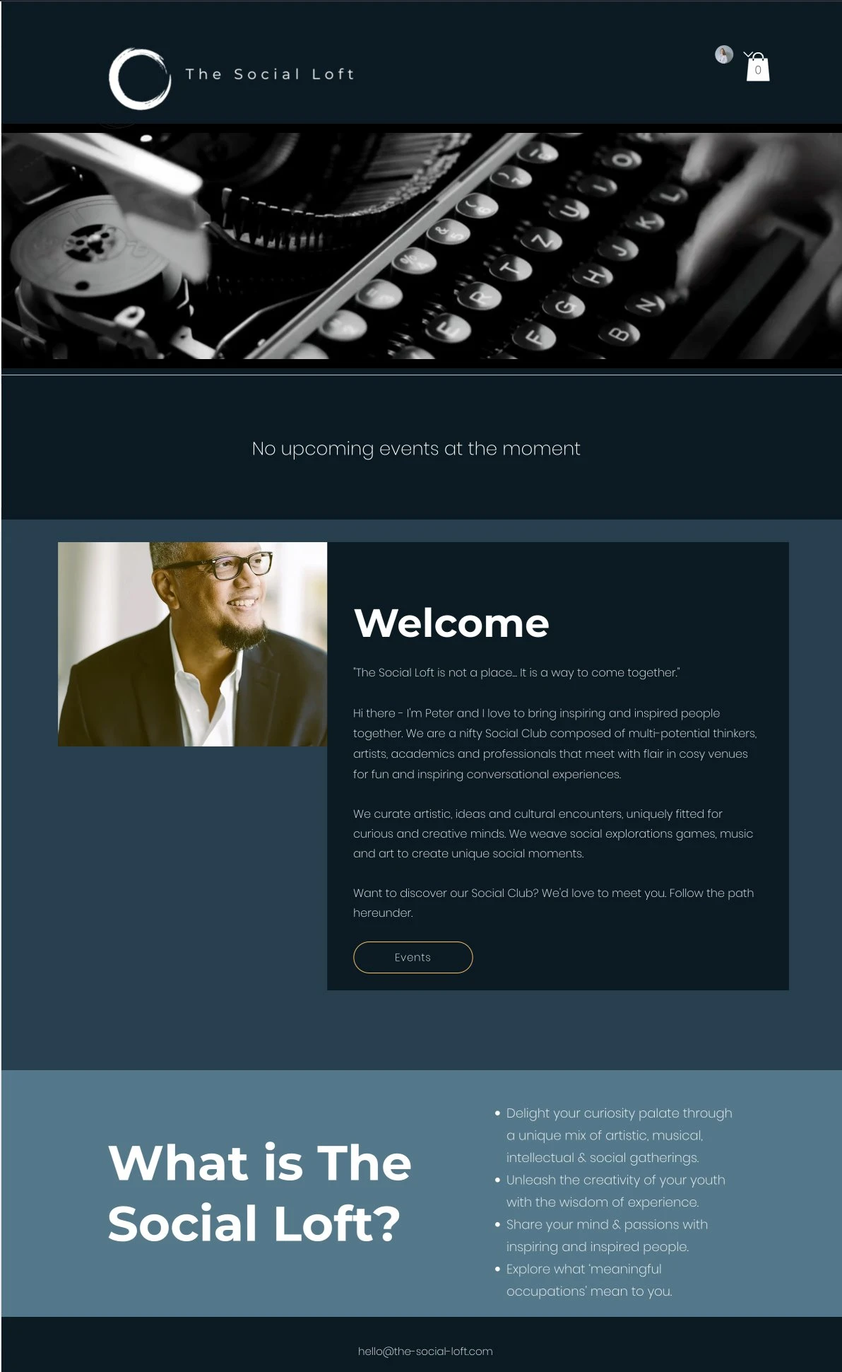
The Social Loft - Website Before Branding
After Rebranding
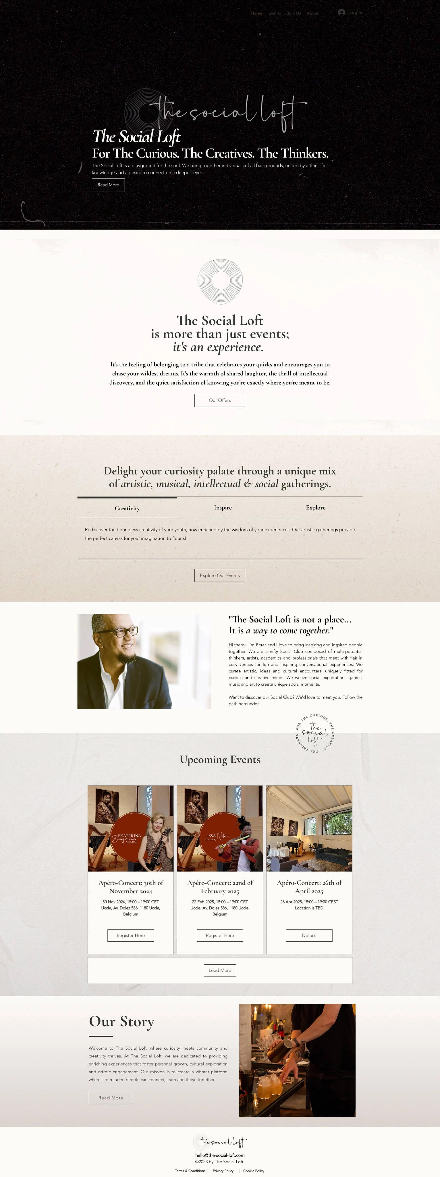
The Social Loft - Website After Branding
The Social Loft's brand aesthetic creates a visual representation of a sophisticated, welcoming space for intellectual and creative pursuits. The warm color palette, combined with elegant typography and carefully curated imagery, evokes a sense of exclusive yet accessible experiences.
The design intentionally steers away from overly bright or trendy colors to emphasize the timeless nature of learning, connection, and personal growth. Muted, earthy tones create a calm, focused atmosphere that encourages deep thinking and meaningful interactions.
By balancing warmth with sophistication and tradition with modernity, the visual identity appeals to the target audience of curious, creative professionals seeking enriching experiences and connections.
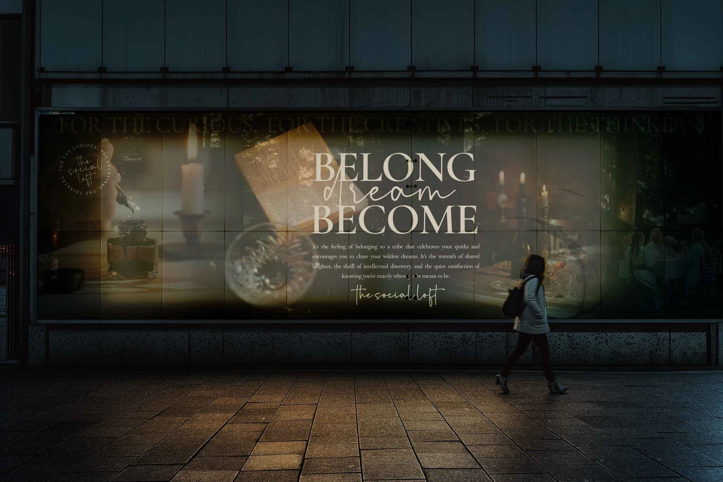
The Social Loft: Rebranding Visual Transformation
Shifted from dark, subdued tones to a light, inviting aesthetic
New warm, neutral color palette with black accents for elegance
Balance of abstract shapes and real-world imagery
Logo Redesign:
Reflects brand's balance of casual and formal elements
Refined Messaging:
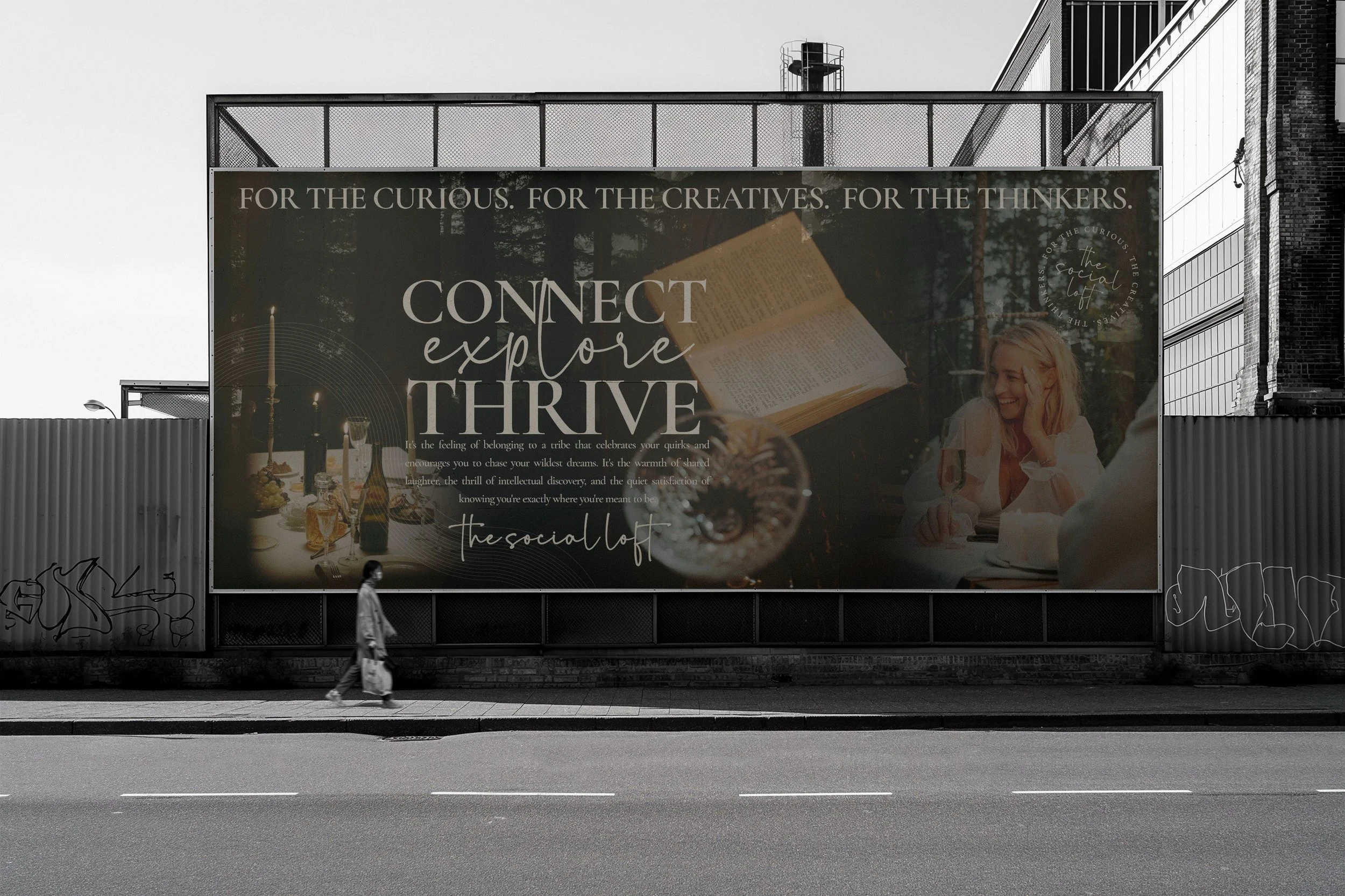
New tagline: "For The Curious. The Creatives. The Thinkers."
Emphasis on "experience" throughout content
Clear articulation of unique value proposition
Improved User Experience:
Restructured homepage with clear information hierarchy
Prominent event showcase with actionable CTAs
Enhanced navigation and content flow
Strengthened Brand Identity:
Positioning as a curator of unique, enriching experiences
Blend of artistic, musical, intellectual, and social elements
Addition of founder's personal touch for authenticity
Key Outcomes:
More welcoming and engaging digital presence
Clearer communication of The Social Loft's offerings
Stronger appeal to target audience of intellectually curious individuals
Seamless connection between digital space and physical experiences
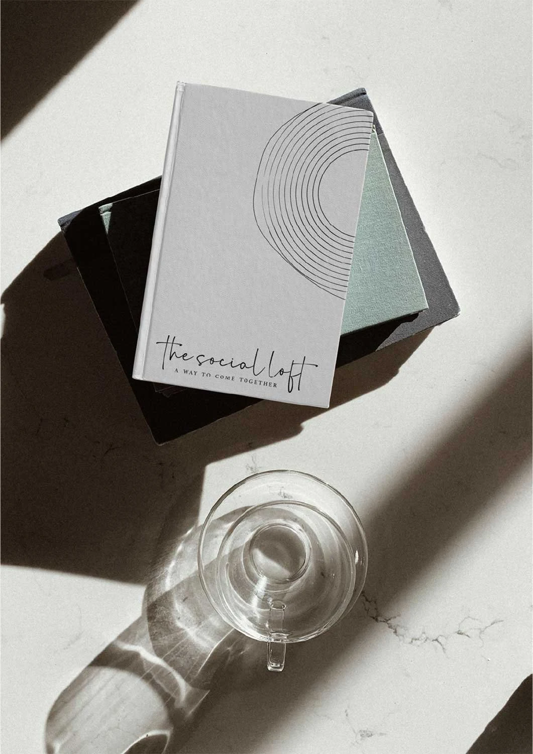
TSL brand identity mockup, logo design on a notebook
The Art of Brand Storytelling
Every brand has a unique story waiting to be told.
The Social Loft project exemplifies how powerful visual narratives can breathe life into a brand's identity. This journey of creating a cohesive brand experience wasn't just about designing logos or choosing color palettes—it was about crafting a visual language that speaks to the heart of what The Social Loft represents.
Like this project
Posted Jan 6, 2025
Crafting a sophisticated, warm brand identity and brand strategy for The Social Loft through a harmonious blend of symbolism, color palette, and typography.