Brand Identity & Design System for Teamersive
The Drawline Design Studio
The Brand Identity
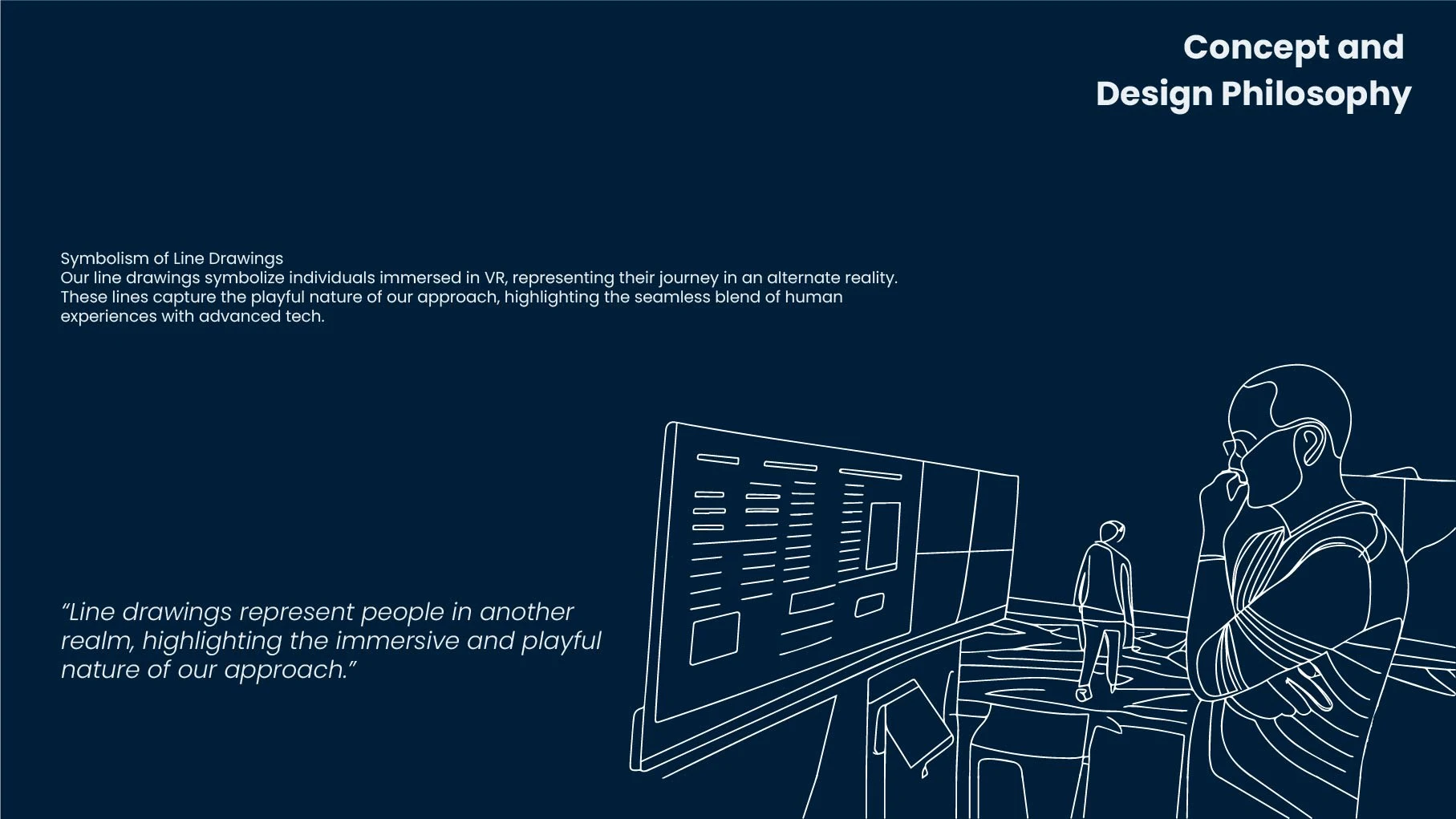
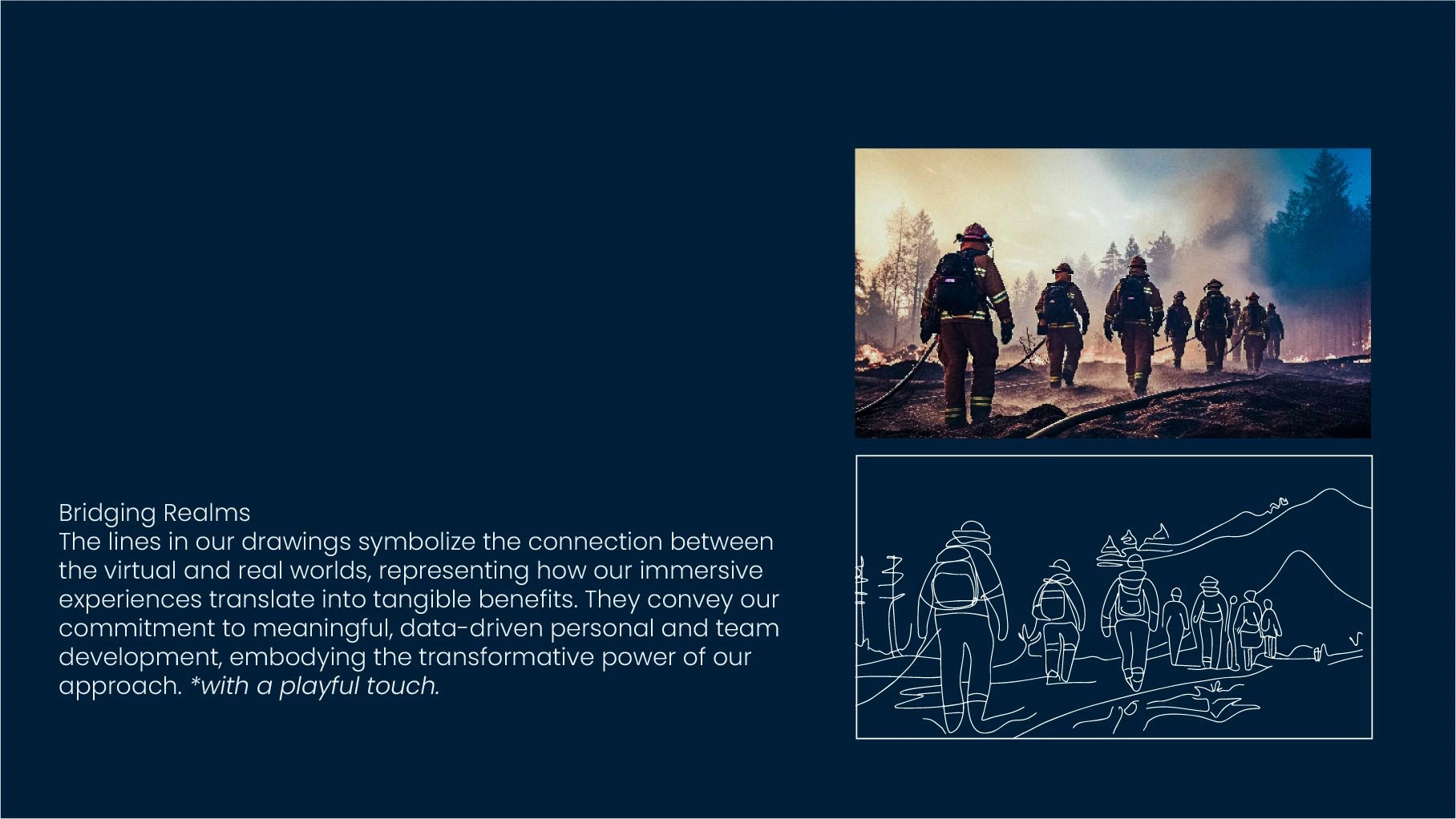
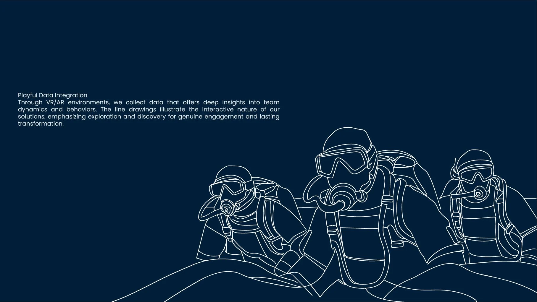
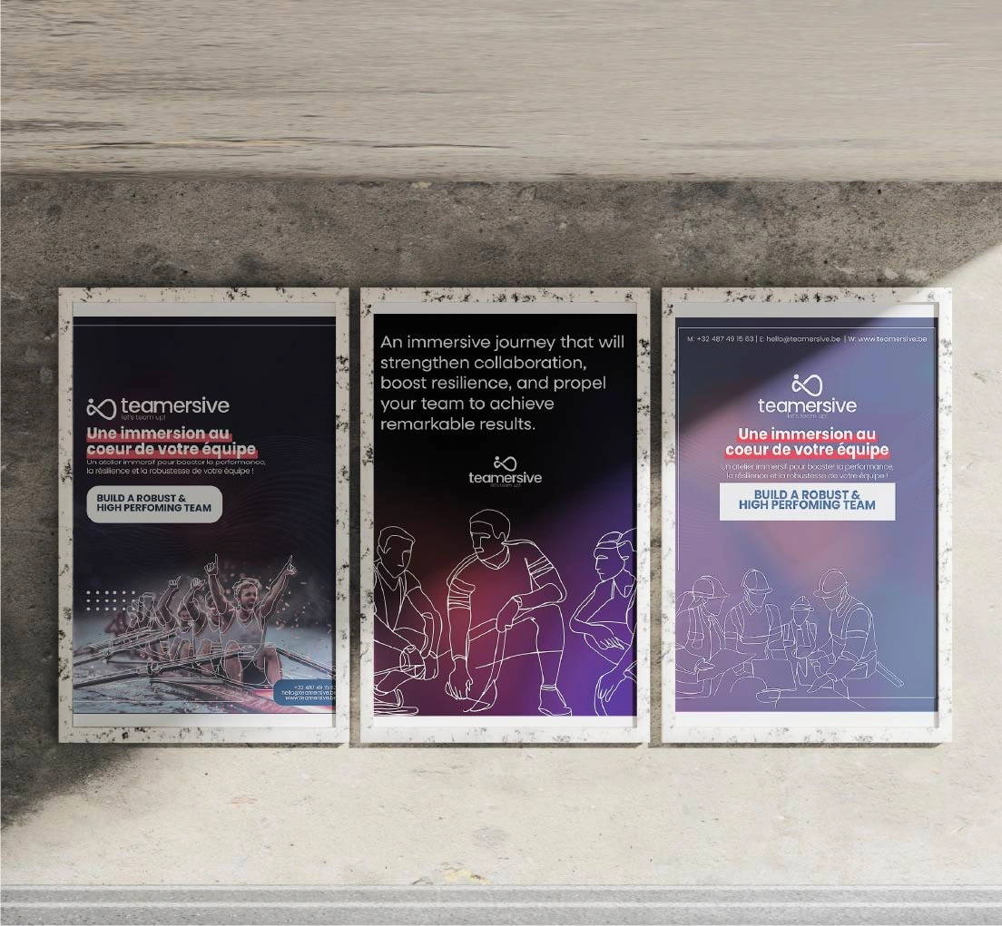
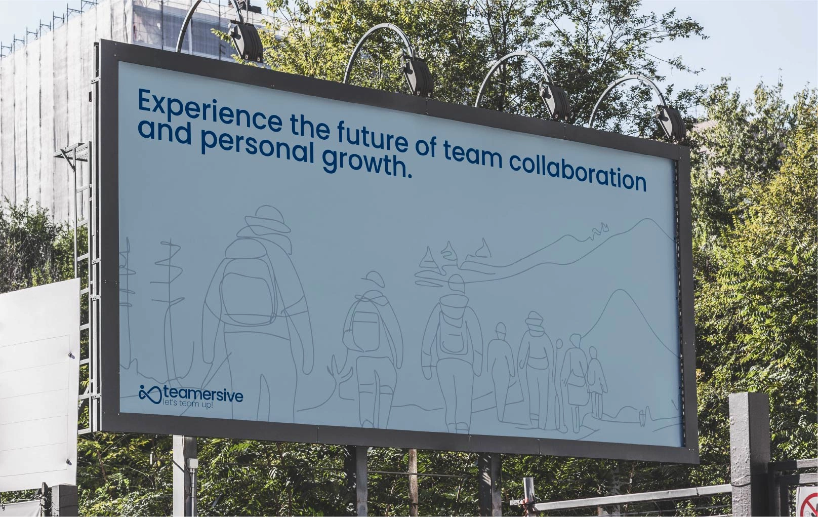
The brand identity for Teamersive explores the intersection between virtual and physical dimensions of team development. At its core, the visual system is built around a unique pairing concept: every photograph of real team interaction has a corresponding line drawing that represents its virtual dimension.
Brand Concept
This dual visualization approach brings to life Teamersive's key differentiator: the ability to seamlessly blend physical team experiences with virtual reality training. The line drawings don't just illustrate - they represent the digital layer of understanding and analysis that Teamersive brings to team development. Each line echoes a real moment, creating a visual metaphor for how technology can enhance human connection rather than replace it.
Visual Language & Symbolism
The visual system operates on multiple symbolic levels. When line drawings trace over photographs, they don't just simplify - they reveal. These illustrations expose underlying patterns and dynamics that might be invisible in regular team interactions. The continuous line technique mirrors the unbroken flow of data and insights that Teamersive captures during team sessions.
Design System Evolution
The brand's visual language evolved from studying how teams move and interact in both physical and virtual spaces. The line art style was specifically developed to feel both technical and human - precise enough to suggest digital analysis, but fluid enough to capture the organic nature of team dynamics. This duality reflects Teamersive's core promise: bringing analytical clarity to human interaction without losing the warmth of genuine connection.
Immersive Storytelling
Each piece of brand communication tells the story of transformation - from physical to virtual, from individual to collective, from challenge to solution. The line drawings serve as a consistent visual metaphor for this journey, showing how Teamersive's technology adds a new dimension to team development rather than replacing human elements.
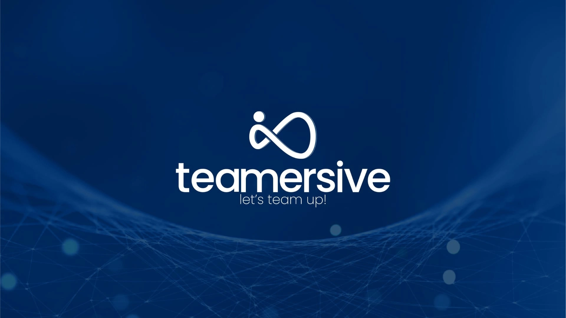
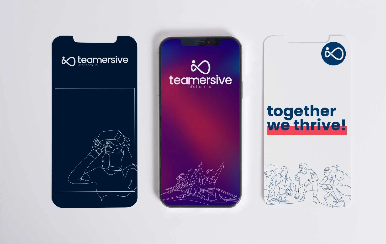
Logo Design - Teamersive
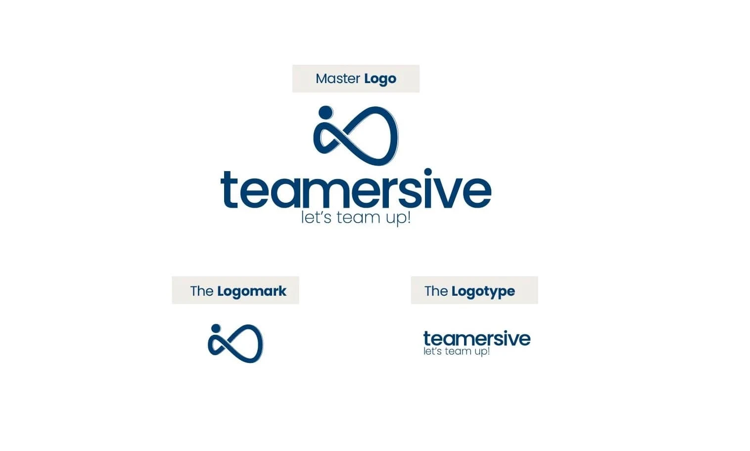
The Möbius Infinity Concept The logo's core element, a Möbius strip, represents continuous transformation and infinite potential in team development. By incorporating a human figure within this mathematical form, the logo expresses how individual growth and team dynamics are inseparable, creating an endless cycle of development.
Visual Construction
Main Symbol: Modified Möbius strip with integrated human element
Wordmark: Custom-modified lowercase Poppins font
Tagline: "let's team up!" in lighter weight
Symbolism
Continuous Line: Represents seamless flow between virtual and real experiences
Human Figure: Shows individual within collective
Infinite Form: Suggests endless possibilities for growth
Negative Space: Creates breathing room and balance
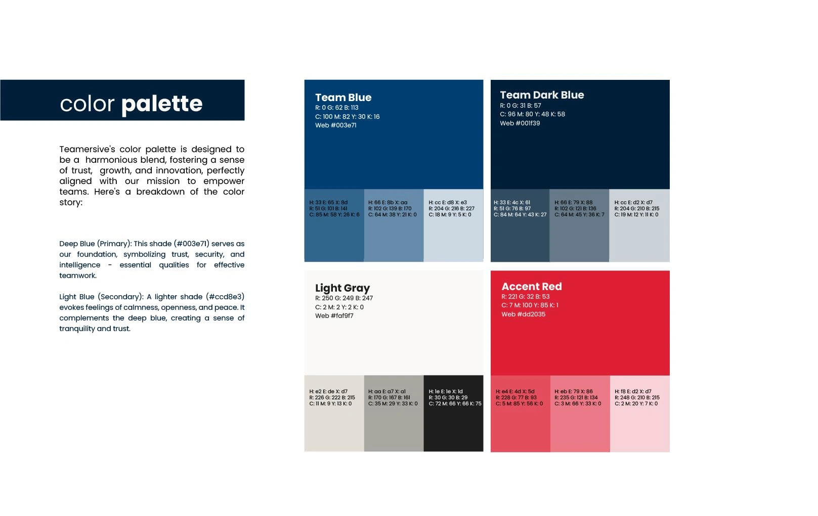
Primary Palette
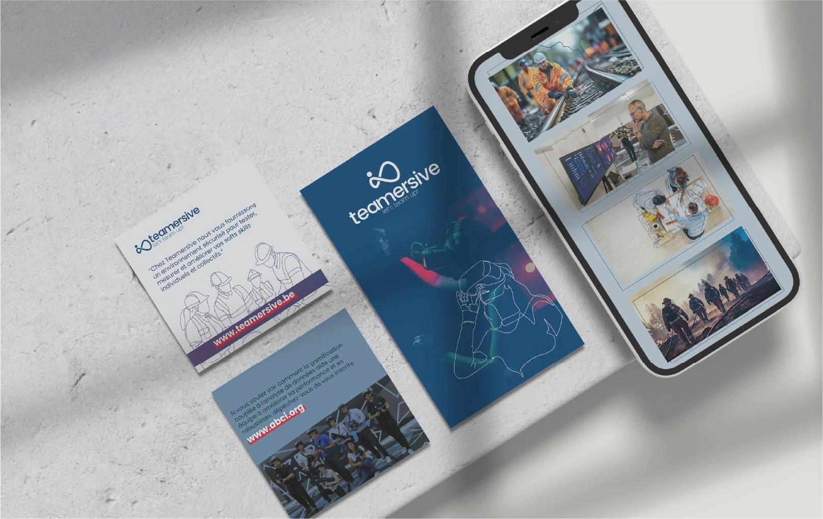
The core color system is anchored by "Team Blue" (#003e71), a deep, trustworthy shade that serves as the foundation of Teamersive's visual identity. This primary blue embodies professionalism, security, and intelligence - essential qualities for team development. The palette expands into lighter variations of blue, creating a sophisticated gradient that suggests depth and dimension.
Like this project
Posted Jan 6, 2025
"Teamersive" branding blends teamwork and innovation with a bold logo, vibrant colors, and an intuitive website, crafted to reflect collaboration and growth.