Momence website redesign to boost sales and engagement
Arkadiy Lapshov
Redesigned Momence website and boosted sales
In a focused 2-week sprint, I overhauled Momence’s marketing site—introducing a bold brand language of calendar-style underlines and highlights, expanding the feature narrative to showcase newly launched 1-on-1 capabilities, and rebuilding the pages in Webflow so the site could serve as a conversion-driven sales tool rather than a static brochure.
+$150 K in new ARR generated directly from website leads
38 % spike in demo requests (conversion uplift)
2 × increase in average time-on-page
Why the overhaul?
The old marketing site buried Momence’s story and treated the product like a feature checkbox. We needed a site that:
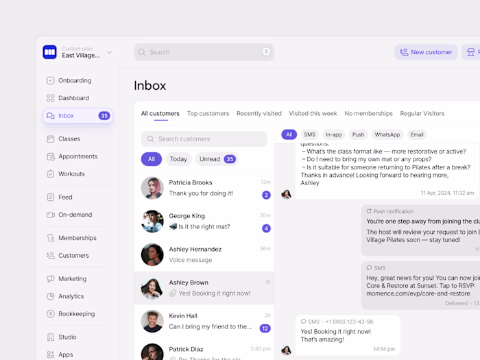
Showcases a fresh brand voice rooted in the product’s daily rituals—calendars, schedules, and 1-on-1 sessions.
Surfaces the full feature set so prospects grasp the platform’s breadth in one scroll.
Turns the site into a high-conversion sales asset, not just a brochure.
What changed?
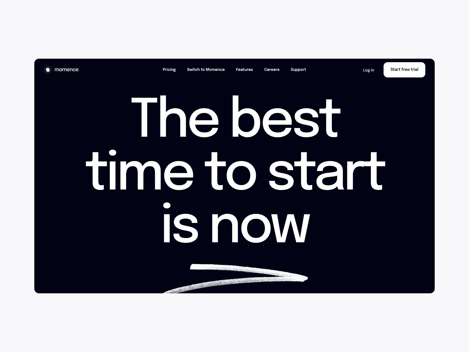
New visual language built around underlines & neon-style highlights echoing the in-app booking calendar—instantly recognizable, undeniably Momence.
Hero narrative → Feature runway: an above-the-fold promise followed by an interactive, scroll-snapping feature list that lets visitors self-select use cases.
Action-first layout: contextual CTAs (“Book a Demo,” “Start Free Trial”) pinned to each section; copy trimmed to one-breath statements.
Proof modules: real revenue numbers, studio logos, and bite-sized case quotes woven between sections to build trust without disrupting flow.
Accessible tech stack: rebuilt in Webflow, enabling marketing to ship updates without engineering sprints.
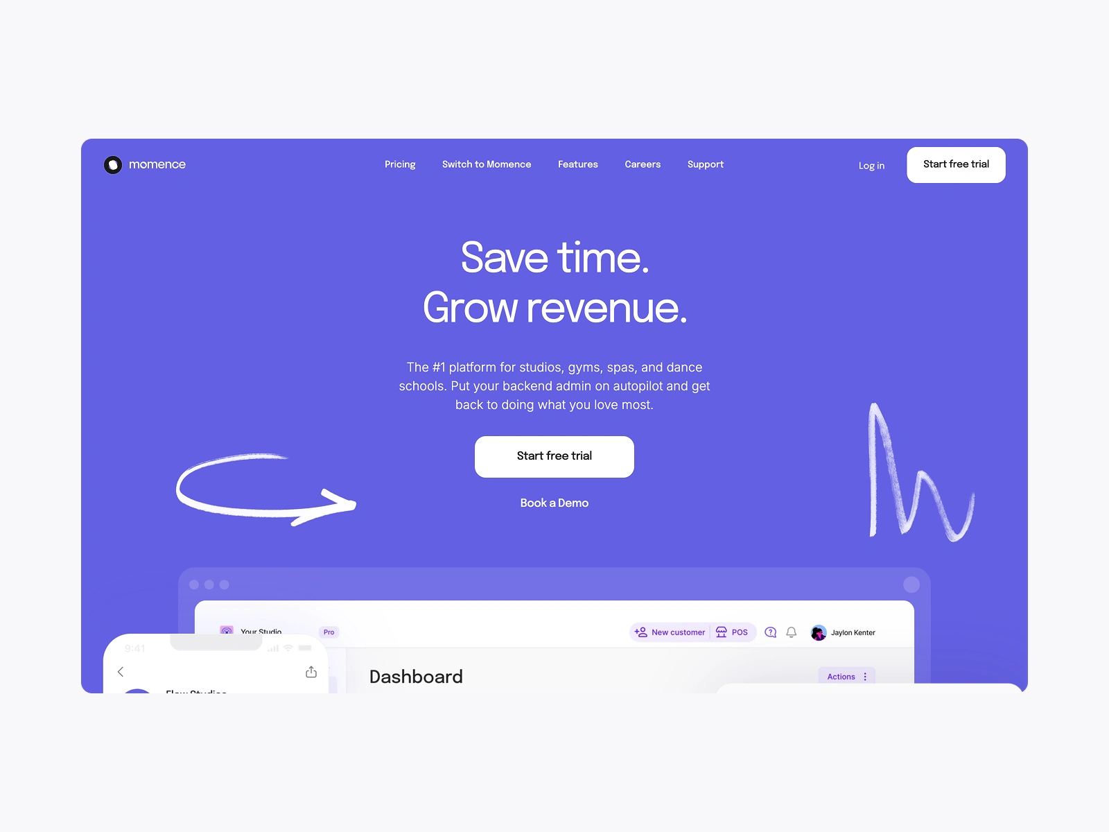
Hero section
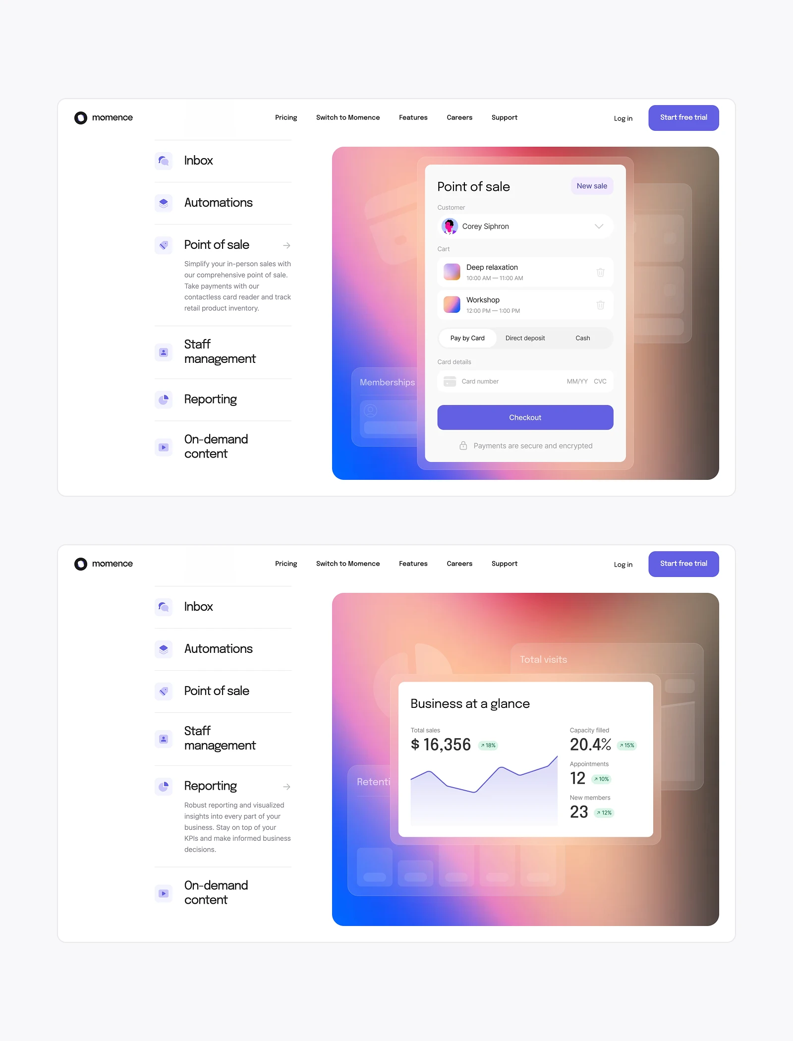
Key functionality highlights
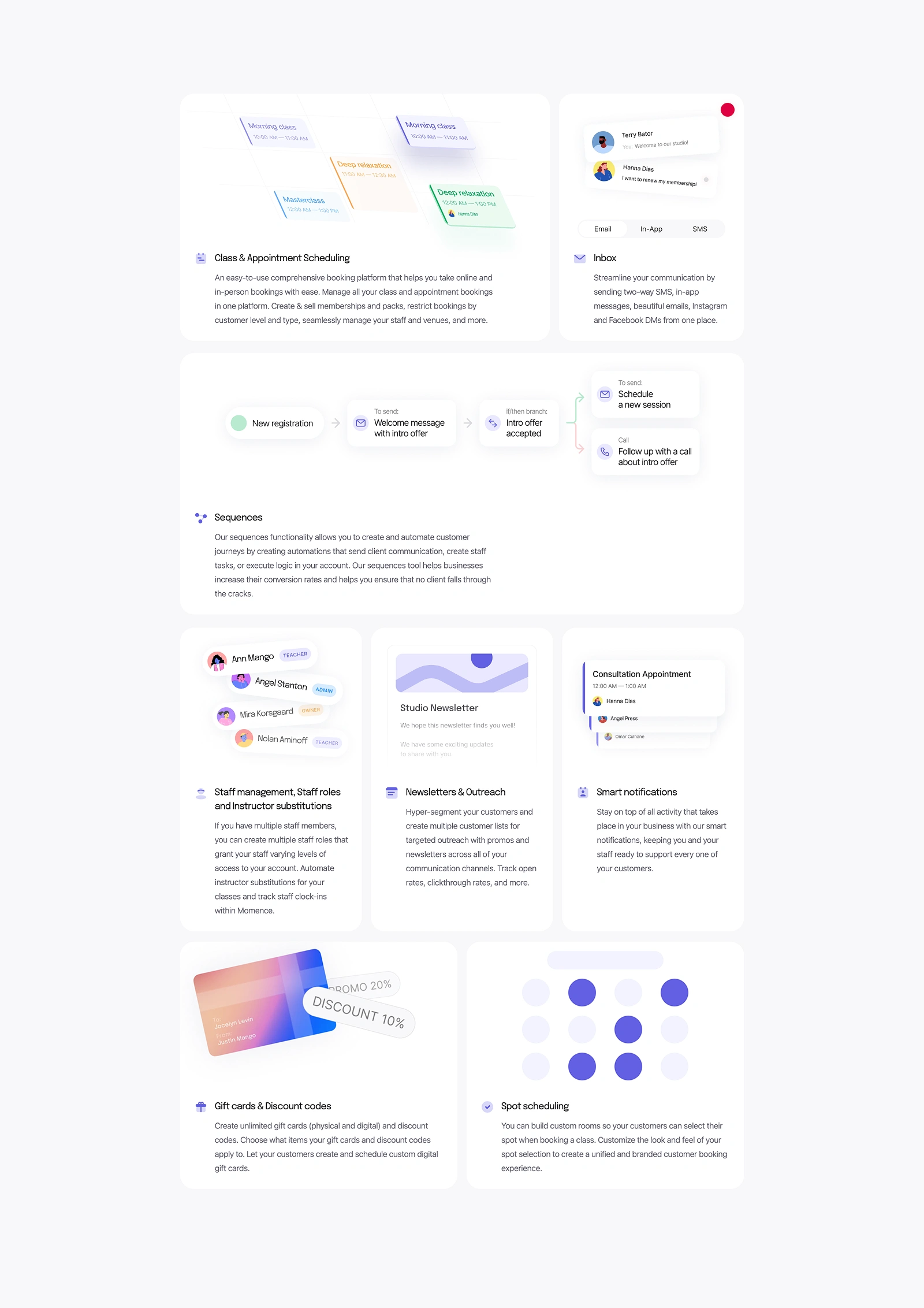
Features vol.1
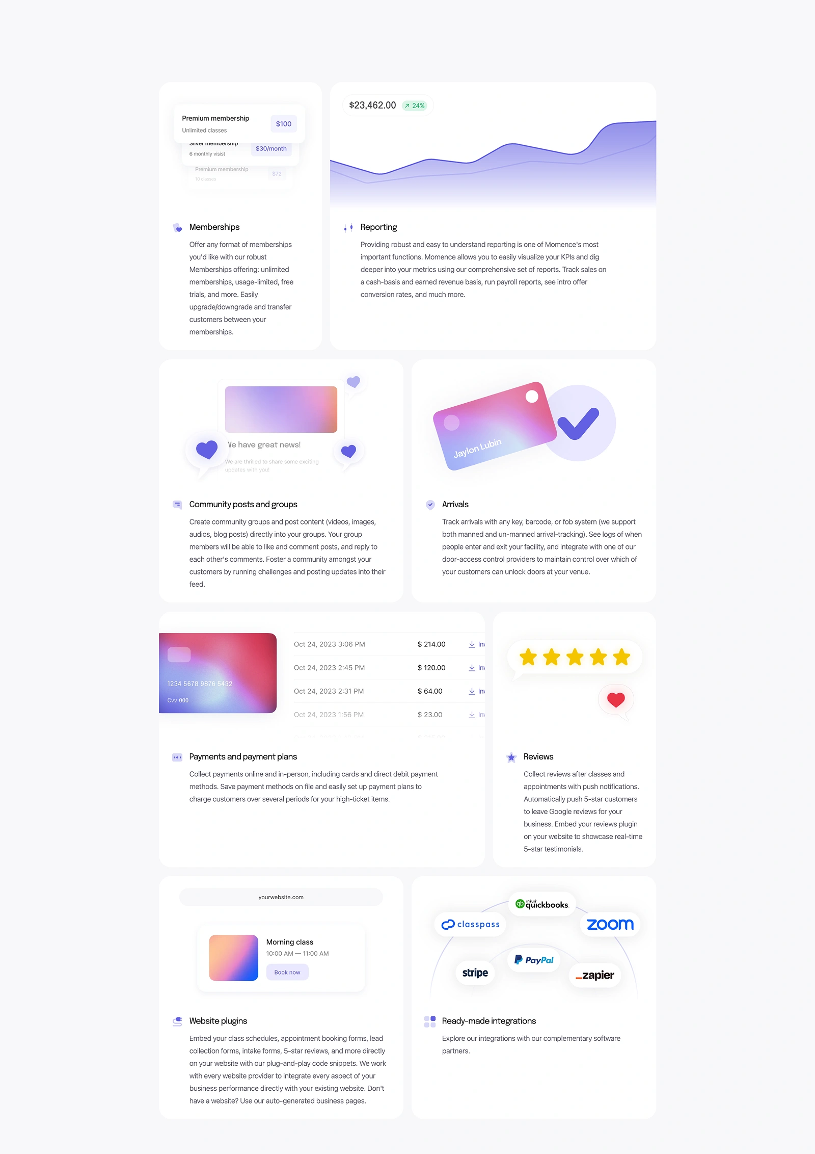
Features vol.2
Like this project
Posted Jul 5, 2025
Overhauled Momence site in 2 weeks: new brand highlights, full feature showcase, Webflow rebuild; +$150K ARR & 38% more demos in first month.
Likes
2
Views
4
Timeline
Feb 1, 2024 - Feb 14, 2024
Clients
Momence