Silver Paw Dog | eCommerce Design + Landing Page Optimization
Creating a seamless and enjoyable shopping experience for pet owners!

Overview
Silver Paw has a strong grasp of what it takes to flourish in the pet lifestyle and accessories business. With the fundamental focus of providing pet owners with a brand that can offer functionality, innovation, and one-of-a-kind design features, the Silver Paw pack continues to expand new ways to further disrupt the pet industry.
Silver Paw continues to rapidly grown into apparel, walking gear, beds, treats, veterinary health products, and other pet accessories with the main goal of becoming the ultimate one-stop-shop for all things dog. No other canine brand has both the breadth and depth of product lines that Silver Paw can deliver.
The Problem
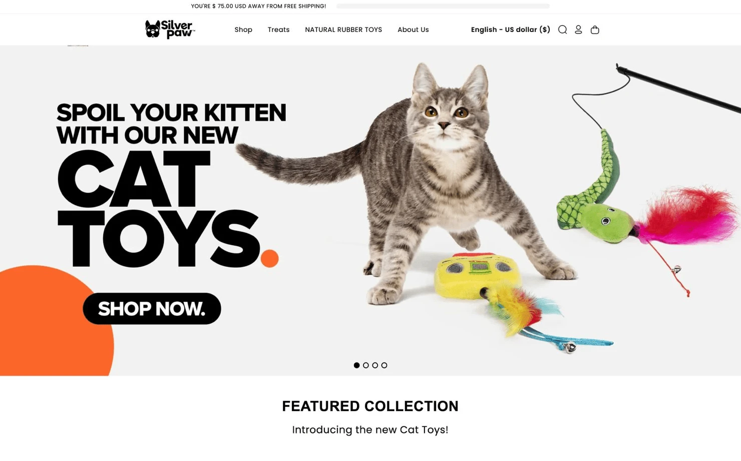
The client already had a design made through a low-code platform (Shopify) but saw the need for design help as some users were experiencing issues with the overall experience.
Silver Paw requested a redesign of their entire website, but through further testing and conversations with the client, creating a better visual understanding of the overall shopping experience was the main priority for our team.
The Solution
Design and Develop and web experience that places their unique and vibrant products front and center. Enabling customers to learn more about Silver Paw, and discover new pet products along the way with suggestions and featured picks.

Research
Objective: To understand users’ preferences and behavior when shopping for pet accessories - and to identify pain points in the online shopping experience.
Kickoff Call & Competitive Analysis
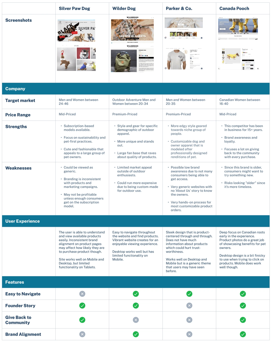
During our kickoff call the design team was able to learn more about Silver Paw Dog's business model, target market size, and market validation. With this information, we worked to understand their concerns regarding Brand Alignment and the improvements they wanted to make.We also reviewed our initial competitive analysis, we learned the following and more:Many of the websites focused on selling the benefits of the products over the features.Limited usability plagued many of the designs whether on desktop or mobile.Ease of Navigation was an important factor that Silver Paw Dog's current website was struggling with.Branding seemed to be a hit or miss with Silver Paw Dog's closest competitors.
Competitive Analysis
User Testing
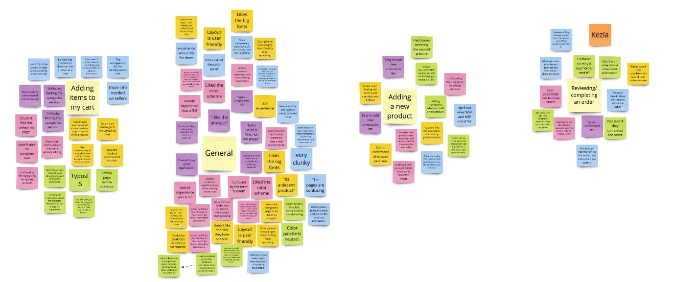
While some participants went through the current site with ease,more than half were confused by the structure and layout, leading many to point out contradictions between accessibility and common web standards. Reviewing the results of our tests allowed us to compile all of our findings into these 5 categories
Adding new items to cart
Completing an order
General e-commerce experience
Adding a new product (back-end CMS)
Finding new and interesting products
Apart from Qualitative testing we also using detailed KPIs throughout the site to better understand large amounts of data.
compilation of our testing notes/ results
Key Takeaway:
Many shoppers do not enter a pet accessories site with a clear idea of what they are seeking. They are instead relying on inspiration and suggestions to influence a purchase.
Ideation
User Stories
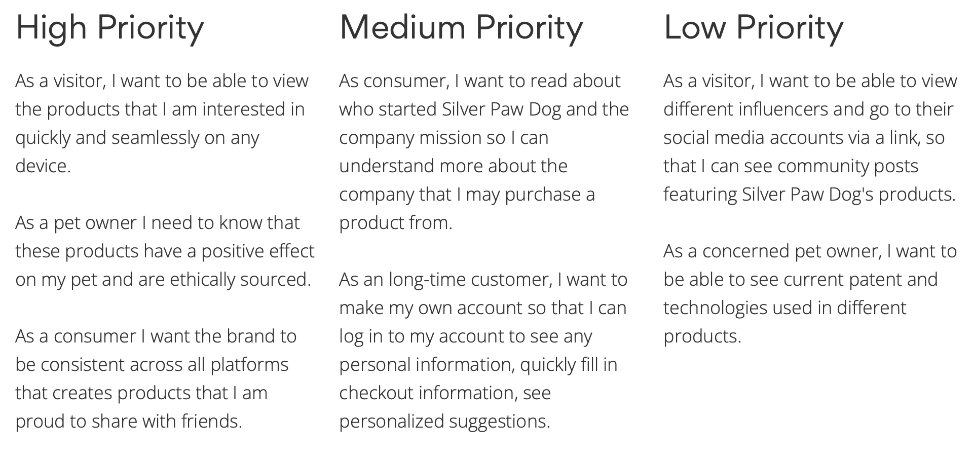
I compiled the information that was gathered from our user testing and client call create user stories. With user stories, I was able to categorize platform features by priority. This allowed my team to fully understand the user's needs when designing the platform based on users' needs.
Sketches
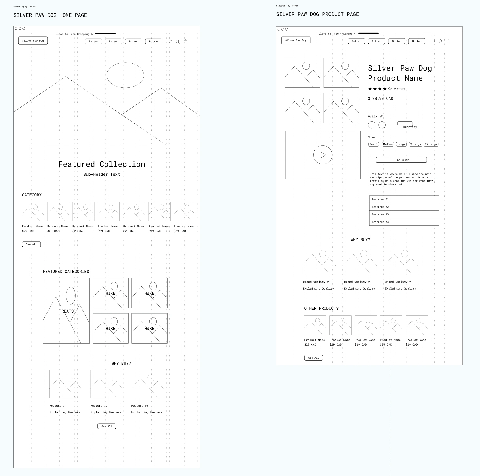
Having the team sketch out our ideas gave us the chance to visualize the screen layout and play around with different concepts while having the freedom to start over if we needed to. I was responsible for sketching out the homepage, product product page, important informations screens, and cart pages. I made sure to keep in mind the client's needs and focused on creating effortless and cohesive designs.
Sitemap

A sitemap was created to scope out the structure of the site as well as the journey a user would experience while interacting with it. This allowed me to visualize the framework of the e-commerce functions through the users lens and understand the overall layout of the primary pages and how they interconnect within Silver Paw Dog.
The main elements established for the e-commerce functions are as follows:Home Page - Focus on branding
Collections
Informational Pages - With a focus on Story and Testimonials pages
Individual Product Pages - Increase conversion rate
Design
Wireframes
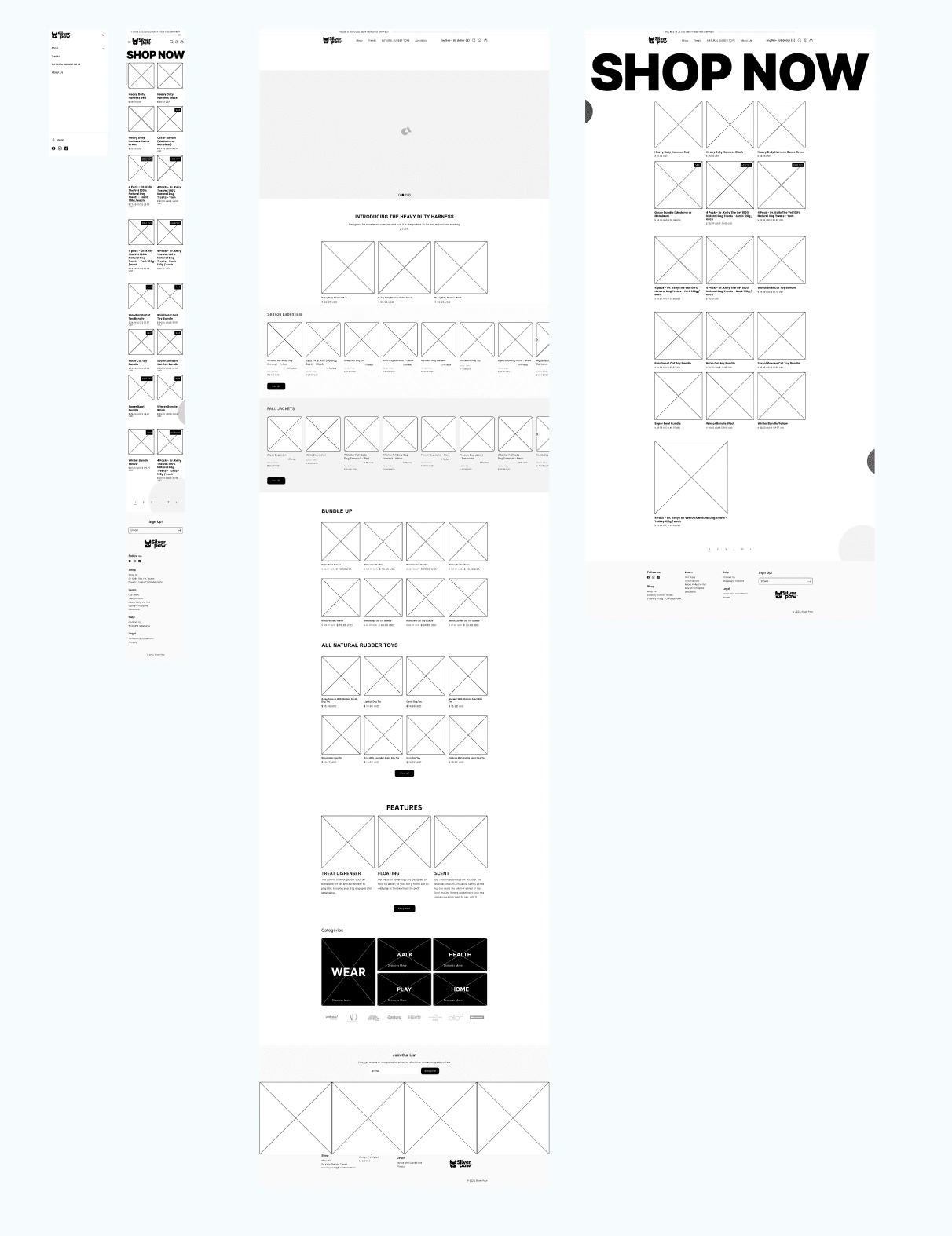
The next thing to do was to transform my sketches into low fidelity wireframes. Using current design best practices as a guide, I paid close attention to spacing and sizing of the elements on their corresponding screens and upheld design consistency among the screens. While turning my sketches into a digital version, I was able to make changes regarding the layout of certain screens such as shop finances, product and services listings, and merchant dashboard. Included in those changes was communications with clients which was added as a main element and now seen as Messages in the navigation bar.Moreover, the client expressed during the briefing that the Homepage and Shop Now pages were some of the prioritized screens, so I ensured that I incorporated key features they requested while maintaining an easy and seamless user experience.
Challenge and Solution
A problem I encountered while transforming the mid-fidelity wireframes into high fidelity screens was revising the entire design of the messaging center screens in order to integrate new features that were more personalized to Silver Paw Dog's users. After deliberating with my team and creating alternative designs, I decided to move forward with a different design for those screens.
Changes made to original design:
More depth was added to the pages
Added in more opportunities for branding hero images
View FAQs and Reviews on the Product Page easier
Using Modal for creating a new message w/clients
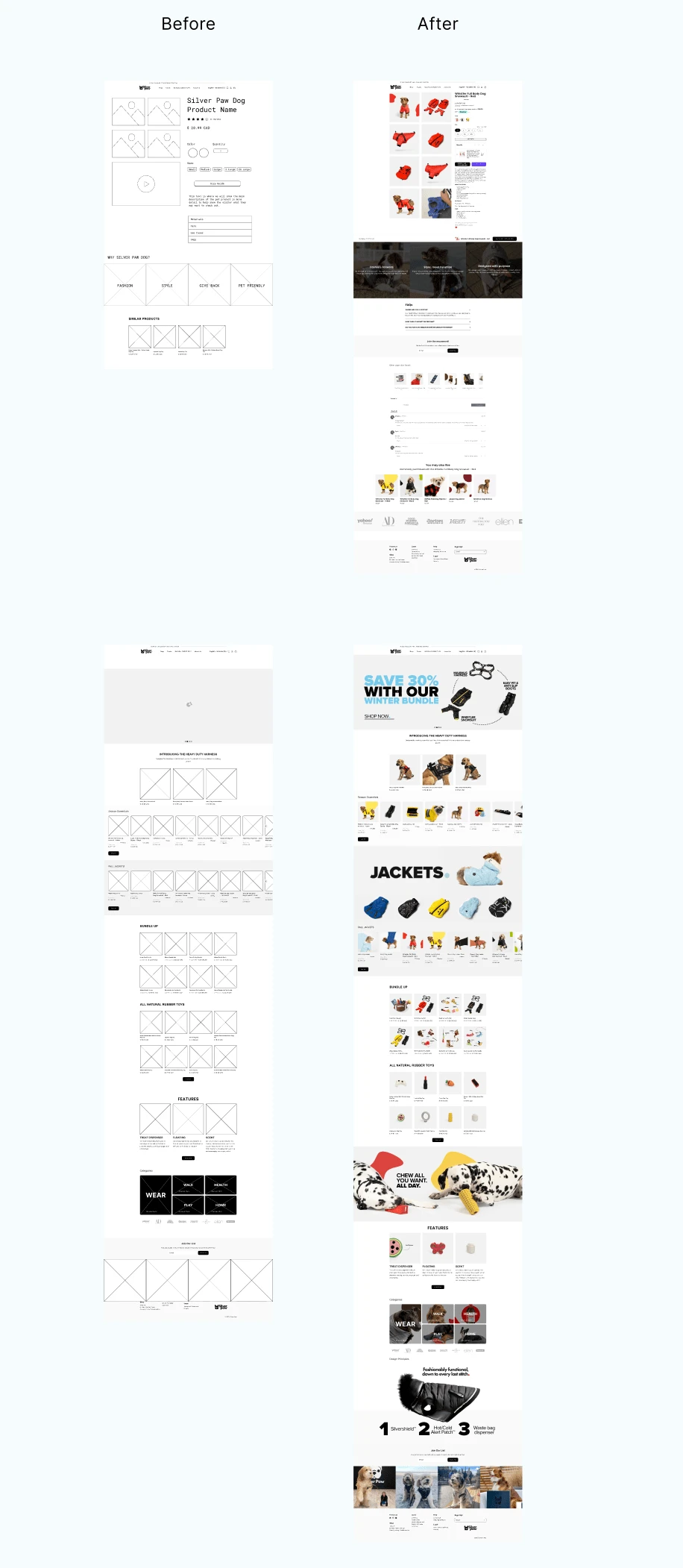
Silver Paw Dog 'Product' and 'Home' pages Before and After
Developer Handoff
As we were moving to develop handoff, we implemented the client's own product images into the design. This version was submitted to the client along with detailed annotations that included measurements and interactions of the design. During this phase, we ensured all sizing, spacing, and content were concise.
The Team of designs was a much appreciated help once I modeled the measurements the developers were looking for! Additionally, I implemented the change to the hero image sections.
This allowed for the branded hero images to stand out with proper spacing separate sections of the design.
Reflections
Like this project
Posted Dec 29, 2023
Design and Develop a web experience that places their unique and vibrant products front and center. As lead of 4 designers I was tasked with project success.
Likes
0
Views
5


