LE.CHE Almond Milk

Adelaida Garcia Lares
Brand Designer
Graphic Designer
Packaging Designer
Adobe Illustrator


Adobe Photoshop

LE.CHE is a modern brand with its principal product, their almond milk which boasts a health-focused formula without any added artificial ingredients.
✨ Client's desire
The new branding should reflect the product’s purity and natural origins, appealing to consumers who value wellness and clean eating.
🎯 Target Audience
From young adults to ederly.
From 17 to +60 years.
Men and Women.
Visual Identity
The color palette denotes freshness and warmth without neglecting the classic, as it is a product that seeks to connect with a varied age range. The use of Tangerine and Robin Egg Blue as contrasting colors passes light (Linen) and dark (Raising Black) backgrounds allows important elements of the graphic line to be highlighted, showing a casual and fun style.
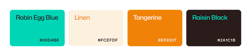
Color Palette
The font chosen is Sedan, a considerably elegant and formal Serif font, which in turn shows character and personality through the different body thicknesses of each type.

To show a more fun and dynamic side, the font was edited to create this cut on the shaft of the "h", and join the shoulder with the "c", as well as smoothing the cut of the shaft to create more consistency with the other types due to its rounded endings.

Logotype
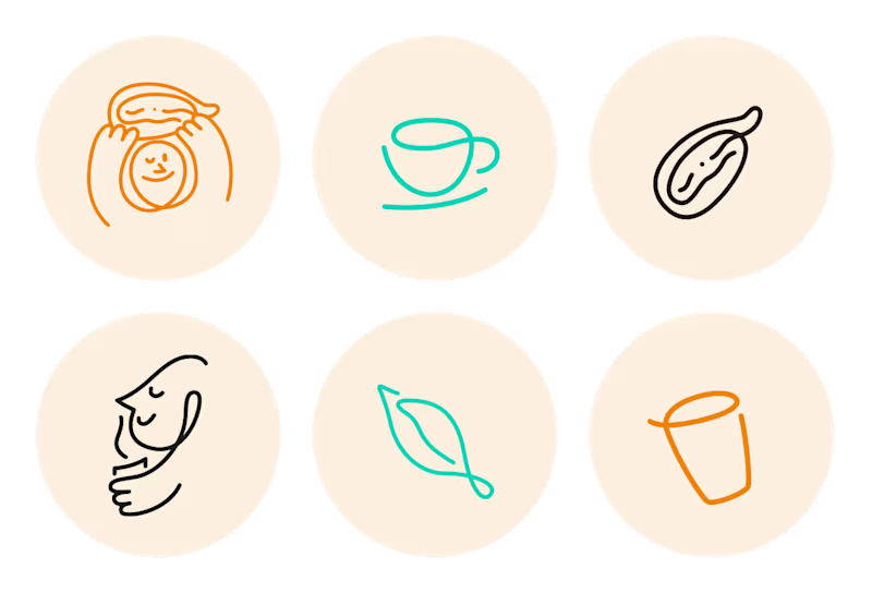
Graphic Line
ILUSTRATIONS
SOCIAL MEDIA
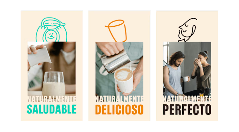
Banners
PACKAGING
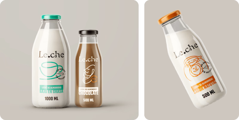
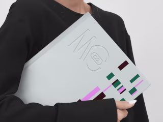
Bottles
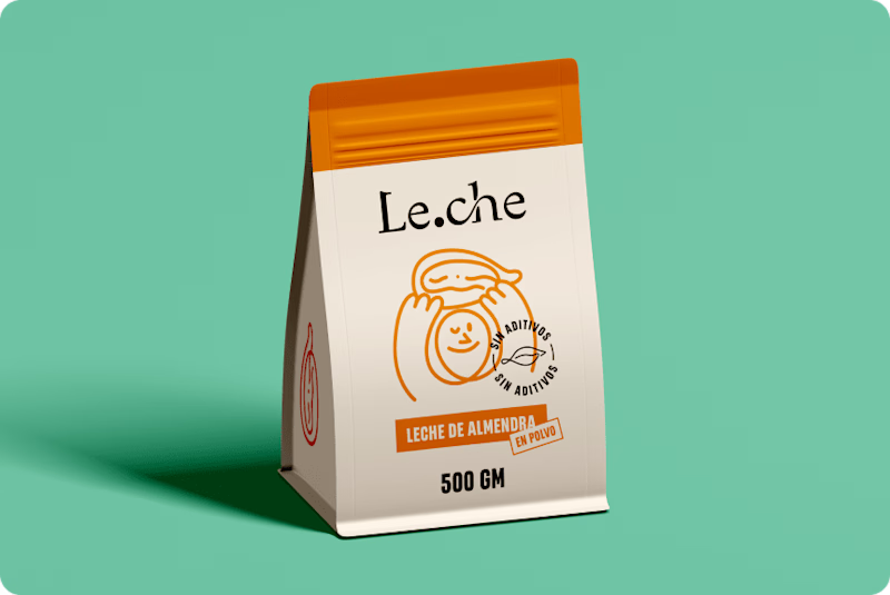
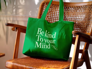
Pouch Bag