Vibrant Design Creation for Poppin Colour
Chioma Gordon
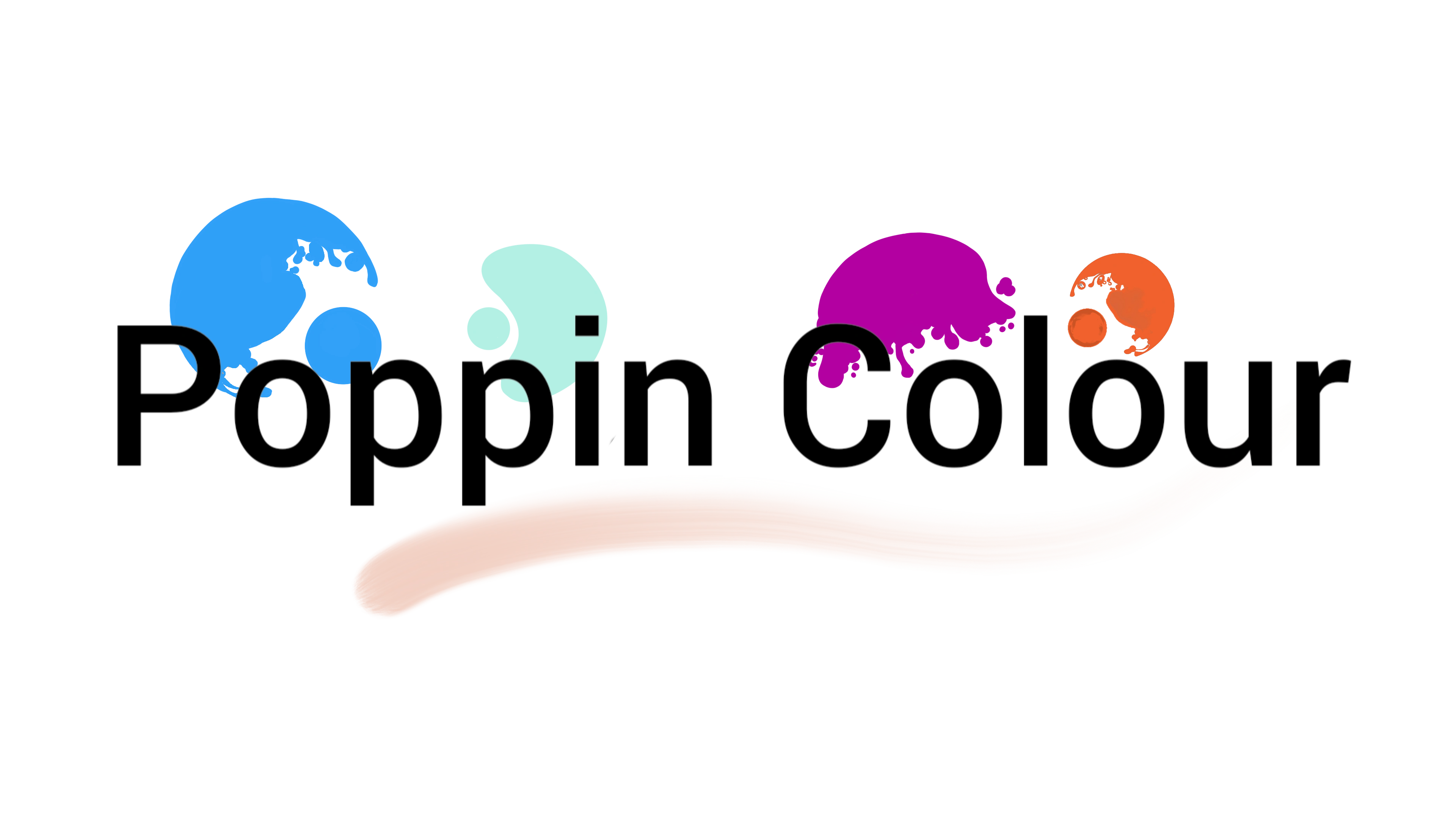
Brand Name: Poppin Colour
Who are they: A clothing POD brand that designs against the status quo with original staples for apparel and Products.
I recently had the pleasure of setting up a new project of creating designs for Print for Poppin Colour a growing clothing and product organisation who emphasises inspiration in originality and expression through vibrant colours and playful tones.
Not only as a designer but as a firm believer of going against the grain when being creative, it's been a passion to start such a project and try something new that would allow for likeminded individuals to find a place for them.
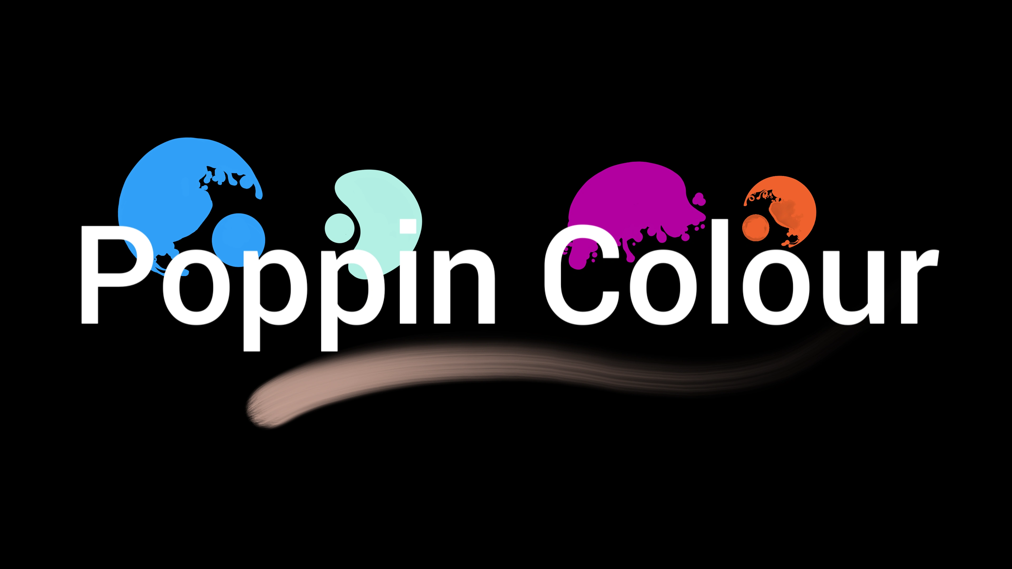
The Logo
The Logo design came from being simplistic and illiterating the pop of colour through the minimalistic style of typography and imagery. When I saw the word pop I thought of shapes and bubbles of different colours and worked with that, adding a stroke for creativity promotion, and used those as the only point of vibrancy.
Shapes and Colours without Typography
Full Logo with B/W variations
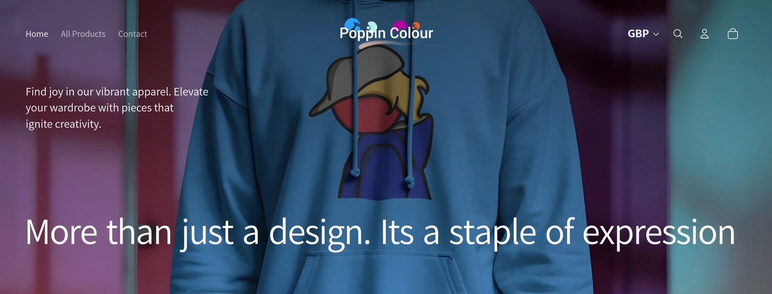
The Products
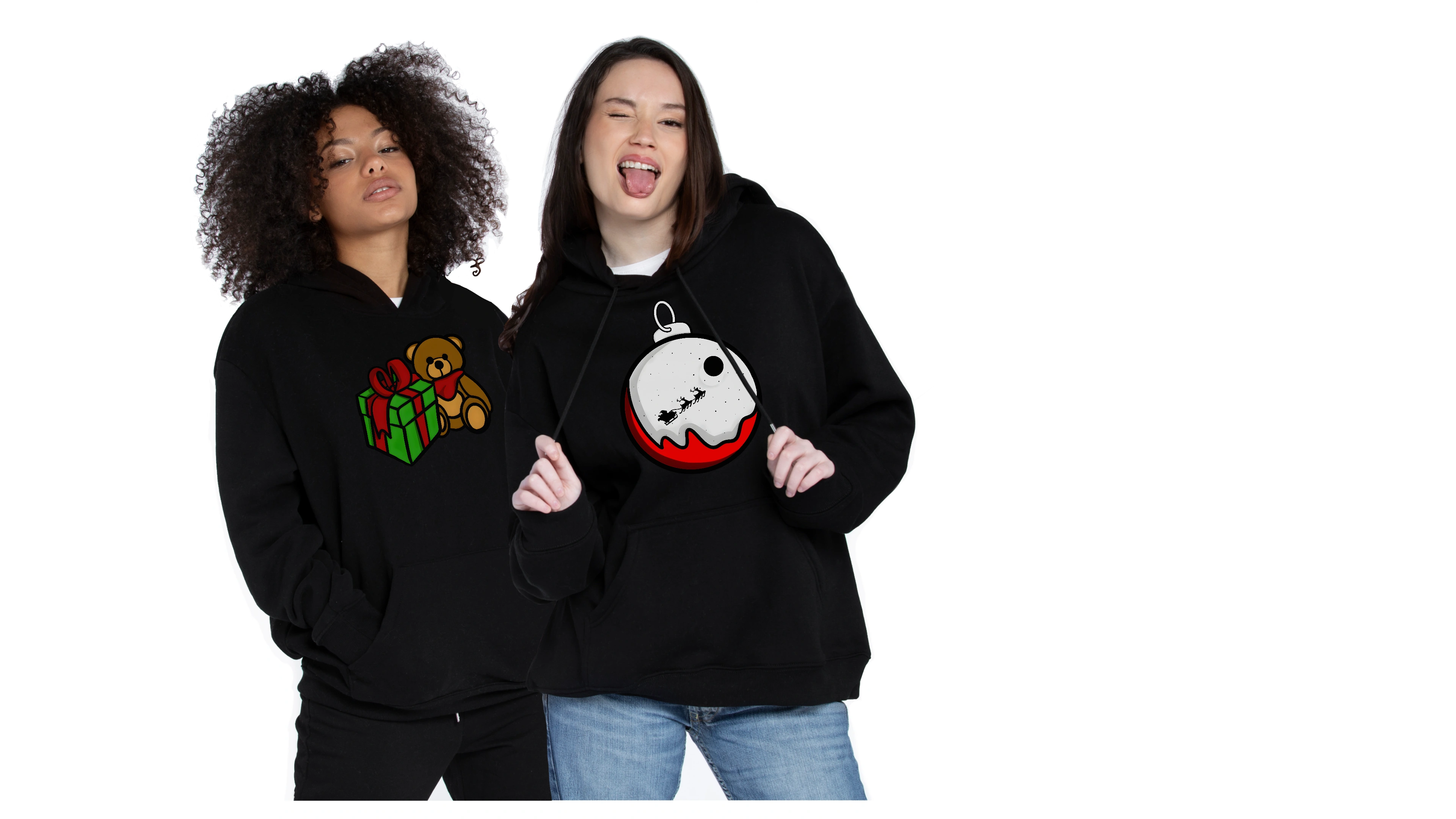
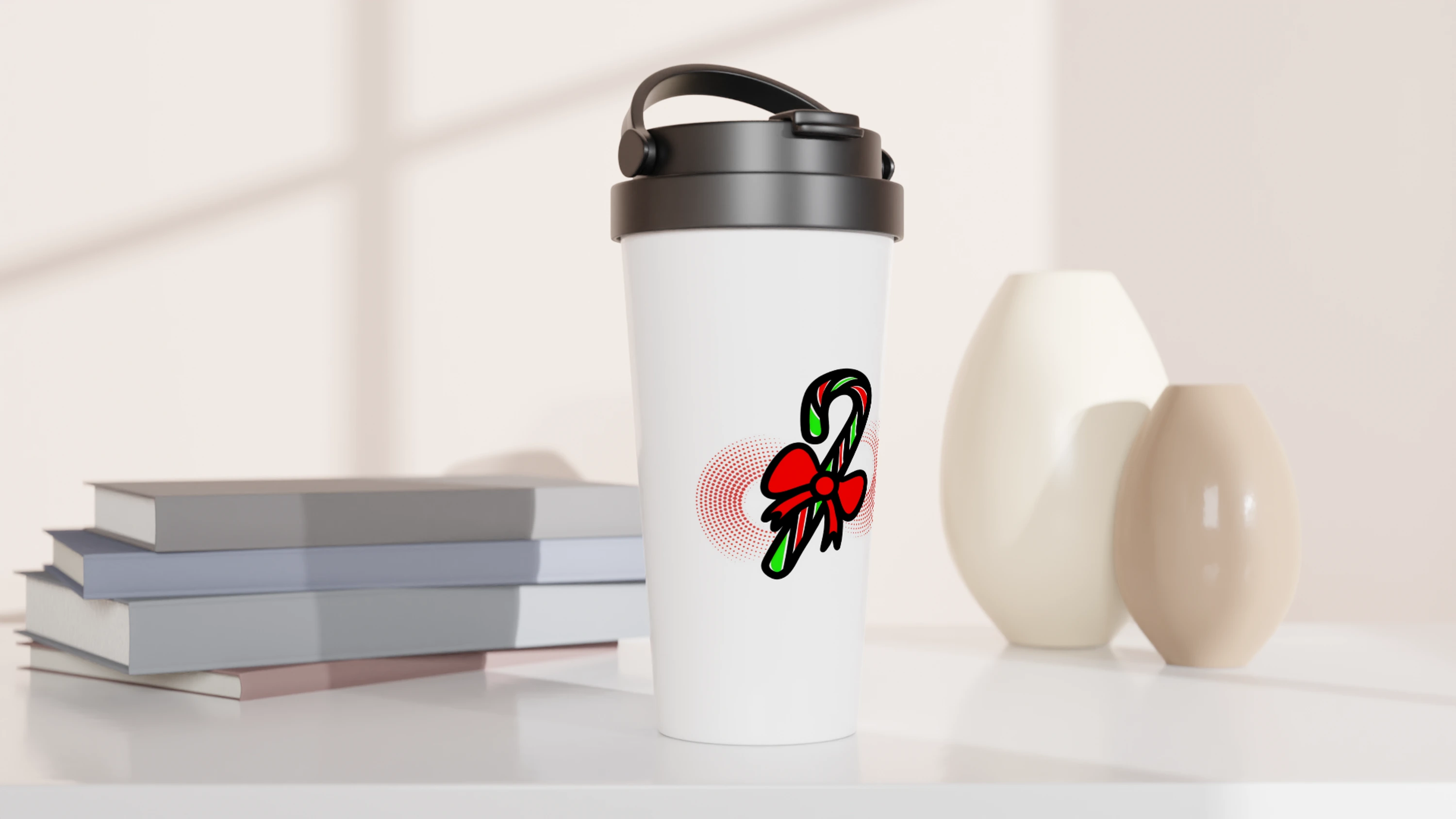
They sell apparel and accessories.
This ranges from Hoodies, tshirts, travel mugs and bags.
The products range from Premium, General and Eco and are great for personal and gifting.
Their products are sold through their website that they operate from and showcase their collections.
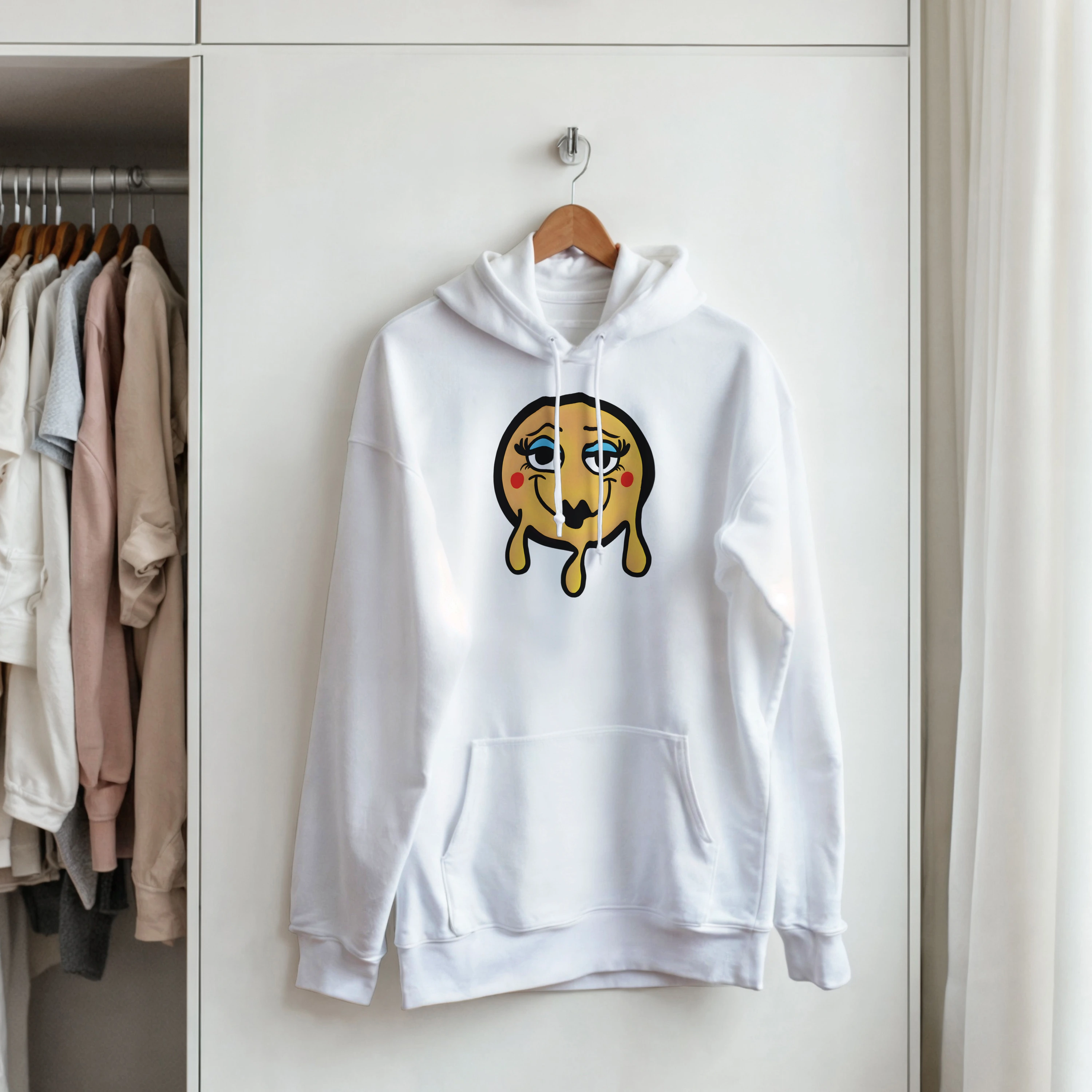
Original Designs
The idea of the designs came from the desire of colourful expression and authenticity. Most know what they are going to get when they hear graphic tees or tote bags.
As a result the designs were created to include three points:
Original Illustration Design
Vibrant and Colourful
Minimalistic
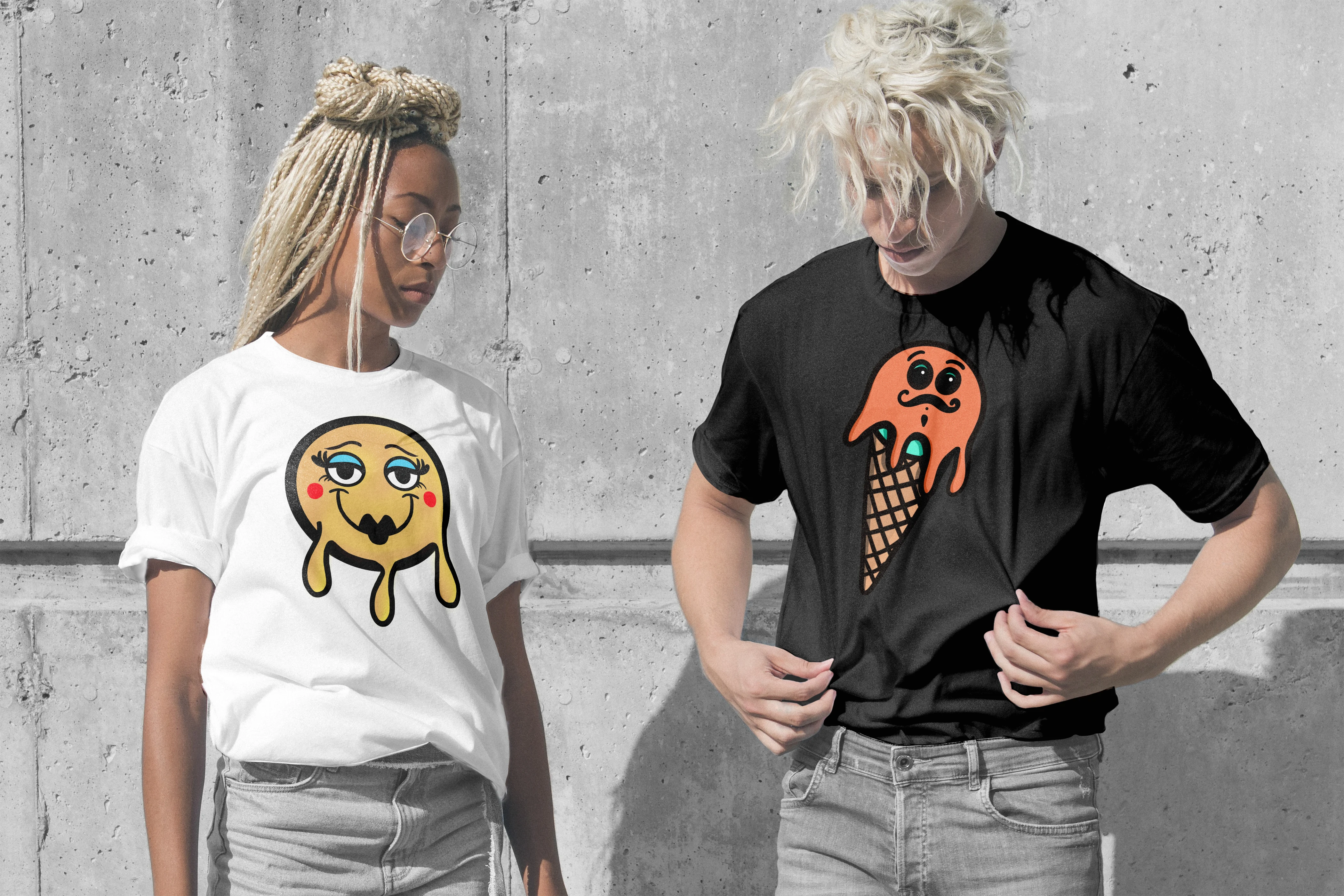
The two signature designs:


Product Visuals
As a designer it's only fitting to get mockups involved and have those product visuals for the collections.
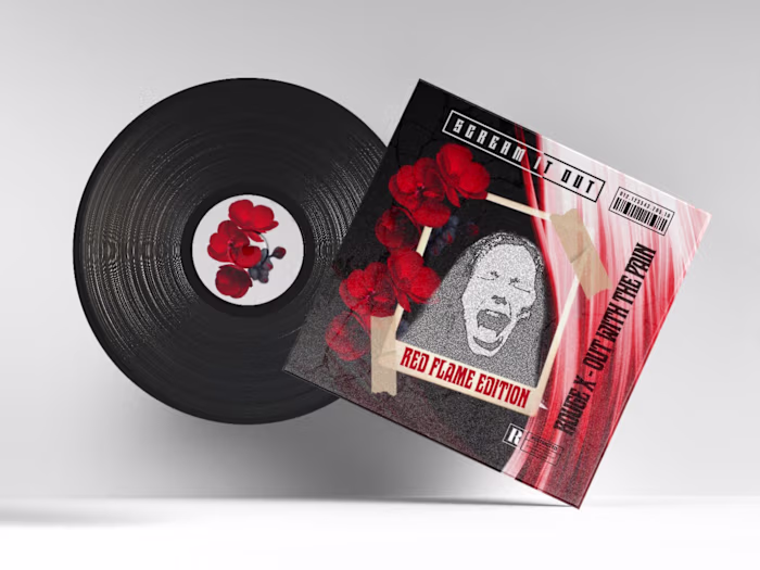
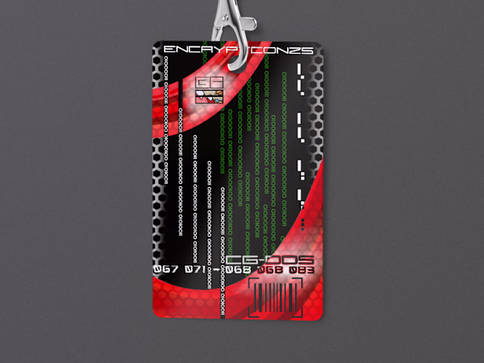
Designs:
Collections:
Currently Poppin Colour are promoting their festive collection. To avoid overwhelming customers and to ensure a targeted festive buy, three designs were chosen for the fesitive season.
All in all...
Being able to bring this project to life and create a company that promotes creativity and expression is amazing and to have such positive reactions from those that have viewed the designs ties into achieving the vision of Poppin Colour.
Thank you for reading! ❤️
All designs and logos used in this project belong to CG-DDS. Poppin Colour brand comes under development and design by CG-DDS and owned by Chioma Gordon all rights reserved. No designs and logos can be used unless given permission by Chioma Gordon, creator and Designer of CG-DDS.
©️ Oct 2025 All rights reserved. CG-DDS. CG Design and Development Solutions
Like this project
Posted Nov 9, 2025
Created original, vibrant designs for Poppin Colour's apparel and products.
Likes
0
Views
4
Timeline
Oct 1, 2025 - Nov 1, 2025