Built with Framer
Vault Landing page
Mahdi Mezelli
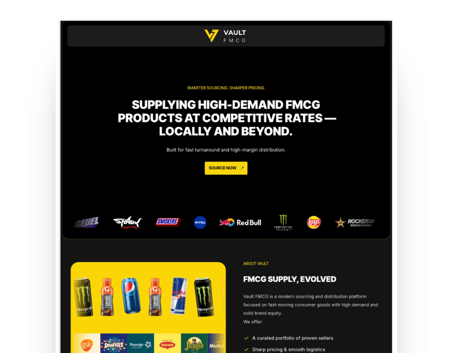
Vault FMCG — Website Design & Framer Build
Role: Product & Web Designer
Scope: UX strategy, content structure, UI design, Framer build
Tools: Figma, Framer
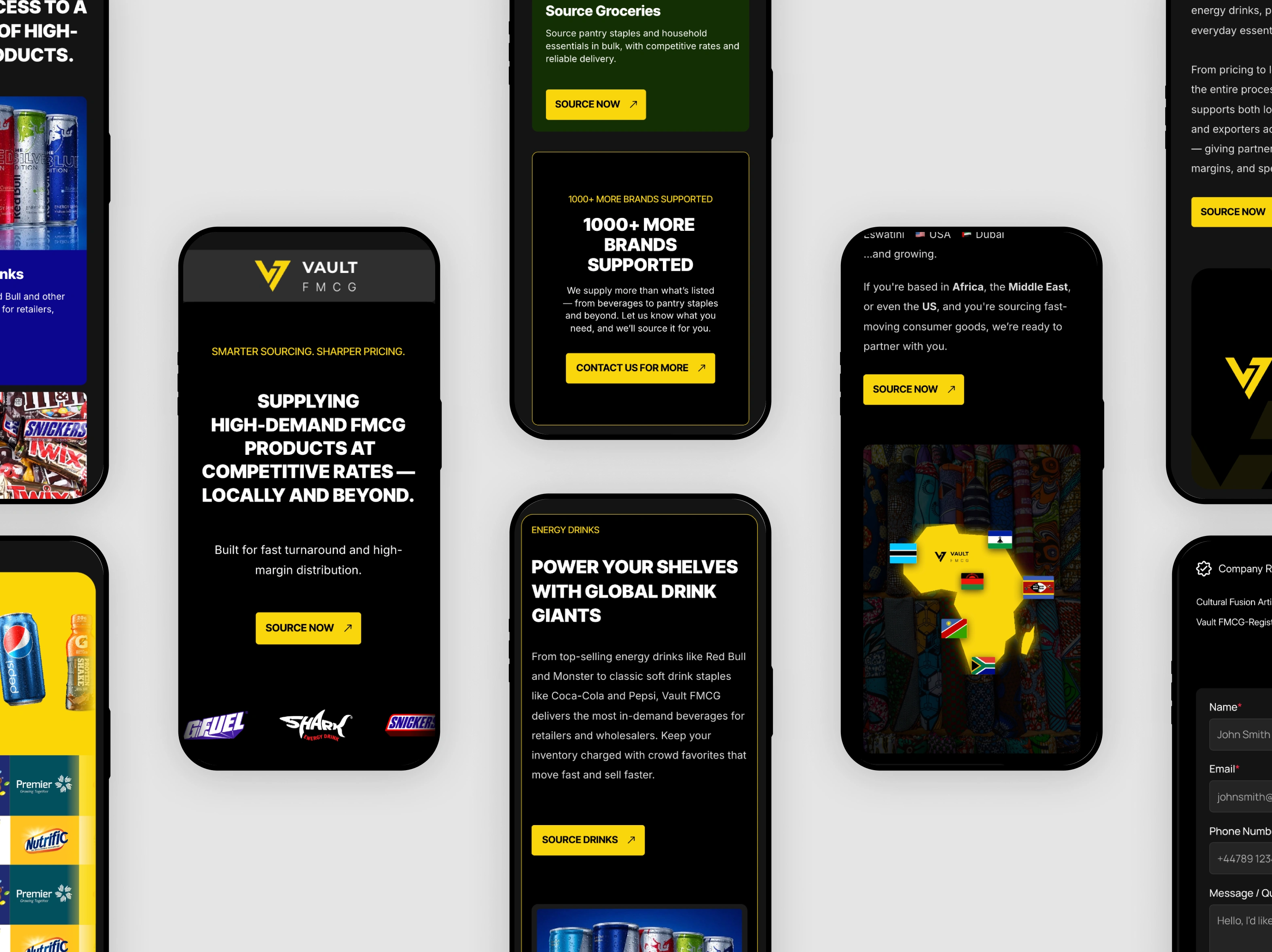
Live site: https://vault-fmcg.com/
The challenge
Vault FMCG came with a clear mission: stand out in a crowded B2B landscape and communicate authority, trust, and clarity to manufacturers, vendors, and buyers in the fast-moving consumer goods space.
The key challenges were:
Complex audience: Multiple user types (retailers, brand owners, distributors) with different motives
Ambiguous product narrative: FMCG is a functional vertical, but the value proposition for Vault needed refinement
Competitive space: Other FMCG platforms feel generic, commodity-like, or over-technical
The strategic question was simple but critical:
How do we present Vault as both credible and differentiated — without overwhelming users with jargon?
Strategic approach
From the outset, the strategy focused on clarity and trust.
Instead of starting with visuals, we started with questions:
What is the core promise of Vault?
Who is the primary audience we should design for?
What actions do we want visitors to take (sign-up, demo request, contact)?
What proof points reinforce credibility?
These questions dictated the structure, messaging, and visual flow of the site.
UX & content decisions
1. Lead with clarity
The hero section clearly states the value proposition in human terms — not industry buzzwords.
Visitors immediately understand:
What Vault does
Who it serves
Why it matters
2. Audience segmentation
Rather than generic content, we created audience-oriented pathways that speak directly to:
Retailers looking for partners
Brands seeking distribution
Distributors evaluating new tools
This makes the site feel personally relevant, not generic.
3. Proof over promise
Instead of abstract claims, we included:
Process explainers
Data points where available
Trust elements such as partner logos or testimonials
4. Focused CTA behavior
Each section ends with a clear next step — demo booking, contact form, or download — reducing hesitation and decision fatigue.
Visual design & Framer build
Design principles
Modern and authoritative typography
Clean layouts with strong visual hierarchy
Consistent spacing and rhythm
Subtle motion to guide focus (Framer transitions, scroll-linked animations)
Framer implementation
Fully responsive build
Optimized for performance and SEO
Use of components and variants for maintainability
Easy future updates (CMS where appropriate)
The experience was tested across breakpoints to ensure clarity on desktop and mobile alike.
The result
The final website for Vault FMCG is:
Clear and confident in its messaging
Structured for real visitors (not just designers)
Visually balanced — authority without intimidation
Built for action — conversion forward with logical pathways
Rather than feeling like a brochure, the site supports real business outcomes:
stronger first impressions
easier onboarding for visitors
reduced confusion about value and next steps
What I learned
Effective B2B website design is not about visual flair —
it’s about relevance, structure, and trust.
By aligning the content with human intent — not assumptions — the Vault site becomes more than a destination: it becomes a guided experience for decision-makers.
Like this project
Posted Aug 5, 2025
Vault FMCG is a modern sourcing and distribution platform focused on fast-moving consumer goods with high demand and solid brand equity.
Likes
0
Views
1
Timeline
Jul 15, 2025 - Ongoing