Built with Framer
Design and Launch of 'Adrian' Framer Template
Mahdi Mezelli
From Concept to Marketplace: Building a High-End Creative Portfolio in Framer
Why I built Adrian: A deep dive into my first Framer Marketplace template
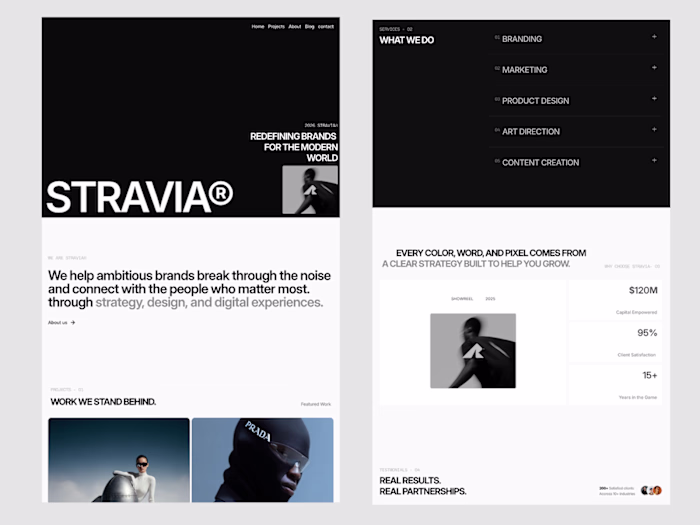
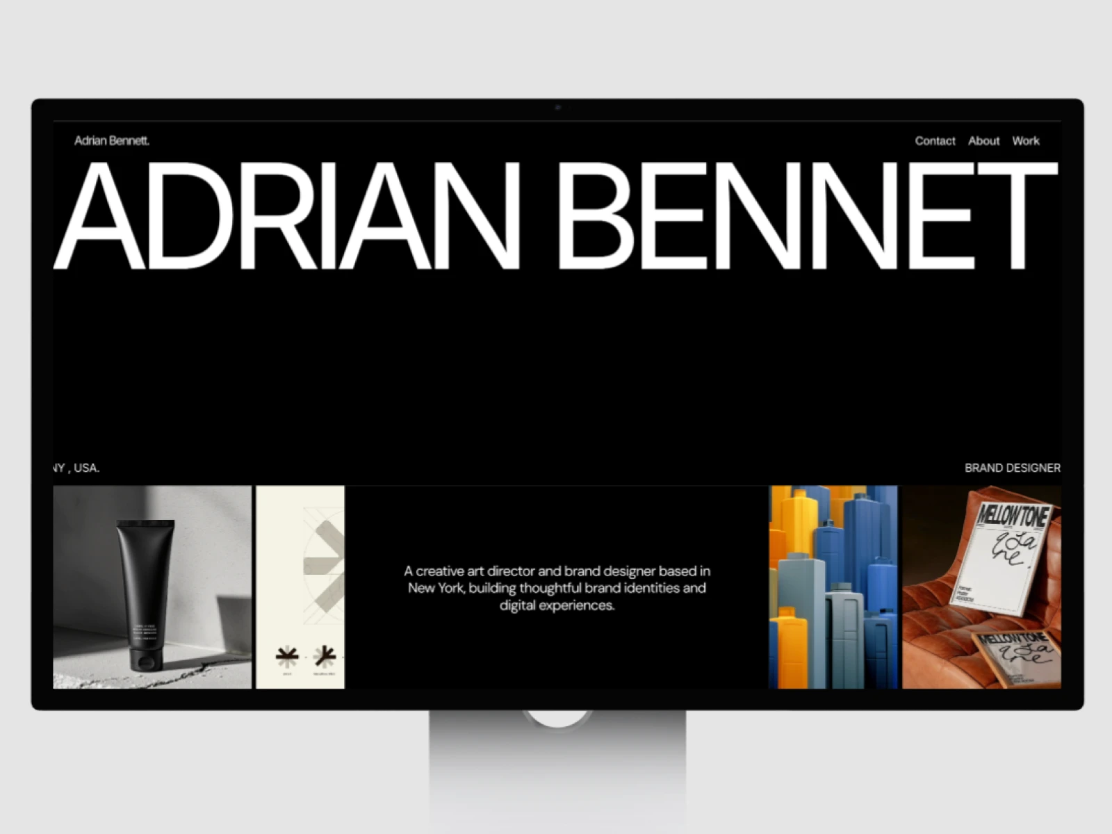
I’ve always believed that a portfolio should stay out of the way of the work. It shouldn’t be a distraction; it should be a frame. That was the goal with Adrian.
The Focus: Less is more
I wanted to build something that felt "premium" without relying on heavy effects. To get there, I focused on three things:
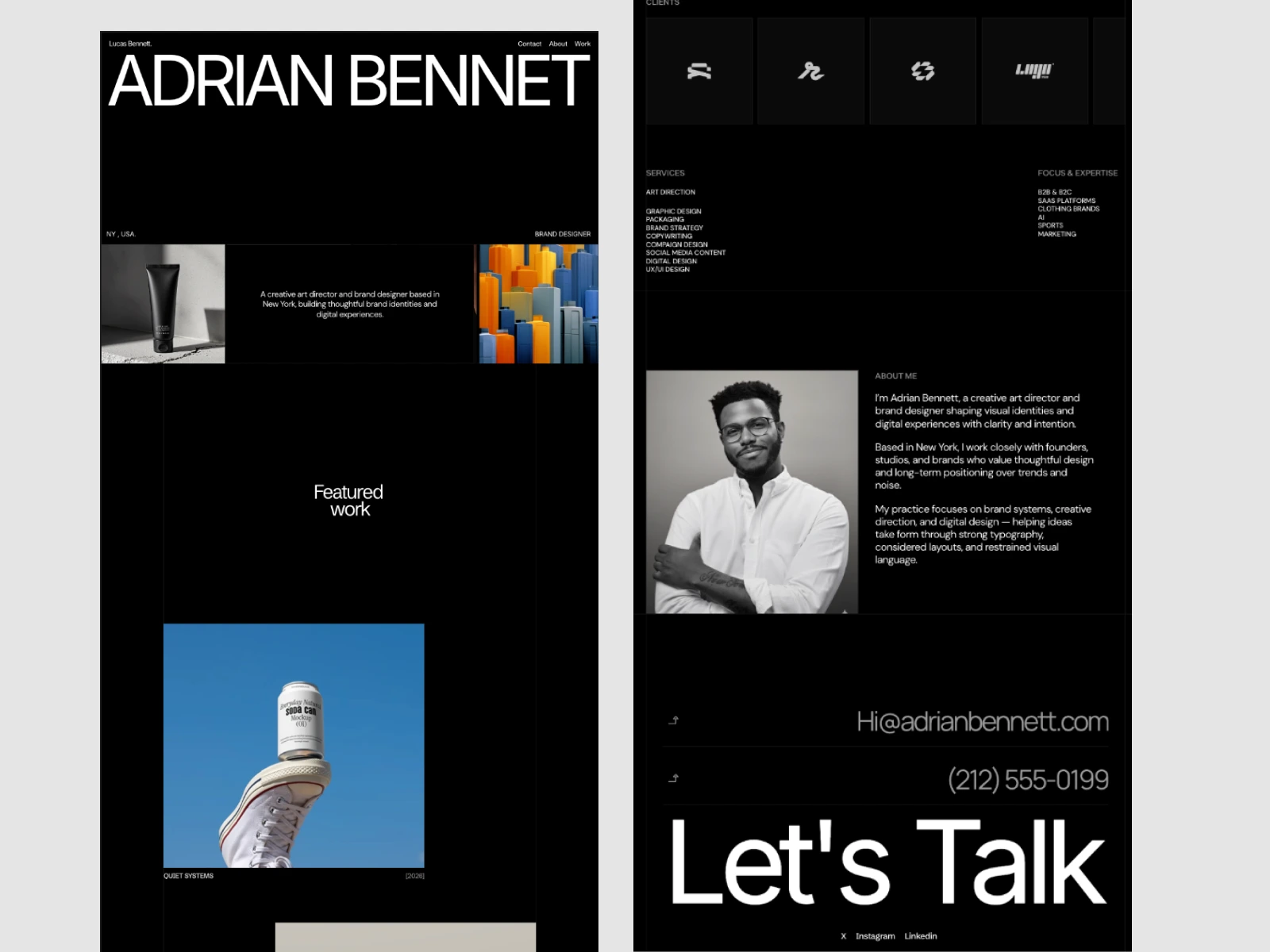
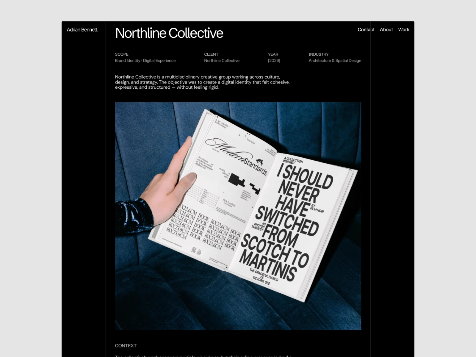
Typography & Space: I spent a lot of time on hierarchy. The goal was to make sure the work is the first thing people see, guided by clean, balanced type.
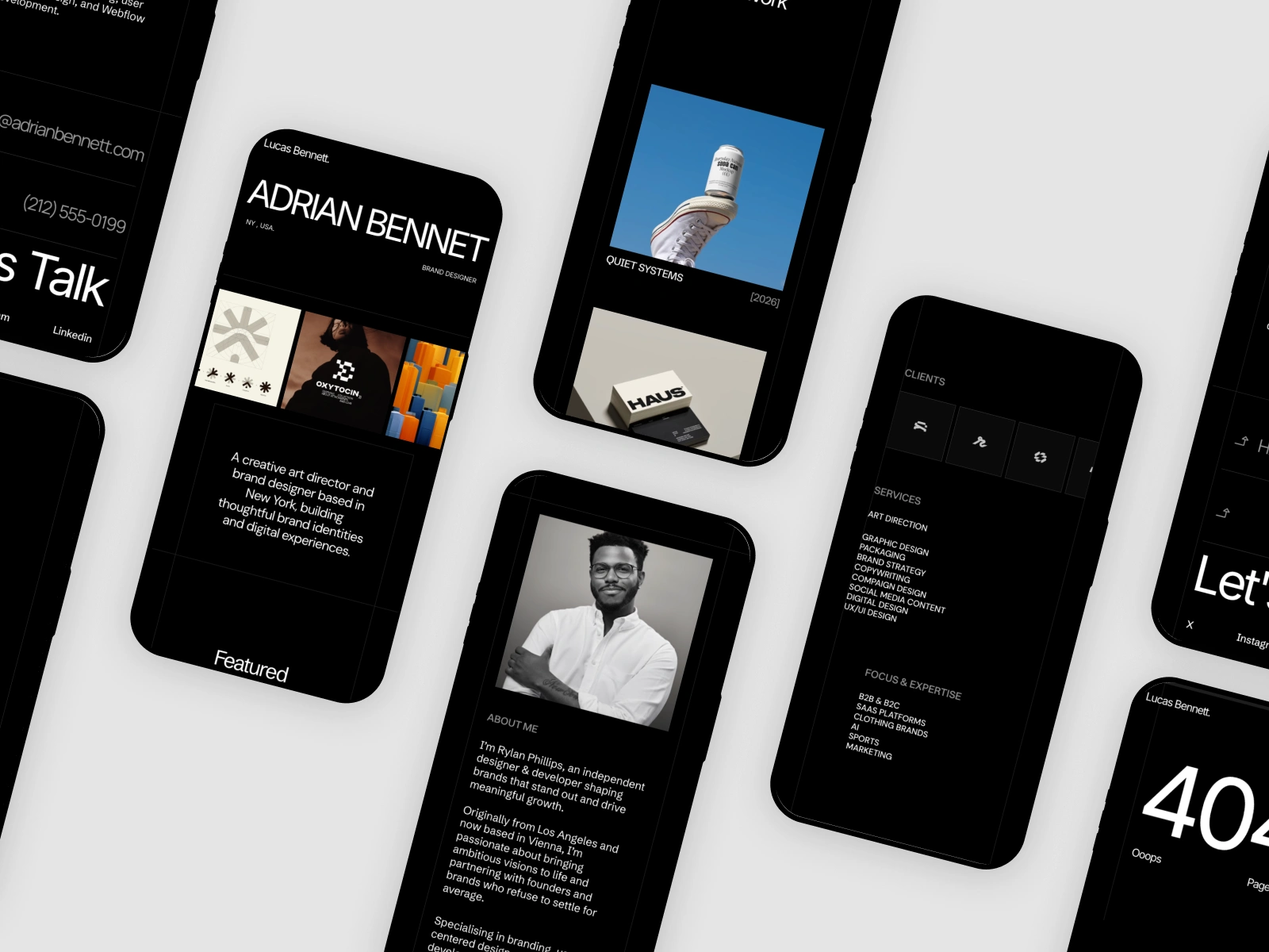
Mobile-First Polish: We’ve all seen templates that break on a phone. I spent days refining the touch breakpoints, removing hover states, and making sure the grid scaling felt natural, not forced.
Speed: No one waits for a slow portfolio. I optimized every container and asset to keep the experience fast and fluid.
The Result
The template just passed the Framer Marketplace review and is officially live. It’s a project that taught me a lot about the technical side of Framer—especially how to build scalable systems that other designers can actually use.
Check it out here: https://www.framer.com/marketplace/templates/adrian/
Like this project
Posted Feb 17, 2026
I built Adrian with a strict grid system and refined scaling to ensure your portfolio looks perfect on every screen.
Likes
0
Views
7
Timeline
Feb 1, 2026 - Ongoing