The Wellness Workshop - Rebranding
The Wellness Workshop
Objective:
Create a holistic, modern and accessible brand of wellness and fitness that would focus on the all-round development of their customers. The Wellness Workshop was a rebranding of an existing fitness brand, of a different name, that wanted to deviate from focusing on the gym mentality and focus on overall well-being.
What were the issues?
While the existing fitness brand was functioning well, the client came to a realisation that fitness and gym expands to so much more than the gym. He wanted to dive into the more modern mind shifts people were going through, away from just fitness. So he wanted to be a part of the change where people are now looking at the holistic health and not just building muscle. Stemming from mental well-being he figured out other aspects were necessary to touch upon like nutrition and lifestyle modification.
What were the problems discussed?
Holistic development pitched to his customers were not heeded to that extent as he would've preferred and he felt a brand redesign was well due to align with the new values that are in place.
He thought the original logo was rigid, stoic and very harsh for the wellness approach he was trying to bring about.
Very theoretical, too informative and not engaging to the audience in their social media.
The brief:
Create a vibrant, modern and soothing brand design that would be easily recognisable.
The colour palette should encapsulate all segments of wellness being explored by the company.
It should create a sense of belonging and be simple to read.
Not too harsh and not too gentle either.
Redesign:
The team at Marketing on a Menu went through an extensive brand strategy and design discussion to figure out the business plan, branding strategy, vision and missions, and creating a whole new outlook towards wellness.
We created an extensive 50 page brand manual to create design systems in place for social media, print, advertising and marketing, photography and videography and future collaterals they would possible want to create for the brand.
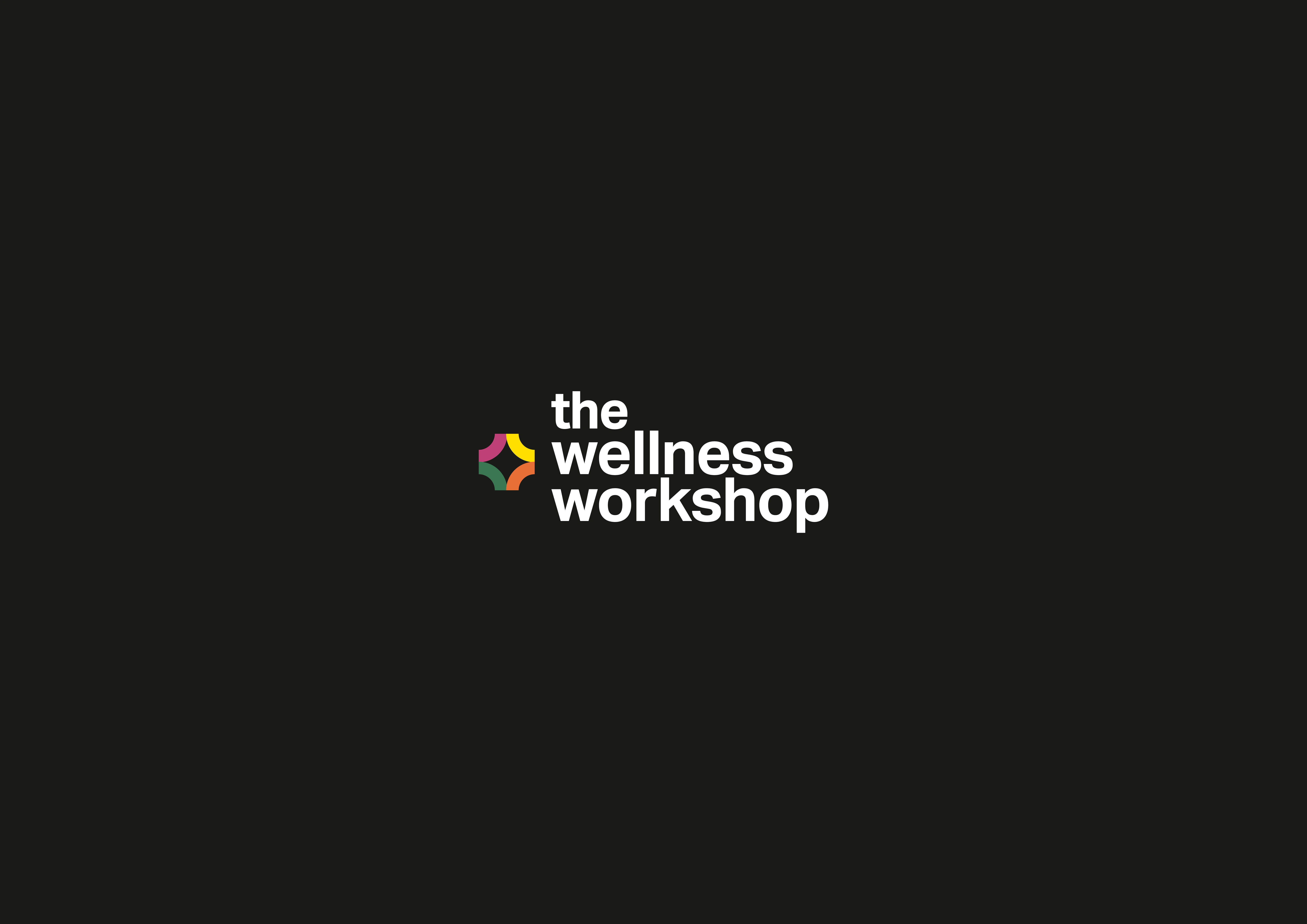
We reached a unanimous decision to use a quadrant as a concept to focus of four main sectors related to wellness to use as a logo, namely - Fitness, Stress Management, Nutrition and Lifestyle Modification.
Along with the text 'The Wellness Workshop' and tagline "Your health, holistically", this is what the final logo looked like:

Logo Mockup
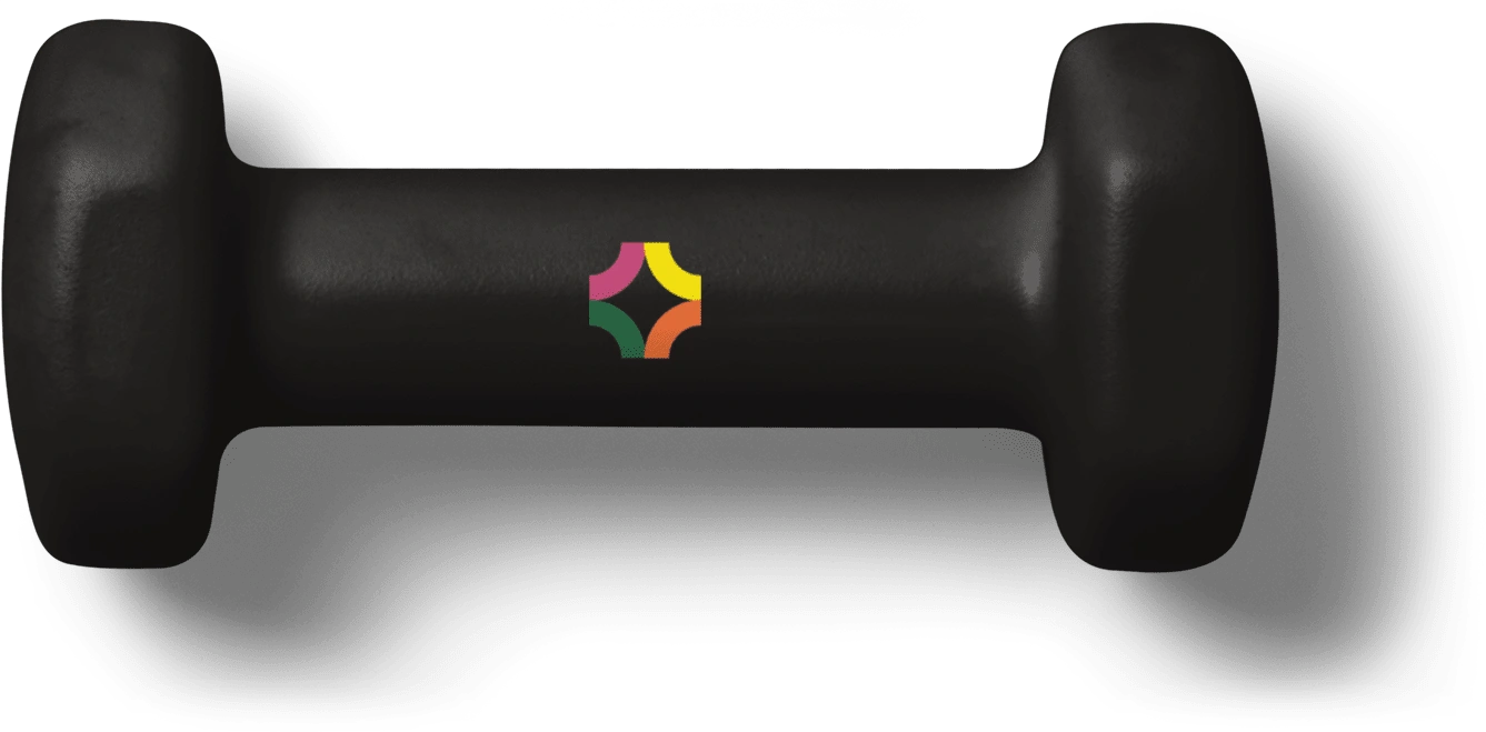
Icon of the logo
Colour Palette:
The colour palette was carefully chosen to denote each quadrant of the logo and gives each quadrant life while bringing unity to the whole logo. The colours used in the logo are Fuchsia Pink for Fitness, Canary Yellow for Stress Management, Orange (Crayola) for Lifestyle Modification and Deep Spring Green for Nutrition. Complementing is the text of the logo in monochromatic tones but primarily in Eerie Black or White.
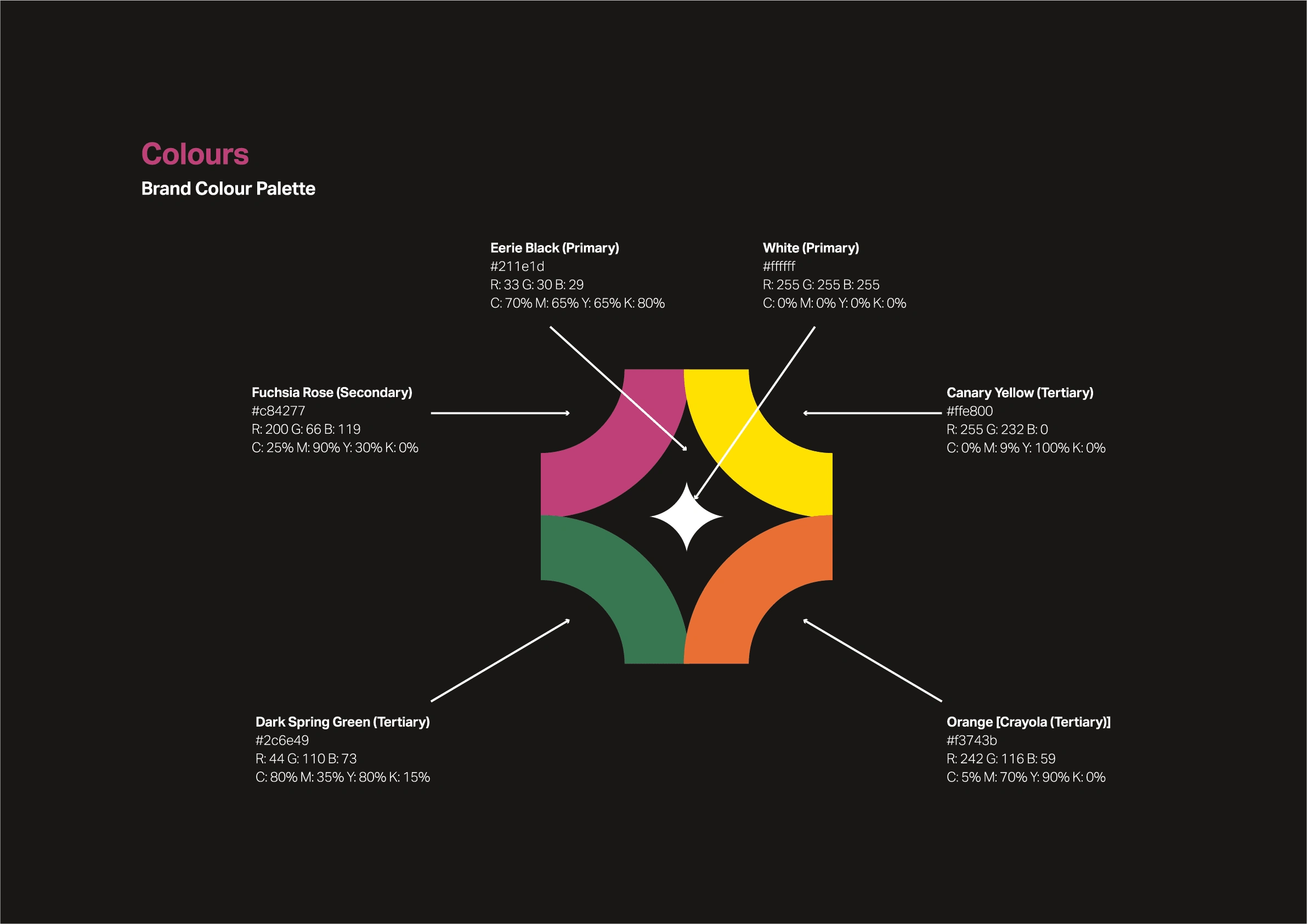
Colour palette
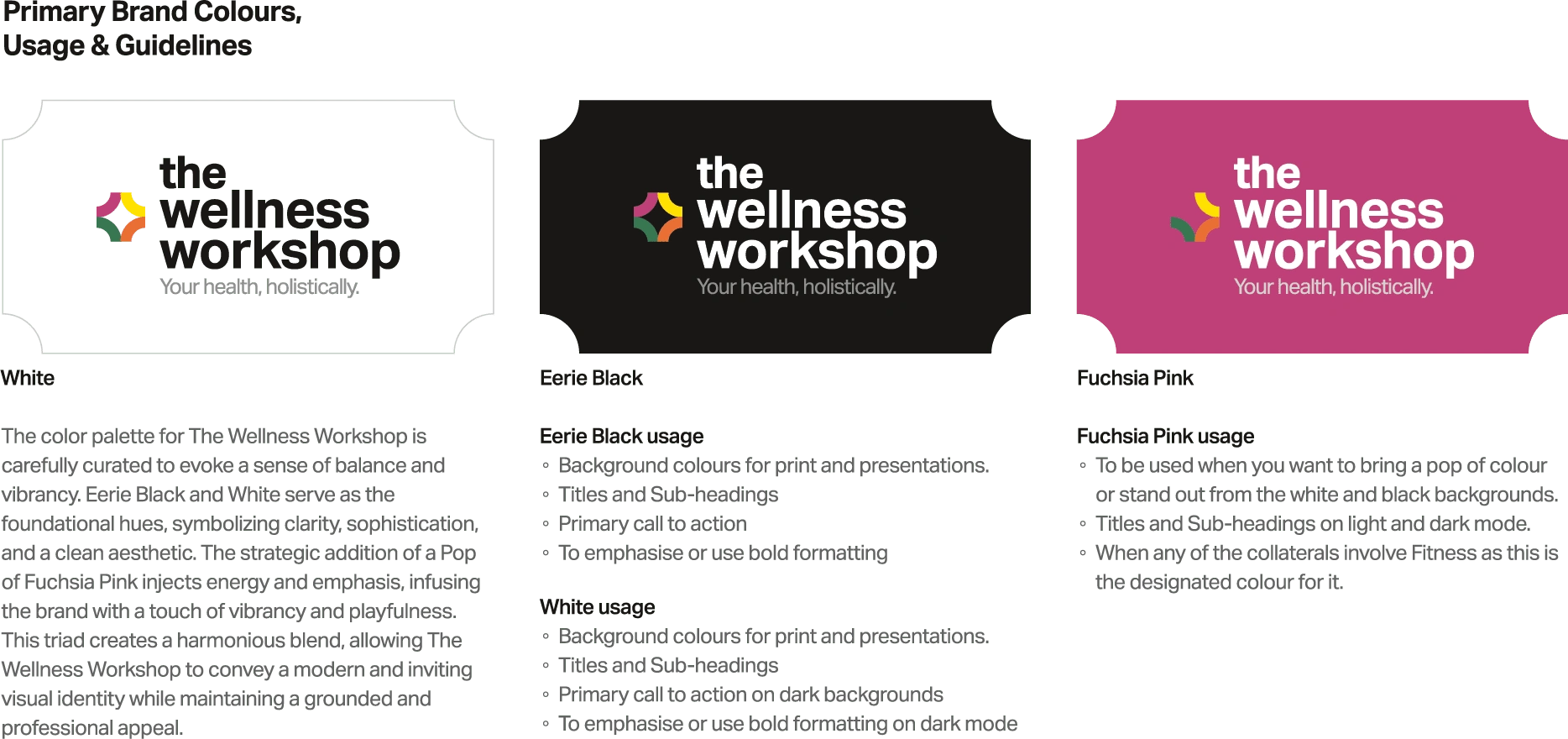
Primary palette and uses

Secondary colours for the logo
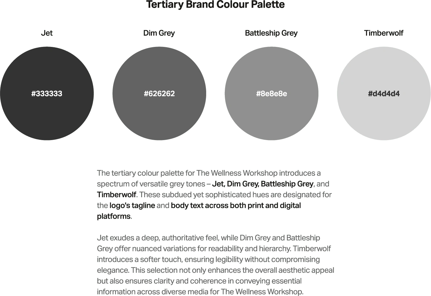
Tertiary colours
Types of Logos:
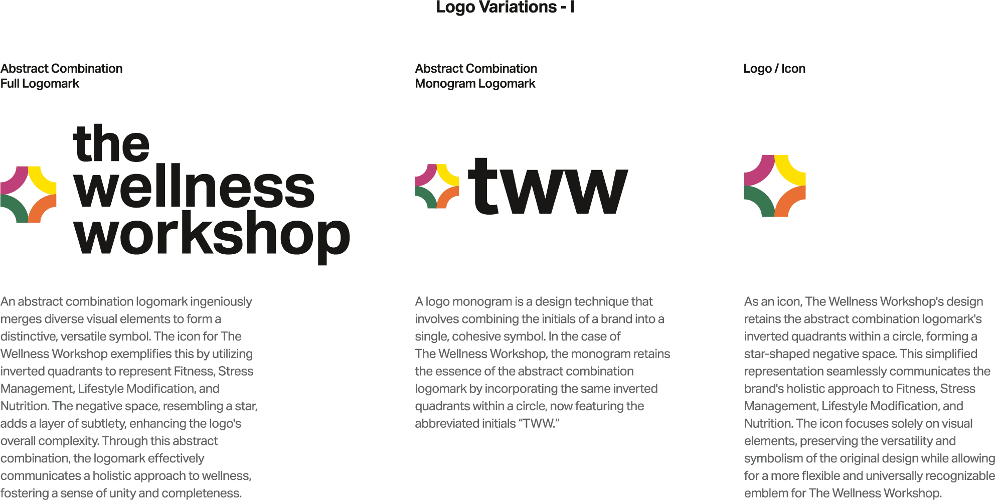
Logomark, Monogram and Icon
Logo Applications and Mockups:
In the full brand manual we included multiple mockups for each scenario. Here is a glimpse of some of the few.

Merchandise and Equipment Mockups

Merch Mockup 2

Print mockup 1
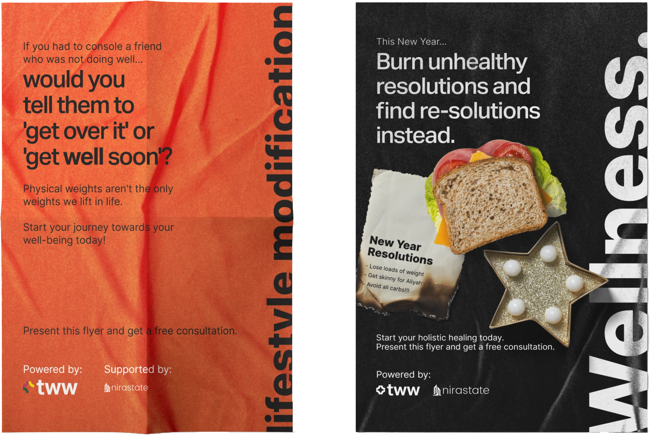
Print mockup 2

Print Mockup 3
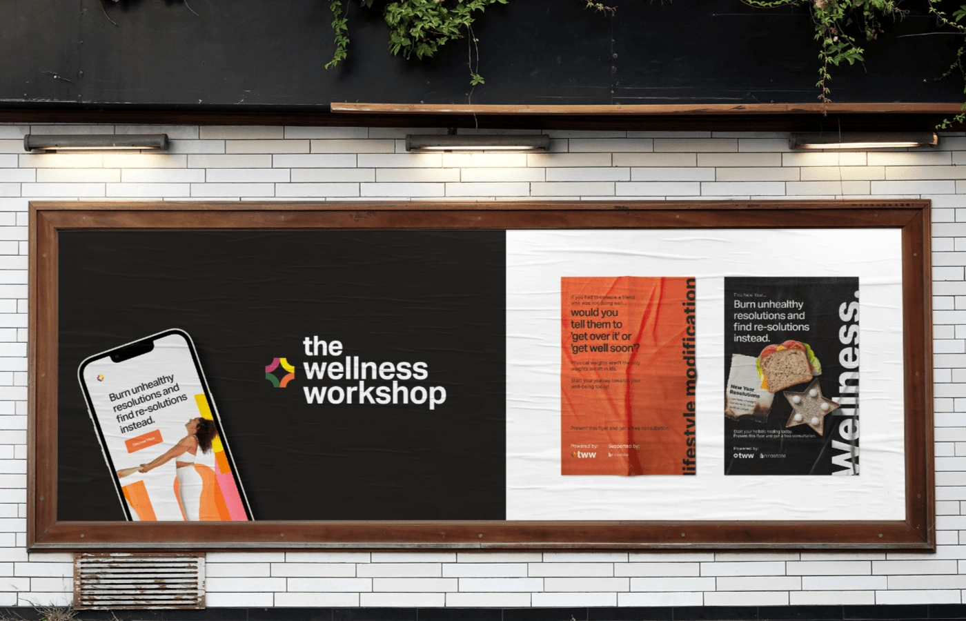
Marketing and advertising mockup
To view the full brand manual, please contact us on marketingonamenu@gmail.com and we'll send you a link to view it comprehensively in its full glory.
We hope you liked viewing this project as much as we liked passionately building this project!✨
Like this project
Posted Apr 15, 2024
See how we lifted the weights of a fitness brand that was being bogged down by gym stereotypes and wanted to transition to a holistic wellness brand instead.


