The deliciously sweet project of Doce Julieta.
About the project
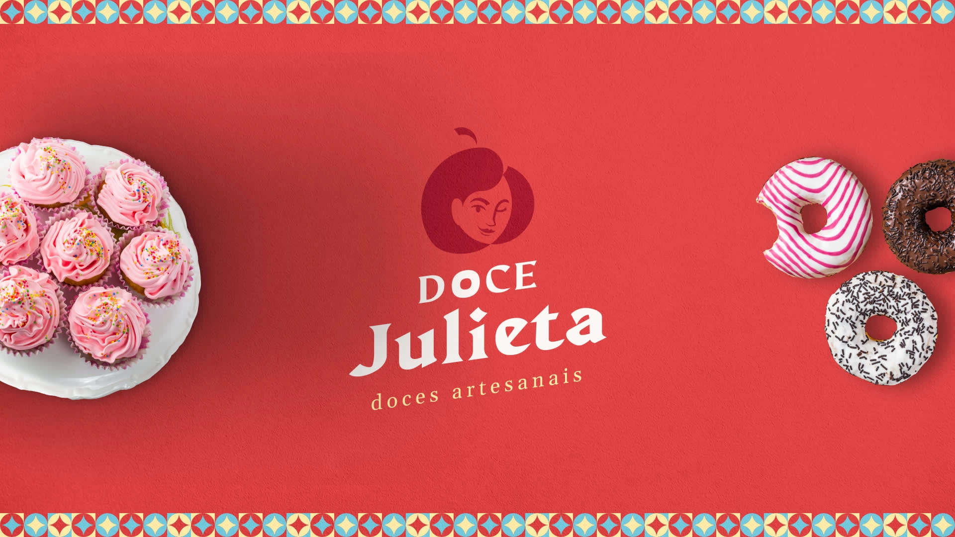
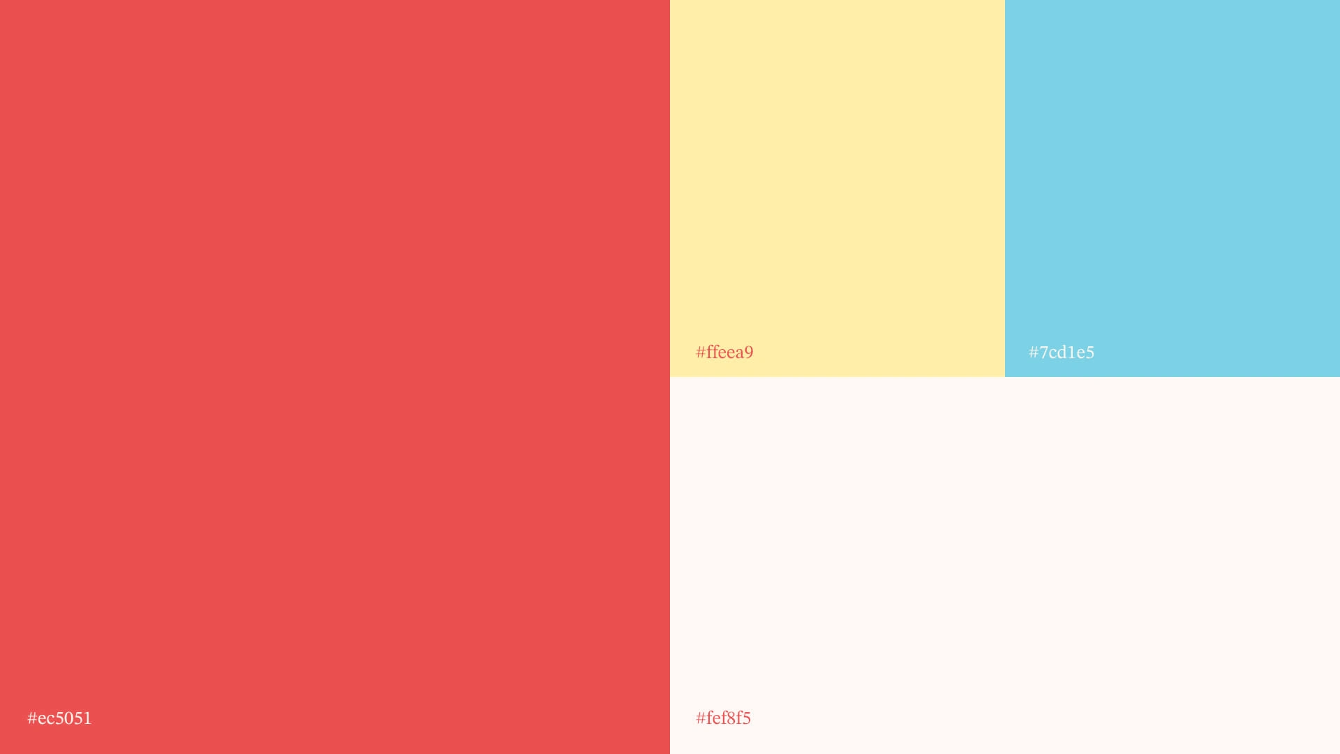
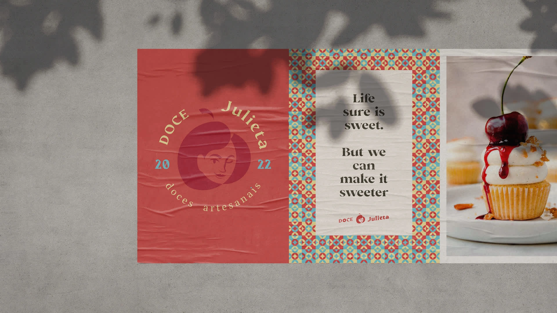
Doce Julieta is a sweetery, specialized in homemade desserts to sweeten and turn the most dull day you can have, into a bright light of warmth and love. To convey this feeling through the brand visuals, the colors must be warm, caring and fun, so a welcoming red was chosen as the main color, accompanied by a contrasting light blue and a complementary cream to stick it all together.
The winking lady icon is just the ... cherry on top of this gorgeous cake that the brand turned out to be. The typography is varied, and mostly seriff, to add more flair to the brand.
The main challenge
With the country's current frail economy, a large proportion of the population are resorting to selling homemade goods, especially desserts. Within Doce Julieta's based location is no different, there are tons of artisanal brands of a one person staff.
The solution
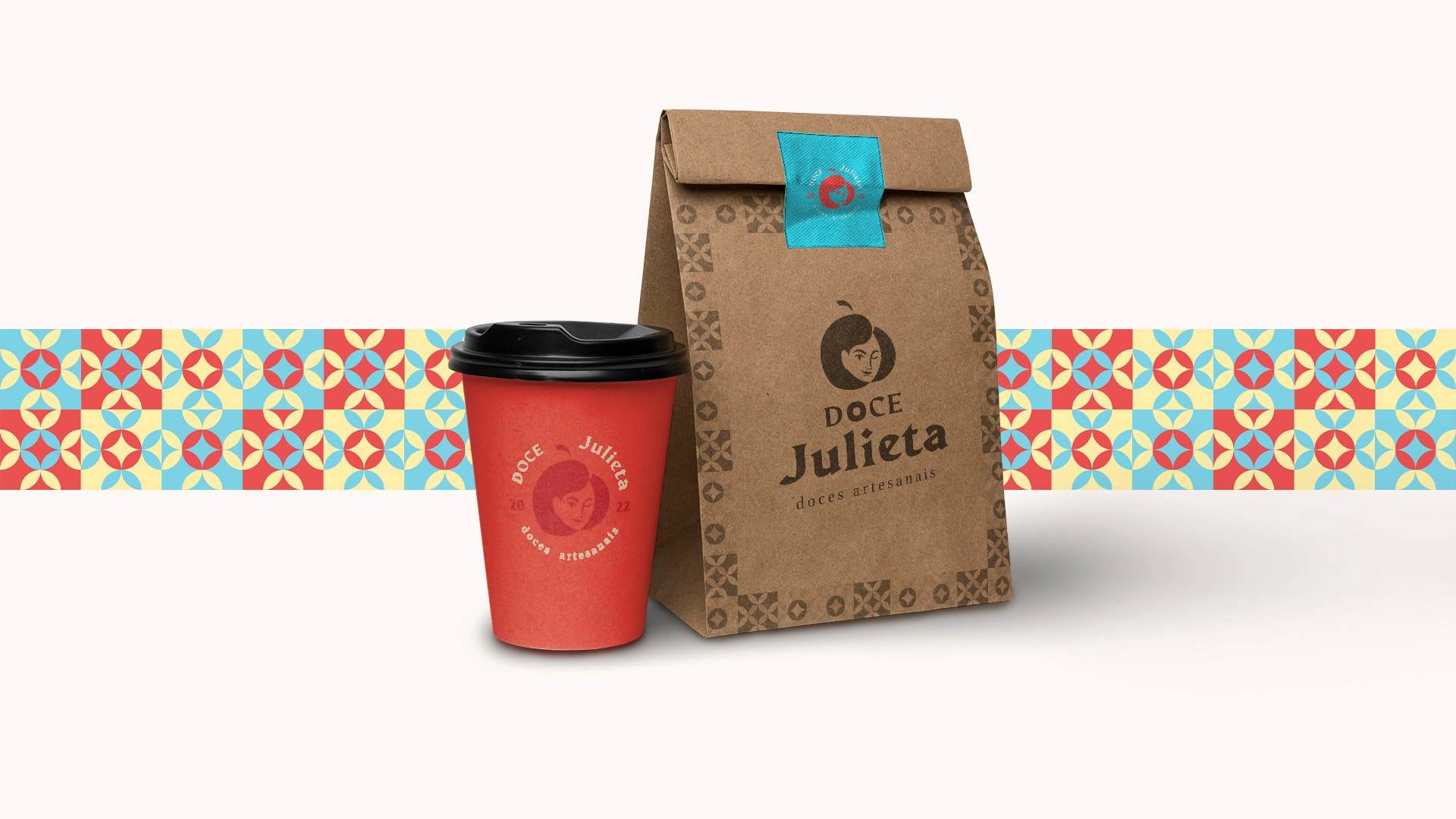
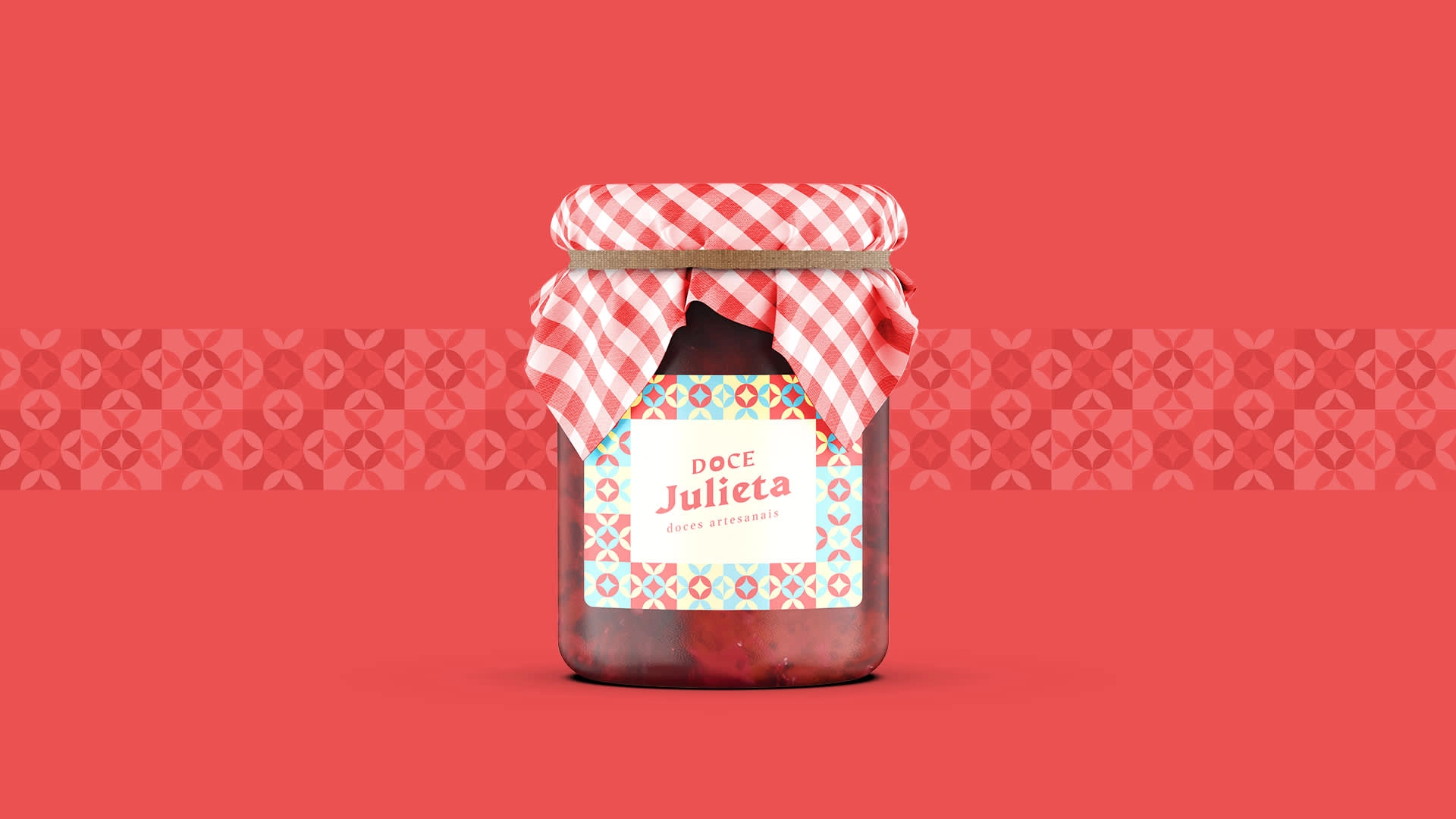
The proposal was simple, to create a strong brand that made a straightforward statement: "We are a professional business, ready to make a impactfull impression with our delicious products." The results are as shown below, I do hope you enjoy the ride.





Like this project
Posted Oct 29, 2024
Graphic Design, Product Design, Branding, Adobe Photoshop, Adobe Illustrator


