The strong transportation brand of ALS.

About the project
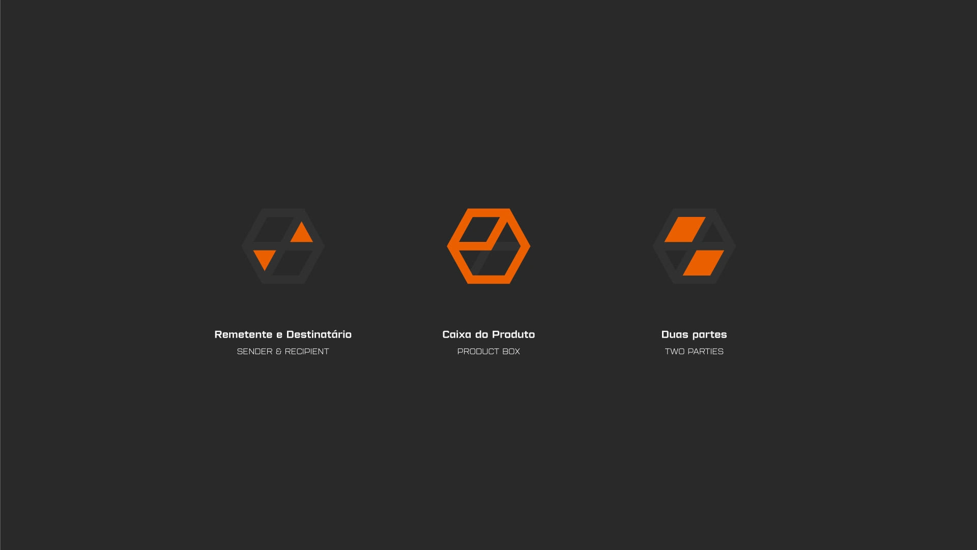
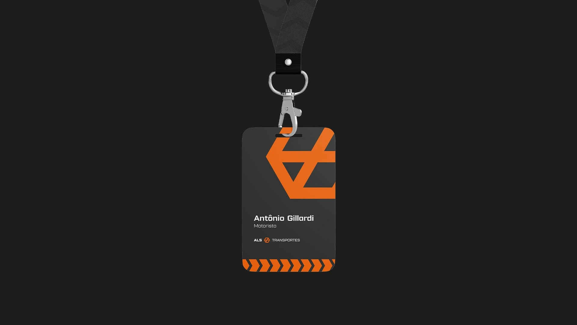
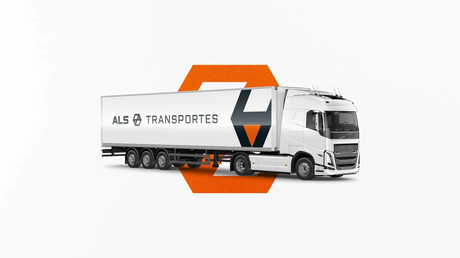
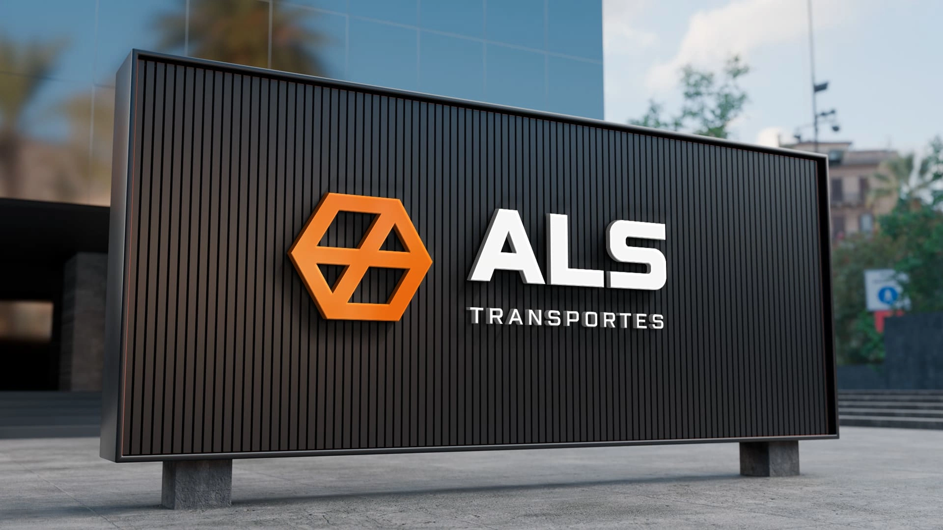
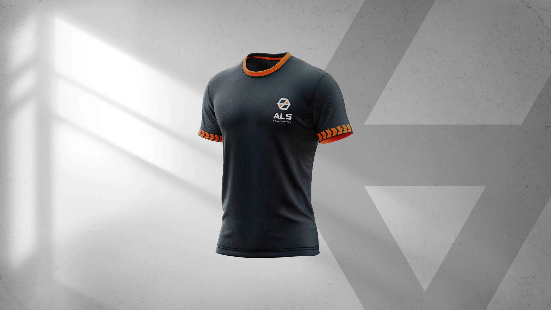
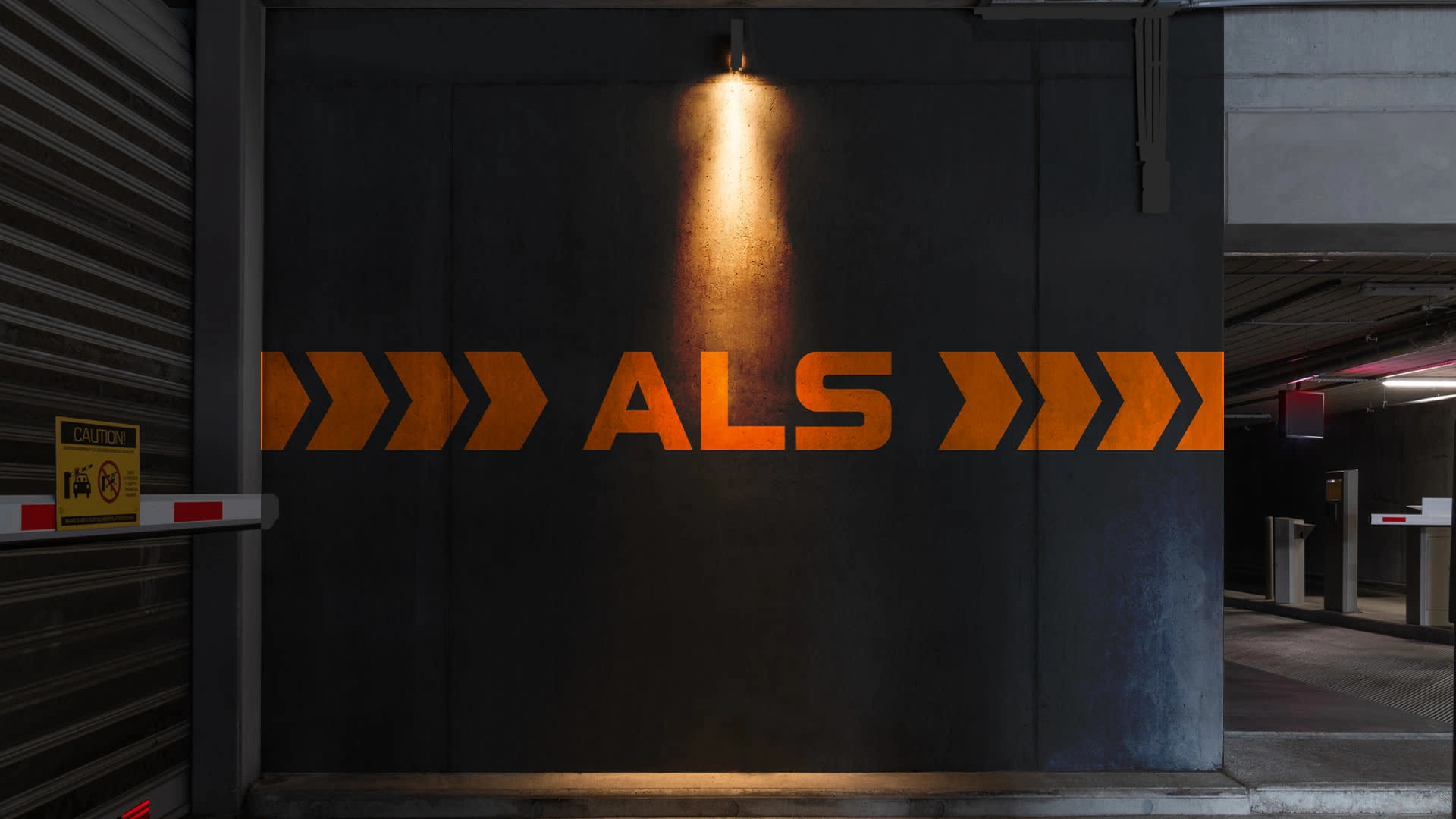
ALS Transportes is a cargo transportation company, specialized in transporting swines, and the raw materials for livestock. It's visual identity is set to convey seriousness, respect, strenght and an end-to-end goal, portrayed on its icon, two ends pointing at each other.
The main challenge
Within the research phase of the project, most of the transportation brands were simplistic and straightforward on their logo and visual, usually represented by a truck, wheel or road. The client approached me with the project context that she wanted a brand that would faccilitate an evolution for their services. It should not be directly linked with swines or trucks, as they have plans for a fleet expansion and the products that they will be transporting.
The solution
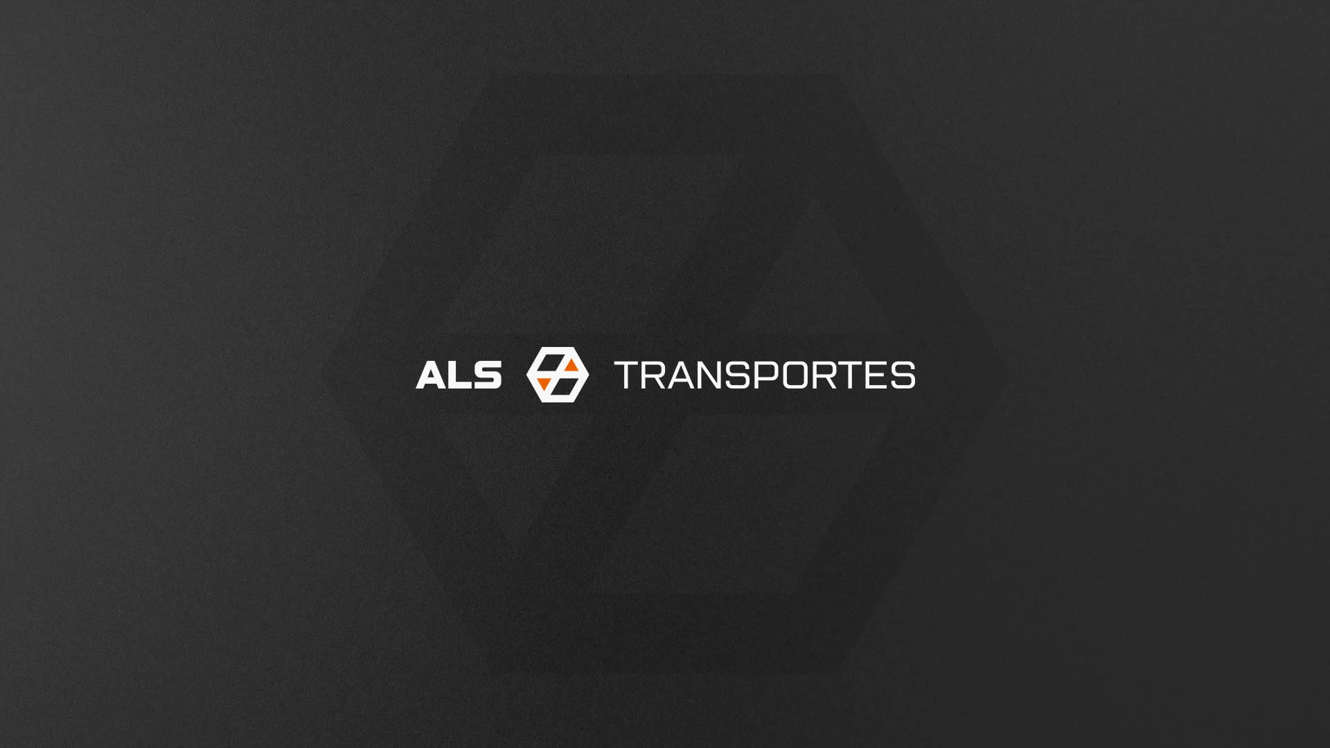
The final design for the logo was a geometric shape, with pointed edges and few shapes, to represent toughness and simplicity. Along with a strong combination of orange to convey action and a charcoal grey that claims stability.




Like this project
Posted Oct 29, 2024
ALS Transportes is a cargo transportation company, specialized in transporting swines, and the raw materials for livestock. It's visual identity is set to conve


