Figma Design System & UI Kit - Lookscout.com
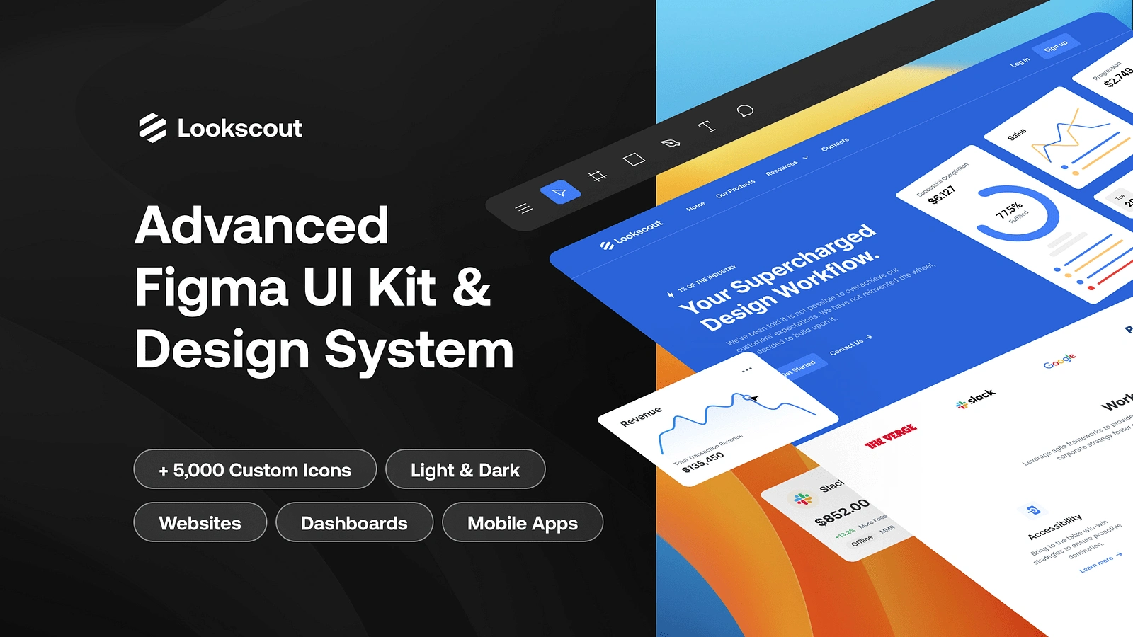
Overview:
The Lookscout Design System was conceived to address the growing need for consistency, scalability, and efficiency within a complex design workflow. The primary goal was to establish a centralized library of components, templates, and design assets, accessible across all stages of the product development process. The system was developed using Figma, enabling real-time collaboration among design, development, and product teams.
Key elements of Lookscout include:
A comprehensive UI component library (buttons, inputs, cards, etc.)
Predefined layouts and design patterns for consistency across interfaces
Responsive design guidelines to accommodate various screen sizes and devices
A robust typography and color system to ensure brand coherence
Accessibility guidelines and features to improve inclusivity
The system is aimed at large-scale projects with complex workflows, ensuring ease of use while offering flexibility for customization when necessary.
Challenges
The development of Lookscout faced several challenges, including:
Inconsistent Design Practices: Prior to Lookscout, multiple teams were using different design conventions, leading to visual inconsistencies and inefficiencies. Establishing a unified design language was essential to reduce friction across the workflow.
Scalability: The system needed to support a broad range of use cases, from basic web apps to more complex enterprise-level platforms. Creating a flexible structure that could scale was key to its success.
Collaboration across Teams: Design systems need to cater not only to UI/UX designers but also to developers, product managers, and other stakeholders. Bridging the gap between these teams and creating a system that was intuitive and usable for all was a critical challenge.
Maintaining Flexibility vs. Consistency: While consistency was a major focus, we also needed to ensure the system was flexible enough for customizations and varied user needs. Striking the right balance was challenging.
Approach
To tackle the challenges, the following approach was implemented:
Research & Stakeholder Interviews: We began by conducting thorough research, including interviews with key stakeholders such as designers, developers, and product managers. This helped identify pain points, existing gaps, and common design patterns used across teams.
Component Design & Iteration: A modular, reusable approach was taken to design components, ensuring flexibility while maintaining consistency. We developed core components (buttons, cards, navigation bars, etc.) that could be adapted based on user needs.
Collaboration & Feedback Loops: We used Figma's real-time collaboration features to gather constant feedback from different team members. This iterative approach helped in refining designs and ensuring alignment with project requirements.
Documenting Guidelines: Clear and concise documentation was created, including design principles, component guidelines, color palettes, typography, and best practices. This was made accessible to everyone involved in the project, ensuring alignment and understanding across teams.
Accessibility Focus: We prioritized accessibility standards, such as color contrast, screen reader compatibility, and keyboard navigation, to make Lookscout inclusive for all users.
Solution/Outcome
The Lookscout Design System has successfully addressed the challenges, offering a consistent, scalable, and user-friendly solution. Key outcomes include:
Consistency Across Platforms: Lookscout’s implementation of standardized components and patterns ensured a unified look and feel across different digital products, improving brand identity and user experience.
Increased Efficiency: The design system significantly reduced duplication of effort and rework, enabling teams to focus on more creative tasks rather than reinventing components for each new project.
Improved Collaboration: Lookscout fostered stronger collaboration between design, development, and product teams. The system served as a single source of truth, ensuring everyone worked from the same page and facilitating quicker decision-making.
Scalable Framework: The modular design of the system allowed for easy scaling. As the product portfolio grew, Lookscout adapted seamlessly, with teams able to reuse and build upon the existing components.
Enhanced Accessibility: The inclusion of accessibility best practices ensured that Lookscout products were usable for a diverse audience, supporting a wide range of devices and user abilities.
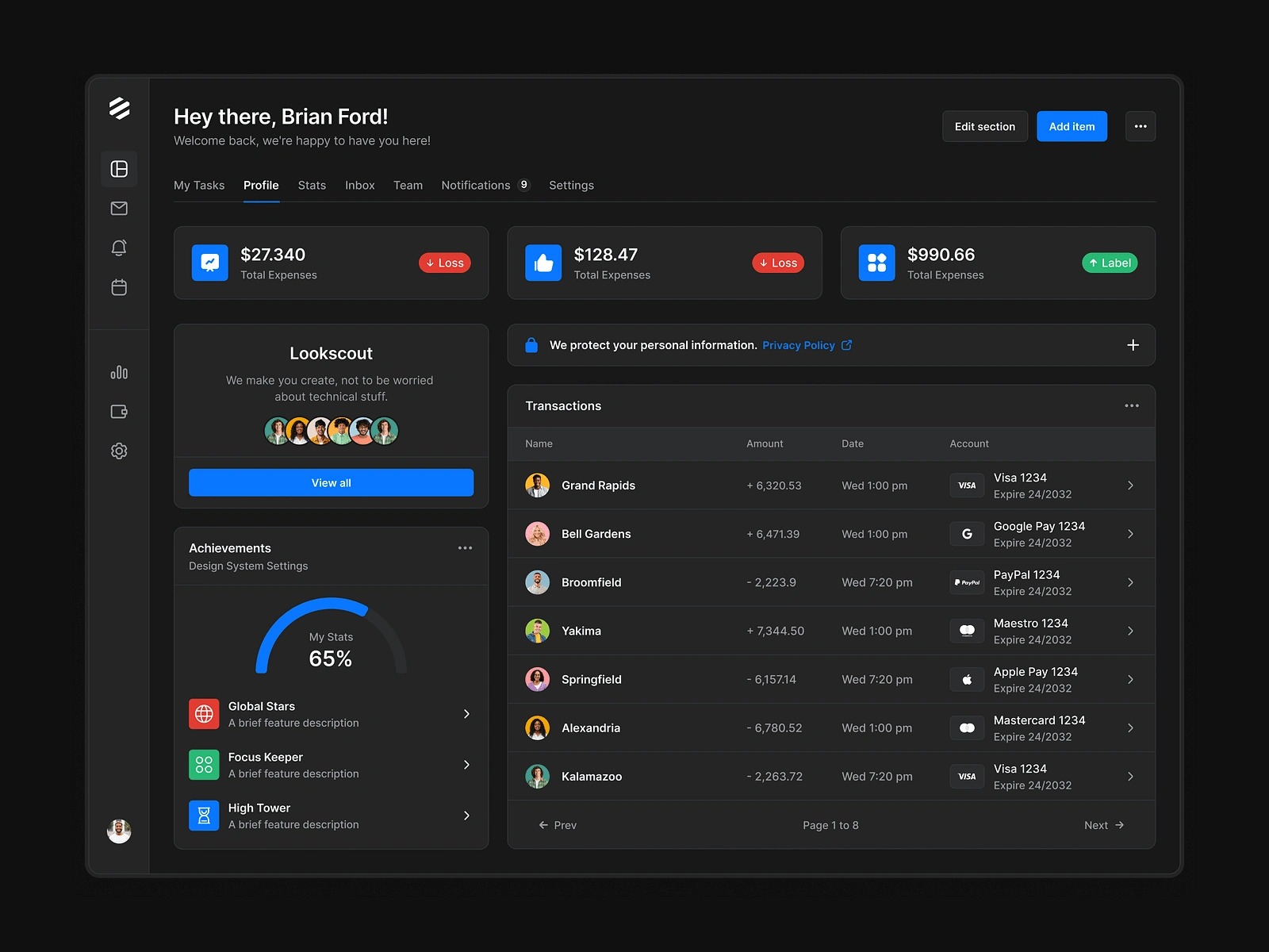
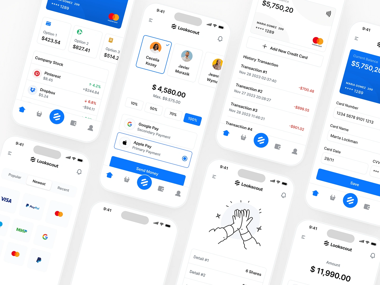
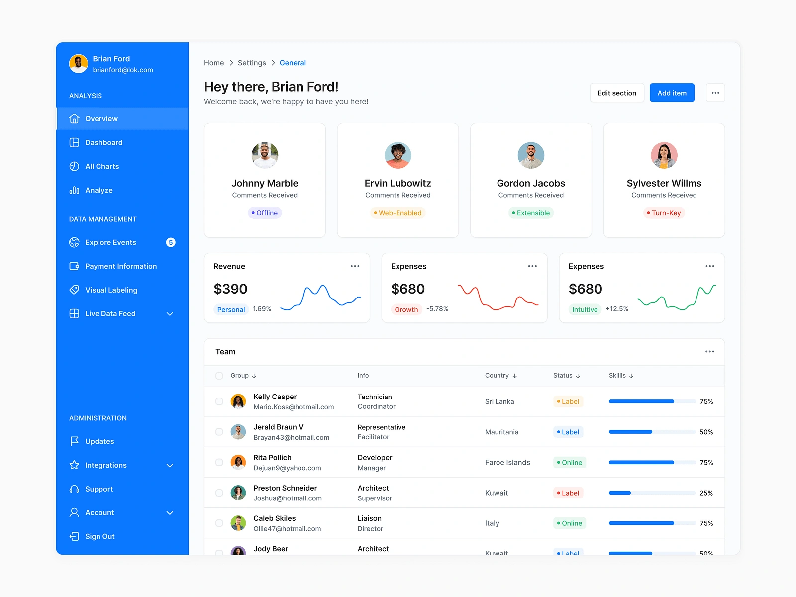
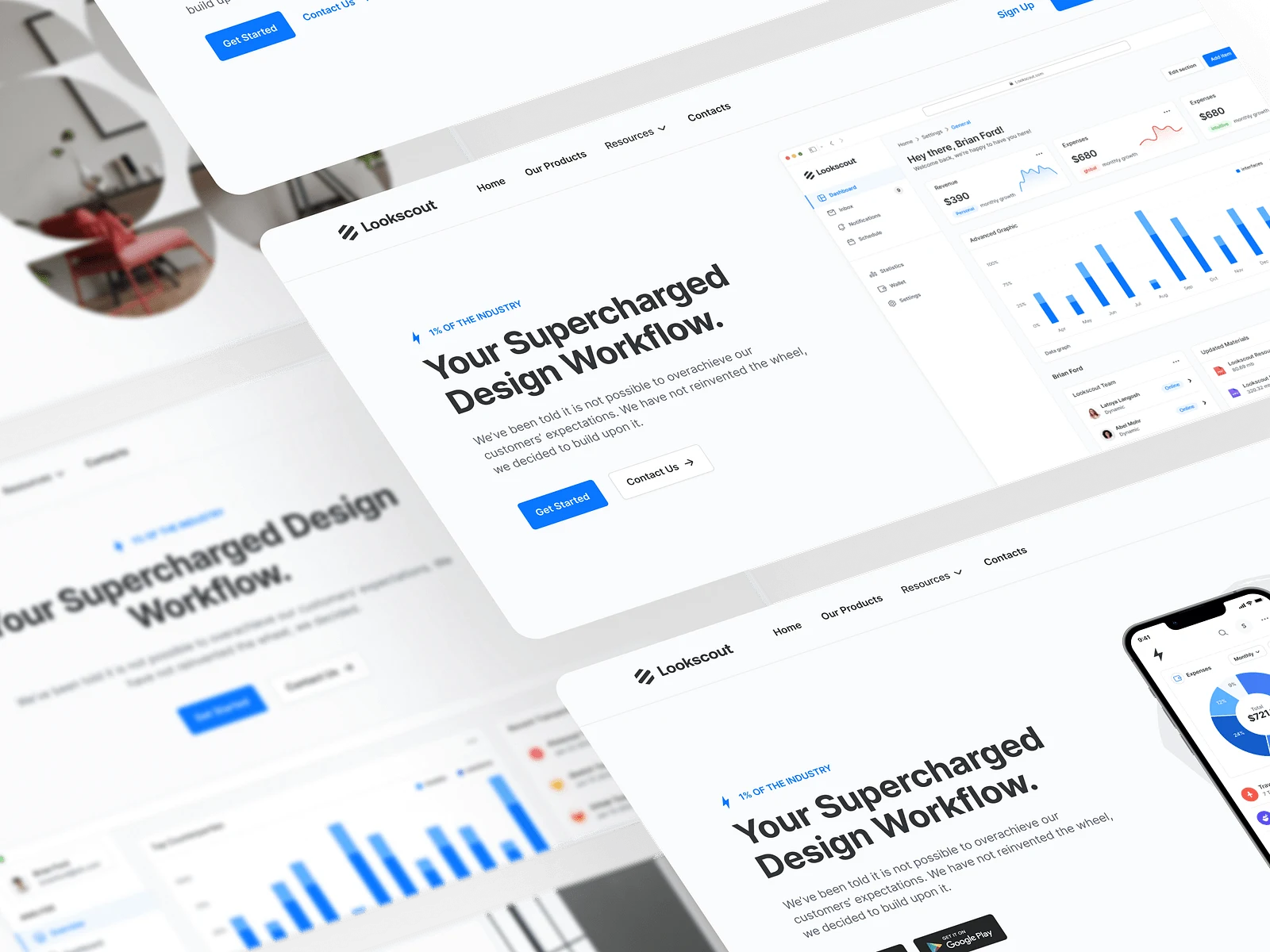
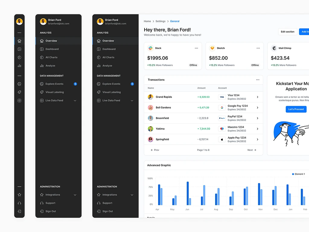
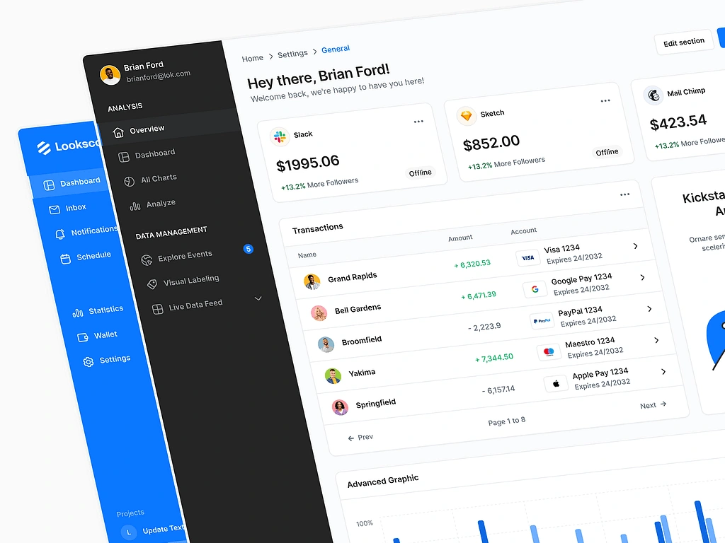
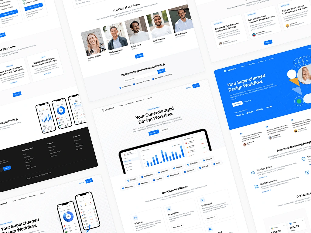
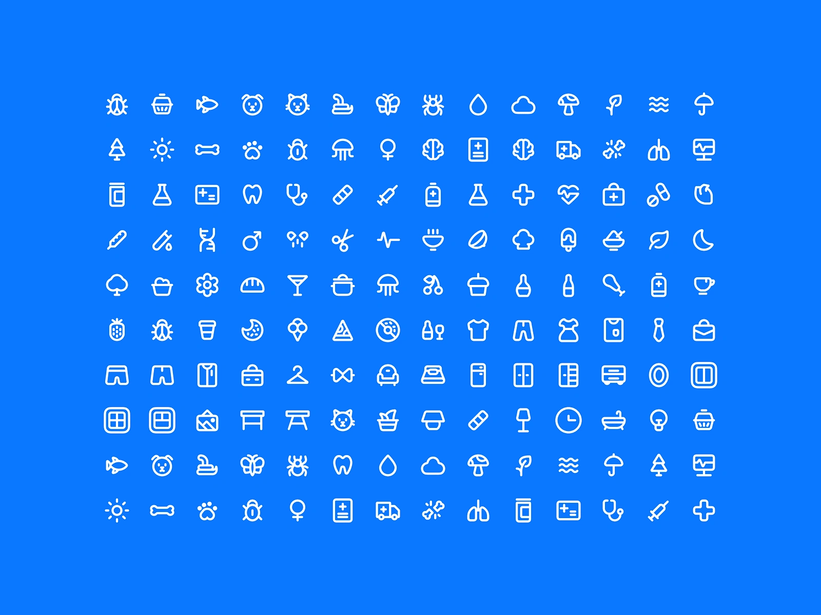
A few product screenshots:
Like this project
Posted Nov 23, 2024
My work designing and building from the ground up and advanced Figma design system & UI Kit - Lookscout.com
Likes
4
Views
59

