SnapServe AI Landing Page Design

Al Razi Siam

🧭 Overview
Company: SnapServe AI
Project Duration: 1 Day
Service: SaaS AI Powered Landing Page Design
Role: UI/UX Designer
Tools Used: Figma
Deliverables: High-Fidelity Desktop & Mobile Designs, Responsive Layouts
Figma Preview: https://bit.ly/4e0nujn
Prototype: https://bit.ly/4dDiPU4
Problem Statement
For SnapServe AI, I designed a full “About Us” landing page that introduces the company’s vision, values, and team in a way that feels both professional and human.
The goal was simple: build trust and spark interest by putting faces to the brand and giving visitors a real sense of what SnapServe AI stands for.
💡 My Role
Figma UI/UX Design (Light + Mobile Responsive)
Visual Hierarchy & Section Planning
Content Structure & CTA Placement
Brand-Aligned Design System
🎯 Project Goals
Build credibility through storytelling and social proof
Communicate the mission and values clearly
Introduce the team in a warm, approachable way
Maintain brand consistency throughout
Ensure a responsive experience across all devices
🔍 Design Breakdown
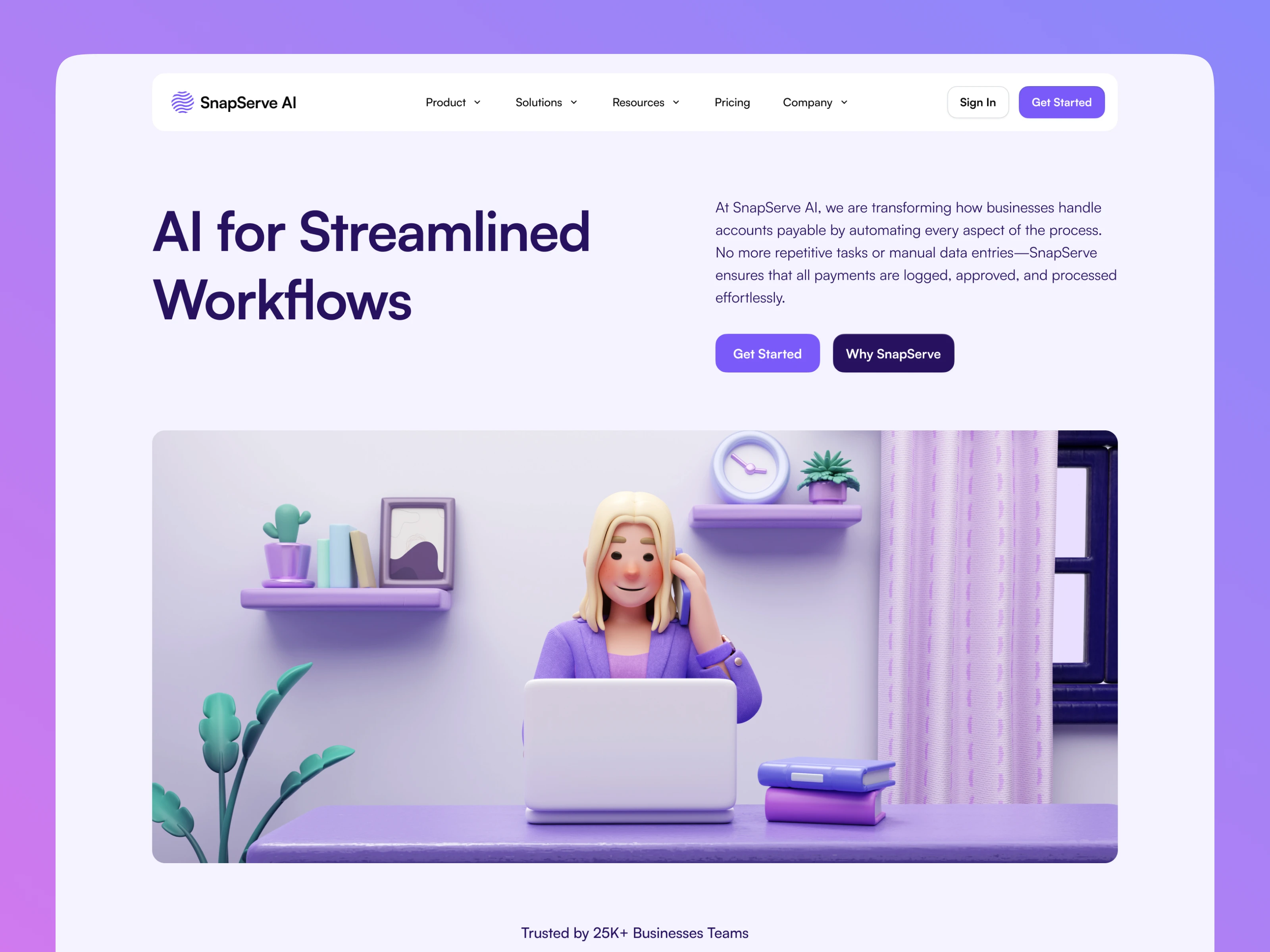
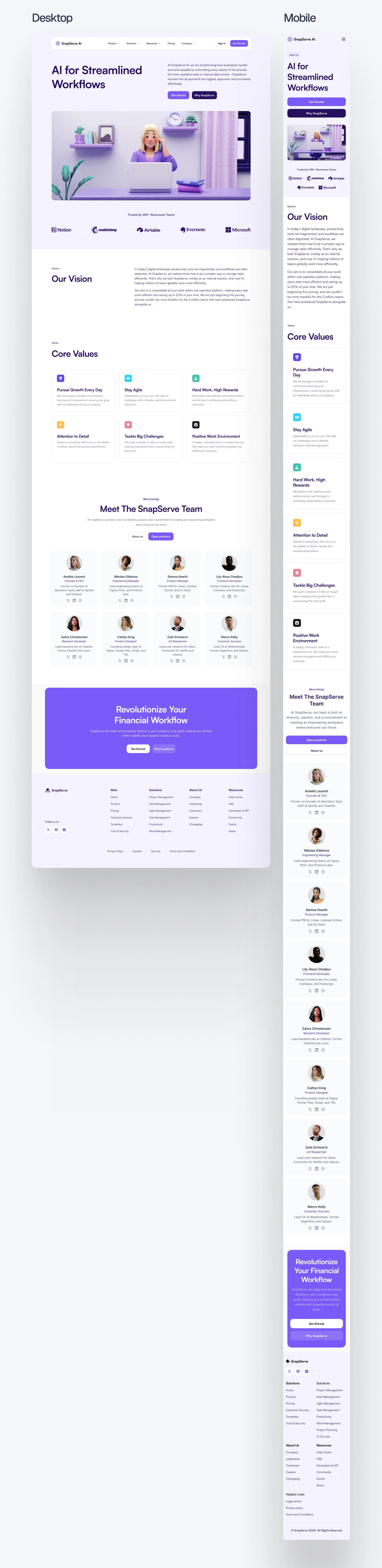
1. Hero Section with CTA
We kick things off with a bold, benefit-driven headline:
“AI for Streamlined Workflows”
It immediately sets the tone. Next to it is a 3D-style character illustration, friendly, not corporate. I paired this with two high-intent CTAs: “Get Started” and “Why Zeno.”
2. Trust Section
I added logos from familiar tools like Notion, Mailchimp, Microsoft, and Airtable. This builds instant trust and shows SnapServe is already used by over 25,000 business teams.
3. Vision Statement
The vision section explains why the company exists in simple, conversational language. It avoids tech jargon and gets straight to the point: reducing busywork and saving time with automation.
4. Core Values Grid
Here I created a 6-card layout featuring team values like “Stay Agile,” “Hard Work, High Rewards,” and “Positive Work Environment.” Each card has a matching icon and short description that reinforces the kind of company culture people want to be part of.
5. Team Showcase
This section makes the brand feel real. I designed a clean grid layout for the core team, complete with names, titles, previous companies, and photos. From engineering to customer success, visitors can now connect the product to the people behind it.
6. Final CTA Block
To wrap it all up, there’s a strong closing section:
“Revolutionize Your Financial Workflow”
Another pair of CTAs drives action while reinforcing the product’s core benefit.
📱 Responsive Design
The entire layout was carefully adapted for mobile. Content stacks naturally, buttons remain thumb-friendly, and nothing feels cramped. Whether viewed on a desktop or phone, the experience stays smooth and engaging.
✅ Outcome
Built a clean, modern, and professional “About Us” page tailored for a SaaS audience
Successfully humanized the brand through clear vision, values, and team showcase
Created a consistent and scalable design system aligned with the SnapServe AI brand
Improved user engagement by guiding visitors through a well-structured content hierarchy
Designed responsive layouts for both desktop and mobile to ensure a seamless experience across devices
Provided a strong CTA framework that encourages users to learn more or take action
Figma Preview: https://bit.ly/4e0nujn
Prototype: https://bit.ly/4dDiPU4
Full View
Like this project
Posted Jul 6, 2025
Designed an 'About Us' landing page for SnapServe AI using Figma, enhancing brand trust and engagement.
Likes
1
Views
1


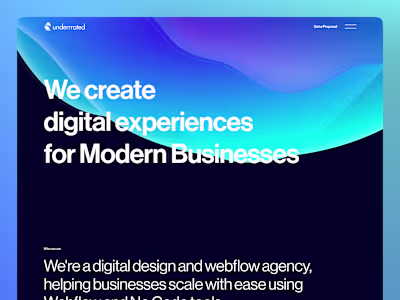
Underrrated - Design Agency | UX/UI Web and Webflow Development
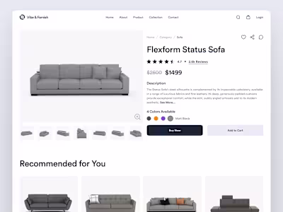
CMS Layout Redesign for an eCommerce Site
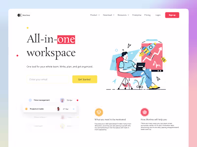
Motivee - Landing Page | UI/UX Design
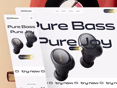
Earbuds-Product Landing Page