How to Convert Leads into Customers on a Website's Style Quiz
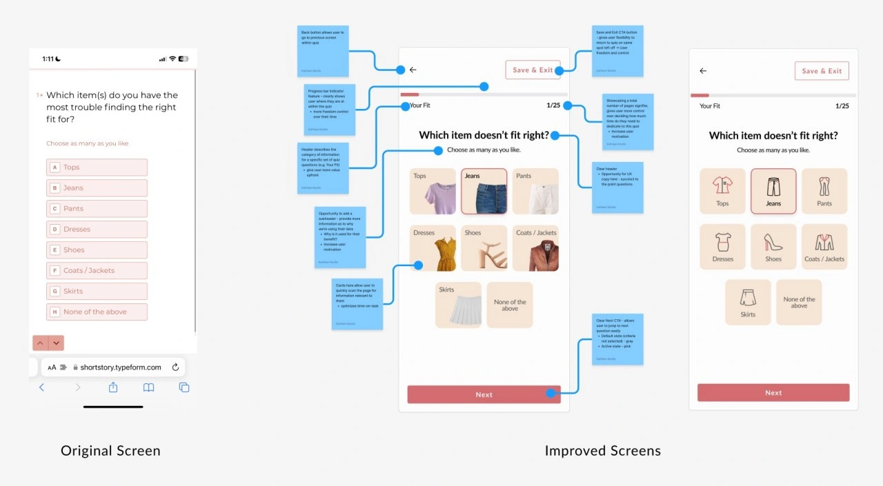
Proposed design solutions for Short Story's style quiz to increase conversion and reduce drop off
How can we help Short Story increase lead generation, reduce drop off, and motivate users to complete their style quiz?
Welcome to a new series where through the lens of Product Design, we’ll take a look into how we can help women feel confident in what they wear, and how to help businesses who value the same. Meet me here at the intersection of Fashion, UX, and Psychology.
Background
Over the years, Fashion brands have adopted Style Quizzes as a fun and engaging tool to acquire new customers and to increase the overall personalization of their customer experience – integral to a new customer’s first touchpoint with a brand.
Brands have also used this strategy to collect helpful information about their customers. Not only does it support Product roadmaps (such as surfacing criteria users care about, like increasing visual hierarchy in a filter of a popular category), but also amplifies their brand marketing campaigns - providing valuable content for their customers (such as targeting ads based on "fit" or a specific product category).
Other wonderful brands such as ThirdLove, Fabletics, and Stitch Fix, use style quizzes to scale and engage with their Community.
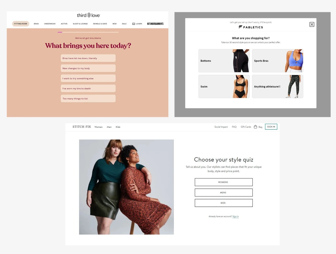
Brands such as Third Love, Fabletics, Stitch Fix use style quizzes to scale and engage with their audience
Going back to the 1990’s, I still remember my first glimpse of a fashion style quiz. Featured in the film, “Clueless,” where the main character Cher, interacted with an early-concept of a technology that helped her choose her outfit for the day. It really showcased how choosing your outfit, can be your own adventure.
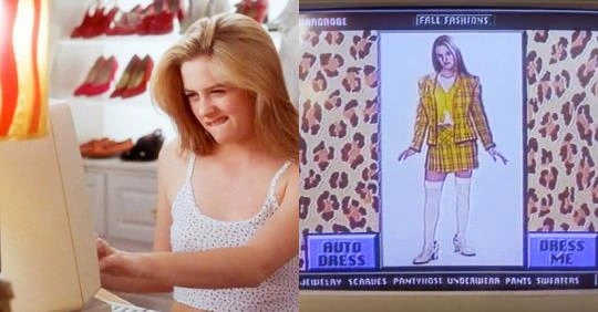
Film 1995 “Clueless” by Director Amy Heckerling, features an early concept of a made-up technology to style your outfit for the day
A look into Short Story's style quiz
Short Story is an online platform that helps women 5’4 and under get easy access to petite clothing with beautifully curated subscription boxes. As a new user, I was excited to dive into this.
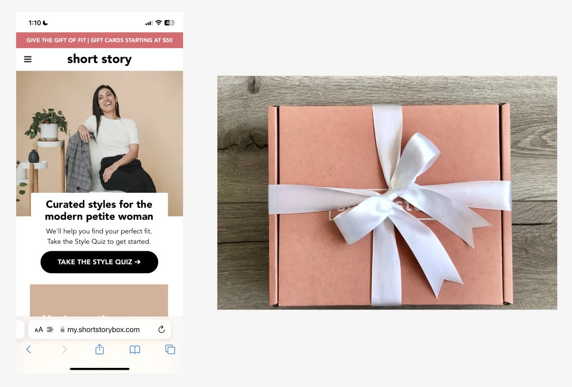
A key component of Short Story's business and customer's first touchpoint, the Style Quiz, before they receive a curated box
The Challenge
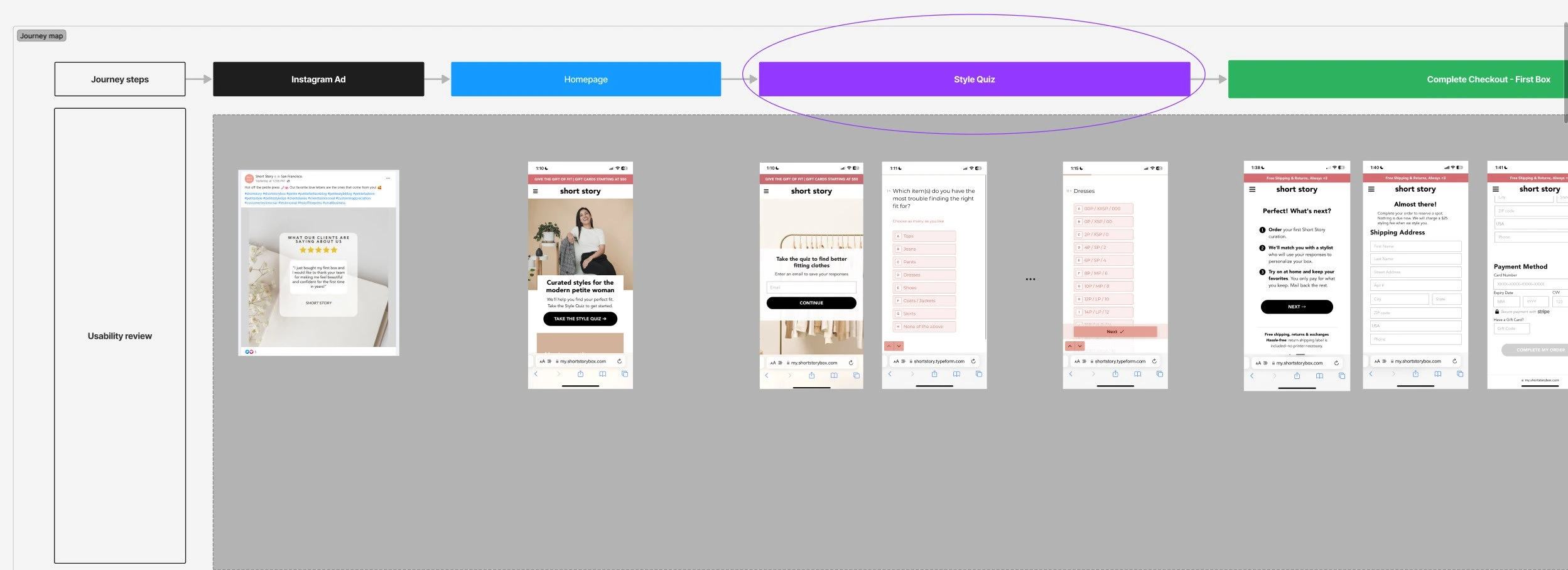
A look into the customer journey map of a new user of Short Story
After secondary background research, I found Short Story’s customer journey included one critical entry point that helps with converting a visitor into a customer...
Their Style Quiz
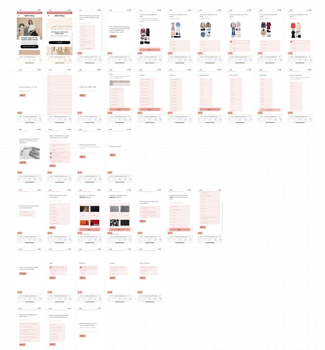
Bulk preview of screens from Short Story’s original quiz
After conducting an initial usability test, I found a key area of focus:
⏰ The time it takes to complete the quiz
There were ~46 screens, and it took me about 20 minutes to complete. (Completely transparent, I had a bit of form-fatigue 😅).
To channel my focus further, I used a user story…
As a first time user, I want to complete the quiz quickly, so that I can start receiving my box.
Now, however there was a challenge that came up...
Balancing business goals and user needs
Business: Short Story needs detailed data from customers to help their stylists better curate boxes for them; ultimately to increase onsite conversion of leads into customers
Users: But at the same time, users want to complete the quiz quickly, or just simply don’t have the time
How can we meet these two in the middle?
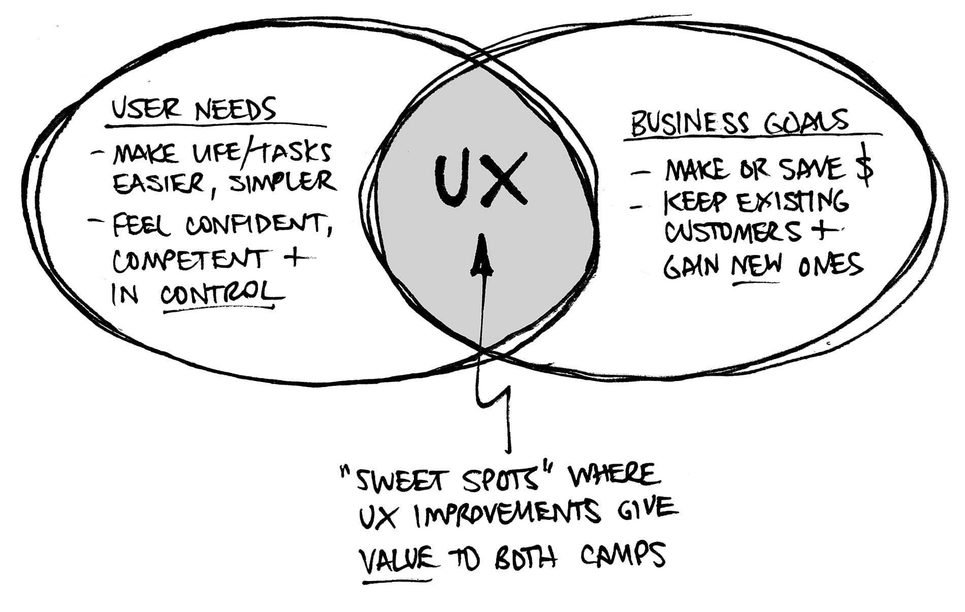
Business and User Goals from Bitesize UX
How might we keep the required quiz criteria as-is, yet still help motivate users to complete the quiz with less friction?
Proposed Design Solutions
Using 3 key psychology design principles, here are my proposed solutions.
Cognitive load
Zeigarnik effect
User freedom and control
Let’s dive in!
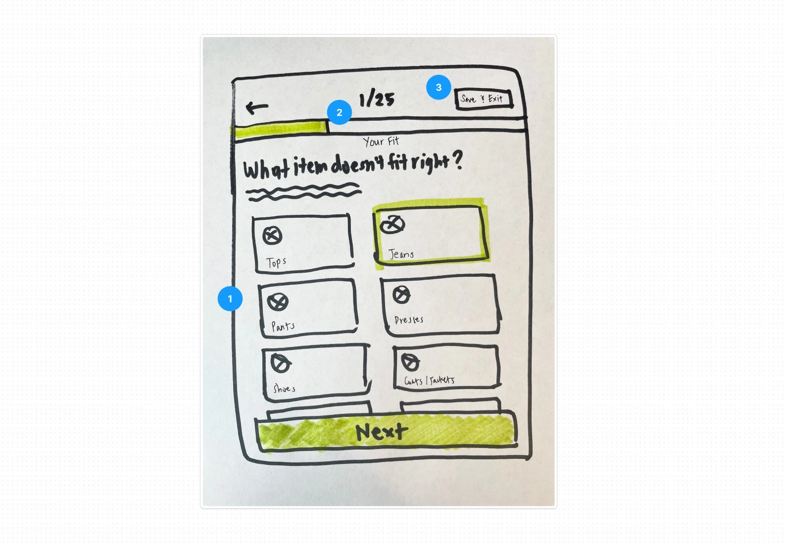
Wireframe sketch - psychology principles / usability heuristics: 1) Cognitive load, 2) Zeigarnik effect, 3) User freedom and control
Psychology Insights
Cognitive load
Cognitive load is the amount of effort that is exerted or required while reasoning and thinking for users. When cognitive load is high, thought processes are potentially interfered with.
Originally the form on some screens have long text only, which increases cognitive load by making users read through every single line. Every option almost ends up looking the same.
If we introduce visual hierarchy with the use of icons and an easy scannable layout, then this will help users easily digest the information requested - thereby freeing up more cognitive space to answer questions more easily.
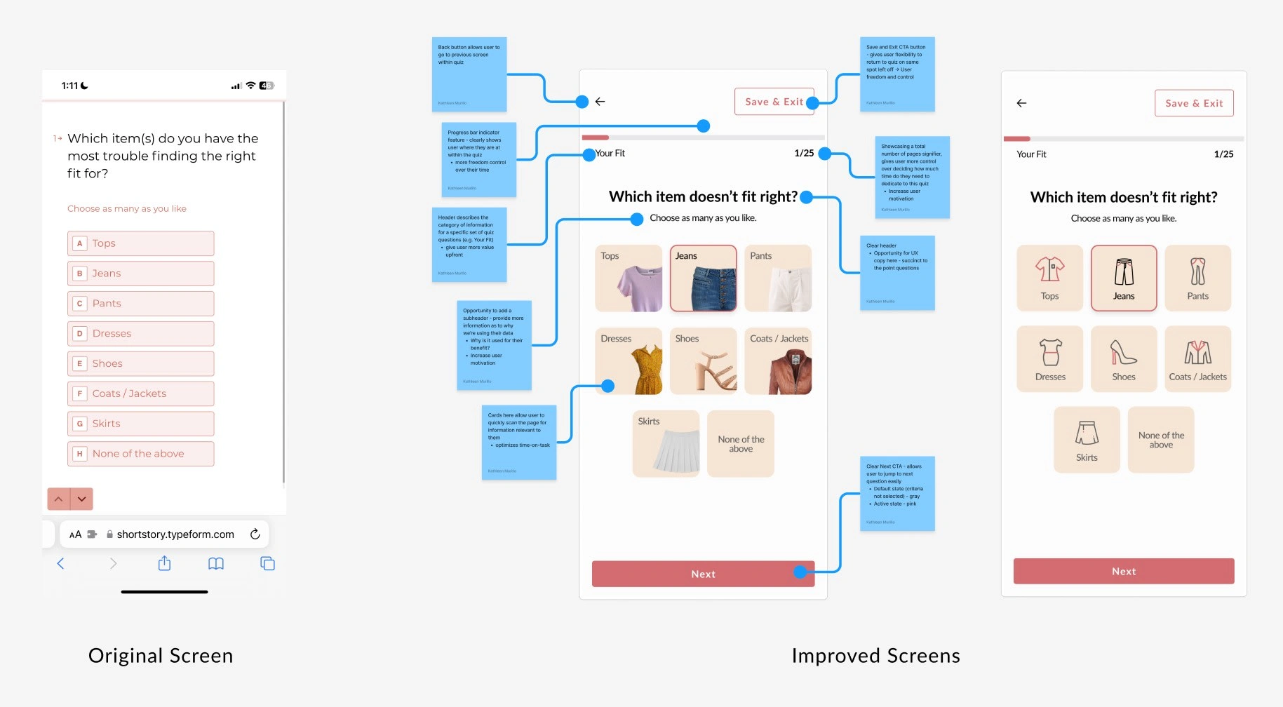
Two proposed design solutions for Short Story's style quiz - image versus icon treatments
It doesn’t matter how many times I have to click, as long as each click is a mindless, unambiguous choice. - Steven Krug,
The less effort we put on a user’s mind, the less friction there will be and ultimately, more ease of use.
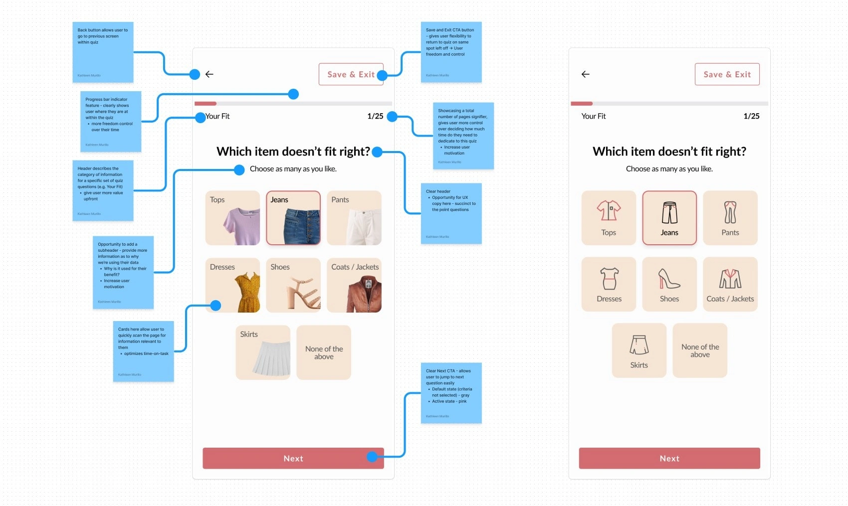
With these two screen versions, these can also be good segway for future A/B testing (which one will improve time-on-task?)
Zeigarnik Effect
Zeigarnik Effect is a psychology design principle that when a user sees a complex task unfinished, they are more likely to remember it. Thereby, users are more likely to be motivated to complete that task.
If we take a look at the original screens, they did have a progress bar, however there was no indication/signifier to forecast how many pages a user would need to dedicate their time to completing this quiz. Having this will show the user not only where they are in the quiz, but also provide them more control over their decision-making and their time.
My proposed hypothesis would be - if we create a progress bar in tandem with a “page summary” text label, then this will help motivate users to complete the quiz.
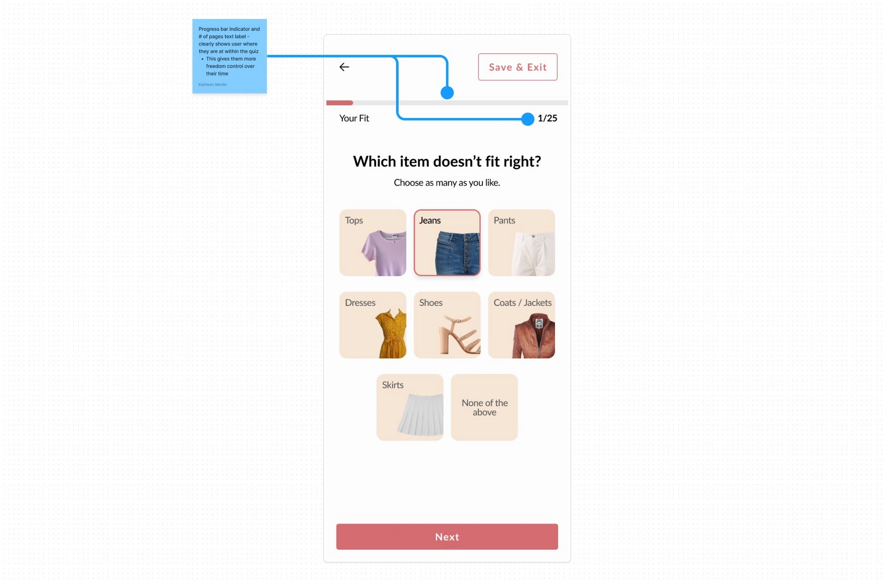
The Zeigarnik Effect applied here with the progress indicator bar and text label of page summary
User freedom and control - usability heuristic
This principle states: Users often choose system functions by mistake and will need a clearly marked “emergency exit” to leave the unwanted state without having to go through an extended dialogue, according to Jakob Nielsen’s usability heuristics.
With life many of us get distracted unexpectedly - it’s inevitable. The average office worker receives around 121 emails every workday. Imagine on top of that, notifications bombarding our phones from left to right.
Allowing the user to come back later, gives them more freedom and control. We’re empowering our users by giving them more options. This furthermore will increase their trust in the brand - Short Story cares and understands! Life happens 🤷🏻
To avoid losing users’ work, systems need to determine the user’s intent — cancel or close — and provide clear options. Here, I took it a step further by providing a clear CTA copy for the button as “Save & Exit," providing a dual-option of saving and exiting.
Jaycee Day's talk from Config 2023 furthermore reinforces this idea that if a brand shows they care by encouraging even taboo areas of a product, such as cancellations, with providing valuable content (reminders) to their customers, this will ultimately increase trust - amplifying the overall long-term customer loyalty.
If we give users easy access to return to the quiz at their previous “left-spot,” then they are more likely to complete the quiz.
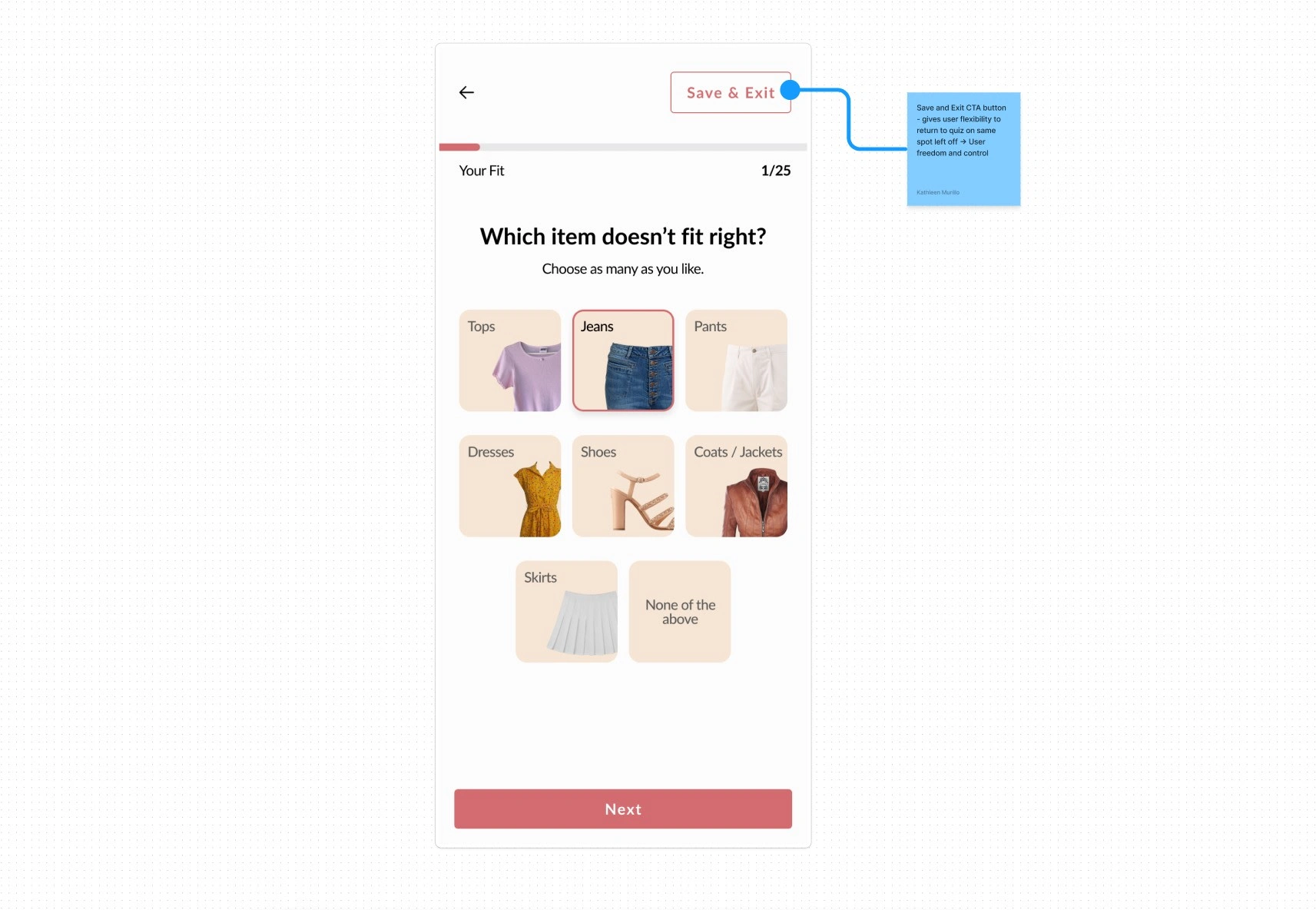
Here I included a secondary “Save & Exit” button, giving the user flexibility to return to the quiz if necessary
Wrapping up
With these features working in tandem, first time users will receive a fluid and easy experience using Short Story's style quiz to signup for their first box.
The onboarding experience for new users is a crucial flow in a customer's journey, especially in setting up new users for success. With businesses integrating quizzes into their onboarding process, they'll need to pay extra attention to how they can best balance time and content together.
💭 What Psychology Design Principles have you found helpful recently?
💭 When was the last time you took a style quiz, and how did it go?
You made it to the end! I appreciate you for tuning in and taking the time out of your day to be here with me. Excited to learn, stay curious, and grow with our #creativecommunity! 💡✨
💻 Interested in UX UI Design for your app or website? Let’s connect here!
📰 To stay updated, join like-minded creatives and subscribe to my newsletter click "follow" here
⛰️ Learn more about my creative journey here
📷 Find me on Instagram as well, where I create content to help inspire women through fashion and lifestyle
Until then, keep creating and inspiring! ✨

Kathleen Murillo, 💼 Product Designer UX UI for Fashion Entrepreneurs, Startups, and Small Business Owners. Previously practiced D2C marketing, creative, psychology, influencer, social media for 7 years.
🧥👡 Helping women feel confident in what they wear, and businesses that value the same. An AAPI Woman-Owned Creative Studio.
👗 Fashion Thrift, Vintage Lover
🧠 Psychology, 🌱 Plants and ☕ Coffee too
📍 San Francisco Bay Area
Like this project
Posted Aug 1, 2023
A look into how fashion entrepreneurs, startups, and small business owners can convert leads and reduce drop off, using a style quiz for onboarding new users
Likes
0
Views
27
