Redesigning a Mobile App Onboarding Experience to Decrease Churn
Creating design solutions for onboarding new users, and balancing business and user goals, to decrease drop-off and increase conversion rates.


Creating design solutions for onboarding new users, and balancing business and user goals, to decrease drop-off and increase conversion rates.
Business Goal
The existing mobile app fell short of showing enough value upfront and visual hierarchy, leading to high drop-off and low conversion rates. The goal was to make the Onboarding experience more smooth and efficient.
My Role
As a Product Designer, in a team led by a UX Lead, I carried out data analysis, synthesized user feedback, created wireframes, and developed stakeholder presentations.
Project Overview
Design Buddies is an inclusive online community of tens of thousands of designers from around the world, started by founder, Grace Lang. There is growing demand for members to find expert mentors “on-demand” to get more specific answers to their questions. Enter their sister-product, Mentor Buddies!
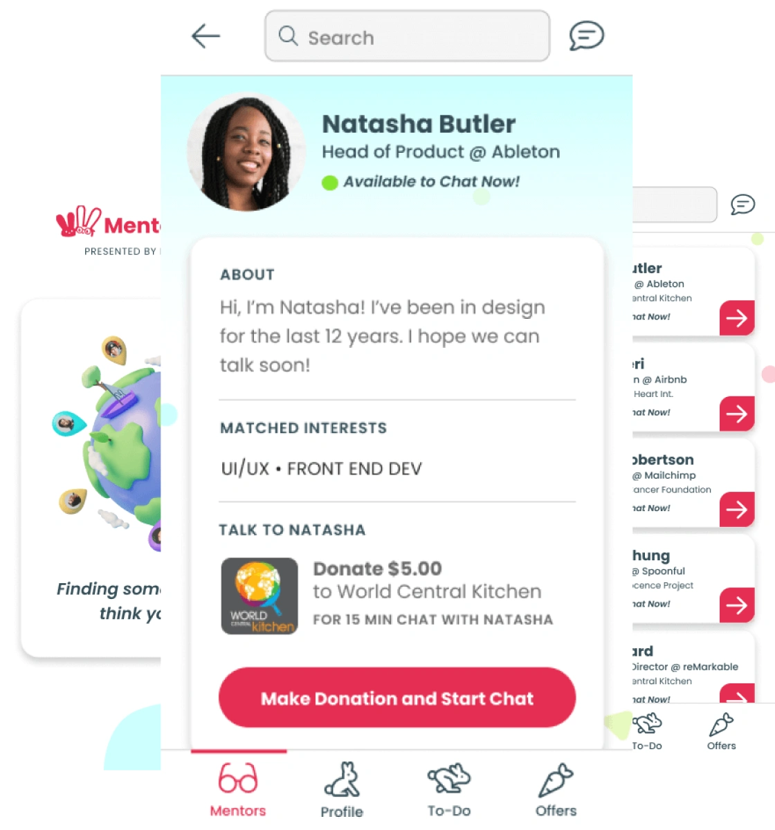
Mentor Buddies is a mobile app where members can find and match with a design expert to chat with privately, in exchange for a small donation to the charity the mentor has chosen.
In this case study, I’ll detail the process of improving their onboarding experience to not only grow their community, but also create an easy and efficient process for new users.
How will improving the onboarding process contribute to business goals for Mentor Buddies?
Stakeholder interviews to understand business goals
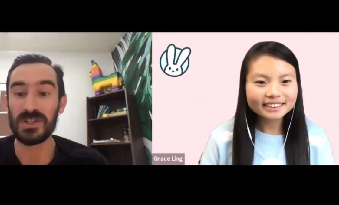
We wanted to learn more about the current process, challenges, and business goals from the Founder, so we could better understand how to create an effective solution. We conducted a stakeholder interview with Founder, Grace Lang, to learn more about what the business is looking to accomplish, what’s currently working, and what needs improvement.
Key Findings from Interview
Goals
What do they want to accomplish?
Grow revenue and community
Get new users to book their first session
Create an onboarding experience that allows users to easily and confidently find a mentor to chat with
What's working?
What are the positive parts of the current experience?
Positive on both sides
Mentees had a positive experience with chats
Mentors liked how mentees did research beforehand
What needs improvement?
Where is current solution falling short of business and/or user goals?
Many users opened the app, but didn’t sign up for their first session with a mentor
Conducting Data Analysis
Next, we looked into quantitative data to further understand user behavior and find focus of what we want to solve and address.
High drop off at “Create Profile”
We noticed we’re losing significant numbers of users, dropping off at 66%, as well as the lowest completion rate at 34%. This is significant, as it’s showing up early on in the onboarding process.
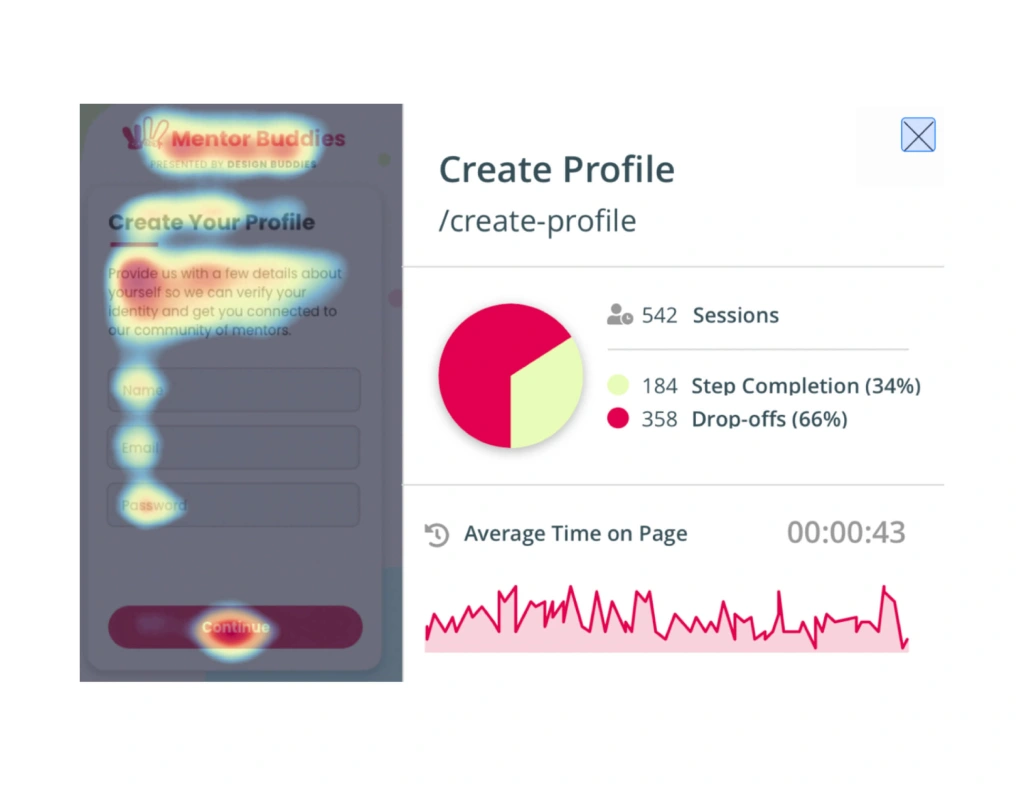
Smoke signals from analysis of create profile page
High drop and lots of time spent on Mentor List Page
We saw highest average time on page here, with users spending lots of time on this screen and not moving forward.
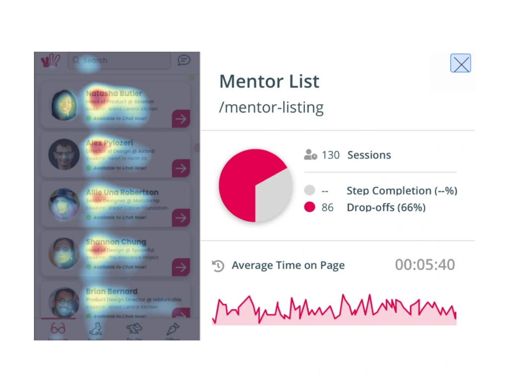
Smoke signals from analysis of mentor list page
High drop and back button tapped frequently on Mentor Profile page
There is the highest drop-off rate out of all screens at 81%, along with a high average time on page.
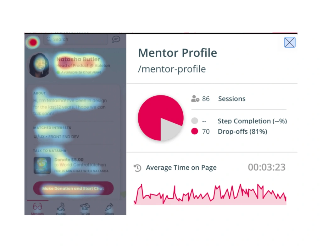
Smoke signals from analysis of mentor profile page
Synthesizing User Feedback
Next, we looked into qualitative data to further pinpoint where exactly are the points of friction, and what is the feedback we want to address.
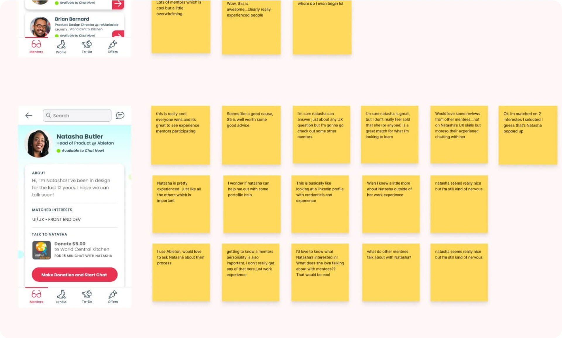
A closer look into the qualitative data from user feedback
Diving into Different Focus Areas within Product
Profile Building
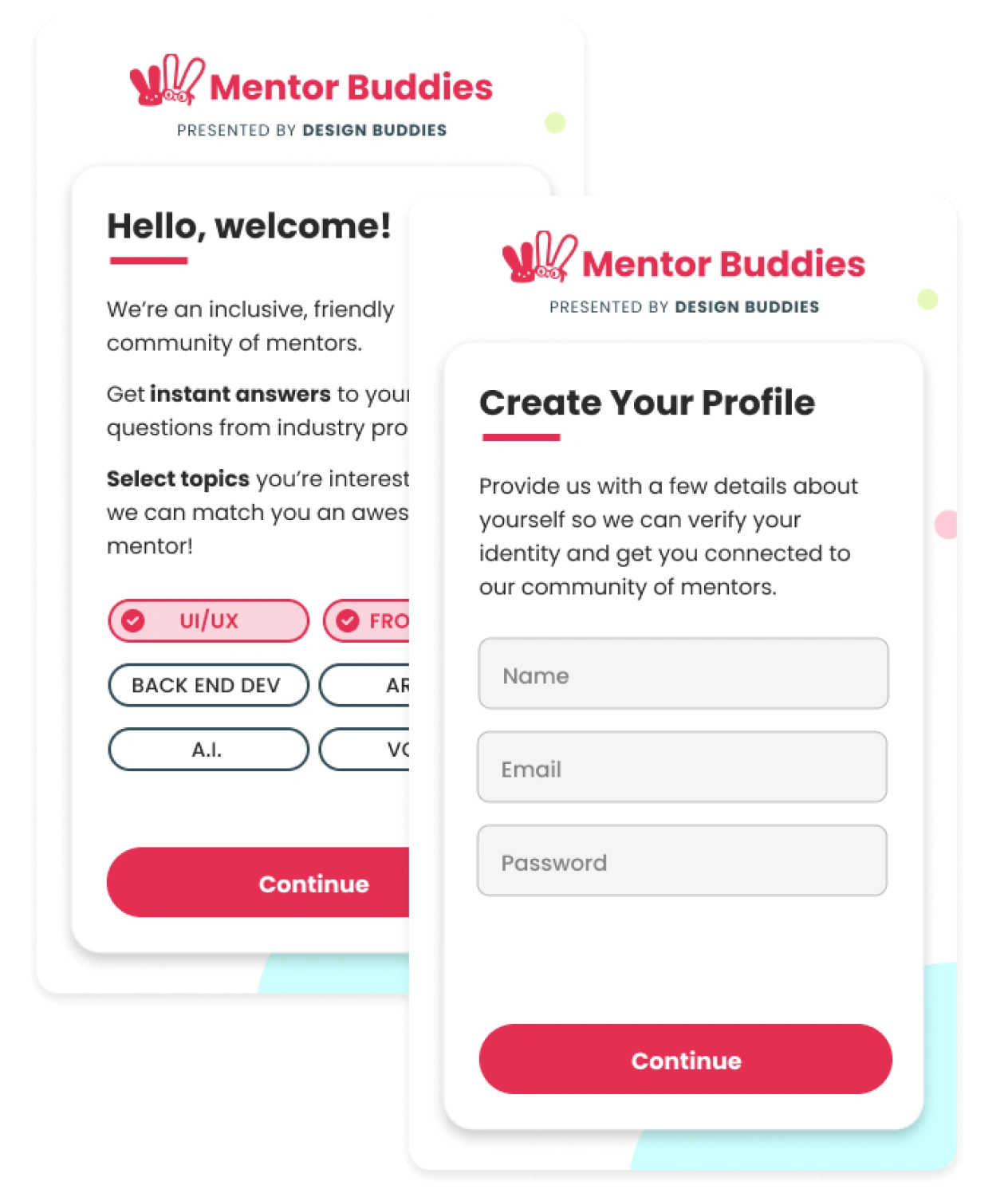
Focus area of Profile Building
Focus Area
Profile Building
I statement describing friction
“I’m not really motivated to sign up because I don’t know what to expect and don’t feel confident that I’ll find the right mentor.”
HMW
HMW clearly show users the value they’ll receive before signing up?
HMW present users with a signup when they’re highly motivated?
Mentor List Page
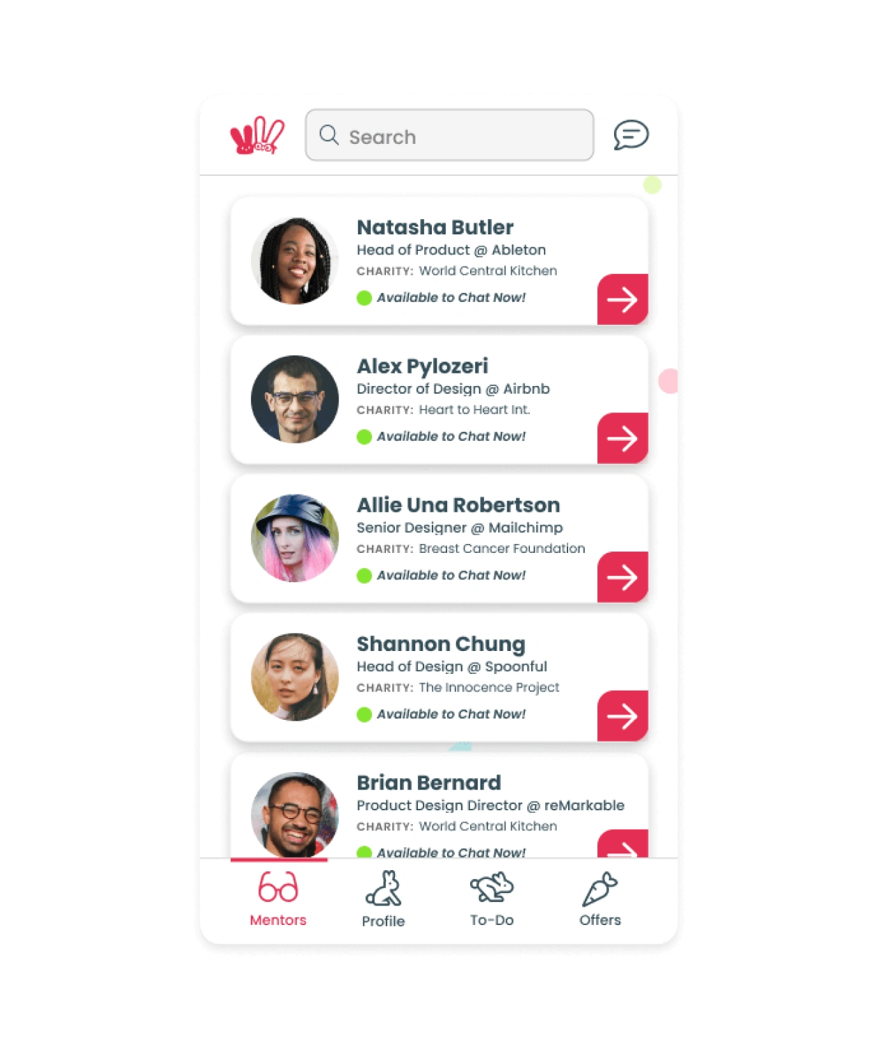
Focus area of Mentor List Page
Focus Area
Mentor List Page
I statement describing friction
“I’m overwhelmed with choices, and don’t have enough information to confidently find a mentor that would be a good fit.”
HMW
HMW give users the tools and information they need to “scan” mentors based on criteria they care about, and select on confidently?
Mentor Profile Page
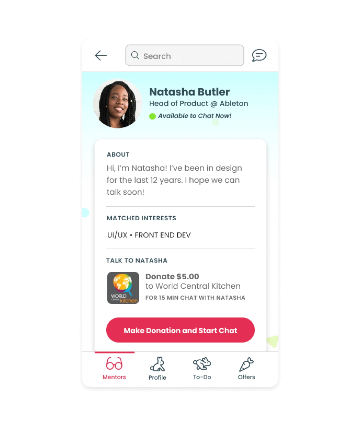
Focus area of Mentor Profile Page
Focus Area
Mentor Profile Page
I statement describing friction
“I don’t know enough about this mentor to decide if I want to chat with them.”
HMW
HMW present mentors in a way that allows users to confidently decide if they are “the one” they want to talk to?
How might we give users the tools and information they need to “scan” mentors based on criteria they care about, and select one confidently?
Sketching Solutions
We decided to focus first on the Mentor List Page area. Next, we sketched some potential features that might support both user and business goals.
I chose to prioritize this Filter feature, as it meets business and user goals because it helps users to easily filter and sift through information they are looking for, while also reinforcing Mentor Buddies’ goal of increasing conversion rates of finding mentors and booking their first session.
Provide a Filter Tool
My Solution
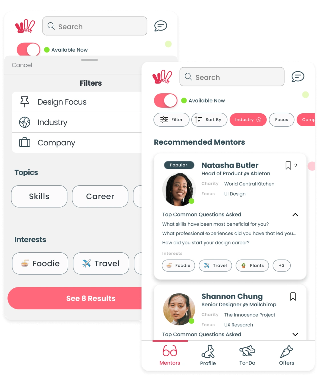
Tapping Filter will trigger a modal from bottom of screen, showcasing specific criteria options. User has control to cancel or clear all options.
Created as a modal - for easier access between filtering and main results page, on mobile screen.
Sort By option as dropdown menu (e.g. recommended, last created, and so forth).
A toggle switch, allows user to quickly see an entire set of results with one action (used for “Available Now / Online Now”).
3 Main Filters - less cognitive overload lessening # of options as a list with label + next view (arrow icon)
Chips - some categories shown as Chips with text or text + icons, with “See All” option. A more visual way of showing filters - to quickly scan.
“See Results” CTA button - the number will update based on filters the user sets; this helps user to understand at a high-level / quickly how many Mentors are right for them.
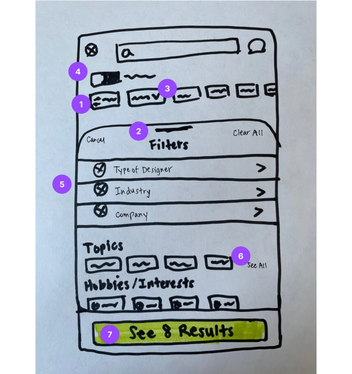
I chose to prioritize this Filter feature, as it meets business and user goals because it helps users to easily filter and sift through information they are looking for, while also reinforcing Mentor Buddies’ goal of increasing conversion rates of finding mentors and booking their first session.
Present Criteria in a Clear, Easily Scannable Layout
My Solution
Clear header “Recommended Mentors” of a collection of search results - shows their “matched” mentors first that was personalized based from preferences in onboarding process.
Toggle Filter - user can easily view results to see which mentor is live online and available now to chat (e.g. Available Now / Online Now)
View Options - users has option to view the list in a tile or list format, gives user more control how they want to easily “scan” the information / results.
Filter and Sort By - tool to help users apply their required criteria easily, filters applied appear on the right with control to clear each.
Highlight Tag on profile image - chance to showcase a most important criteria (e.g. “Popular”)
“Top Common Questions Asked” drop-down - provides Mentees with more insight/transparency to what Topics of interest other Mentees asked this Mentor in the past.
Emoji Icons and Text - a way to highlight important criteria (e.g. life outside of work for user to relate to).
Save to Favorites - users can save a mentor’s profile page that they find interesting, so that also allows them to narrow down / compare which mentor is best for them.
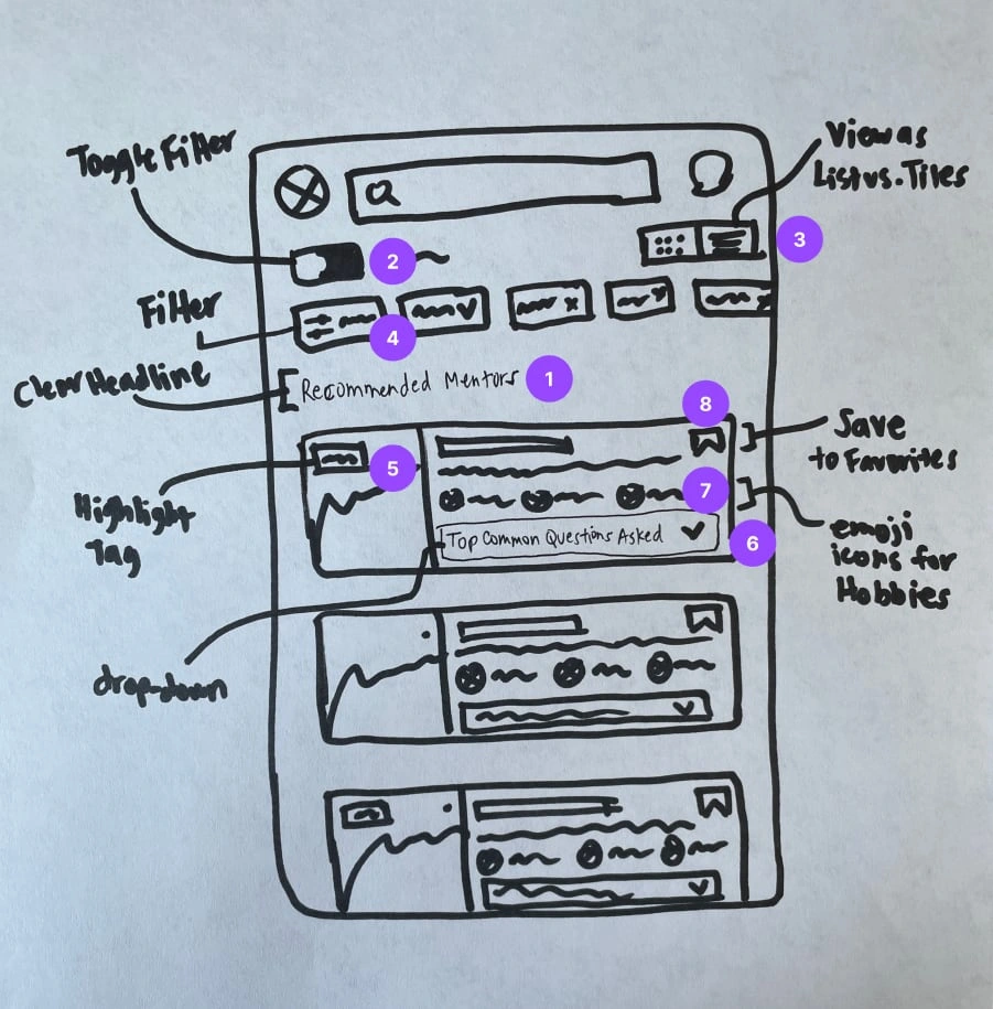
I chose to prioritize this summary listing page feature with cards, as it meets business and user goals because it provides users with key highlights and criteria of mentor information in a clear, easily scannable layout with visual hierarchy, while also reinforcing Mentor Buddies’ goal of increasing conversion rates of finding mentors and booking their first session.
Highlighting Key Features
Next, I created high-fidelity designs for these features to show the details of their functionality, and how they might support business and user goals in the onboarding process.
Feature #1 - Filter Modal
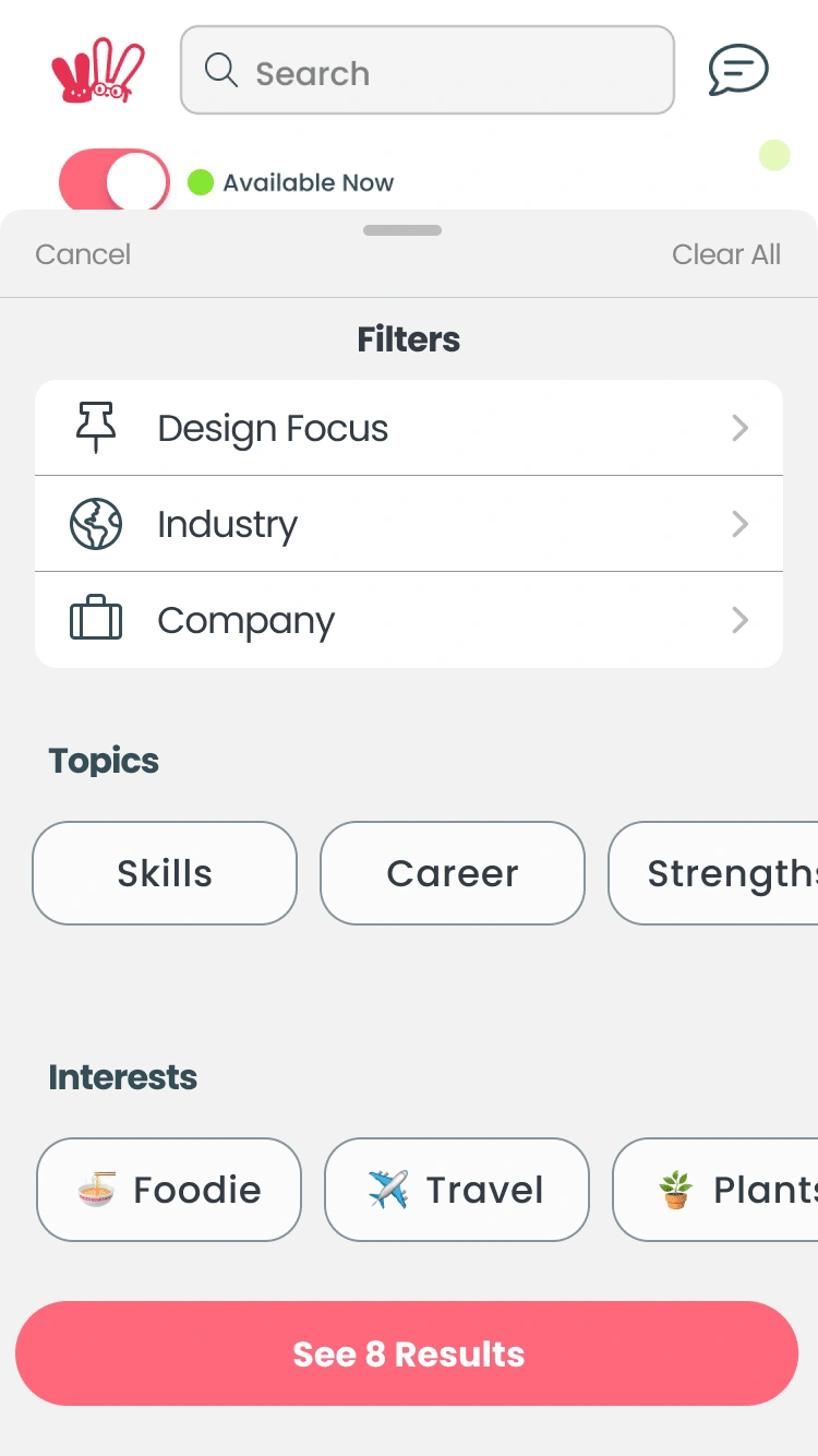
To address the pain point of users need to “scan” mentors based on criteria they care about, and select one confidently, we designed a filter tool feature providing users an easy and efficient way of sifting through key information they need to find the right mentor for them.
Based on user research, we believe that this will work well to help users find the best mentor that meets their needs, quickly and efficiently.
We would track these metrics to measure the effectiveness of this solution:
% Conversion Rate - Completed a Session
Average click-through rate of “See Results” CTA, per user
Average time on page - decrease % MoM
Feature #2 - Listing Screen with Cards
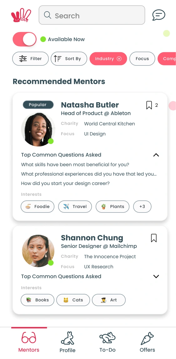
To address the pain point of users need to “scan” mentors based on criteria they care about, and select one confidently, we designed a summarized listing page with cards providing key criteria of mentor information in a clear, easily scannable layout with visual hierarchy in mind.
Based on user research, we believe that this will work well to help users find the best mentor that meets their needs, quickly and efficiently.
We would track these metrics to measure the effectiveness of this solution:
% Conversion Rate - Completed a Session
Average click-through rate on mentor cards, per user
Average # of "Saves", per user
Average time on page - decrease % MoM
Next Steps
We would take the following next steps to continue refining our solution and improving conversion rate:
Ongoing usability tests
Expand on the Filter Modal feature + cards reflecting filter criteria
Iterate on the “Common Questions Asked” feature, explore carousels versus dropdown
Complete View Options
Overall Cohesiveness
Like this project
Posted Aug 1, 2023
Creating design solutions for a community mobile app onboarding new users, to decrease drop-off and increase conversion rates.
Likes
0
Views
9
Clients
Design Buddies
