WithinEHR Landing Page Design
Tolulope Adeyi

WithinEHR Landing Page
Turning healthcare complexity into clarity.
WithinEHR is an all-in-one EHR platform designed for modern medical practices. The challenge? Make a dense, feature-rich product feel simple, human, and trustworthy — and drive early access signups before launch.
My Role
UI Design
UX Design
UX Writing
Conversion-focused messaging
The result: A clear, confident landing page that positions WithinEHR as a smarter, faster alternative to outdated systems, while capturing qualified leads through urgency, relevance, and trust.
Design Goals
Convert traffic into early access signups
Build trust through clarity and transparency
Make complex healthcare tech feel simple and modern
Hero Section - Clear Value Prop & Action
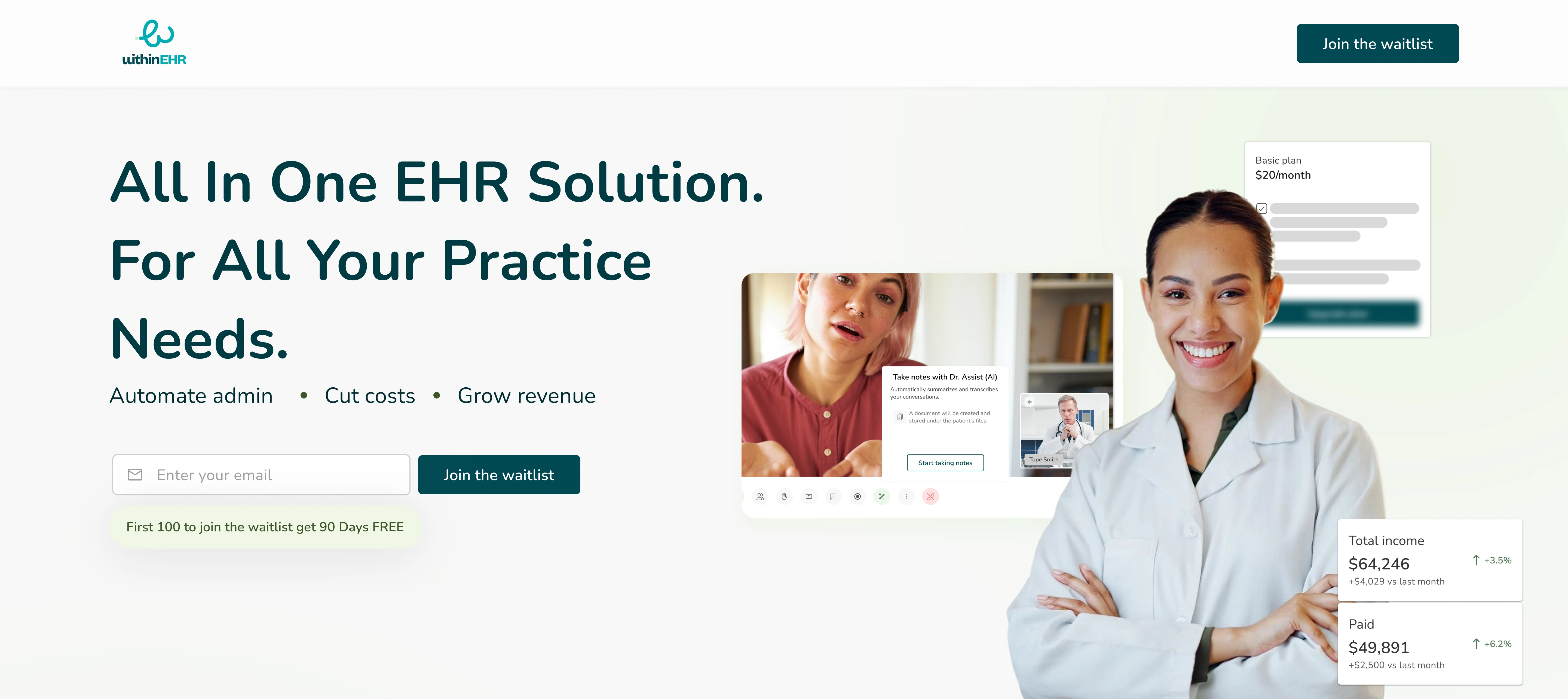
Hero Section of landing page
“All In One EHR Solution. For All Your Practice Needs.”
Design choices
Bold, benefit-led headline focuses on completeness and ease.
Subheading emphasizes three key outcomes: saving time, cutting costs, and boosting revenue which are high-priority concerns for healthcare practitioners.
Imagery features diverse healthcare professionals to visually communicate inclusivity and trust.
Early access CTA (“Join the waitlist”) is placed prominently, using urgency with "Only 100 spots."
I led with clarity. The most common frustration with EHRs is bloat and complexity, so I positioned the product as an antidote. Every element here is optimized to make the user think: “This might finally be different.”
Benefit Section - Clear Value Prop & Action
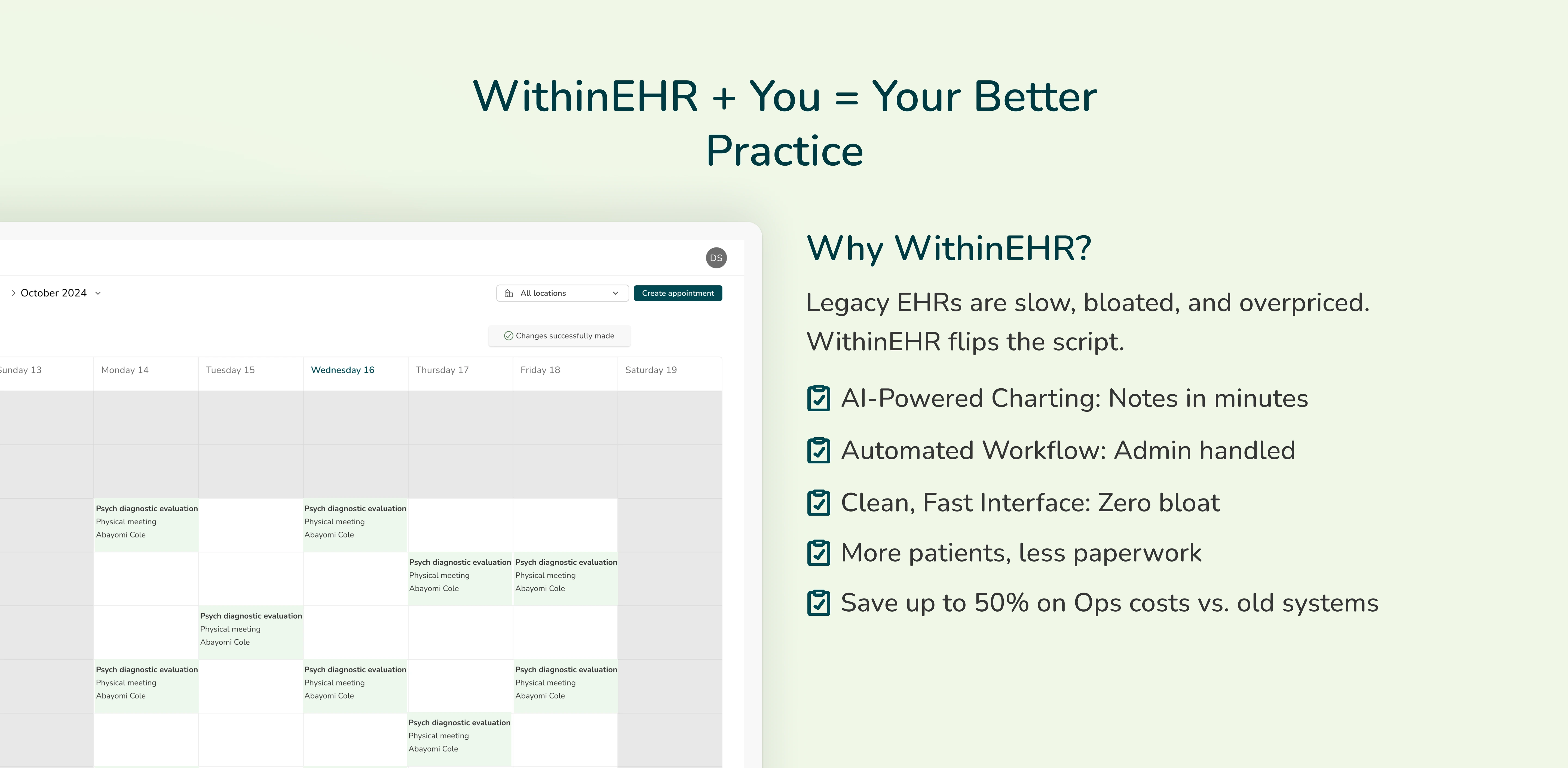
Benefit section of landing page
“WithinEHR + You = Your Better Practice”
I used this headline to establish credibility and differentiate the product from legacy systems. This way users can immediately know what they will be getting using the product.
Design choices
Side-by-side layout with UI screenshot and benefit checklist.
Copy is broken into 6 quick, skimmable selling points (AI-powered notes, fast UI, admin automation, etc.).
This section reinforces why the product exists. Legacy systems are the villain; speed, automation, and cost-saving are the heroes. I wrote benefits like headlines, making it short, punchy, and direct.
Who are the Users? - Clear Value Prop & Action

User section of landing page
I used a scrollable horizontal card carousel showing at first five medical professional types (Psychiatrists, Therapists, NPs, Chiropractors, Psychologists). The user can scroll to check other professions that can be users of the product.
Design choices
Helps visitors instantly self-identify.
Allows WithinEHR to appear tailored and inclusive without overwhelming the screen.
Rather than saying "for everyone," I showed it. Letting users see themselves reflected in the product builds instant relevance and lowers bounce rates.
Pricing Section - “Fair Pricing That Prioritizes Practices”
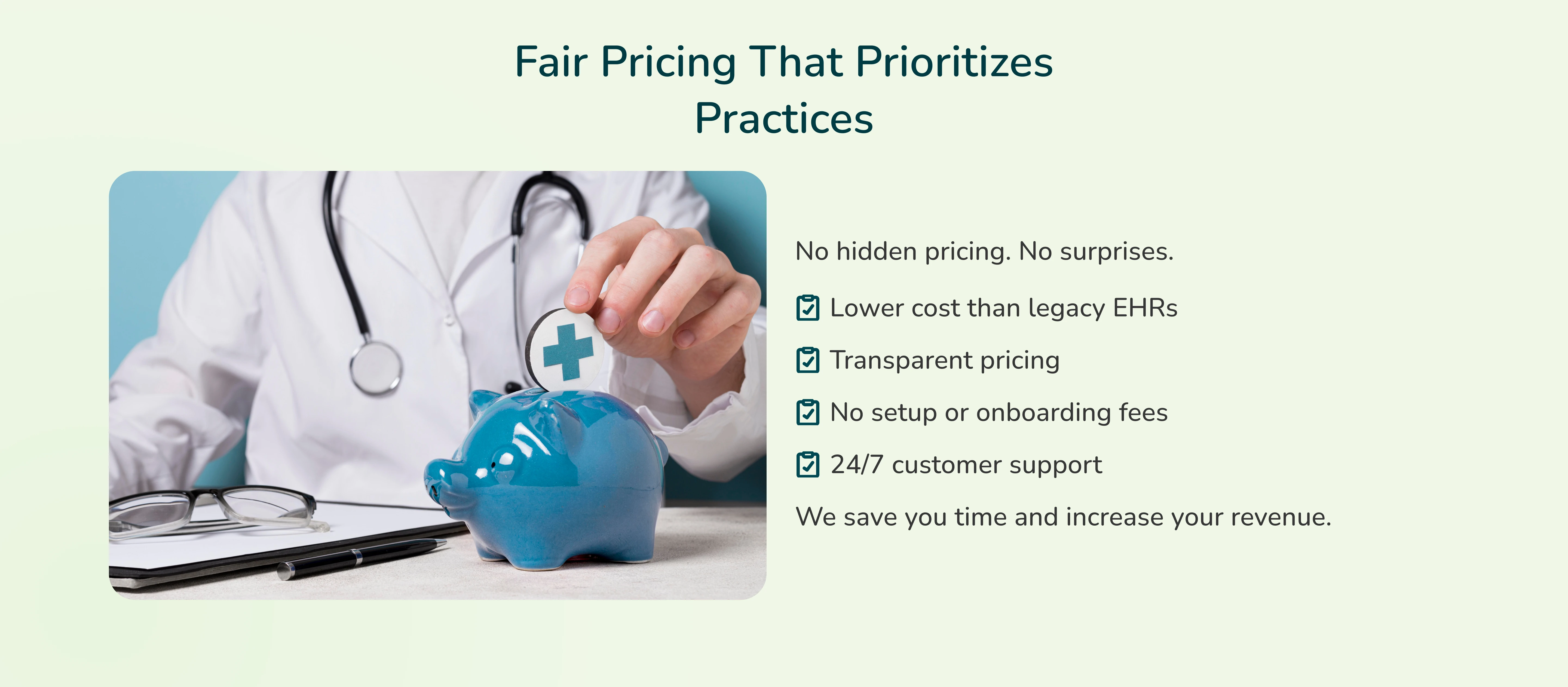
Pricing section of the landing page
At the time of designing this landing page, the product had not yet launched, and final pricing had not been established. Rather than leave the section blank or vague, I focused on anchoring the value of the product in a way that would resonate at any future price point.
Design choices
Drawing emphasis to transparency by letting users read “No hidden pricing. No surprises.”
Bullet points emphasize affordability and transparency.
A compassionate image of a doctor placing a coin into a piggy bank reinforces the financial angle emotionally.
I knew pricing is a major drop-off point in SaaS onboarding. So I tackled objections head-on by stating the value for user such as no fees, lower cost, 24/7 support and paired it with a soft, trust-building image.
Early Access = Urgency + Exclusivity
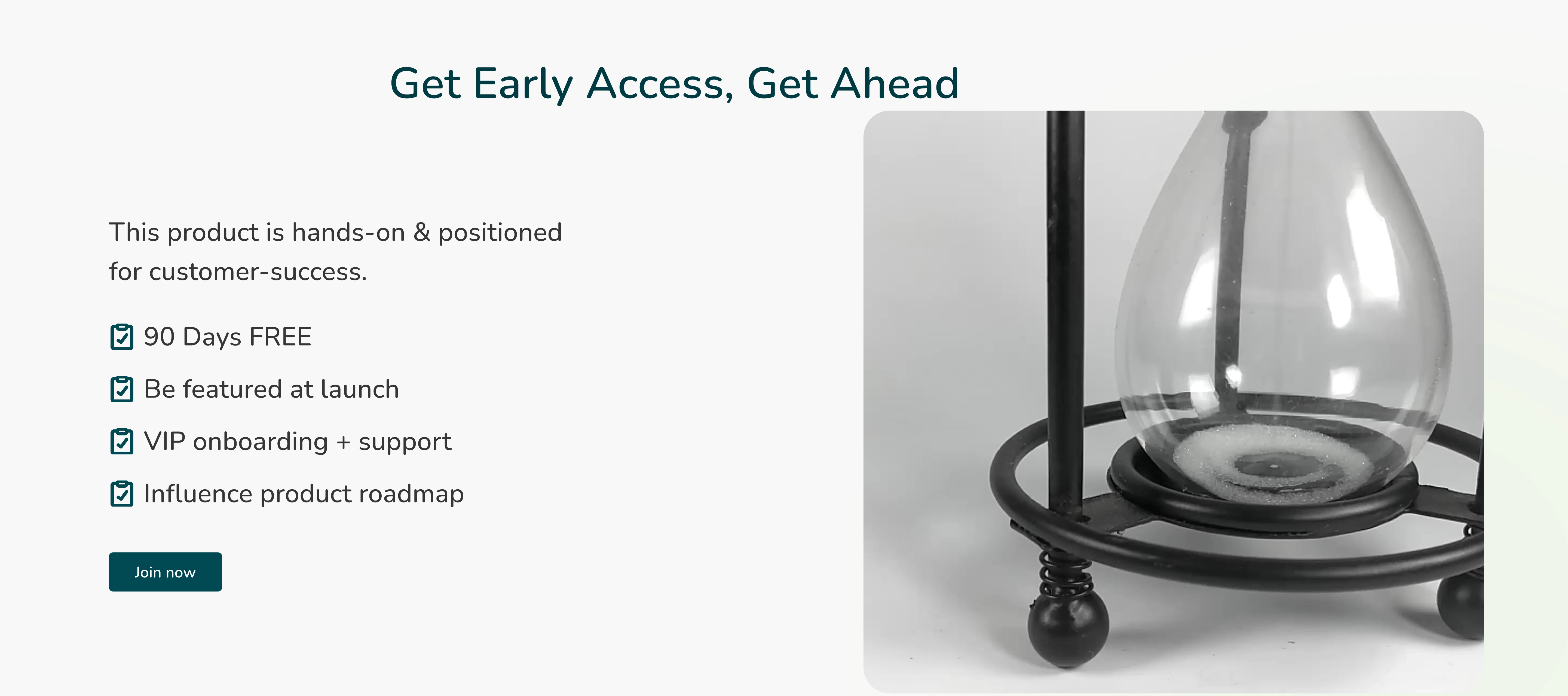
Early access section of landing page
The Early Access section was designed to drive urgency and commitment from early adopters. Since the product was not fully launched, the focus was on creating a sense of exclusivity and involvement. By offering clear benefits, we framed early sign-up as a rare opportunity, not just a free trial.
Design choices
List of perks (90 days free, product influence).
Hourglass imagery for urgency and metaphor.
The Fear of Missing Out (FOMO) works on humans and especially in healthcare, where practitioners want to be ahead of the curve. The hourglass and “only 100 spots” framing turn curiosity into action.
Product Tease
A glimpse of cards in the product
The Product Tease section was placed near the bottom of the page to visually reinforce what the user is signing up for without overwhelming them upfront. Since the product was still in development, I used minimal UI mockups (appointment cards, calendar views) to hint at core features like scheduling and patient management.
Design choices
Appointment card UI mockups to show product interface without overwhelming details
Reinforcing the core purpose of the product of simplifying patient care by stating it is “An EHR that works as hard as you do.”
A mini “soft demo” section helps users visualize the product. I included it low on the page so the top copy could do its job first—hook, inform, then show.
The Landing Page
The Landing Page
Like this project
Posted Jun 25, 2025
Clean, user-friendly landing page design for WithinEHR, showcasing its powerful features to streamline health record management and improve user engagement.
Likes
0
Views
44