Yorka brand identity design and guidelines
Yorka brand identity design and guidelines
1. Defining the Mission and Vision
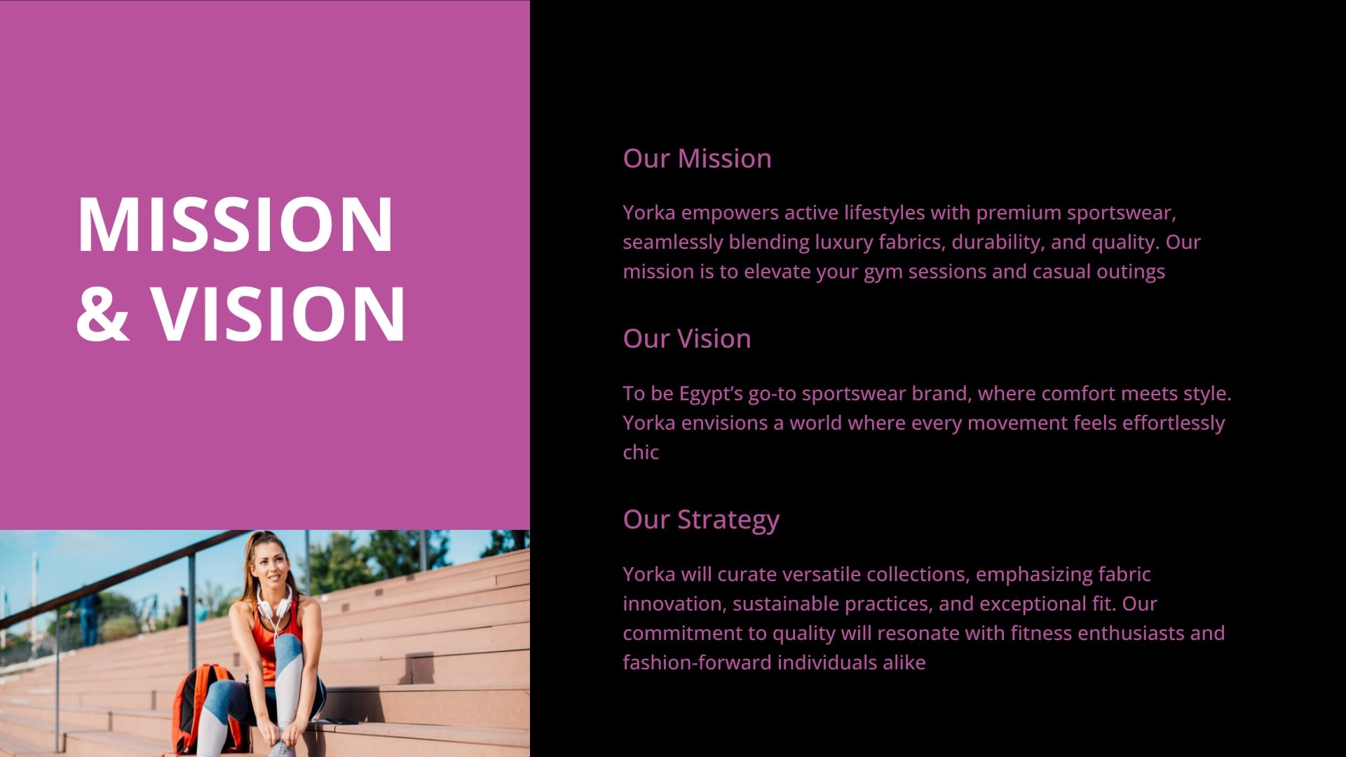
Mission: YORKA's mission is to empower active lifestyles with premium sportswear that blends luxury fabrics, durability, and quality. The focus was on enhancing gym sessions and casual outings with stylish and functional sportswear.
Vision: The vision was to position YORKA as Egypt's go-to sportswear brand, where comfort meets style. This vision aimed to ensure that every movement feels effortlessly chic, targeting both fitness enthusiasts and fashion-forward individuals.
Strategy: The strategy focused on curating versatile collections that emphasize fabric innovation, sustainable practices, and exceptional fit. This approach aimed to resonate with a broad audience who values quality and style in their activewear.
2. Choosing the Brand's Color Palette
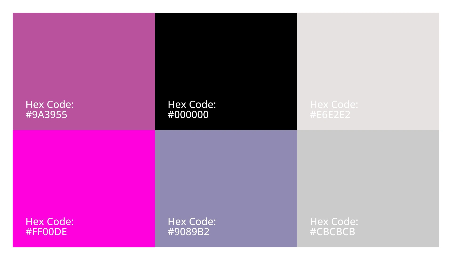
The color palette for YORKA included vibrant and bold colors such as #FF00DE (a bright magenta), #9A3955 (a deep maroon), #9089B2 (a muted lavender), #000000 (black), #CBCBCB (a light gray), and #E6E2E2 (a soft gray). These colors were chosen to reflect energy, modernity, and versatility, aligning with the brand’s dynamic and active lifestyle positioning.
3. Selecting Typography
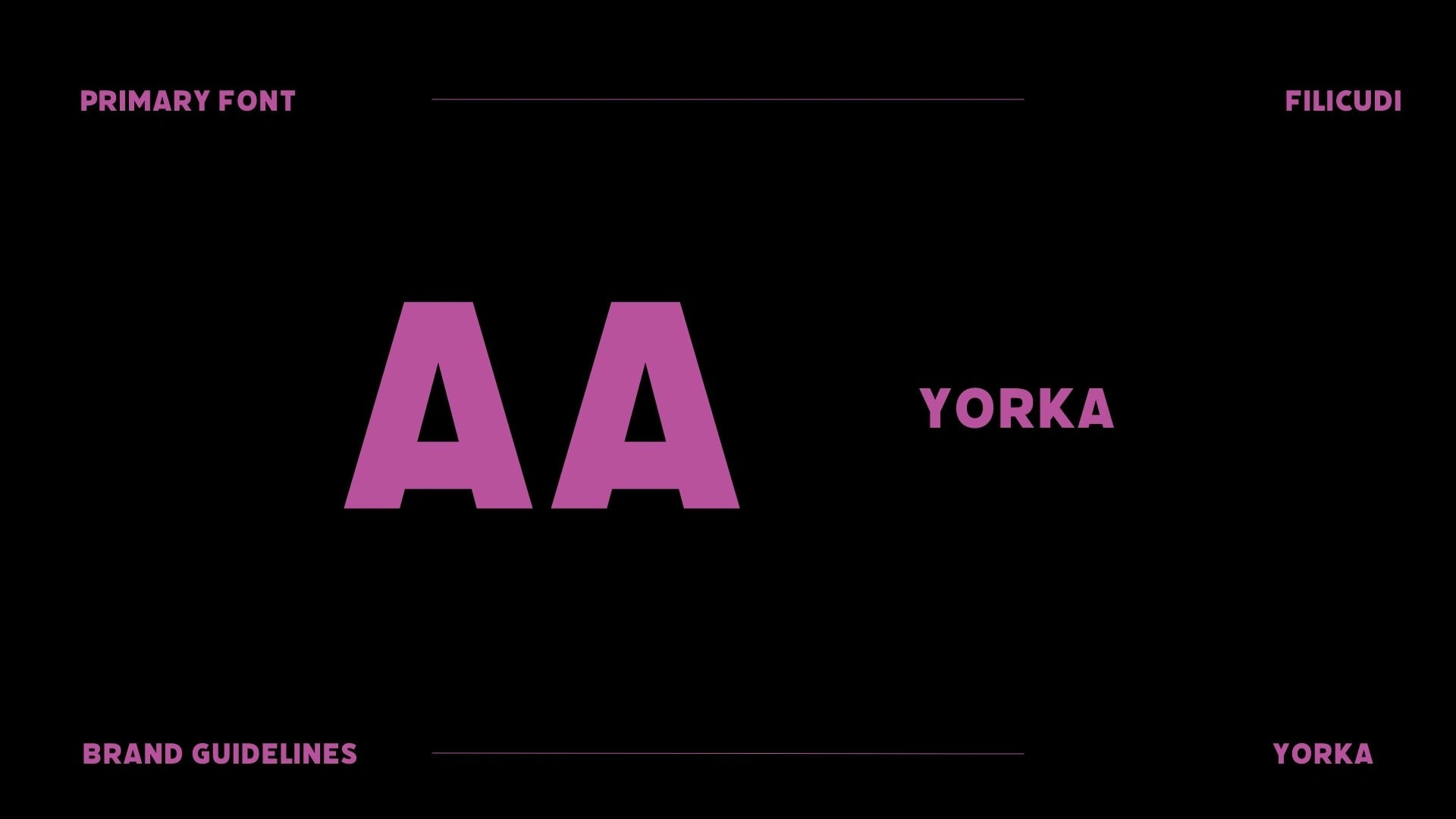
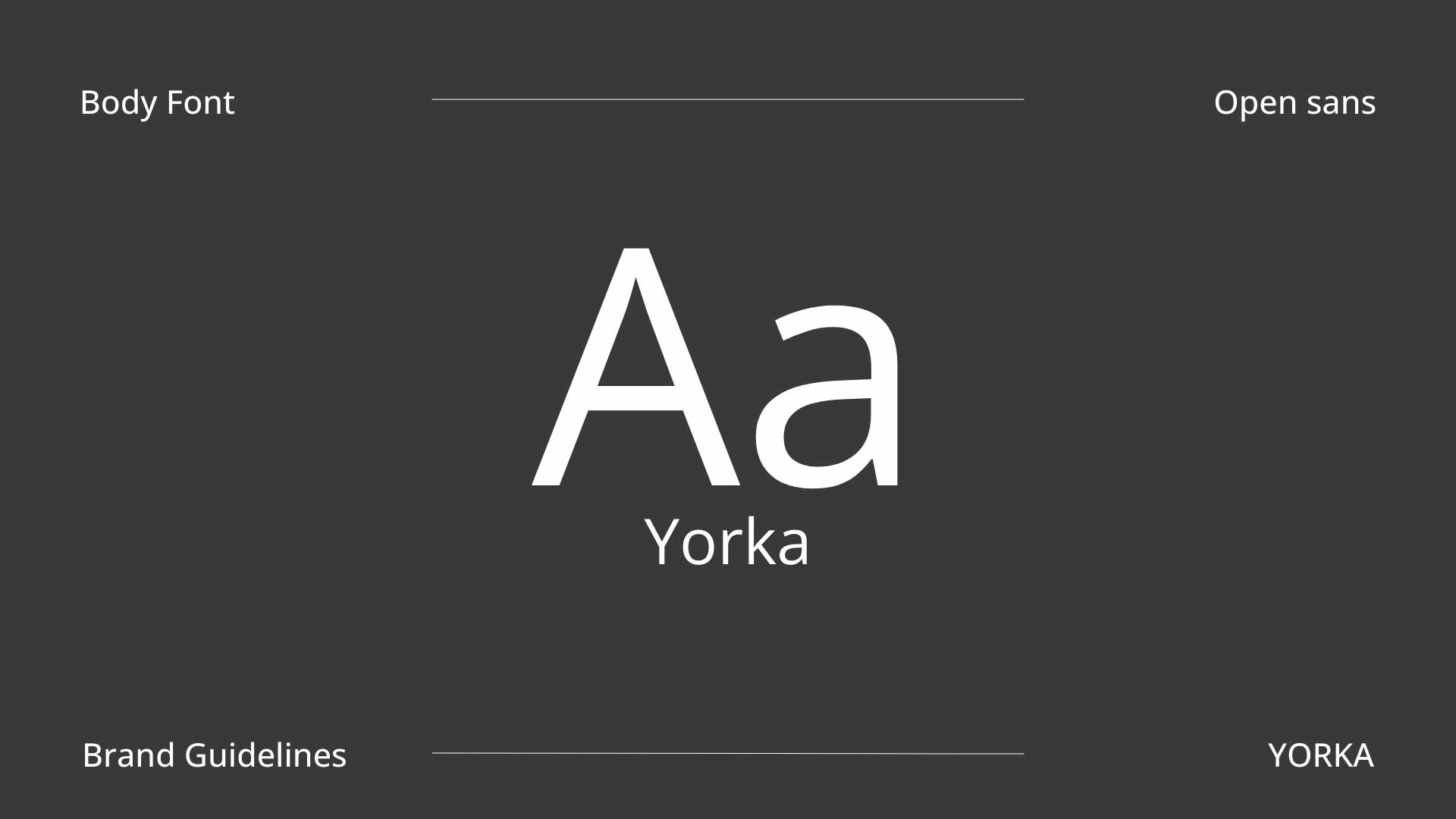
The primary font selected for YORKA was FILICUDI, which gives a modern and sporty feel, complementing the brand's active and stylish identity. Open Sans was chosen as the body font for its readability and clean look, ensuring that all communications are clear and accessible.
4. Developing a Photography Style
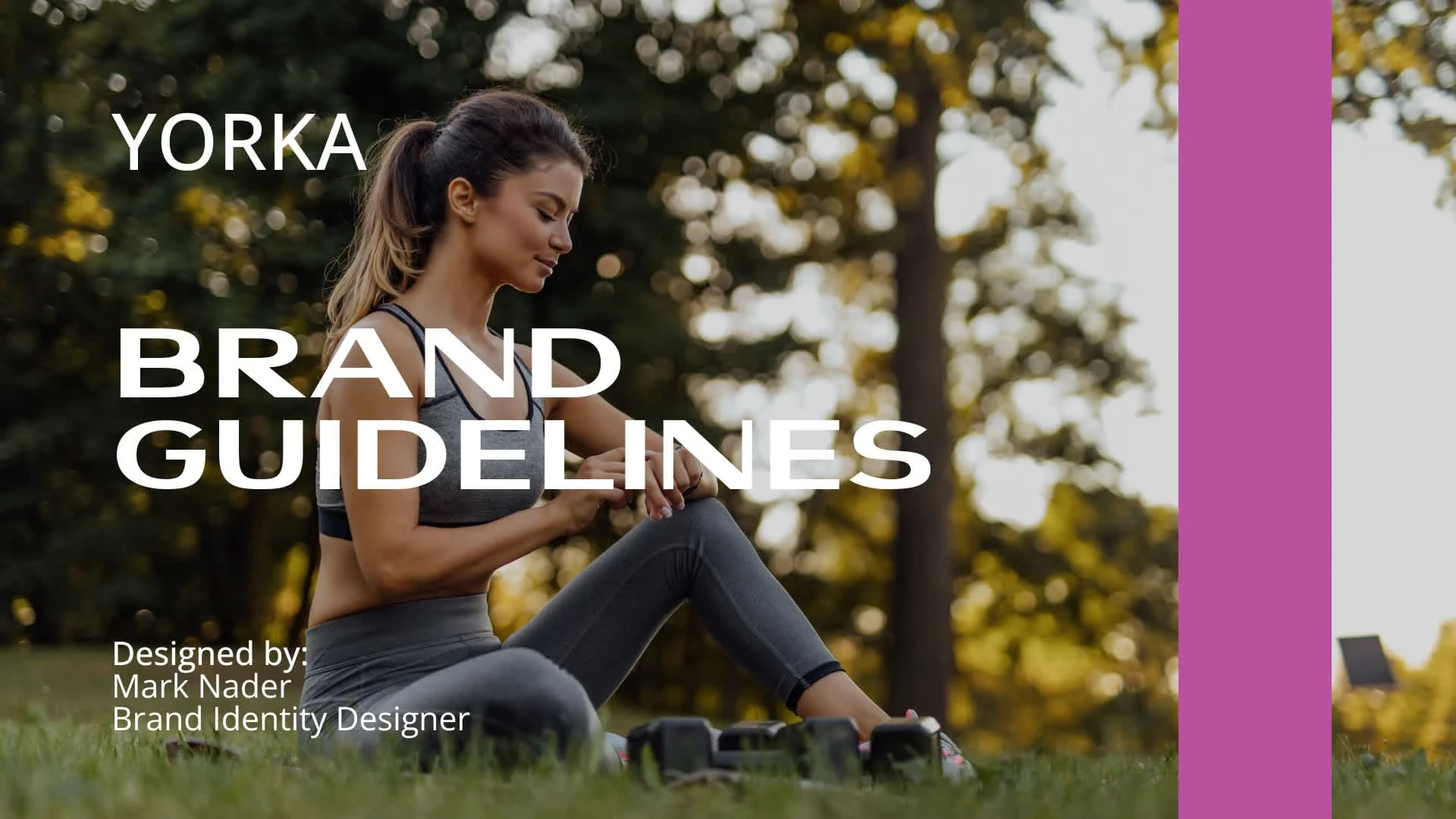
The photography style was crafted to showcase the active and dynamic nature of the brand. High-energy images of individuals wearing YORKA sportswear in various fitness and lifestyle settings were used to reflect the brand’s mission of blending luxury and durability.
5. Designing the Logo
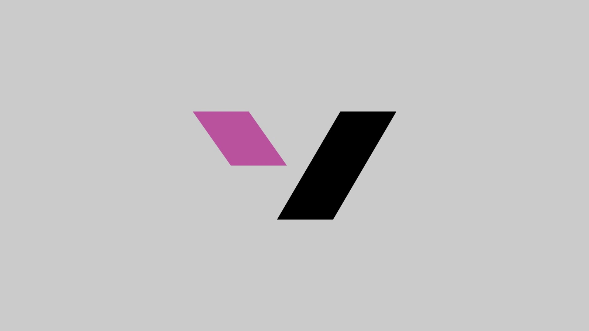
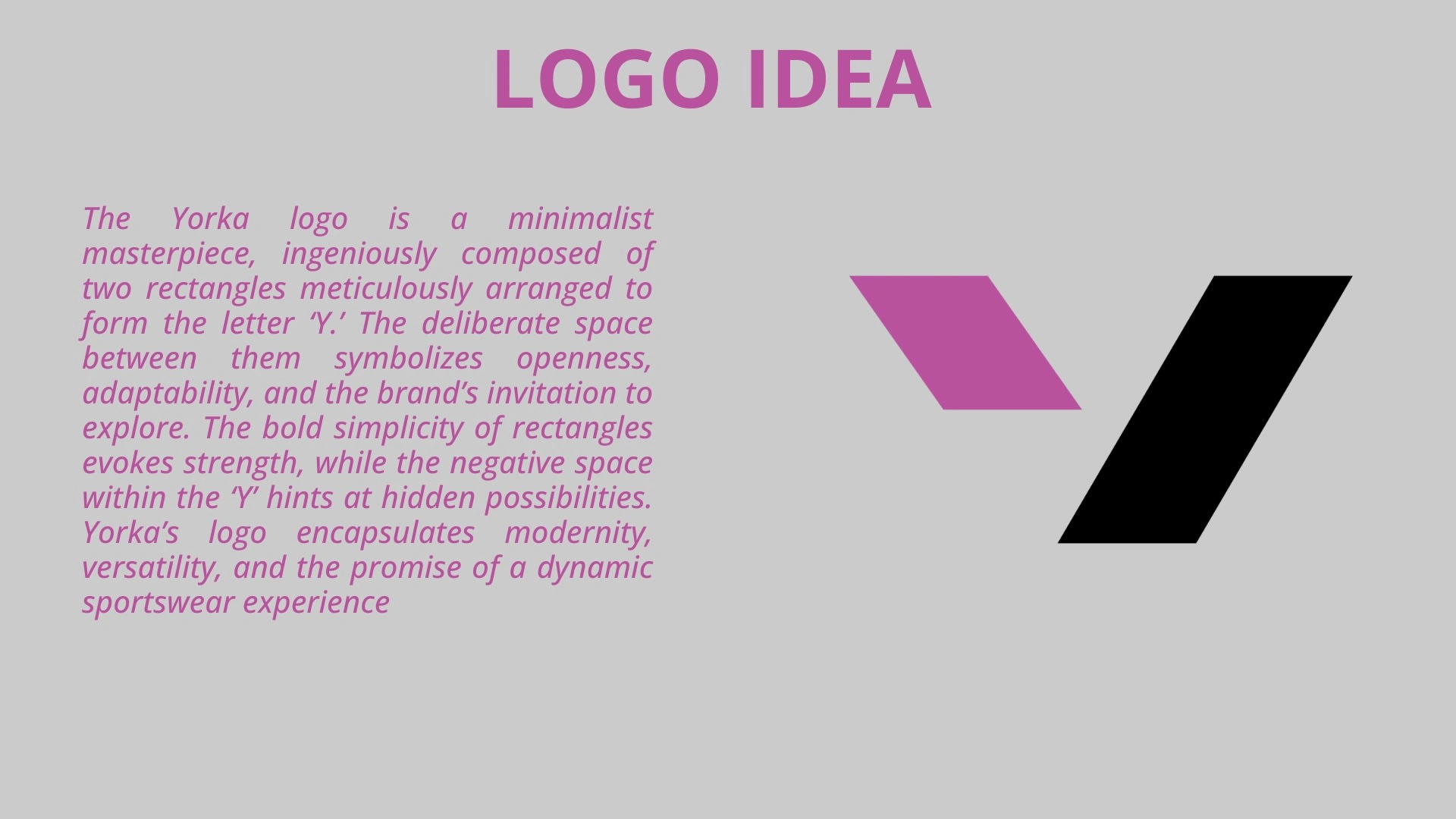
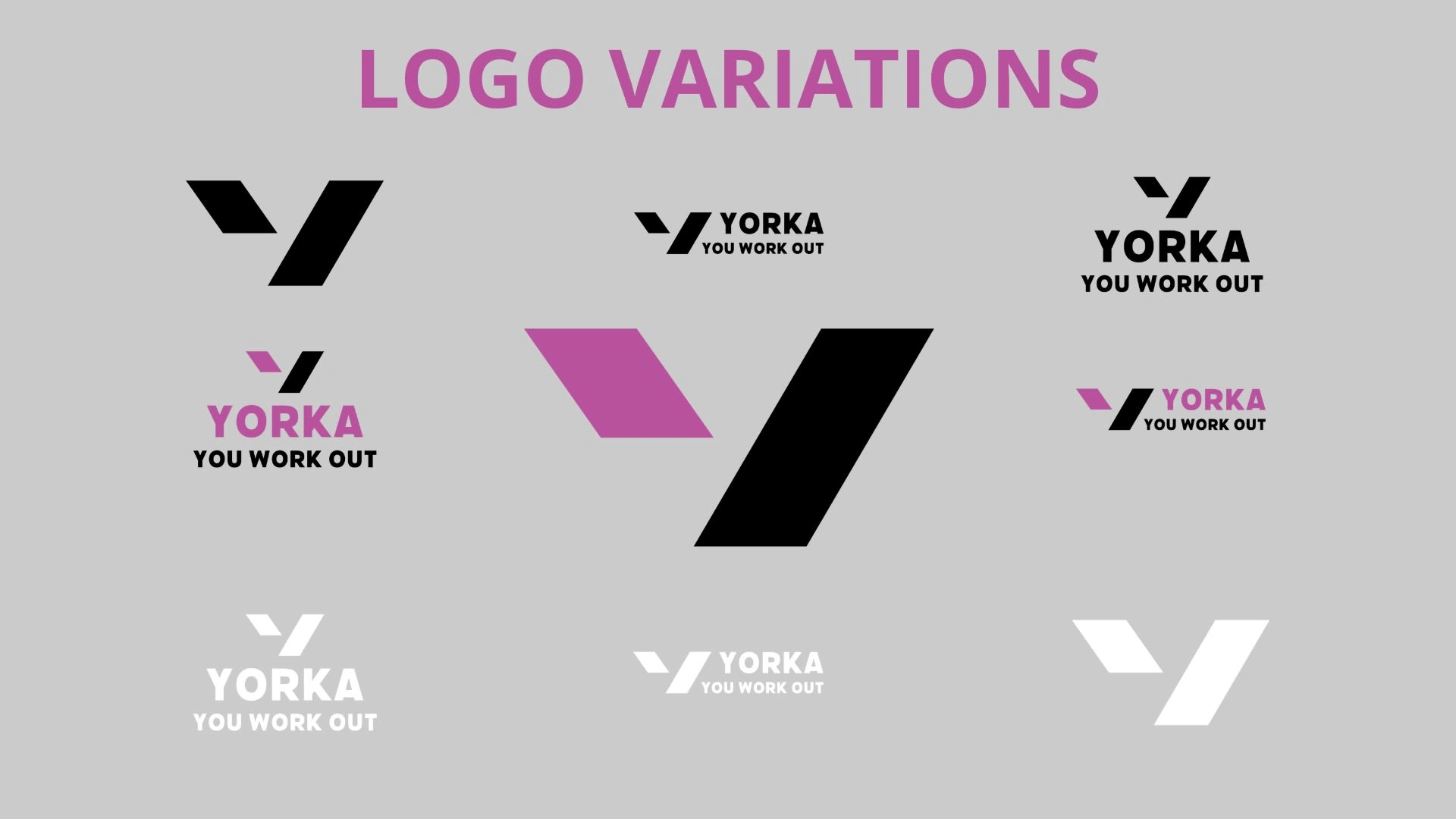
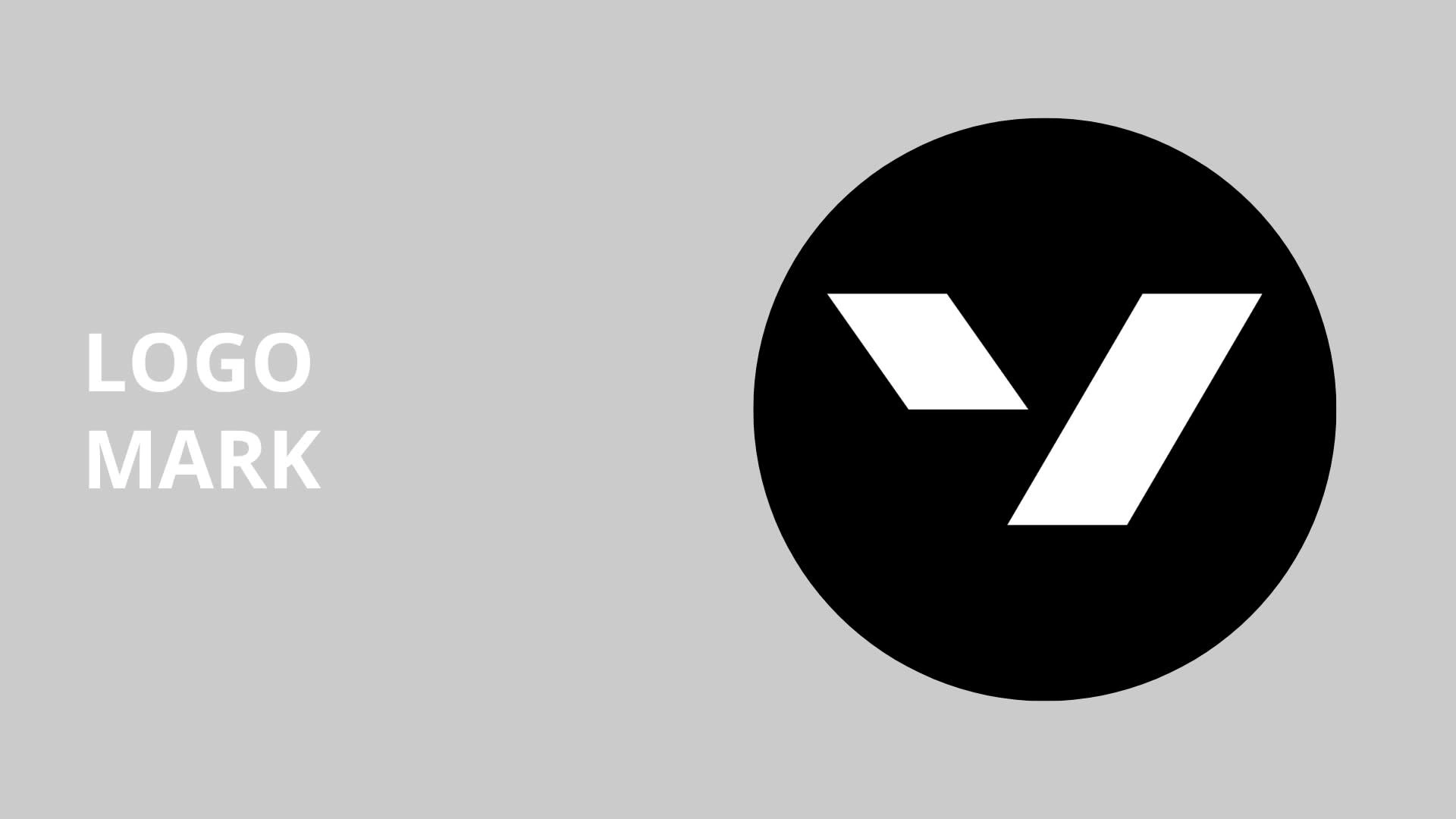
The YORKA logo was designed to be a minimalist masterpiece. It is composed of two rectangles arranged to form the letter ‘Y.’ The space between the rectangles symbolizes openness, adaptability, and an invitation to explore, reflecting the brand’s commitment to modernity and versatility. The bold simplicity of the rectangles represents strength, while the negative space within the ‘Y’ hints at hidden possibilities.
6. Creating Social Media Visuals
Social media visuals were designed to maintain consistency across all digital platforms. The visuals featured the brand’s colors, typography, and energetic imagery to engage the audience and build a strong online presence. The goal was to communicate YORKA’s brand message effectively and attract a community of active, style-conscious individuals.




Like this project
Posted Aug 31, 2024
Designed YORKA’s brand by defining mission, vision, colors, typography, logo, and social media visuals to represent active, stylish, and premium sportswear.

