Mayumi brand identity design
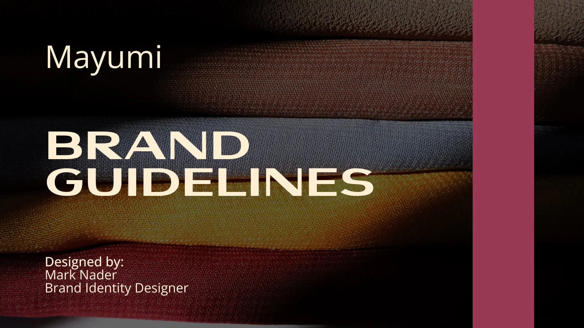
Mayumi brand identity design and guidelines
1. Understanding the Brand's Mission and Vision
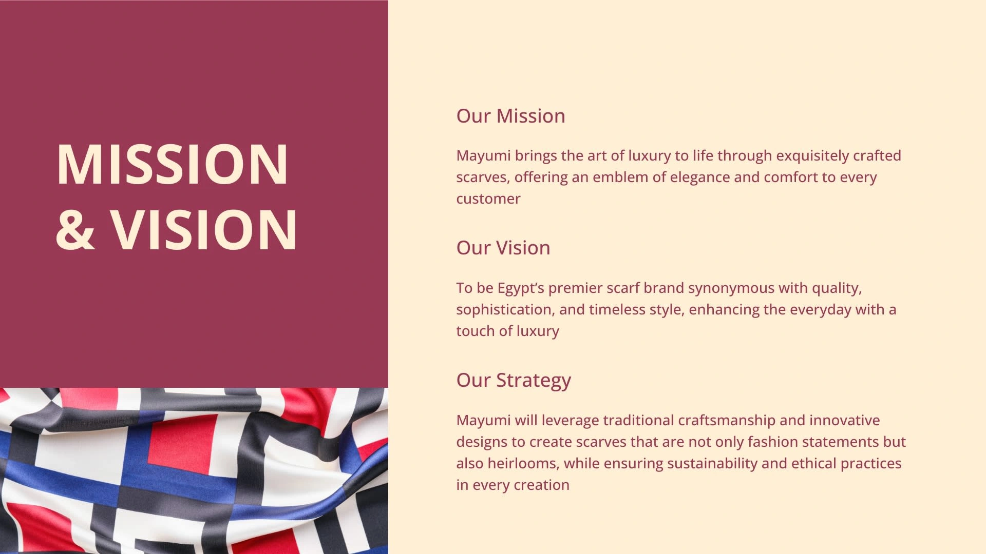
Mission: The mission was to bring the art of luxury to life through exquisitely crafted scarves, offering an emblem of elegance and comfort to every customer. This statement set the foundation for the entire brand, focusing on luxury, craftsmanship, and customer experience.
Vision: The vision was to position MAYUMI as Egypt's premier scarf brand, synonymous with quality, sophistication, and timeless style. This vision aimed to elevate the everyday with a touch of luxury, guiding the brand's future direction.
Strategy: The strategy revolved around leveraging traditional craftsmanship and innovative designs. The focus was on creating scarves that are not only fashion statements but also heirlooms, emphasizing sustainability and ethical practices.
2. Defining the Brand's Color Palette
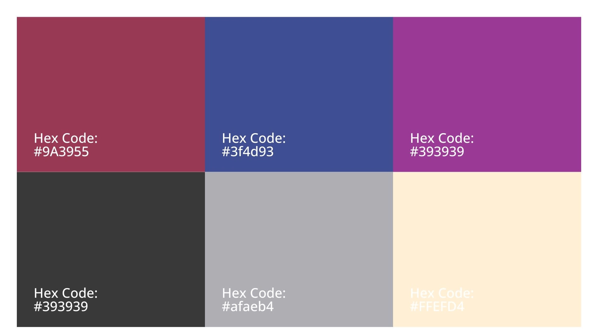
A cohesive color palette was chosen to reflect the brand's essence. The selected colors included dark and sophisticated hues like #393939 (a deep gray), #9A3955 (a rich maroon), #afaeb4 (a muted lavender), #3f4d93 (a deep blue), and #FFEFD4 (a soft beige). These colors were chosen to evoke a sense of luxury, sophistication, and timelessness, aligning with the brand's vision.
3. Selecting Typography
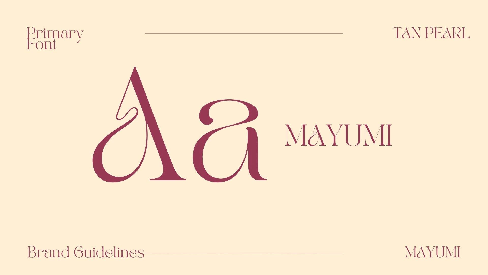
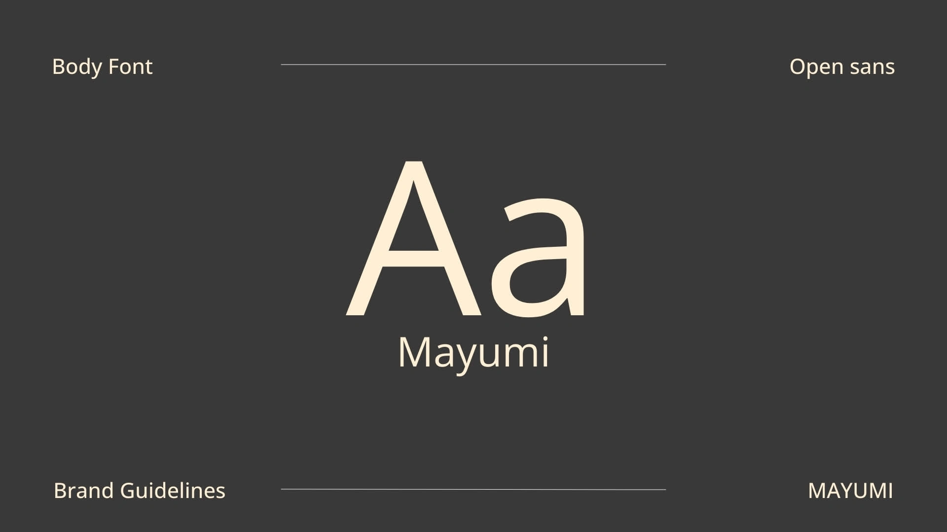
The typography chosen for MAYUMI included a primary font, TAN PEARL, which gives a luxurious and modern feel to the brand's visual identity. For body text, Open Sans was selected for its readability and clean appearance, ensuring all brand materials are easily accessible and visually appealing.
4. Creating a Photography Style
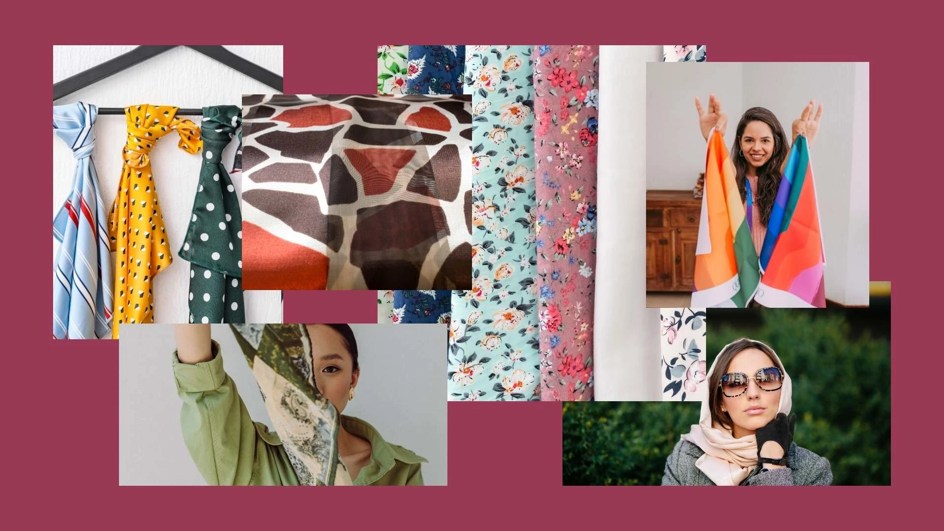
The photography style was carefully curated to reflect the brand’s luxury and sophistication. High-quality images showcasing the scarves in various settings, highlighting their craftsmanship and elegance, were selected. The photography aimed to evoke emotions and connect with the brand's target audience, enhancing the brand’s storytelling.
5. Designing the Logo
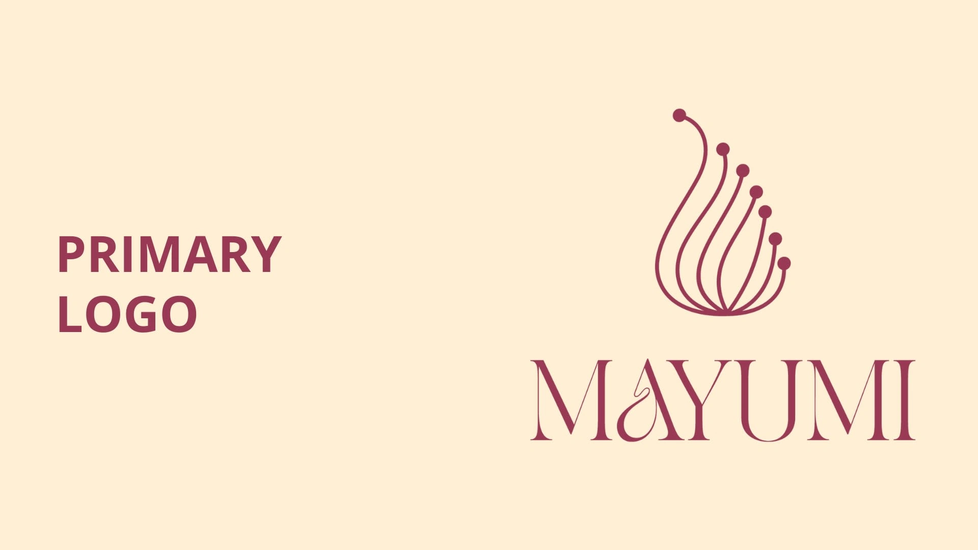
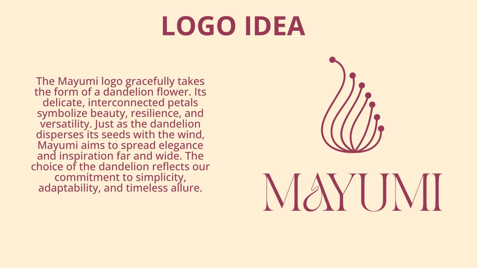
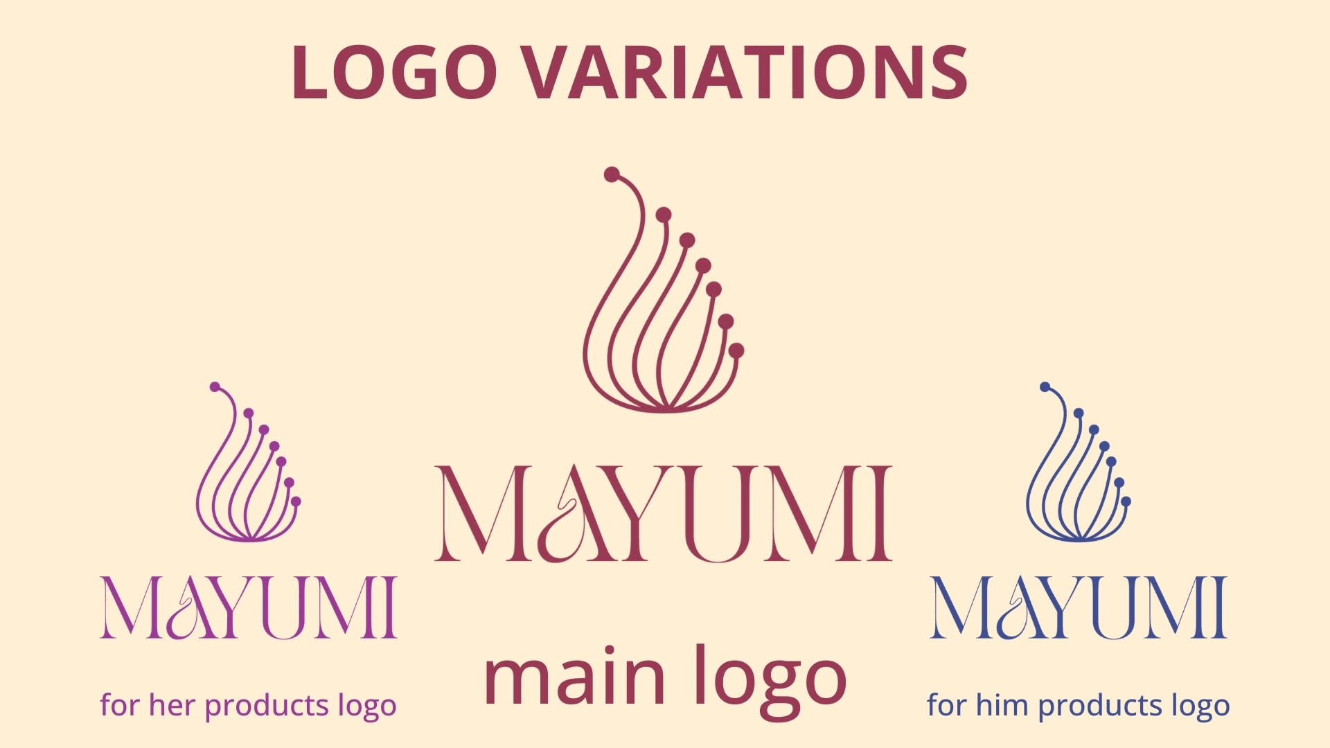
The logo design was inspired by the dandelion flower, with its delicate and interconnected petals symbolizing beauty, resilience, and versatility. The choice of the dandelion reflects the brand’s commitment to simplicity, adaptability, and timeless allure. Multiple logo variations were created for different applications, such as a primary logo, product-specific logos, and a logo mark, ensuring consistency across all brand materials.
6. Developing Social Media Visuals
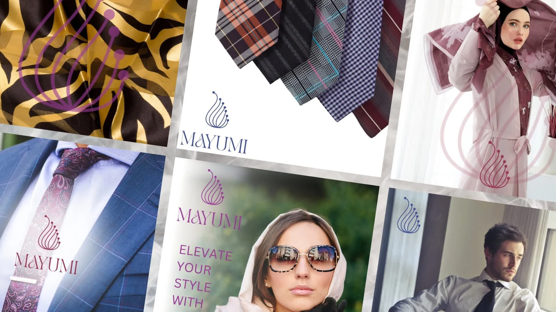
Social media visuals were designed to maintain a consistent brand identity across all digital platforms. The visuals included cohesive use of colors, typography, and imagery that reflected the brand’s luxury and sophistication. The goal was to engage with the audience and build a strong online presence.


Like this project
Posted Aug 31, 2024
Designed MAYUMI’s brand by defining mission, vision, colors, typography, logo, and social media visuals to embody luxury, quality, and timeless style.

