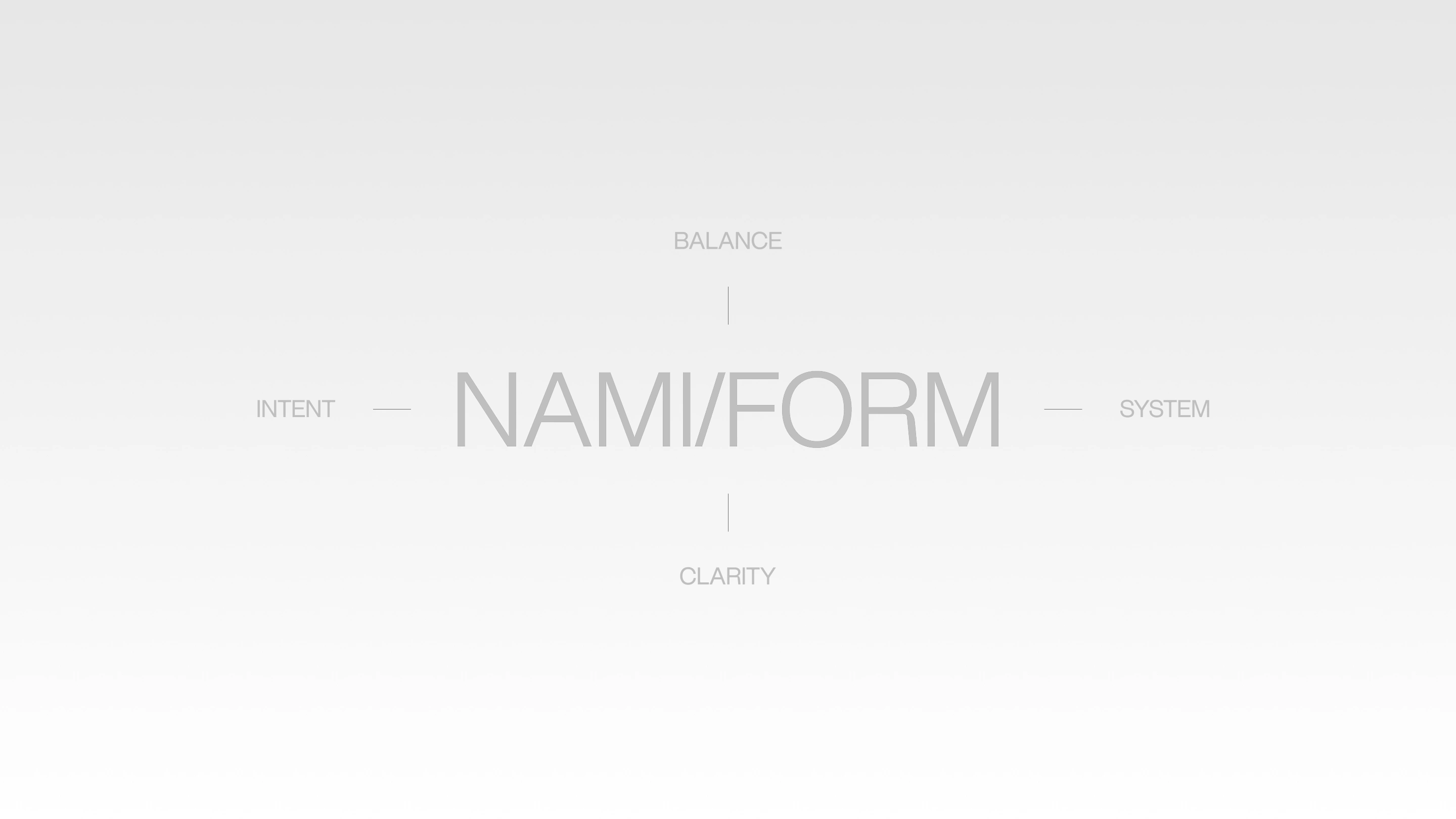
NAMI/FORM® – Brand Identity
Harry Crawler
NAMI/FORM © 2026
[ENG]
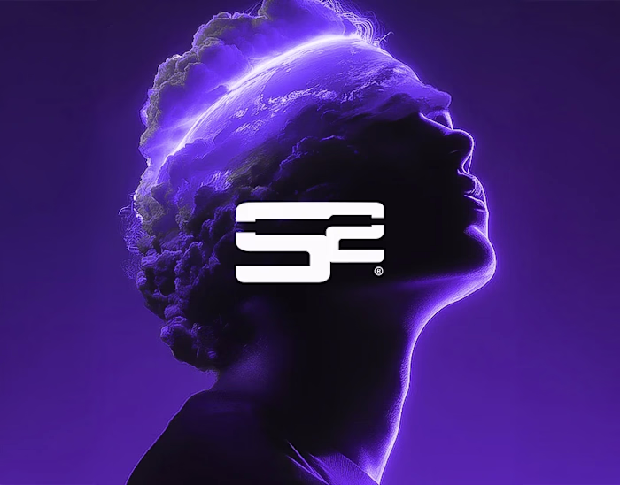
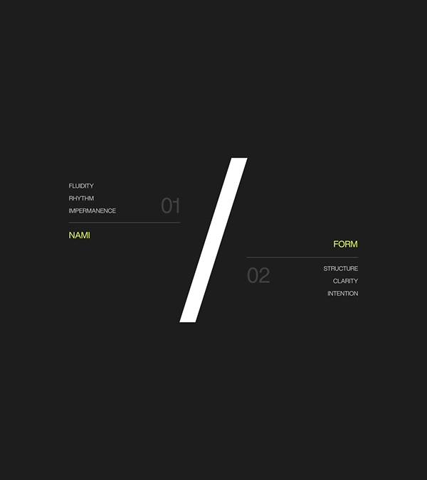
NAMI/FORM© is a design studio built on the tension between movement and structure—where instinct meets intention, and form emerges through restraint.
Rooted in Japanese design philosophies such as Ma, Wabi-Sabi, and Kanso, the studio approaches visual identity as an act of reduction rather than addition, shaping work that feels both precise and alive. Every element is considered, every absence deliberate. The result is a design language defined not by excess, but by clarity, rhythm, and the quiet power of space.
Design — Harry Crawler
Studio — Mosaic Made
Year — 2026
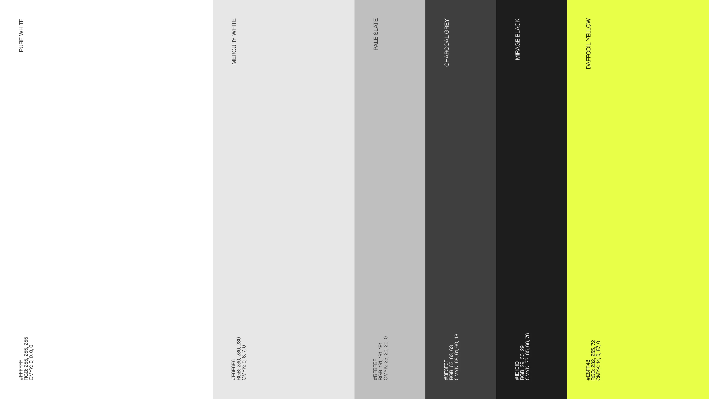
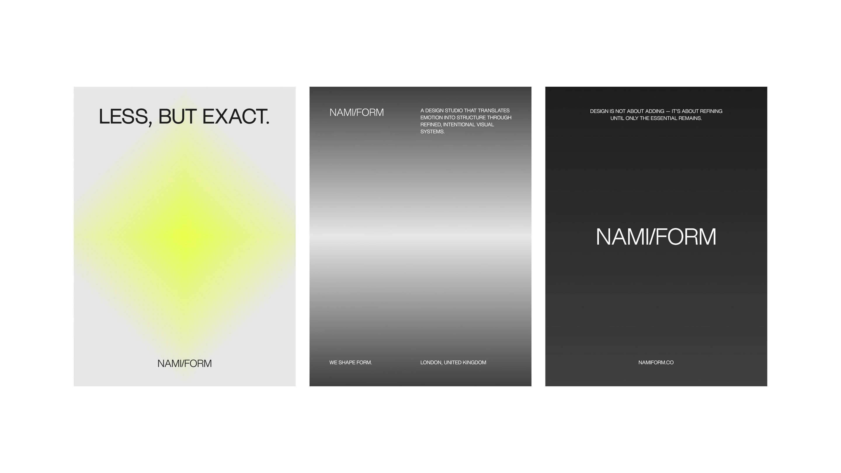
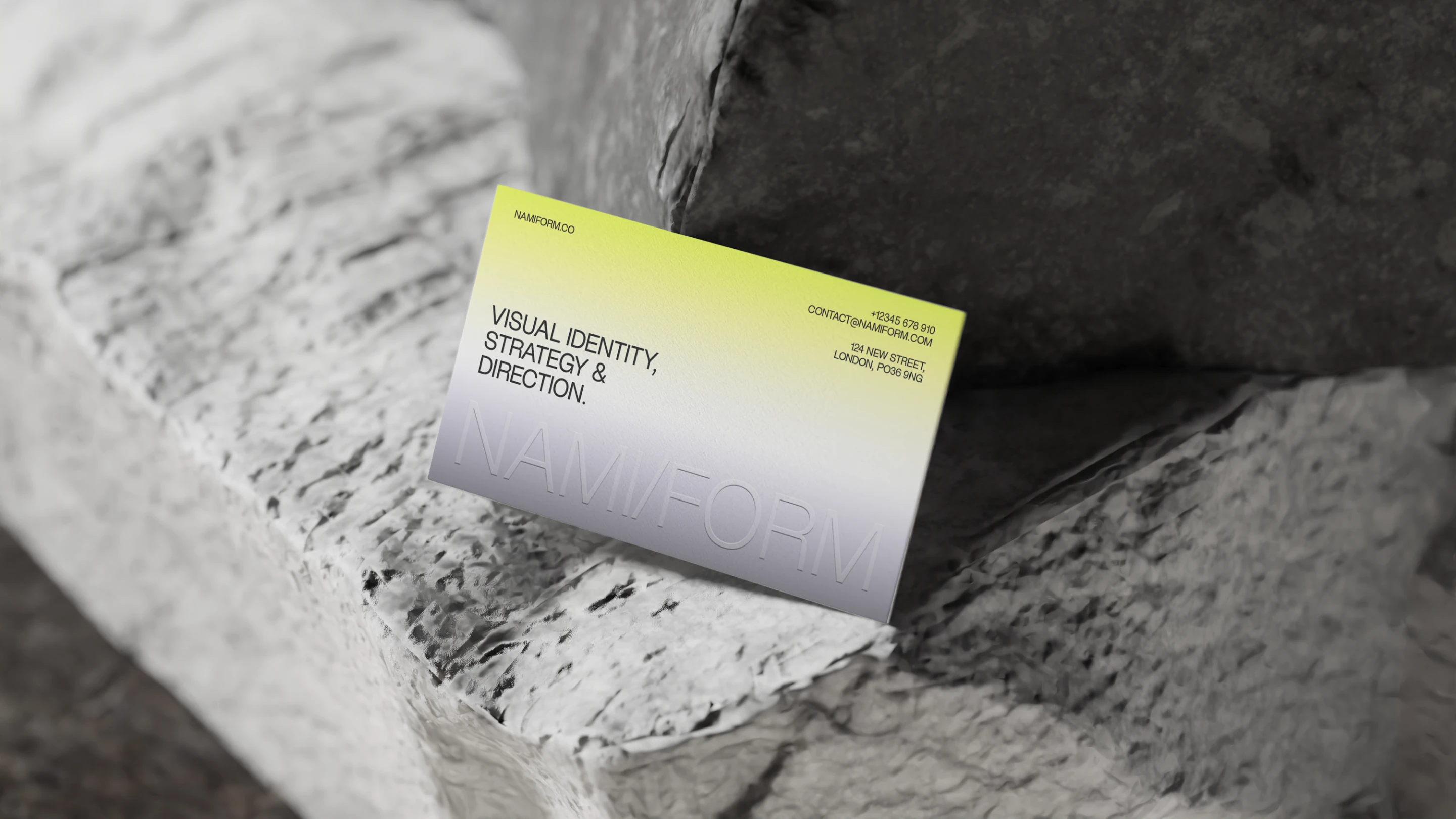
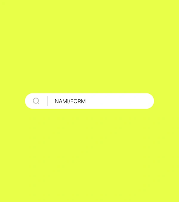
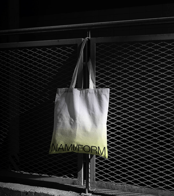
COLOR SYSTEM
This palette reflects NAMI/FORM’s commitment to restraint, balance, and intentional contrast. A foundation of soft whites and layered greys establishes a calm, neutral field—allowing space to function as an active design element rather than a backdrop. These tones create clarity and stillness, supporting compositions that feel precise and considered.
In contrast, the introduction of a vivid yellow acts as a controlled disruption—an accent used sparingly to create tension, draw focus, and introduce rhythm within the system. The result is a palette that embodies both quiet discipline and moments of energy, reinforcing the studio’s balance between form and flow.
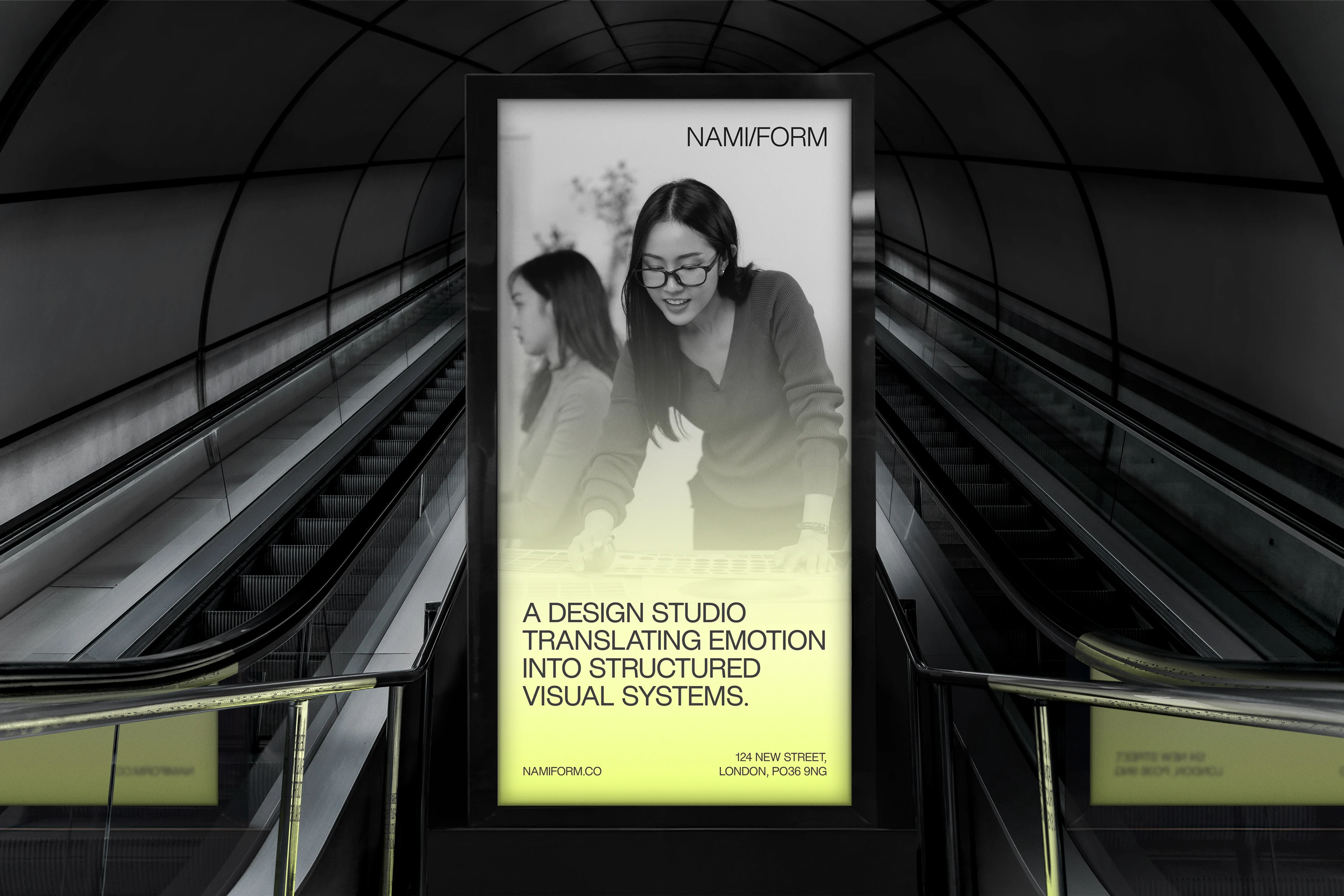
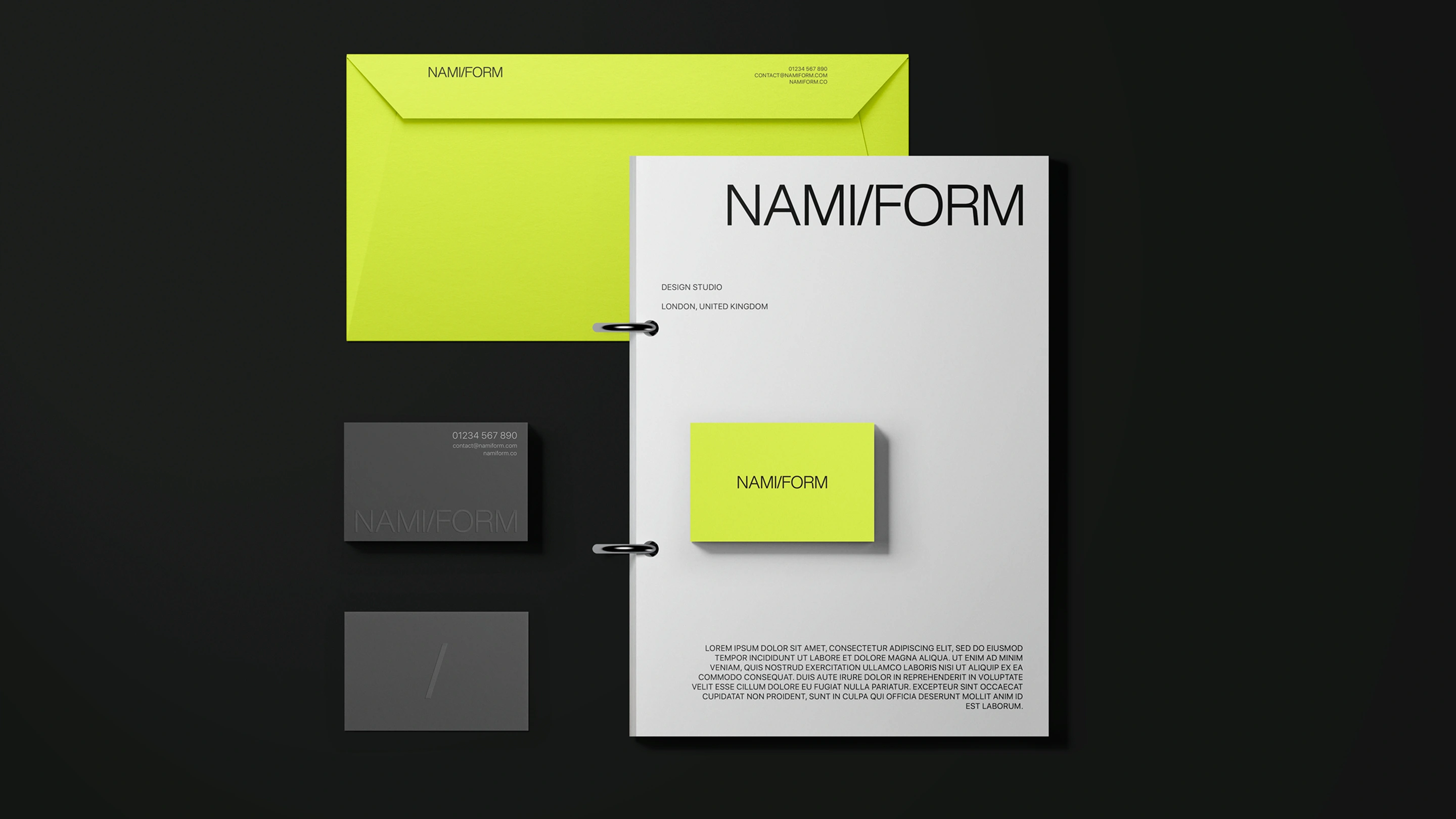
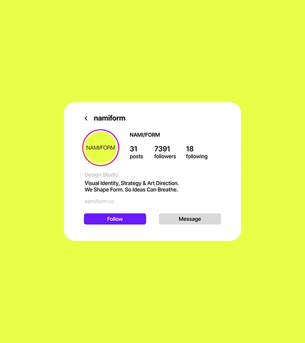
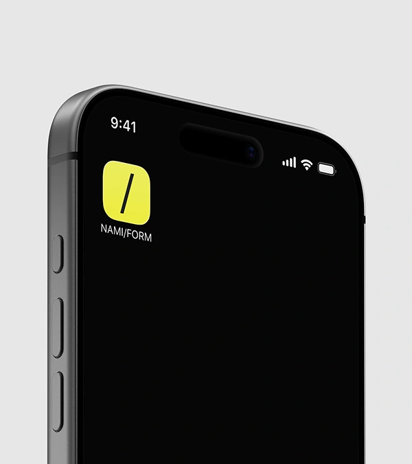
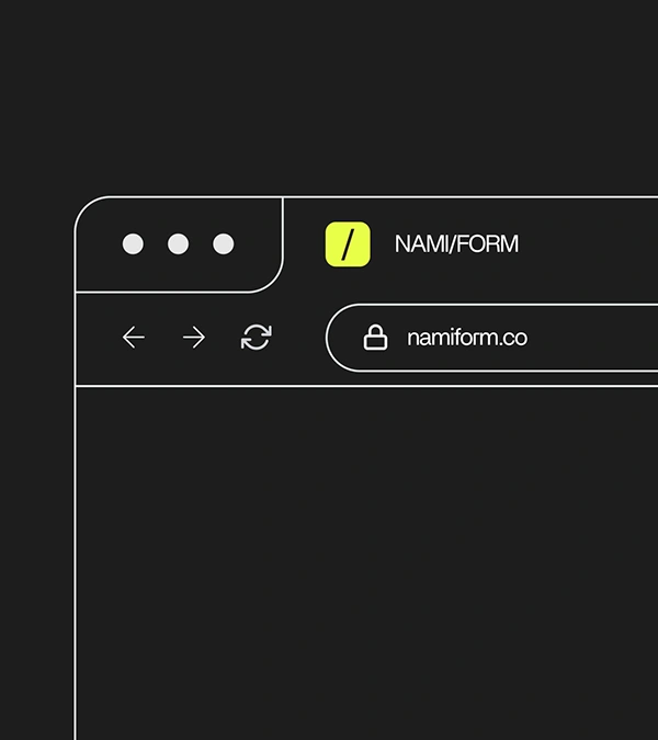
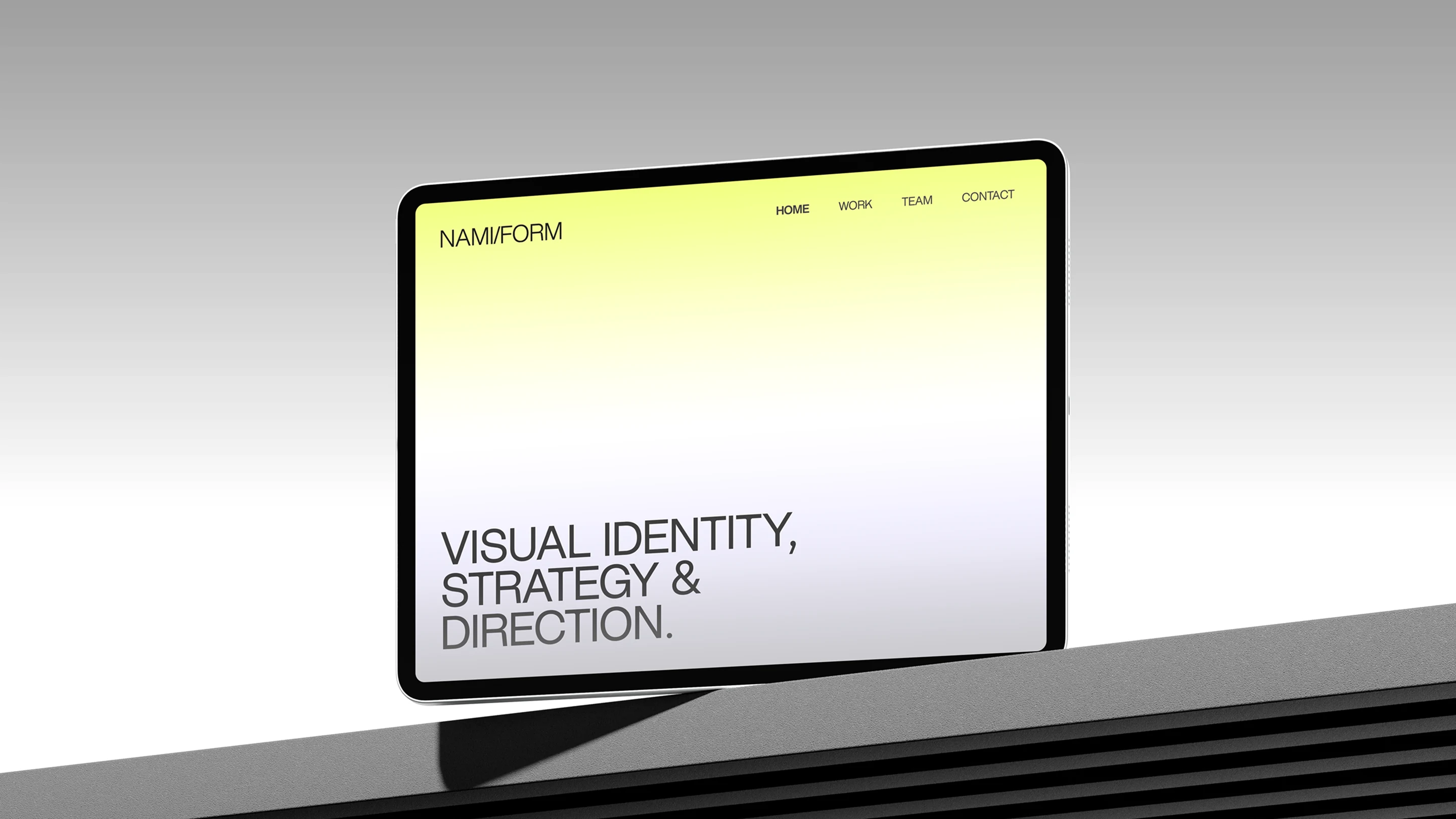
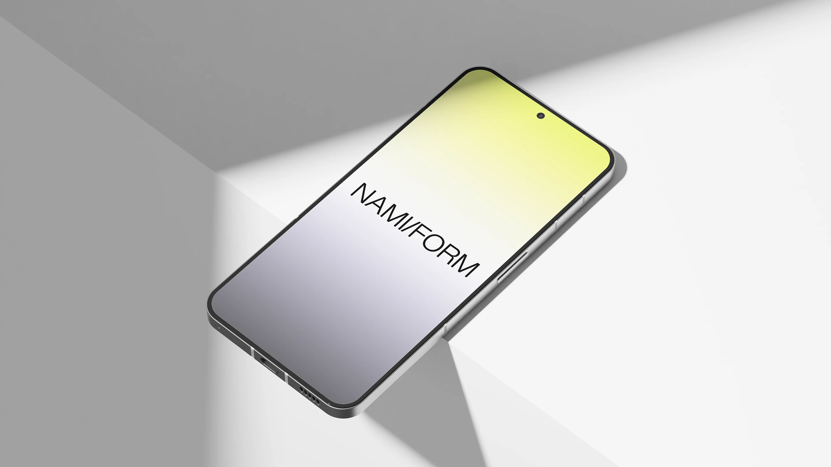
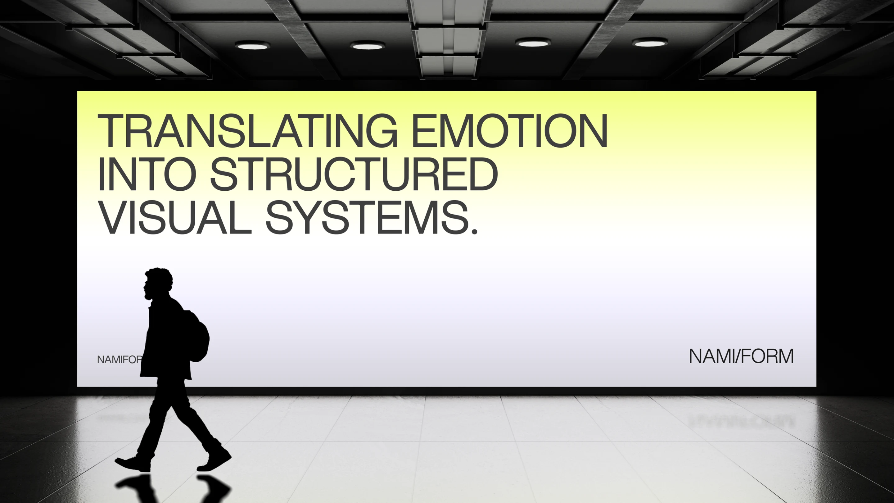
BRAND APPLICATION
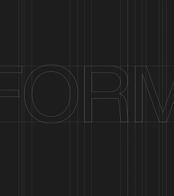
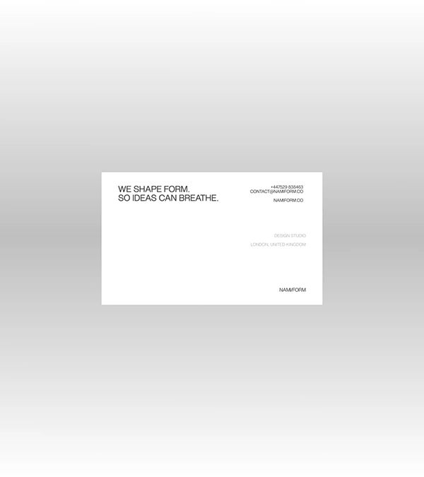
The NAMI/FORM visual system is applied with consistency through disciplined use of colour, space, and restraint across all social and media touchpoints. Neutral tones form the primary foundation, creating a calm, structured backdrop that allows content to breathe, while the accent yellow is used sparingly to signal moments of emphasis, hierarchy, or motion.
Brand assets—typography, grid, and spacing—are treated as a cohesive system rather than decorative elements, ensuring each composition feels intentional and aligned. Across social graphics, this results in a rhythm of quiet, minimal layouts punctuated by controlled contrast, maintaining a balance between consistency and variation while preserving the brand’s distinct, understated presence.
Thank you for viewing!
Design — Harry Crawler
Studio — Mosaic Made
Contact — ukcrawler@gmail.com
© All rights reserved.
Like this project
Posted Apr 20, 2026