Redesigning the way argentinian choose their doctor
Overview
Solo project done over 11 weeks. Completed at Coderhouse UX/UI bootcamp. The project goal was to redising an existing product. Project´s company was of my choice
Scope
Role: Designer and researcher
Industry: medicine and health
Duration: April - June, 2023 (11 weeks)
Tools and platforms: Figma, Notion, Miro, Optimal workshop
Purpose: why Osde?
I was looking for a product that I personally use and interact with regularly, so I can have a deep understanding of its strengths and weaknesses.
I knew that if I wanted to make real changes, I needed a product with real problems. That was my motivation. Osde allowed me to implement tangible and impactful improvements, without having to modify the entire user experience from scratch.
My goal was not to introduce subjective enhancements based solely on my preferences, but rather to select a product where a real redesign would significantly enhance user usability.
Problem definition and constraits
The problem
Osde's medical appointment app aims to simplify the time and effort spent choosing a doctor. We have observed that the product does not meet these objectives, which is causing users to associate Osde with a confusing, extensive and difficult to use service.
How could we improve the Osde app so that our CX is more successful based on the number of users actively using the application?
The assumption
We believe users schedule their medical appointments by phone and not through the app. We will know we're wrong/right when we see the following feedback from the market:
increased NPS and increased acquisition and retention of older users
The hypothesis
We believe the expected objective (that users can schedule their medical appointment through the application instead of using the phone) will be achieved if people over 60 years of age, with some type of visual or motor limitation, are able to schedule a medical appointment easily. and quickly using accessibility features and exploring comments and reviews from doctors.
Research and experimentation
Moving from doubt to certainty
The goal here was to to validate (or invalidate) our early assumptions, and build based on what we learn. The research is based on 3 key questions
Does this user exist?
Do they have the needs and obstacles we think they do? AKA: are we solving a real problem?
Would they value a solution for this problem? AKA: How serious/painful is the problem we are solving?
Problems faced by the user
Non-essential, confusing and non-scannable information
Hidden and ambiguous CTAs
Overloaded UI
The final result
Ease and speed to make a medical appointment
We managed to make a MVP with an onboarding that gives the user the possibility of changing the font size
We also added a system of comments and reviews about the doctor, so that the user can make an informed decision about who to see.
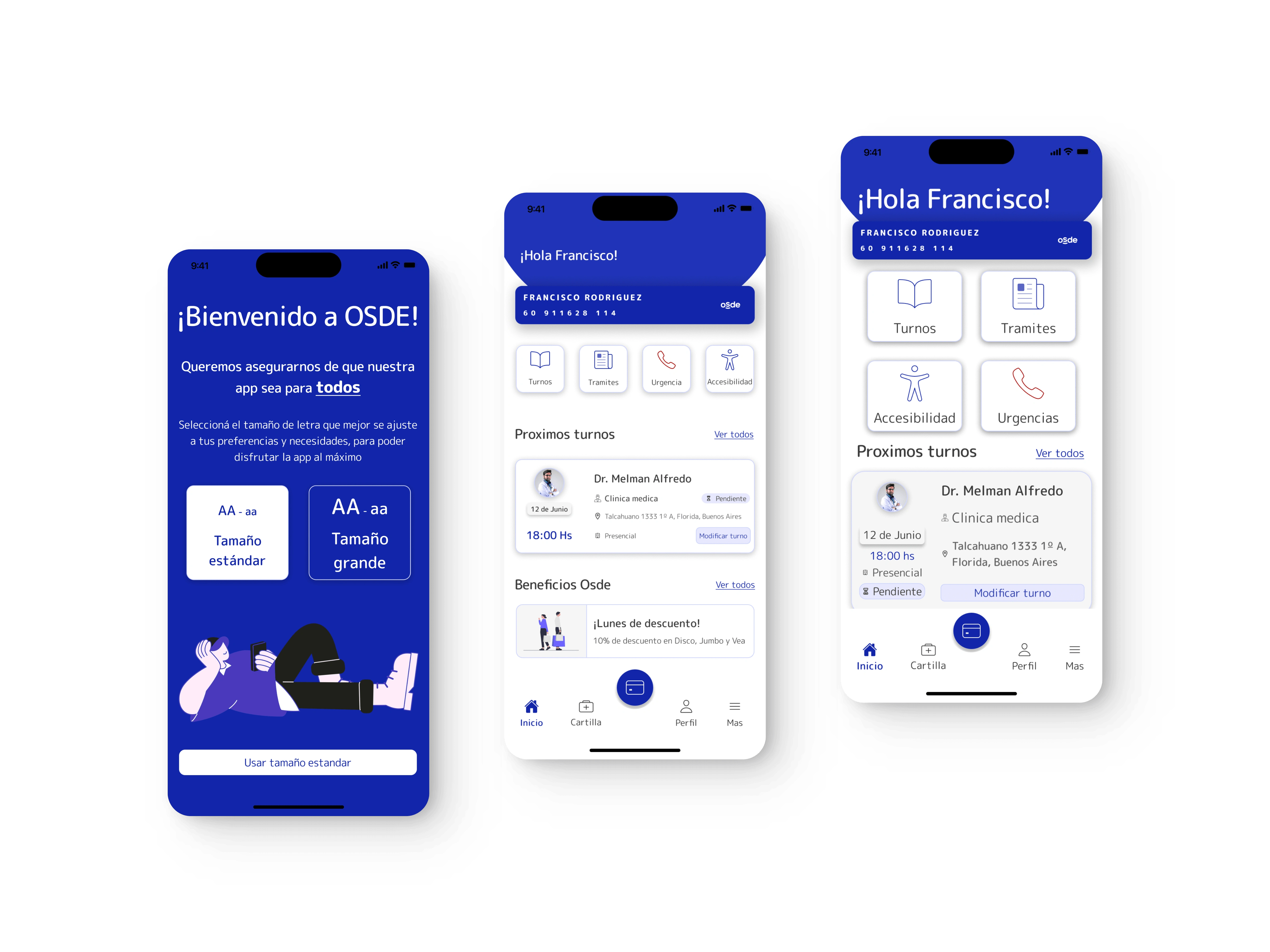
Now the user can navigate the app easily, choosing the font size that best suits them.
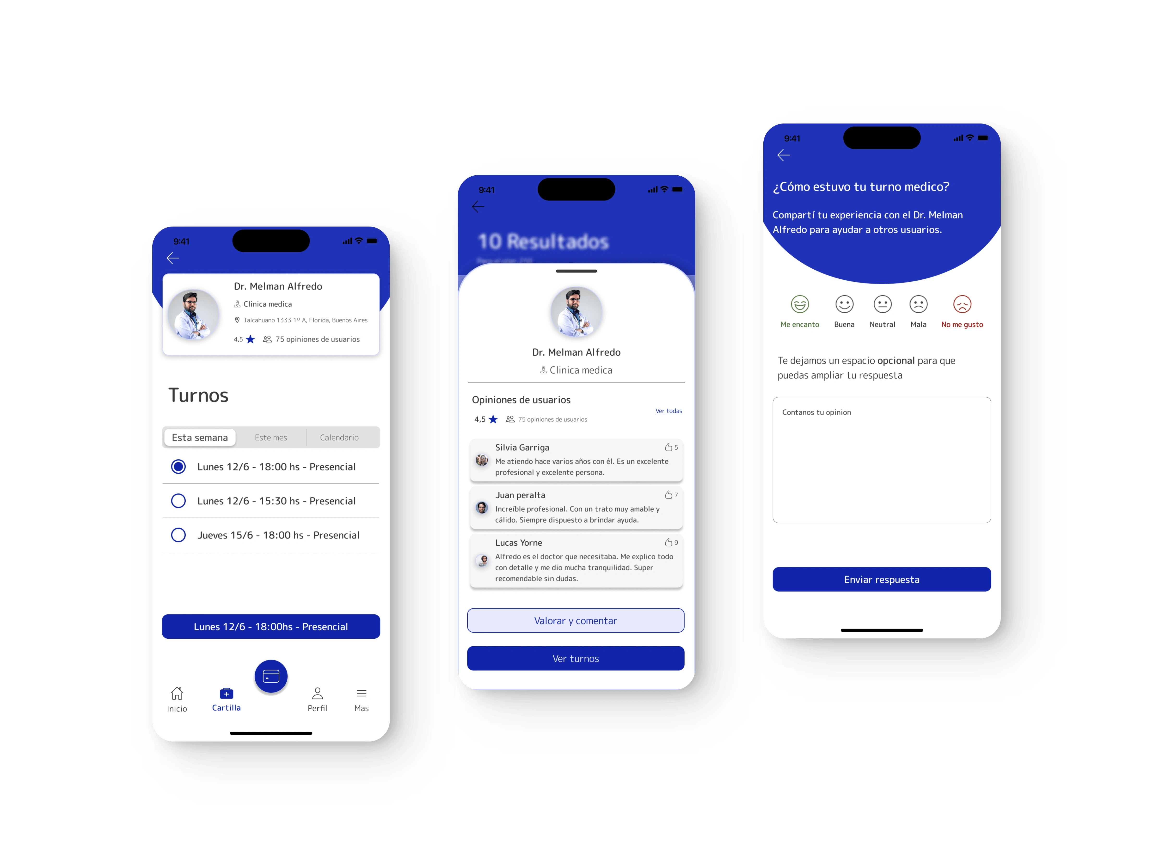
Now the user can choose their trusted doctor, reading opinions from other patients
Like this project
Posted Oct 9, 2023
An app designed for young people, but used by older adults: how to solve this difference?
Likes
0
Views
58
