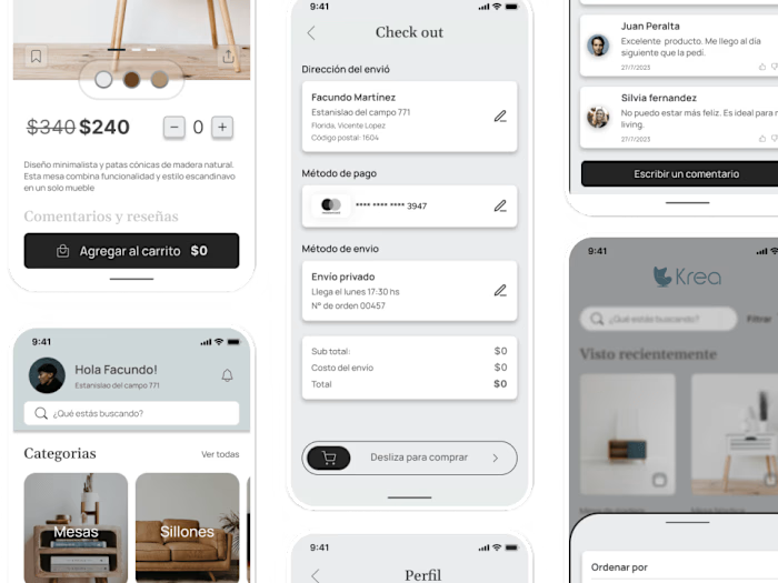
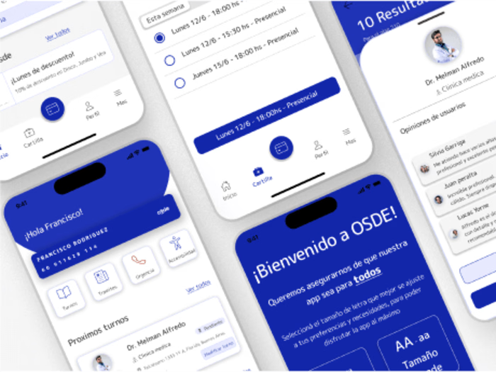
TaDá research plan: understanding the root of the problem
A brilliant solution to the wrong problem can be worse than no solution at all
Overview
Solo project done over 8 weeks. Completed at Coderhouse UX/UI bootcamp.
The context
TaDá is a liquor delivery application from the company Ab Inbev, which works as a home delivery service for drinks from Argentina and other Latin American countries.
The problem
The app is facing a decrease in sales of liquor, especially during periods of low activity, such as days of the week.
The purpose
The purpose of the research is to understand the essential reason for the problem, and to offer concrete and actionable recommendations that improve the user experience, and that are also supported and validated by the research findings.
The goal
Explore the specific areas of the app that generate friction and dissatisfaction in the flow, affecting the reputation of the Tadá app.
Understand users' pain points when purchasing liquor, whether in periods of high and low demand.
The research approach
The research was carried out in 4 stages.
1. Understand user needs and pain points
2. Define the root of the problem
3. Evaluate the user flow to find the point of greatest friction
4. Devise a possible solution and deliver an actionable recommendation
1. Understanding user needs and pain points
We established 3 key questions for the entire investigation:
What are your barriers and pain points?
What do they really want?
What do they really need?
We immersed ourselves in an attempted research process for 2 weeks. The goal was to obtain qualitative and attitudinal (interview) and quantitative (survey) data about the purchasing process (why, how and when they buy liquor) and about the last experience using the app.
2. Defining a strategy
The next step was to understand, analyze and synthesize the information collected. For this we use: User personas and Empathy map
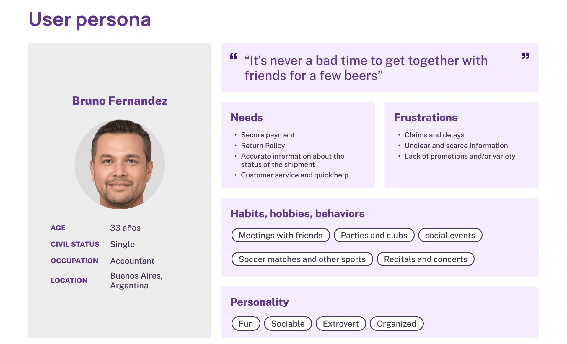
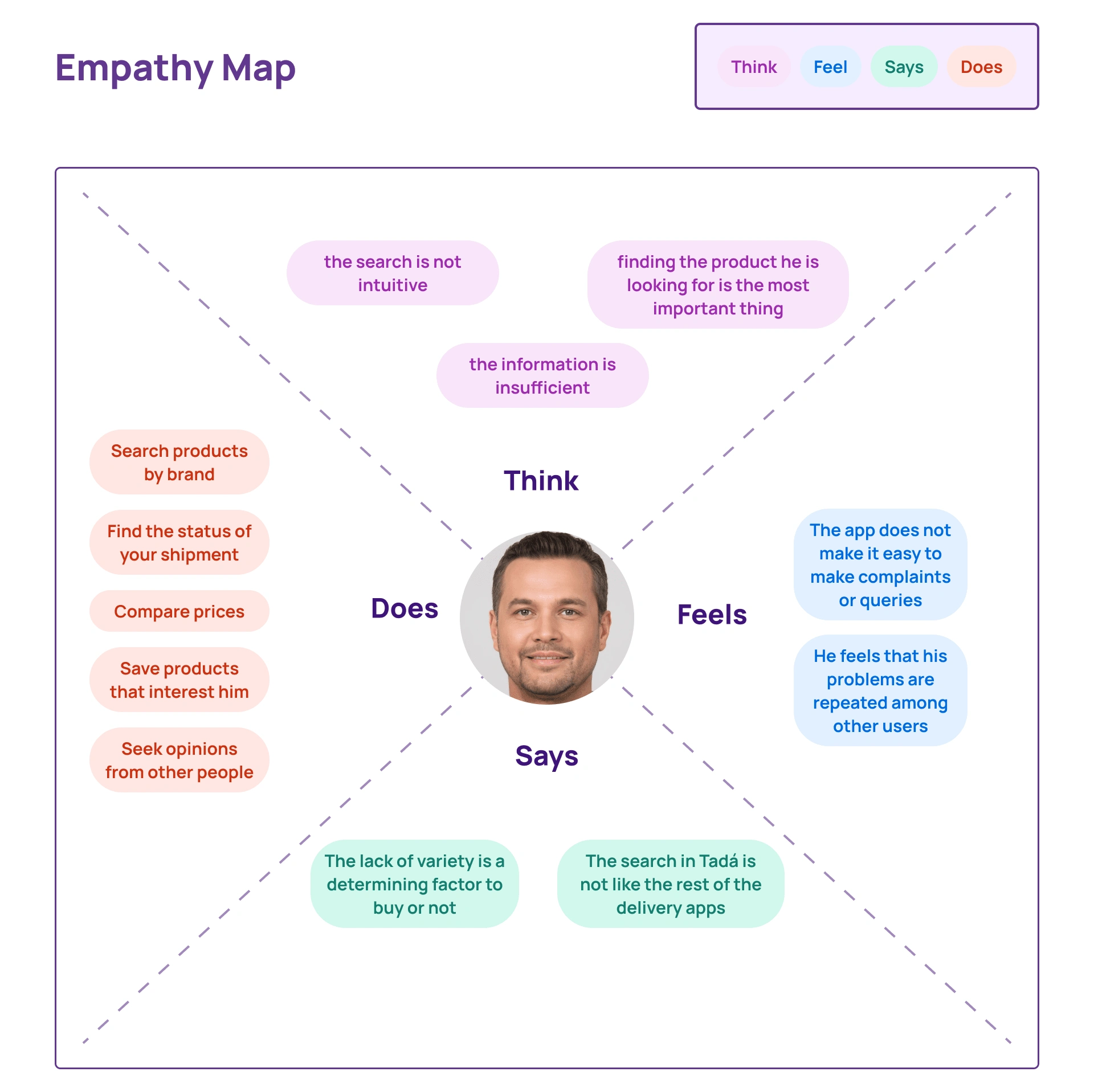
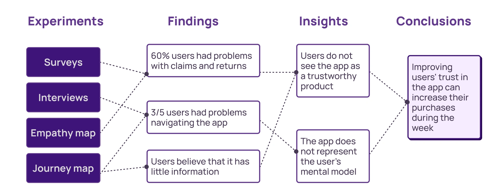
Atomic research: the research results
3. Evaluating the user flow
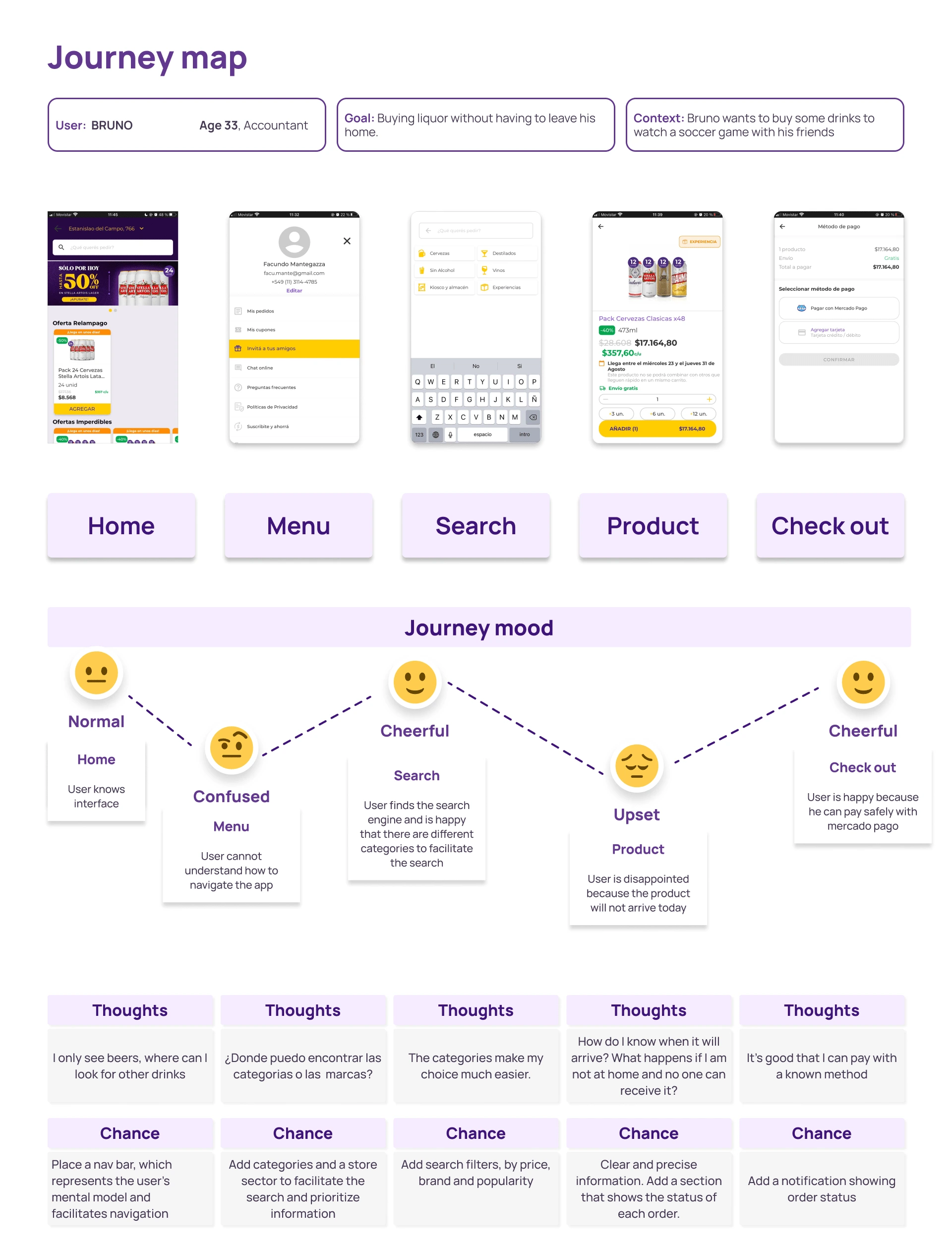
We use co-design tools, such as journey maps to empathize with the user, knowing exactly how they feel when using the app.
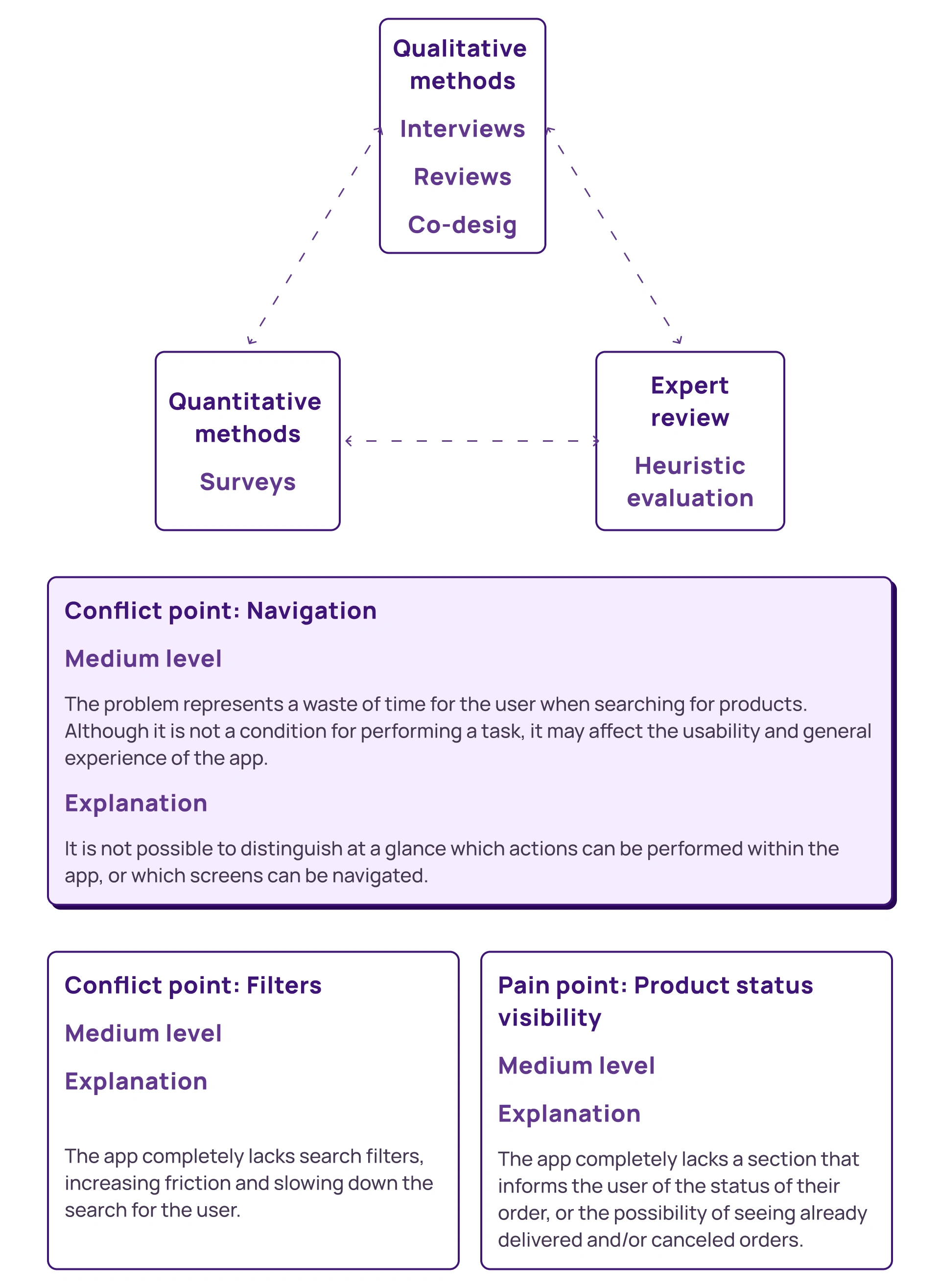
Based on all the information collected, we defined which was the point of greatest friction in the flow.
4. Devising the solution
HMW: How might we?
How could we improve user trust in the app?
How could we improve navigation so that information is scannable and easy to access?
How could we improve product status visibility?
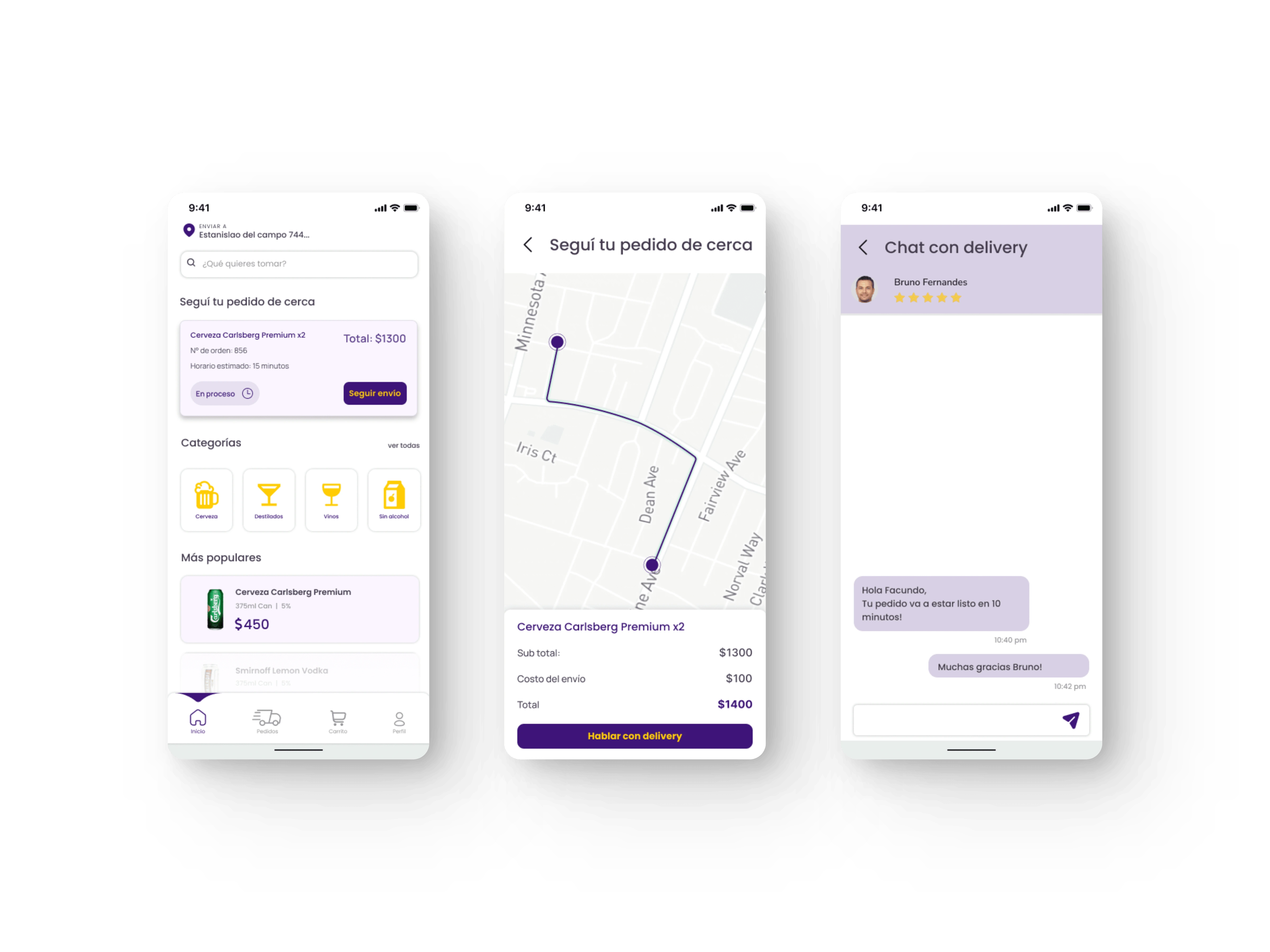
A. We added a card at home that allows the user to see the status of their product and track the shipment. B.We added a real-time map to reduce the feeling of waiting. C. A direct chat was added with the delivery
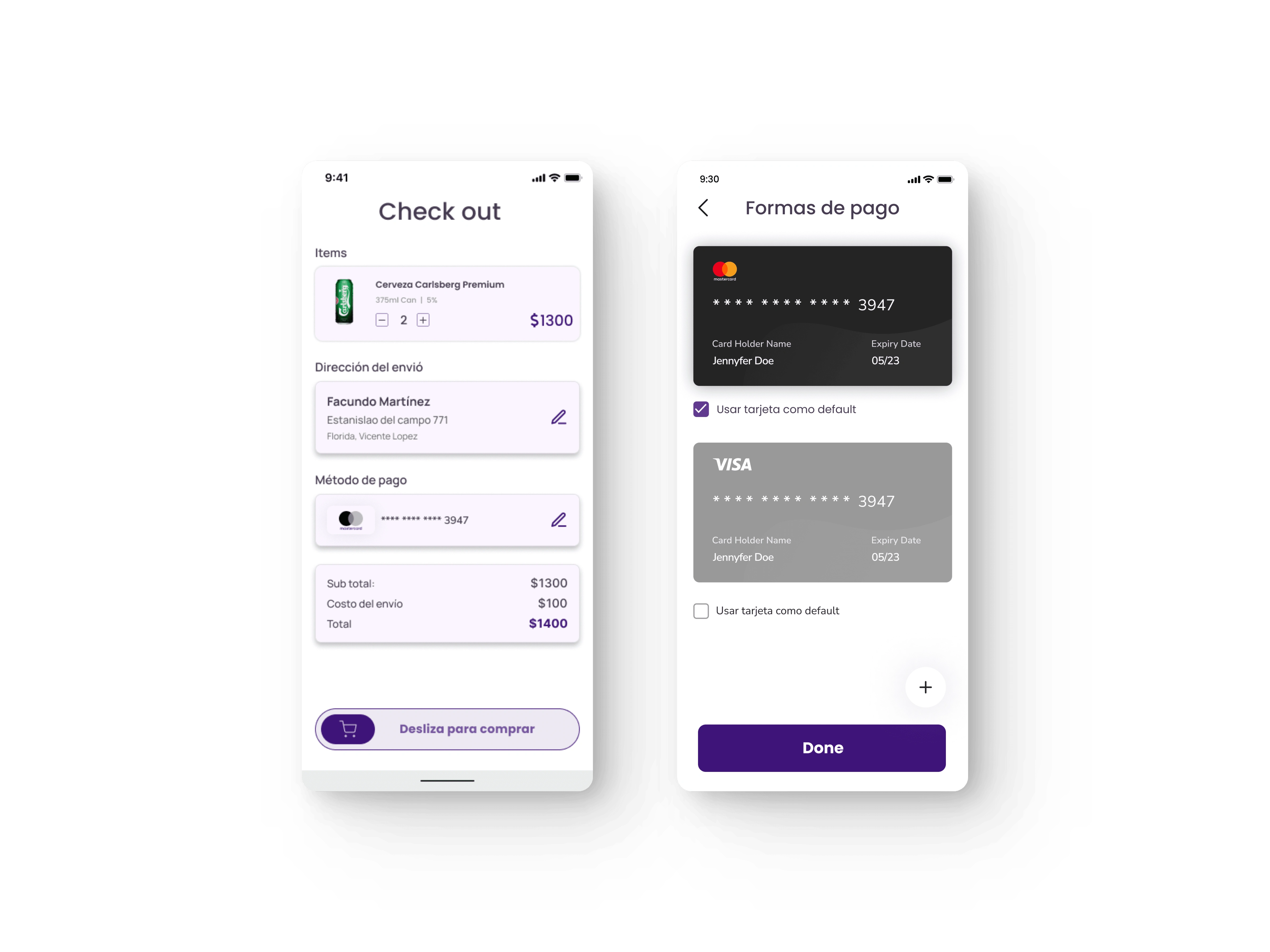
A. A clear check out, which centralizes all the information necessary for the user. B. An easy, fast and secure way to choose the payment method.
Final Conclusion and Actionable Recommendations
Based on the research carried out, and all the information collected, analyzed and documented, it can be considered that both the lack of trust of users in the app, together with the friction generated during navigation and searching for products, both seem to be the essential reasons of the research problem, and the main reason why users stopped placing orders in the app.
It is recommended to do an A/B test with the objective of validating or invalidating the possible solution. It would be expected that with these improvements, user confidence in the app would increase, solving the initial problem.
Like this project
Posted Oct 14, 2023
Research plan to understand the essential reason for Tada's sales decline. Our main assumption: lack of user trust in the app.
Likes
1
Views
37

