Built with Lummi
Ben's Vault: Digital Asset Portfolio Landing Page

Raymond A.


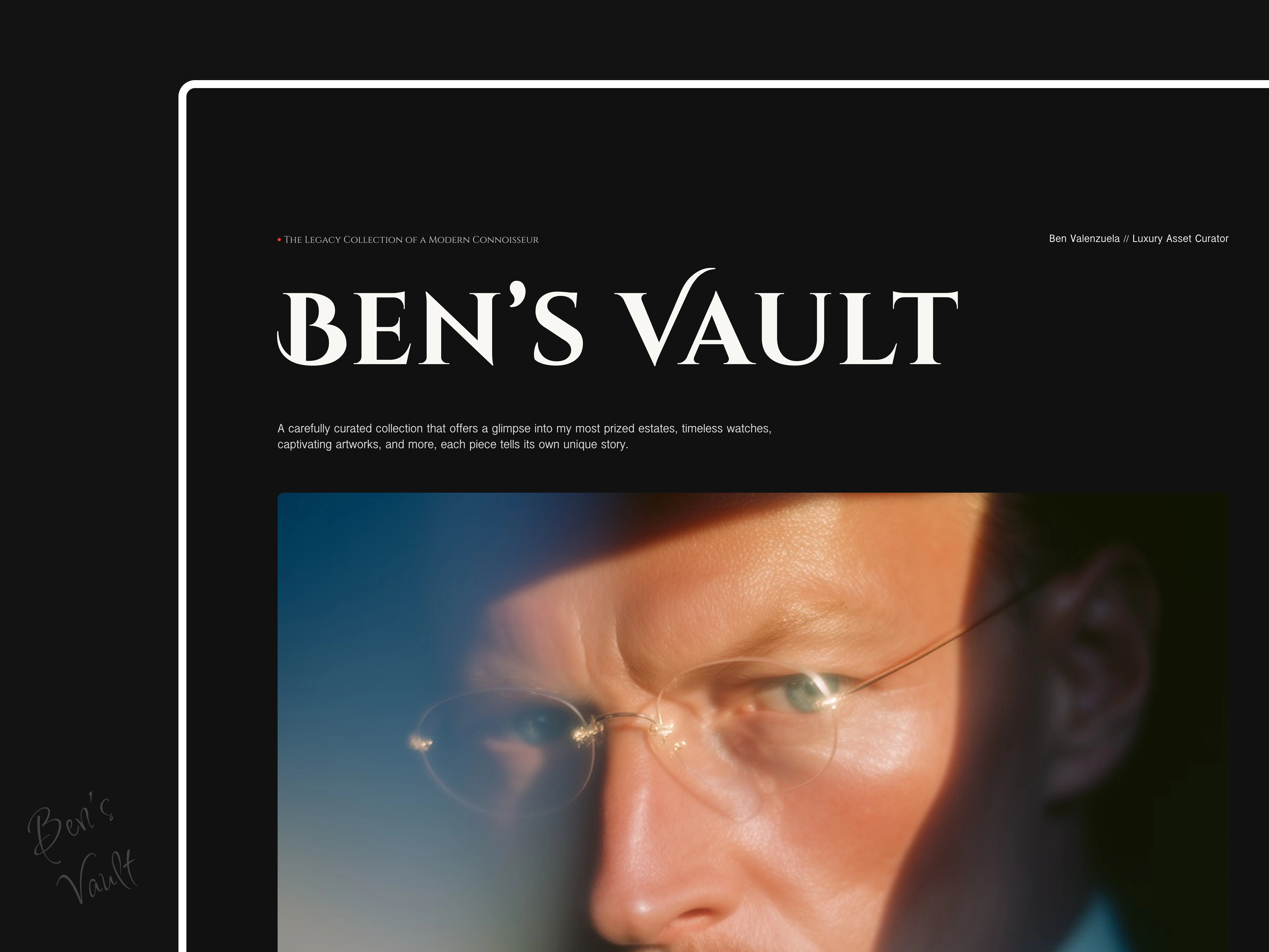
Ben's Vault: A Curated Showcase of Timeless Assets
Ben’s Vault is a digital archive of exclusive, high-value assets from rare timepieces and luxury automobiles to heirloom art, fine jewelry, and investment-grade properties.
More than a portfolio, it’s a curated window into a life of taste, intention, and legacy.
For this project, I designed and developed a polished, immersive experience using Framer and Lummi. One that captures both the richness of the collection of Ben and the restraint of refined luxury.
Each section was crafted to feel personal yet prestigious, turning a simple website into a story-driven asset vault.
Client: Ben
Role: Designer & Framer Developer
Tools: Framer, Figma, Lummi
Deliverables:
Fully responsive, high-impact portfolio site
Minimal, editorial-inspired design with images that communicate
Asset cards with built-in motion and hierarchy
Flexible layout for future collection growth
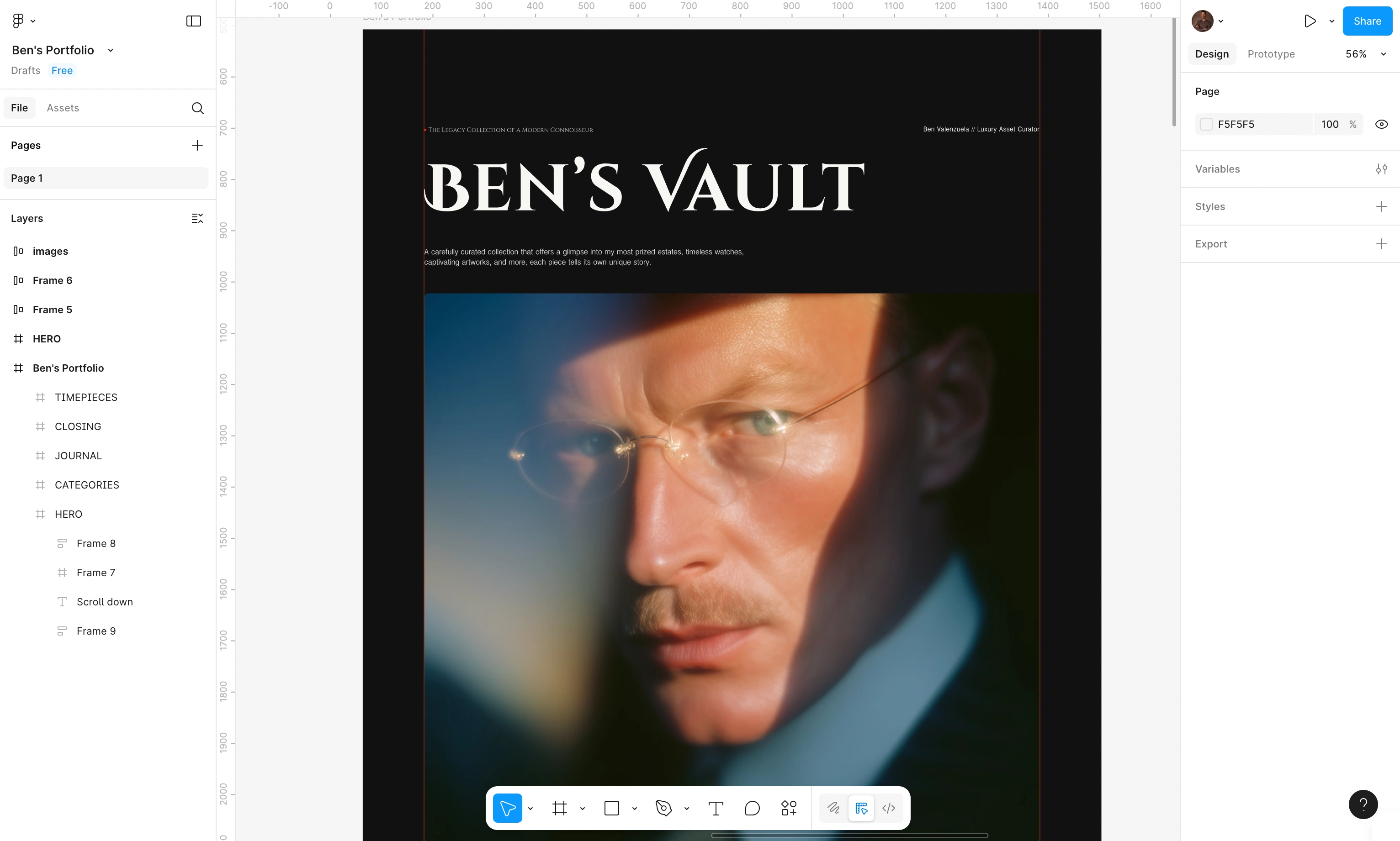
Figma Design 001
The Challenge
Curating a Multi-Category Experience:
The collection spans watches, cars, art, and real estate, all with different visual and contextual needs. Designing a system that felt cohesive yet gave each category space to shine was a key challenge.
Telling a Story Through Luxury Objects:
Each asset carries significance, historically, personally, or financially. The design had to go beyond showing photos and instead tell quiet stories that hinted at legacy, exclusivity, and taste.
Designing for a High-Net-Worth Audience:
This wasn’t for the average viewer. The audience values restraint, elegance, and authenticity. Striking that balance, where nothing feels flashy but everything feels valuable, took deep visual research into luxury brands, experiences, and heritage portfolios.
Crafting Emotion Without Excess:
Every visual decision had to carry weight. From type selection(which was a major pick back) to hover transitions, the goal was to evoke a sense of calm sophistication.
And for me, the biggest challenge? Making each page feel important without ever being loud.
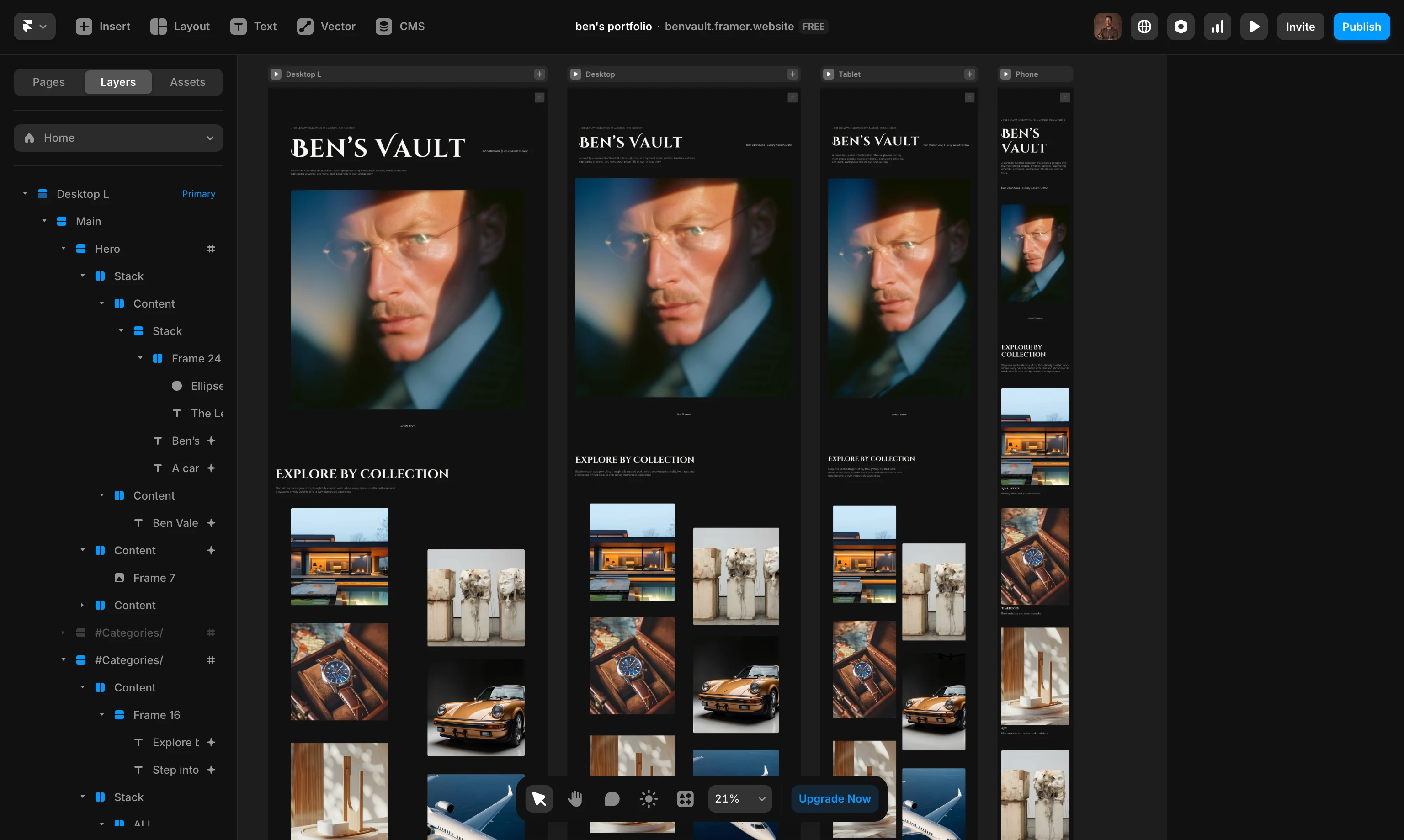
Framer designs & responsiveness
The Process
Exploration & Research:
Studying High-End Sites: Studied private collection brands, images, and lifestyle galleries to build a relevant reference point.
Mapping: Planned a visual rhythm for each section to keep the experience fluid and premium.(took longer than expected, but it's worth it)
Design Strategy:
Color Palette: Chose deep blacks and soft off-whites for contrast and clarity.
Typography & Layout: Used editorial spacing and modern serif typography to blend luxury with digital readability.
Framer Development:
Responsive Grid System: Built flexible card components for consistent layout across all asset types.
Subtle Motion: Integrated hover effects and scroll transitions to add life without stealing attention.
Optimized Navigation: Clean, top-aligned nav bar to keep the user grounded throughout.
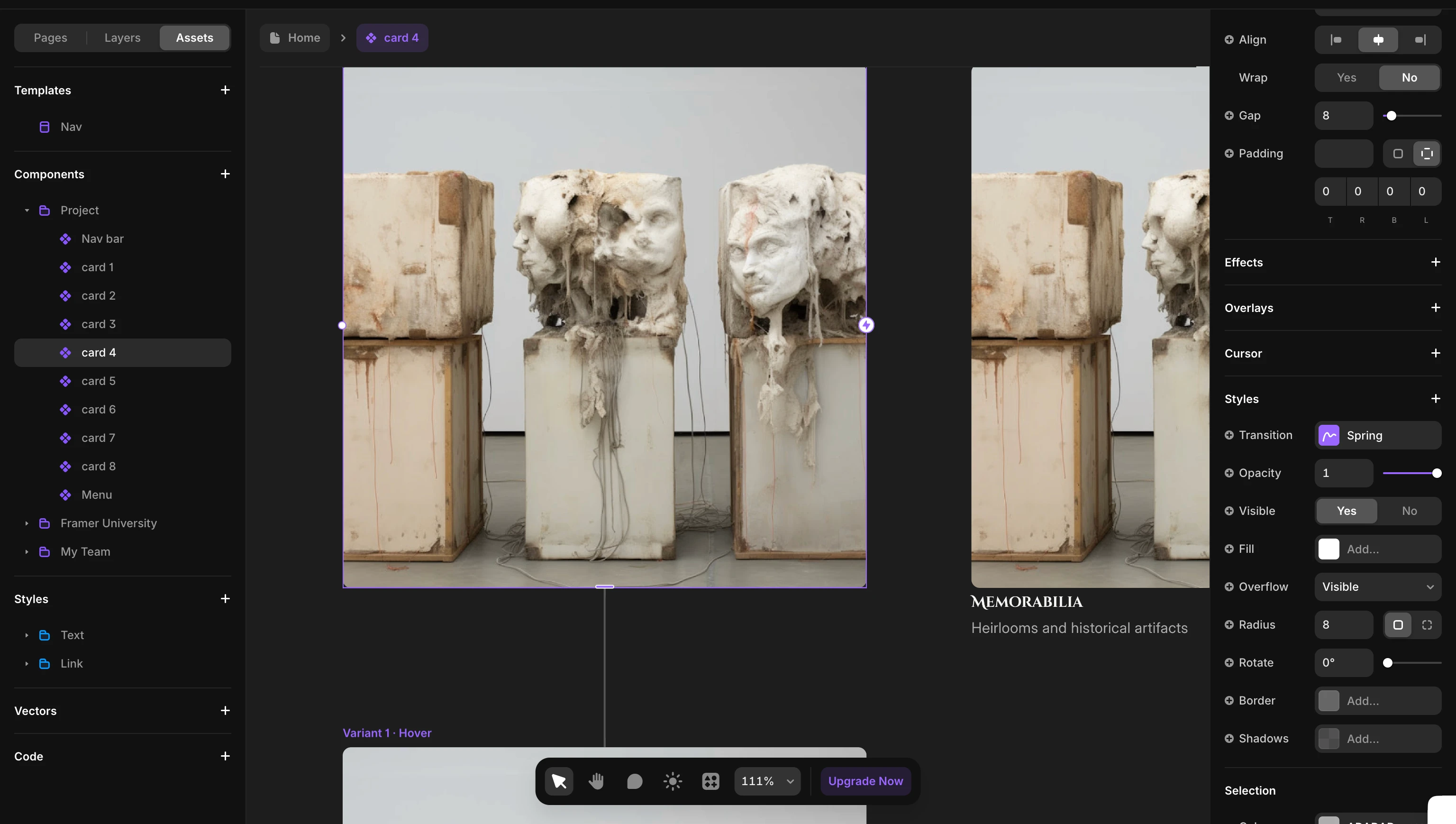
Some assets
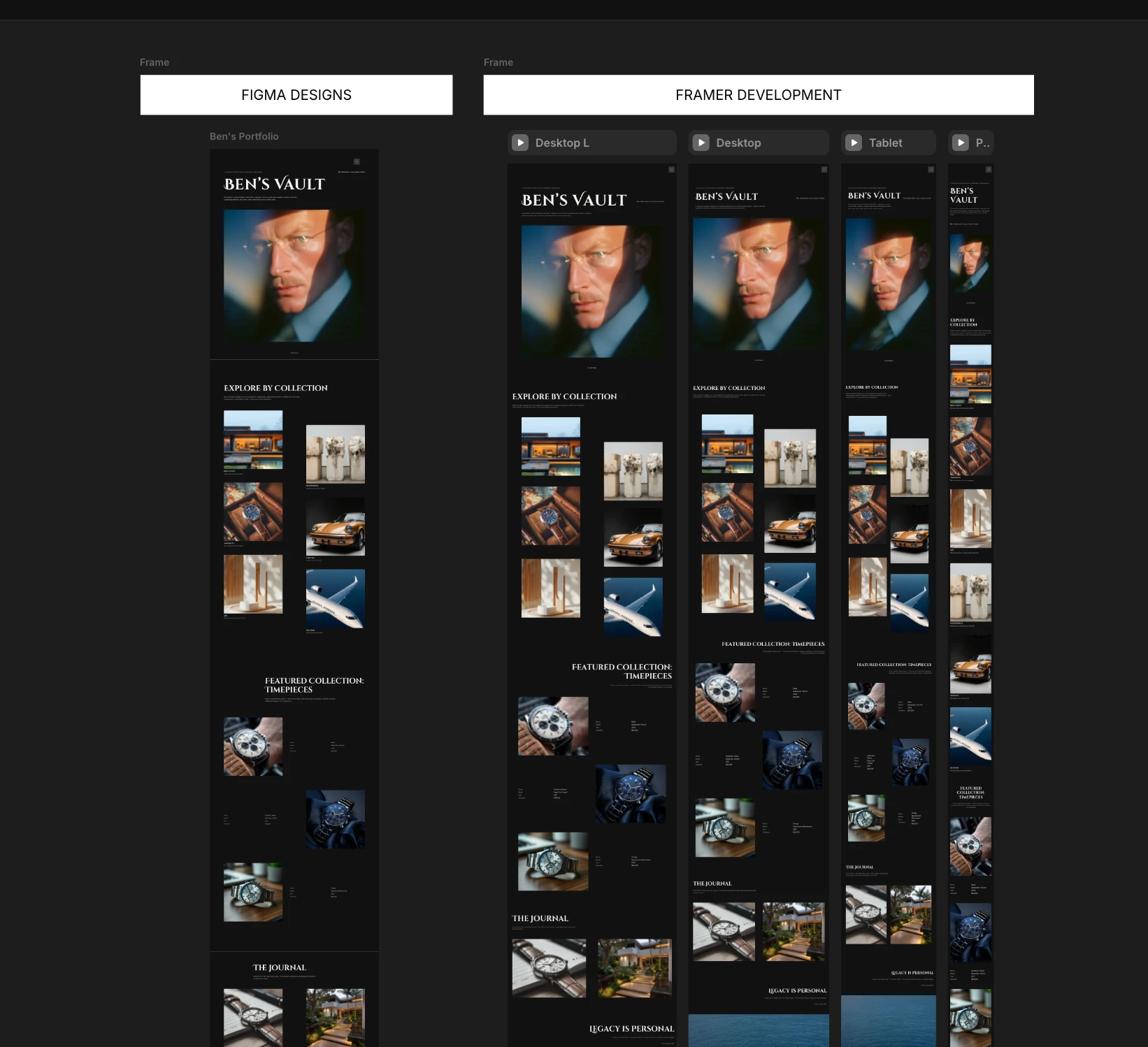
Figma designs & Framer Developemnt
The Outcome
Timeless Visual Language:
The final site feels less like a portfolio and more like a digital exhibit, refined, respectful, and elegant.
Audience-Aligned Presentation:
Every design choice, spacing, color, motion etc. speaks directly to the expectations of a discerning, high-value audience.
Modular for Growth:
The build allows easy expansion more assets, filters, even collection timelines...all within the same elegant structure.
Short Video of final website
Live link - Ben's Vault
Like this project
Posted May 26, 2025
Curated and built a luxurious digital archive experience for Ben's Vault, blending sleek design with seamless functionality using Framer and Lummi.
Likes
1
Views
0
Timeline
May 23, 2025 - May 26, 2025
Clients
Ben


Dynamic Progress Meter Animation
Tatem Inspired UI Animations
Animated UI Card for Bento Grid
Theo & Luca Landing Page Design & Development