
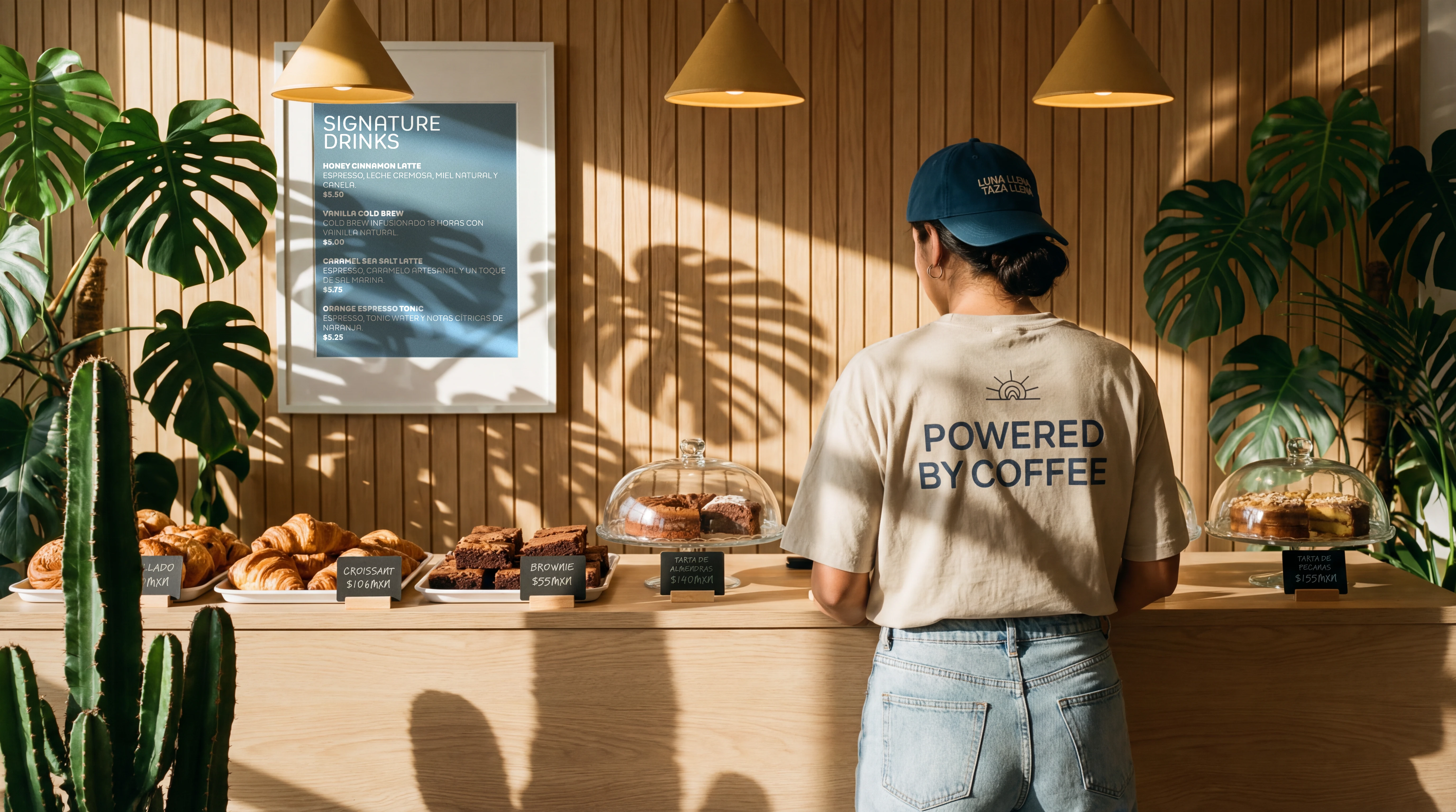
A café built for the hour the city changes. Brand identity and visual system for a specialty coffee venue in Polanco, Mexico City, designed around the transitional moment between day and night.
Strategy
Luna Café isn't competing for the morning rush. It owns a different window: 5 to 9 PM, when the workday dissolves and the city shifts its energy. The brand was conceived around three distinct types who occupy that hour: the person looking for a warm place to slow down, the creative who thinks best when the pressure lifts, and the one who needs one final push before the night takes over.
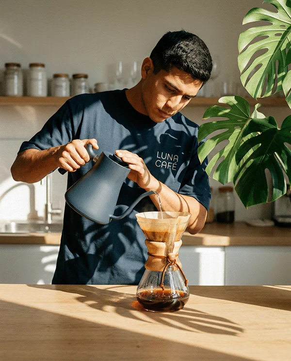
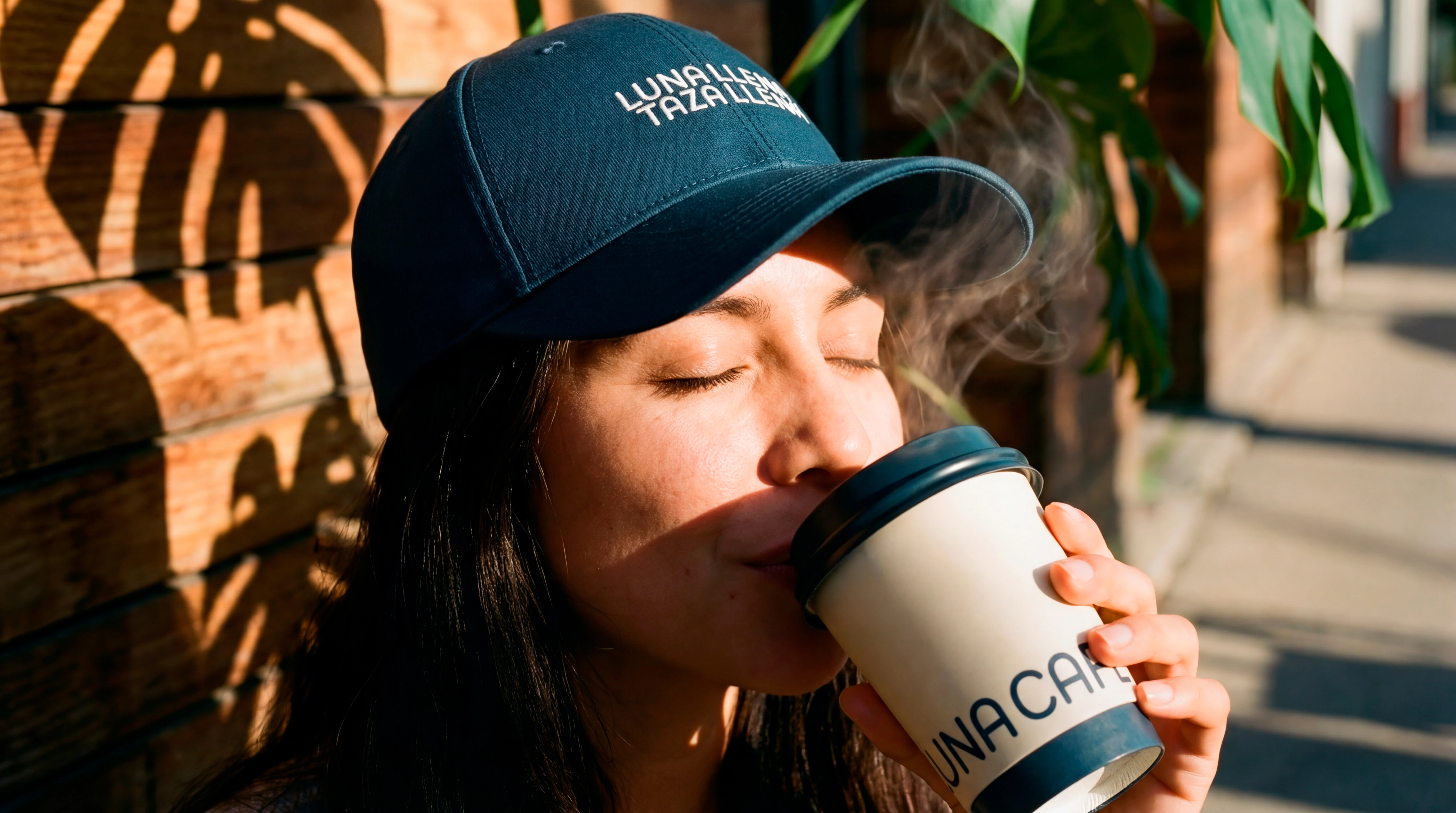
The strategic decision was to resist the café category's tendency toward either sterile minimalism or nostalgic warmth. Instead, the identity leans into atmosphere as a genuine product. The experience Luna Café sells isn't just the coffee. It's the quality of a specific kind of light, and what happens to people when they're inside it.
Visual Direction
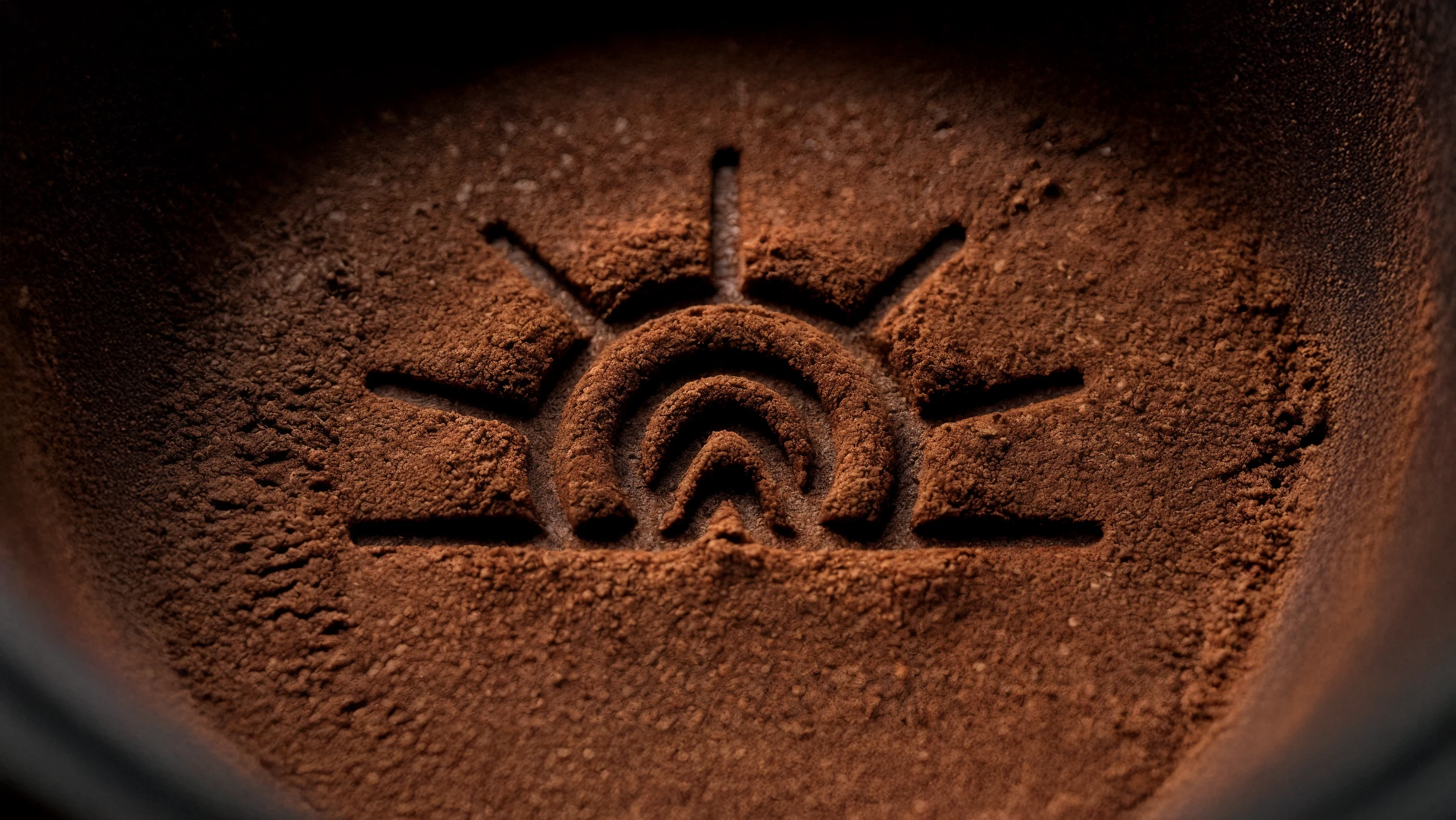
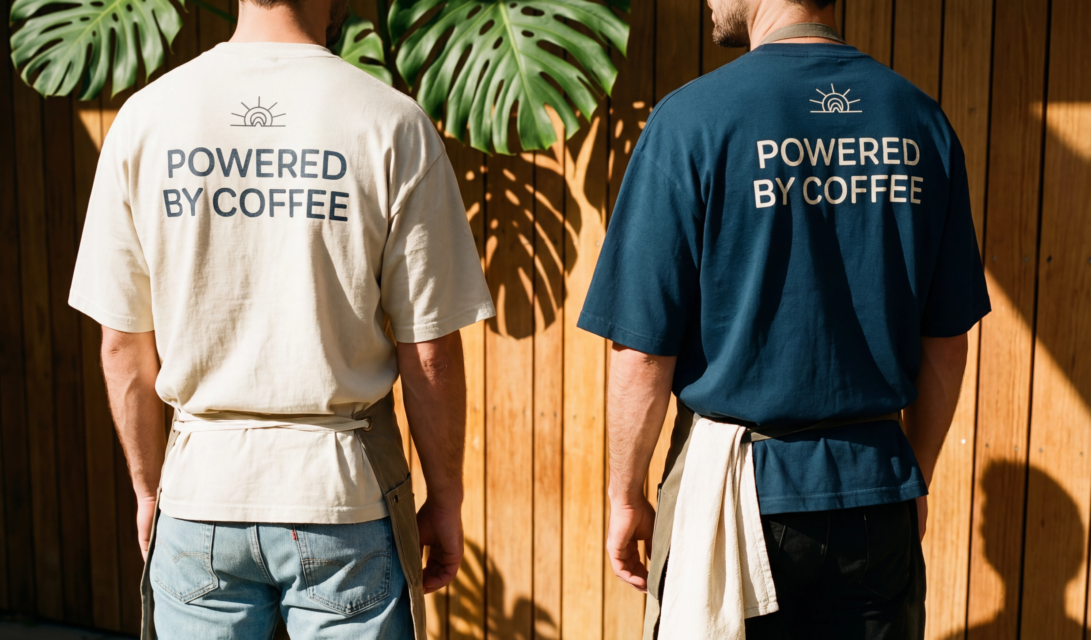
The brandmark is built from three layered symbols: a sun marking the end of the day, a moon signaling the arrival of night and the contemplative energy the brand cultivates, and a mountain form grounding the composition in stillness and destination. Read together, the three elements resolve into a single concept: La Hora Azul, the blue hour. That fleeting atmospheric moment when the sun has set but the sky has not yet gone dark.
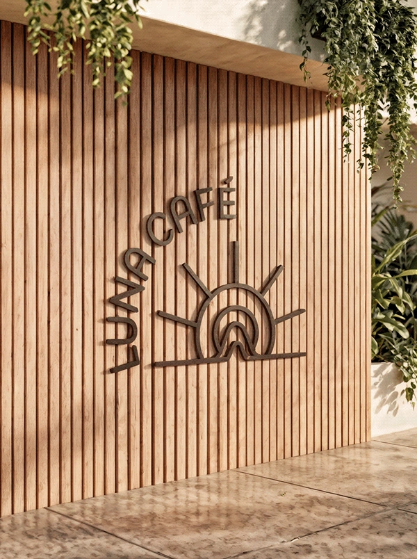
The identity draws from the visual language of contemporary Mexican design: confident, warm, and unafraid of symbolism, filtered through a modern editorial sensibility. The brandmark is built to hold its character at every scale, from espresso cup to storefront signage to digital presence.
Color
The palette is built on two opposing registers that mirror the brand concept directly.
#183b4e is a deep teal-navy carrying the weight of the night sky just after the sun disappears. It brings institutional gravity and calm authority to the identity, the kind of color that reads as considered rather than corporate. Applied to typography, backgrounds, and structural elements, it anchors the system.
#f4eddb is the warm parchment of fading daylight, a color with the temperature of late afternoon still held in it. Against the deep teal, it glows. It functions as the brand's primary surface tone, giving the identity an analog warmth that resists the cold neutrality of pure white.
Together, the two colors don't describe a café. They describe a moment in time.
Outcome
Luna Café is a conceptual branding project developed to demonstrate how a focused temporal insight can generate a complete and cohesive visual system. Every decision in the identity traces back to a single premise: that the transitional hour between day and night is not an afterthought in the coffee experience. It is the product.
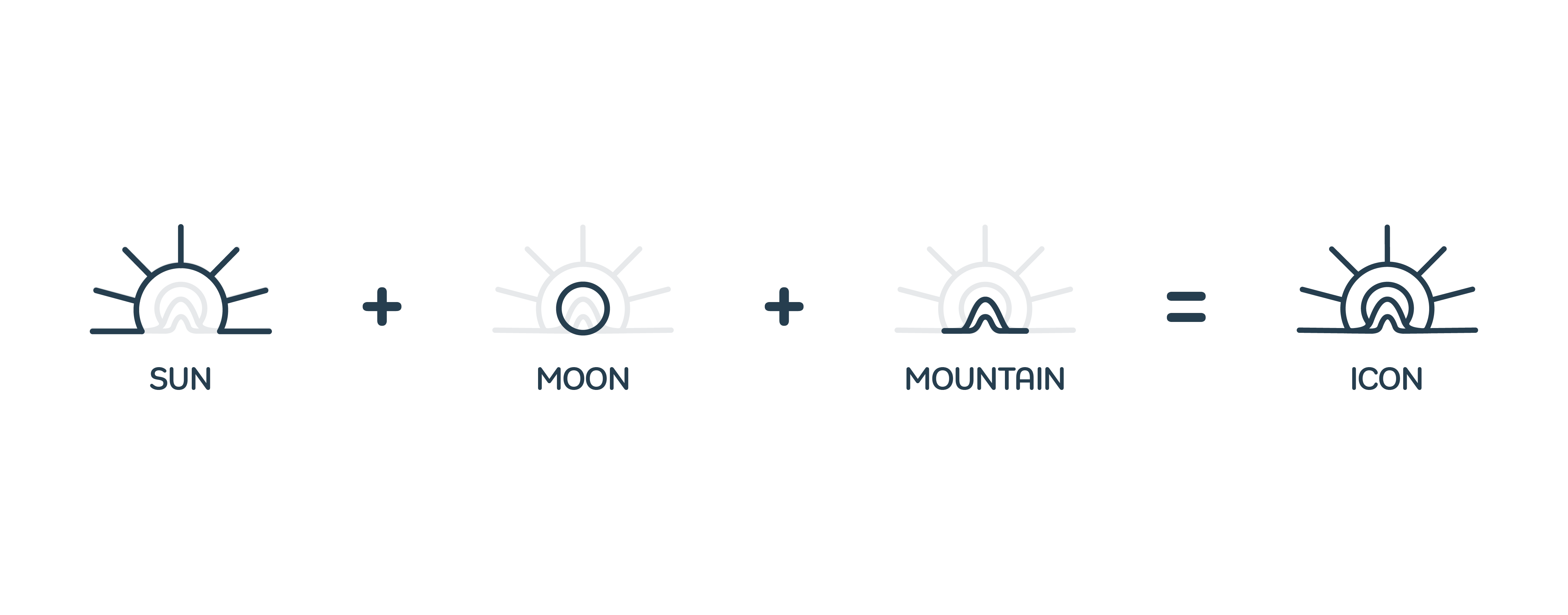
The brandmark is a layered symbol built from three elements in deliberate conversation with each other.
The sun marks the closing of the day: its rays carry the warmth and golden-hour energy that define the café's opening atmosphere, that specific quality of late afternoon light that makes everything feel a little more cinematic. The moon is both name and metaphor, signaling the arrival of night and the creative, reflective mindset the brand cultivates. It belongs to the people who treat a good cup of coffee as a ritual rather than a habit. The mountain grounds the composition in stillness and natural connection, the idea of a destination worth arriving at. In a city that never fully stops, it suggests a pause.
Read together, the three elements converge on a single concept: La Hora Azul. That rare, luminous moment when the sun has just set but the sky has not yet gone dark. Fleeting, atmospheric, quietly charged with possibility.
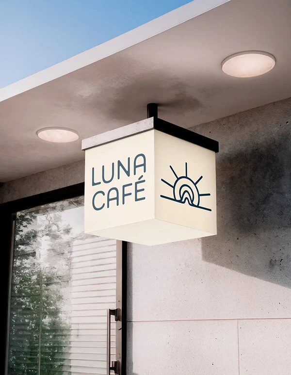
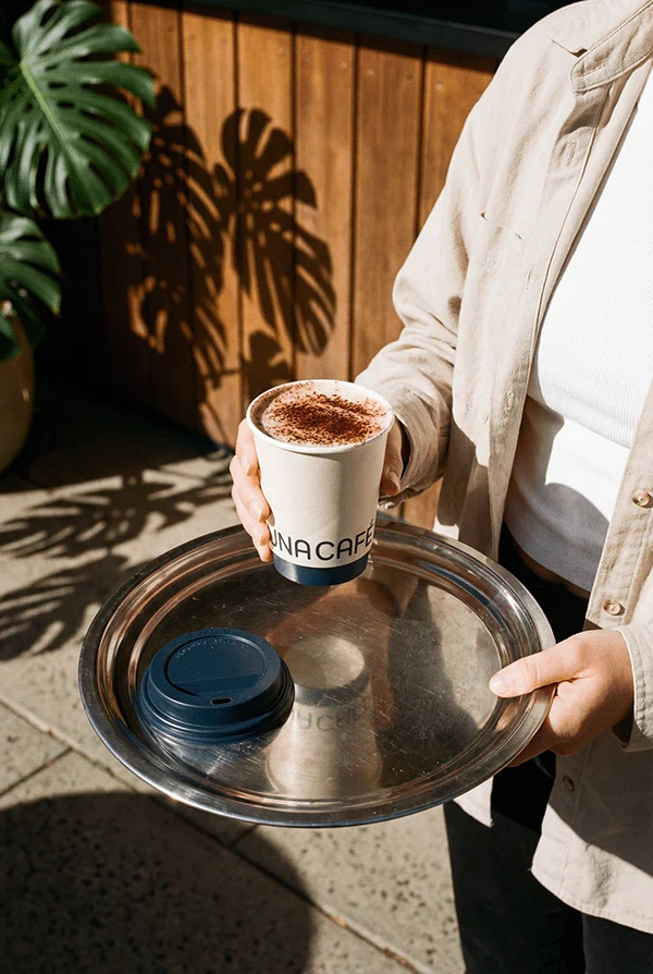
The identity system draws from the visual language of contemporary Mexican design, confident, warm, and unafraid of symbolism, filtered through a modern editorial sensibility. The brandmark holds its clarity and character at every scale, from espresso cup to storefront signage to digital presence.

Typography
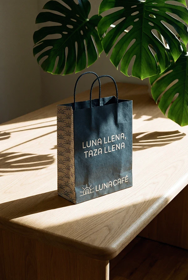
The choice of Bouba Round Var connects directly to one of the most instinctive principles in design psychology. This typeface draws its name from, describes how rounded shapes are universally perceived as soft, warm, and approachable. Using a typeface that is literally named after that concept was not accidental, it was the most honest typographic decision the brand could make.
It brings a gentle, organic quality to the wordmark and all supporting text. Its variable nature also allows the identity to breathe across different applications, from the weight needed on a storefront sign to the lightness required on a paper cup or a digital screen, without ever losing its character. The rounded terminals echo the curves already living inside the icon, the arc of the moon, the softness of the mountain silhouette, the circular warmth of the sun. Typography and symbol speak the same visual language.
Color
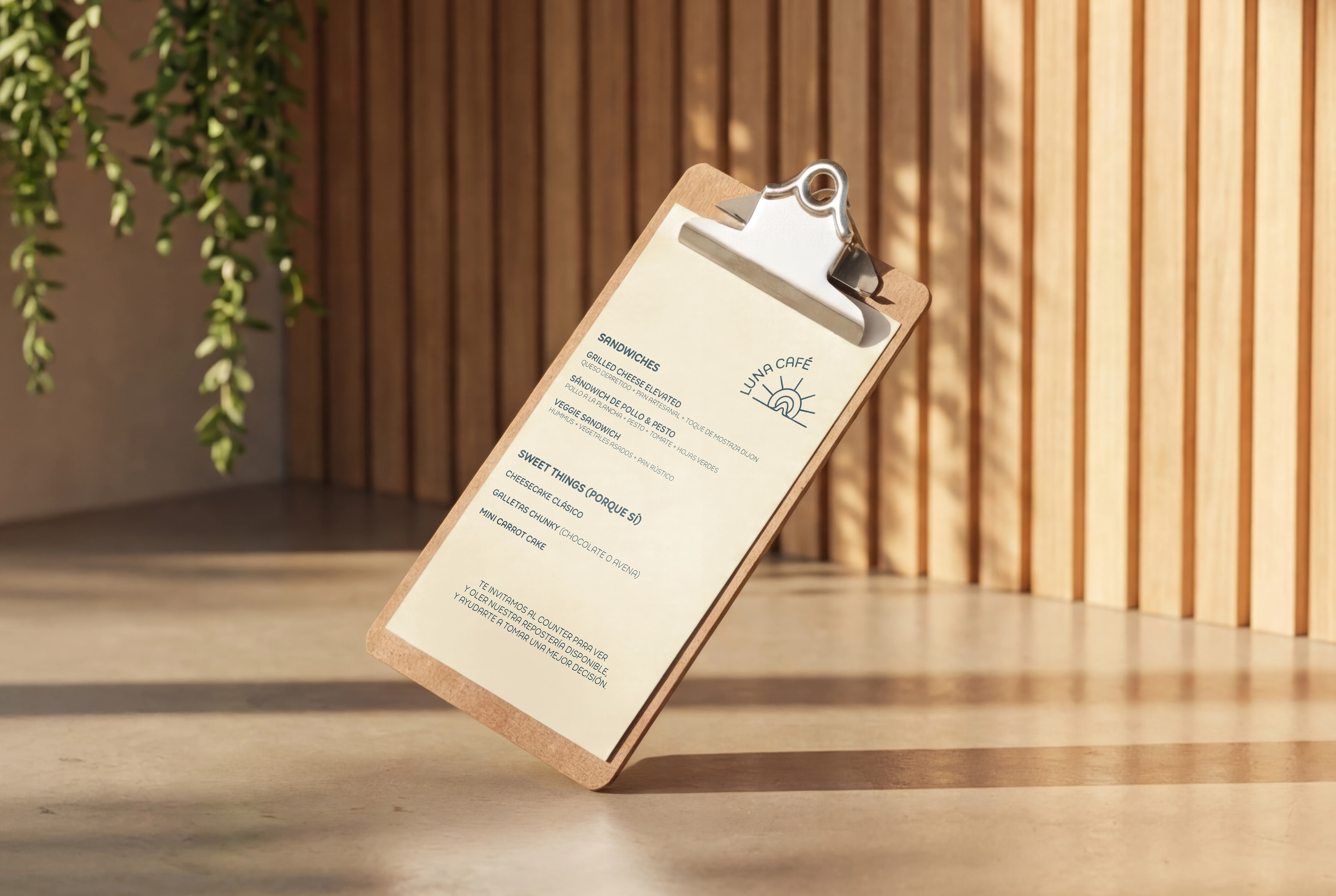
Warm Cream This is the color of the last light. It references the warm, golden tone of late afternoon sun hitting a surface, think café walls, worn paper, the inside of a good book. It grounds the brand in comfort and familiarity without feeling nostalgic or outdated. On screen and in print, it reads as inviting and considered, the kind of background color that makes everything placed on top of it feel intentional.
Deep Dusk Blue This is the sky at the exact moment the blue hour begins. Deep, quiet, and full of atmosphere. It gives the brand its moodier, more editorial dimension and balances the warmth of the cream without canceling it out. Together, the two colors are essentially a single image: the sky meeting the earth at sunset. They do not compete. They complete each other, which is exactly what the brand is about.


Creative Direction
Fernando Curtis
Art Direction & Brand Design
Ariana Mejia
Studio
Rage Collective
0 likes · 1 view · Sep 17, 2026
Brand identity for Luna Café, a specialty coffee venue in Polanco, Mexico City. The concept is built around La Hora Azul — the transitional window between afternoon and night where people gather to unwind, connect, and recharge before the evening begins. The icon unifies three symbols — sun, moon, and mountain — into a single mark that captures this fleeting moment in time. A warm cream and deep navy palette reinforces the shift from daylight to dusk, while Bouba Round Var brings organic softness to the wordmark. A project about owning a moment and turning it into a place people return to.


