
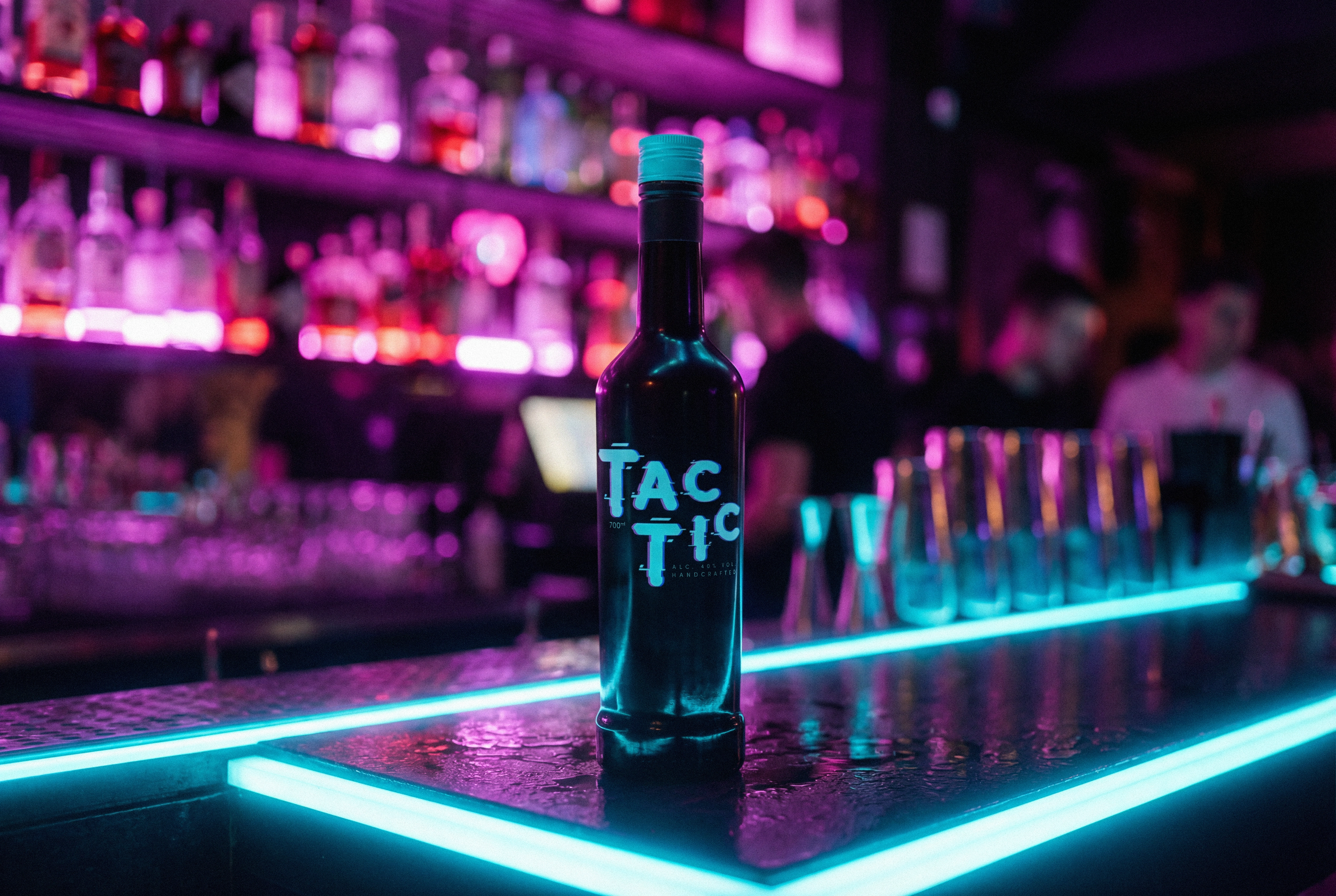
"TAC-TIC" Your grandma drinks better than you.
Brand identity, packaging design and art direction for a vodka brand that doesn't care about your age. It cares about your attitude.
Background: TAC-TIC was born from a simple observation: the spirits industry worships youth and ignores the people who actually know how to enjoy a drink. This conceptual branding project strips vodka of its bottle-service ego and rebuilds it around one idea. Celebration doesn't expire. The brief was self-assigned. The ambition was not. Because the best pour is the one nobody's measuring.
Strategy: TAC-TIC doesn't sell exclusivity. It sells permission. Permission to stop performing youth and start performing joy. The target isn't a demographic. It's a mentality. Whether you're 27 or 72, if you understand that a good drink is about the moment and not the image, this bottle was already yours before you picked it up. It's not about drinking more. It's about enjoying it without apology.
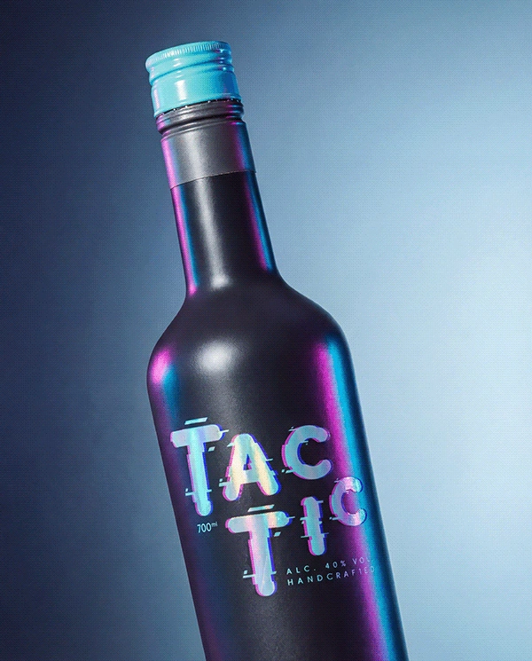
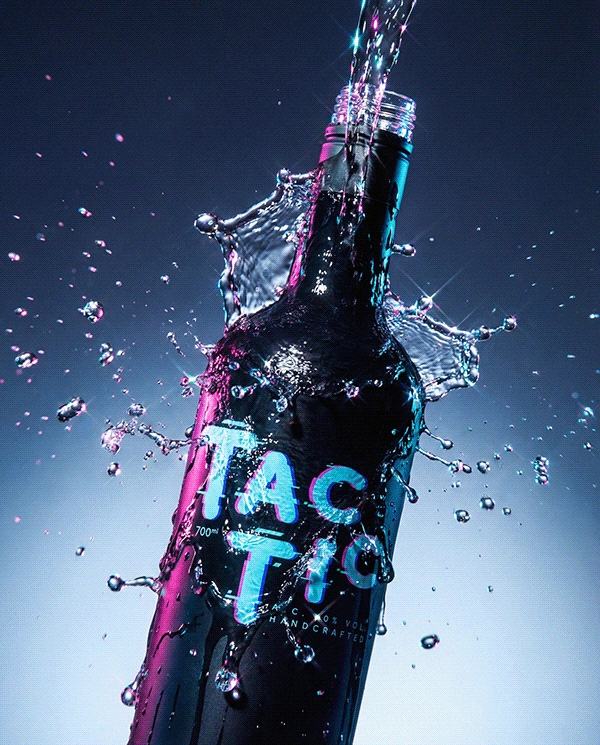
Visual Direction: Typography: Rounded, approachable forms disrupted by a signal-glitch effect. Legible enough to trust, broken enough to stay dangerous. The logo lives in the tension between warmth and interference.
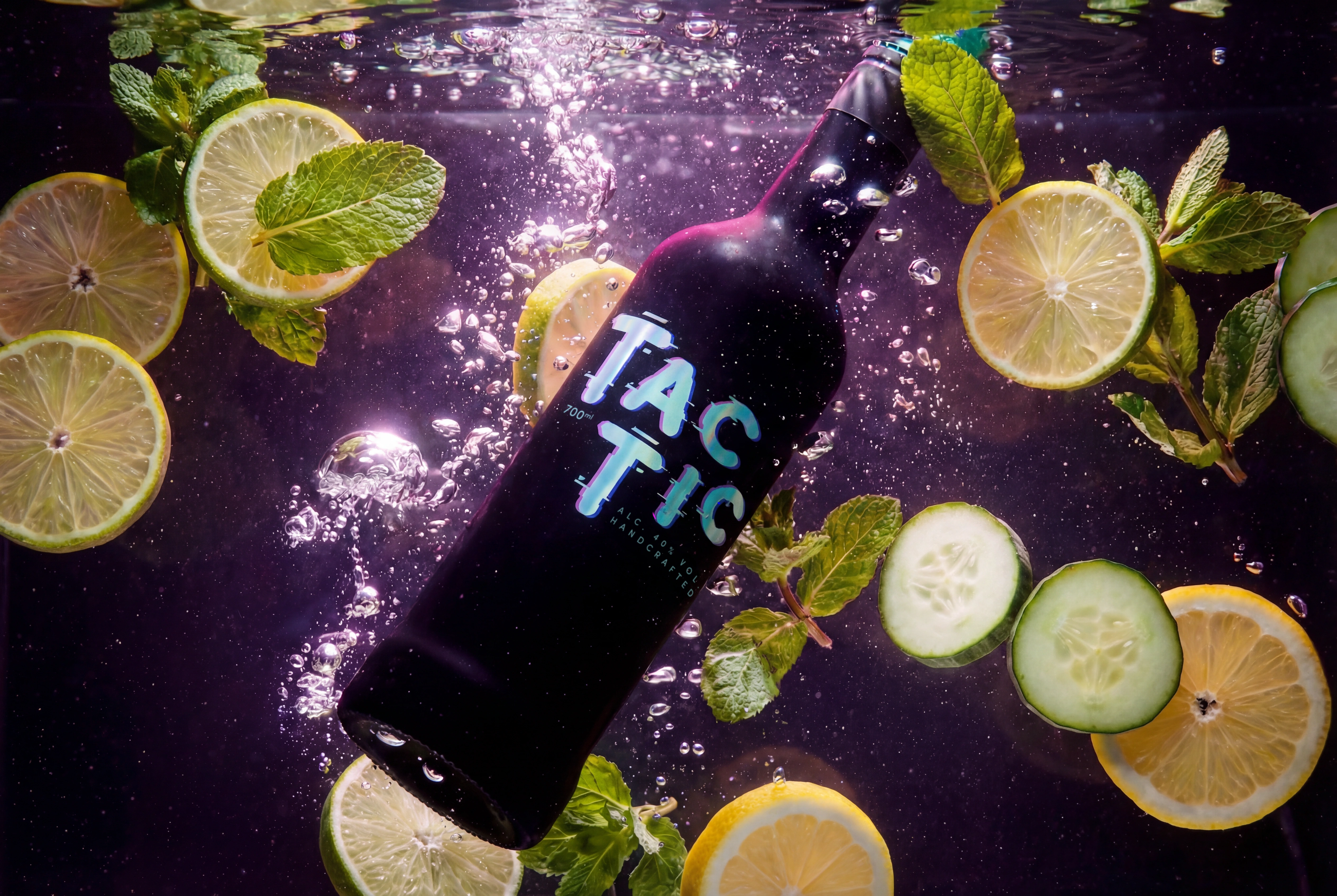
Colors: • Cyan • Magenta • Purple. A palette pulled from transmission errors between a party and a dream. Against full black, they detonate like neon through smoke.
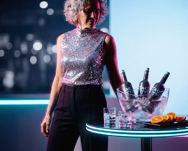
Packaging: Full matte black bottle. Opaque by design. You can't see how much is left, and that's the entire philosophy. Once it's open, you're not rationing. You're committing. Share it, pour it, finish it. The bottle isn't a container. It's a pact.
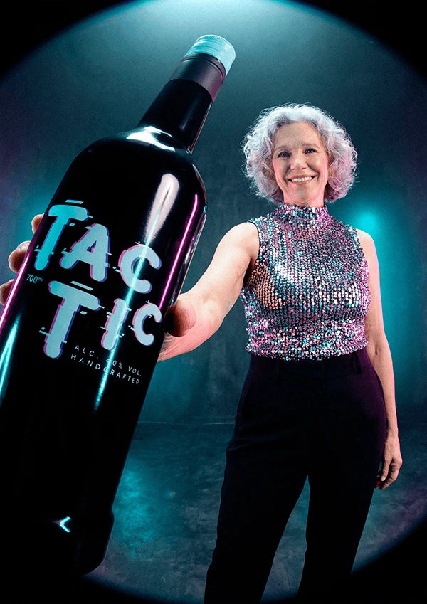
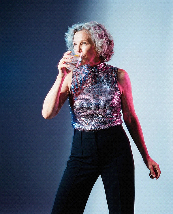
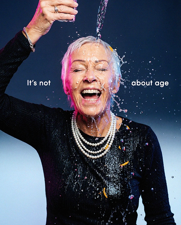
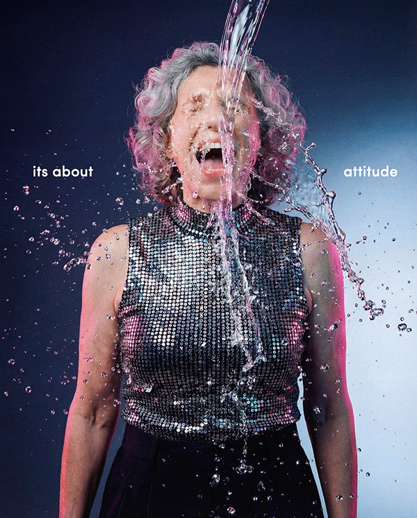
Photography: Elderly women. Fully styled. Unapologetically glamorous. Laughing, toasting, overdressed and underconcerned. Shot with editorial confidence. No irony, no condescension, no punchline. Just proof that fun doesn't downgrade with age. Mood: Glitchy, celebratory, defiant. Like if David LaChapelle directed a toast at your abuela's 80th birthday.
Tone of Voice: bold, warm and generationally fearless. "Your best years aren't behind you. They're in the glass." "Don't check the bottle. Check the vibe." "Age is a number. TAC-TIC is a decision." "She's 74. She's three drinks in. She's having a better night than you."
Outcome: TAC-TIC doesn't whisper "premium." It doesn't scream "party." It says enjoy this, whoever you are, whatever age you are and it means every word. This project was designed to challenge the spirits industry's obsession with youth, reframe celebration as a lifelong act, and prove that packaging and art direction can carry a philosophy, not just an aesthetic. All while answering a single question: What if vodka stopped pretending fun has a deadline? And the answer is: "TAC-TIC."





0 likes · 1 view · Sep 17, 2026
Tactic is a conceptual vodka brand built around the idea that celebration has no age limit. The identity pairs glitch-disrupted typography in cyan, magenta and purple with opaque matte black packaging — designed so you can't see what's left, because once it's open, the only move is to enjoy it. Art direction features styled, joyful elderly women as the brand's real protagonists. Bold, warm and unapologetically inclusive.


