
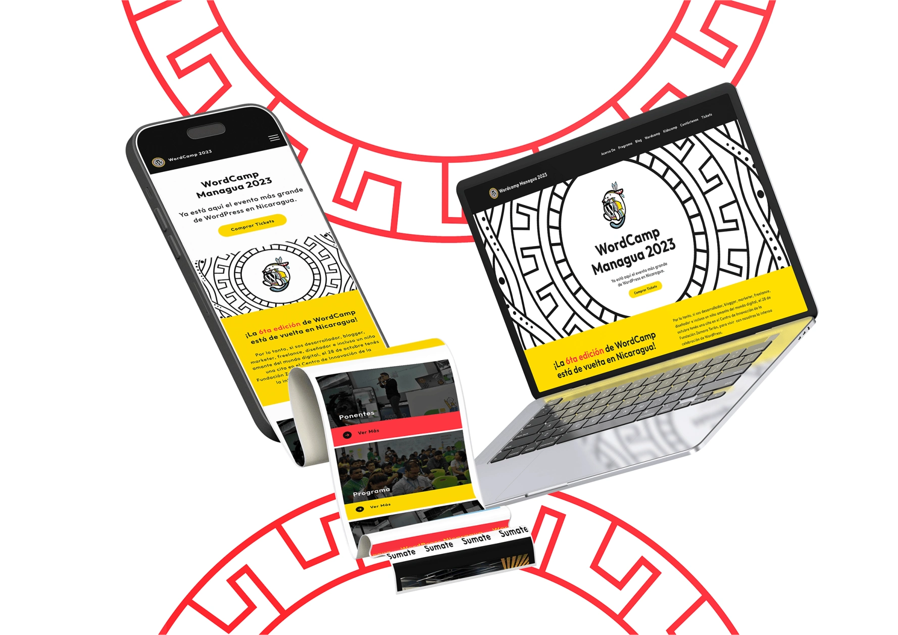
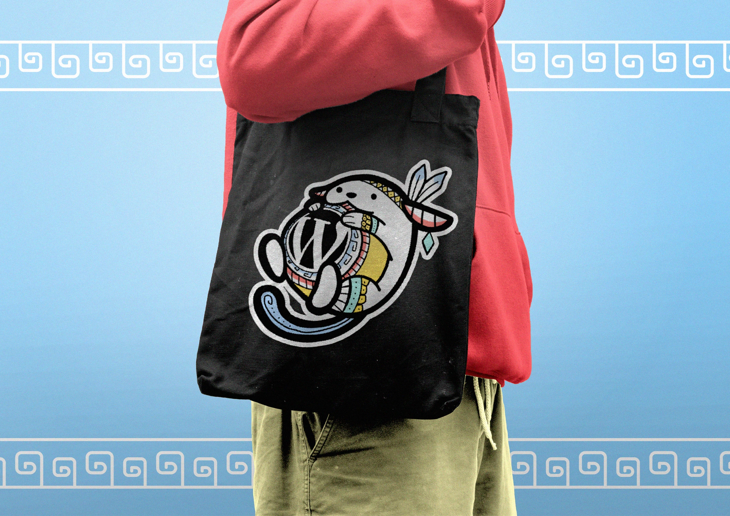
WordCamp Managua 2023, a WordPress-powered event, celebrated the vibrant intersection of technology, creativity, and community. The branding for this year’s edition was a bold fusion of contemporary design and cultural heritage, drawing inspiration from the iconic pre-Columbian vase associated with San Juan de Oriente, a region in Nicaragua renowned for its rich tradition in pottery and indigenous art.
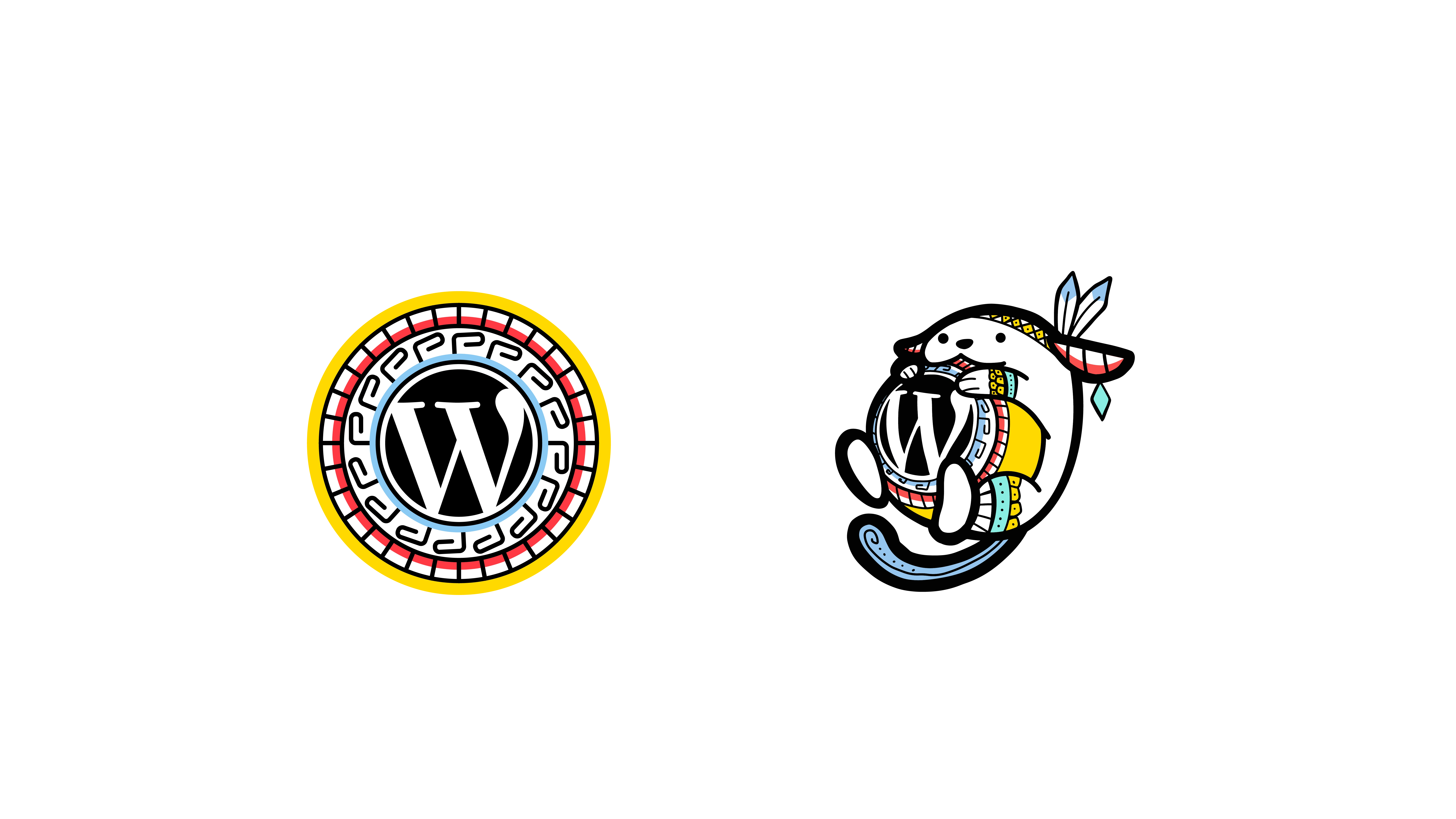
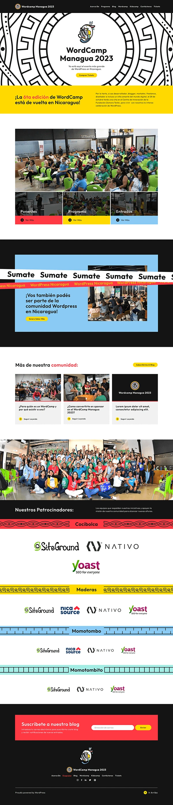
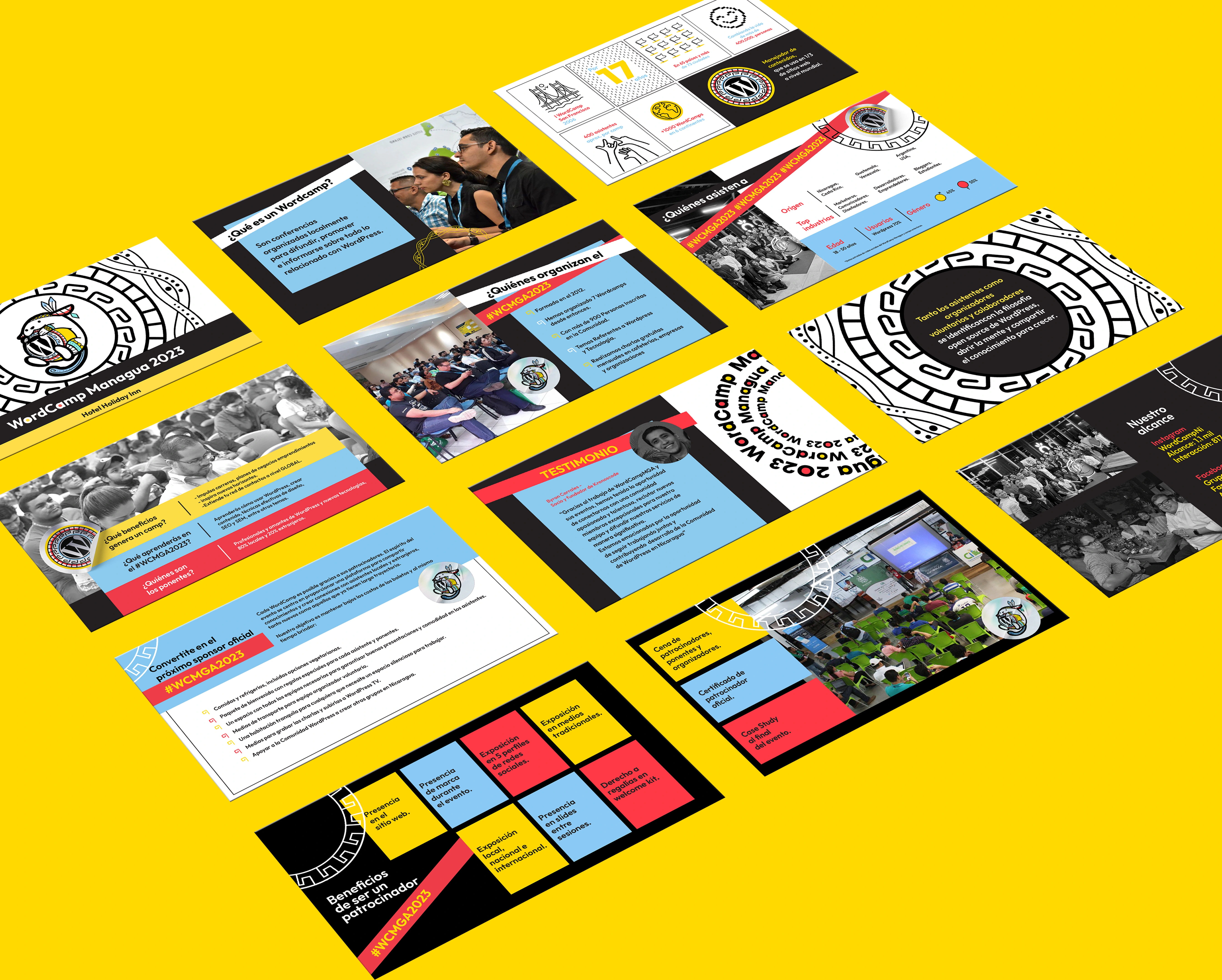
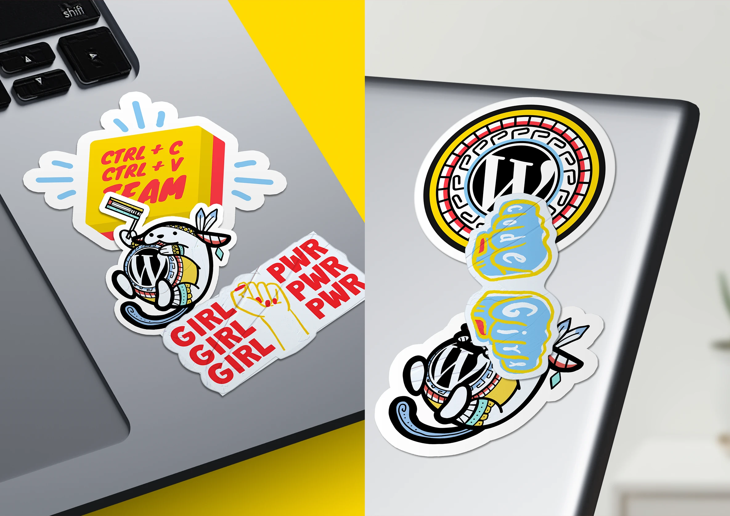
The visual identity centered on a dynamic palette of light blue, red, and yellow over a clean white canvas, accented with subtle black details. This choice reflected the intricate colors and geometric motifs found in the pottery of San Juan de Oriente, reinterpreted in a modern context. Rings symbolizing connection, growth, and continuity echoed both the essence of WordPress as a global platform and the circular patterns of pre-Columbian ceramics.
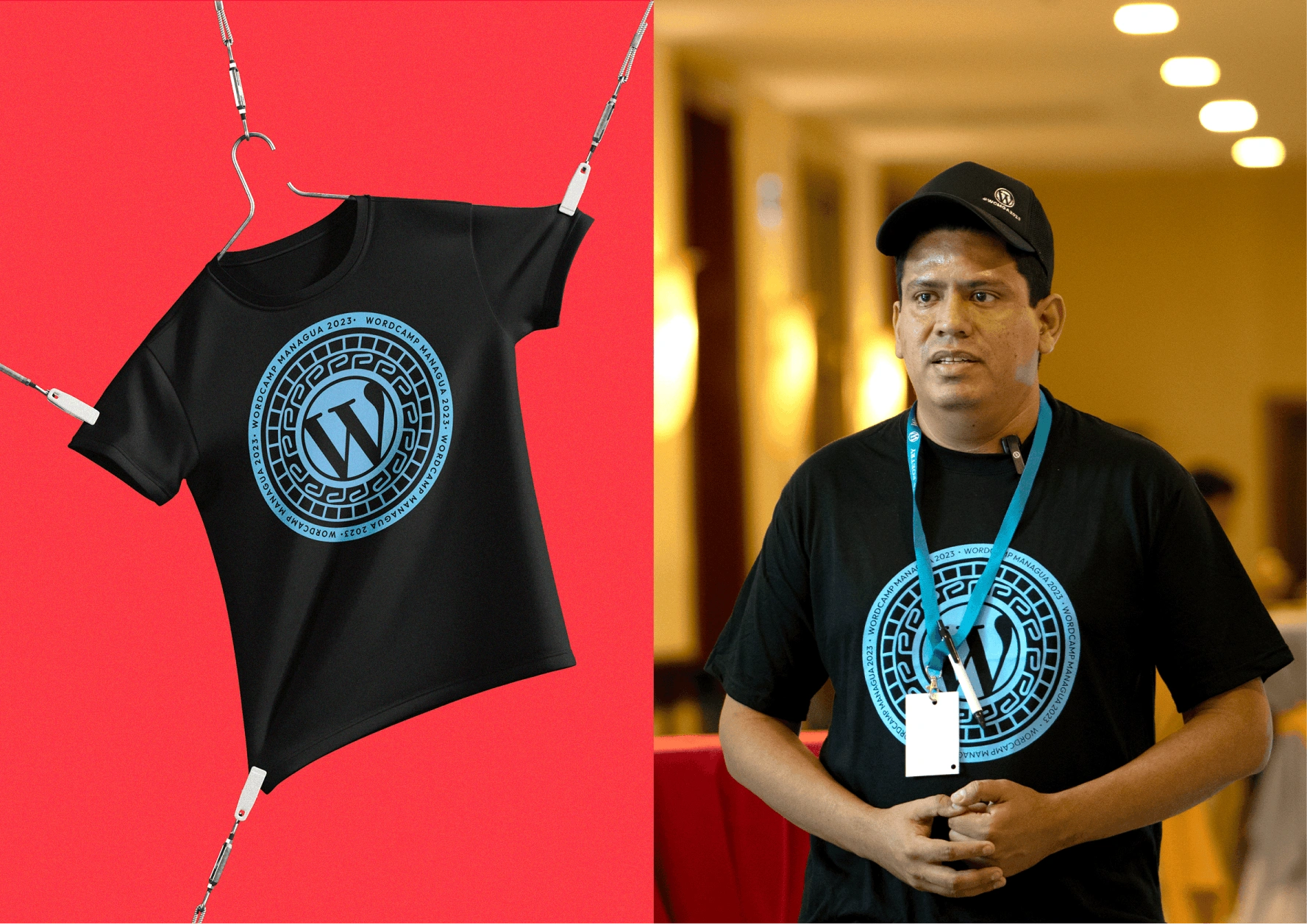
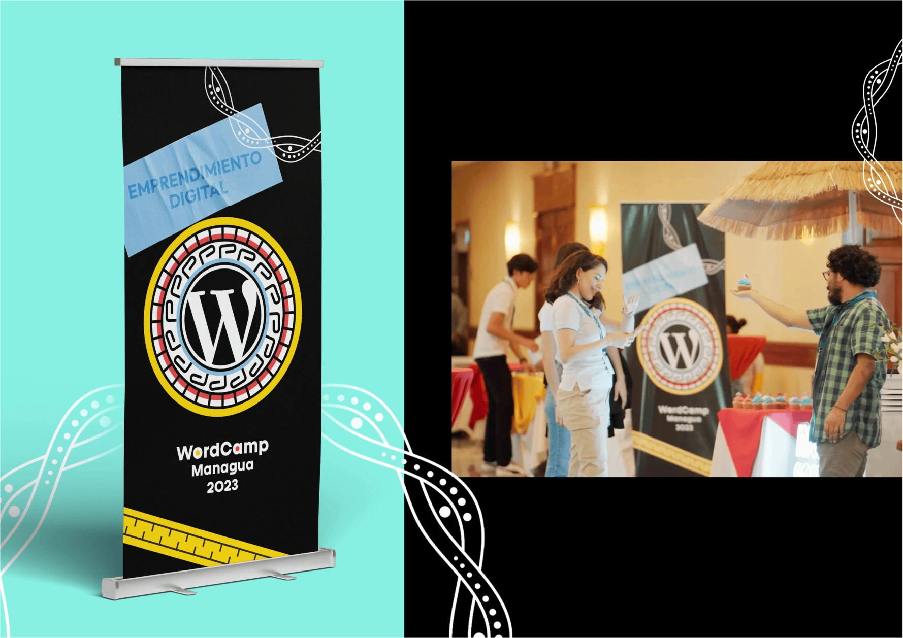
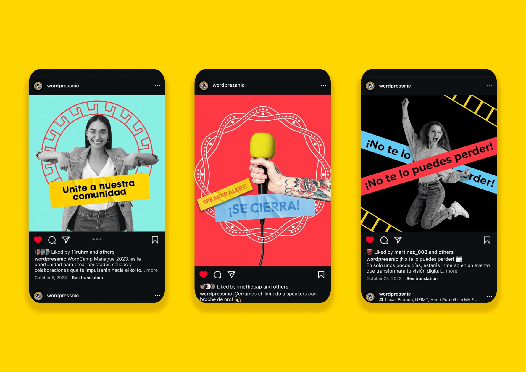
The branding extended across digital and physical touchpoints, creating a cohesive experience that celebrated both local culture and the open-source spirit of WordPress. By weaving together Nicaragua’s artistic heritage with the future-forward ethos of WordPress, WordCamp Managua 2023’s branding served as a tribute to innovation deeply rooted in tradition.
This creative direction connected participants not only to the powerful tools WordPress offers but also to the cultural richness of the event’s host city. It became a visual narrative of collaboration, honoring the past while shaping the future.

Producer: Alex Cuadra
Creative Director: Fernando Curtis (Rage Collective)
Lead Designer: Nahomi Cuadra
Graphic Designer: Gloria Murillo
Filmmaking: Naiot Espinoza (Mista VisualCrafters)
UX/UI Designer: Anian Trujillo
Web Development: Luis Peralta , Alex Cuadra
0 likes · 1 view · Sep 17, 2026
The branding for WordCamp Managua 2023 blended technology and tradition, inspired by the pre-Columbian vase of San Juan de Oriente, a region famed for its pottery and indigenous art. Using light blue, red, yellow, and white with black accents, the design reinterpreted the vibrant colors and geometric motifs of local ceramics. Rings symbolized connection and growth, aligning with WordPress's global community spirit. This identity celebrated innovation while honoring Nicaragua’s rich cultural heritage, creating a visual story that bridged the past and future.


