Data Pipeline and Embeddable Visual Widgets Using APIs
Ivy Zhou
Project Overview
Embeddable Data Visualization Widgets using jQuery, Leaflet and React
I create data visualizations designed for embedding as flexible solutions that transform complex data into interactive visualizations that are easy to integrate into existing web pipelines to provide a convenient way to enhance websites with dynamic, informative visuals.
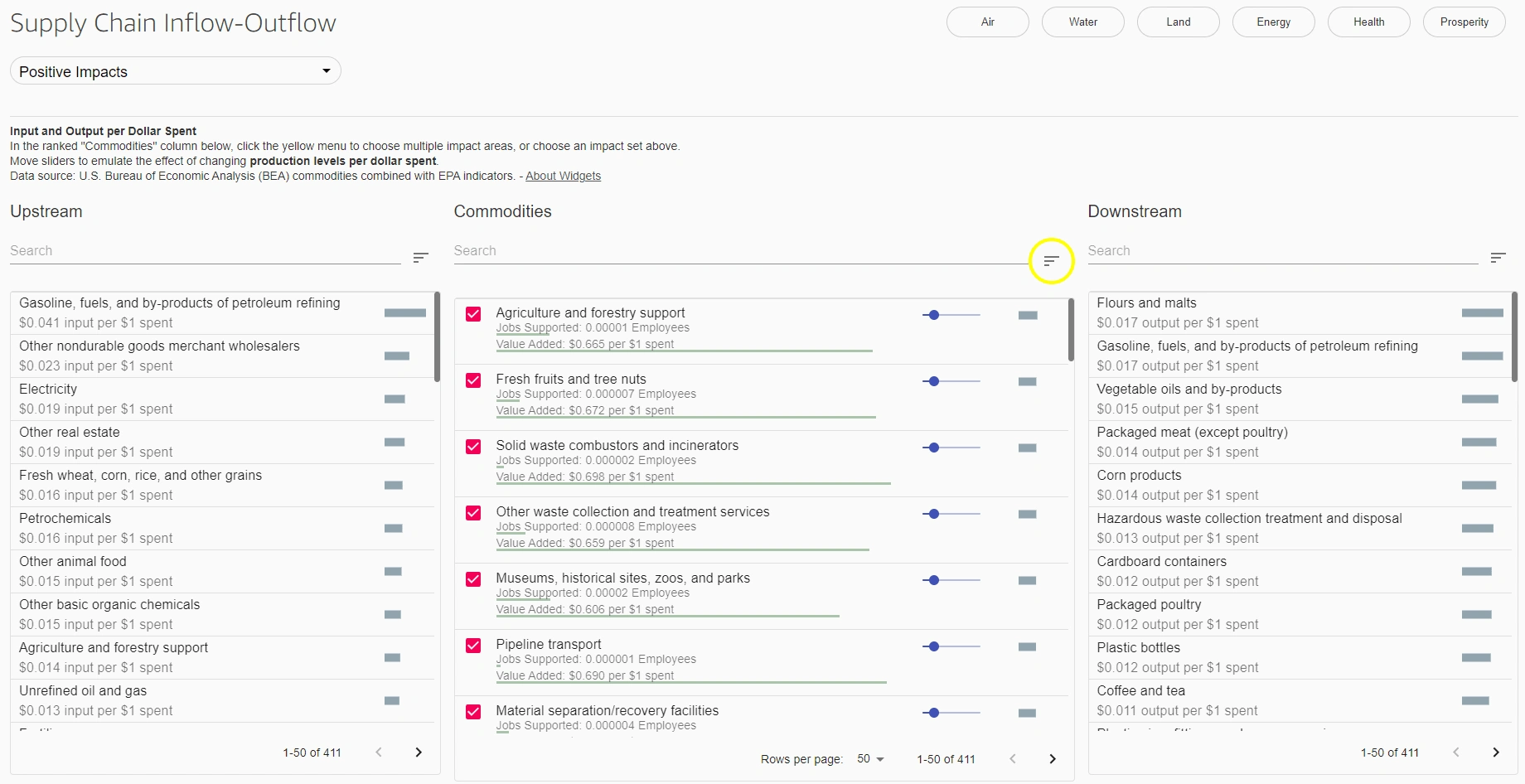
Figure 1: Supply Chain Inflow-Outflow widget IO charts using jQuery, Leaflet and React - "Positive Impact
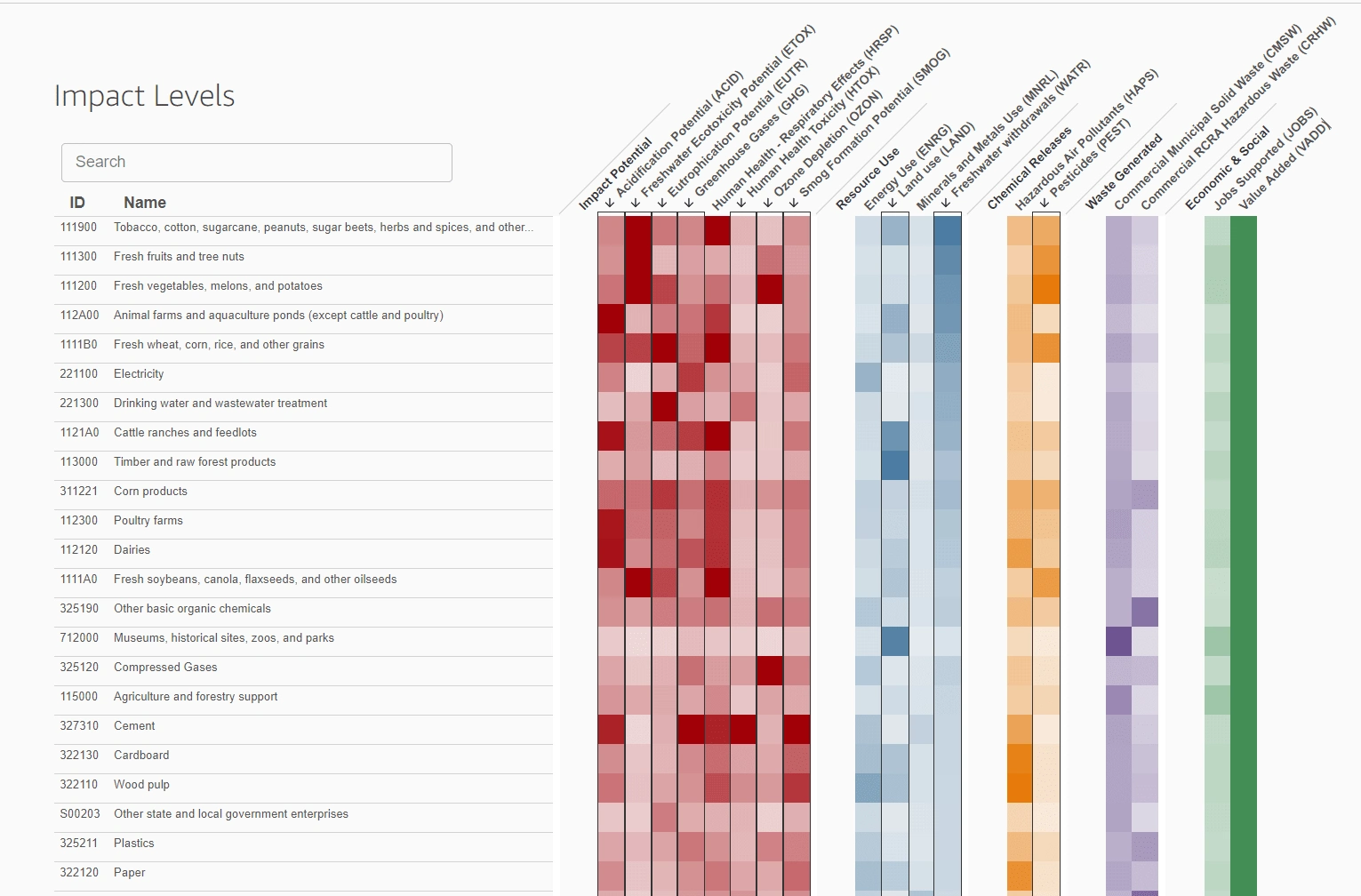
Figure 2: Supply Chaine Inflow-Outflow widget IO charts - "Positive Impact"
Figures 1 and 2 illustrate a Supply Chain Inflow-Outflow widget that we developed, visualizing industry supply chain input-output (IO) charts. This widget integrates data from the U.S. Bureau of Economic Analysis (BEA) on commodities, enhanced with Environmental Protection Agency (EPA) indicators. The widget provides a clear, interactive representation of how various industries contribute to and are impacted by supply chain flows, offering valuable insights for sustainability and economic analysis. This tool can be easily embedded into websites for collaborative use.
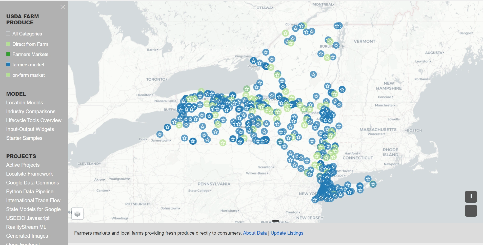
Figure 3: Part 1 of USDA Farm Produce Data Visualization Widget
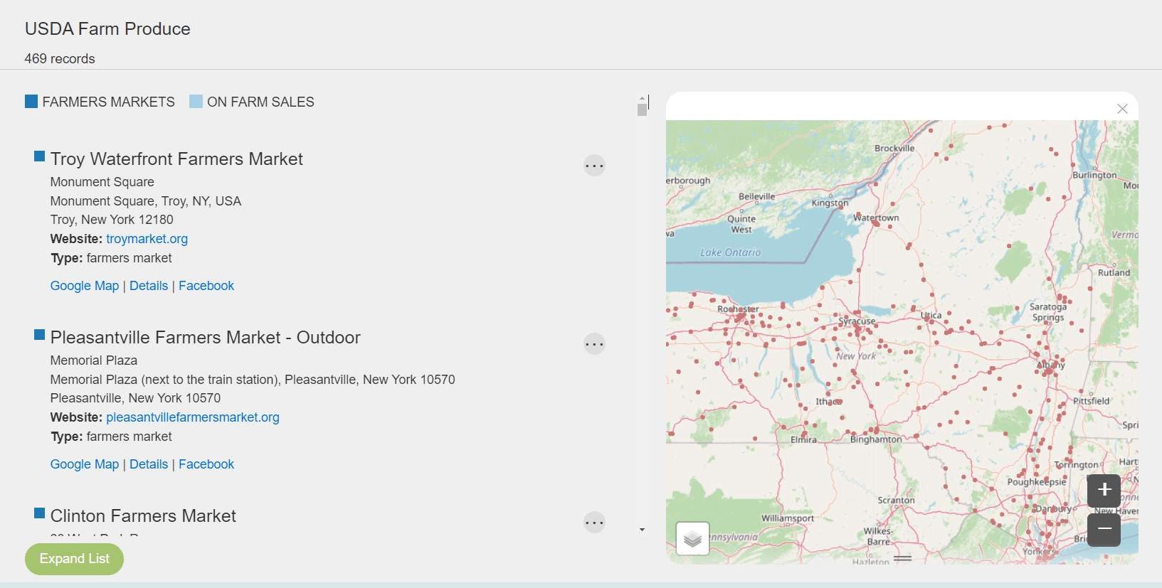
Figure 4: Part 2 of USDA Farm Produce Data Visualization Widget
Collaborative Websites Using Python/JavaScript Scripts on Google Collaborations via the Google Data Commons API
This project uses Google Data Commons API to integrate global datasets focusing on the United Nations Sustainable Development Goals (UN SDGs) and a collaborative data pipeline hosted on GitHub. The core script resides in Google Colab, with a continuous deployment pipeline between GitHub and Colab, using GitHub’s CI/CD pipeline for seamless updates and deployment.
Using both REST and GraphQL interfaces, the Google Data Commons API provides structured data on topics such as economics, the environment, and health. Our solutions, developed in both JavaScript and Python, gather key metrics like air quality, emissions, and energy usage, transforming them into dynamic visualizations that track global trends over time.
The resulting visualizations are integrated in multiple websites, providing users insights on progress toward goals. By making complex data more accessible, the interfaces I create aim to empower informed decision-making and raise public awareness through effective visual storytelling.
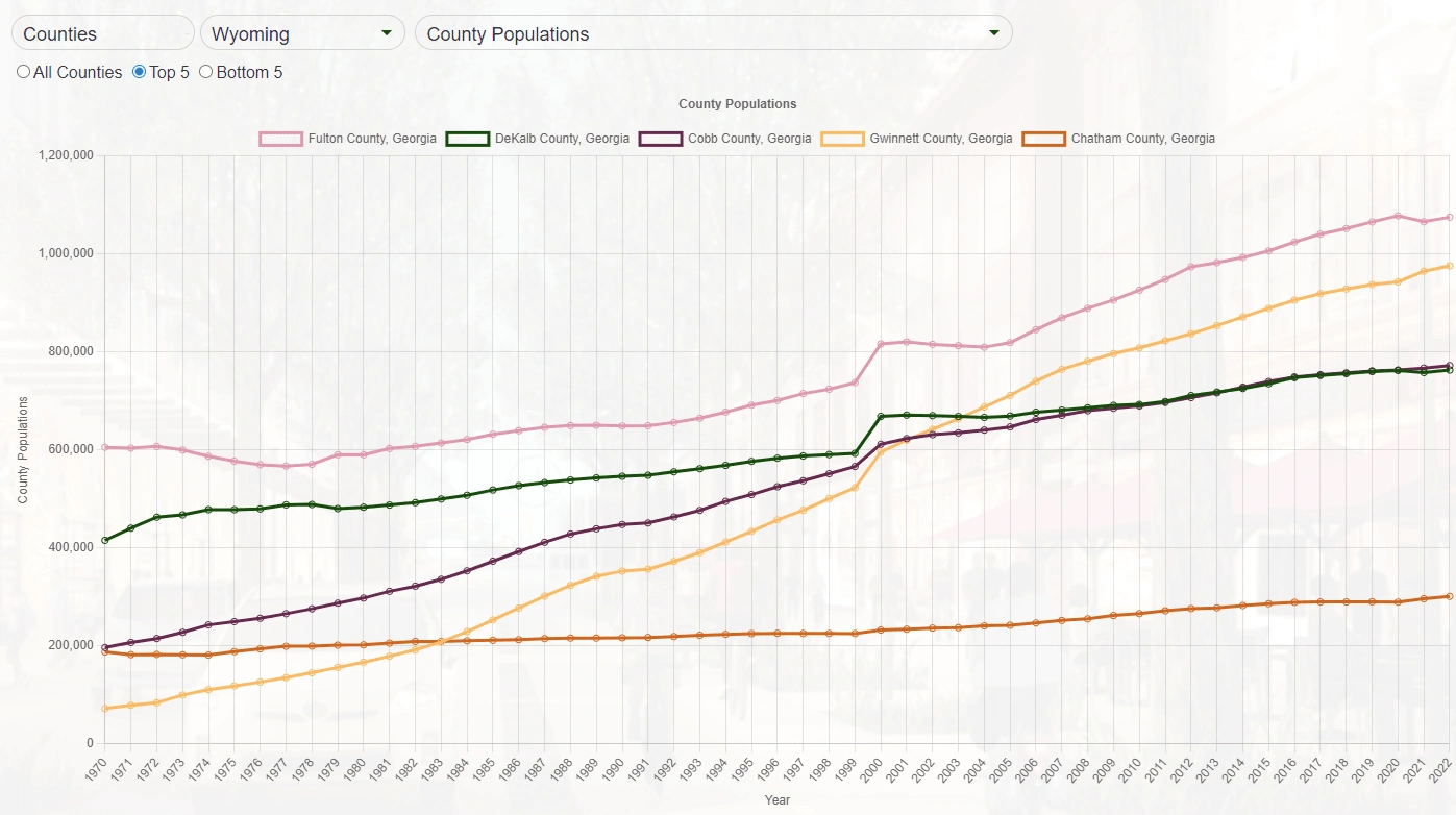
Figure 3 : Interactable visualization - County Populations for top 5 counties in Georgia
Like this project
Posted Oct 5, 2024
I develop interactive data visualizations that pull data into websites using both APIs and free static data hosting for extremely fast page load times.