Designing and building a marketing website for a live iOS app
Hillary N
Designing the first impression for a faith-based iOS app — from brand to deployment.
Role: Designer, Copywriter, Frontend Developer
Site: getwaymark.app
Stack: Next.js, Vercel, Framer Motion, Figma
Pages: Landing, About, FAQ, Privacy Policy
A marketing website for a solo product has one job: earn enough trust in the first thirty seconds that a stranger downloads your app. This project shows I can design and build that surface from scratch — handling visual identity, copywriting, interaction design, and frontend development without handing off to anyone.
The Brief
Waymark is a faith-based iOS app for people who want to understand the Bible but feel overwhelmed, lost, or put off by apps that assume prior knowledge. The website needed to do three things before a visitor ever touched the App Store button: explain what Waymark is clearly, speak to the right person without alienating anyone else, and make the product feel trustworthy enough to download from a developer they had never heard of.
That last part is the hardest problem a solo founder's marketing site has to solve. There is no company name behind it. No press. No social proof. Just the product, the person who built it, and the copy holding everything together.
Copywriting as a Design Decision
The landing page opens with two lines in sequence: "Faith was never meant to feel distant." Then, on scroll: "Or disconnected from the life you are living right now." That rhythm — a statement, then its extension — is intentional. It mirrors how the app itself works: one thing at a time, each step building on the last.
The middle of the page carries what is arguably the strongest piece of writing on the site:
Most Christians own a Bible. Less than half read it weekly. Fewer know how it fits into Monday mornings, hard conversations, quiet doubts, or long seasons of waiting. It is not a lack of faith. It is a lack of clarity. That's why Waymark exists.
That passage does not describe the product at all. It describes the person reading it. The copy earns trust before it asks for anything. Writing it this way was a deliberate choice to lead with empathy rather than features — the same principle that drives the app's design.
Each feature section follows the same structure: a short headline, a single line of description, and a short video. No extra words. The restraint is the point. A faith app that explains itself in the calmest, clearest way possible should have a website that does the same.
Design Approach
The relationship between the website and the app was defined early as same voice, different register. The app is quiet, personal, and unhurried — designed for someone already inside the experience. The website needed that same warmth but with slightly more confidence, the way the same person sounds when explaining something they care about to someone they have just met.
The visual language borrows the app's calm palette and typographic restraint but opens into more generous layout proportions suited to a large screen. A background video on the hero section adds depth without noise. Framer Motion handles scroll-triggered reveals and transitions throughout — the motion language mirrors the product: nothing sudden, nothing decorative for its own sake. If a visitor notices the animations, they are probably too prominent. If the page just feels smooth and unhurried, the motion is doing its job.
The About Page
The About page carries a full personal origin story — why Waymark exists, who built it, and the conviction behind it. For a solo product, the founder's credibility is the brand's credibility. A stranger who understands the personal investment behind the product is far more likely to trust it than one who only sees a feature list.
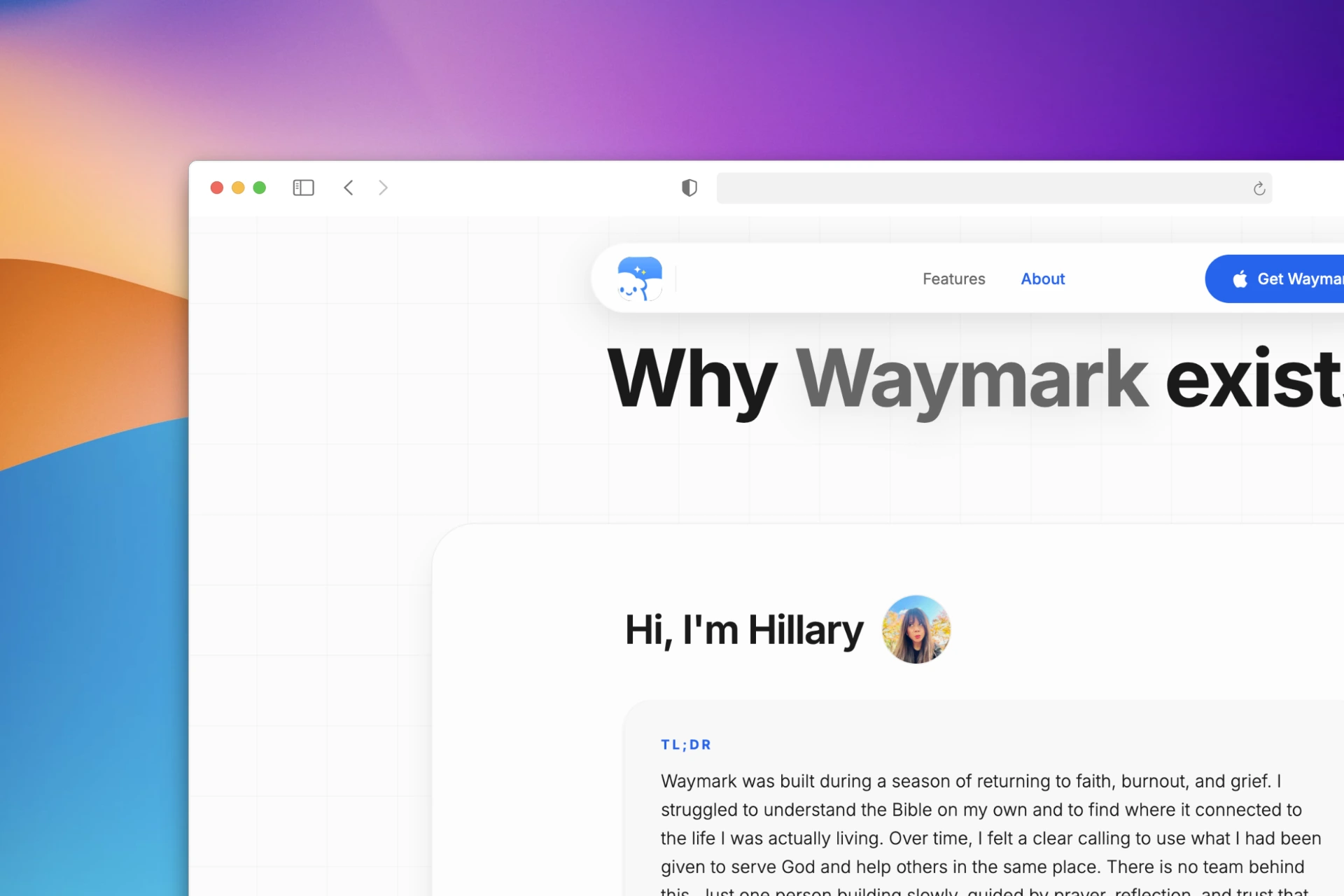
The page opens with a TL;DR summary before the full story. That was a deliberate UX choice: some visitors want to skim, some want to read everything. The TL;DR respects both without sacrificing the depth of the longer version. It also signals self-awareness — a quality that matters for a product built around empathy.
What I Owned
Every part of this. Brand voice definition. Copywriting across all four pages. Visual design and layout in Figma. Frontend development in Next.js. Animation and scroll interaction design with Framer Motion. Hero background video integration. Deployment and hosting on Vercel. App Store compliance pages structured to meet Apple's requirements without breaking the site's tone.
The Result
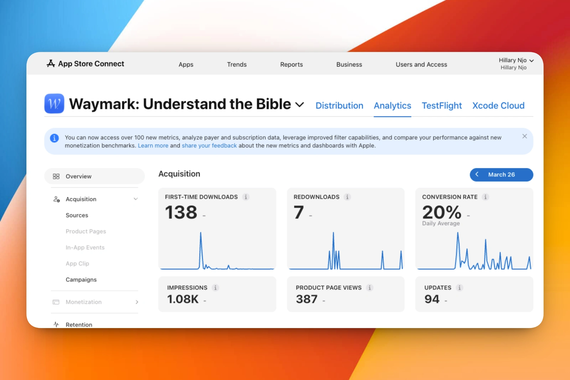
The website launched alongside the app with no paid traffic, no SEO work, and no social presence. The app recorded 138 first-time downloads and a 20% App Store conversion rate in its first release cycle — four to six times the App Store category average. While direct attribution between the website and the download rate cannot be fully isolated, the website was the primary pre-download touchpoint for every organic visitor. A conversion rate that high, with no distribution behind it, suggests the trust-building work translated.
Want to see the full Waymark product case study — the app design, content quality system, early data, and what changed in the next version?
Like this project
Posted Mar 28, 2026
Solo-built in Next.js with Framer Motion. Designed to build trust and drive App Store downloads — same voice as the app, different register.
Likes
0
Views
3