Redesigning a car financing platform with a 95% drop-off rate
Hillary N
From a 95% drop-off to 1700% lead growth — by solving a mental model mismatch, not a visual problem.
Role: UI/UX Designer
Agency: Aleph
Client: SEVA (car financing platform)
Timeline: December 2022 – March 2023
Industry: Fintech / Automotive
Type: Responsive Web
The Result First
The redesign drove a 1700% increase in lead conversions, reported by the design director after the platform was fully implemented and event tracking was in place. That number reflects what happens when a product stops fighting its users' mental model and starts working with it.
The Problem
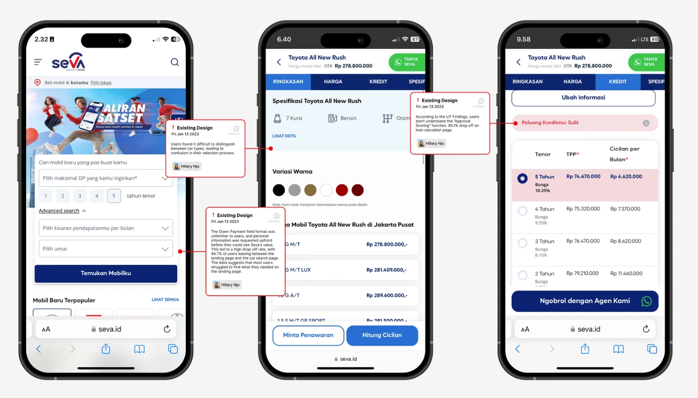
SEVA's platform was built around a finance-first philosophy: understand your budget before browsing cars. Sound advice in theory. In practice, most people buying a car think about the car first and financing second. Asking them to flip that sequence — before they had any reason to trust the platform — produced a 95% drop-off rate. Nearly every person who arrived left before completing a meaningful action.
The problem was not the visual design. It was that the experience asked users to adopt a new way of thinking before giving them any reason to do so.
What I Did
My contribution spanned four areas: UX audit and competitor analysis, workshop facilitation, the design of the concept that was validated through user testing and became the foundation of the redesign, and UI design execution across the final deliverables.
The UX audit used click heatmaps and funnel data to pinpoint where and why users were leaving. Content prioritisation was working against the flow. The search had too many steps. SEVA's Instant Approval feature — a genuine competitive advantage offering fast financing decisions — was buried too deep for most users to ever reach it.
I facilitated a cross-functional workshop with design, marketing, and product teams to align on root causes before moving into design. That alignment was necessary because the changes required were structural. Getting buy-in at the architecture level before wireframing prevented the kind of late-stage rework that kills timelines.
The Design Decision That Mattered
Two concepts were developed and tested with users through in-depth interviews run by the research team.
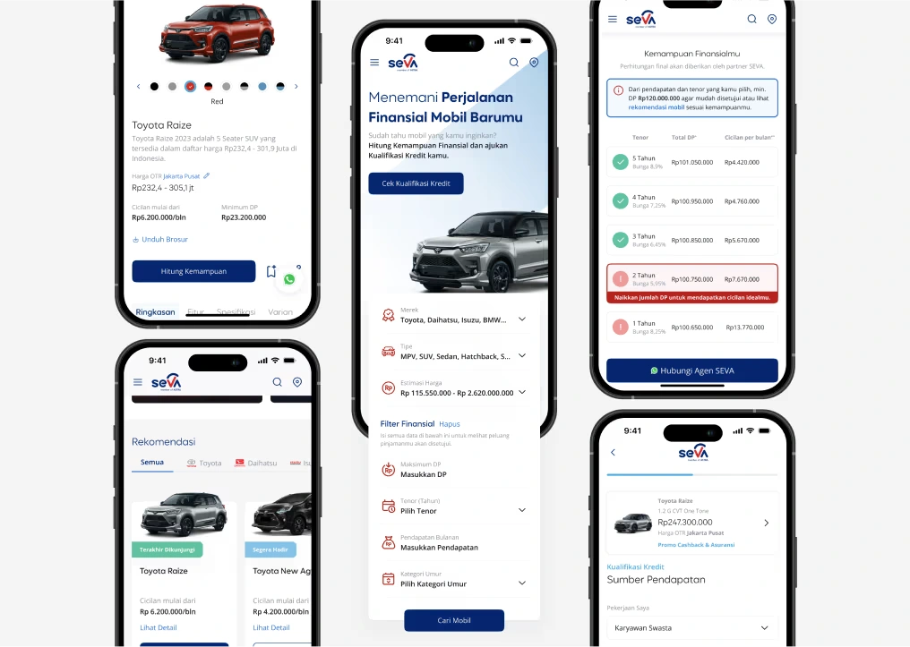
Concept A — the one I designed — let users browse by car type first, with financial filters available progressively but not mandatory. Financing appeared as a support layer, not a gatekeeper. Concept B offered hyper-personalised recommendations from the start, but introduced opacity: users could not tell why certain cars were being shown, and in a high-stakes financial decision, opacity breeds distrust.
The testing was unambiguous. Concept A felt controllable. Concept B felt presumptuous. Concept A became the redesign.
The core insight: users were never opposed to financing support. They were opposed to being asked to engage with it before they had found something worth financing.
The Outcome
1700% increase in lead conversions. The redesign was developed and tracked after the design engagement concluded — standard for agency work — and the result was reported back through the design director once event tracking had been running long enough to be meaningful.
The 95% drop-off did not exist because users were uninterested in SEVA's product. It existed because the product was asking the wrong question first.
Like this project
Posted Mar 30, 2026
UX audit, workshop facilitation, concept design, and UI execution. The redesign drove a 1700% increase in lead conversions.