Mobile App Design | Fintech Investment App | Learning IOS App
Anna asol_design
Verified
FINANCIAL LITERACY CAN SAVE PEOPLE YEARS OF THEIR LIVES
From debt. From fear around money. From depending on one salary. From expensive financial mistakes that take years to repair.
That is why this fintech app design project became more meaningful to me than another mobile app.
Creating a financial literacy app for teenagers is a serious product challenge.
Teenagers will not use a finance app simply because it is useful. They lose interest quickly, ignore long explanations, and immediately notice when a product is trying too hard to speak their language.
The real challenge was not only to explain investing, saving, assets, portfolio management, and financial responsibility.
I needed to create a teen finance app that users would genuinely want to open, explore, and return to.
PROBLEM
The client came to me with an AI-generated mobile app containing:
500+ AI-generated screens 15 bottom navigation tabs duplicated user flows disconnected financial features no clear MVP direction no scalable product architecture
AI had generated hundreds of screens, but it had not created a coherent fintech product.
The same actions appeared in multiple sections. Important features were buried inside overloaded navigation. The hierarchy was unclear, and users had no obvious path from financial education to practical investing.
The app looked extensive, but it was not ready for development, launch, or growth.
Building all 500+ screens would have required a large development budget without solving the fundamental product problems.
Instead of a scalable investment app, the founder had a collection of interfaces with no clear user journey, retention strategy, or monetization logic.
MY APPROACH
I did not begin with visual mobile app design.
I started with a full Product Discovery Phase, UX audit, and MVP strategy.
First, I analyzed the existing product structure, financial features, user flows, navigation, and AI-generated screens.
Then I identified:
duplicated functionality
unnecessary screens
missing product relationships
unclear user priorities
features that belonged in the MVP
features that could be moved to future releases
potential engagement and monetization opportunities
I did not ask how to redesign 500+ screens.
I asked:
What does a teenager need to understand first?
What should they do after learning a financial concept?
How can financial education lead naturally to simulated investing?
What creates visible progress?
What motivates users to return?
What can make this financial literacy product commercially scalable?
Based on those questions, I rebuilt the entire fintech app information architecture.
I connected financial education, simulated investing, portfolio management, progress tracking, rewards, achievements, and parental controls into one structured mobile app ecosystem.
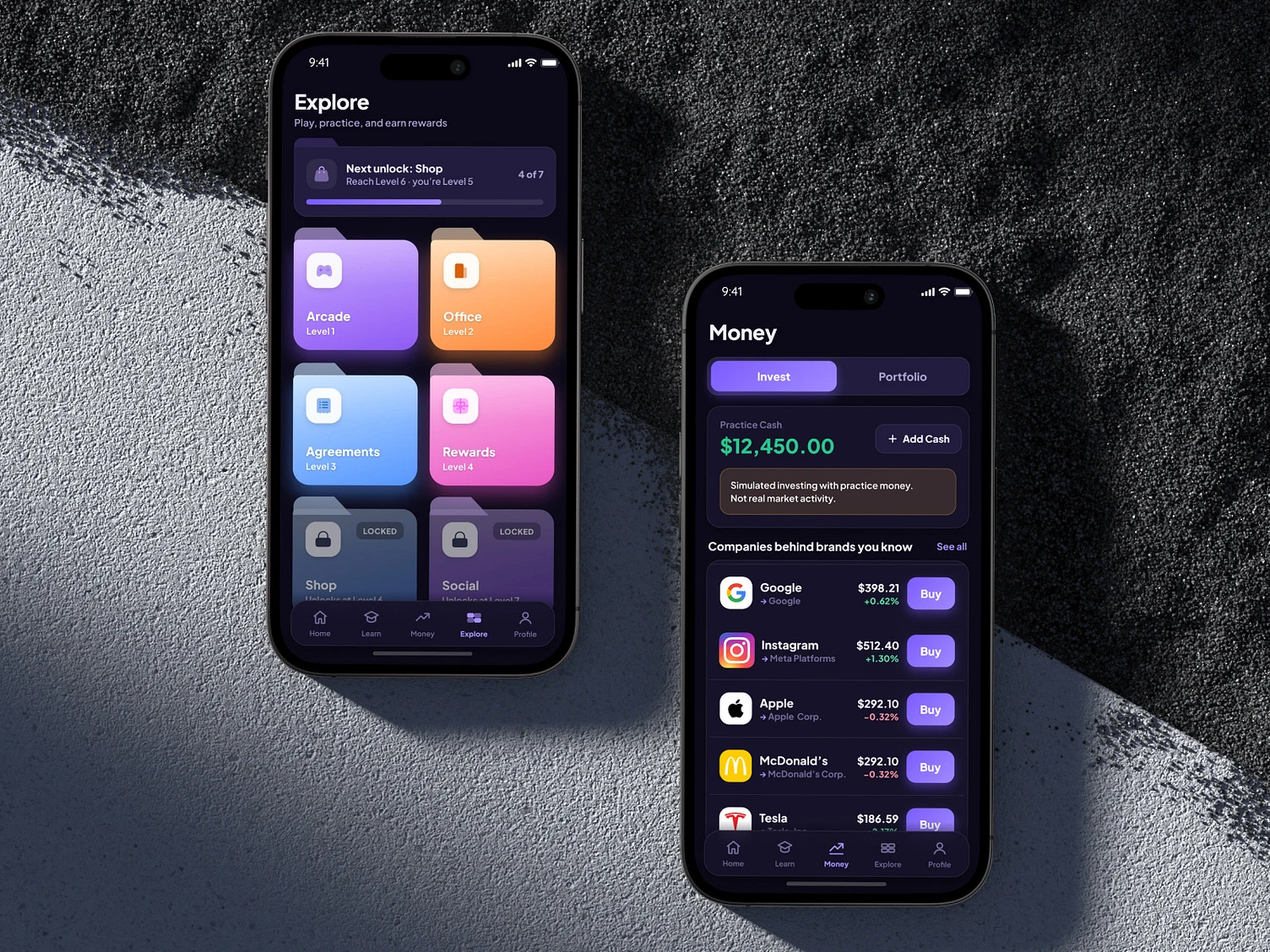
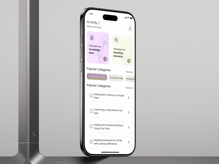
The product was reorganized into five clear navigation areas:
Home - progress, goals, recommendations, and next actions
Learn - short financial education lessons and practical knowledge
Money - simulated investing, stocks, and portfolio management
Explore - challenges, locations, rewards, and gamified progression
Profile - achievements, streaks, inventory, and parental settings
The new structure gives users a clear path through the product without exposing them to hundreds of features at once.
GROWTH SOLUTION
Simplifying the navigation was only part of the solution.
The larger product challenge was retention.
Teenagers will not return to a financial literacy app simply because the information is valuable.
The product needs to create curiosity, visible progress, rewards, and a reason to continue.
I designed the experience around a repeatable engagement loop:
Learn → Practice → Earn XP → Unlock → Return
Instead of passively reading financial content, users practice through action.
They can:
complete short financial lessons
learn how investing works
explore familiar global companies
invest simulated money
build and manage a virtual portfolio
complete financial challenges
earn XP and rewards
unlock new product areas
maintain streaks
track achievements and progress
Gamification was not added as a decorative layer.
It became part of the fintech product strategy.
The progression system gives users an immediate reason to continue, while the simulated investment experience helps transform theoretical knowledge into practical decisions.
This creates a stronger connection between:
financial education investment app functionality habit formation user engagement retention product monetization
The product is designed to support teenagers while remaining scalable for the founder.
Because impact without a strong business model does not scale.
RESULTS AFTER DISCOVERY
FROM AI-GENERATED CHAOS TO A SCALABLE PRODUCT
500+ AI-generated screens
were transformed into one structured fintech product ecosystem.
15 → 5 core navigation areas
This created 67% less navigation complexity.
The product now has:
1 clear MVP direction 100% rebuilt product architecture a defined primary user journey a scalable mobile app structure a clear connection between learning and investing stronger gamification and retention mechanics clearer monetization opportunities a realistic product development roadmap
Instead of developing hundreds of disconnected screens, the founder now has a clear fintech app strategy that can be designed, developed, tested, and released in stages.
The new system also creates a reusable foundation for future financial lessons, investment scenarios, challenges, rewards, subscriptions, and premium features.
The client waited almost six months for our Discovery Phase.
Now my team and I are moving forward with the complete financial literacy and investment app design.
💫 Let’s turn your idea into a lovable, high-converting mobile app.
Whether you're launching from scratch or scaling what works — we design apps that users trust, love, and pay for.
✨ Trusted by Spotify, Meta, Coopah, Blush Design & more
📲 Tell me what your mobile app does — I’ll show you exactly how it can make money.
Like this project
Posted Jun 23, 2026
Redesigned a teen fintech app, reducing 15 navigation areas to 5 and transforming 500+ AI-generated screens into one scalable MVP.
Likes
10
Views
18
Timeline
Jun 17, 2026 - Jun 17, 2026
Clients
CleverShares
