Mastering the "Soft-UI" Aesthetic in High-Stakes Banking 🎨 ...
Md. Rizwan Siddiquei
Mastering the "Soft-UI" Aesthetic in High-Stakes Banking 🎨
The Design Secret: Low-Contrast Hierarchy.
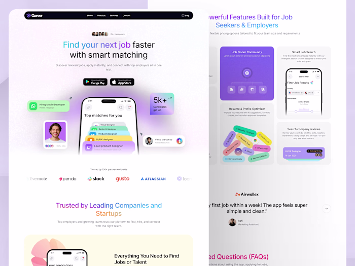
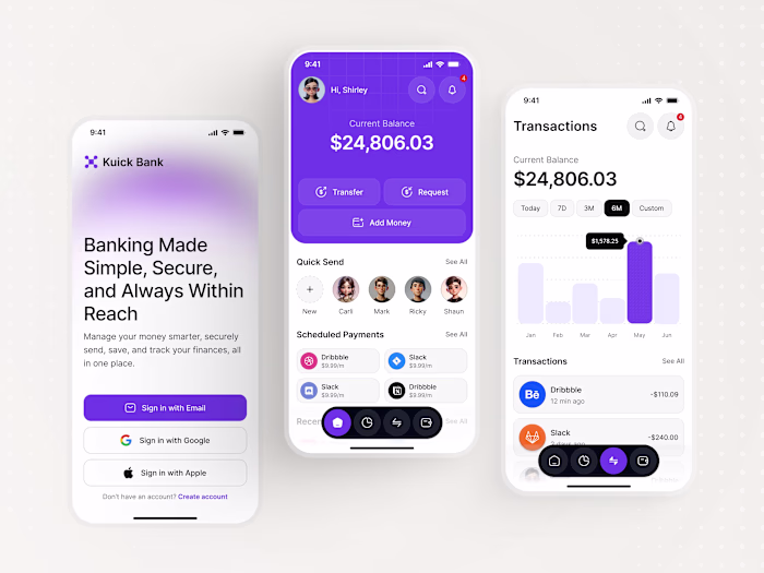
Challenge: How do you show 8+ features on one page without looking like a mess? For Kardex, I used a low-contrast, monochromatic palette with subtle shadows. This allows the bento boxes to feel like part of the background, making the CTA (the card) the only thing that pops.
Feedback Request: Does the "Muted" color palette feel too soft for a credit service, or does it add to the premium feel?
Like this project
Posted Jan 26, 2026
Mastering the "Soft-UI" Aesthetic in High-Stakes Banking 🎨 The Design Secret: Low-Contrast Hierarchy. Challenge: How do you show 8+ features on one page wit...
Likes
0
Views
0