Final look at the UX behind Qareer: Turning job search anxie...
Md. Rizwan Siddiquei
Final look at the UX behind Qareer: Turning job search anxiety into action. 🚀
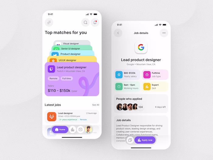
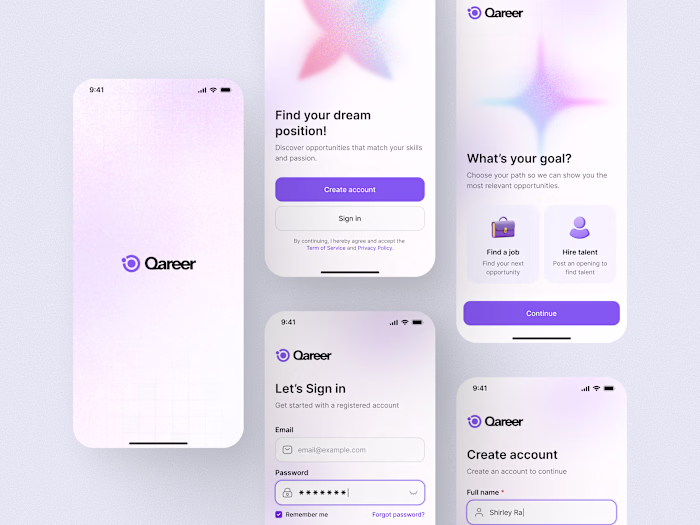
For this screen set, I focused on Information Architecture. By simplifying complex filters and creating a visual "Application Tracker," I reduced the cognitive load for users managing multiple job leads.
My goal was to move away from cluttered lists and toward a clean, "scannable" interface that prioritizes what matters most, the user’s next career move.
🛠 Data visualization, filter logic, and status tracking.
🎨 Clean, modern, and high-contrast for accessibility.
What’s your favorite design trick for making data-heavy apps feel light? Let's discuss!
Like this project
Posted Jan 7, 2026
Final look at the UX behind Qareer: Turning job search anxiety into action. 🚀 For this screen set, I focused on Information Architecture. By simplifying com...