D1 & WBNA Player Brand & Website


Hammer Basketball
Brand Identity Refresh & Website Design/Development
Crafting an engaging and scalable brand system for a former D1 and WNBA Draft player to support her mission to build stronger athletes—and even stronger leaders—through elite, position-specific training.
Client Type: Basketball Training Solopreneur
Industry: Sports, Athletic Training, Basketball
Scope: Brand Strategy, Brand Identity Transformation, Flexible Visual System, Tone of Voice and Messaging, Framer Website Copy, Design, and Development, Marketing Collateral, Custom Iconography
The Challenge
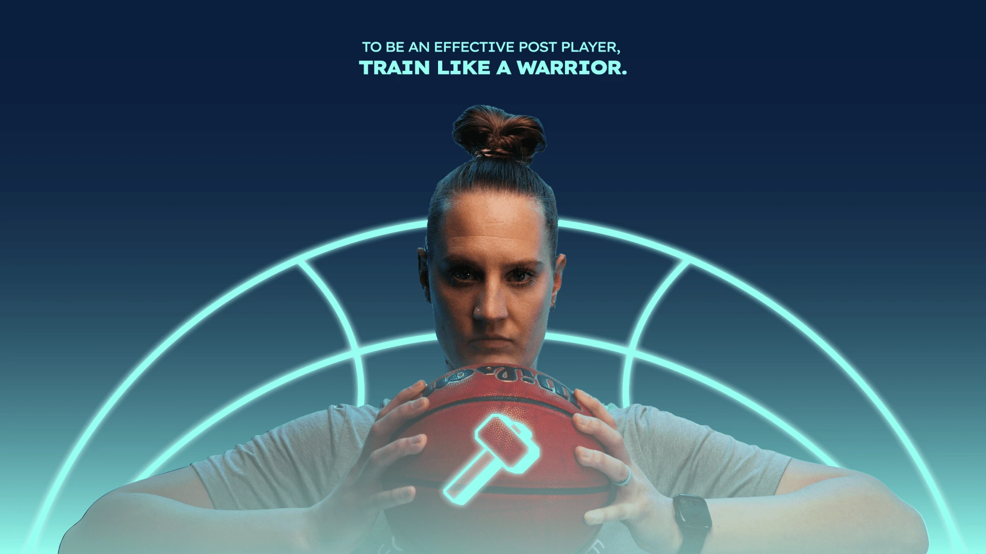
Hammer Basketball is a training program built specifically for female post players in middle and high school. The brand needed a strong identity that matched the intensity and focus of its training. The goal: stand out in a crowded space, connect with young athletes, and drive sign-ups for the program on the Playbook-powered Hammer Basketball app.
The Solution
I worked closely with Hammer Basketball founder Anna DeHamer, a Division 1 and WNBA Draft post player, to bring her vision to life. The brand needed to feel strong, gritty, and empowering—just like the athletes it serves.
We started by building a brand strategy around one powerful idea:
Train Like a Warrior.
From there, the objective was:
• Create a bold, empowering brand identity rooted in strength, grit, and focus
• Design a conversion optimized landing page that promotes app downloads
• Craft a tone and visual system that speaks to young athletes and their mindset
Deliver assets within the visual system for marketing and promotion
Visual Identity System
A strong, modern wordmark paired with a dimensional hammer logo. The brand draws visual cues from blacksmithing, discipline, and basketball culture.
The hammer logo was designed with adaptation into a design element in mind.
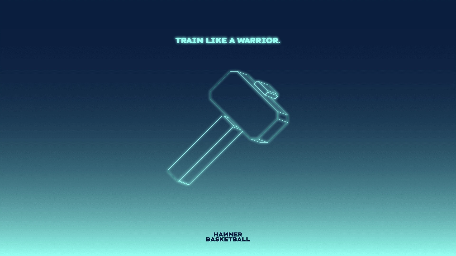
"Neon glow" was a design feature Anna latched onto early in the process, as she wanted to communicate electric energy.

The logo also needed to be responsive - recognizable at any size.

While Anna expressed a desire to keep the turquoise color as a primary, she understood the need for secondary colors.

The color system needed to be bold, strong, and slightly edgy, but maintain an energetic femininity to appeal to female athletes.

In basketball, the post position is sometimes referred to as "5", inspiring the 5 balls in motion icons.

A bird's eye view of the basketball court was introduced as an element in the visual system sandbox, representing "Post IQ", a key idea Anna teaches to athletes.
The hammer logo was turned into an impactful 3D element with gritty texture while keeping the neon glow effect in mind. Made in Spline.
Framer Website Design & Development
A high-impact website landing page designed to convert visitors into app downloads
“Train Like a Warrior” sets the tone. The hero section is clean, direct, and focused on converting users into app downloads with a strong CTA and bold messaging.
I built a page flow that mirrors the mindset of a post player: confident, grounded, and action oriented. Each section is purposeful—no fluff, all focus.
Messaging & Marketing Collateral
A sharp, athletic visual system designed for bold statements and strong hierarchy.
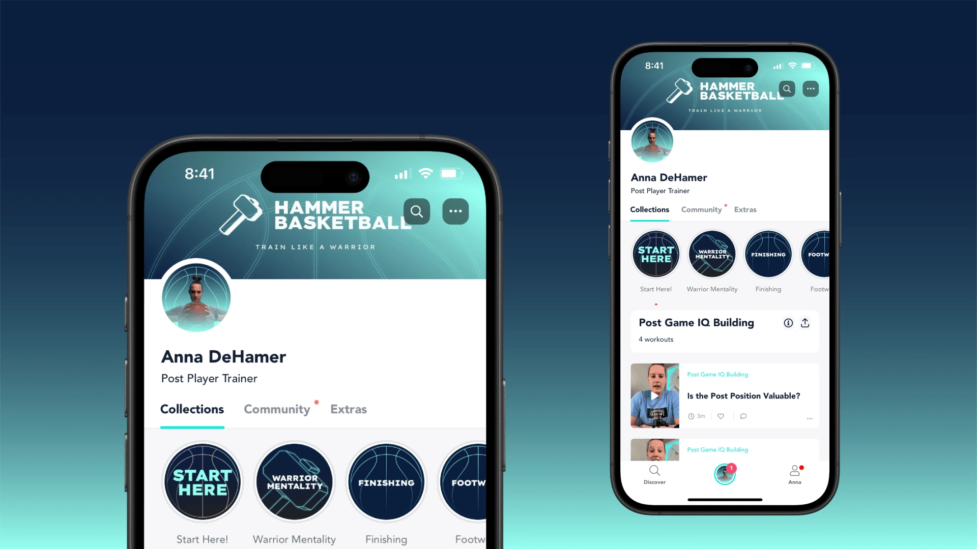
The visual system needed to maintain consistency across every touchpoint, even down to the category bubbles in the app
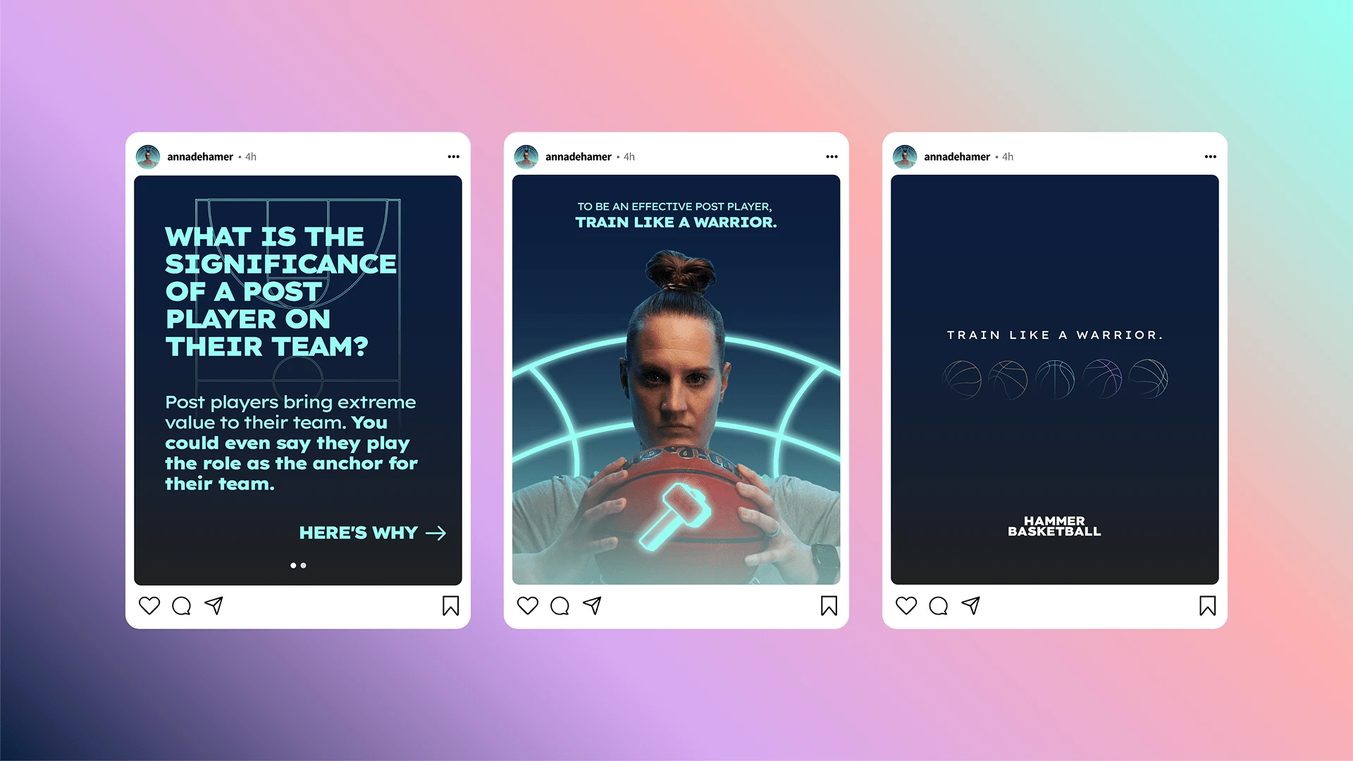
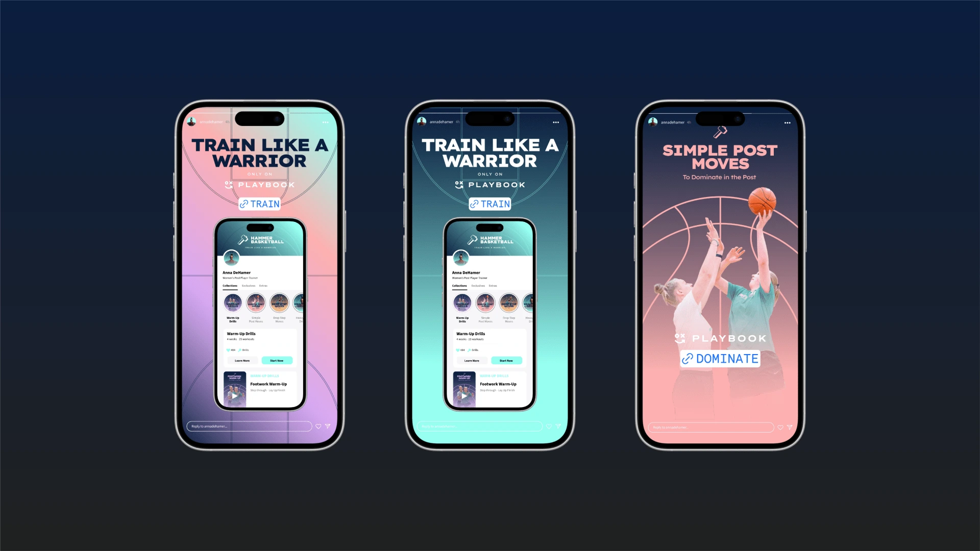
Social templates/examples
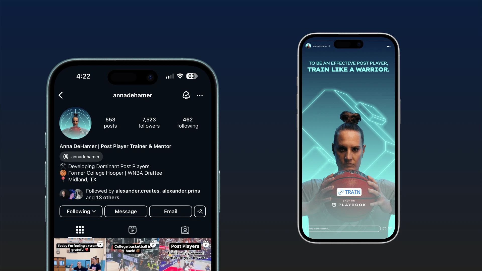
Social examples continued
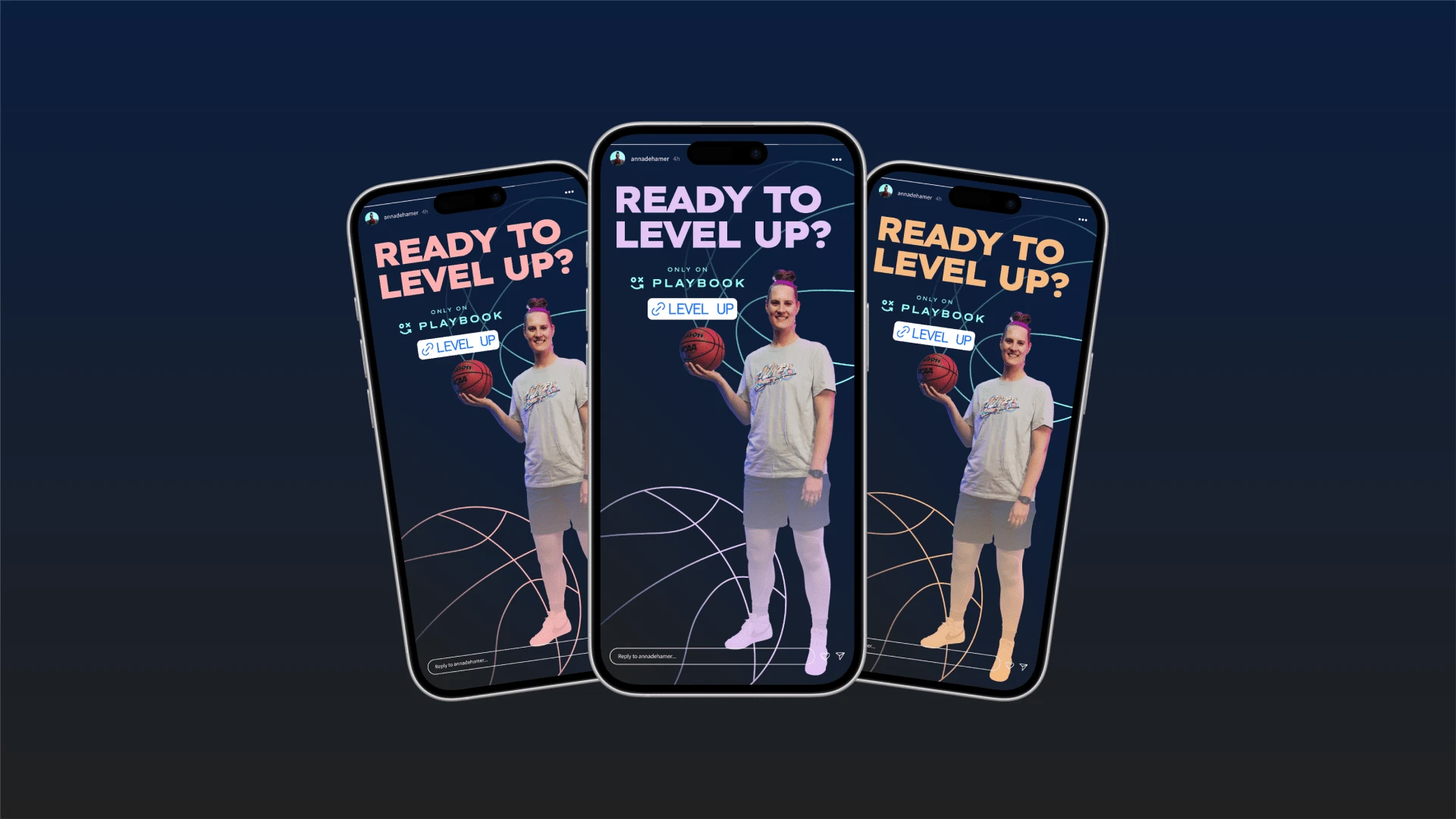
Marketing asset templates
Marketing asset templates
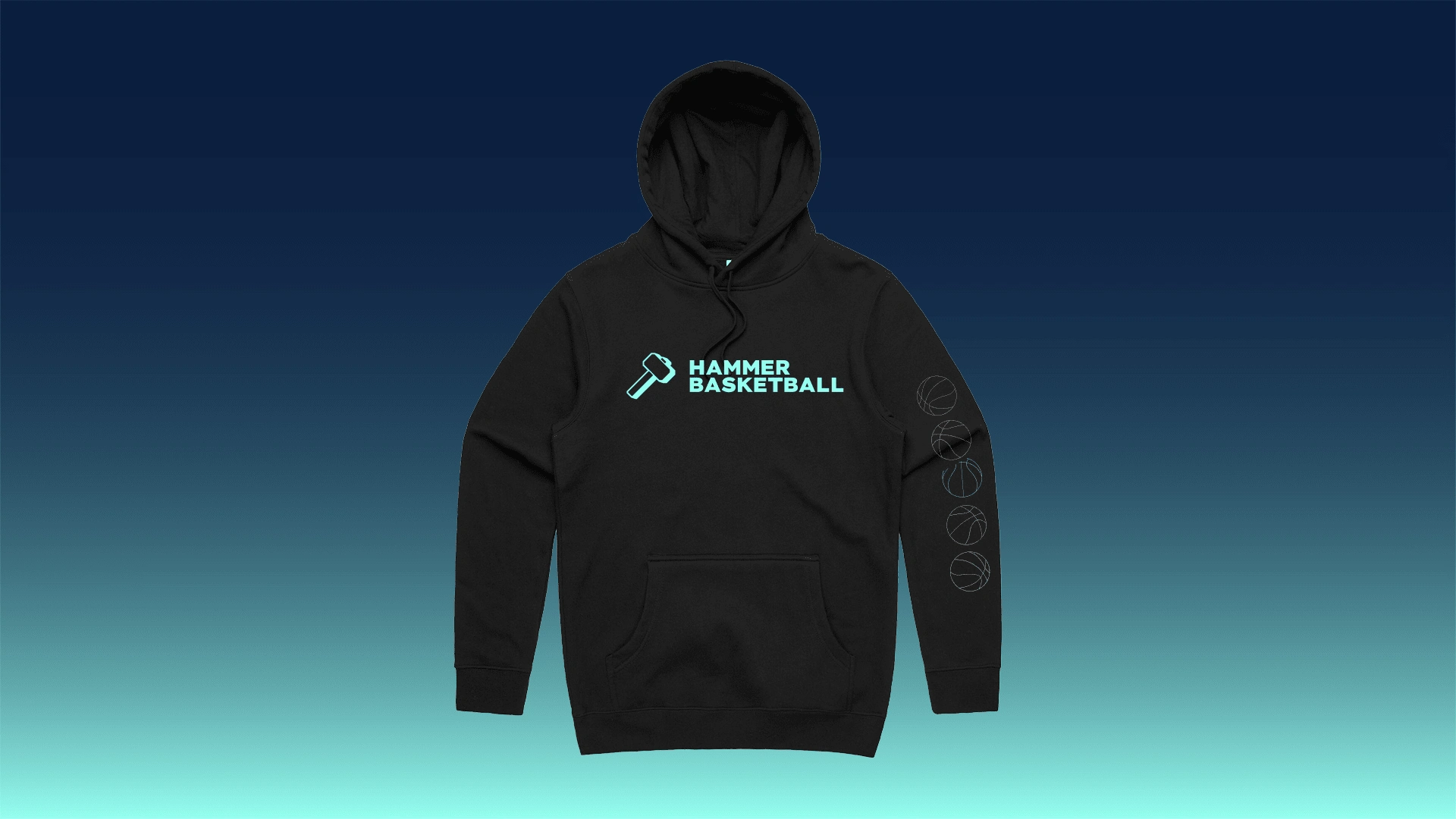
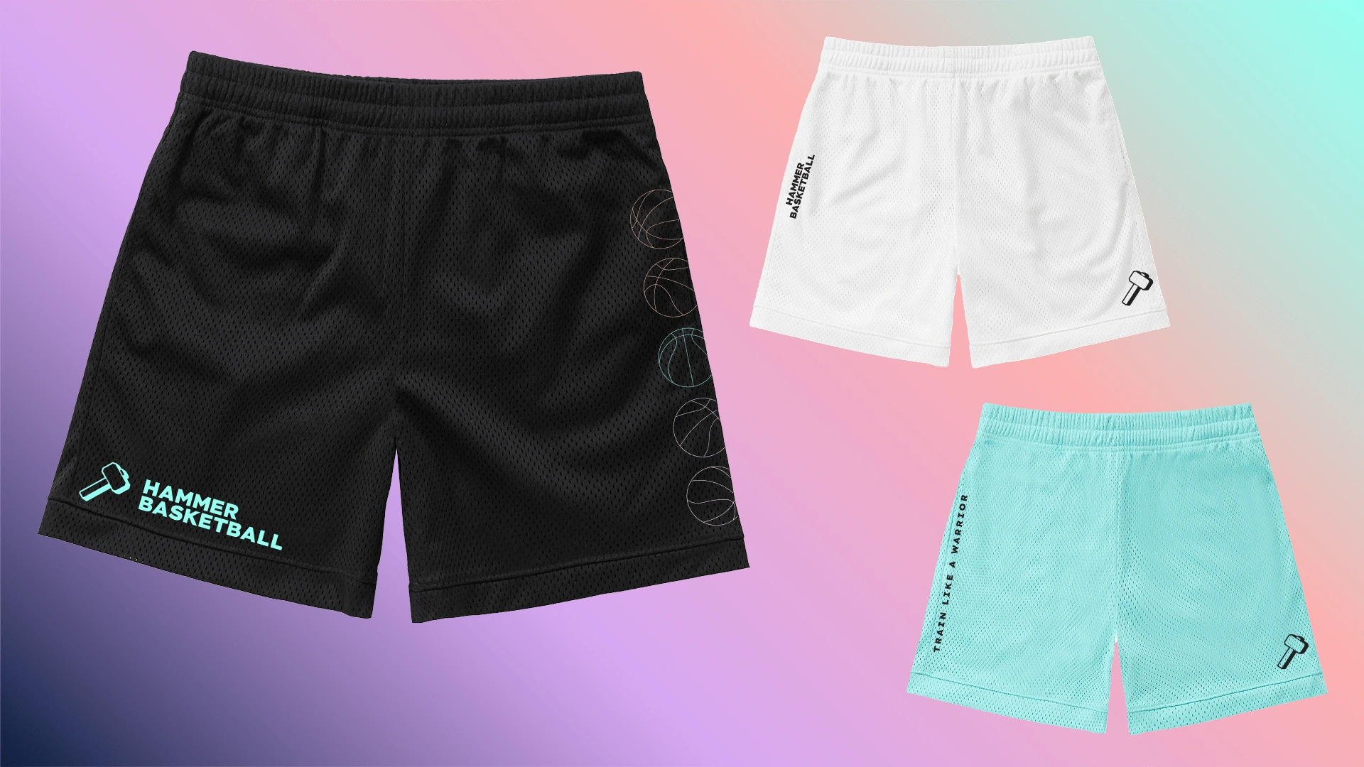
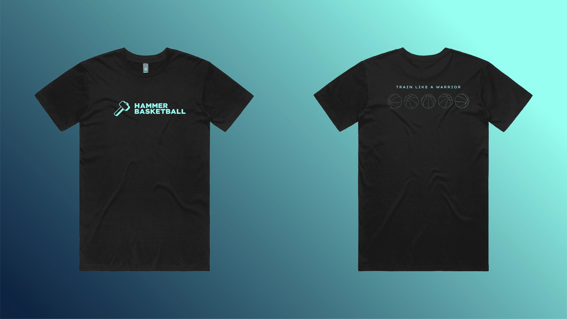
Anna intends to invest in merch drops in the future, so I presented a few ideas based on the core brand system
Outcome & Value
The Hammer Basketball brand now reflects what it stands for:
Power. Precision. Purpose.
The site gives athletes a clear next step and a reason to believe in what’s possible when they train like a warrior.

Thanks for looking!
Like this project
0
Posted Apr 11, 2025
An in depth and strategic brand transformation now reflects what Hammer Basketabll stands for: Power. Precision. Purpose.
Likes
0
Views
4
Timeline
Dec 1, 2024 - Jan 17, 2025


My Favorite Merch Designs

LASIK Marketing Agency Brand Transformation
Fractional CFO Brand Transformation