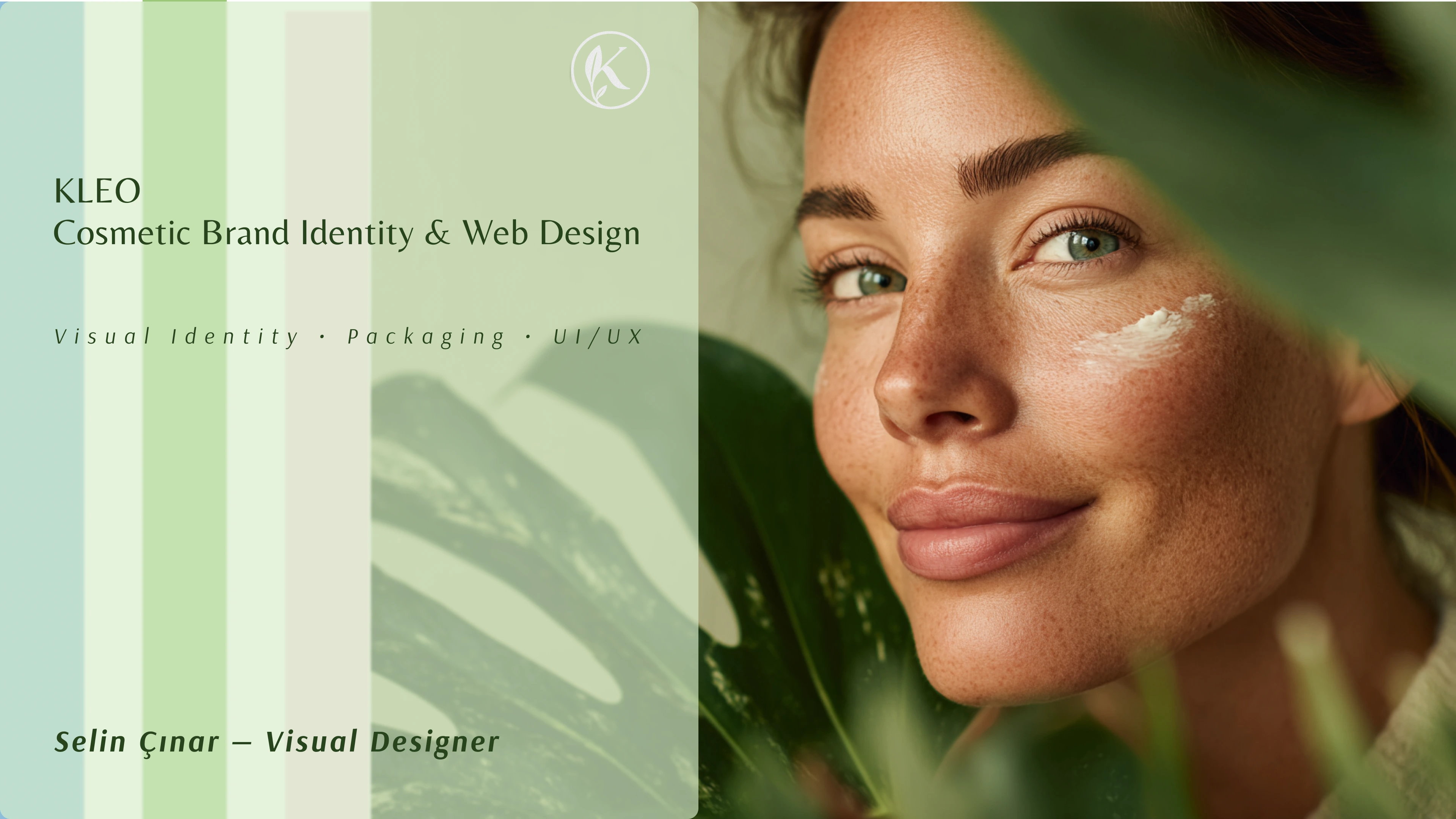
Kleo Brand & Web Design

selin çınar
Verified


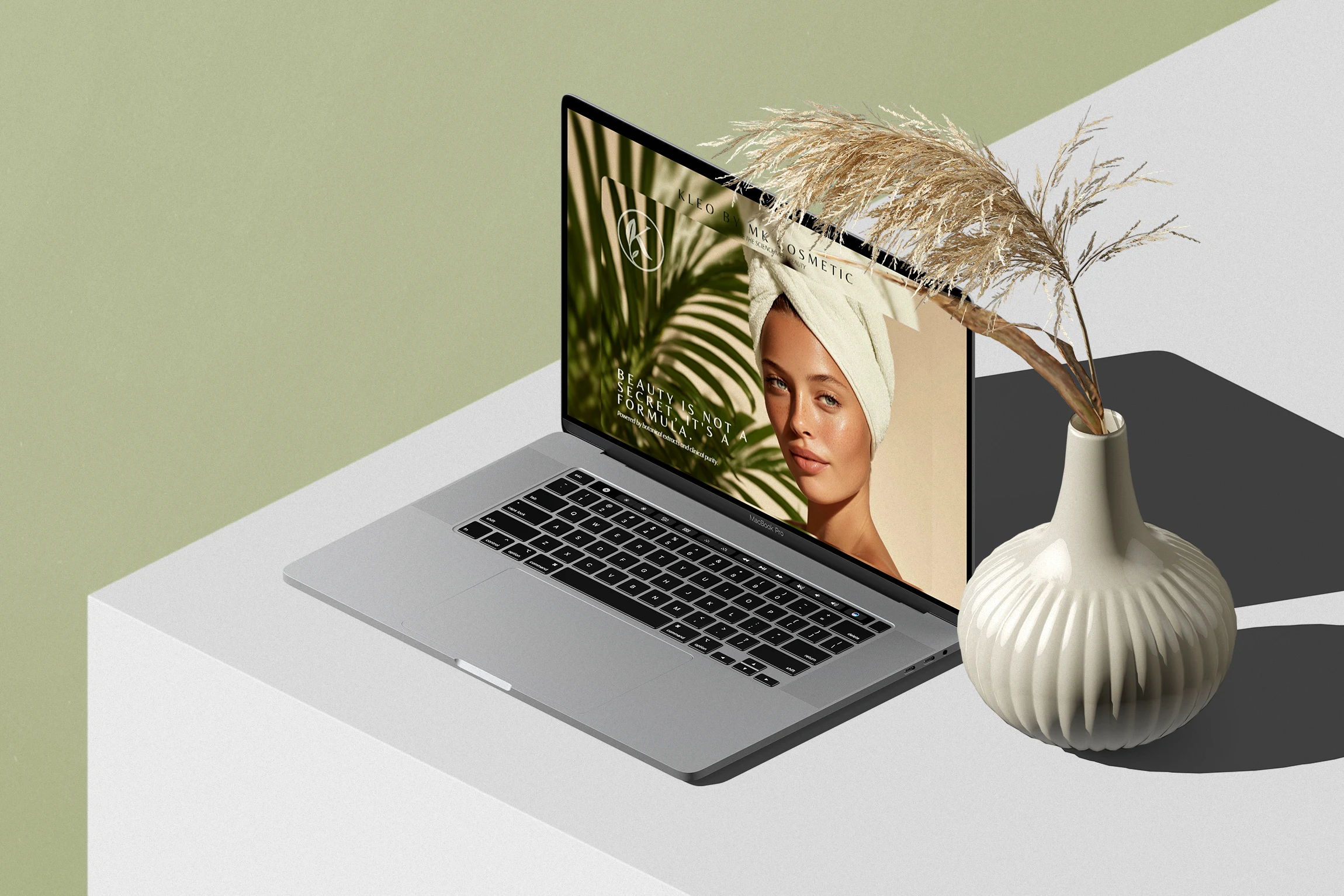
A clean and minimal desktop mockup of Kleo’s landing page, combining natural tones with a gentle layout to reflect the brand’s calm and scientific identity.
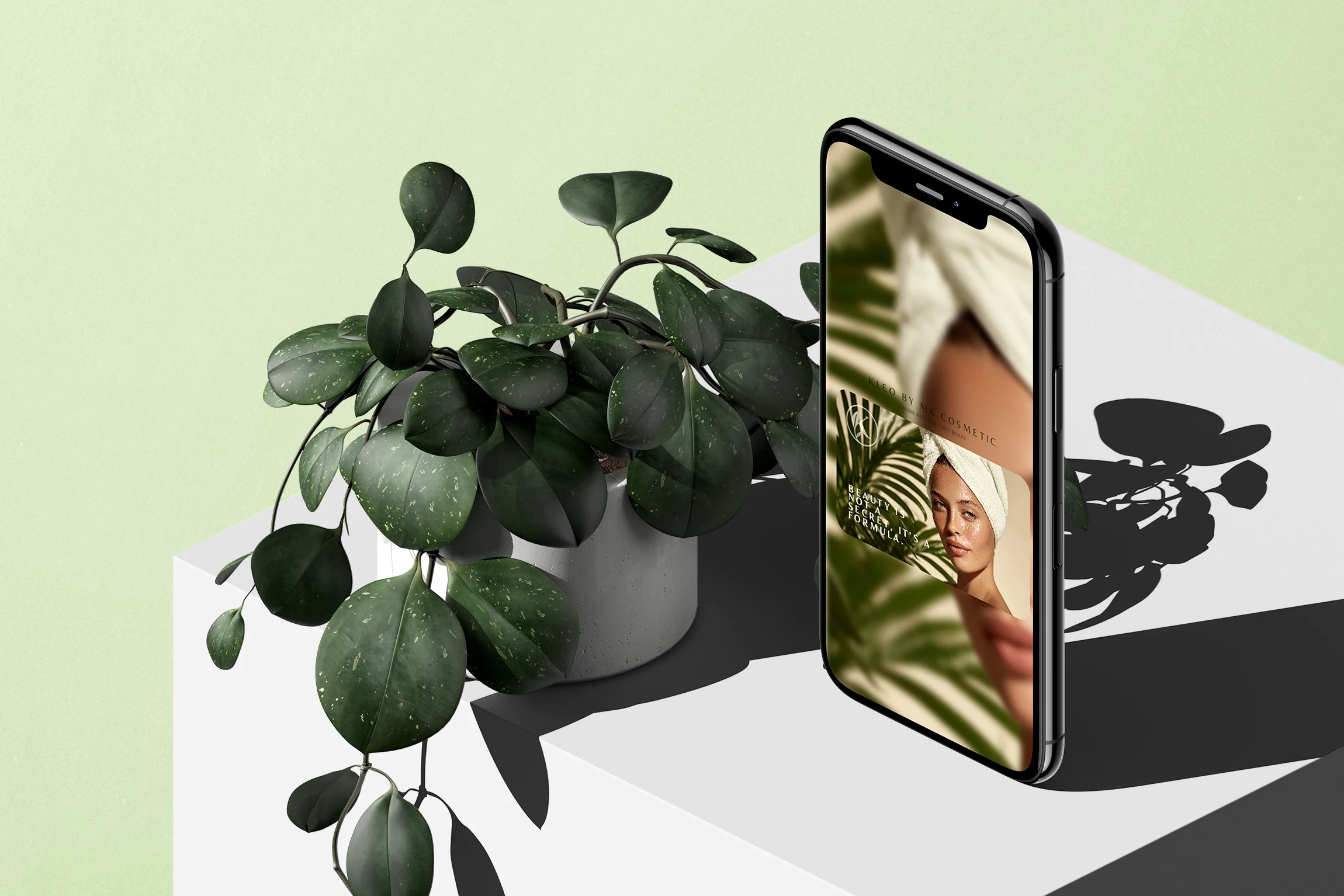
Mobile version of Kleo’s landing page, showcasing a soft and user-friendly layout designed to reflect the brand’s calm and natural skincare approach.
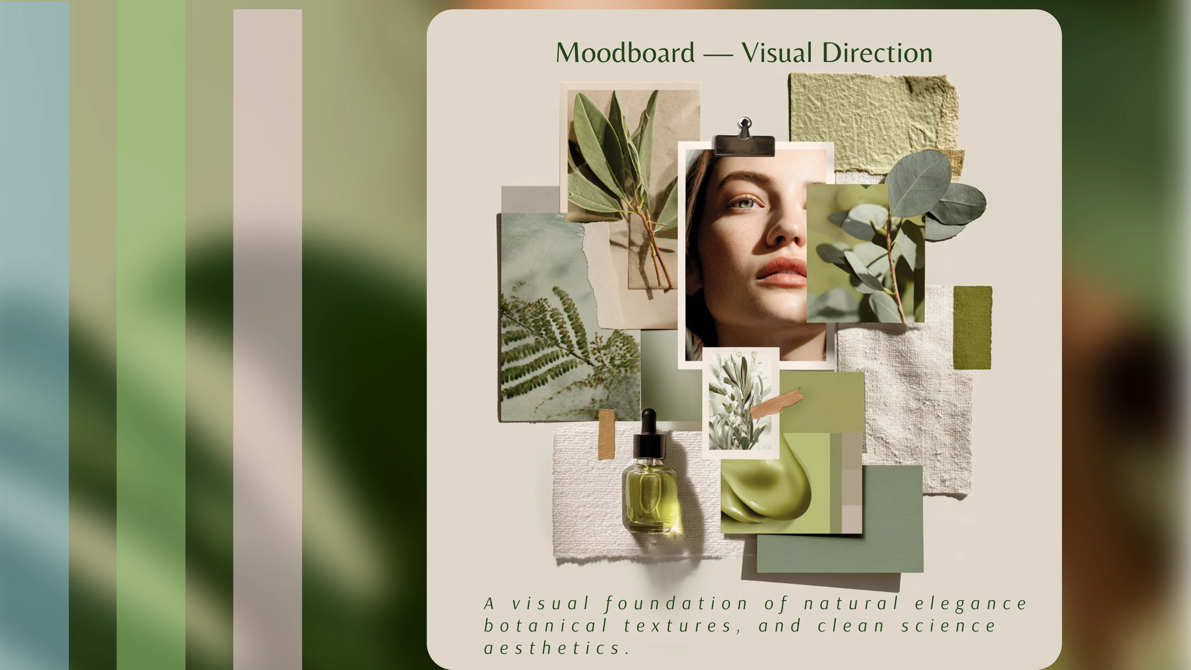
A visual moodboard capturing Kleo’s aesthetic direction — soft botanicals, natural textures, and a science-inspired calm color palette.
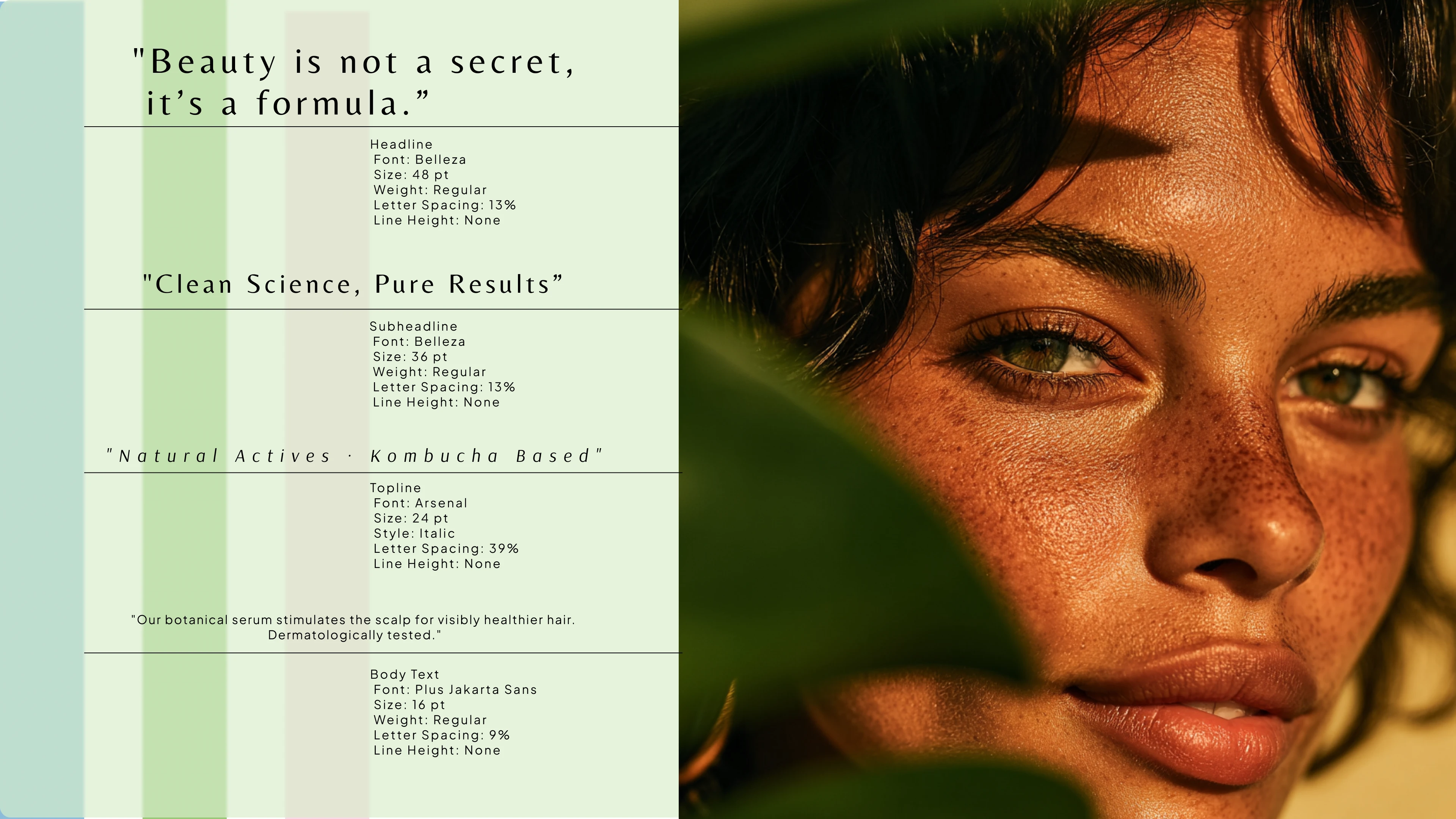
Typography system developed for Kleo, combining elegance and readability through a clean font hierarchy and balanced spacing.
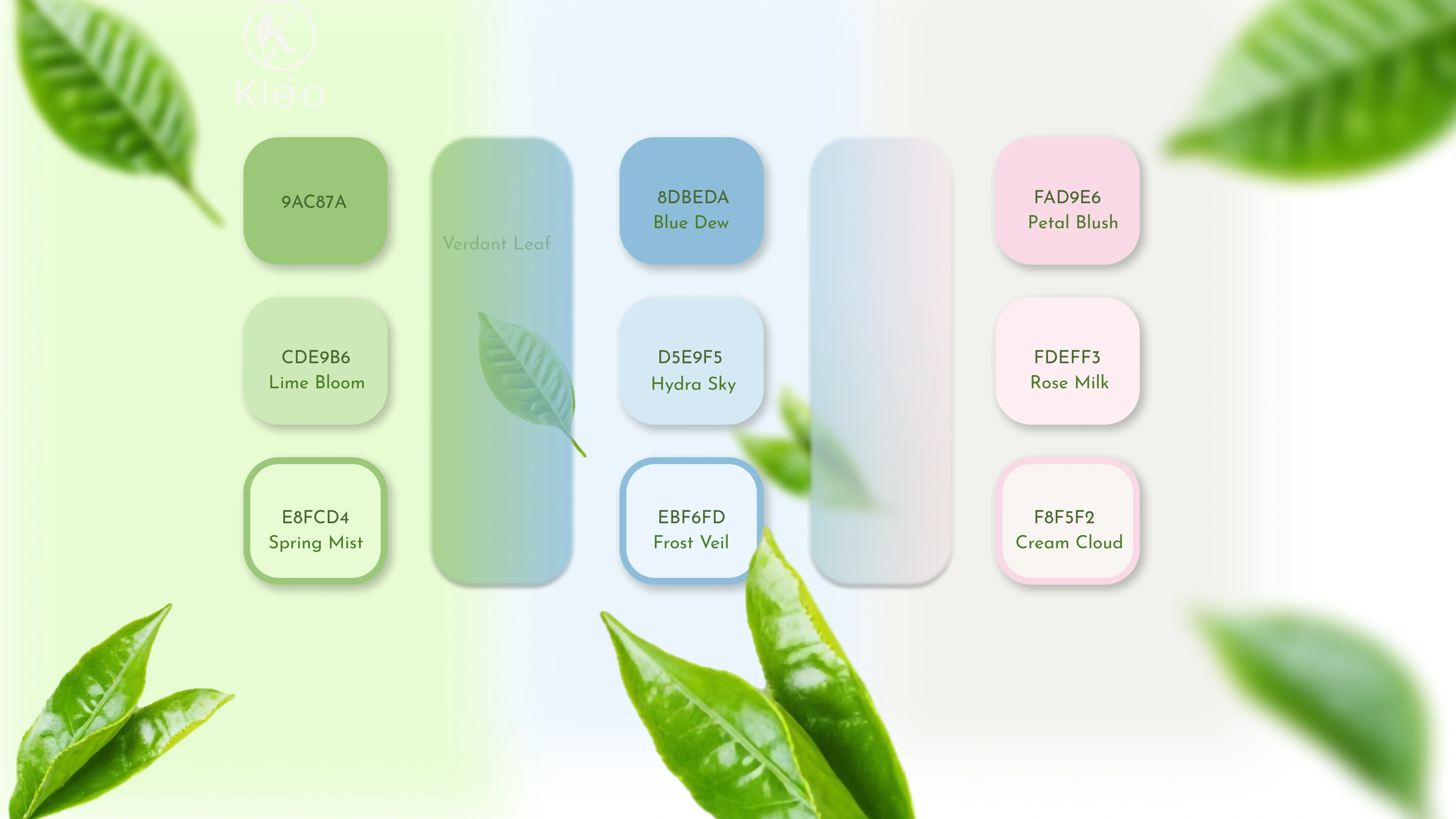
Kleo’s color palette reflects a sense of calm, purity, and botanical freshness with pastel greens, beige tones, and natural contrasts.
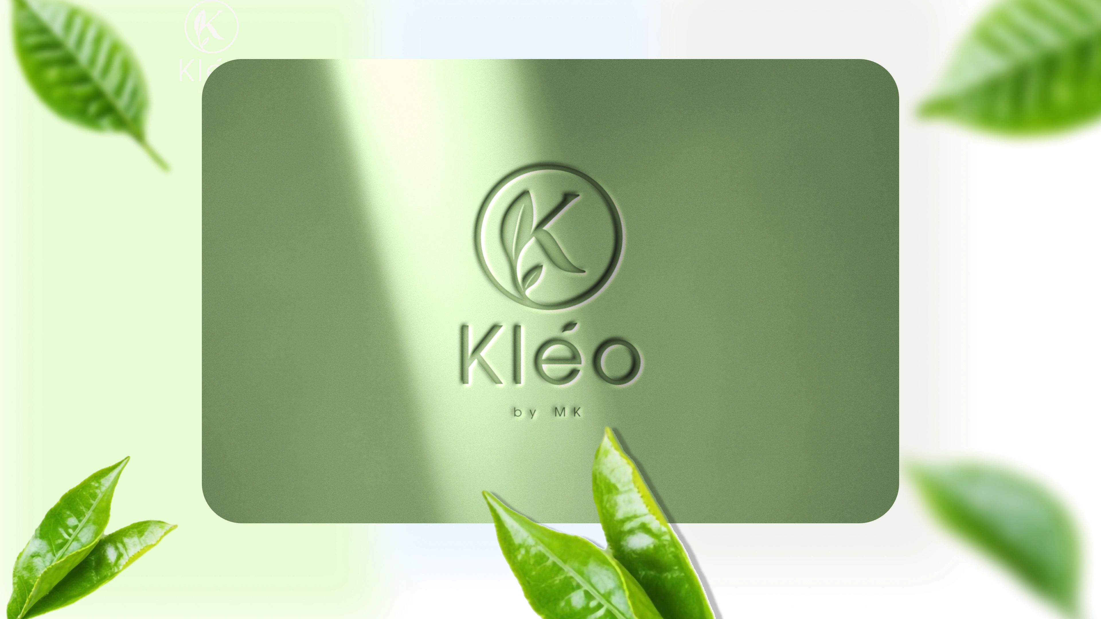
A sleek logo presentation showcasing the versatility of Kleo’s brand mark
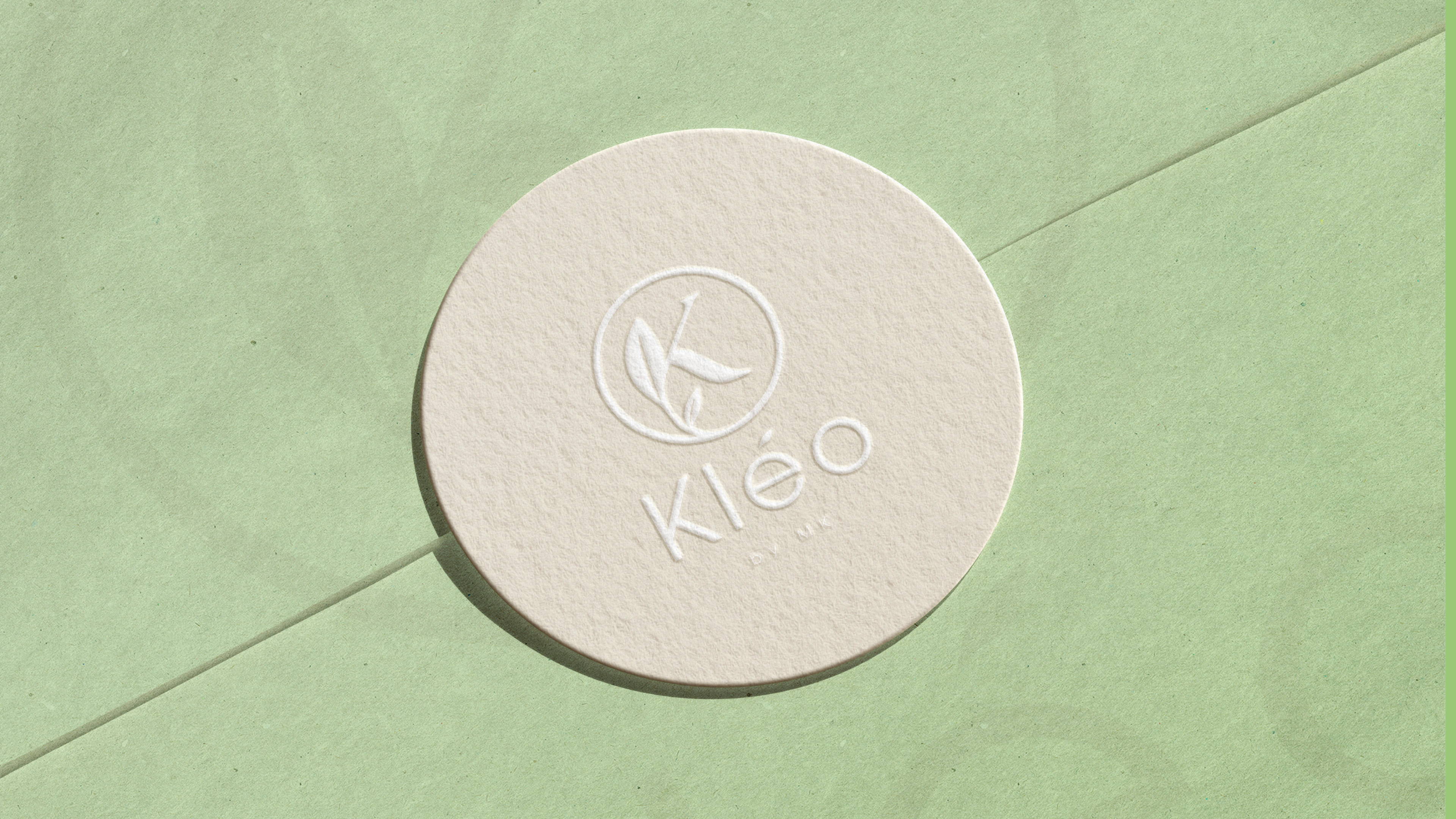
A sleek logo presentation showcasing the versatility of Kleo’s brand mark
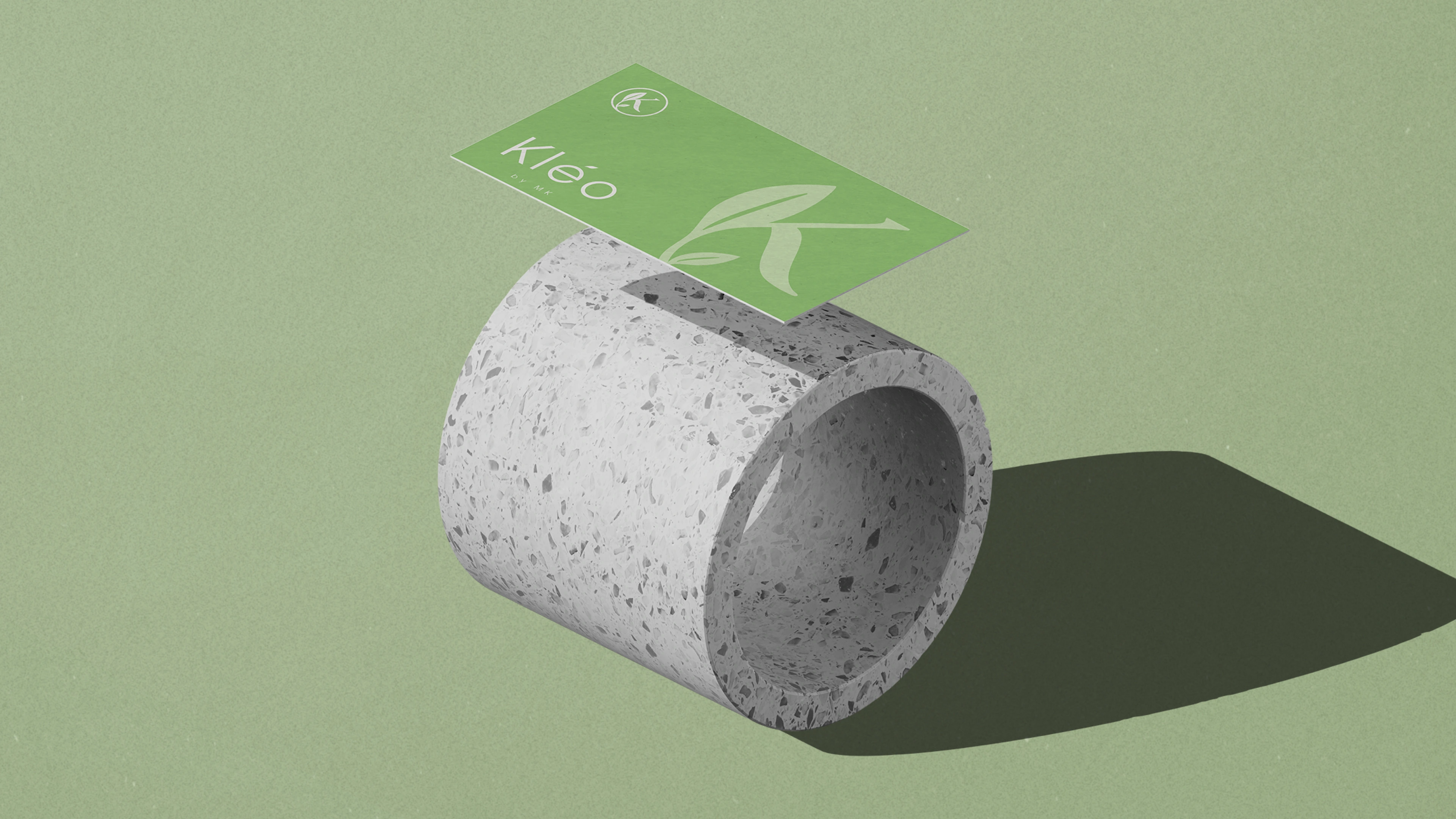
Back side of Kleo’s business card design, emphasizing minimal elegance and brand clarity.
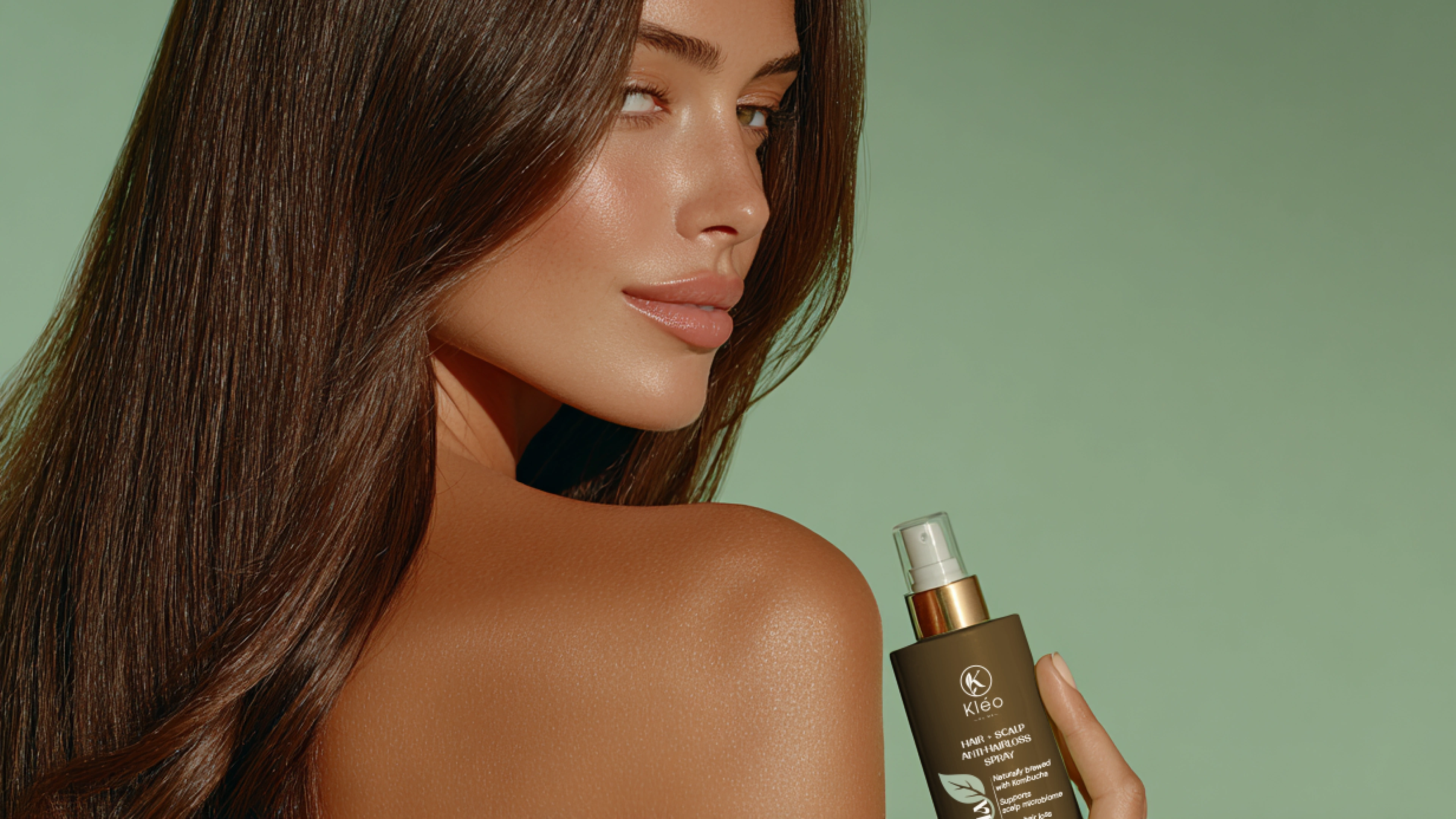
Lifestyle shot featuring a natural woman holding Kleo’s product, emphasizing authenticity and everyday elegance.
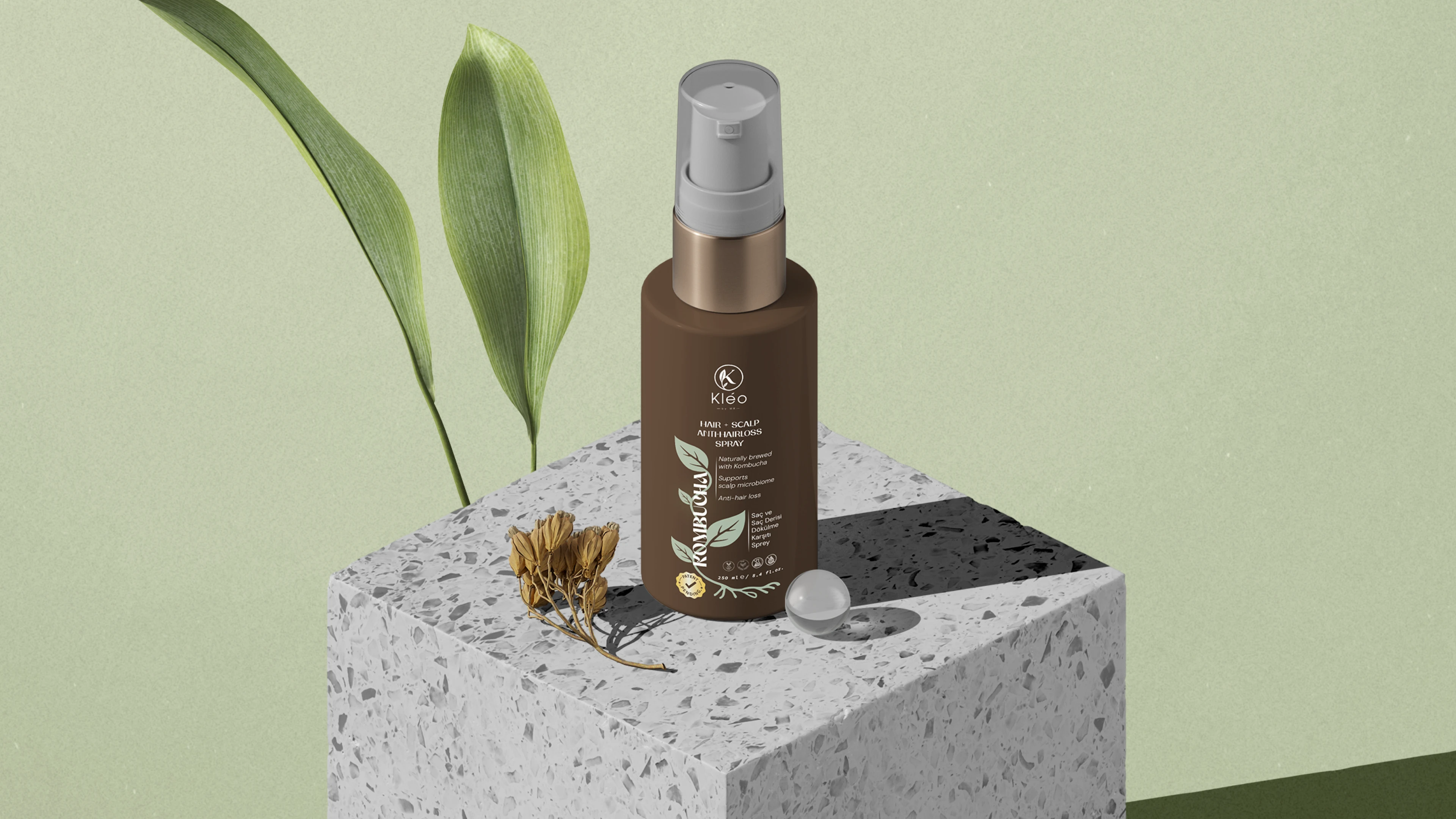
A minimalist label for Kleo’s signature Hair Revive Spray — designed to reflect purity, science, and care.
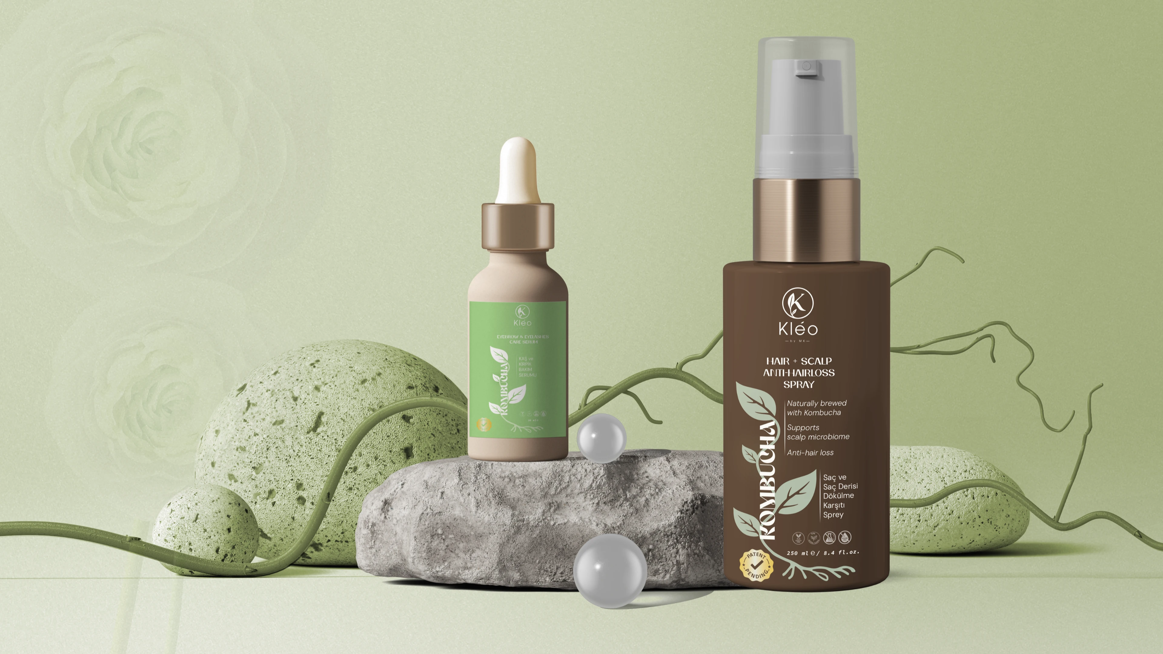
Kleo’s hair and brow essentials in one frame — a botanical harmony of revival and nourishment, rooted in science.
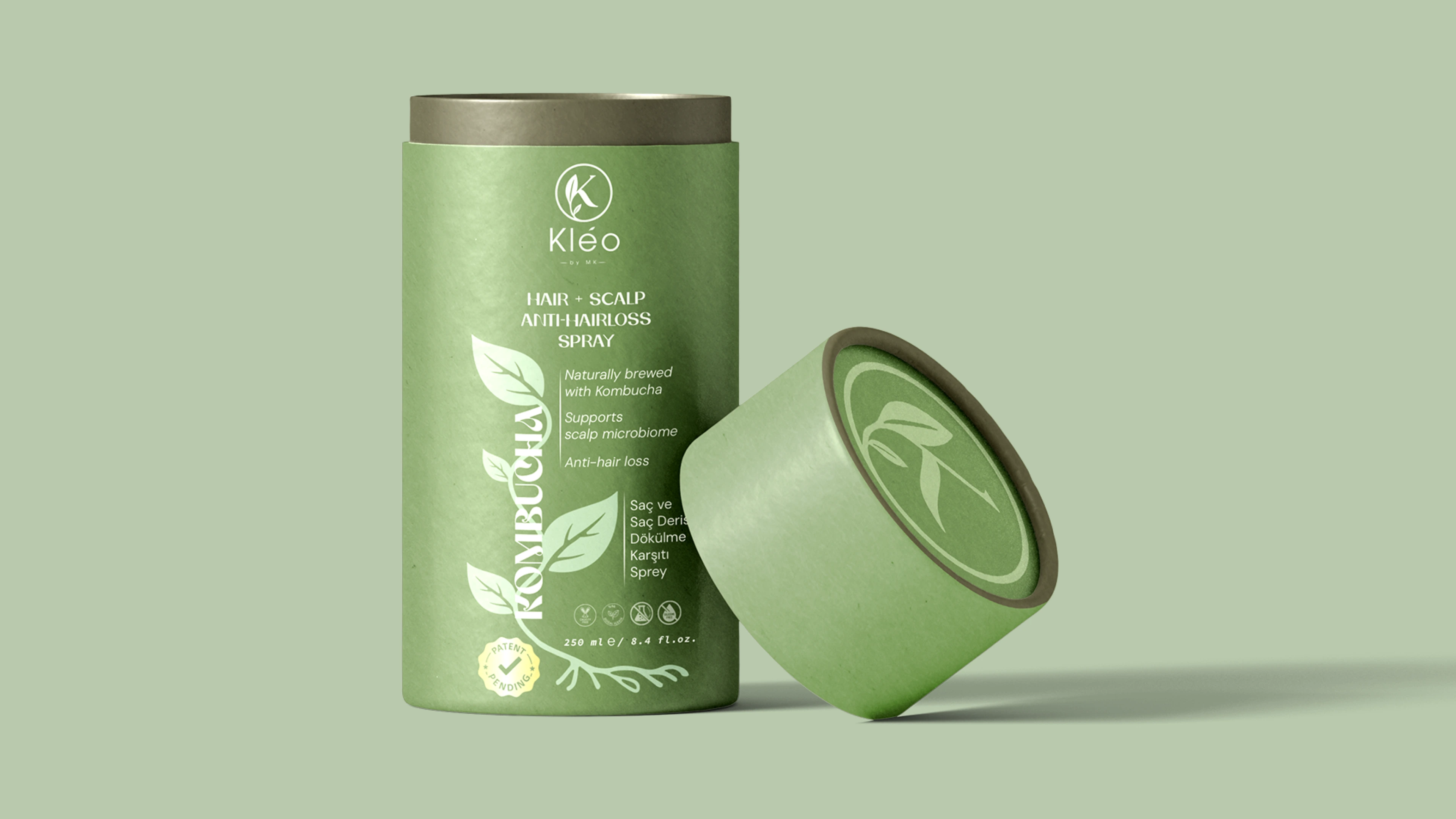
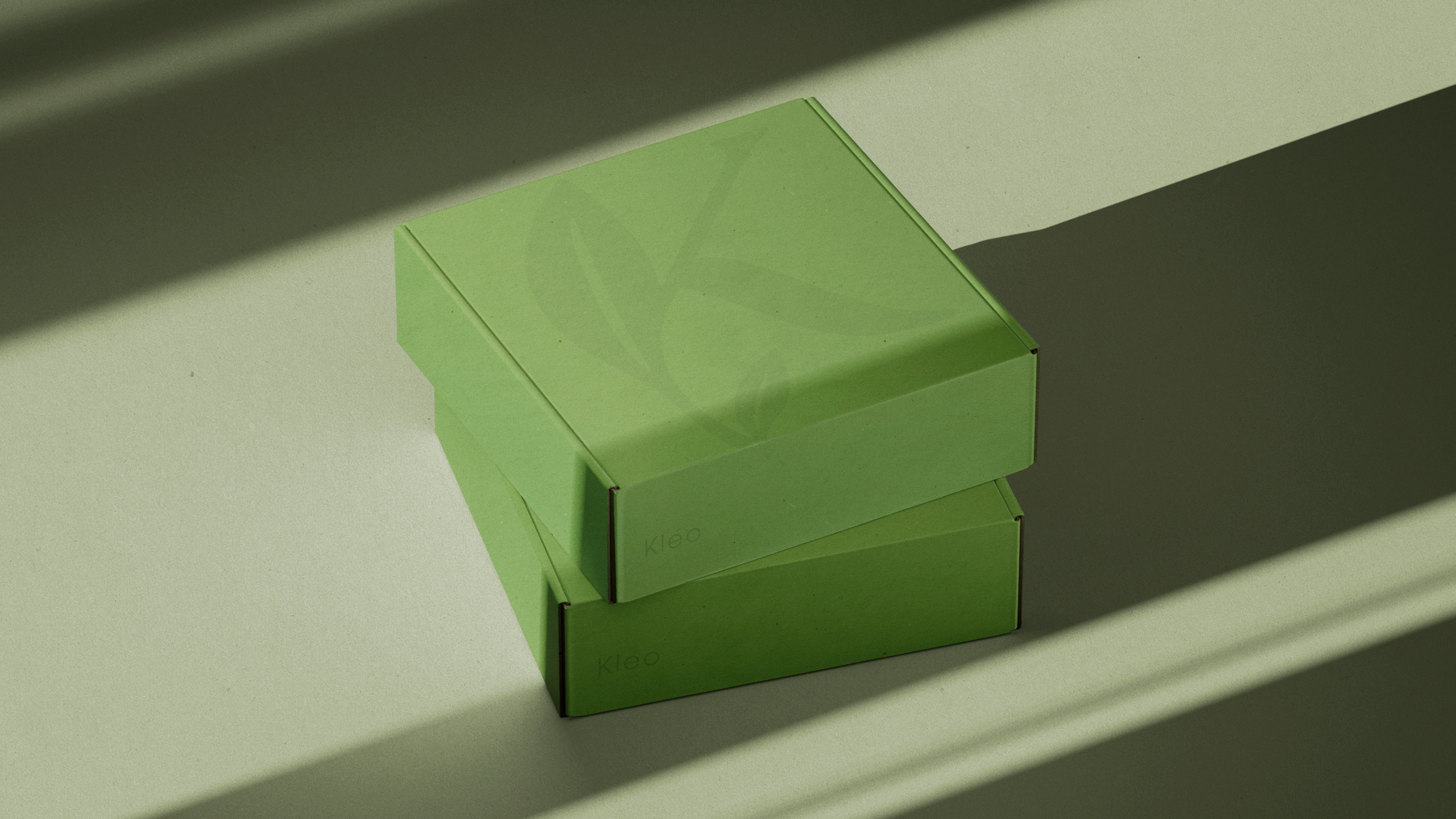
Unboxing science-backed beauty — Kleo’s thoughtfully designed packaging reflects its commitment to natural care and premium formulation.
Branded mailbox design for Kleo — subtle yet sophisticated
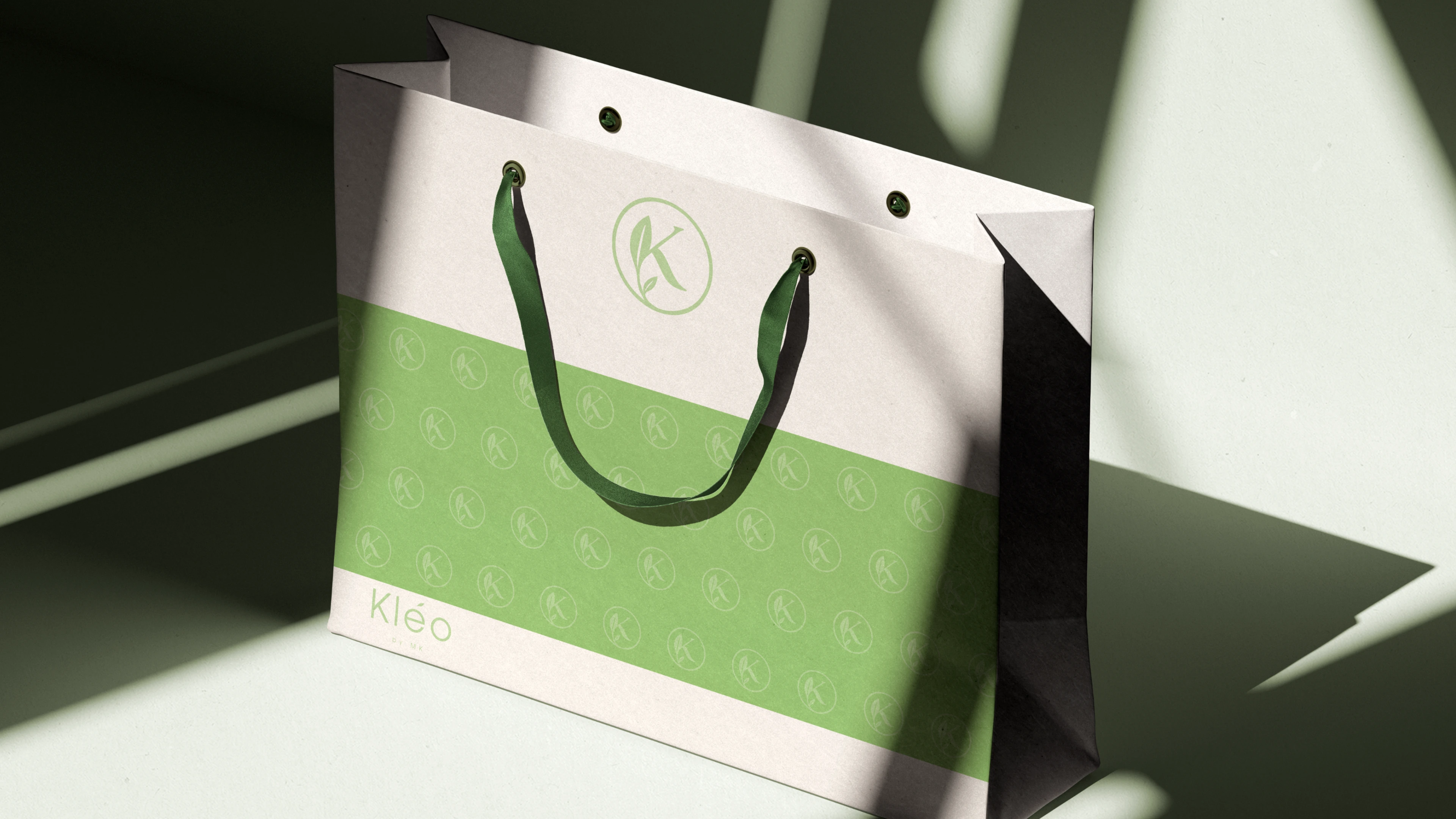
Minimalist bag design for Kleo, blending functional elegance with brand identity.
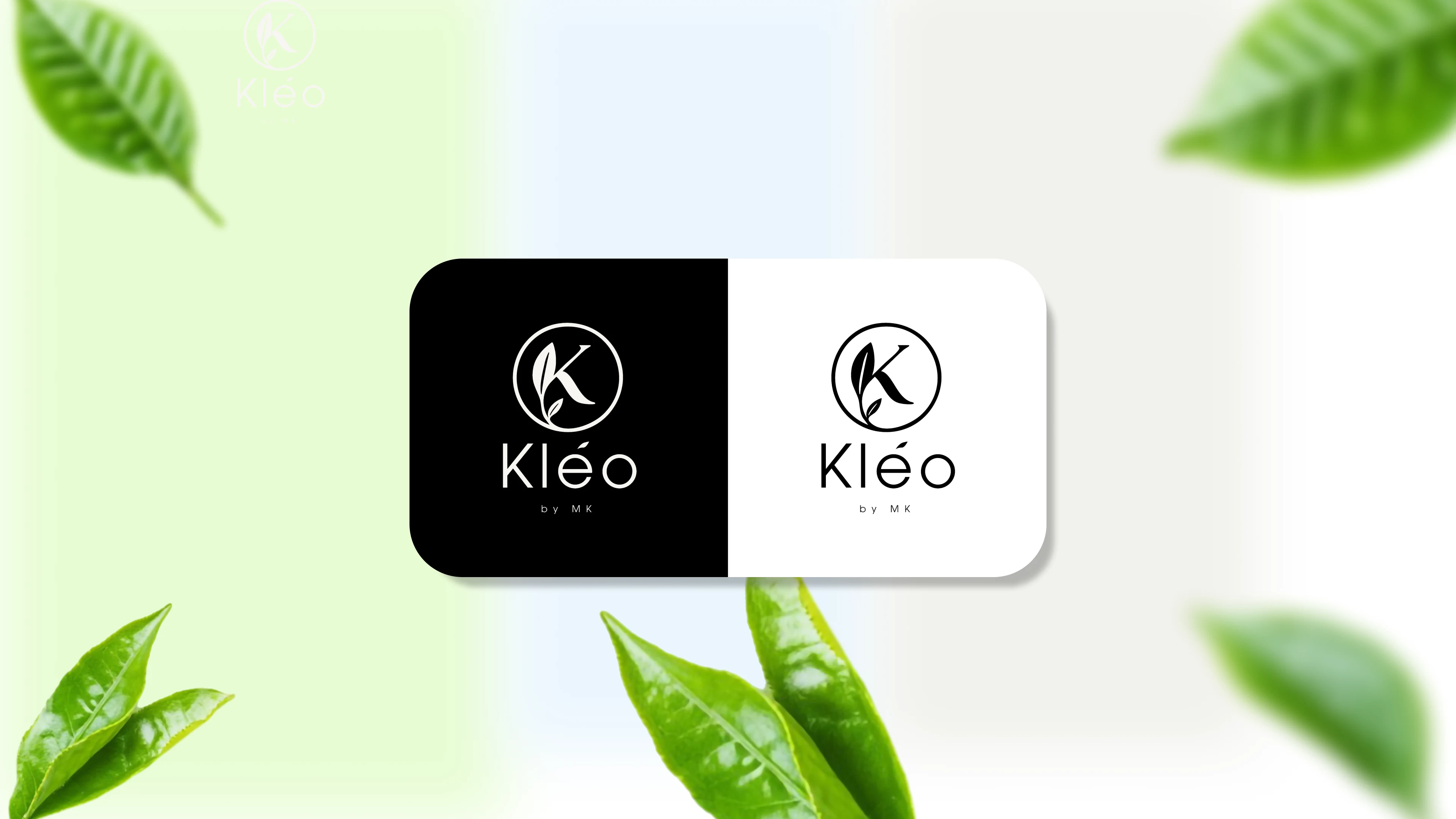
Kleo logo variations — black, white, and inverted versions for versatile use across backgrounds.
🔧 Scope of Work
This project involved the complete branding and visual identity design for Kleo, a biotechnology-driven haircare brand. The scope included:
Brand strategy and moodboard
Logo and logotype design
Typography and color system
Packaging and label design (Hair Revive Spray & Eyebrow Serum)
Business card and stationery design
Lifestyle art direction for campaign visuals
Custom mockups (website, print, packaging)
Responsive landing page design (desktop & mobile)
Brand guideline documentation
🌀 Design Process
1. Research & Discovery
We explored Kleo’s scientific foundation, focusing on Kombucha-based formulations and symbiotic living organisms. This inspired a visual language that merges nature and biotechnology.
2. Moodboarding & Concept Development
A moodboard was curated to reflect a clean, botanical, and editorial look — emphasizing softness, health, and authenticity.
3. Brand Mark & Identity System
At the core of the identity is a custom brand mark derived from the letter "K", subtly fused with the form of a botanical leaf. This integration symbolizes both Kleo's name and its botanical-scientific roots.
Rather than using an elaborate logotype, the brand mark leads the identity, supported by elegant serif and minimal sans-serif typography for system consistency.
4. Packaging & Mockups
Packaging visuals emphasize a premium and organic feel, using soft tones, spacious layouts, and real-life inspired renders that connect emotionally with the user.
5. Web Design
A fully customized landing page built in Framer blends motion design and minimal UI with lifestyle imagery, translating the brand's story into digital interaction.
6. Brand Guidelines
A comprehensive guide defines how to apply the visual identity across platforms — including logo clear space, typography use, and brand applications — ensuring long-term coherence.
Like this project
What the client had to say
I had a fantastic experience with Selin!She was incredibly helpful, knowledgeable, and attentive. Her clear guidance and kind approach made the process enjoyable. Highly recommend; her professionalism made everything easy.Thank you!🥰💫🙏

MUSTAFA KAYA, BY MK Cosmetic Chemistry and Construction Limited Company
Jul 16, 2025, Client
Posted Jul 26, 2025
Kleo is a kombucha-based haircare brand blending clinical efficacy with feminine aesthetics. Branding, packaging, and web design all done from scratch.
Likes
2
Views
30
Timeline
Jul 16, 2025 - Jul 16, 2025
Clients
BY MK Cosmetic Chemistry and Construction Limited Company