MODEST
Objective
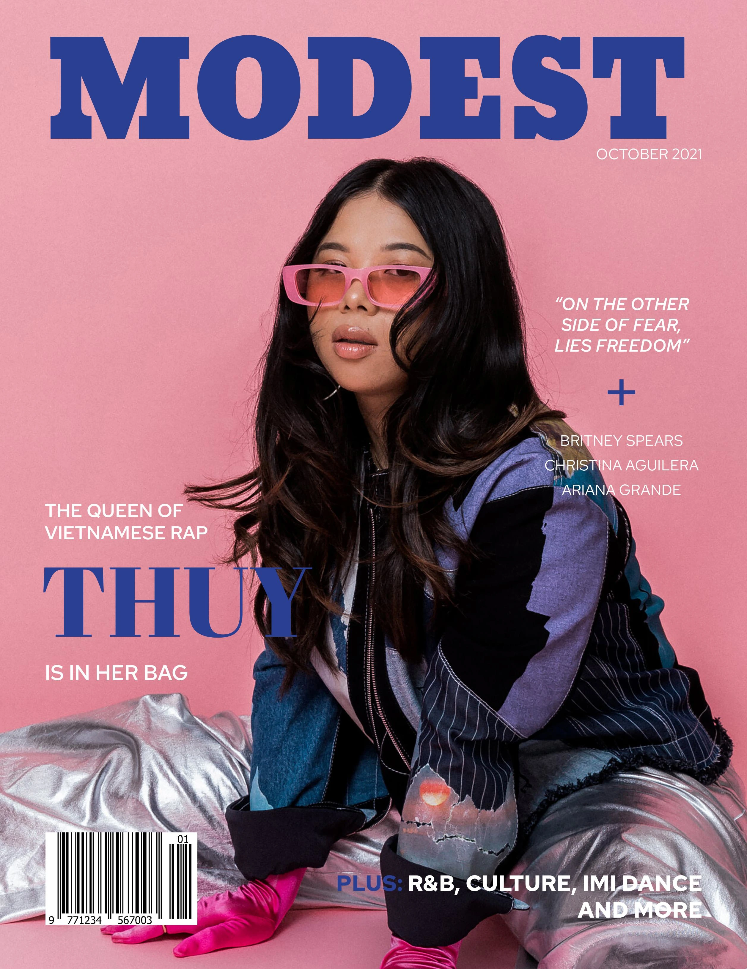
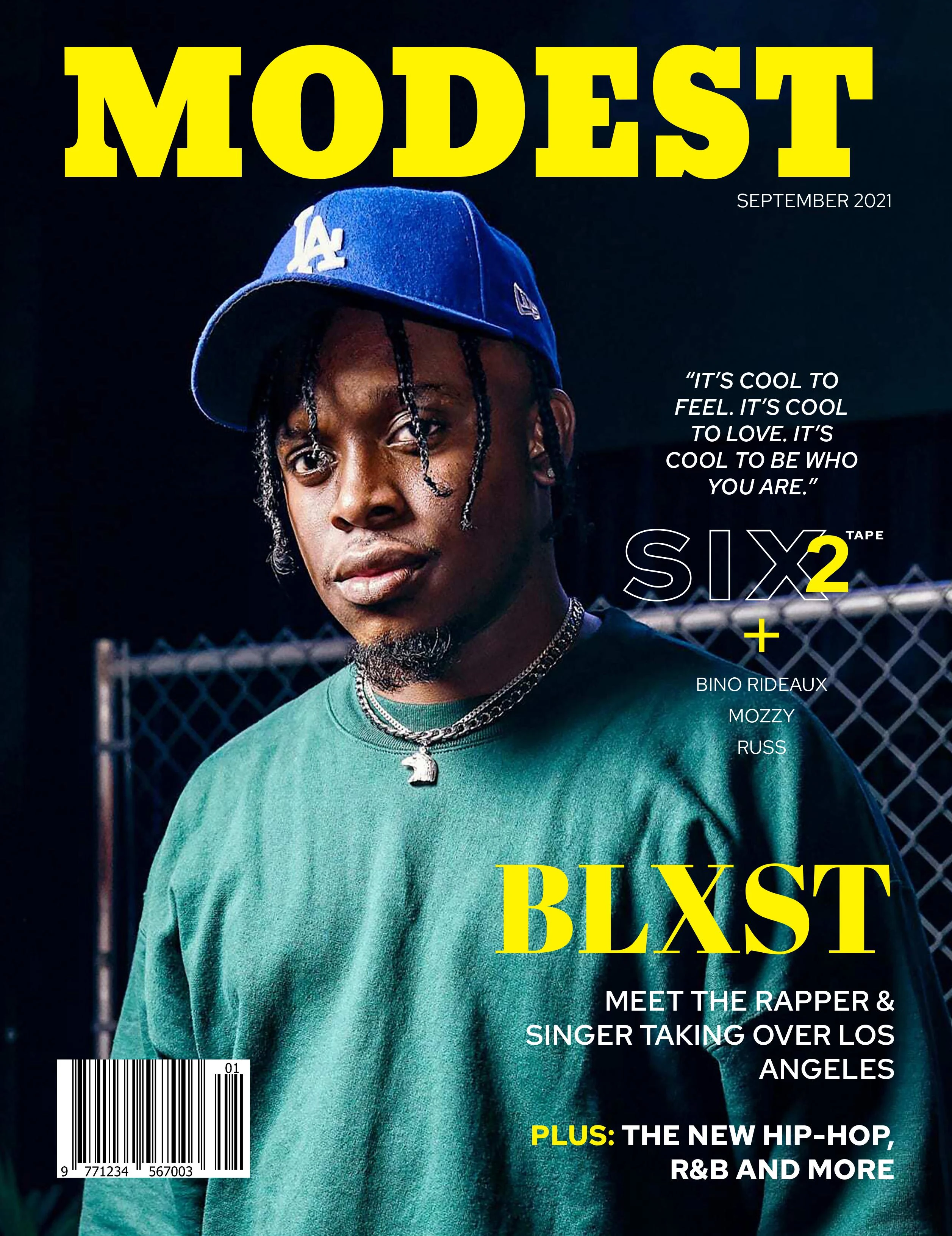
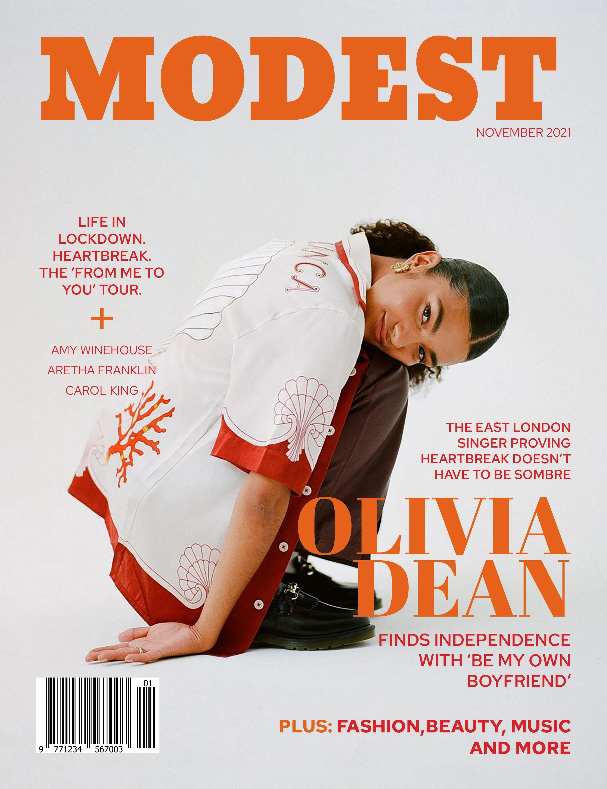
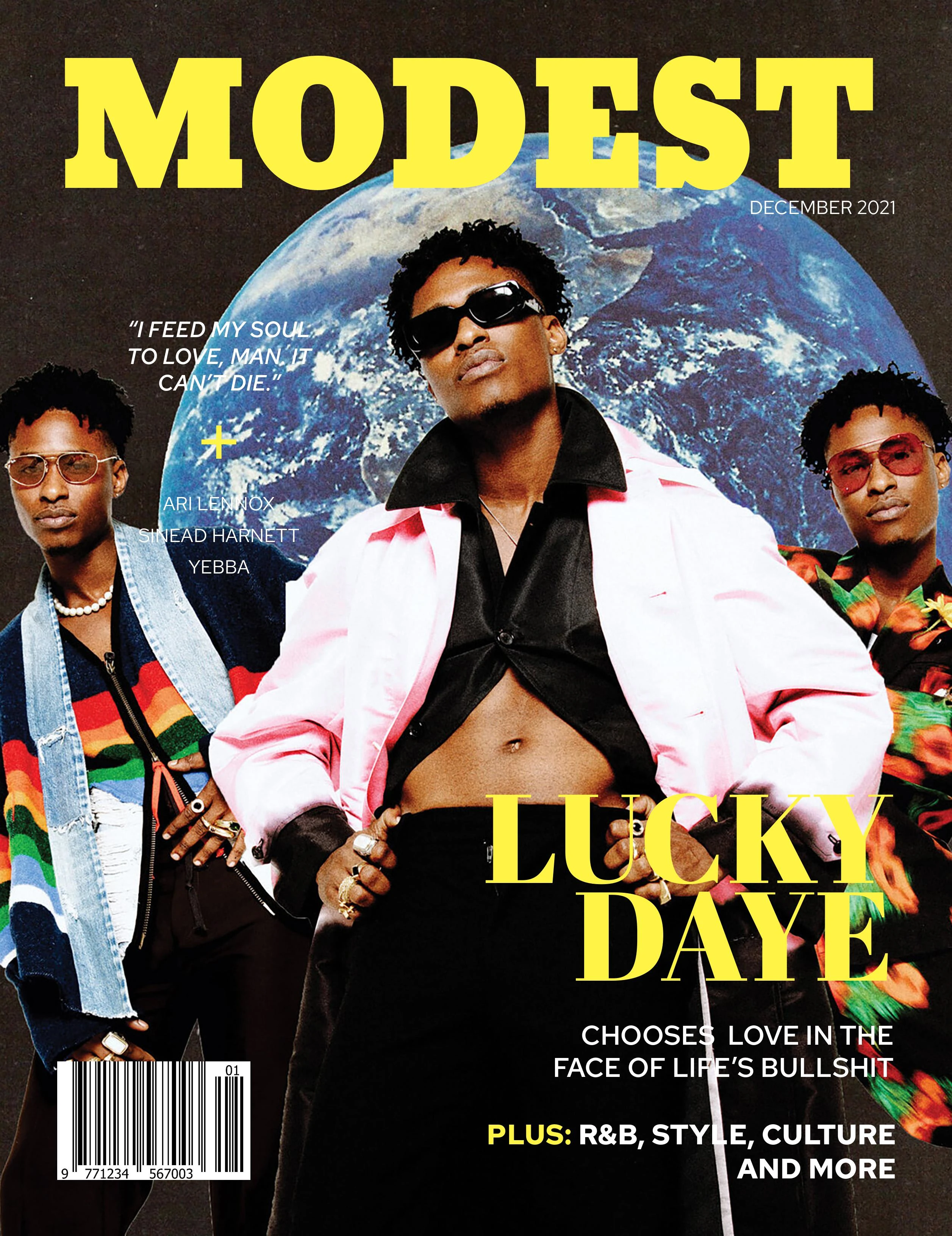
I had to come up with a magazine idea and create a sample cover, which included the publication name, masthead (wordmark), cover image, dateline and coverlines, plugs, and so on.
About the project
MODEST is a magazine that reaches out to those who are interested about music, culture, and other topics.
Process + Challenge
I start by looking for a high-resolution photograph of an artist and creating a brand name that promotes multiculturalism in music. ‘MODEST’ is a good name for a magazine since it implies a reasonable assessment of one’s talents or accomplishments without being unduly proud of one’s own success.
The masthead is then applied with a bold, clean, and modern look. The typography is straightforward and consistent, and it contrasts nicely with the colour palettes and cover photos. The major problem is to ensure that all aesthetic aspects, as well as the brand’s establishment, are in sync with one another. In this scenario, I use negative space in my layouts without significantly influencing flow.
Outcome
Overall, the magazine cover succeeds in presenting each visual aspect in the arrangement. The magazine’s graphic components mostly matched the requirements for communicating the voice of my publication’s visual brand identity to its target audience.
Like this project
Posted Aug 2, 2023
'MODEST' is a magazine that reaches out to those who are interested about music, culture, and other topics.
Likes
0
Views
50

