Brand Identity Design for LYF
A. Ashmawy

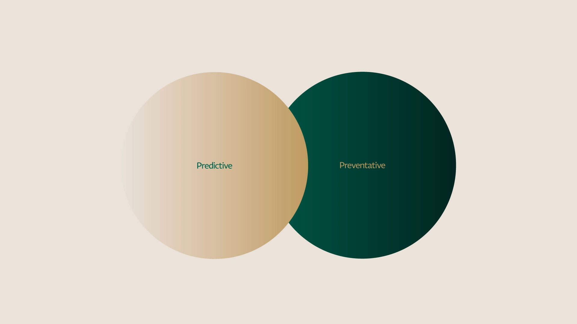
Empower Your Health, Elevate Your Life
Empowering individuals to enhance their health span and well-being through personalized, proactive scientific methods.
The Design Strategy was to create something that is very approachable and well recognizable for the audience. Linking the core of our identity by creating an identity system that is created from personalized human and nature patterns.
Visual Language Created to ensure the branding concept and nature effection between the integration of human and plants patterns. Structured to make the icons and graphical elements stand out between the use abstract shapes simplified and clipped within the subject matter.

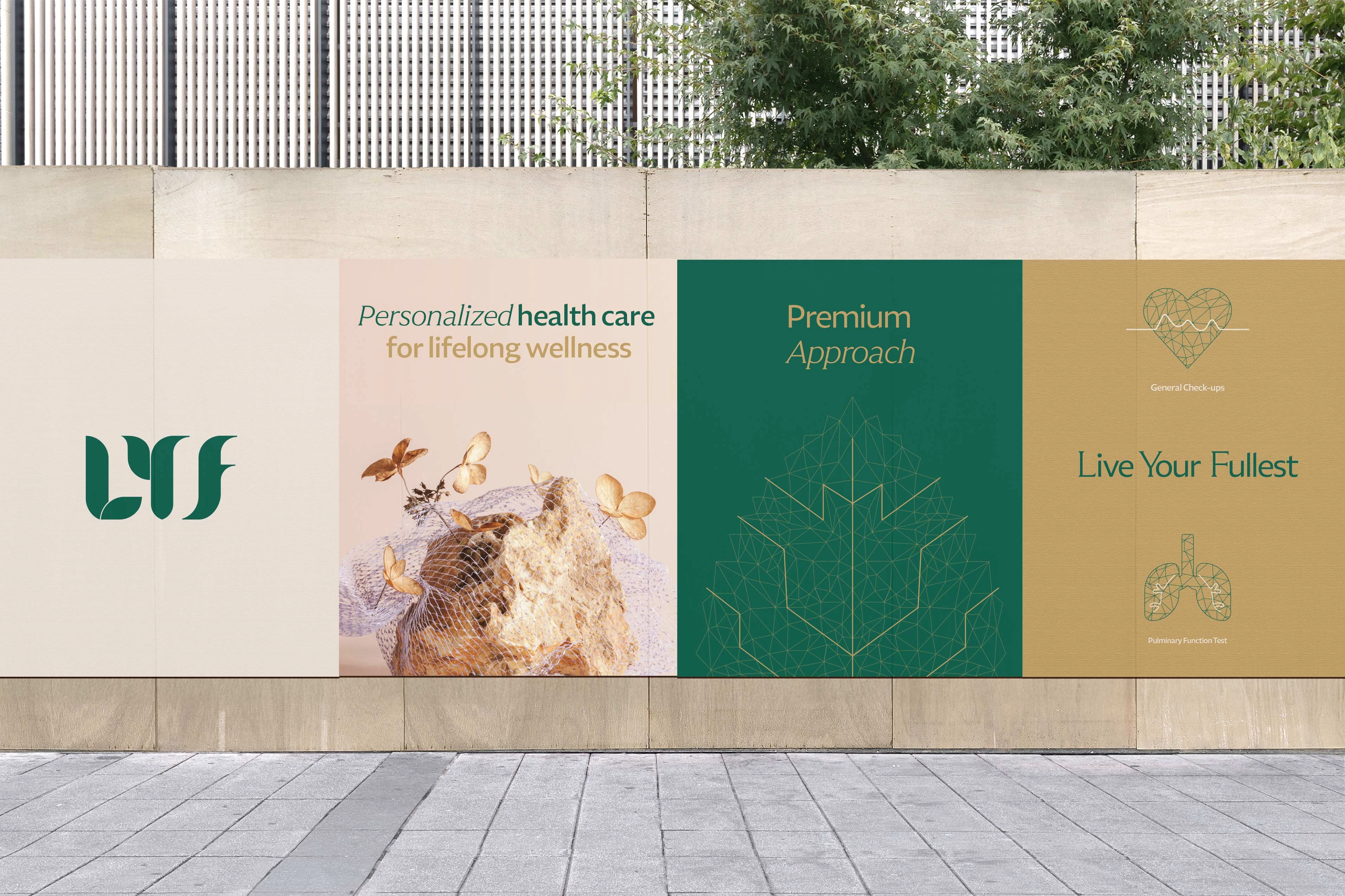
“LYF” Live Your Fullest
In the logo, the leaf used symbolises health, care, growth, scientific innovation, and personal attention, making it instantly recognizable and trustworthy to our target audience while reflecting the advanced, data-driven nature of the service.
Embodying the brand purpose, values, and unwavering commitment to people around the world. It symbolizes the essence of what LYF offers to customers: incredible healthcare services
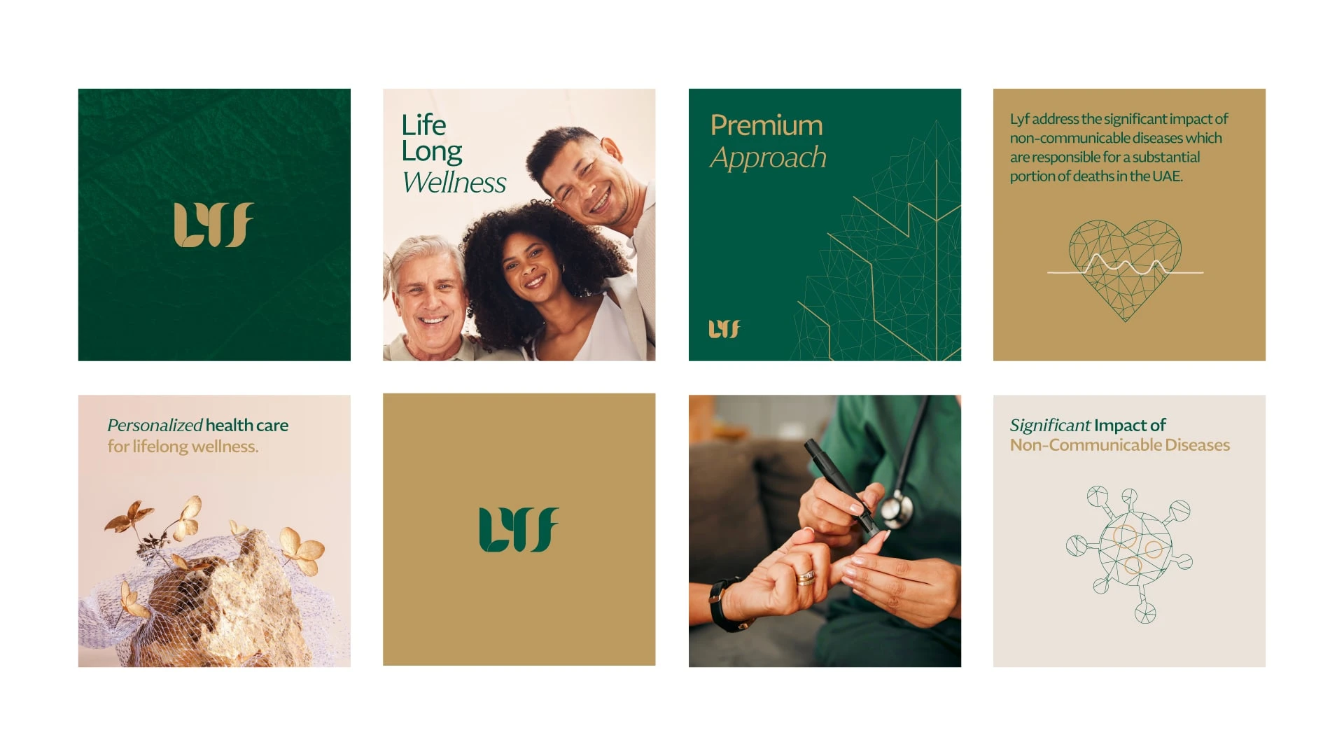
Social media presence consistently appealing and informative with our precious visual language and identity system.
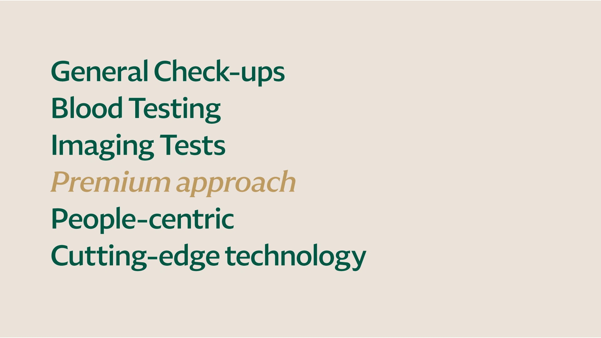
Created from the light to dark emerald and from light to gold champagne. To add more dynamic presence to our LYF brand to make it feel more authentic and lively.
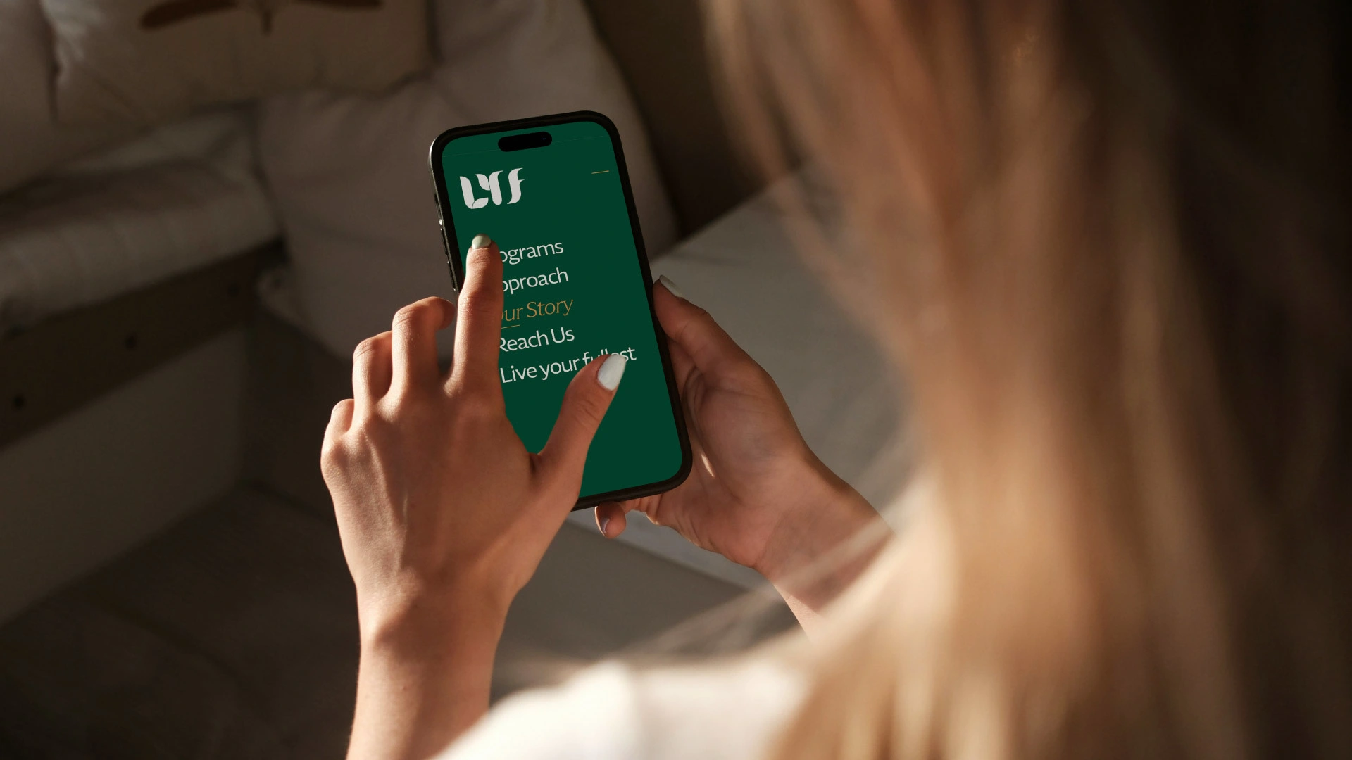
Brand in use with the enhanced look and feel to ensure consistently and trigger our audience attention and evoke their actions. Conveing our values, services and personality through type and color.

The primary identity of SuperFamily Mart is established through the use of the Leksikal retail font by Tokotype Foundry complemented by a brand identity crafted. Completed work at boopin UAE For LYF. Credits in collaboration Boopin creative team and Lyna domiatti Regional Creative Director.
Like this project
Posted Nov 11, 2025
Developed a brand identity for LYF using human and nature patterns. Motivated by the understanding of the lifestyle factors.
Likes
5
Views
17