Learnings + Takeaways
Getting leadership sign-off, my PM approached me with a project to design a new campaign booking feature in app. We agreed the best way to approach the project was to break it into sections: Campaign Planner, Cart, and Checkout, respectively.
First step, we needed to first ask ourselves some questions to better understand the problem we were trying to solve for users:
- What is the problem for our users?
- What are their specific pain points?
- How are they solving the problem today?
- What are the business considerations? App constraints?

Above are just a couple screens a user would interact with along their checkout journey.
As someone who has never planned for an OOH campaign I was initially overwhelmed. Inviting internal team members from accounts and sales was important in making sure we were approaching the problem in the right way. These discussions encourage us to modify and think deeper than some of our initial thoughts. A few of our takeaways from these early conversations were (not in any particular order):
- Considering cart abandonment with users
- Scalable UI components and design system
- Process and user journey
Additionally, to get a better sense of the current process users were going though, I setup shadow sessions with 2 account managers as they went through planning and booking an actual campaign in real-time. I will note here that there was some user research that had be conducted prior to me doing the team, naturally I referred to those findings as well as other sources across the internet pertaining to checkout experiences and cart abandonment by Baymard.
Ideate, Iterate, and Validate
Excited to take the next steps, I was ready to move along in the design process. Based on our early discussions and research, we knew the project needed to focus on optimizing time to plan, book and purchase a campaign. My ideation process started with notes, map and Figma. It helped me to get a quick visual of the current process on screen, then, referring to my notes, to reformat that into something I felt moved closer to the solution.

A quick visual of the current campaign booking flow.

My updated version of the user journey for booking a campaign.
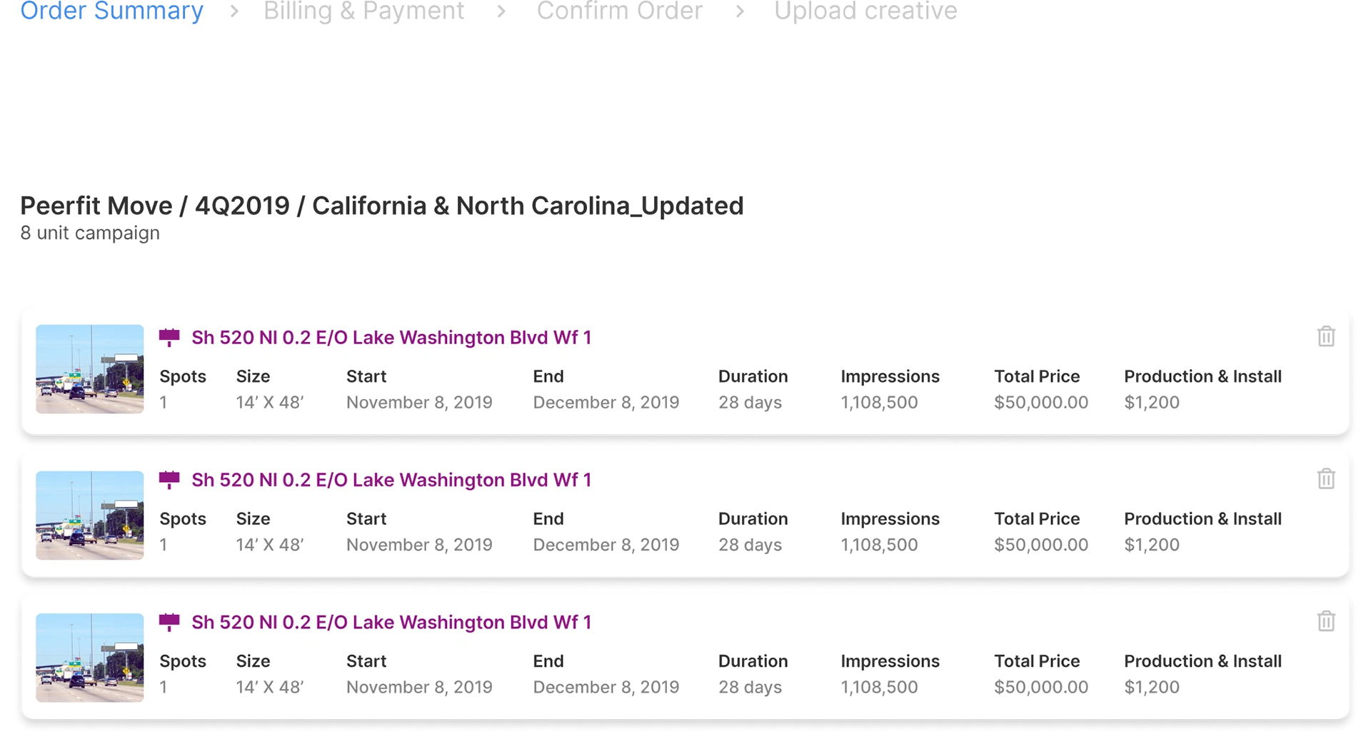
Itemized Units
The design for itemized units answers common questions users have when determining ROI. Before committing to any location buys, users get a glimpse of the data associated with each unit in cart to inform their purchasing.
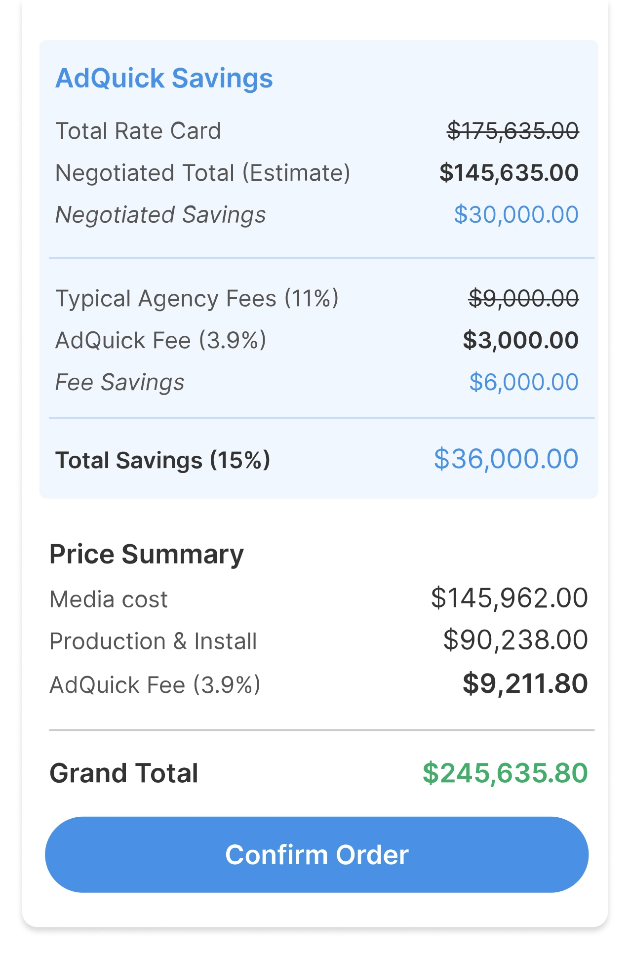
Transparent Pricing
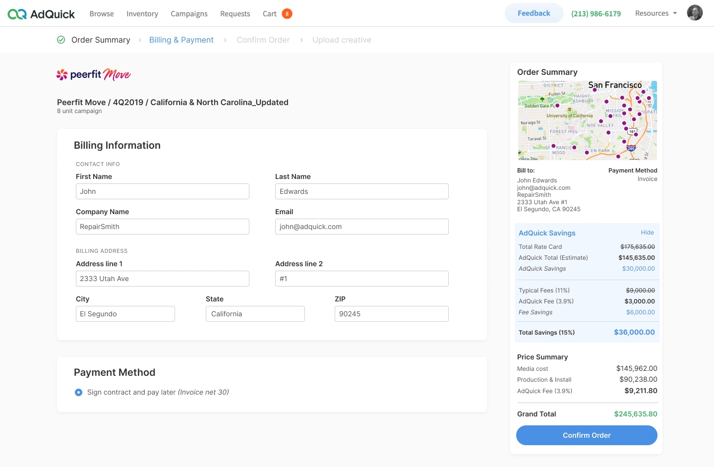
One of AdQuick's primary checkout distinctions is showing value and benefit of booking with AdQuick. As users step through checkout - saving, pricing and fees are highlighted to reassure transparency.
This was a veryconscious decision. Because it ties back to a fundamental brand distinction.
Zero Pressure
To better understand the way OOH is purchased I regrouped with our Sales and Am team.
Conclusion: Many users drop-off when payment card information is required, like there is an invisible pressure to pay now.
Solution: Approach less aggressively. Intended to establish trust and focus on relationship building.
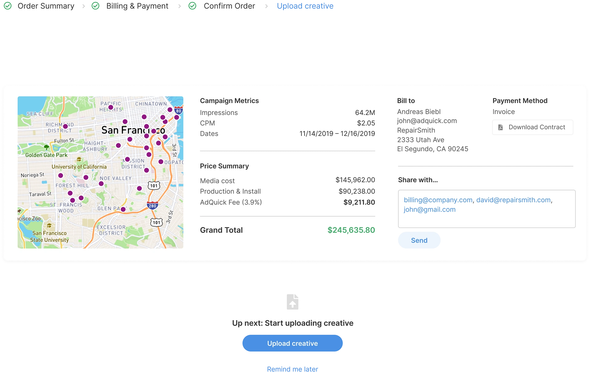
Campaign Booked, Now what...
The goal here was to enhance the experience by keeping functionality in app, AdQuick should allow users the peace of mind to purchase OOH and keep their teams on the same page.
Offering a novel approach, the idea is that when a user confirms checkout and signs contract there is a sense of "I've completed something." As a result, users would feel more accomplished, additionally, they could do more productive actions like included their team members.
Learnings + Takeaways
There is never too much research/information. Drown in research before touching a design tool. Analyze it, get deeper context, down in ideas before moving forward. Find problems and identify how important they are.
Like this project
Posted Aug 12, 2023
Product feature for cart & checkout experience.
Likes
0
Views
3
