SolarShare Rebranding and Website Design
Urte Gl
SolarShare — Rebrand + Website Design
SolarShare wanted to refresh their identity and website so the brand feels more modern, credible, and aligned with their vision.
Process
1) Direction exploration
I created 4 moodboard directions to explore different ways SolarShare could look and feel. After a review call, we selected the strongest direction and used it as the base for the system.
Exploring four visual directions before selecting the final route
2) Built the brand foundation
I packaged the rebrand into a practical system: typography, color, graphic language, imagery rules, and layout principles—documented in a brandbook so future web and marketing work stays consistent as the product evolves.
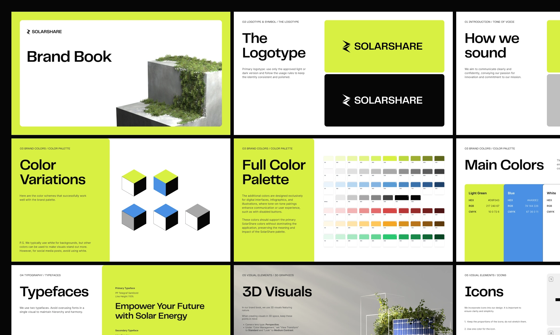
Brandbook pages
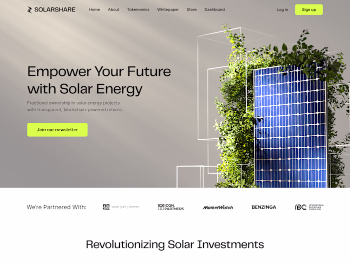
3) Website designs
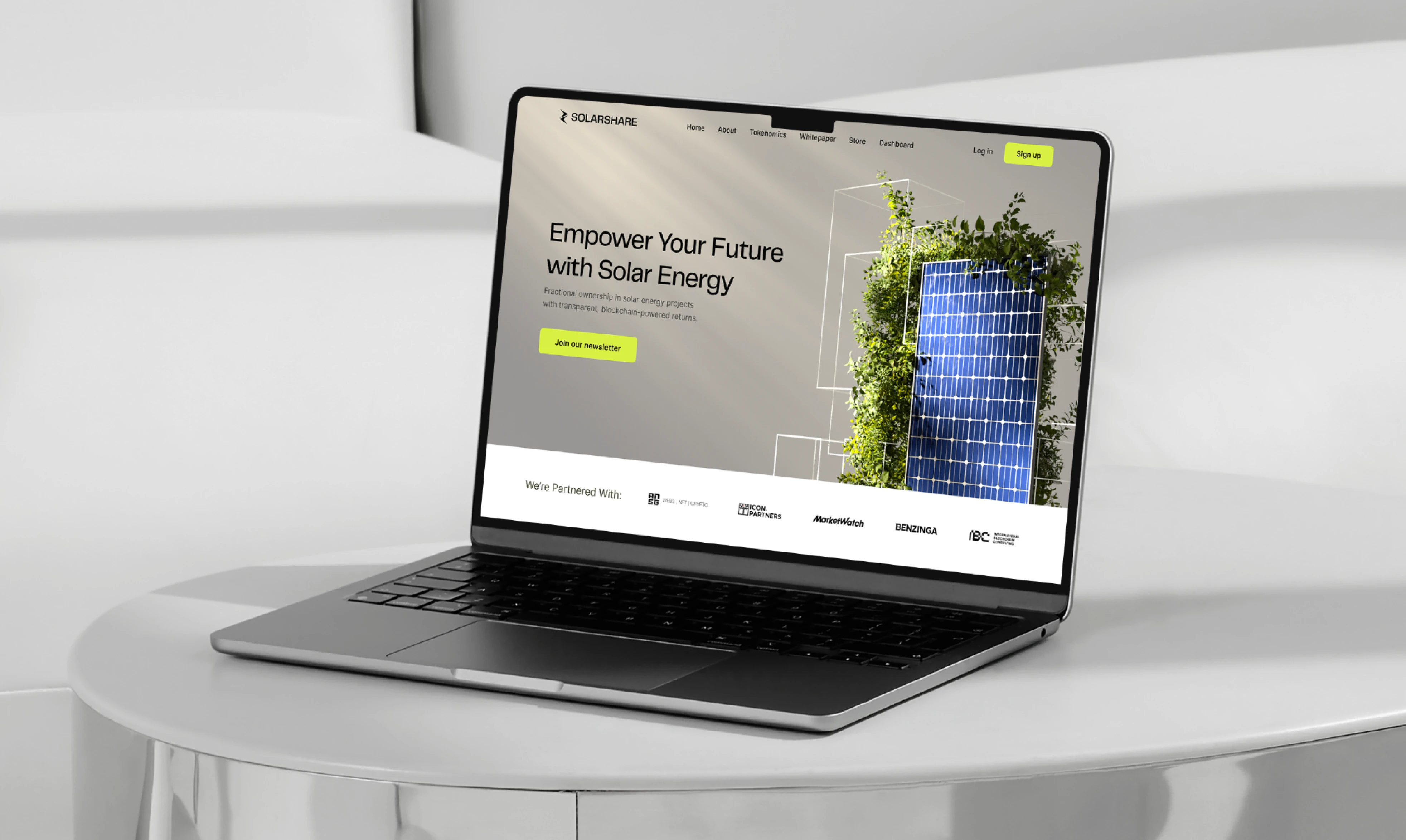
I designed website screens aligned with the new system, focusing on clear hierarchy, modern layout, and a confident first impression.
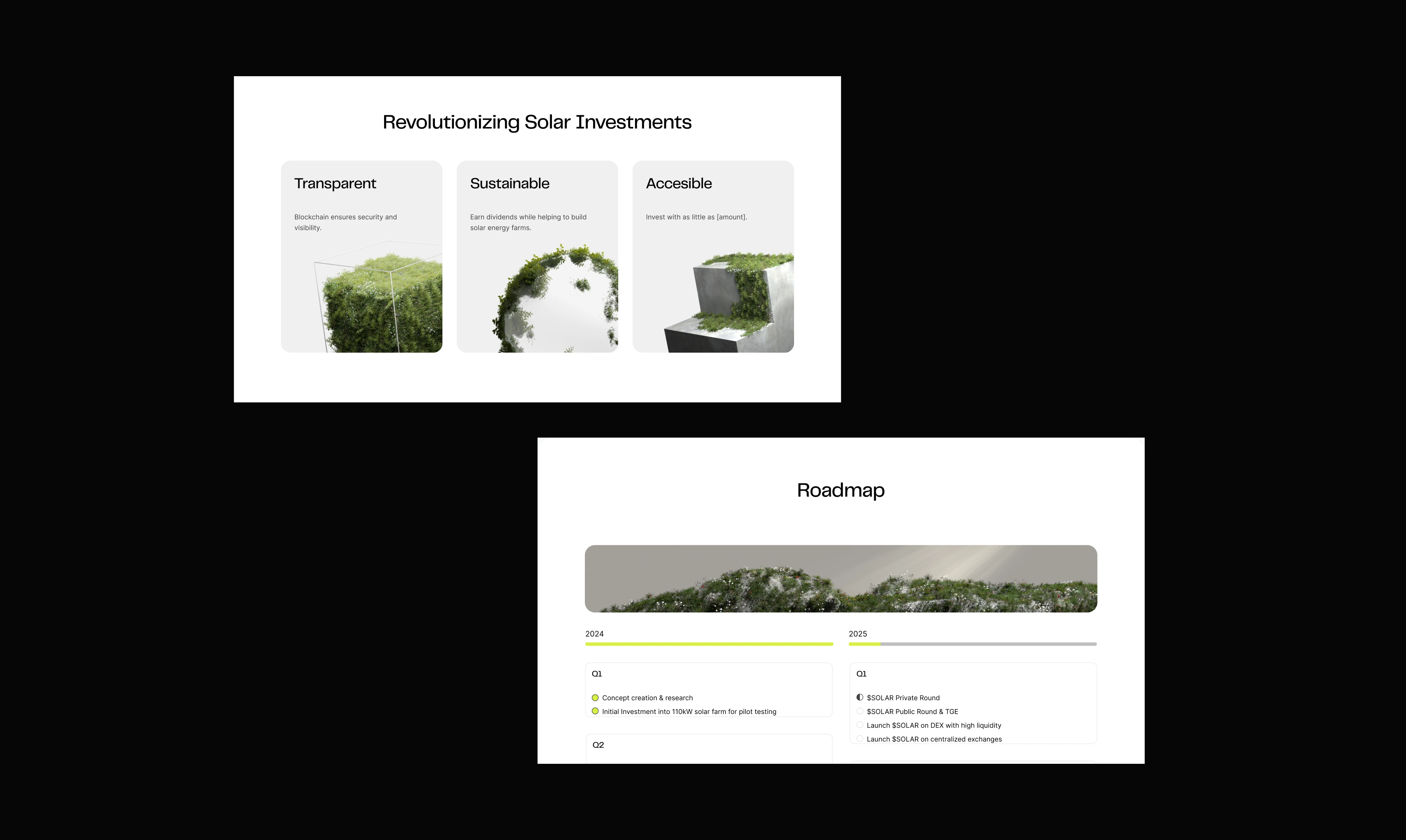
Screens from the website
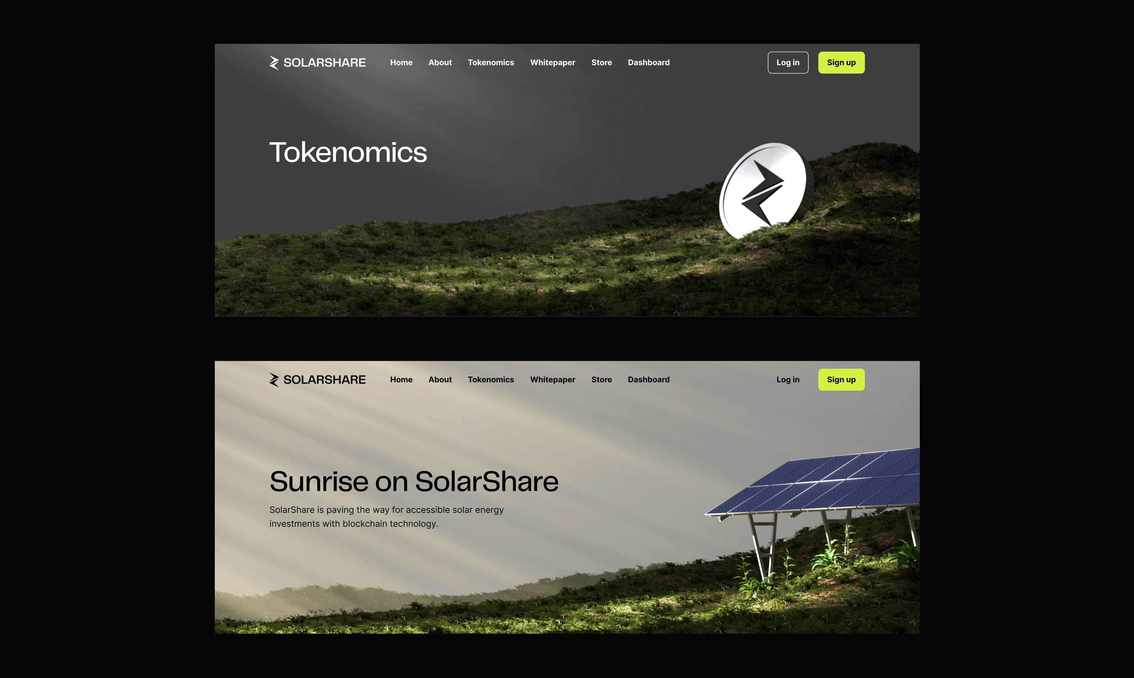
Screens from the website
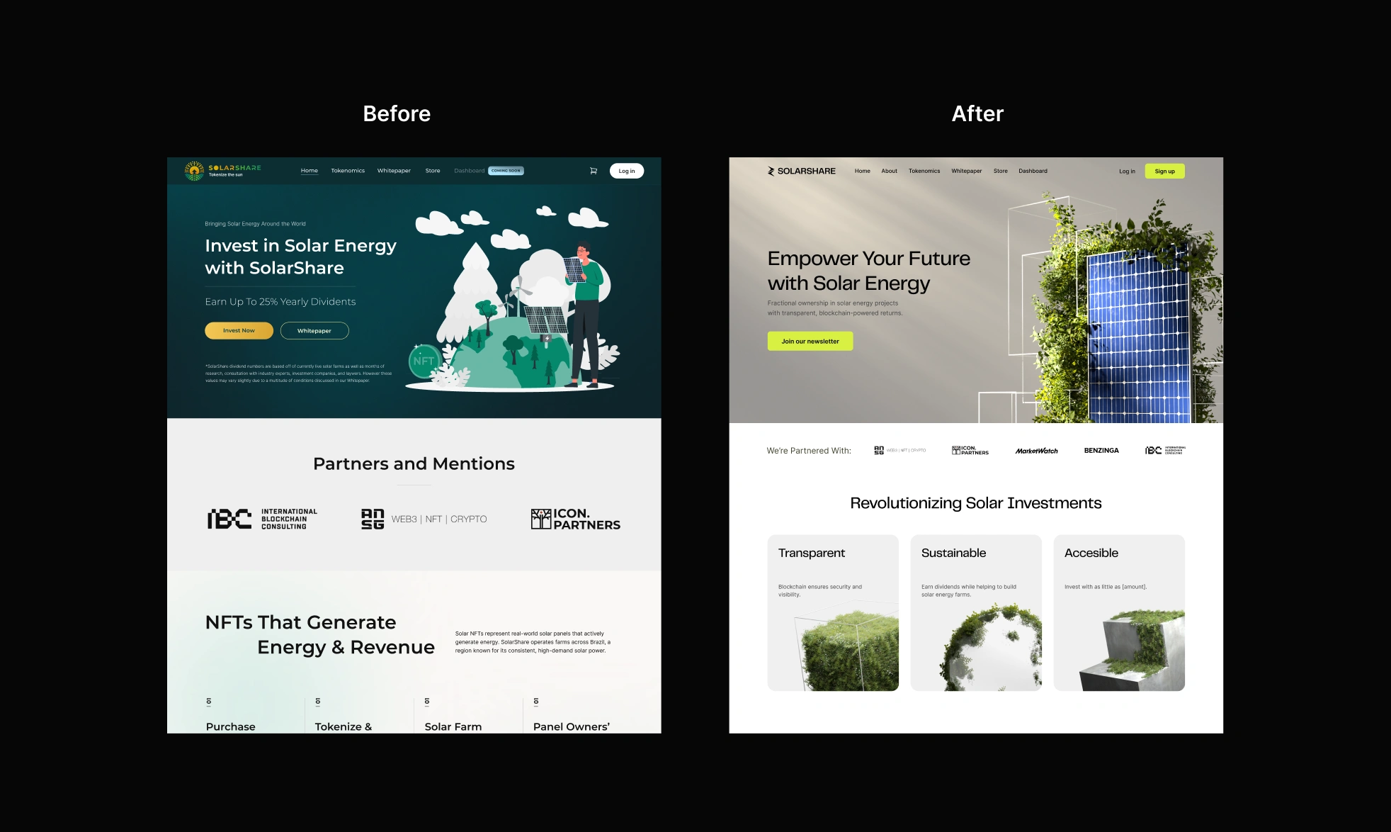
Before and after
Outcome
A cohesive brand foundation and website design direction that SolarShare could build on going forward.
Implementation note: The brandbook remained the foundation; the website was later iterated with another designer.
Services
Rebrand • Brandbook • Website design (Figma) • 3D visuals (Blender)
Like this project
Posted Feb 4, 2026
Developed a new brand identity and website for SolarShare, creating a modern and credible presence in the clean energy space.
Likes
1
Views
2