Prepd Brand Identity
Cansu Dağbağlı Ferreira
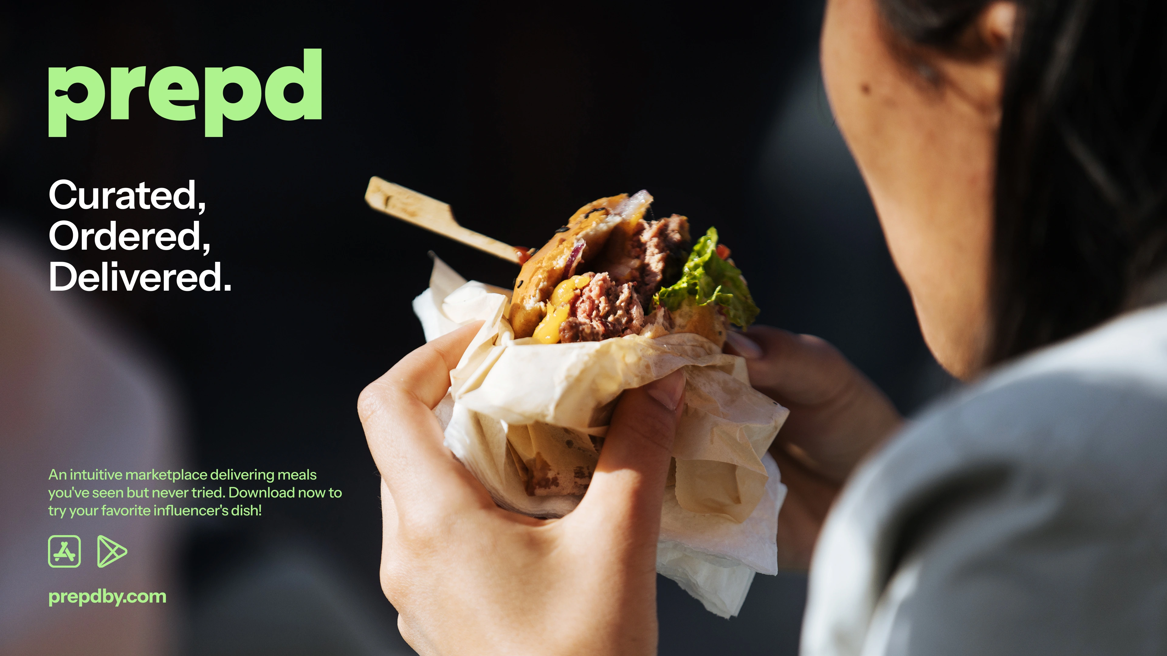
Prepd — Taste, Revealed
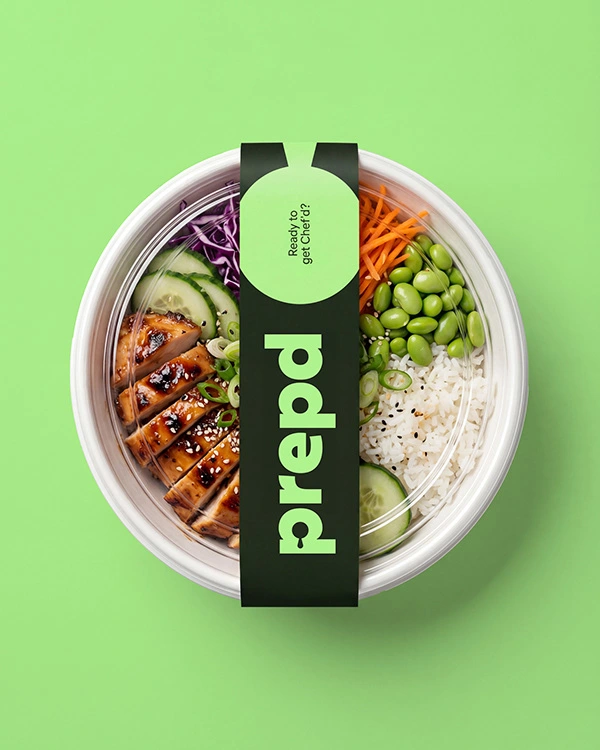
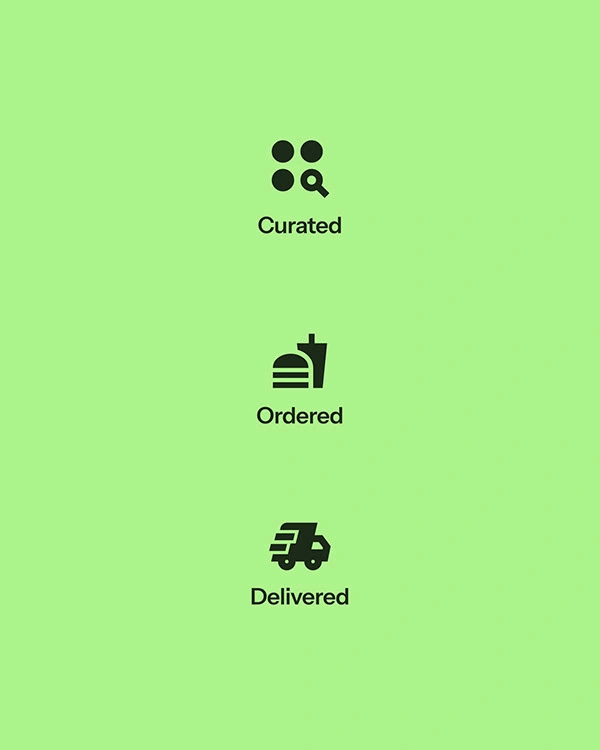
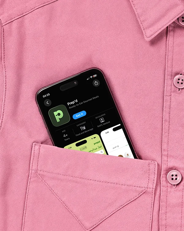
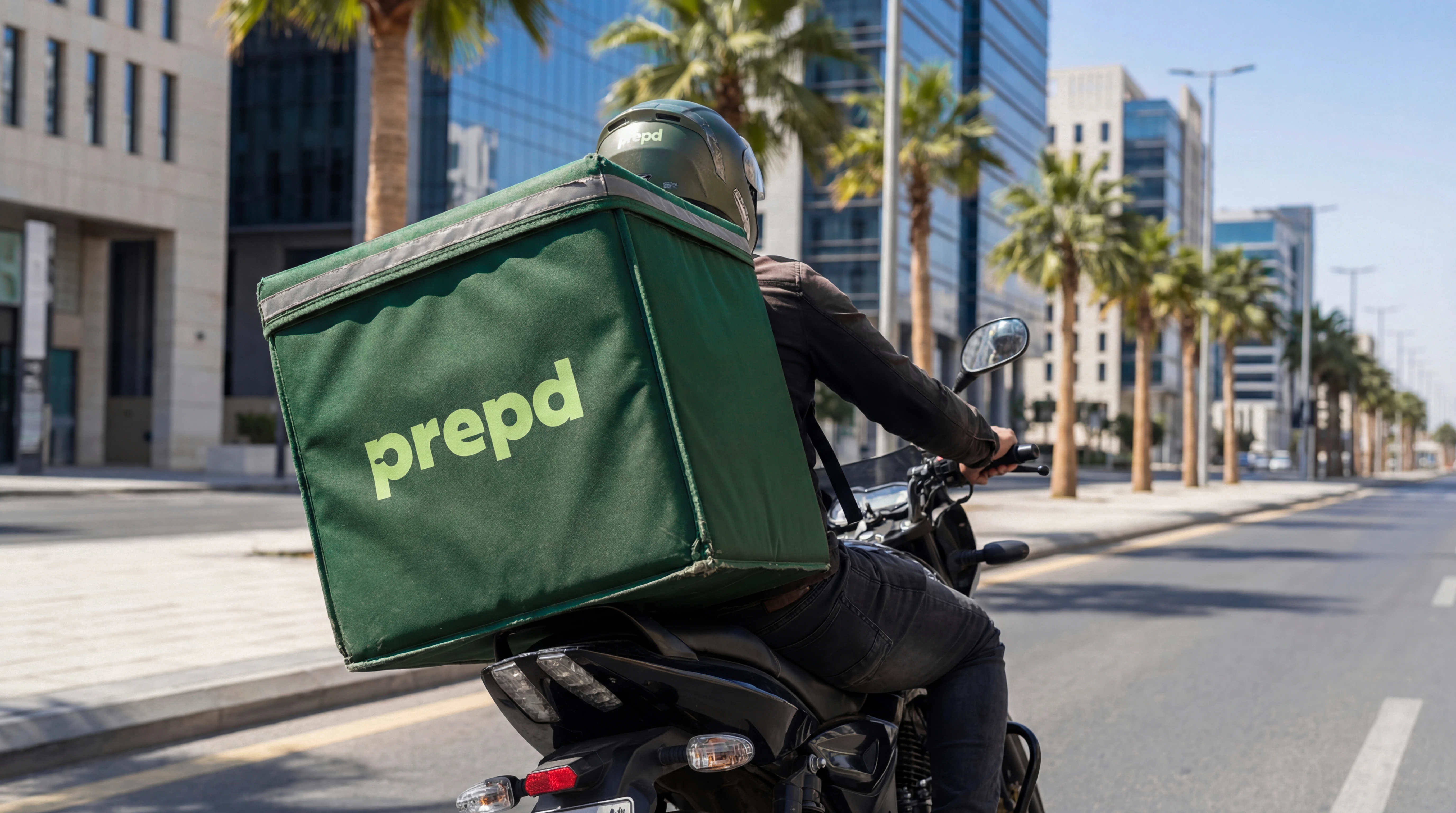
Prepd is a food delivery platform where food lovers can order dishes created by their favorite influencers and prepared fresh by professional chefs. Operating as a cloud kitchen, Prepd turns the recipes people save and crave online into real, high-quality meals delivered straight to their door.
The brand was designed to feel confident, bold, and clever, standing apart from traditional food delivery apps while celebrating the emotional connection between creators, food, and people.
Brand Identity
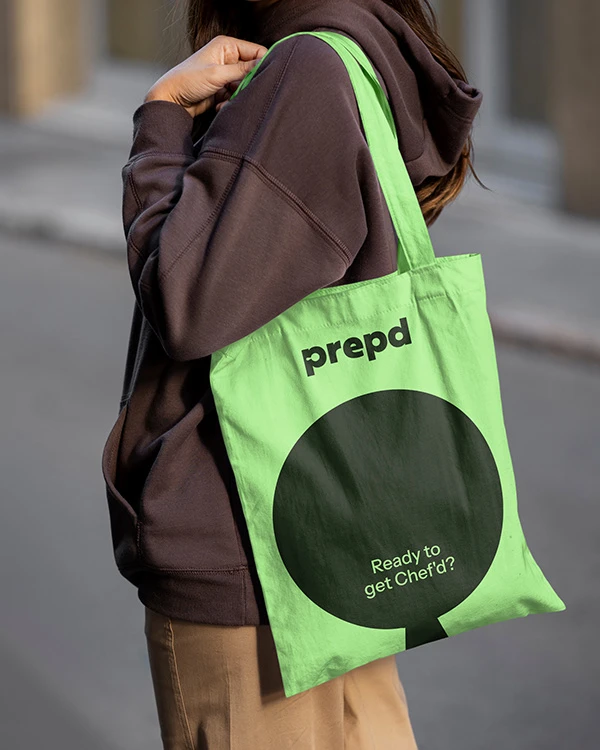
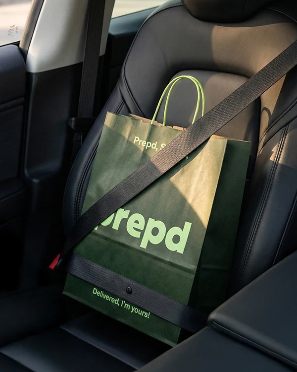
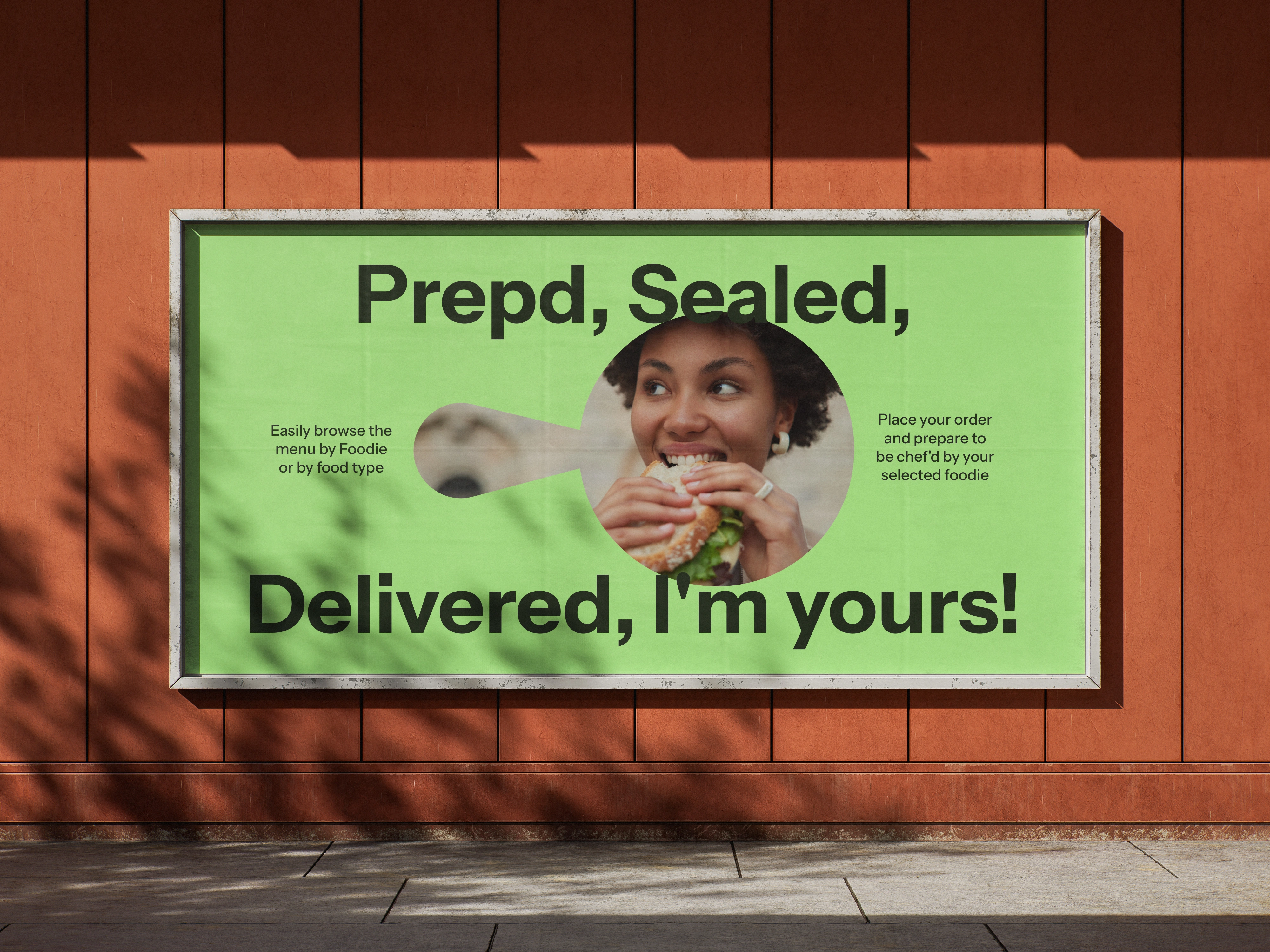
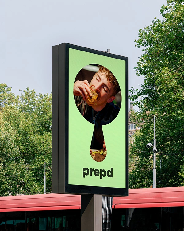
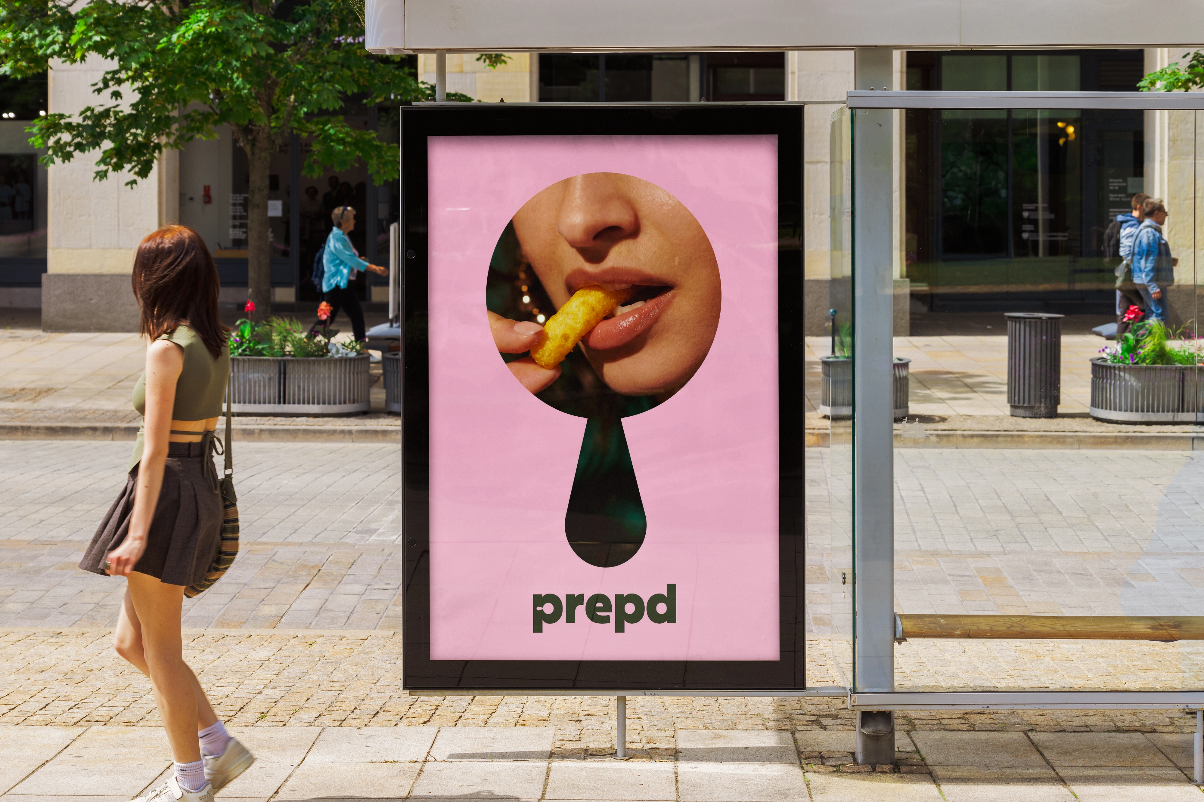
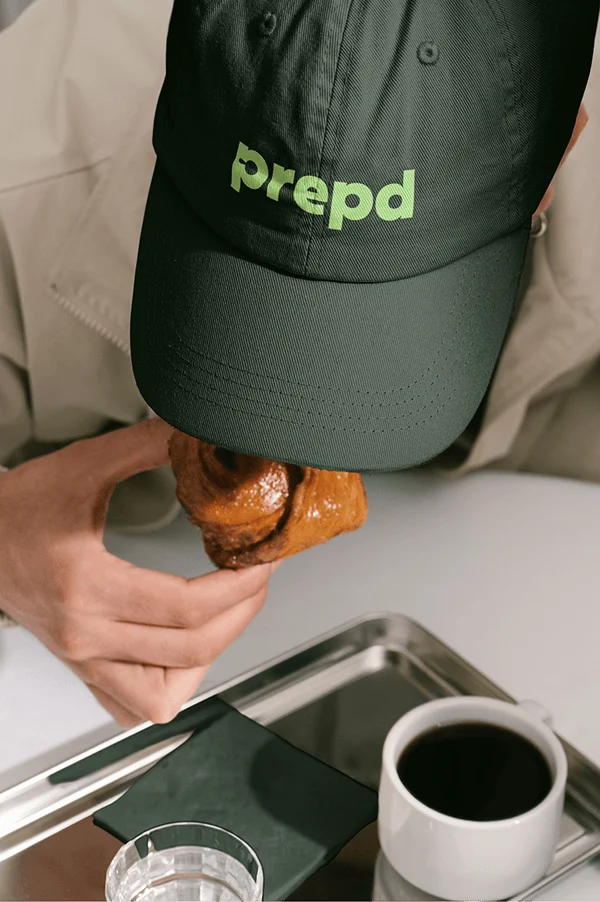
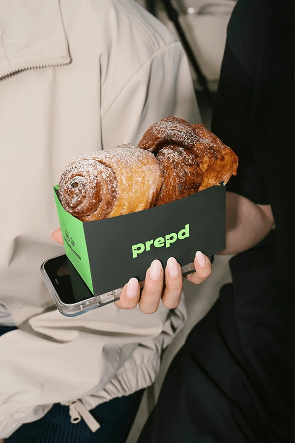
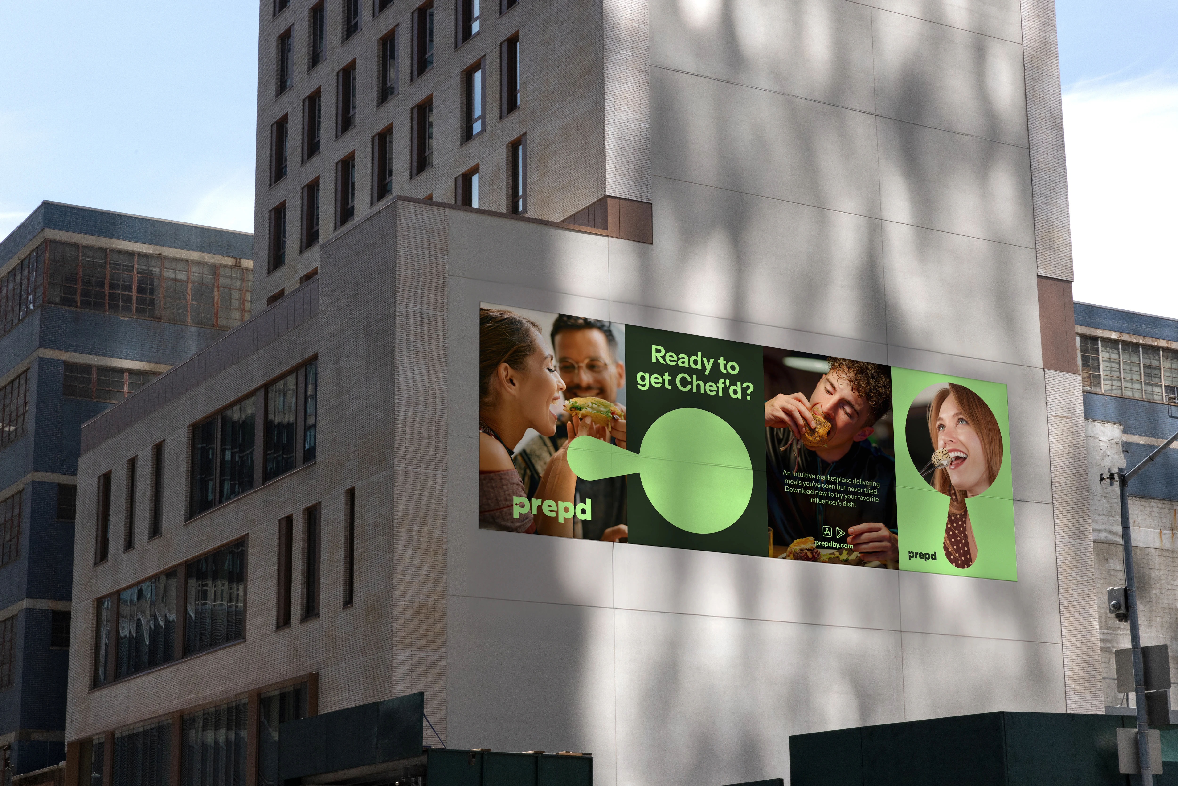
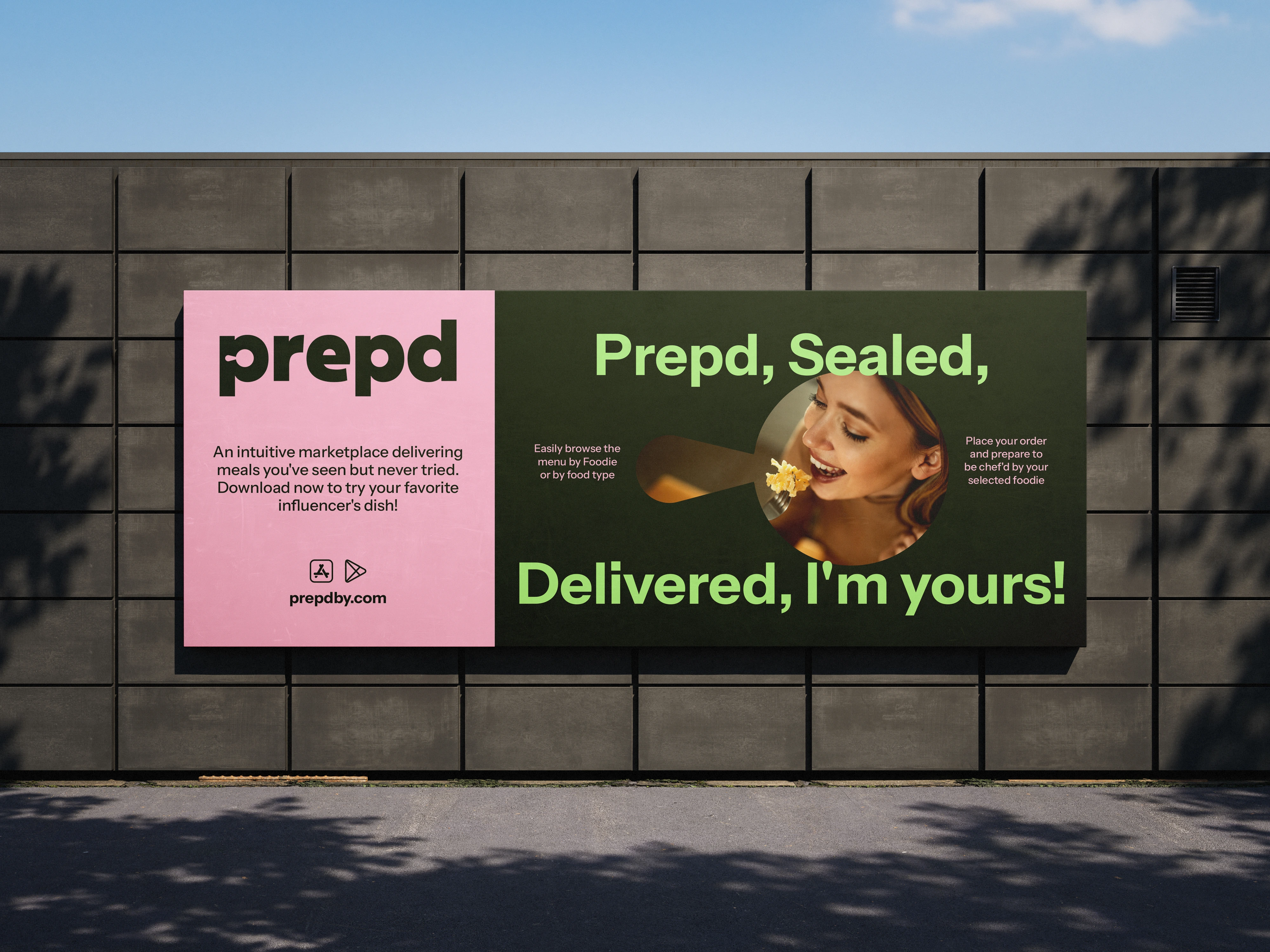
The visual identity balances clean geometry with playful details, creating a system that feels modern yet approachable. Bold compositions, vibrant contrasts, and expressive imagery position Prepd as a personality-driven brand — one that brings attitude and appetite into the food-tech space.
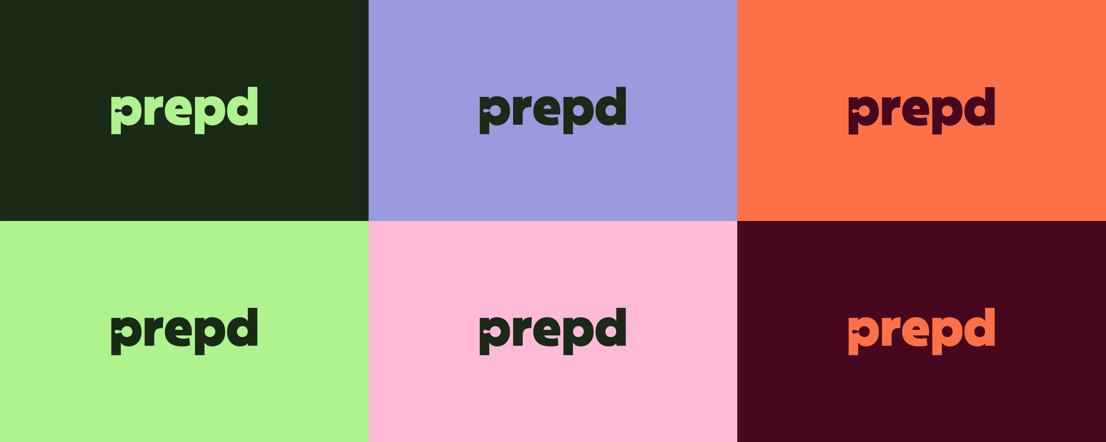
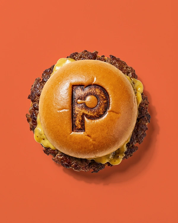
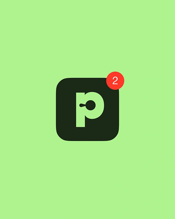
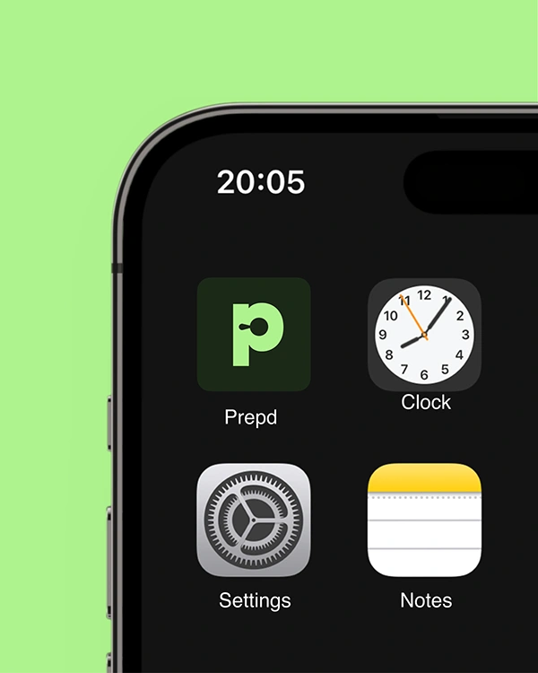
Logo
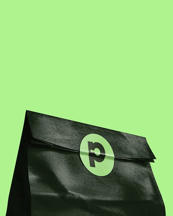
The logotype features a subtle frying pan hidden in the negative space of the letter “p”, symbolizing preparation, curation, and where ingredients come together. It also nods to influencer culture, where cooking often unfolds in front of the camera, pan sizzling and in motion.
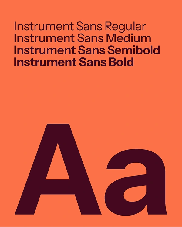
Colors & Typography
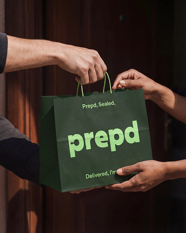
A deep green anchors the identity with a sense of quality and grounding, while a bright lime injects energy and memorability. Supporting accent colors add warmth and flavor without overwhelming the system.
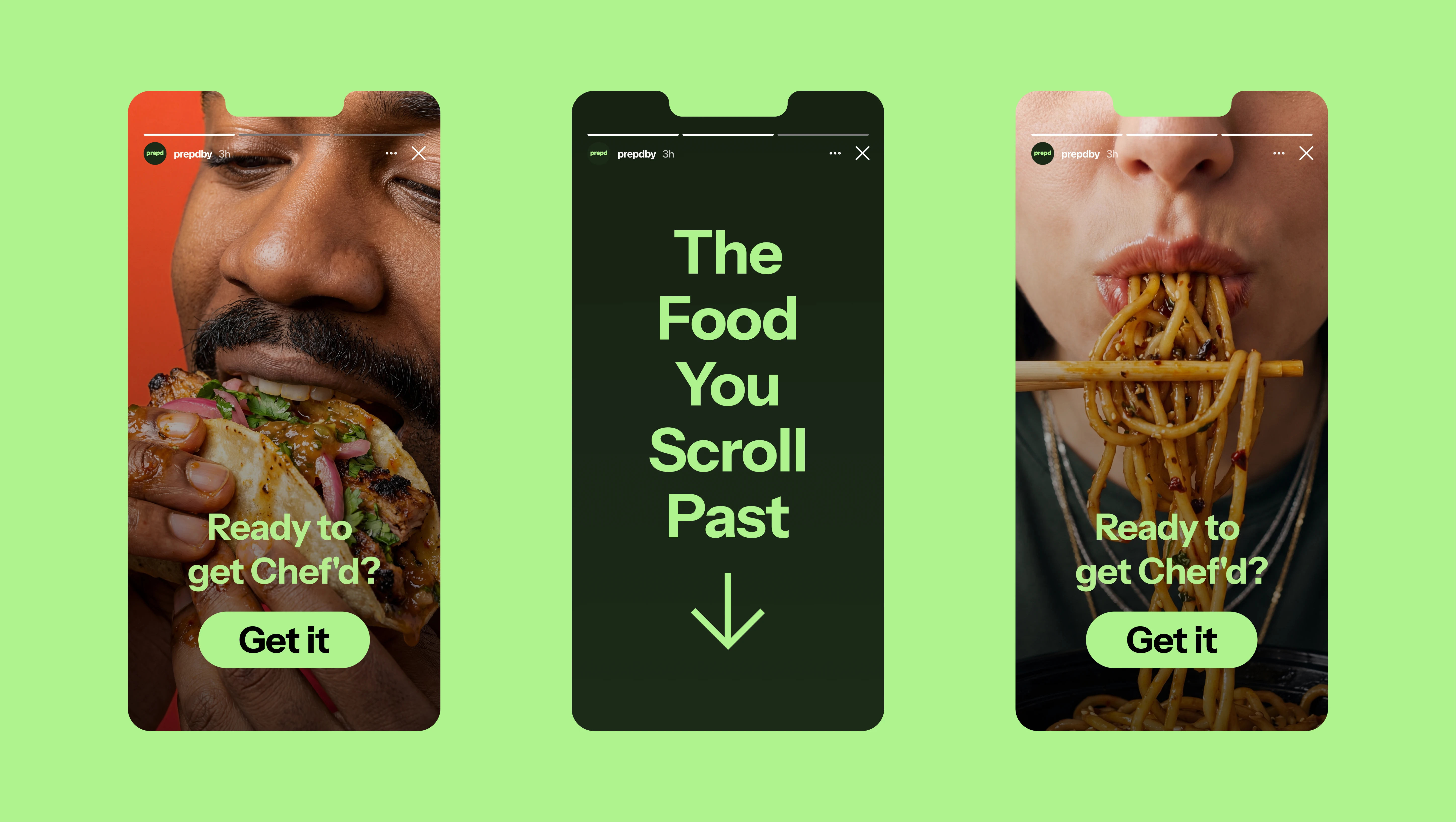
The brand uses Instrument Sans, a clean, contemporary typeface that balances clarity and warmth, reinforcing Prepd’s confident yet human tone.
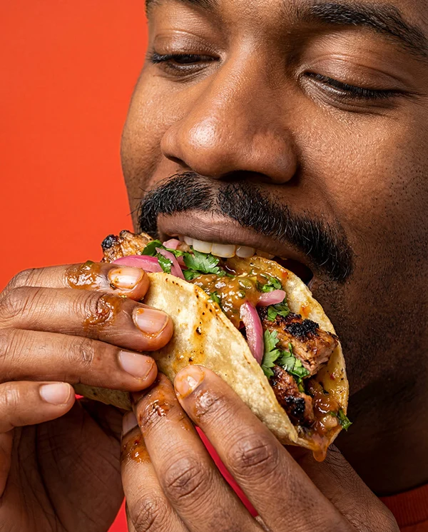
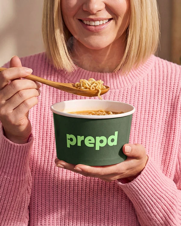
Photography
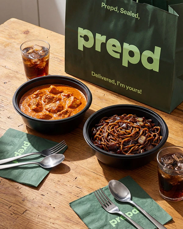
Photography is always human-first. Close, expressive shots capture people mid-bite, mid-laugh, and fully immersed in the experience of eating. Natural light, texture, and imperfection keep the brand feeling real, emotional, and crave-worthy.
The result is a bold, modern identity that transforms influencer recipes into tangible experiences — and makes good taste impossible to scroll past.
Services: Creative Direction & Brand Identity Design, Motion Design
Thank you ❤️
Follow us on Instagram
Like this project
Posted Mar 25, 2026
A bold, modern visual brand identity design for Prepd, a food delivery app connecting influencer recipes with chef-prepared meals.