Hummzies Branding & Packaging
Cansu Dağbağlı Ferreira
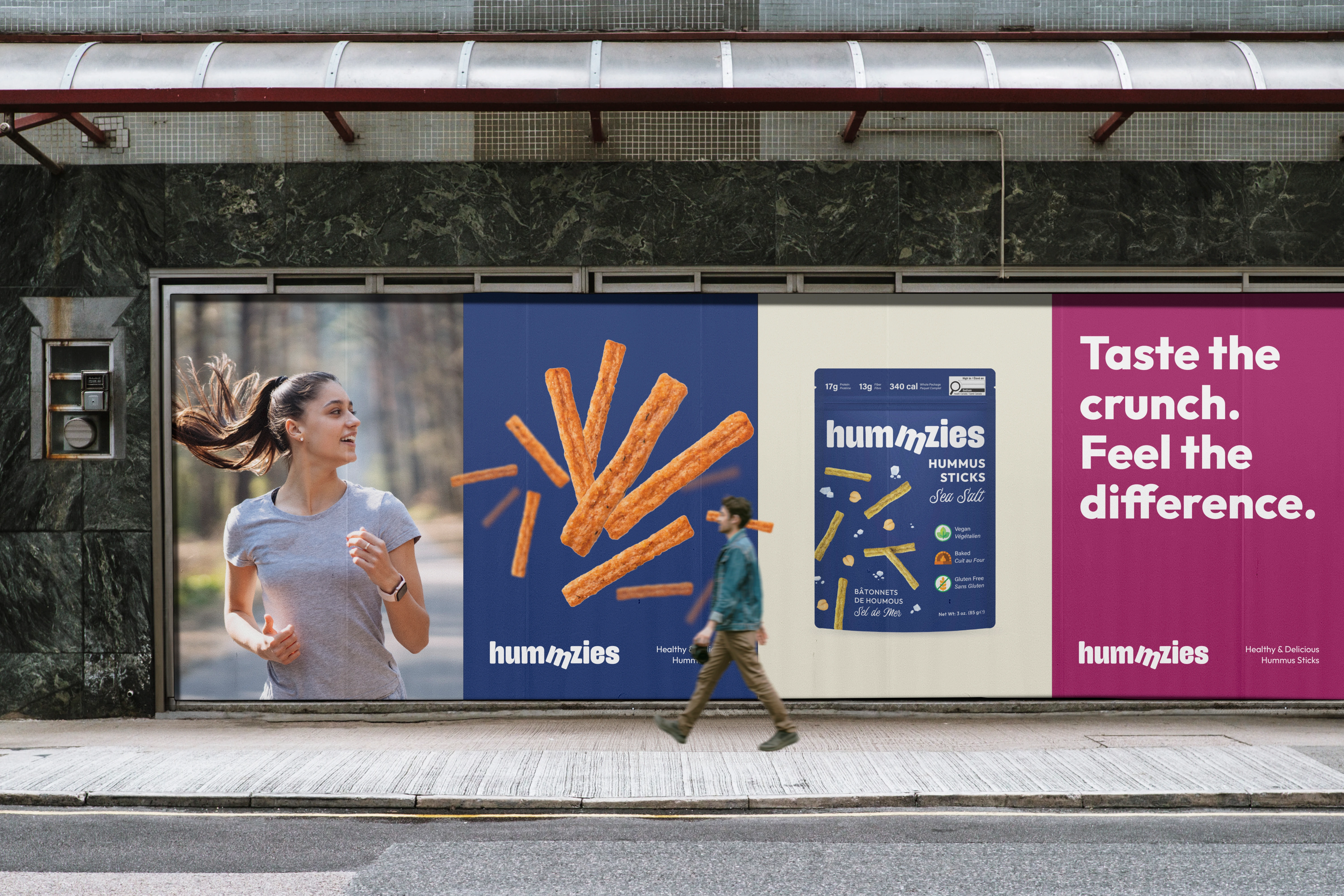
Taste the crunch. Feel the difference.
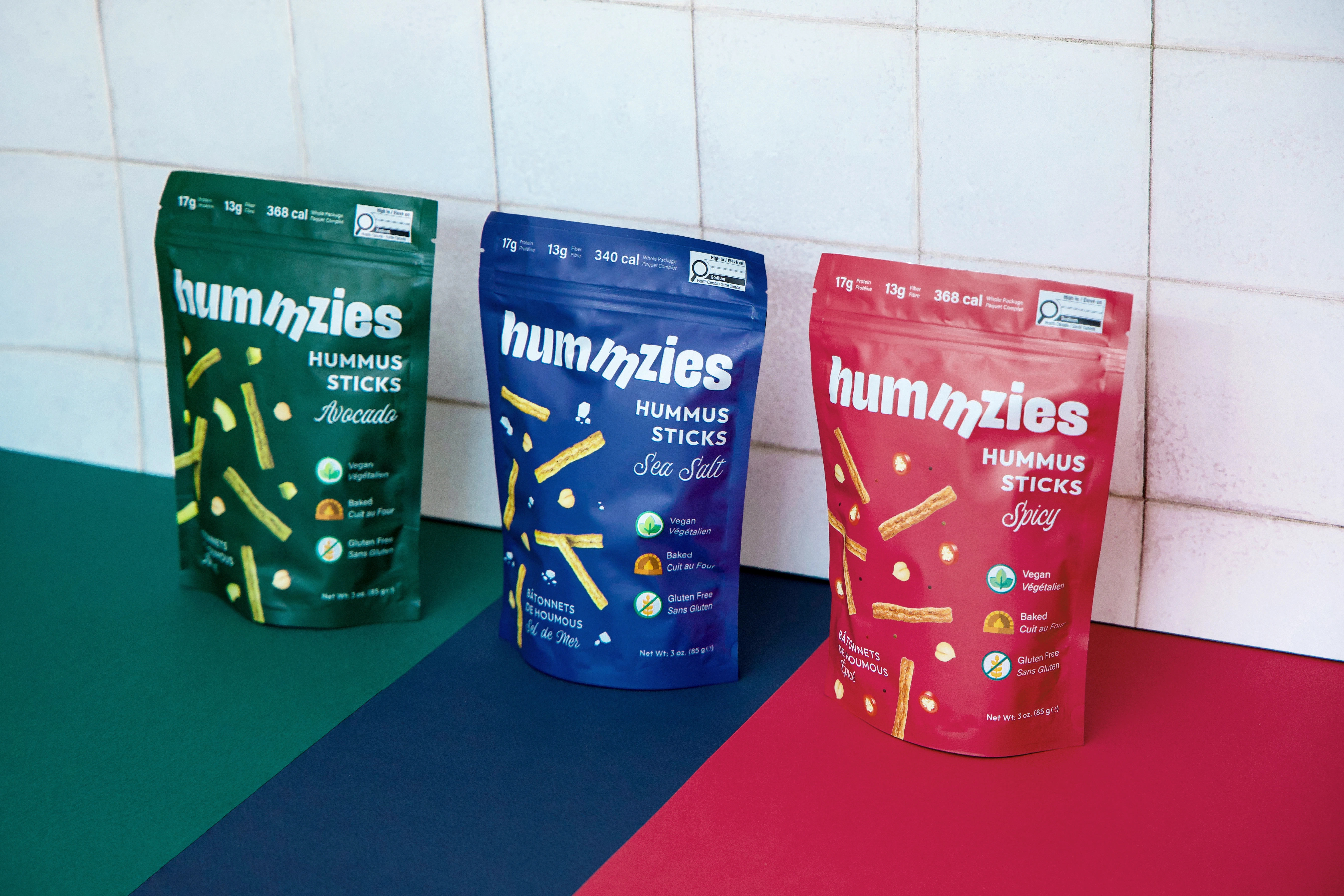
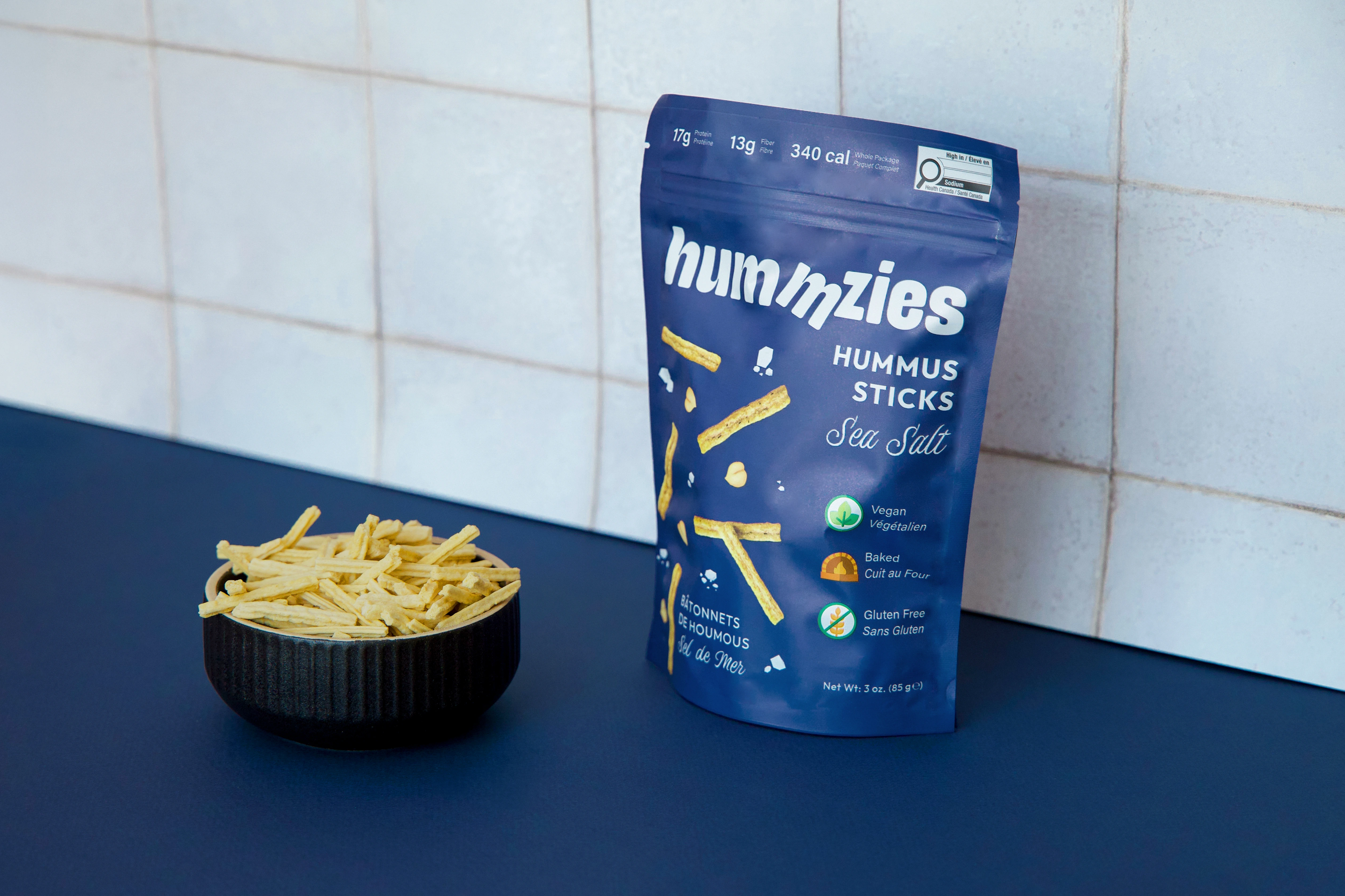
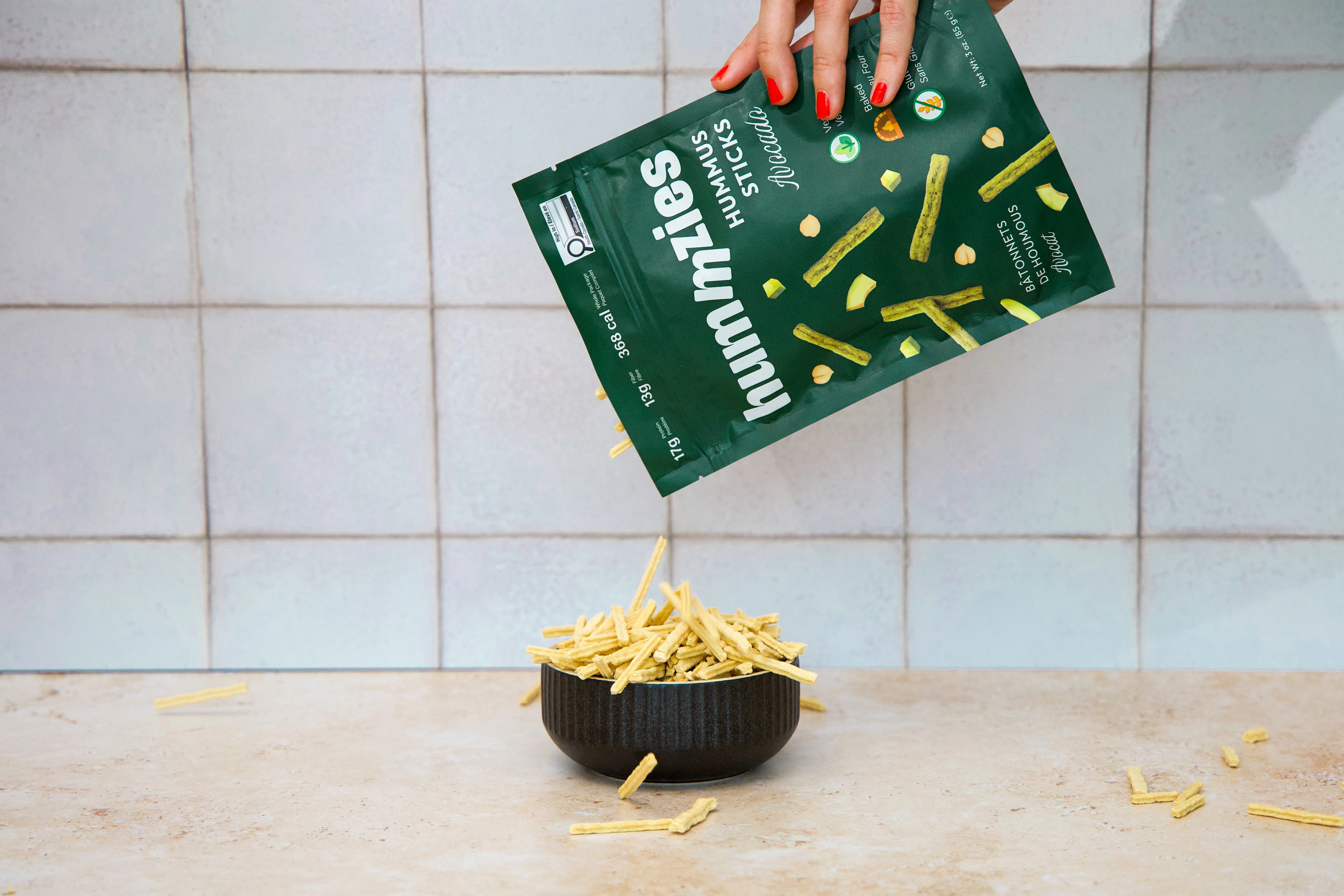
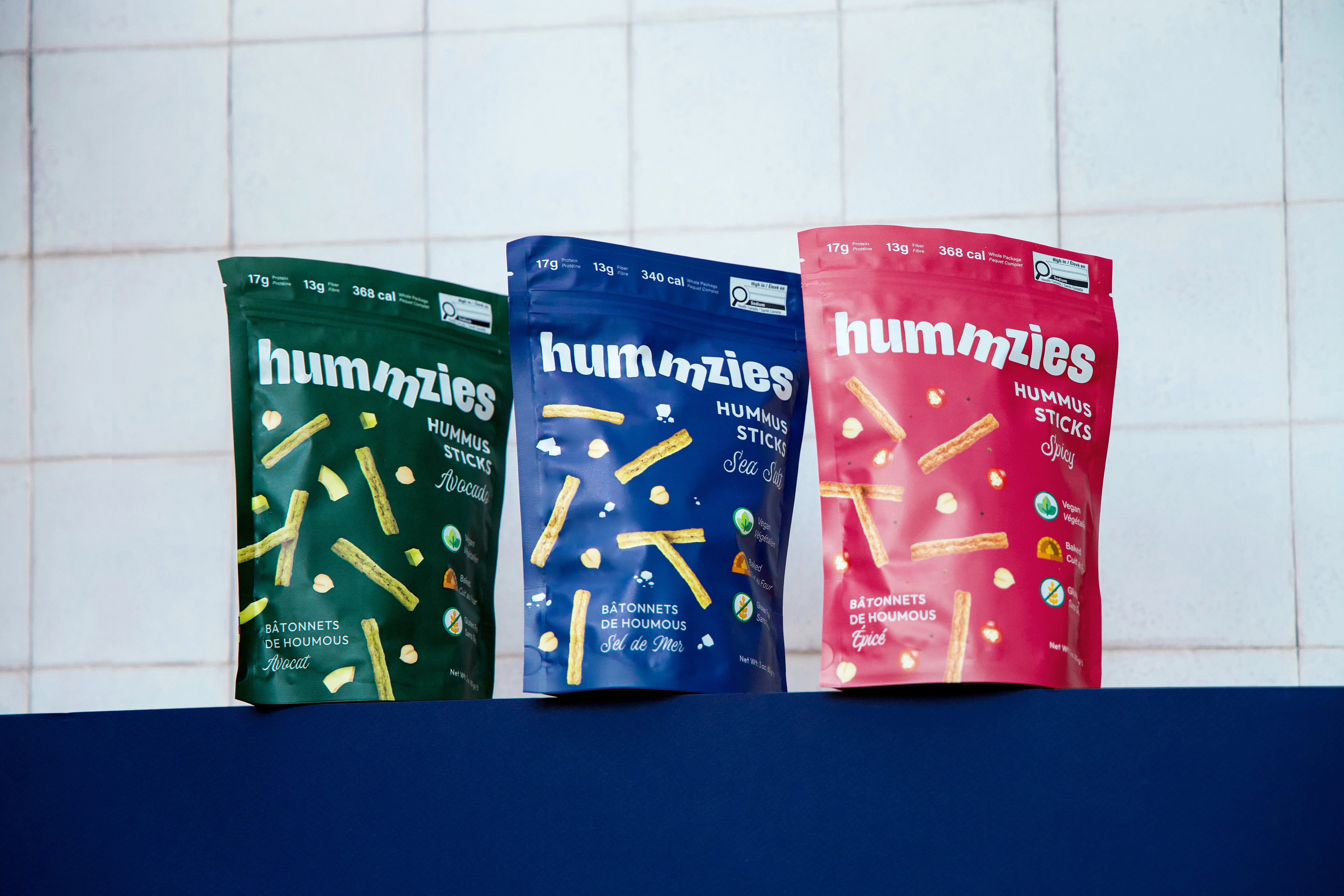
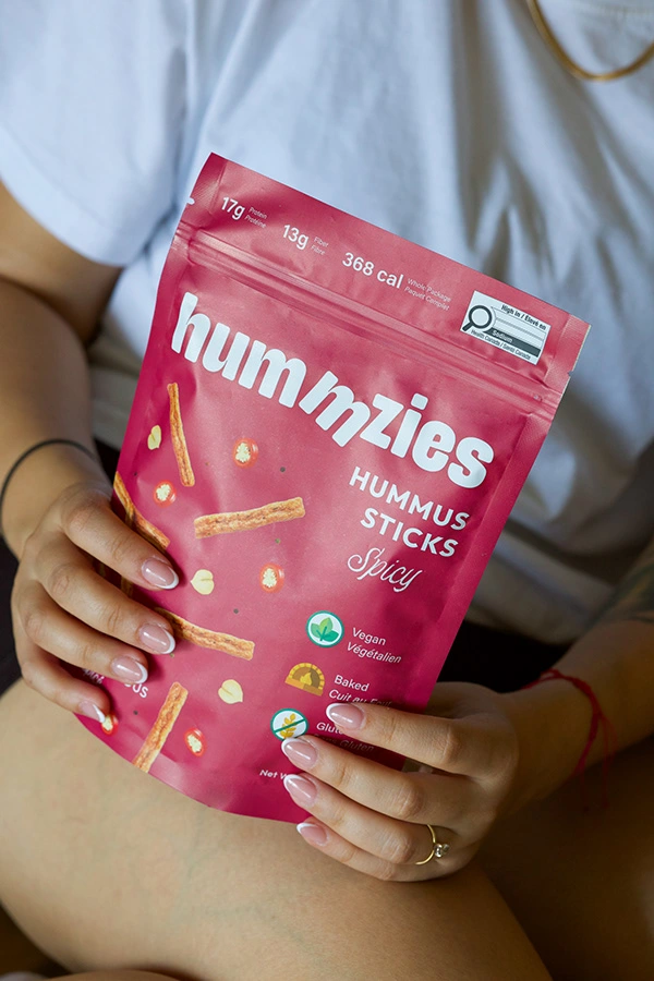
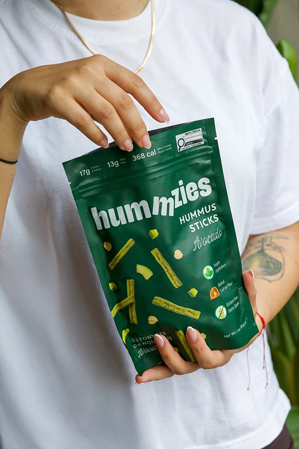
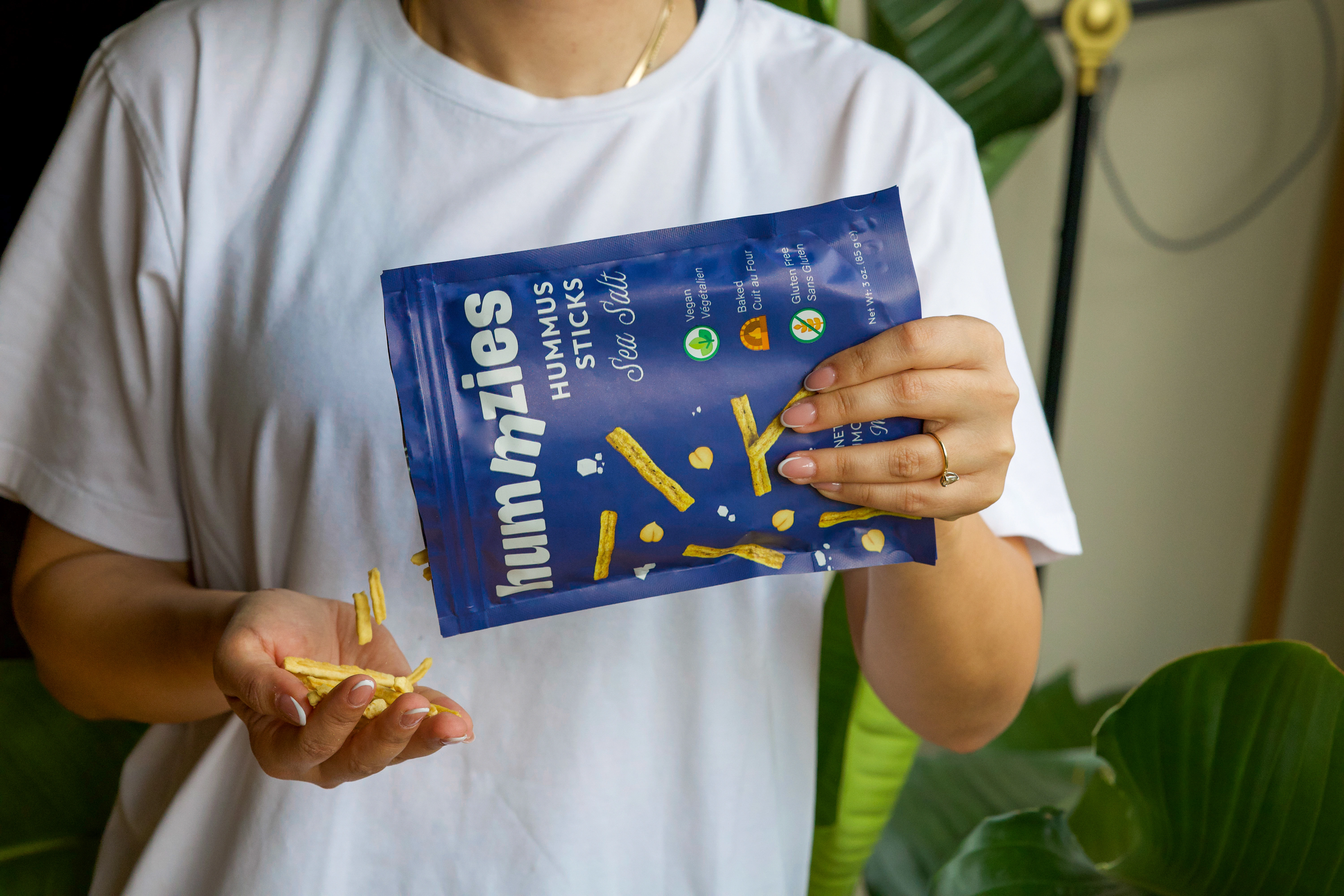
Hummzies is a Canadian brand offering a new take on snacking — protein-packed, vegan, and oven-baked hummus chips designed for health-conscious, active individuals who want to upgrade their snacks without compromising on taste.
The visual identity and packaging design reflect this philosophy with a bold yet minimal approach. The concept was built around standing out on crowded shelves while keeping the design clean, approachable, and clear.
Logo Design
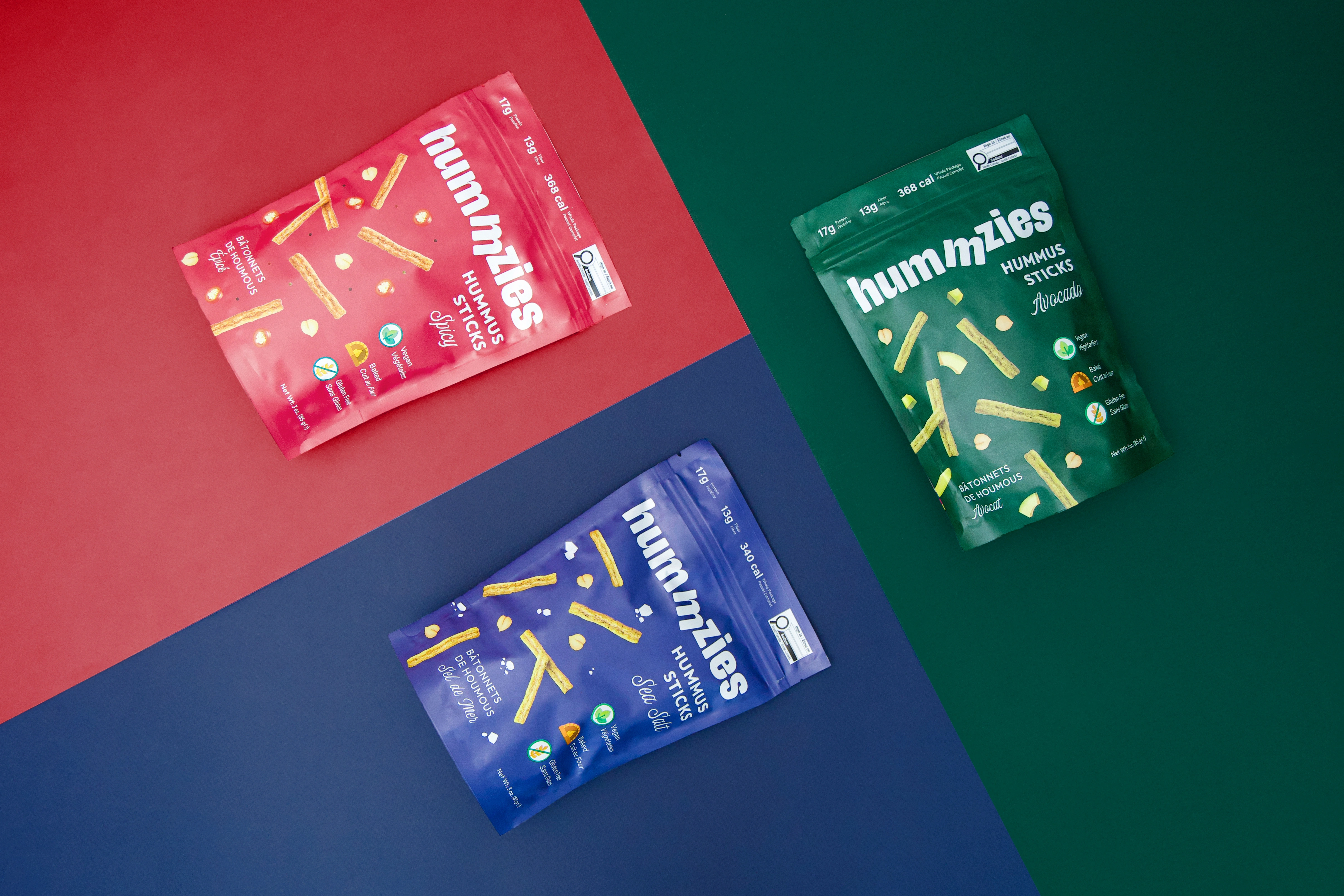
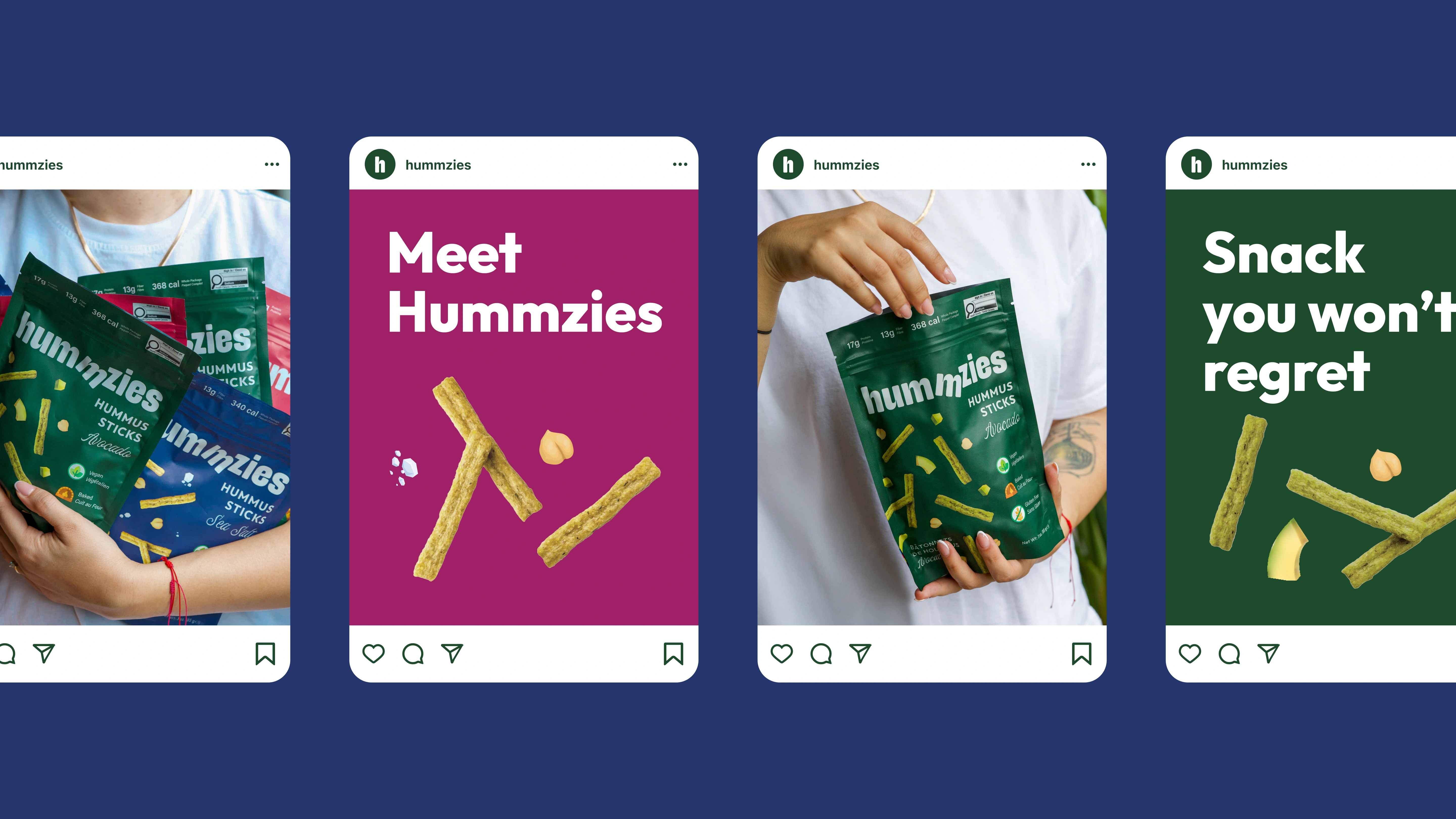
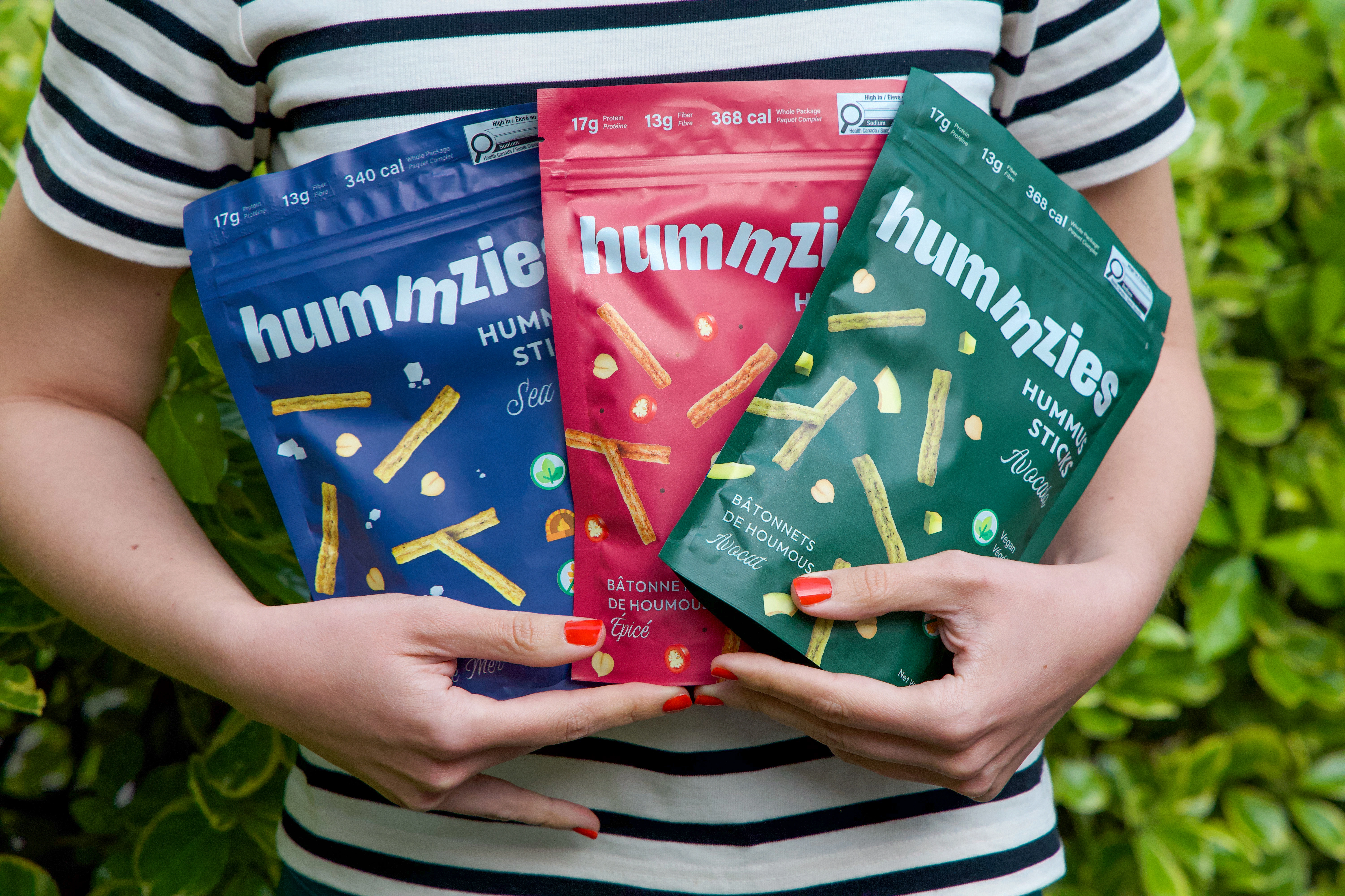
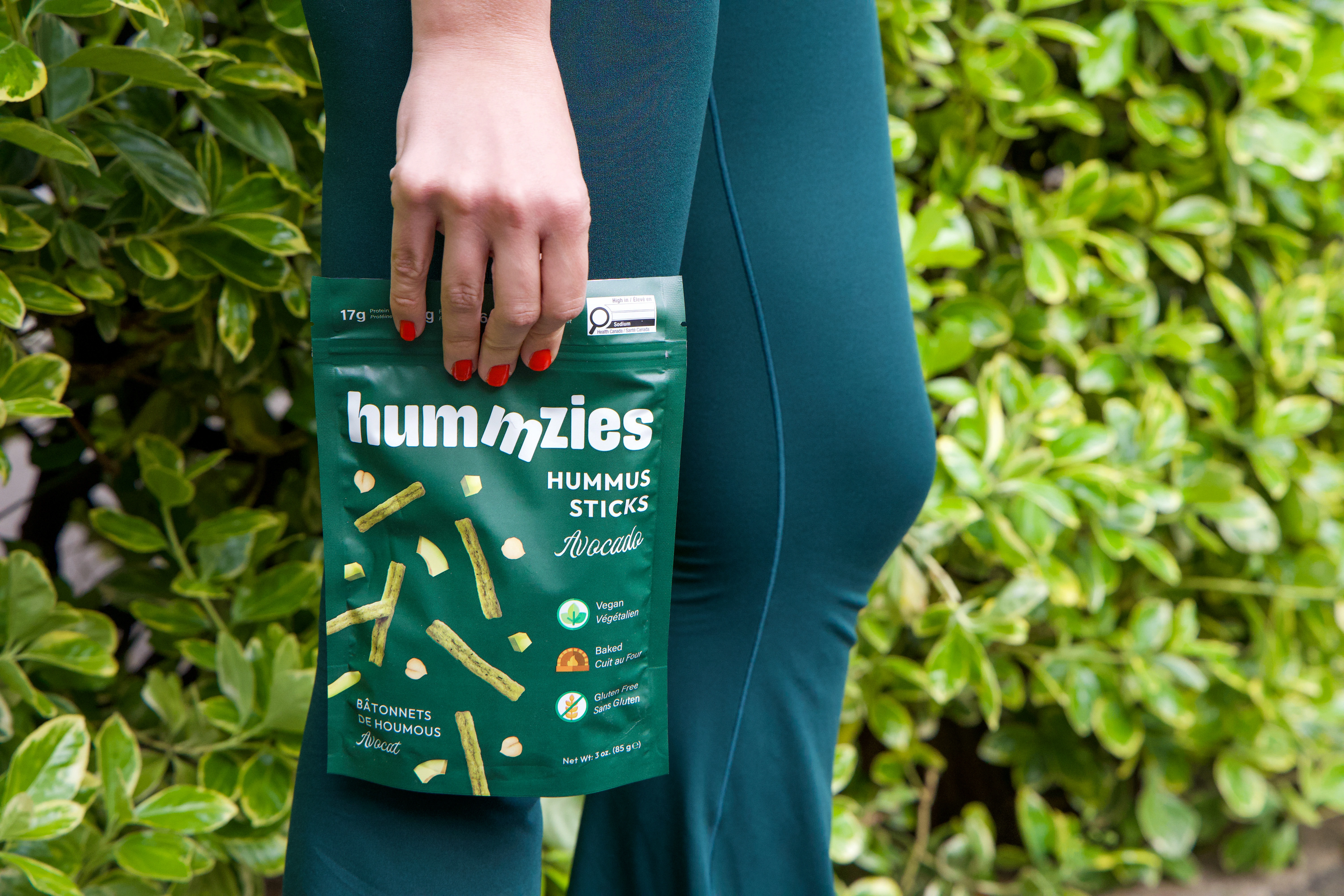
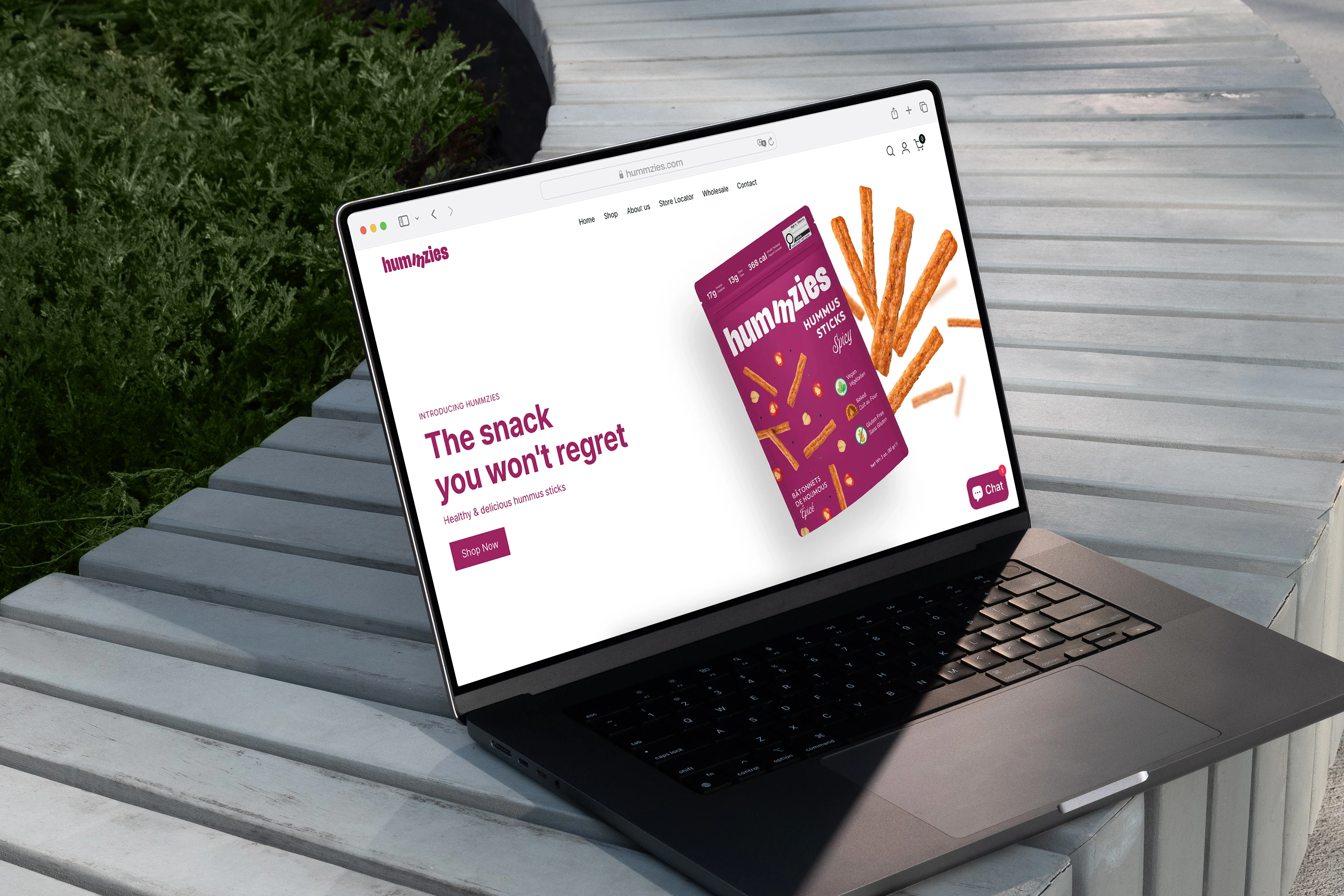
At the heart of the identity is the Hummzies wordmark — a simple, confident design with a subtle, clever twist. One of the "m"s is slightly tilted, mimicking the natural "mmm" sound that comes with a satisfying, tasty snack. It's a minimal but playful detail that reinforces the brand's promise of deliciousness.
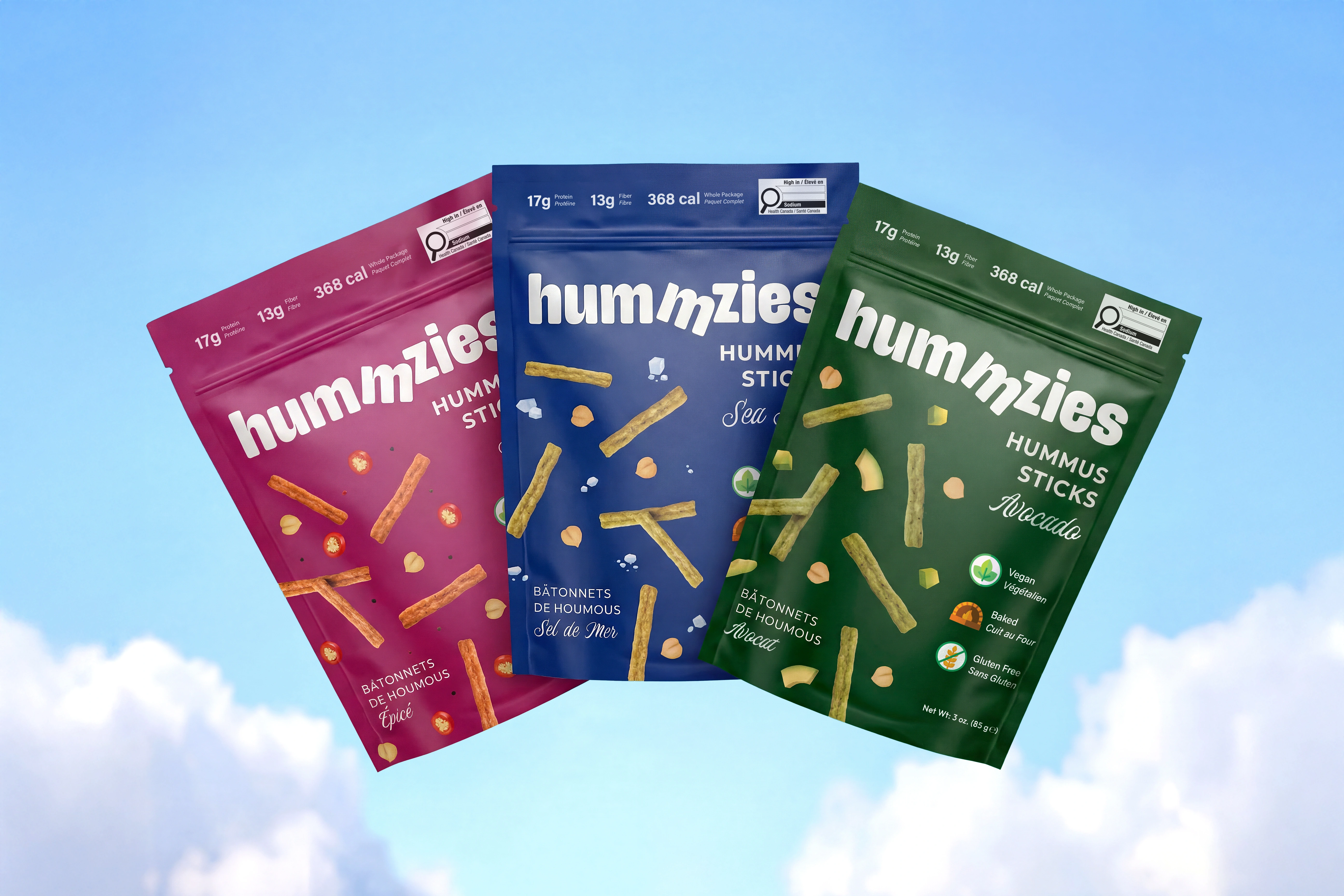
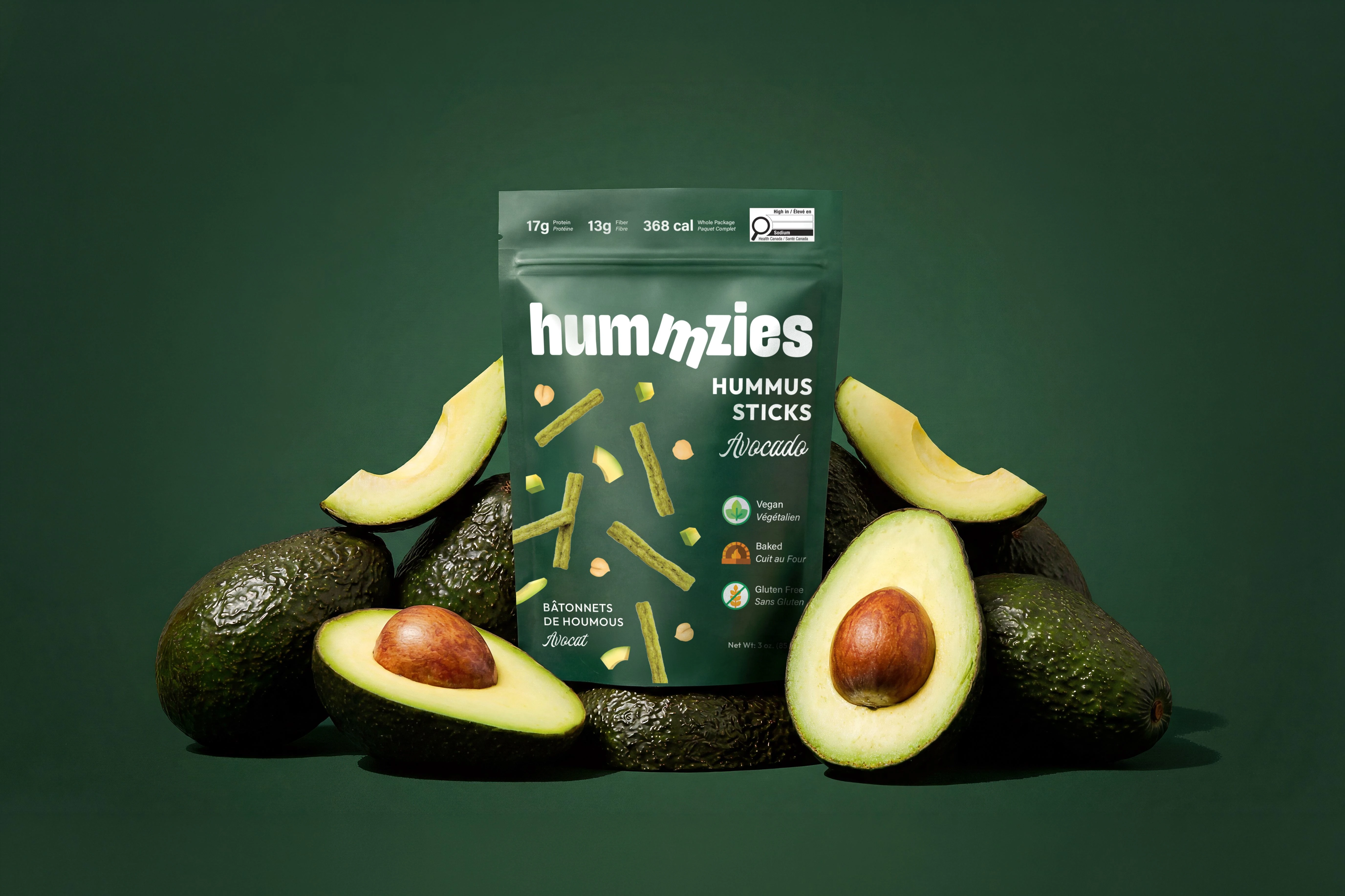
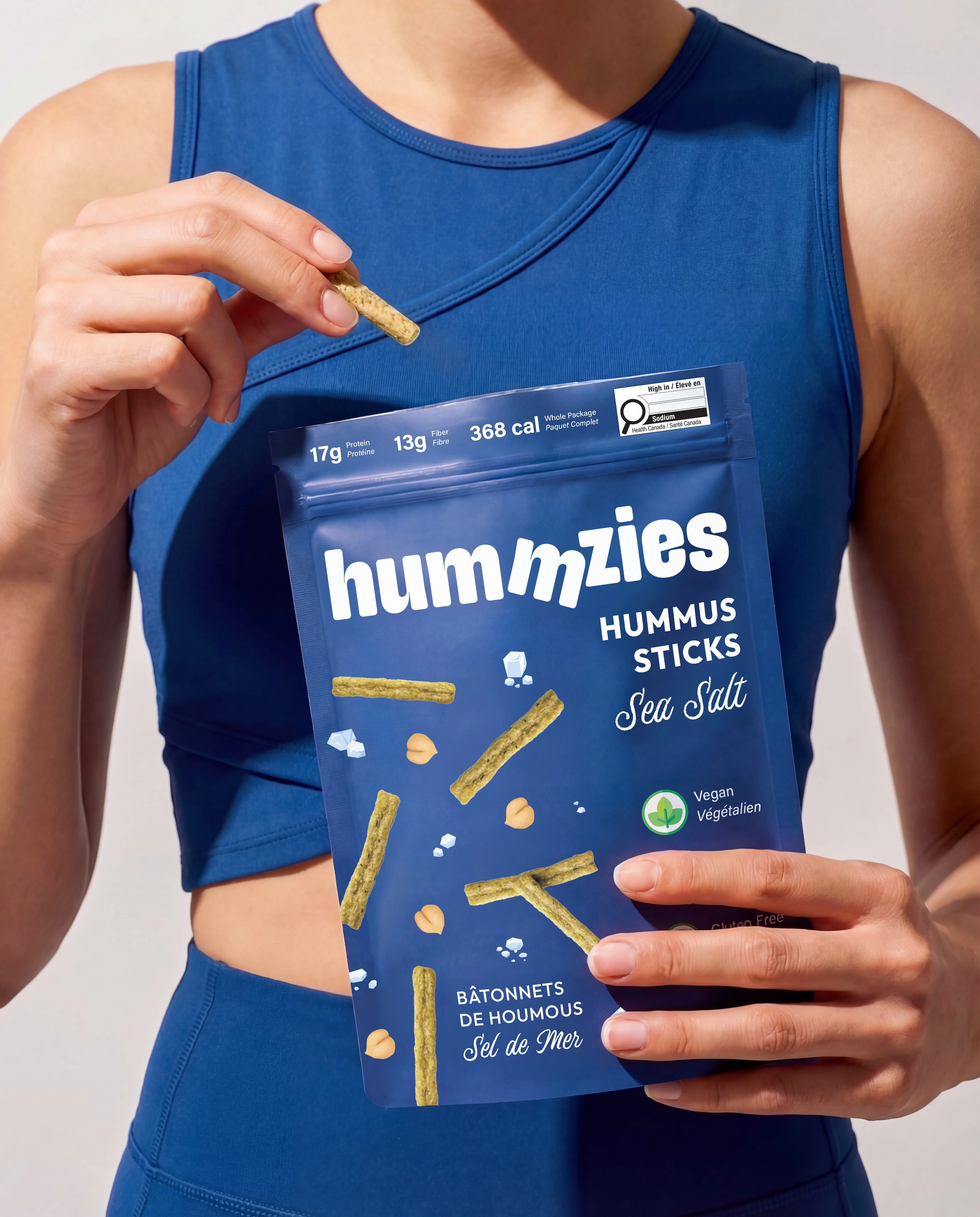
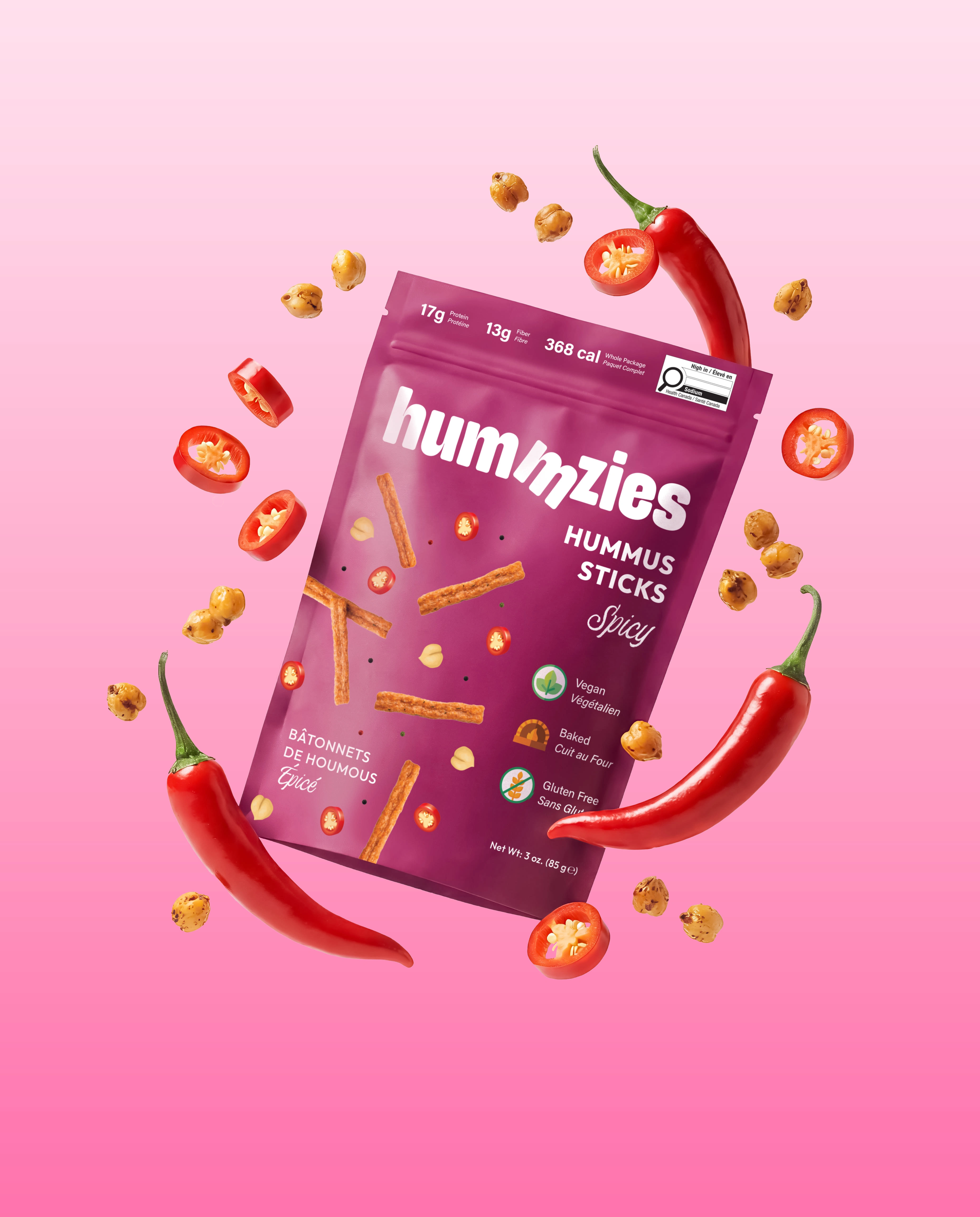
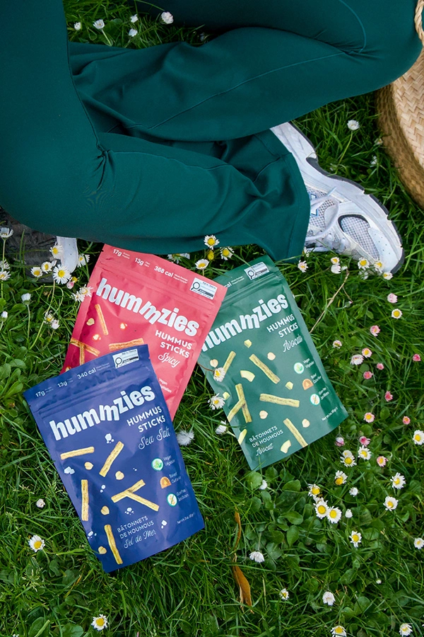
Color & Packaging Concept
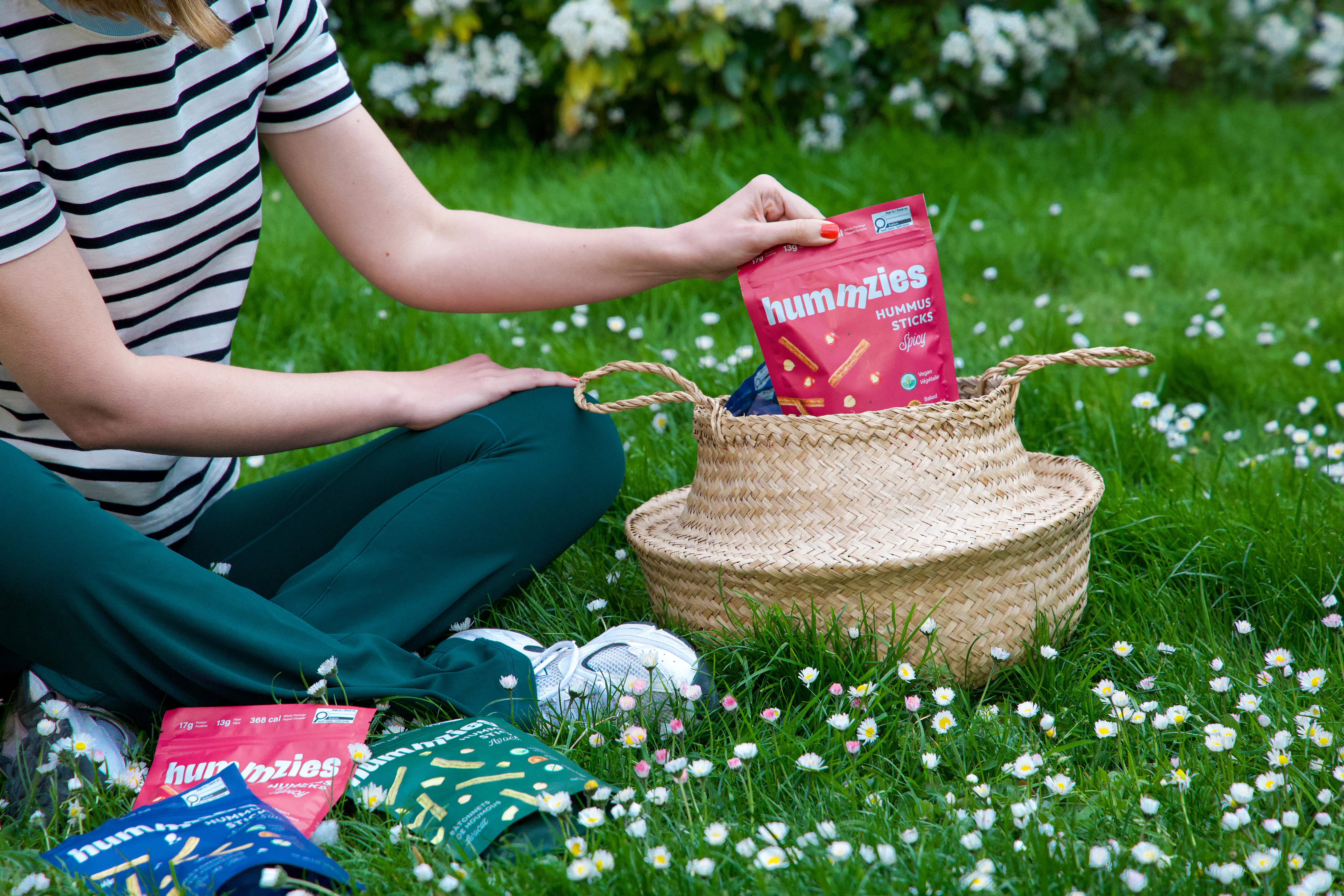
Our field research revealed a common trend among healthy snack brands: light colors, pastel tones, and predominantly white backgrounds. Hummzies intentionally breaks this pattern. We opted for rich, saturated backgrounds — deep blue, bold red, and forest green — to create instant shelf impact and visual distinction. The minimal layout allows consumers to easily identify the product and its key benefits at a glance.
Typography & Visual Language
The typography is modern, clear, and friendly — perfectly in line with the brand's positioning as accessible yet premium. Supporting graphics, like floating ingredients and snack pieces, emphasize the crunchy, irresistible nature of the product while keeping the design playful and dynamic.
Final Result
The overall design strikes a balance between healthy and tasty, minimal and bold. It speaks to consumers who care about what they eat — and enjoy every bite.
Services: Creative Direction, Branding Identity, Packaging Design & Product Photography
Client: Hummzies
Motion Design: Murat Kaan Öztürk


Thank you 🤍
Follow us on Instagram
Like this project
Posted Mar 26, 2026
A bold, playful identity for a Canadian snack brand. Vegan, and packed with protein, designed to stand out on shelves and satisfy health-conscious snack lovers.