Grovehood Collective Branding
Cansu Dağbağlı Ferreira
Pentawards 2025 Winner
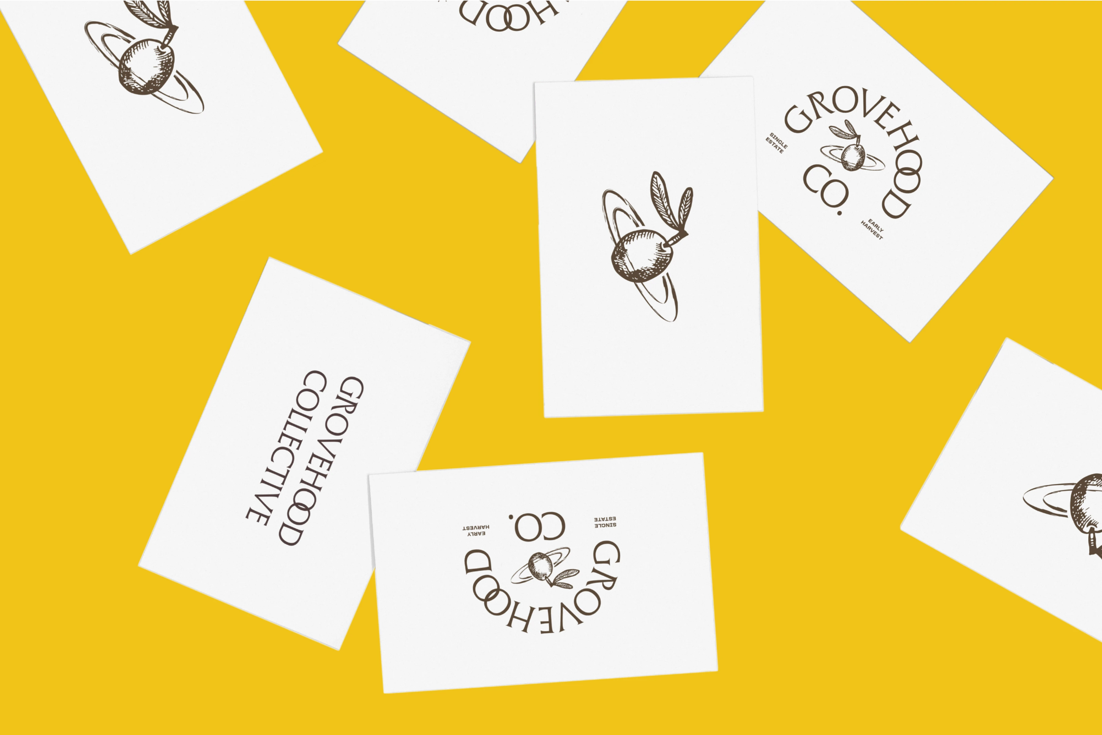
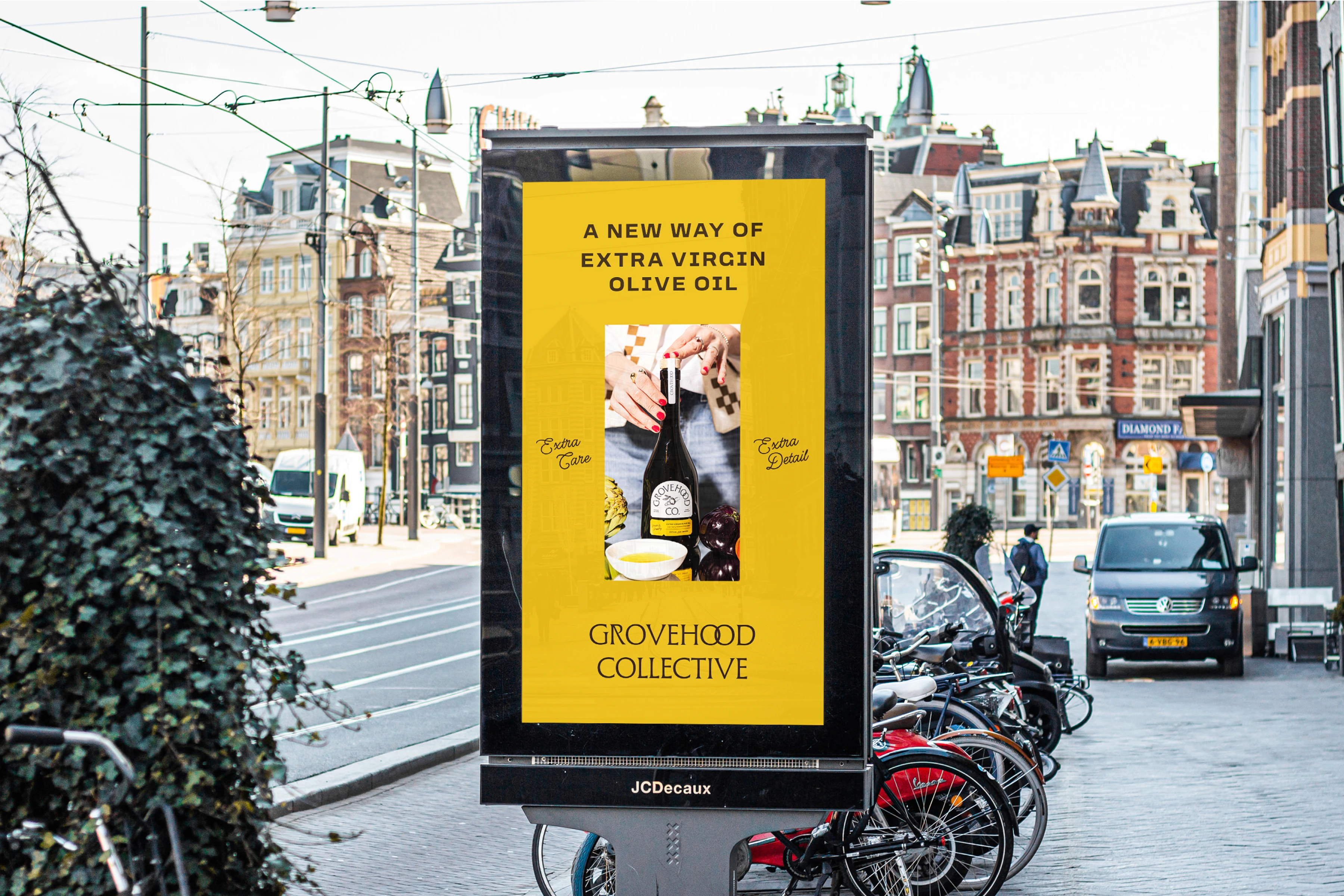
A New Way of Extra Virgin Olive Oil
Grovehood Collective collaborates with earth-friendly boutique farms to offer transparent extra virgin olive oil in the Netherlands. As the first brand in the country to prioritize full traceability, the design reflects a commitment to authenticity and craftsmanship.
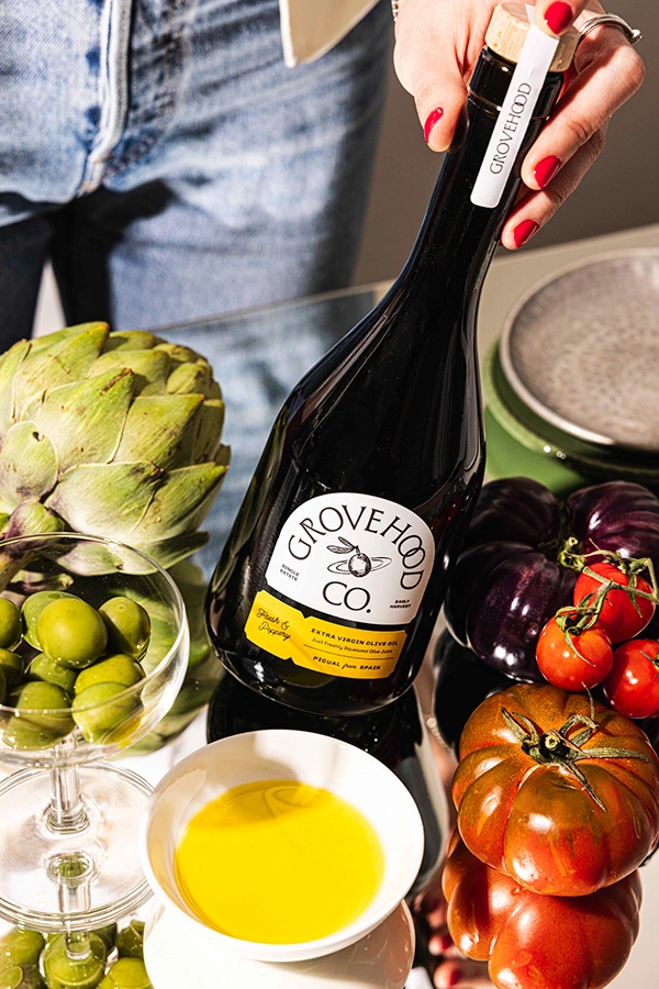
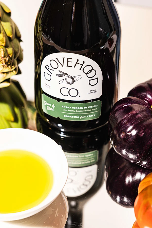
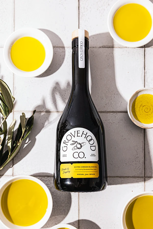
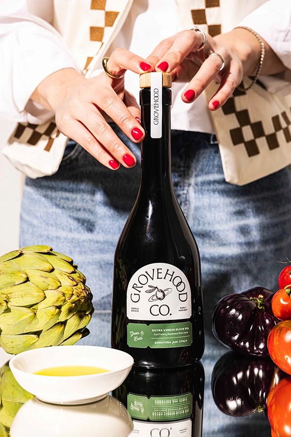
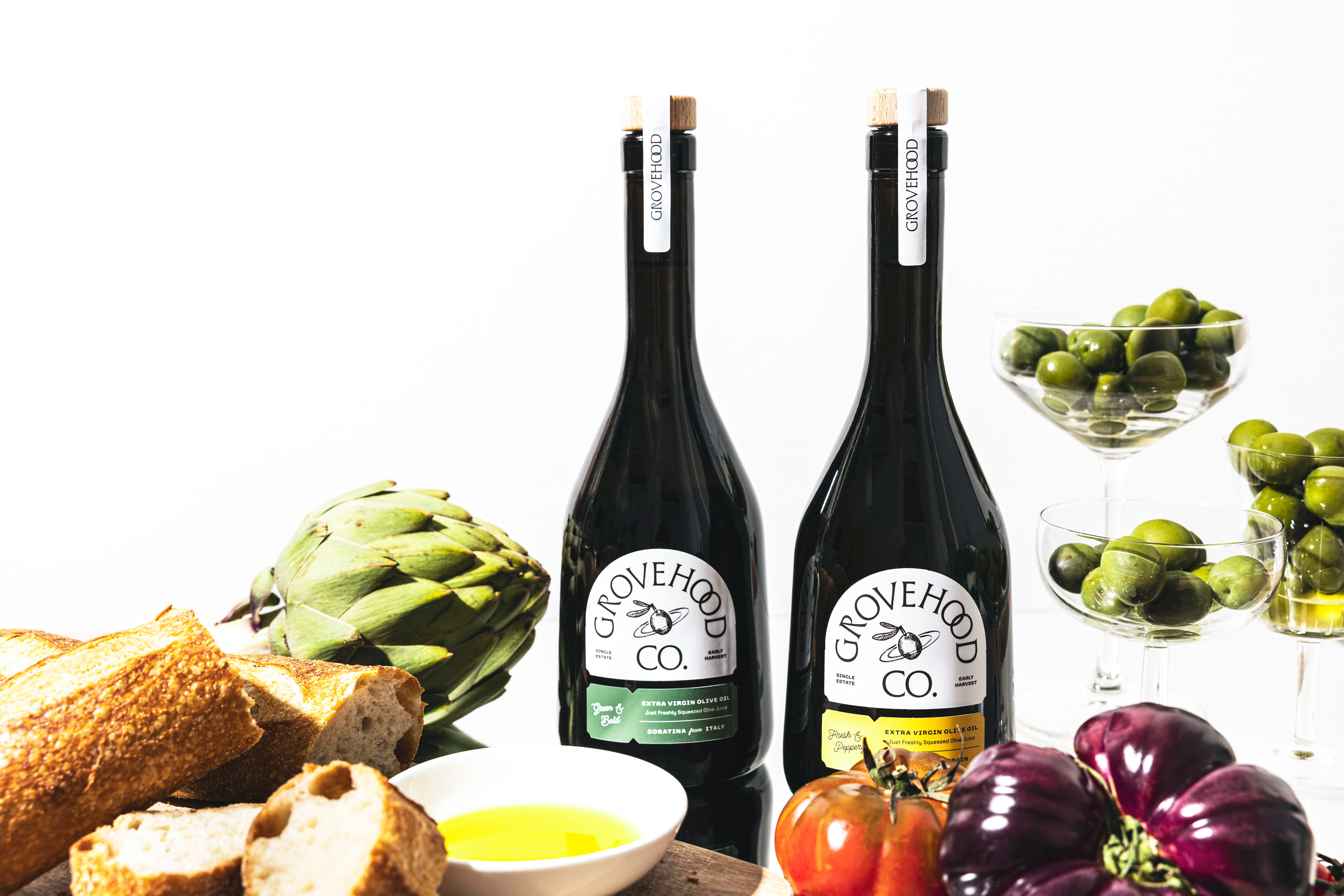
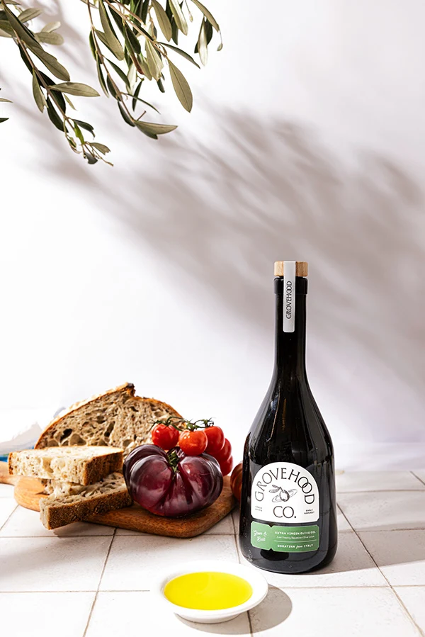
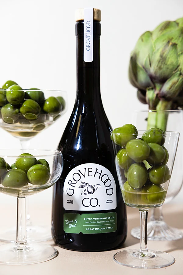
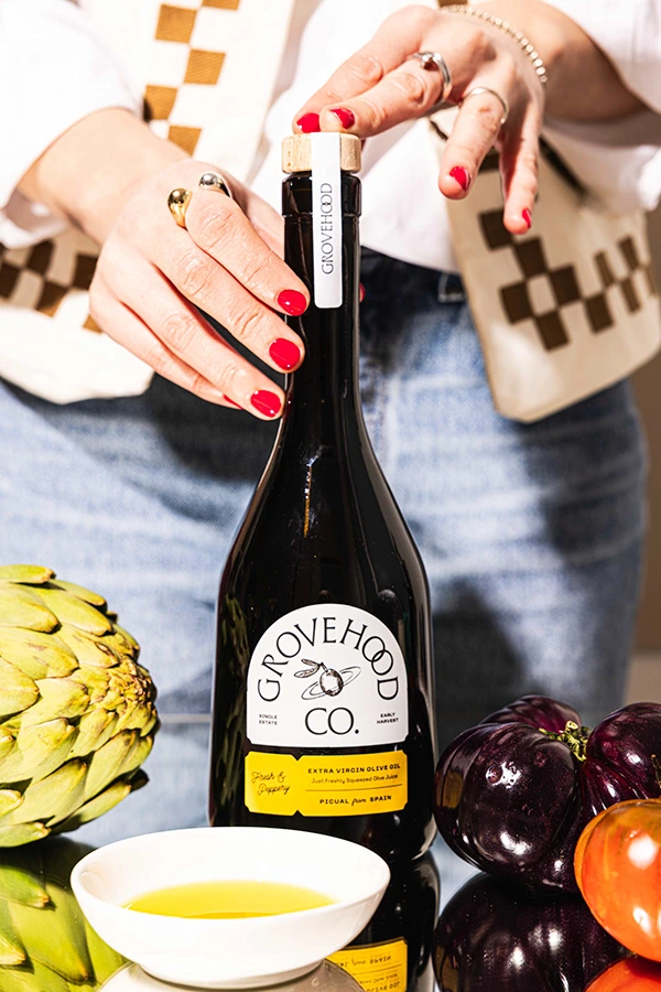
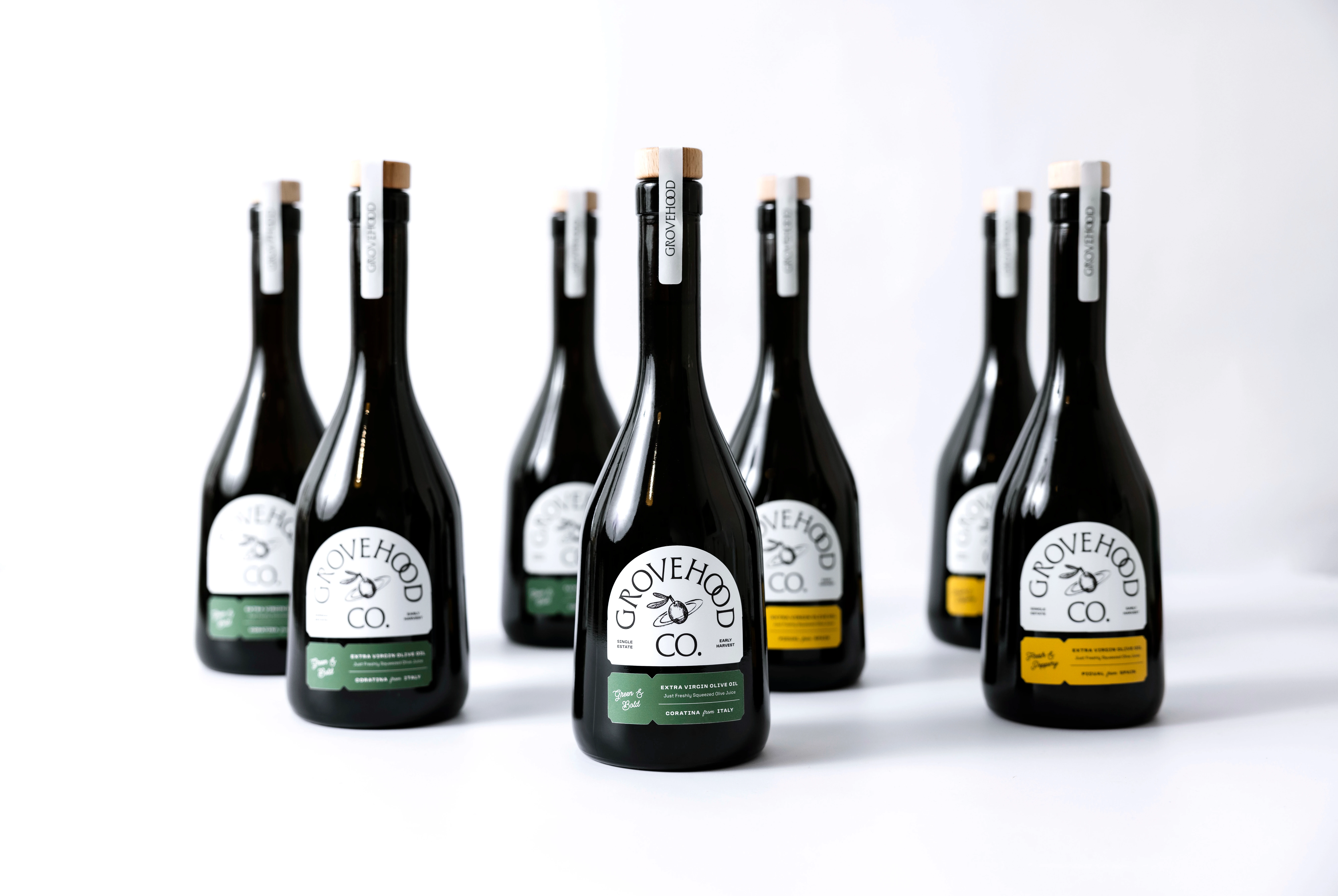
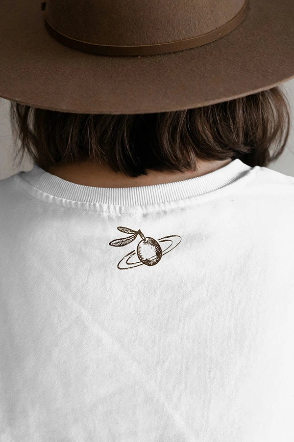
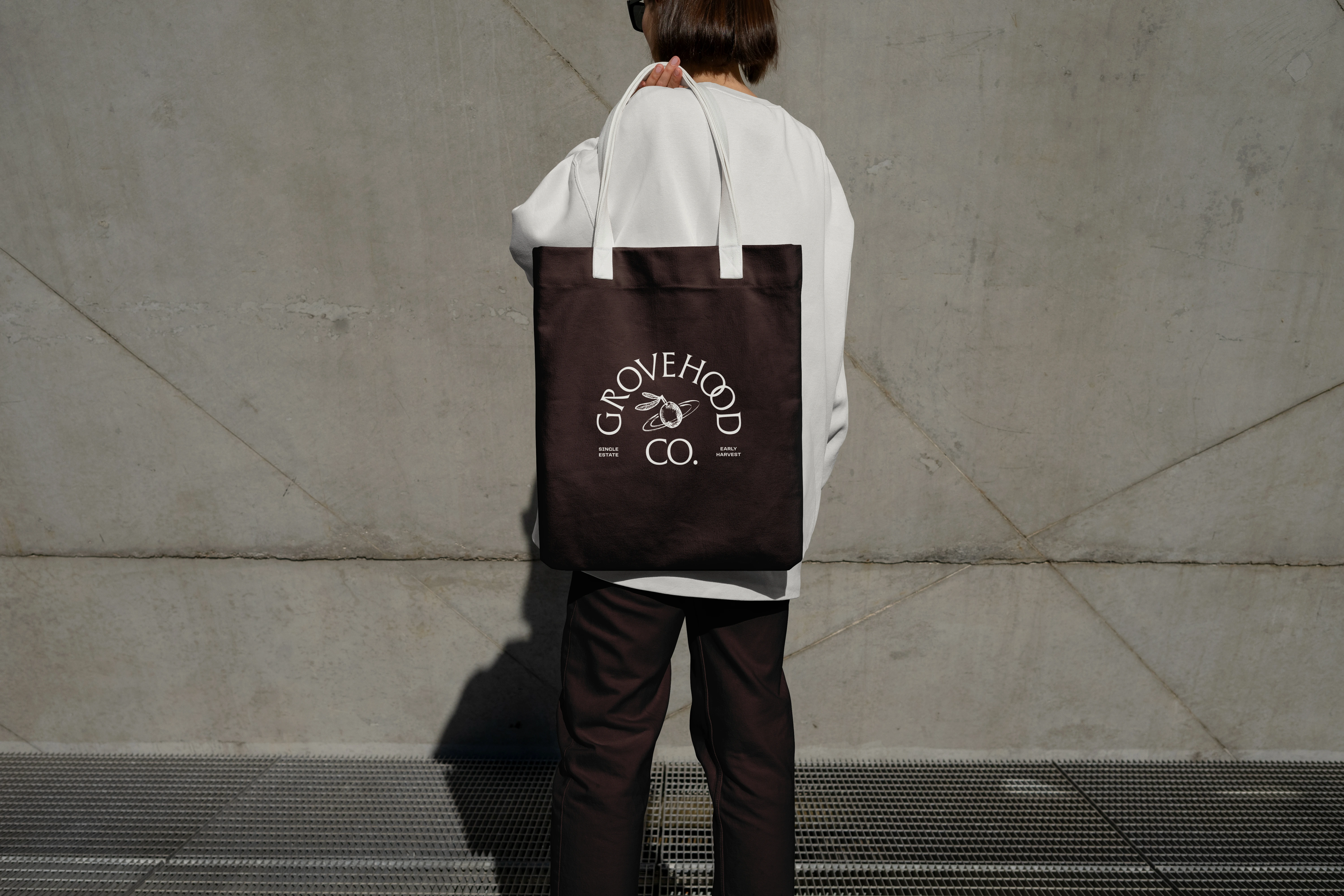
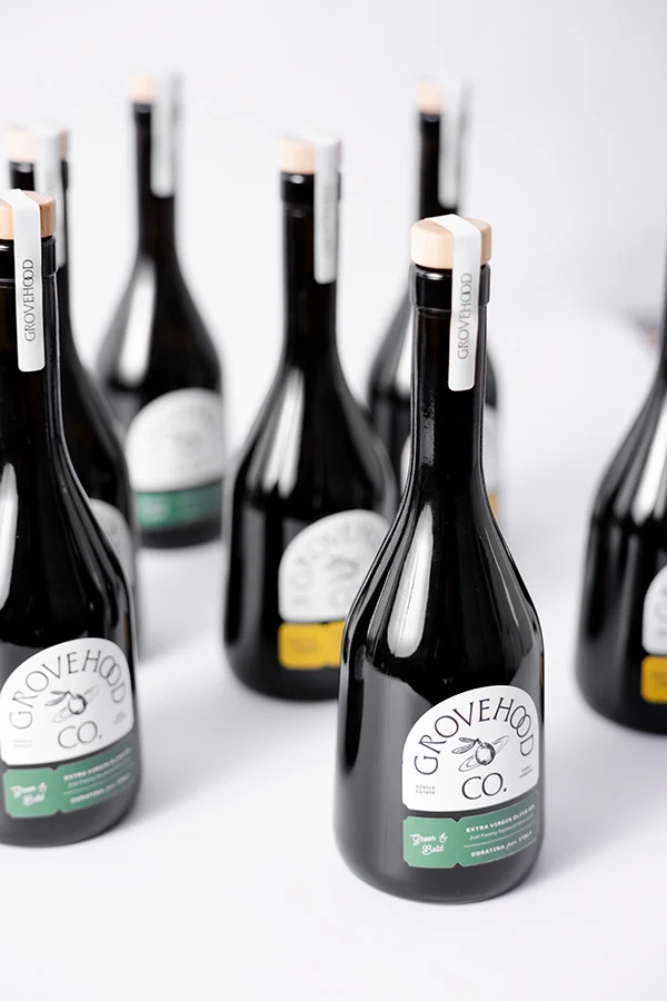
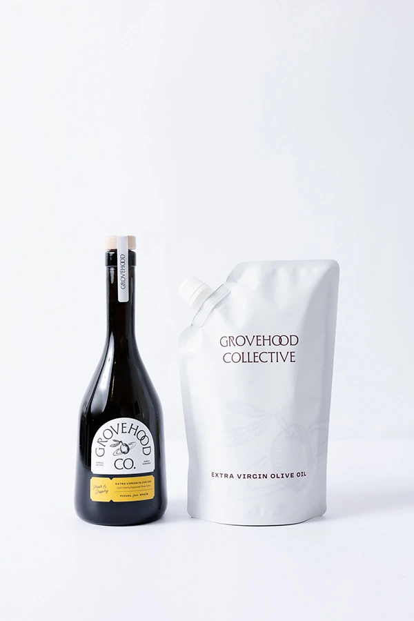
The visual identity balances tradition and modernity, emphasizing the connection between nature and the people who nurture it. A vintage-inspired label, with custom-cut details and refined typography, highlights the artisanal nature of the product while offering a tactile, crafted feel. The olive with orbits symbol represents the dedication of family-run farms whose lives revolve around the olive harvest, reinforcing the brand's focus on ethical sourcing and sustainable practices.
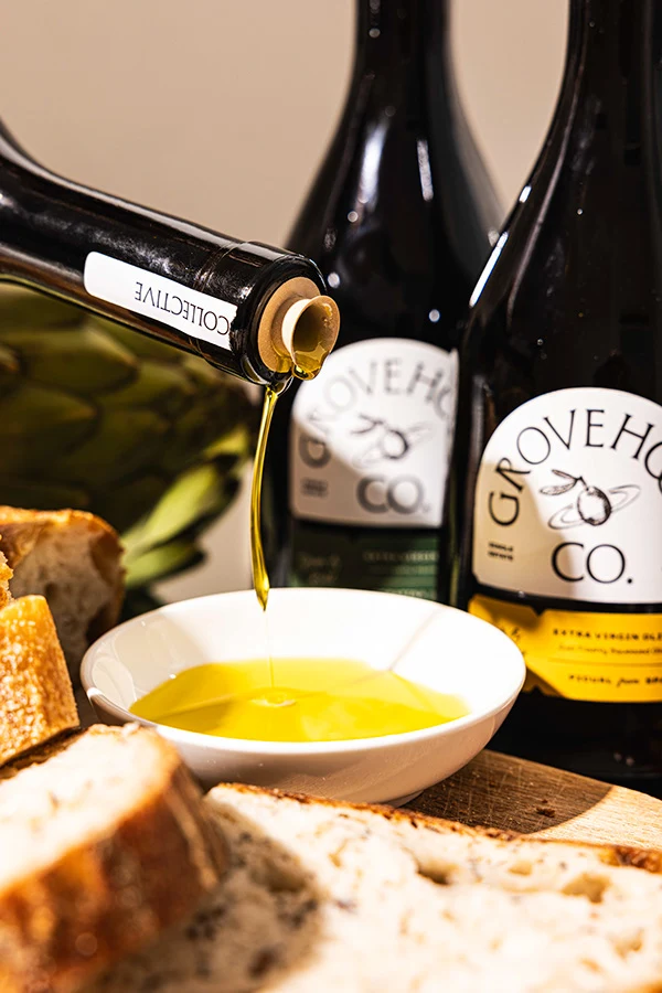
The packaging system reflects the product's natural origins through an earthy color palette, echoing the landscapes where the olives are cultivated. Special attention was given to material selection and perfection of the double label cut to ensure a premium yet grounded presentation.
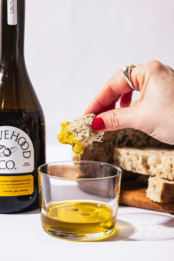
This cohesive identity not only communicates the purity of the product but also elevates the customer experience by blending visual storytelling with functionality. Each design choice is rooted in the brand's mission to connect consumers with the origins of their food and highlight the care and dedication behind every bottle of olive oil.
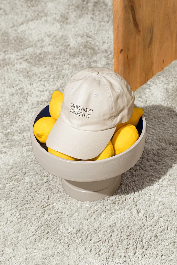
Services: Brand Strategy, Creative Direction, Branding Identity & Packaging Design
Client: Grovehood Collective
Motion Design: Murat Kaan Öztürk
Photography: Elvan Unlu

Like this project
Posted May 20, 2025
Brand Identity for Grovehood Collective blending tradition and modernity, featuring vintage-inspired packaging with custom cut label design.