Webcrumbs Brand Identity
Building the modern web, one plugin at a time.
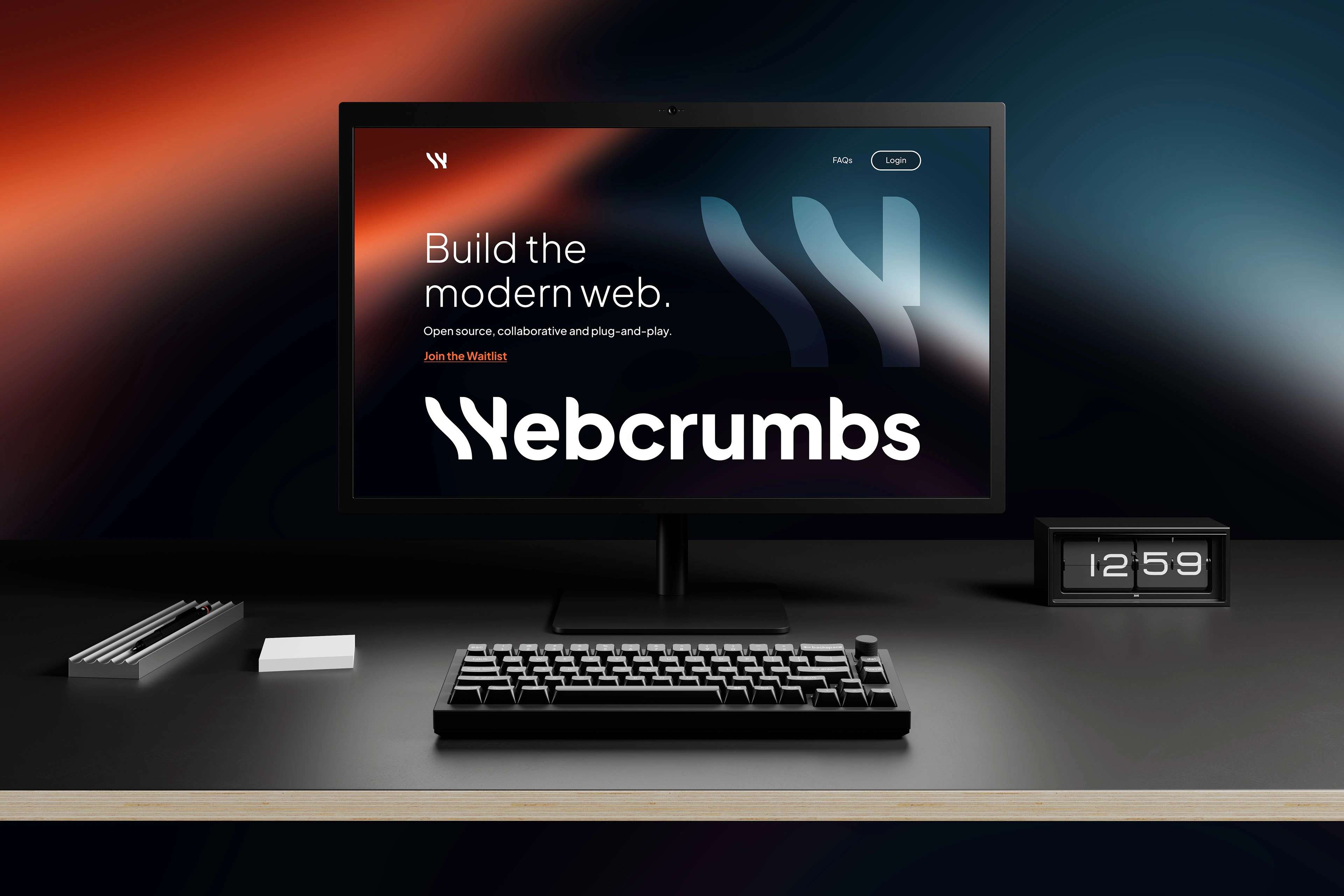
Webcrumbs is an open source software company creating the first open ecosystem of plugins for JavaScript developers. The company was founded with the concept for a modular web development solution, with themes and plugins, enriched by the community.
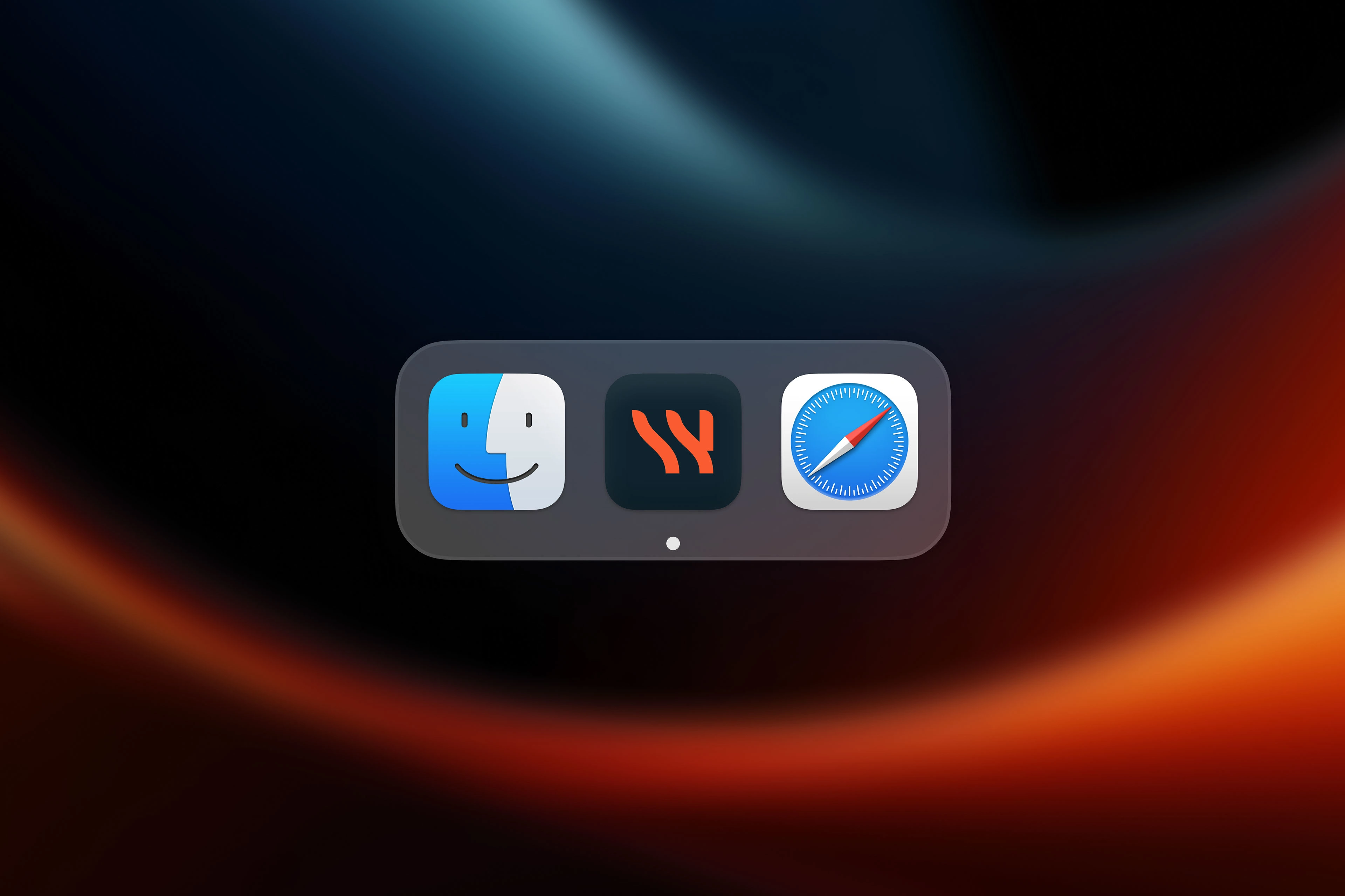
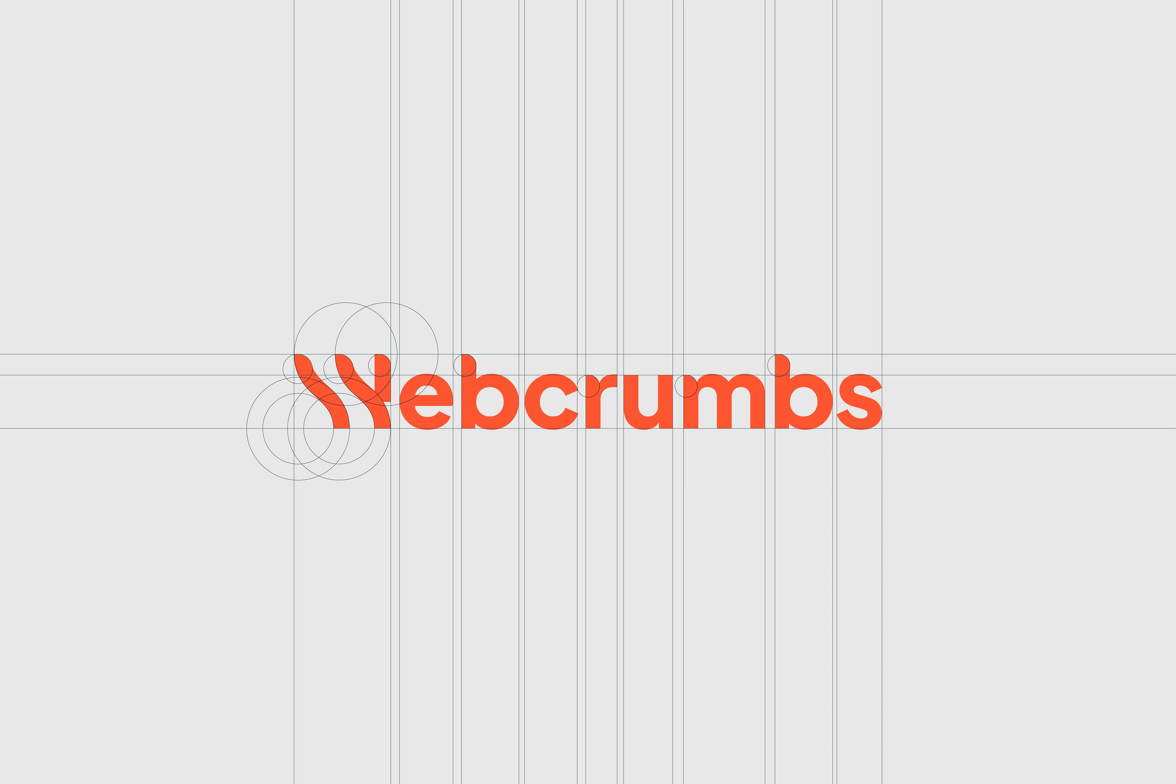
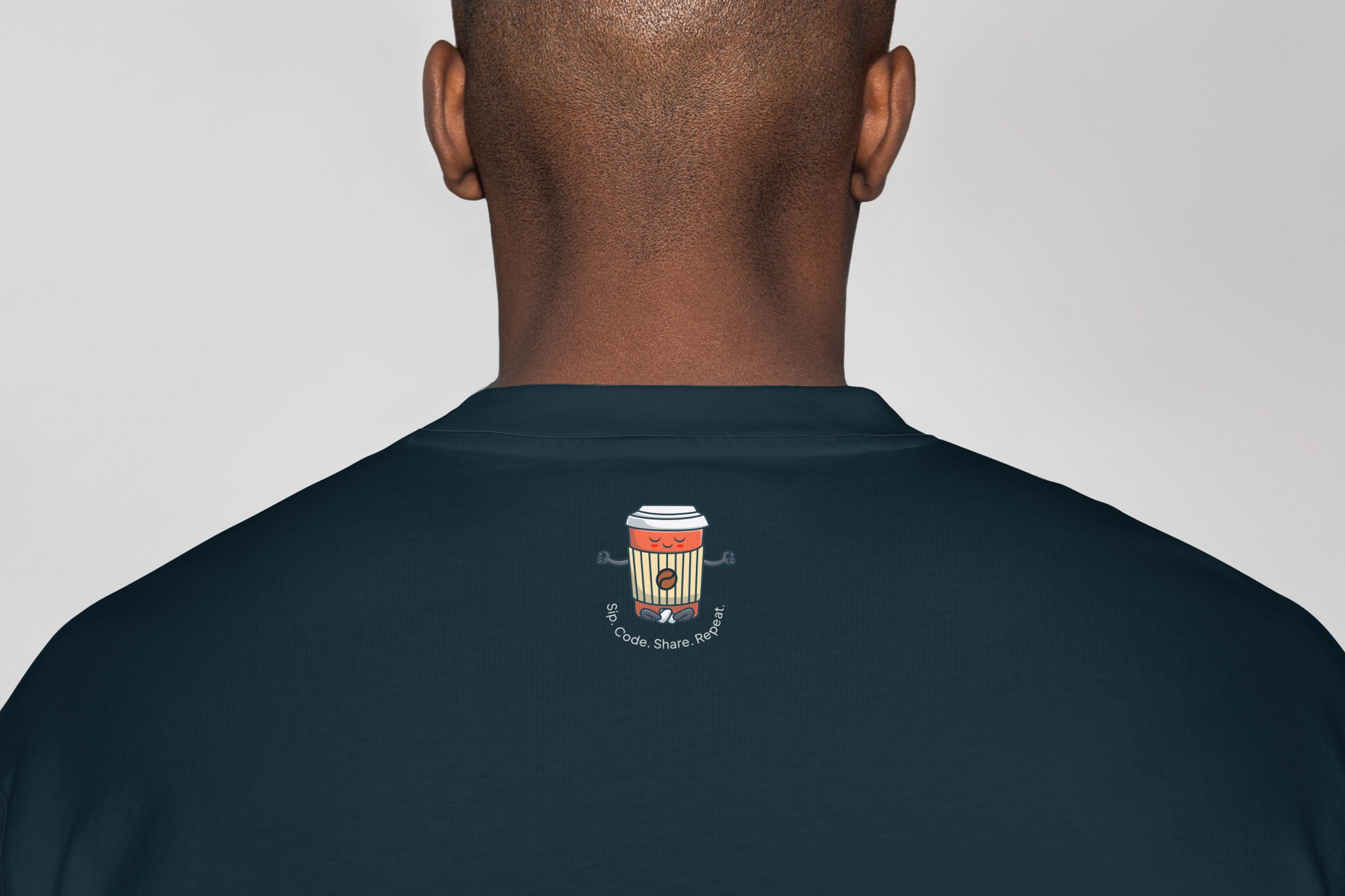
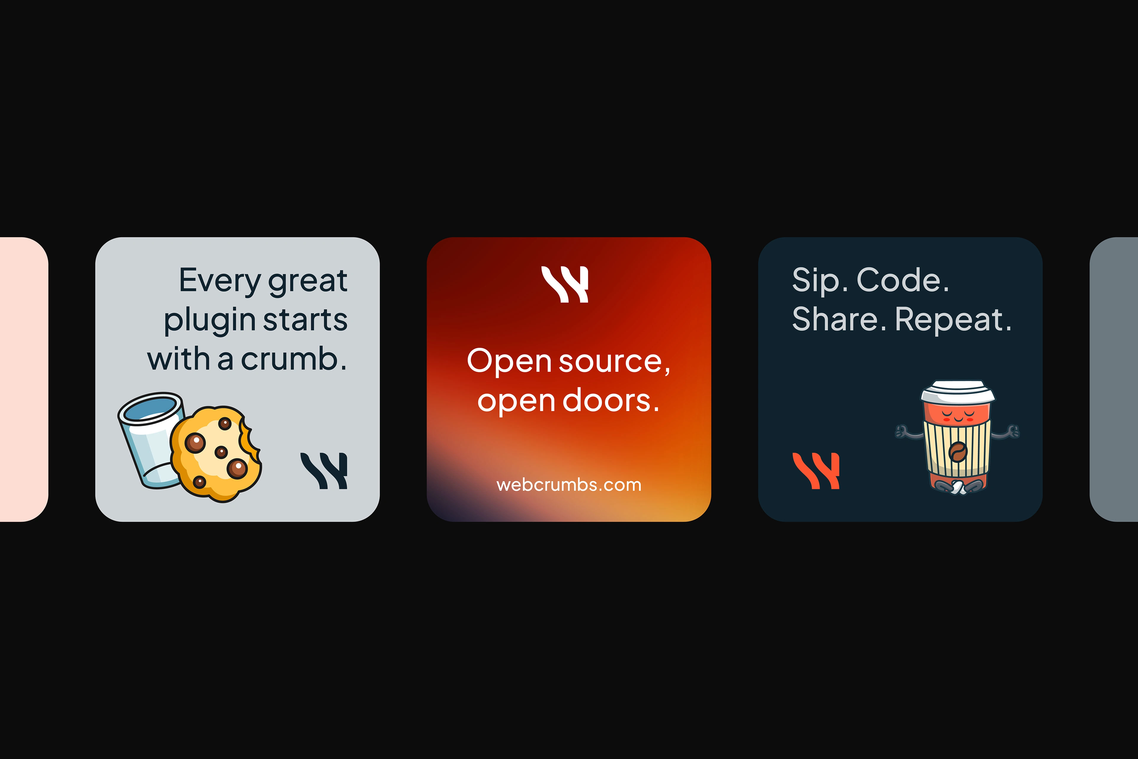
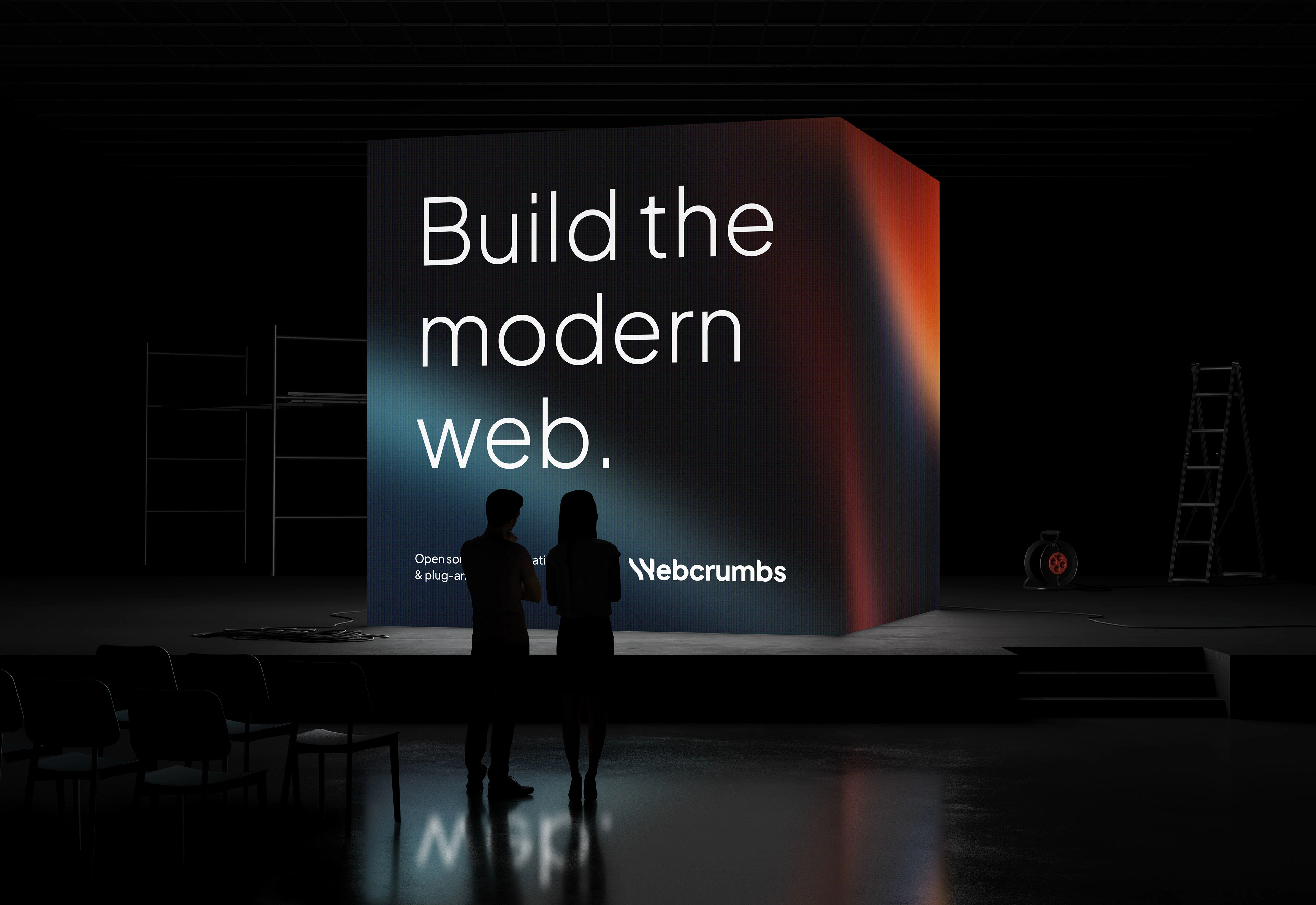
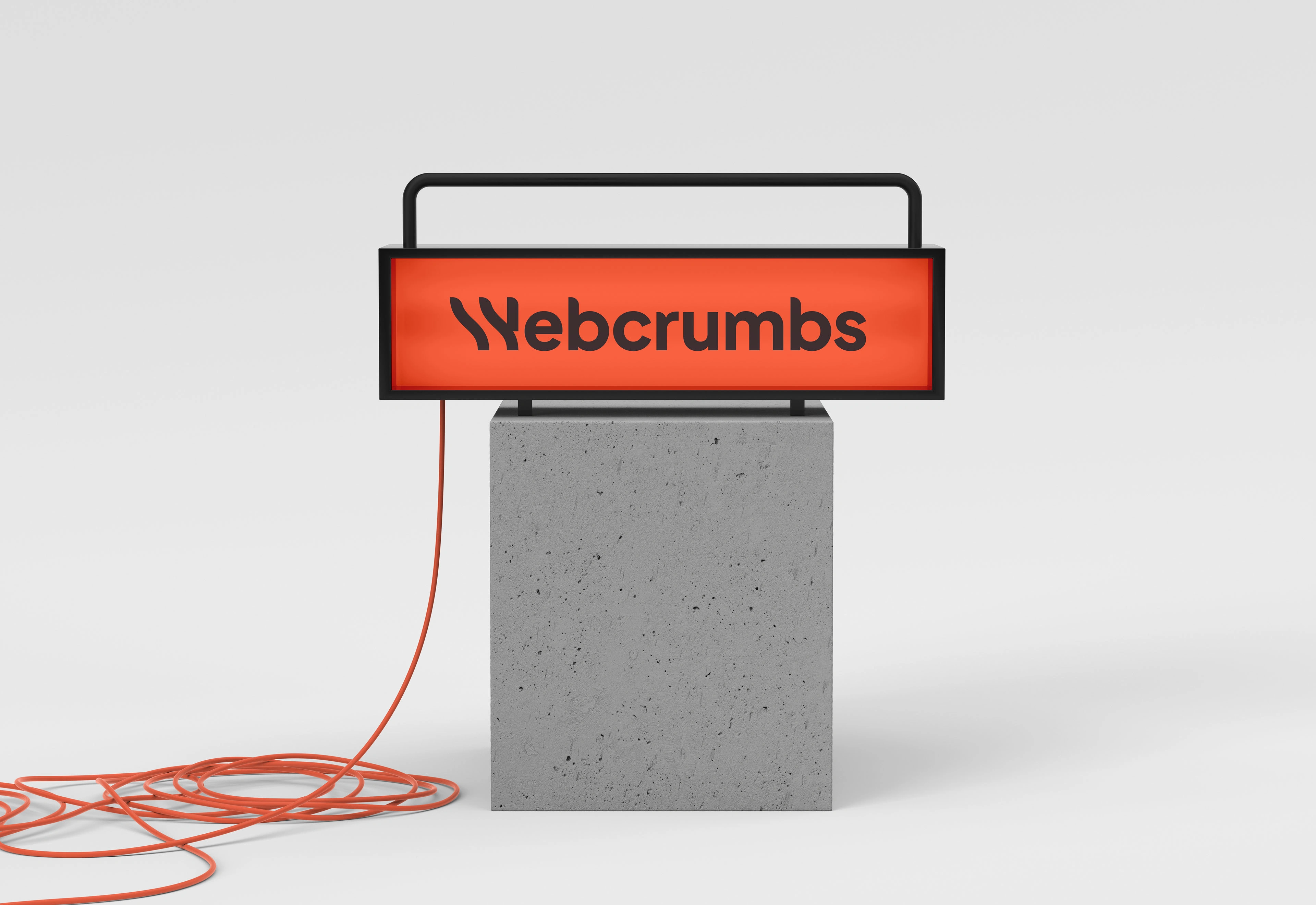
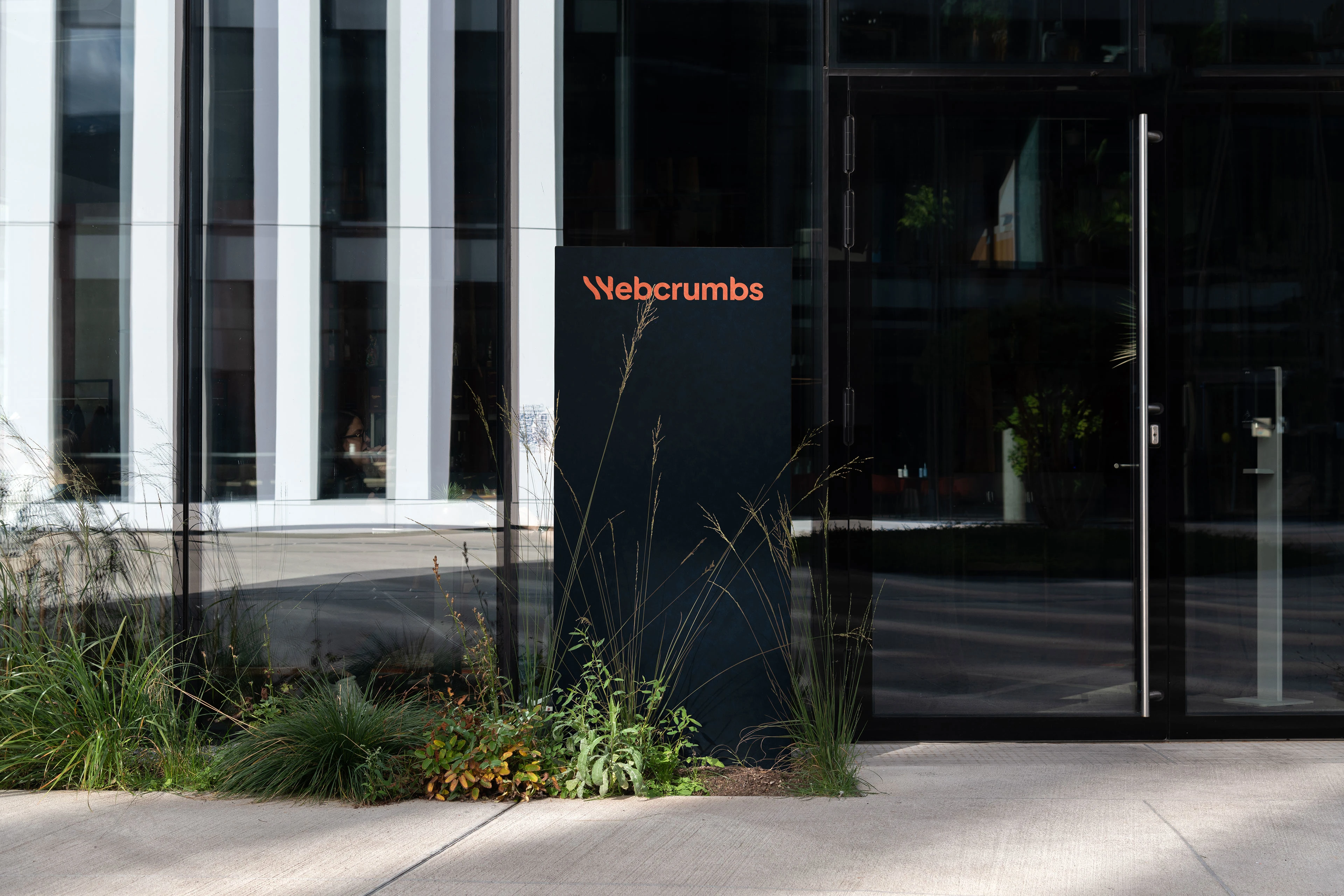
Belonging feeling was the driven force for the branding. And the aim was to create a timeless wordmark, which can serve the company for long years ahead. Steering away from the current trends, I found myself playing with enduring colors and letters representing coding symbols such as curly braces, brackets and equals.
Services: Creative Direction & Branding







Like this project
Posted Nov 3, 2024
Building the modern web, one plugin at a time.Webcrumbs is an open source software company creating the first open ecosystem of plugins for JavaScript develope…

