UX/UI Design for Appspotr’s Project Dashboard
Senal Wijeratne
Project Overview
Appspotr is a no-code mobile app development platform catering to individuals and businesses without extensive coding knowledge. It offers pre-designed templates and easy customization options, allowing users to design and build their mobile applications without traditional programming skills.
However, the user interface (UI) for Appspotr’s app project dashboard was outdated and didn't match the platform’s design patterns. This case study explores how we tackled redesigning and updating the App Dashboard.
Appspotr’s App dashboard
📝 Note: To comply with confidentiality clauses in my agreement, I have omitted and obfuscated sensitive and confidential information from this case study.
The Challenge
The UI for Appspotr’s app project dashboard had some elements that were either deprecated or malfunctioning due to system changes. It also contained many UX issues due to poor design. Our primary goal was to improve the UX and UI of the dashboard.
Below is a screenshot of the old dashboard along with some problems we had identified.
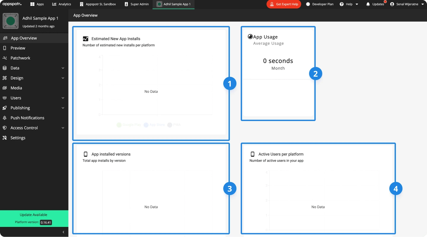
Old app dashboard on Appspotr
Estimated App Downloads: The amount and total downloads shown here were sometimes inaccurate, our investigation revealed that this was due to some system change
App Usage: This was used to show the total average session time for the current month. There were some minor inaccuracies here as well but more importantly - users needed a daily breakdown of this which was not available at the time.
App Installed Version: This indicates what percentage of users are using what version of the app. Most users did not find this to be useful.
Active Users per Platform: This was intended to show the number of active sessions per platform(iOS, Android, PWA). However, this metric was not calculated accurately at the time
Users & Audience
Appspotr was in a unique position, it had its own app development service called Appspotr Studio. This meant that we had two main audiences for this project.
Commercial Users: Individuals and businesses with low technical knowledge, and relatively new to no-code app development.
Appspotr’s In-House App Studio Users: Professionals with higher technical knowledge, and experienced in no-code app building.
Within these two audiences, we identified several roles for our users:
App builders: Users who design, build and publish apps.
Content Managers: Users who create, update and publish content on apps.
App Owners and Managers: Users who analyze and maintain apps.
While this design effort benefitted all users, we mostly focused on improving the user experience for App Owners and Managers.
Role and Responsibility
I was the lead designer on this project, I was joined by another designer who handled some parts of the final design.
I was responsible for competitor research, concept design, final design, and overseeing implementation together with our development team.
Design Process
At the start of this project, we had an open scope with a general goal of improving UX and UI.
We began with a complete audit of the existing UI to understand what worked and what didn’t, this audit also helped us understand the technical constraints. Next, we conducted research and competitor analysis into existing products in the no-code, low-code space.
This research guided us to focus our efforts on several key areas for improvement:
App analytics requested by our users
Improving the app preview experience
Adding a summary of push notifications
Enhancing the overall UI for increased usability and clarity
We had a major focus on analytics - this led us to two major products within the analytics space, Google Analytics and Mixpanel. Below are some points of interest we found from Google Analytics
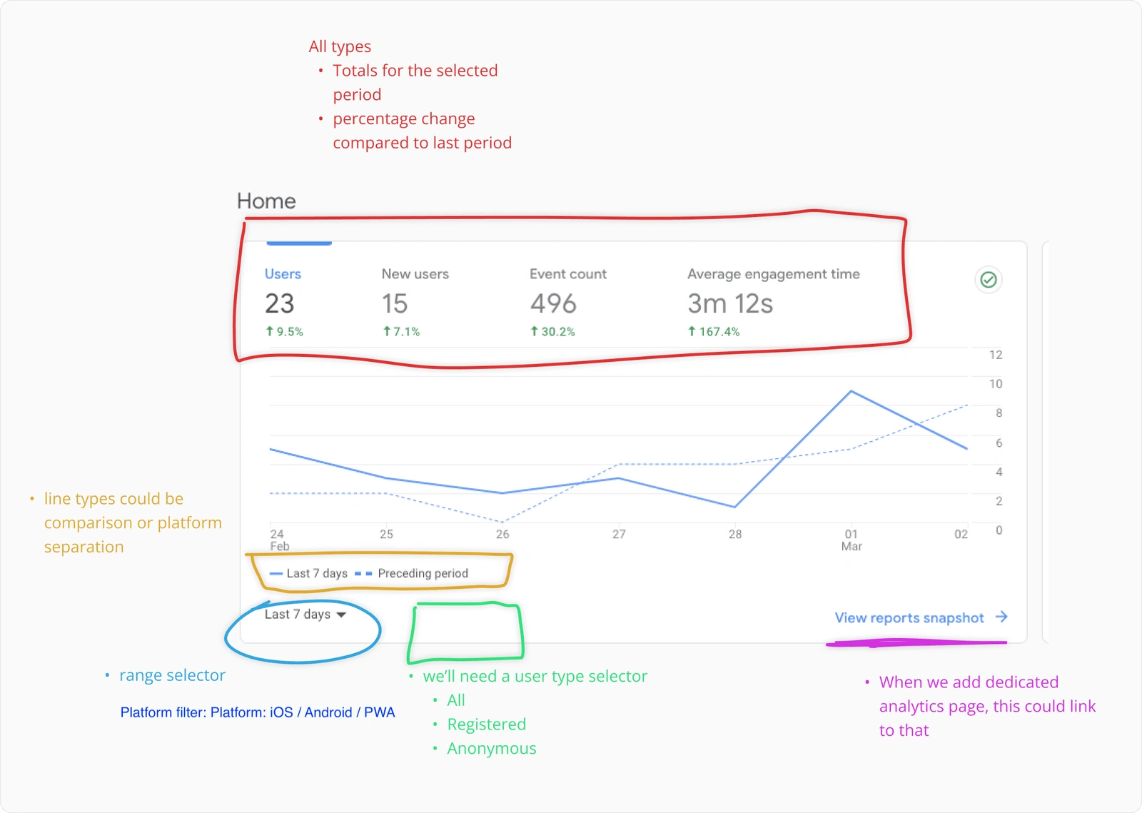
Line chart from Google Analytics
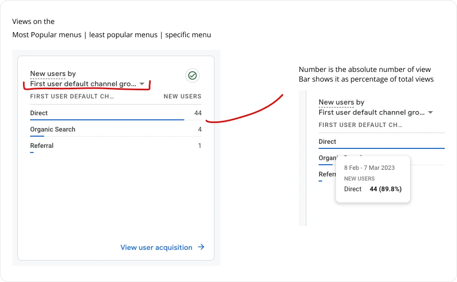
Page visits UI from Google Analytics
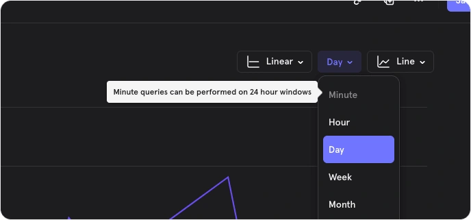
Time range filter from Mixpanel
Through collaborating with our development team, we were able to figure out we could calculate and show the below data points as analytics:
App downloads: Number of downloads for a selected time range
App Users: Number of registered and non-registered app users
Active users: Number of users that have some activity
Time in app: Average engagement time within the app
Screen views: Number of views on a particular screen
Post views: Number of views on a particular content screen(news article, post, etc.)
We then wireframed a basic sketch and came up with a concept design to get buy-in from stakeholders.
1st iteration of the dashboard
After the design got the green light, we validated it with internal users to get some feedback on the above design. Through user feedback and some more research, we realized we could make a few more improvements
Restructured analytics
We were able to re-organize the analytics and group them into two main categories; App Analytics and Content Analytics
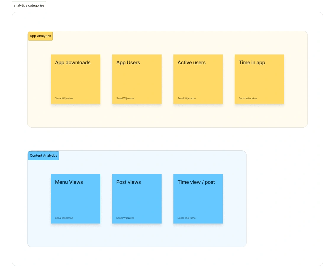
Result of a card sorting exercise
Improved UI
While our 1st iteration was good, we felt that we could further improve the visual design for a cleaner look
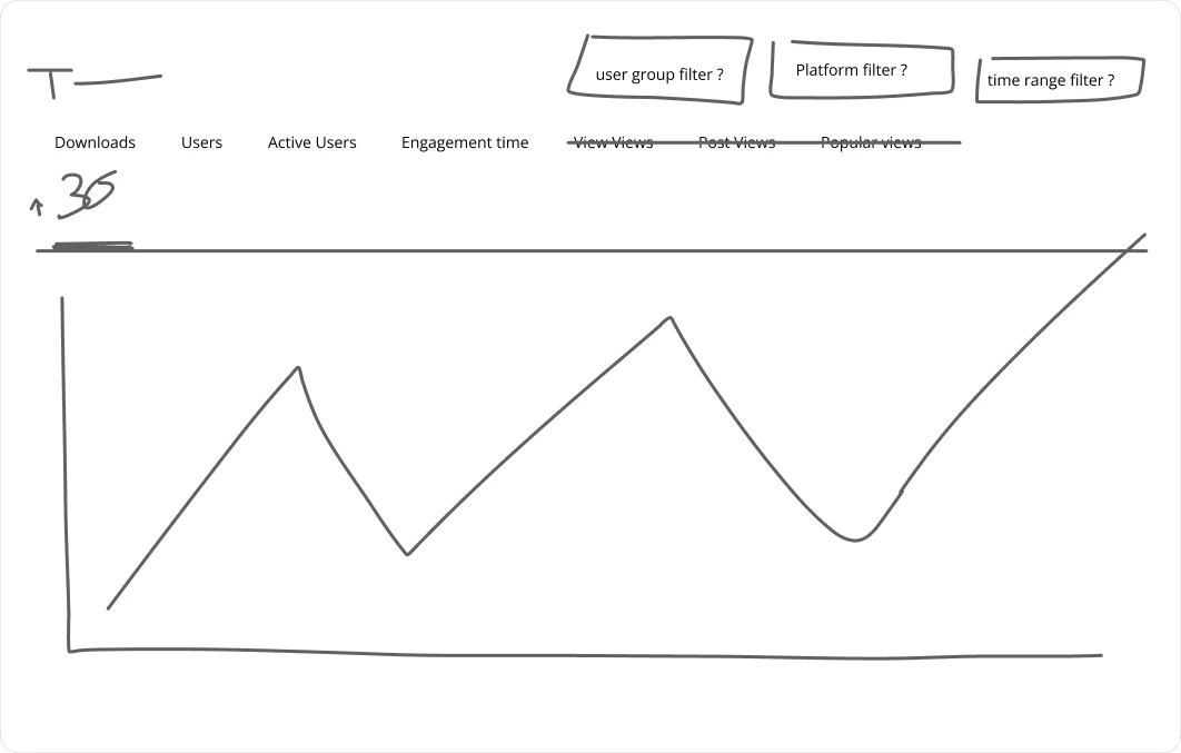
Early sketch of the dashboard design
Filters groups
Understanding the technical capabilities and limitations helped us figure out what kind of filters we’re able to provide to the user
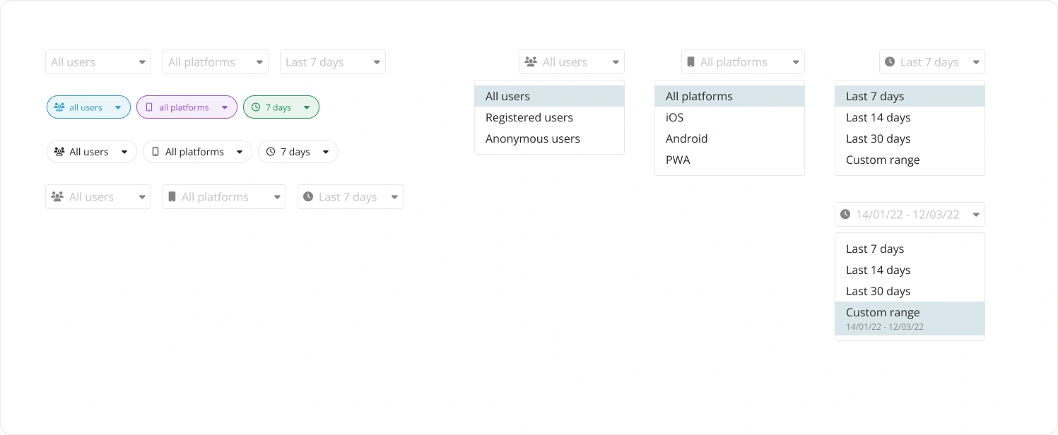
Filter UI options
Finalizing the Design
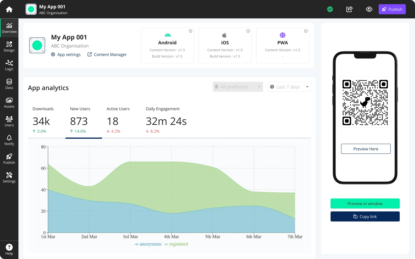
Analytics
With all the above changes and some design iterations, we were able to finalize the analytics components of the dashboard. Below are some screenshots of the final design for Content Analytics and App Analytics.
App Analytics
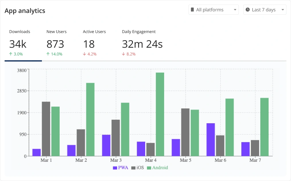
App analytics on the app dashboard
Content Analytics
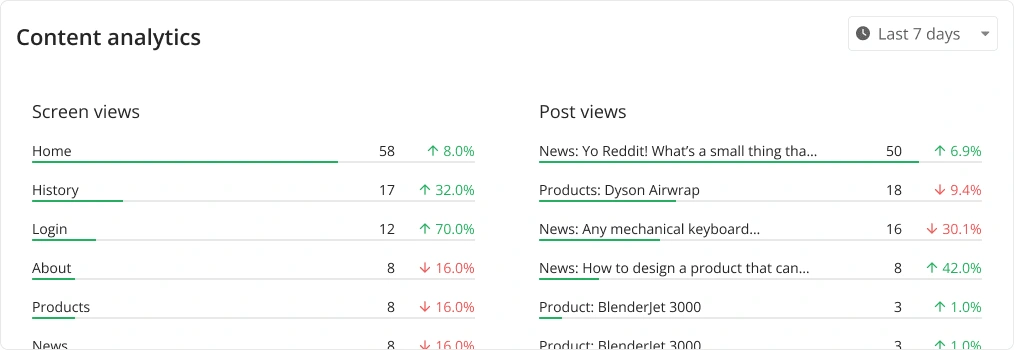
Content analytics on the app dashboard
App Preview
A new feature that was added with the new dashboard design is the built-in App Preview. Appspotr used a web preview that users could use to test their apps while they were developing them. With this users were able to preview it right on the dashboard.
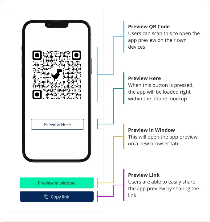
App Preview on the app dashboard
Push Notifications and Help
In this section, we are displaying the recently sent push notifications and the scheduled push notifications. These also show some metadata such as which platforms are targeted(iOS, Android, PWA), How many users are targeted and what time it was sent out/scheduled for.
In the Help section, we’ve given the users easy access to Appspotr resources such as the link to documentation, the link to access video tutorials and the option to reach out to Appspotr’s app experts.
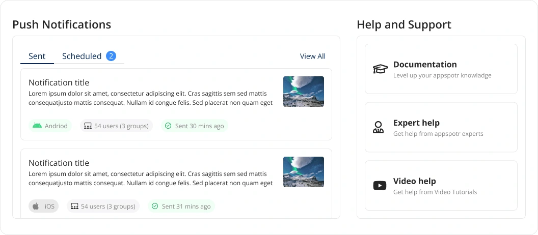
Push notifications on the app dashboard
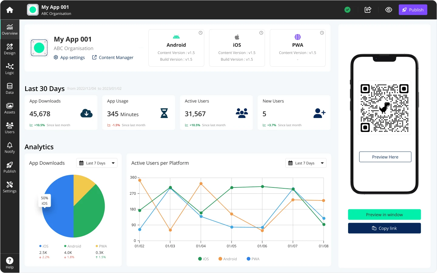
Final Design
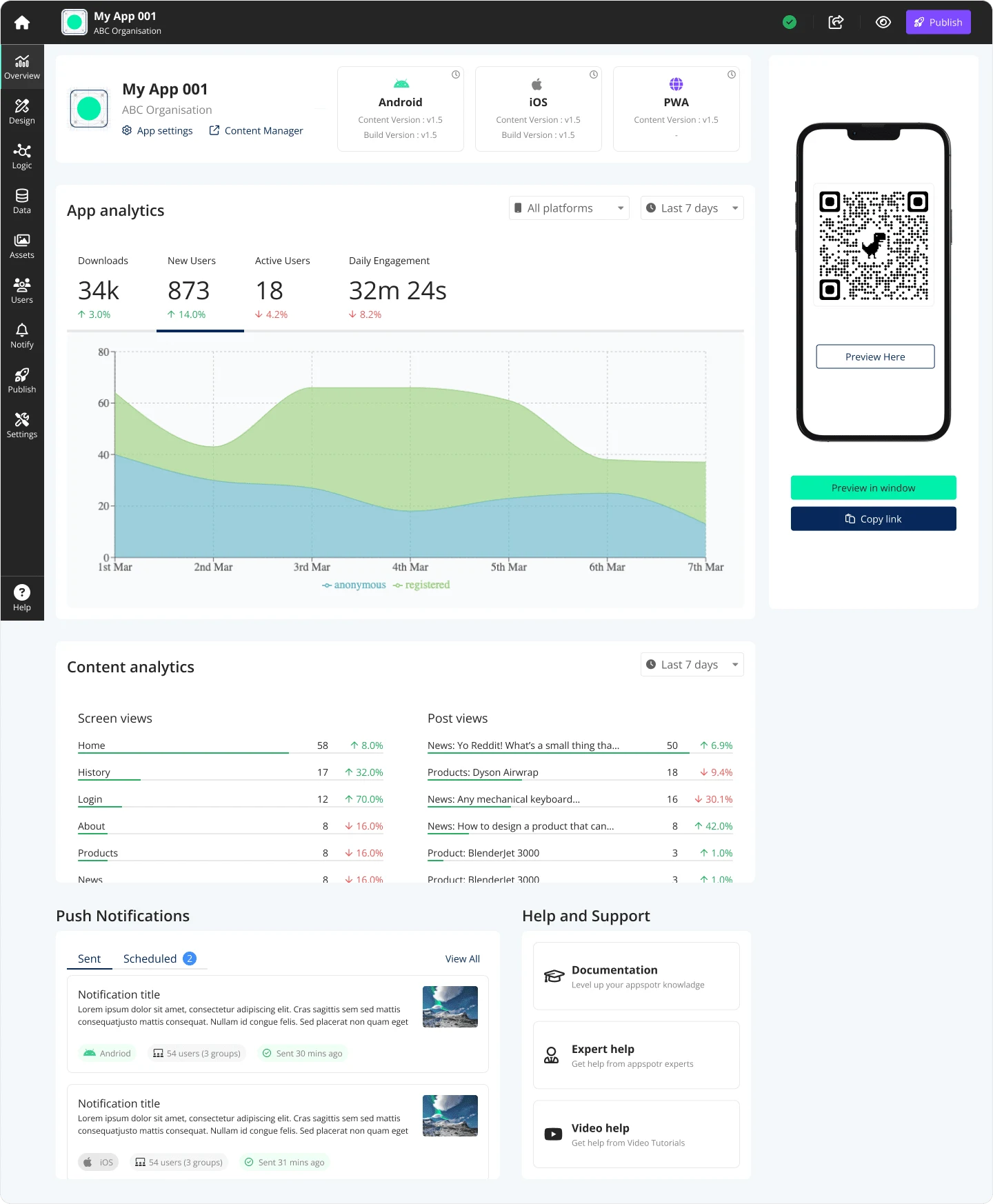
Finalized design for Appspotr’s App Dashboard
The Outcome
After finalizing our design based on user feedback, we successfully launched the improved App Dashboard. This project taught us the importance of user feedback in shaping our design process and the need for continuous improvement to meet the changing needs of our users.
In hindsight, conducting a thorough audit of the existing UI at the very beginning of the project proved to be invaluable. It's a step we will be incorporating into our future projects.
Like this project
Posted Feb 5, 2024
Redesign of Appspotr's project dashboard, improving UI/UX and introducing new features for better user experience.