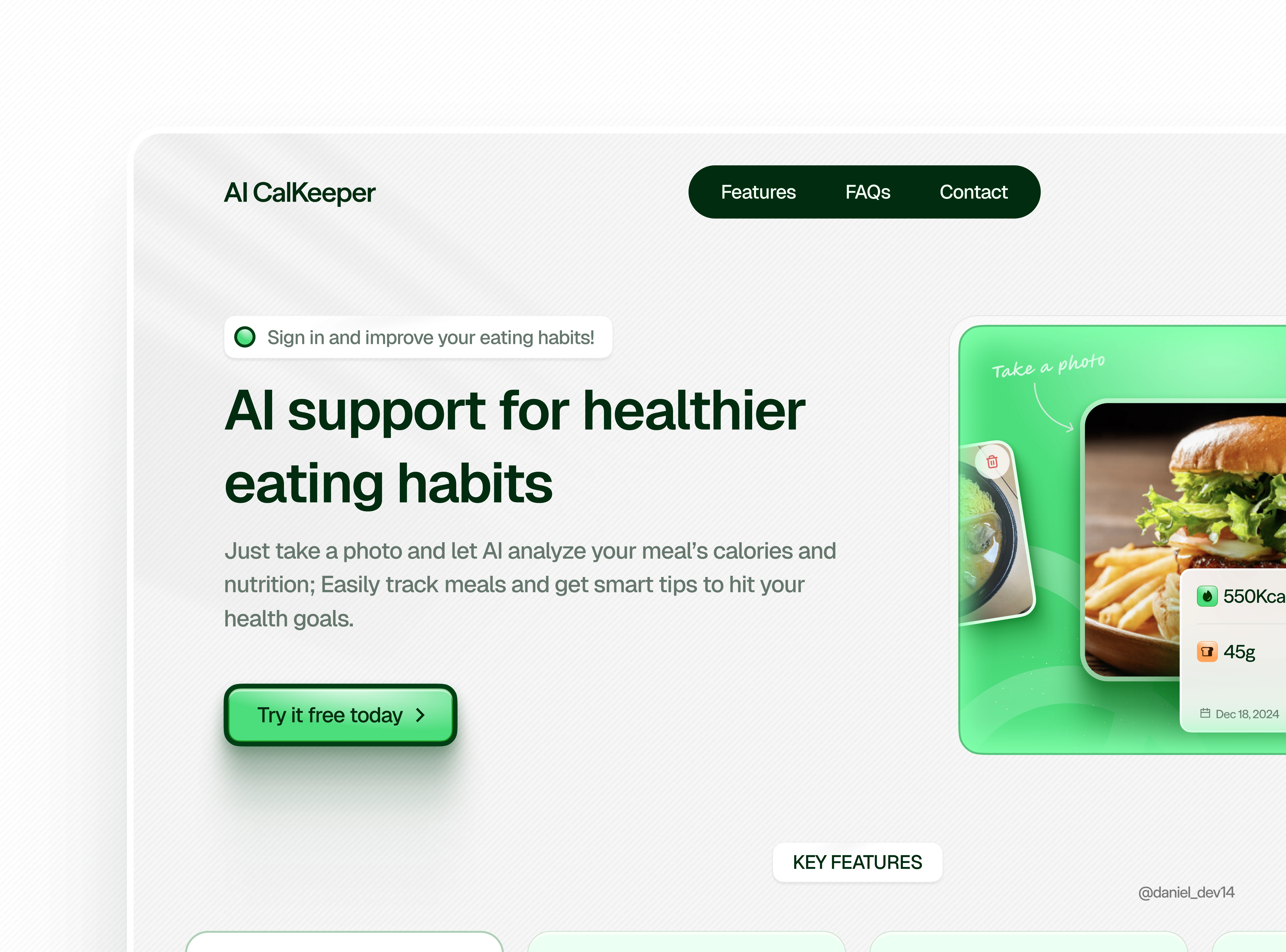
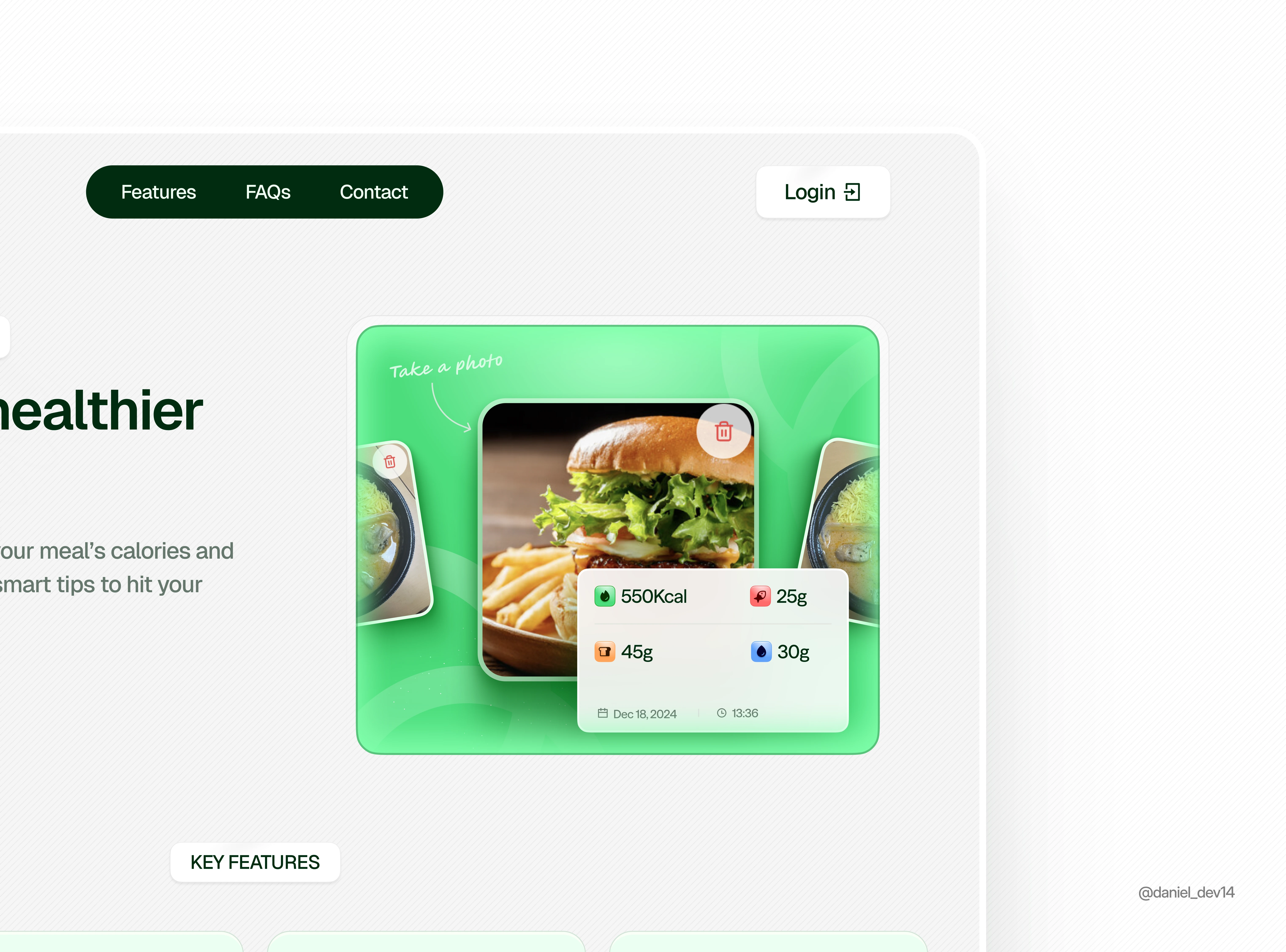
AI Calkeeper Homepage Redesign
Daniel Obileye
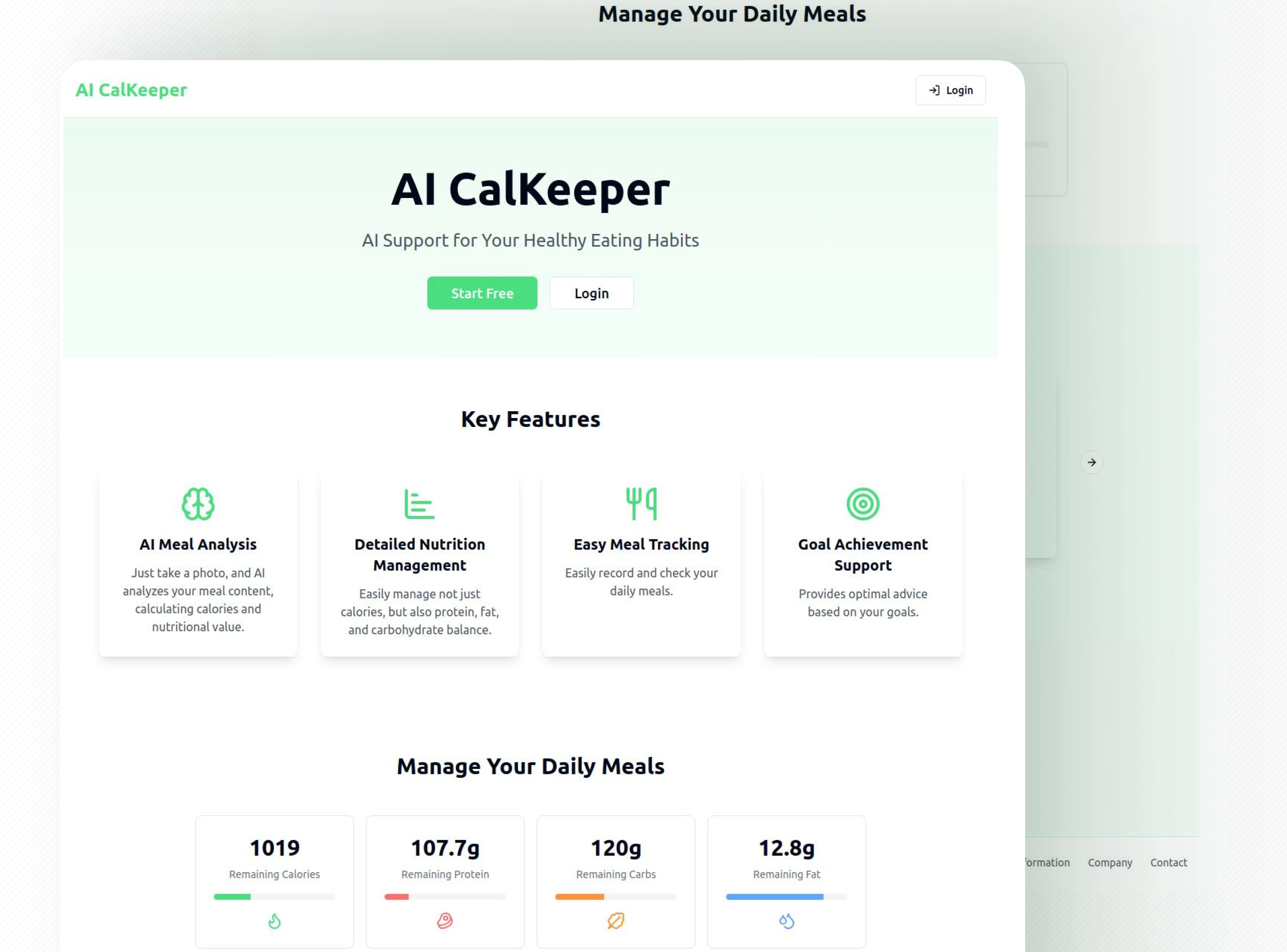
V1
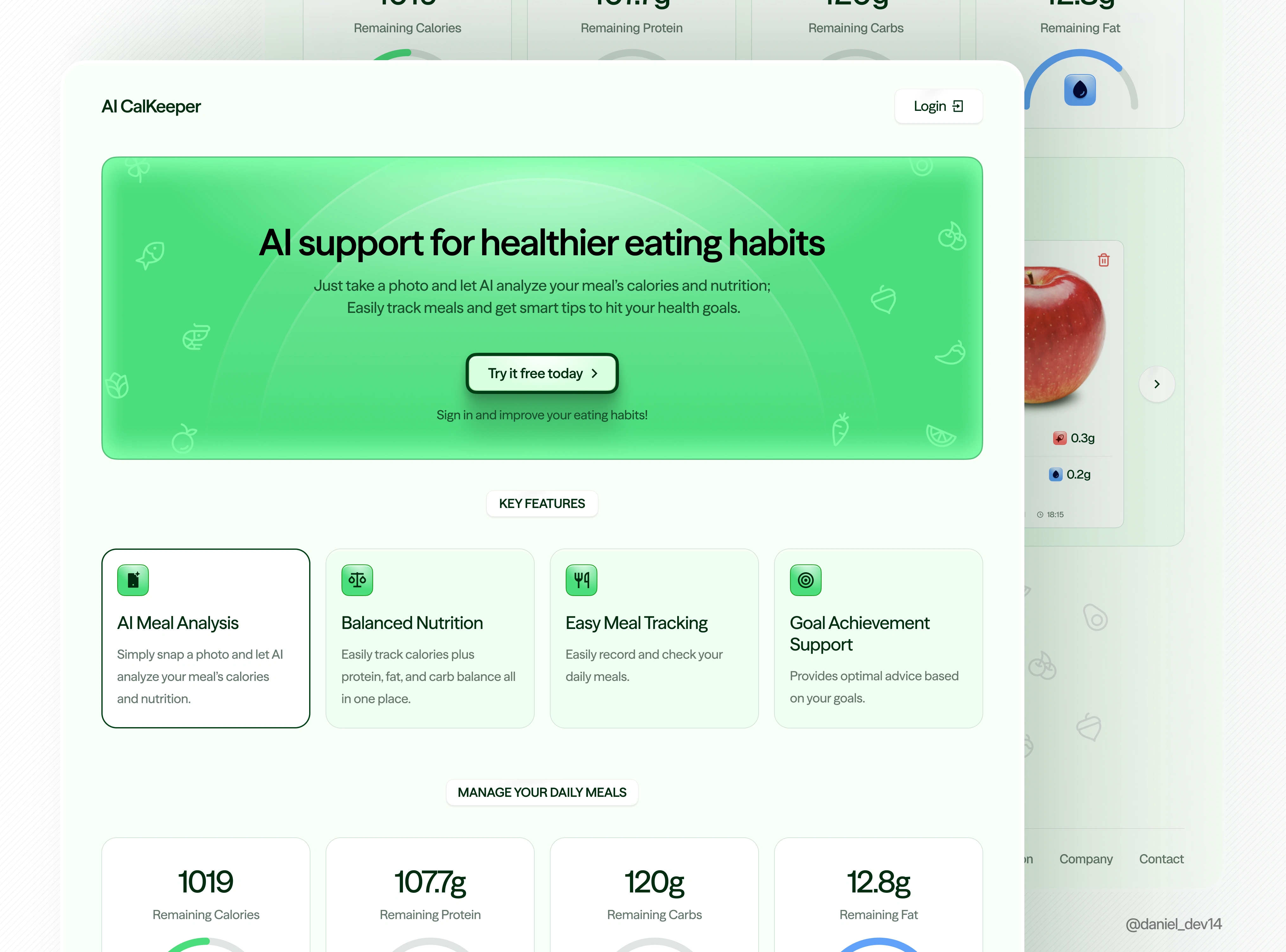
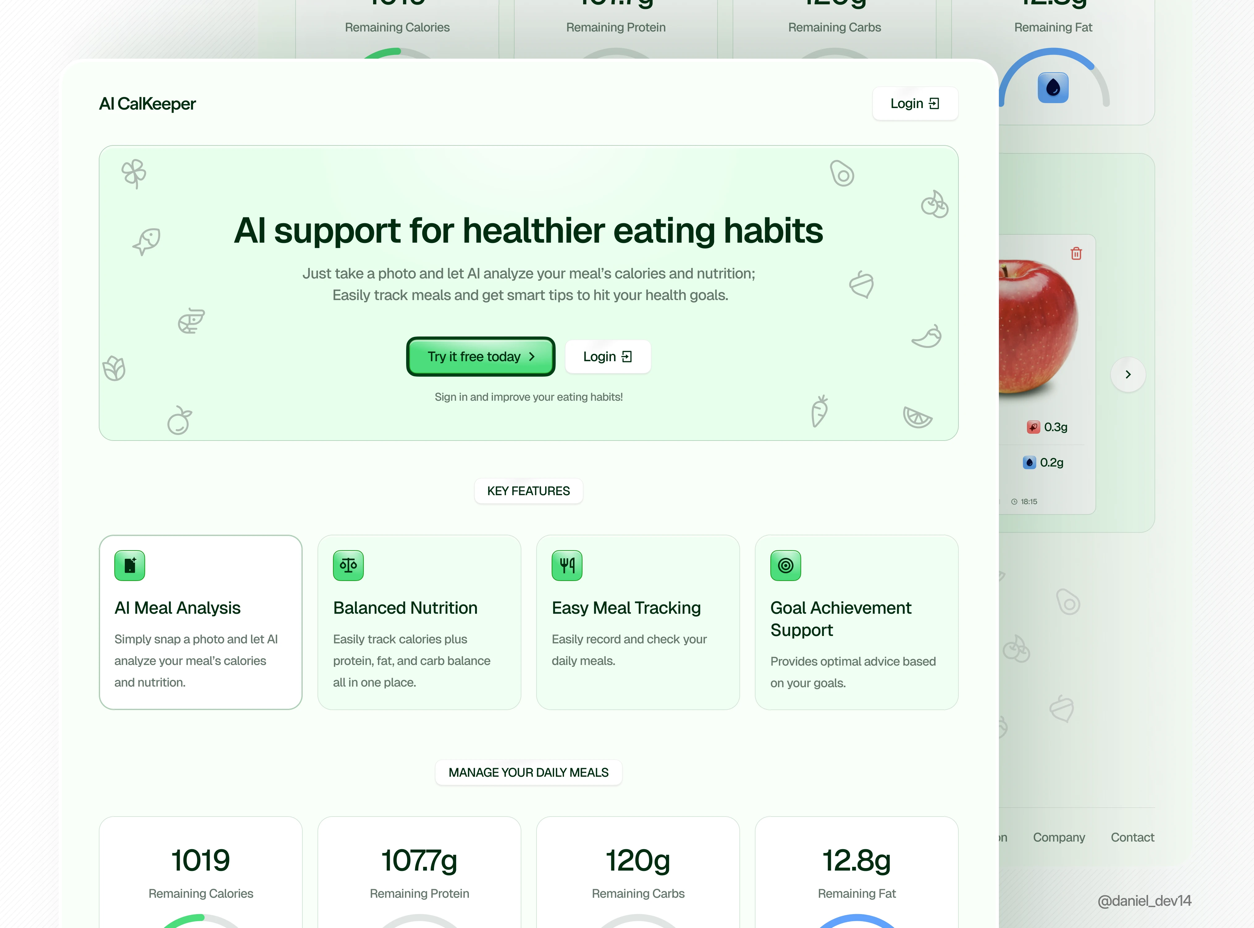
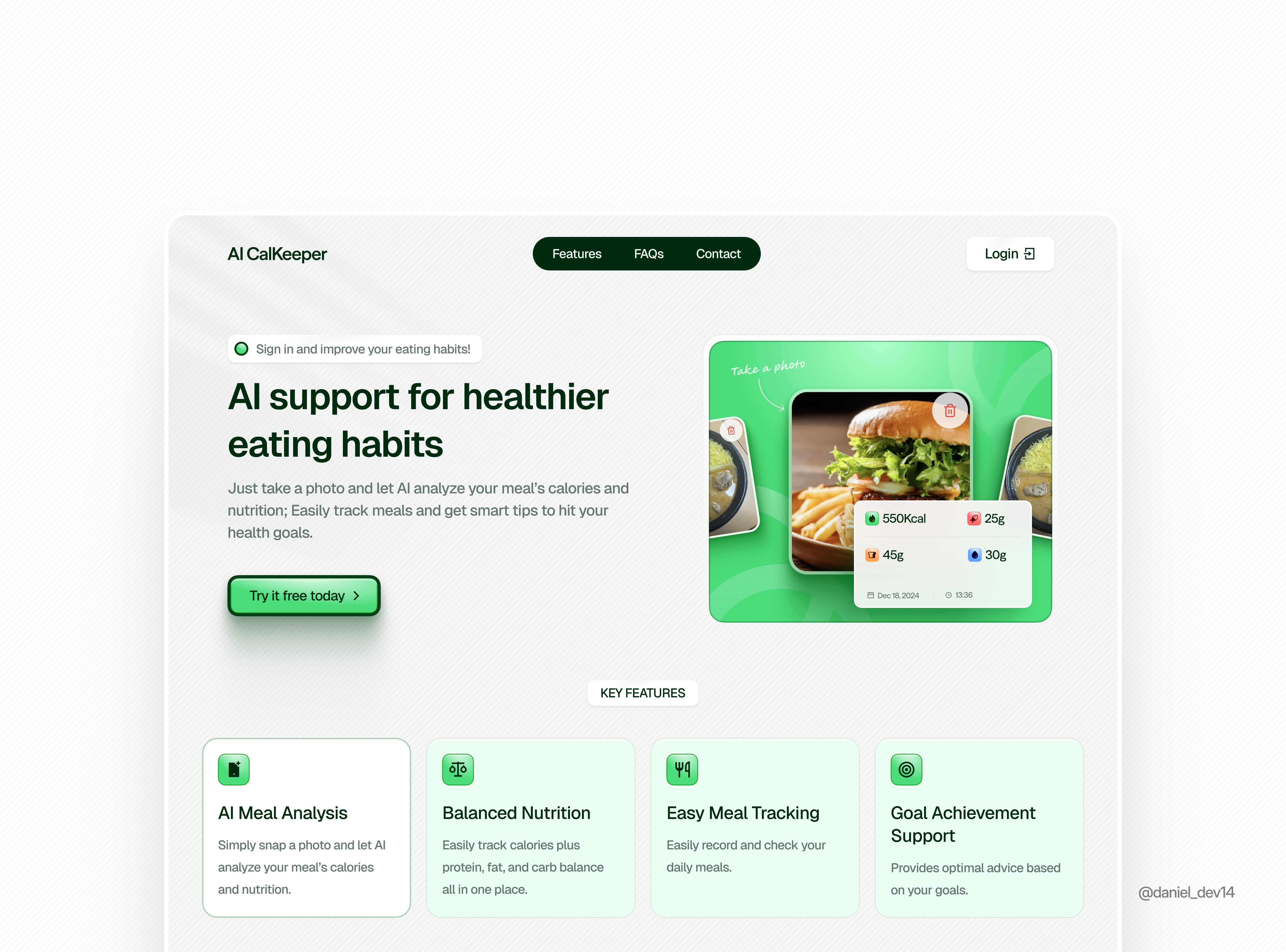
V2
AI CALKEEPER HOMEPAGE REDESIGN
1️⃣ Hero Section Copy:
Rewrote the copy to include a clear headline and friendly supporting text for a more balanced and welcoming feel.
2️⃣ Cleaner hero section:
Added playful icons
Made the CTA more inviting: “Try it free today”
Short, clear sentence underneath to explain important action.
3️⃣ Improved feature section:
Renamed a few things to sound more intuitive (e.g. “Balanced Nutrition” instead of “Detailed Nutrition Management”)
Gave each feature more space to breathe
Icons now match and feel more friendly.
4️⃣ Softer overall look
Used light greens and subtle fruit icons to add personality
Rounded cards and smoother layout make it feel less clinical.
5️⃣ Visual hierarchy is much stronger:
The layout flows better, headline grabs attention, then the paragraph, then the CTA.
Each section feels more intentional and easier to scan.
6️⃣ More inviting CTA design
The "Try it free today" button pops without being too aggressive.
It looks clickable, clear, and friendly.
7️⃣ Softer, more approachable tone:
The language throughout feels way more human. Phrases like “Just take a photo” and “Sign in and improve your eating habits” make it feel like a real product you want to use, not a nutrition spreadsheet.
📝 Overall, My goal was to make the experience feel less like a tracker and more like a helpful companion, clean, friendly, and easy to trust.
Like this project
Posted Apr 25, 2025
I Redesigned aicalkeeper.com with a focus on creating a modern design, improving clarity and trust. Overall usability and quality is improved as well.
Likes
2
Views
10
Timeline
Apr 24, 2025 - Apr 25, 2025