Mentio Hero Redesign
Daniel Obileye
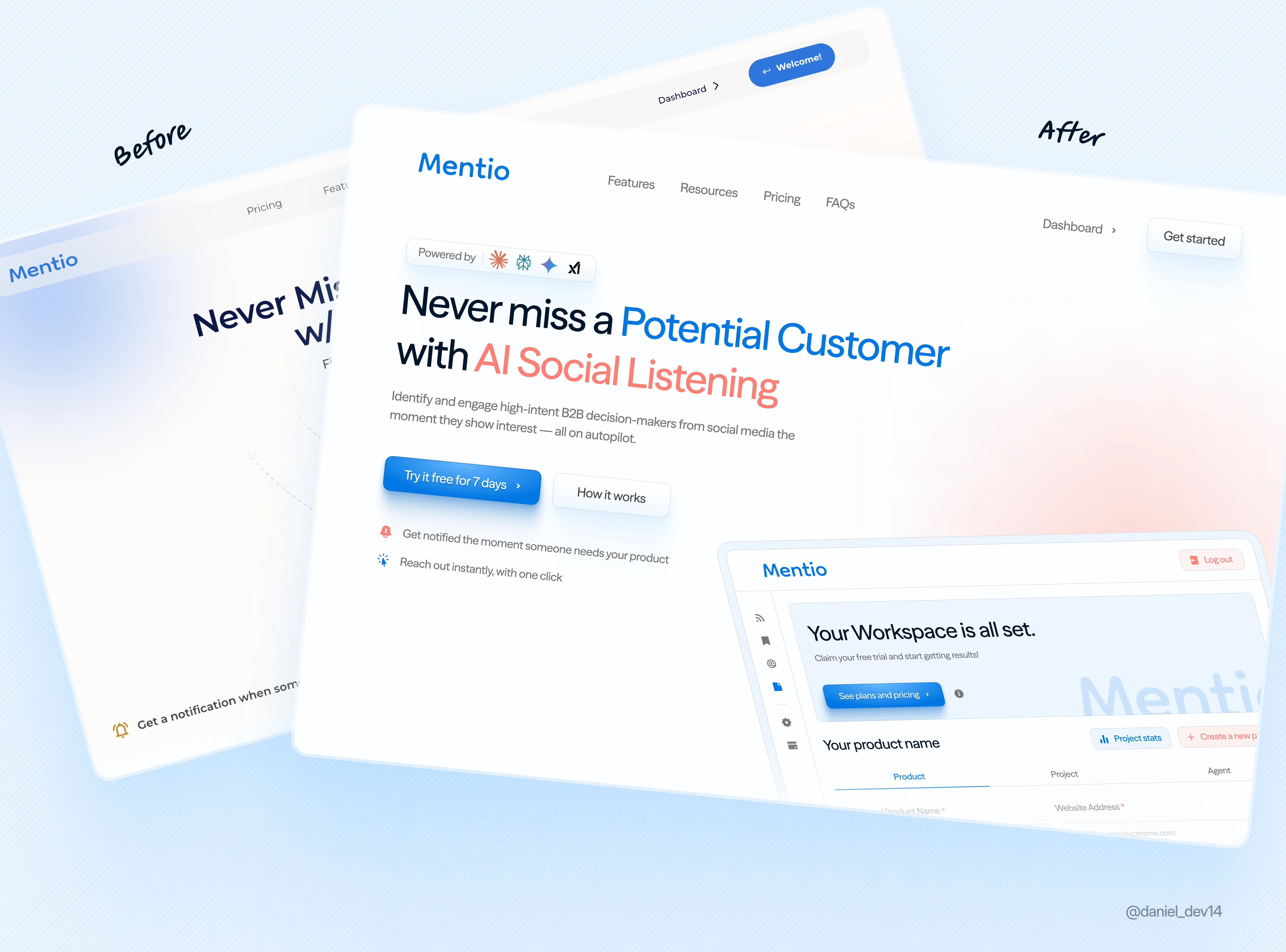
Mentio Hero Redesign
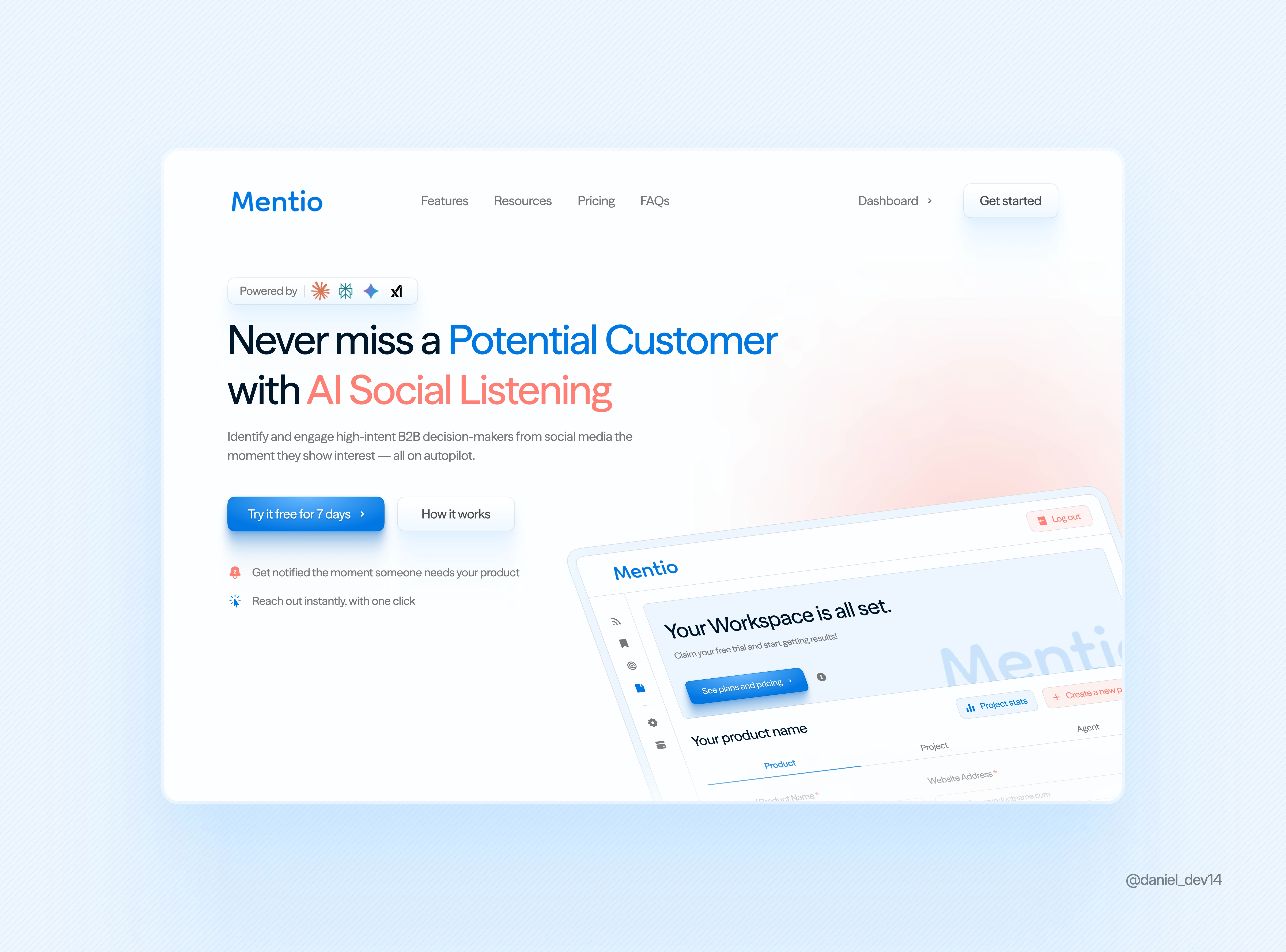
V1
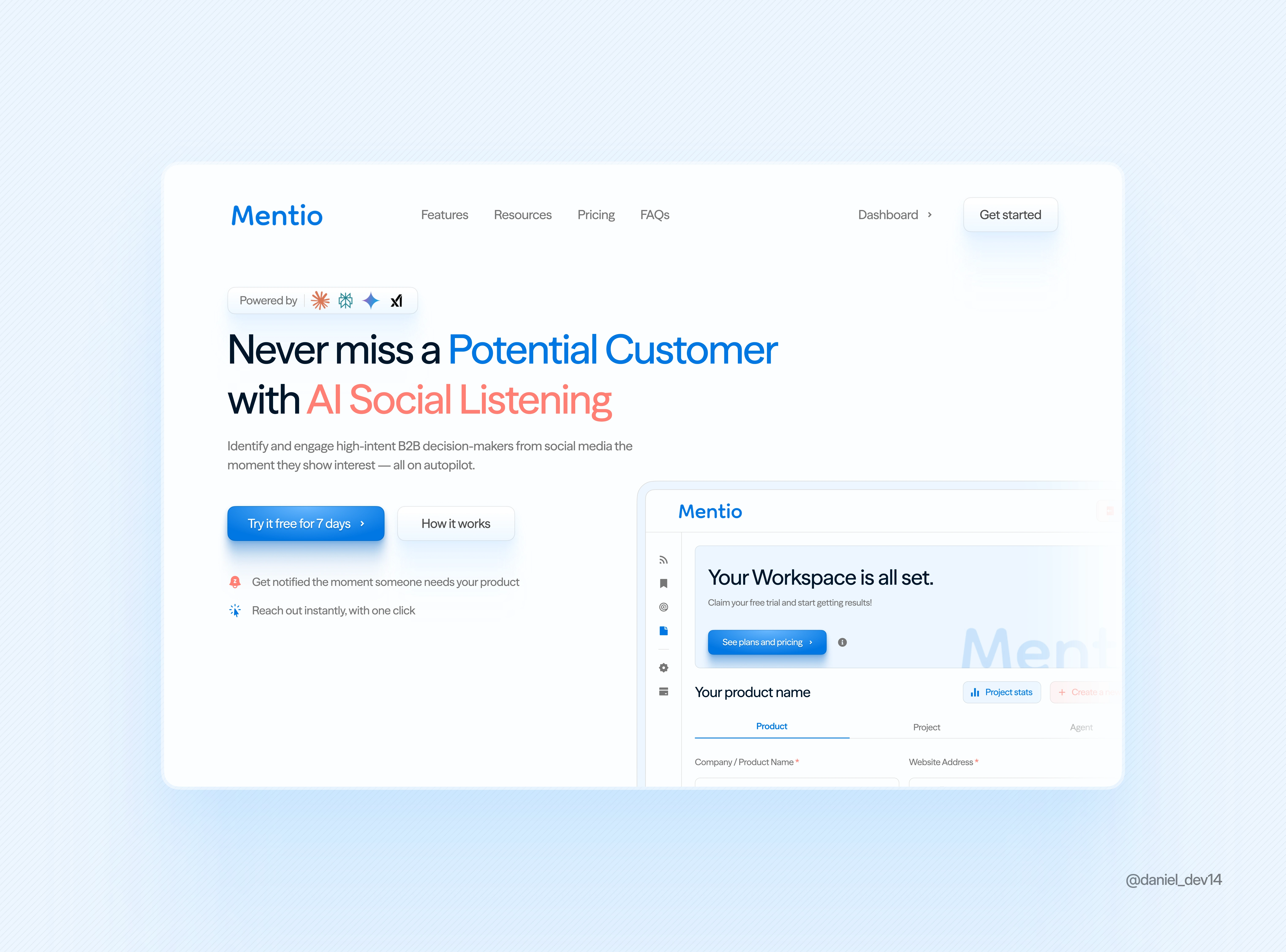
V2
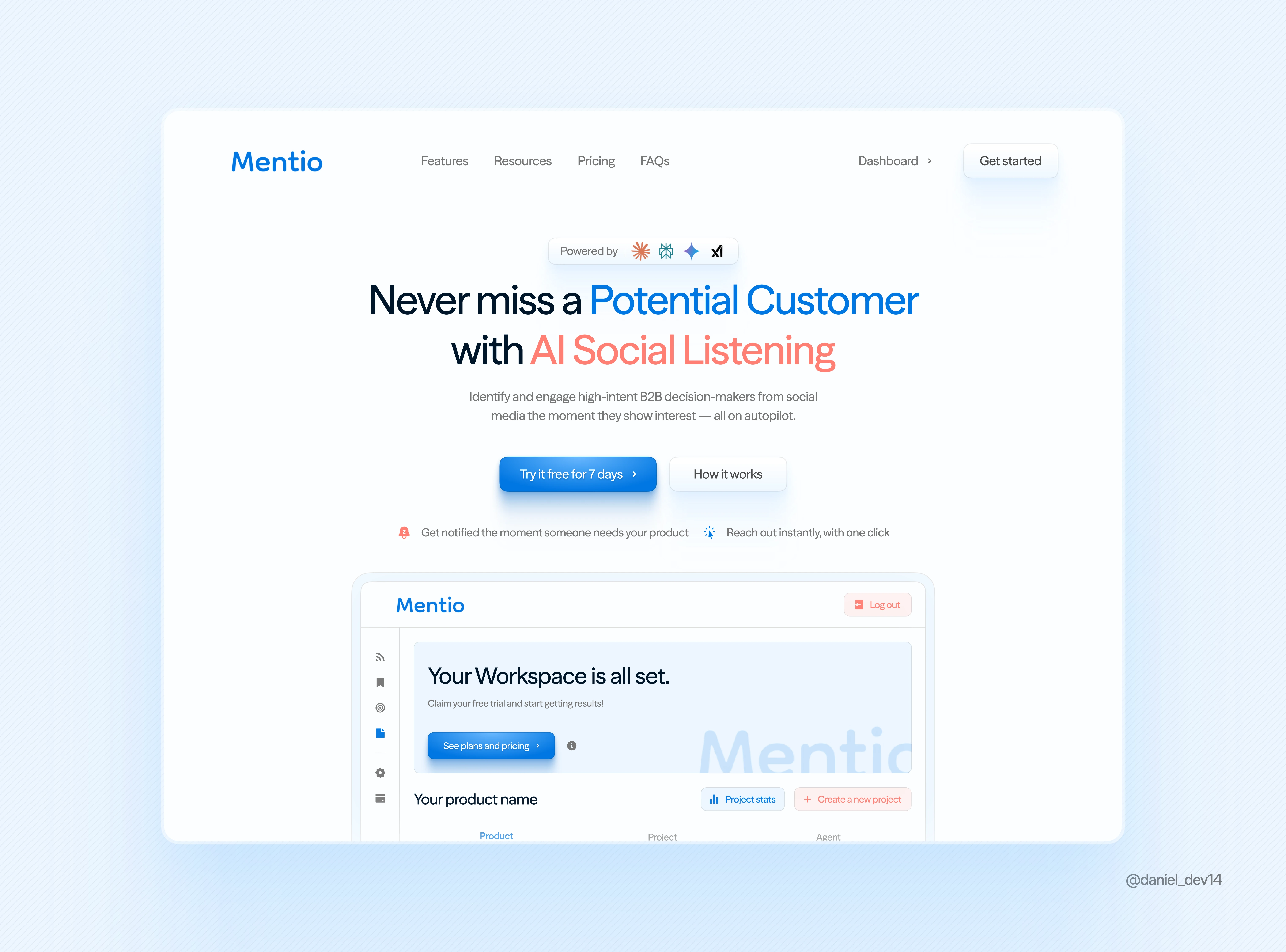
V3
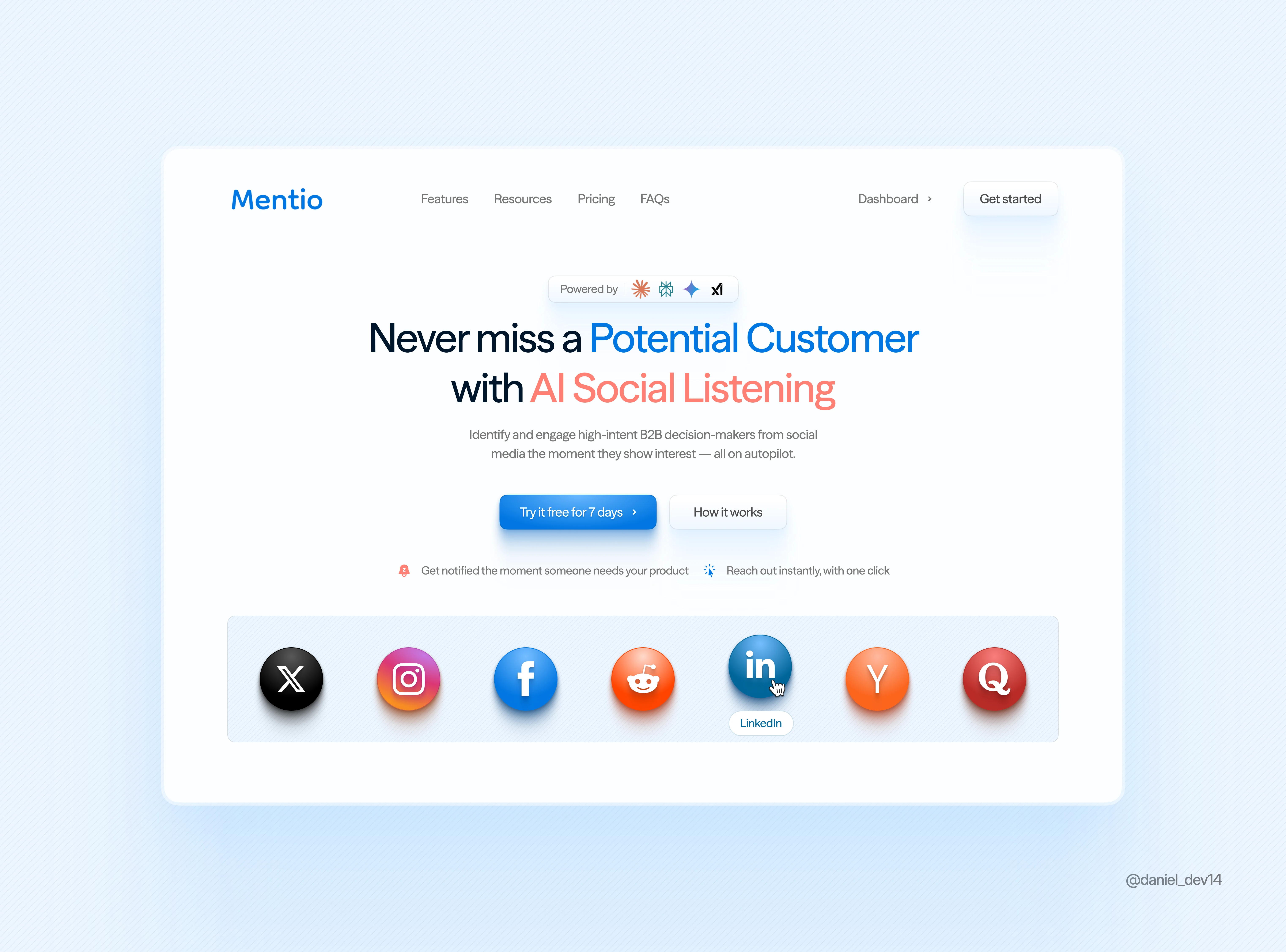
V4
Breakdown 🧵
1️⃣ Cleaner Hierarchy - The original had multiple focal points. I simplified the layout to guide the eye—headline, CTA, then supporting info. Easier to scan, easier to act.
2️⃣ Simplified CTAs - Swapped the double CTA (Try / Discover more) for a focused "Try it free" + a subtle "How it works" for users who need context. Less confusion, better conversion.
3️⃣ Refined Visuals - Removed the floating social icons + dotted paths. They felt noisy and didn’t add much. Replaced with a subtle workspace preview that supports the product promise.
4️⃣ More Breathing Room - Spacing was tightened up and now there's better padding all around. Makes the whole section feel calmer and more trustworthy.
5️⃣ Typography + Tone - Switched to a warmer highlight color (red-orange) to emphasize "AI Social Listening". It adds emotion and contrast without being loud.
6️⃣ Subtle Gradients - Kept the soft gradient but refined the blend. The visual direction still feels dynamic, but more mature and product-focused.
This redesign focuses on clarity, trust, and reducing friction.
Let the message breathe and guide users to act.
What do you think? 💭
Need a Redesign for your website or app design. Send me a message now and let's talk.
Like this project
Posted Apr 8, 2025
I crafted 4 Hero Redesign variation for Mentio, with a focus on creating a more spaced out design, professional look and improving conversions drastically.
Likes
3
Views
18
Timeline
Apr 5, 2025 - Apr 8, 2025