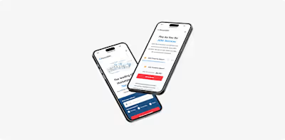
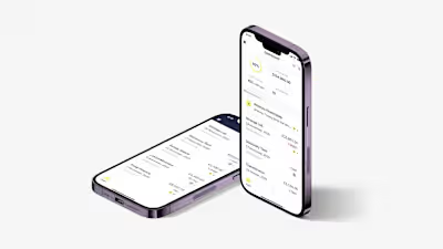
ezra
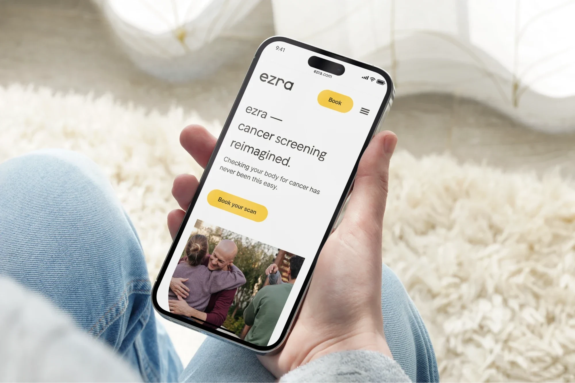
ezra — Supercharging a US based healthcare startup from concept to a fully fledged product.
We found cancer’s greatest weakness — early detection.
That's ezra's motto. A healthcare startup based out of NYC, looking to make preventative care the norm.
What drew me to ezra was its owner Emi Gal and and the Head of Product Humale Khan. For anyone that knows me, the people are the most important part of any place I choose to work at and these two were the sort of people I wanted to work with.
They quickly let me know ezra is only at the beginning of it's lifecycle (with the aim being 1 million scans) and we had the opportunity to do great work. My time with ezra (of almost 3 years) we did a lot. Shipped almost a dozen new products, changed the branding and alignment of the company 10x the revenue and more.
Below are some quick highlights of some of the work I led throughout my time at ezra as Lead Designer.
Creating a comprehensive Design System
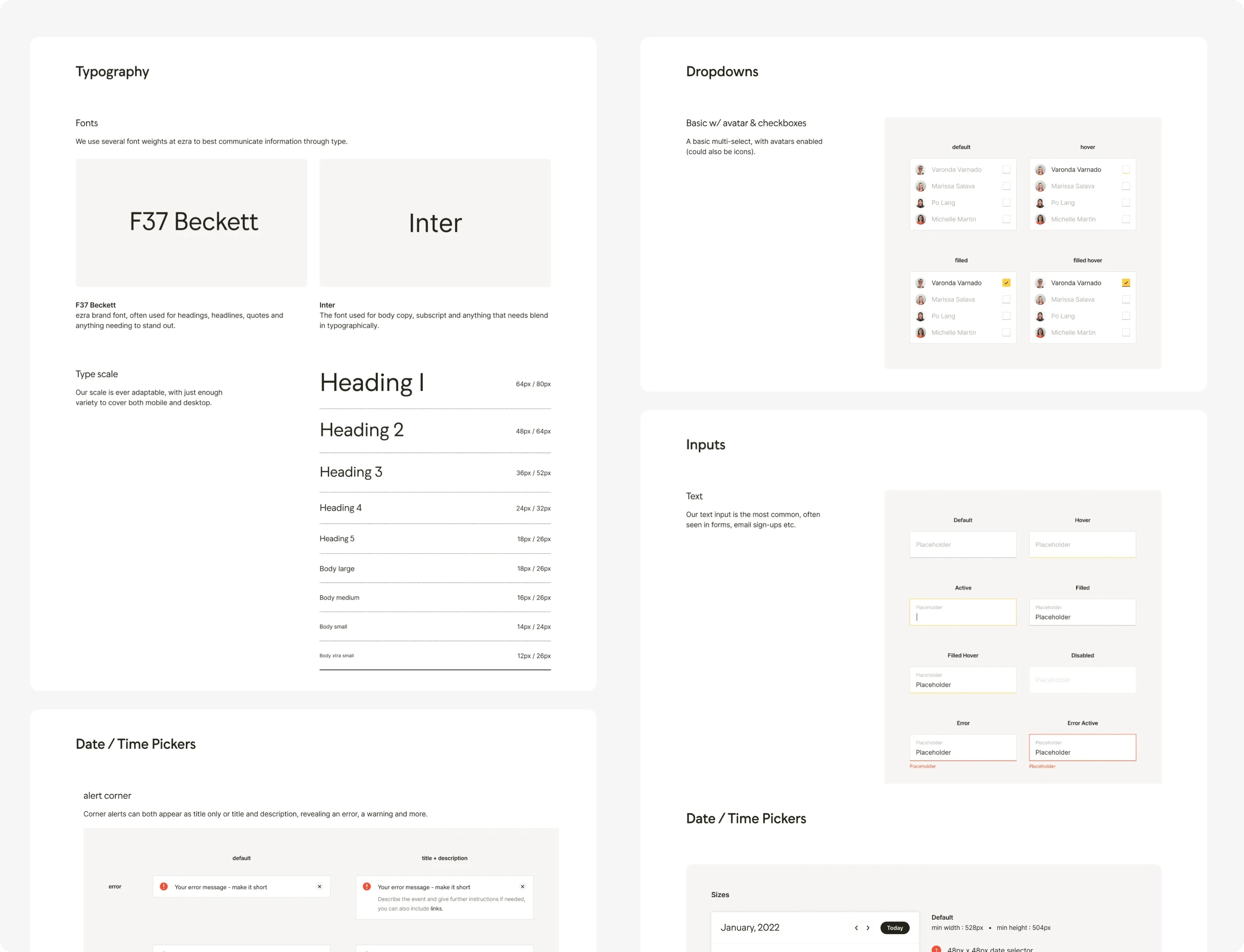
Almost everything in my time at ezra had (multiple) varients of itself, due to company pivots etc and the Design System was no different. In early 2023, I posed to the team to create a final source of truth to align all our external and internal products; so working with my dev team we got to work.
The Design System was one of the most comprehensive I had the chance to work on. With clear outlines, animations and use cases for almost every item. The system was created in conjunction with my rework of the brand itself so they went hand in hand
The Design System work consisted of laying the groundwork with the more pastel driven colours (moving away from the tech-bro heavy scheme we had in the past) but keeping the iconic yellow in place. The inputs themselves were designed with the idea that everything should be familiar and welcoming - we did that by making sure our inputs never moved place, always had welcoming copy and had multiple variants of tooltips to guide our members. The system was pushed extensively to include everything from dropdowns, to cards, navigation, iconography and more.
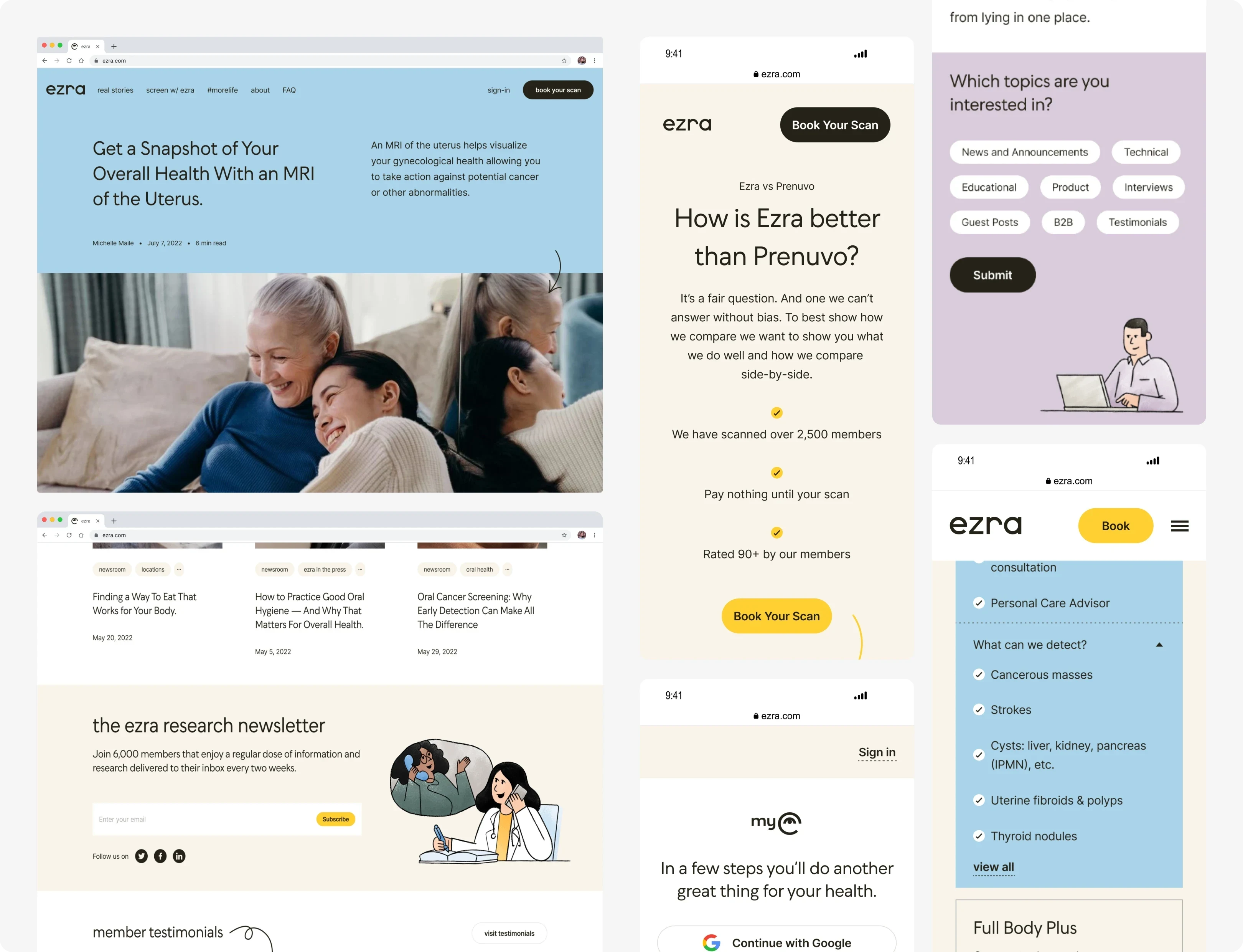
A website to better understand ezra
A product, that encourages early detection, for not exactly a cheap price - needs a great website. Early detection isn't something a lot of people are familiar with, or can afford (as much as we worked on getting the price down) so we worked on really improving the experience of discovering ezra.
The website itself benefitted from a tone of voice shift, as well as warming up the entire site with more colour, an introduction to illustrations to better explain our products and revisions of everything from blog to creating dedicated pages for specific products.
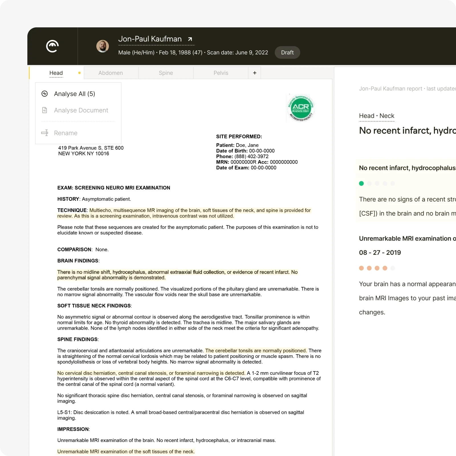
Making Reports easy as 1-2-3
Something that was really taking up a lot of time for the Care Advisors and MD at ezra was the creation of ezra reports for our members. These reports took 80-minutes + each time and needed 2 levels of checks to make sure they were correct.
Using the power of AI we spent a number of months creating a dedicated software to essentially cut down the amount of time to create a report to under 15-minutes. This was done by creating a two-pane software, that had AI analysis (of direct medical reports on the left) that would analyse and parse all the information in the report to the text editor on the right. Then it was just a matter of double checking everything, adding any addendum notes and using a switch-breaker type confirmation (needing confirmation of both the CA and MD) to submit the finished report.
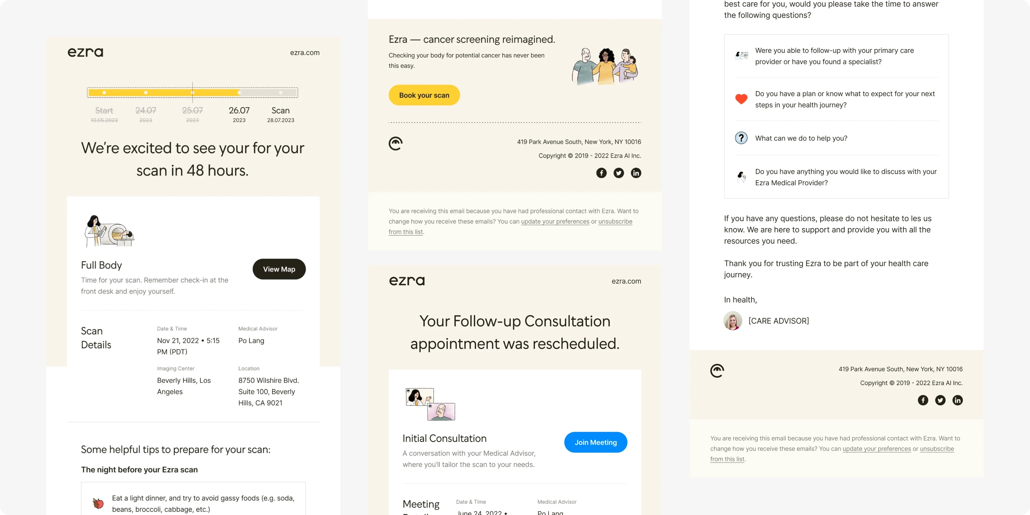
Approachable communication
One thing I was never happy with at ezra was our outward communication. We tried to promote really high standards with anything we did but the emails and social media was always lacking.
Like with any challenge though, I love to step up to the table. So with myself and my PM in hand we went through everything system and marketing email that was currently circulating (approx 50+) and we toned it down to 30, reworked each one to be more informative and truly communicate the members needs as quickly as possible and then the work began in design.
I took cues from the ongoing brand rework to create around 30 templates that could fill any potential need. From timeline led countdowns to your scan, to cute, informative nuggets about the scans themselves. Or even basic things like cancellation - they could all be done now. And I spent a fair bit of time creating a DarkMode version of each template to make sure no matter the member, their emails would look good.
Like this project
Posted May 14, 2024
ezra — Supercharging a US based healthcare startup from concept to a fully fledged product.
Likes
0
Views
10
Clients

Ezra AI


