Translating a Physical Card Game to Digital for Senior Users

Abhishek Kushwaha


Translating a Physical Card Game to Digital for Senior Users
TL;DR
I translated a physical card-based personality assessment into a digital experience for users aged 50+, focusing on cognitive accessibility, culturally relevant imagery, and interaction patterns that reduced friction across the game.
Overview
WisdomCircle, a platform for retired professionals (age 50+), partnered with AryaPlay (a psychometric assessment company) to digitally transform a physical card-based personality game into an accessible online experience, enriching senior job seekers' profiles with psychometric insights.
Team
Solo designer, collaborating with developers and stakeholders from WisdomCircle and AryaPlay
How the game works
Each round, users are shown a set of illustrated value cards. They pick the card they resonate with most, then the one they resonate with least. After eight rounds, the game assigns a personality type based on their selections.
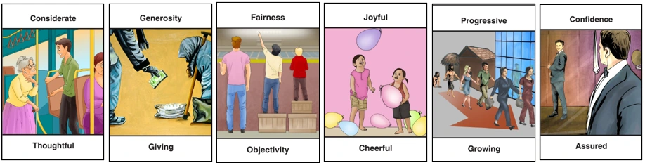
Image Cards provided by AryaPlay
Key Design Decisions
The design process involved continuous collaboration and multiple feedback rounds between WisdomCircle and AryaPlay stakeholders. Here's what mattered most.
Optimizing Cards for Clarity and Comfort
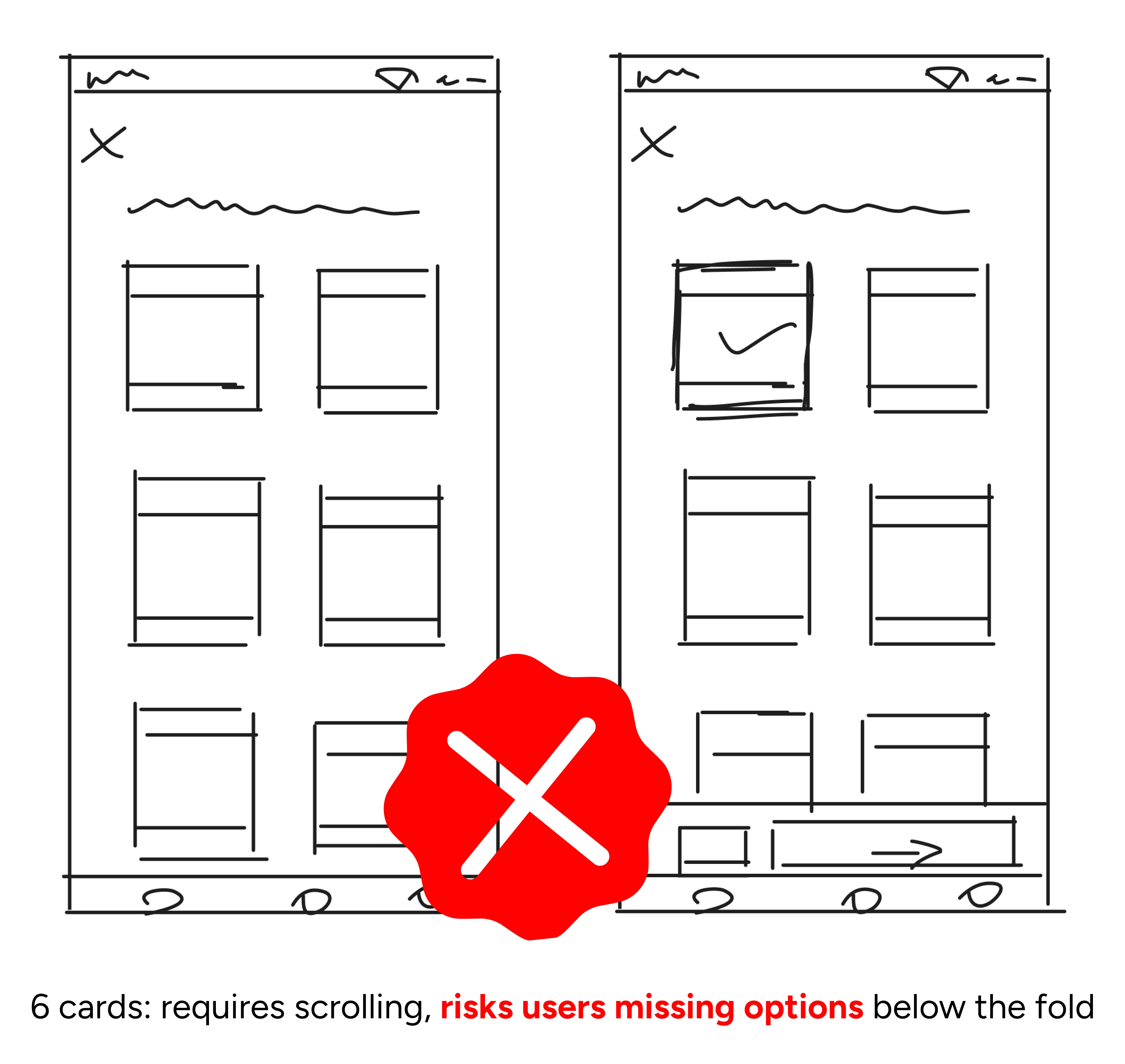
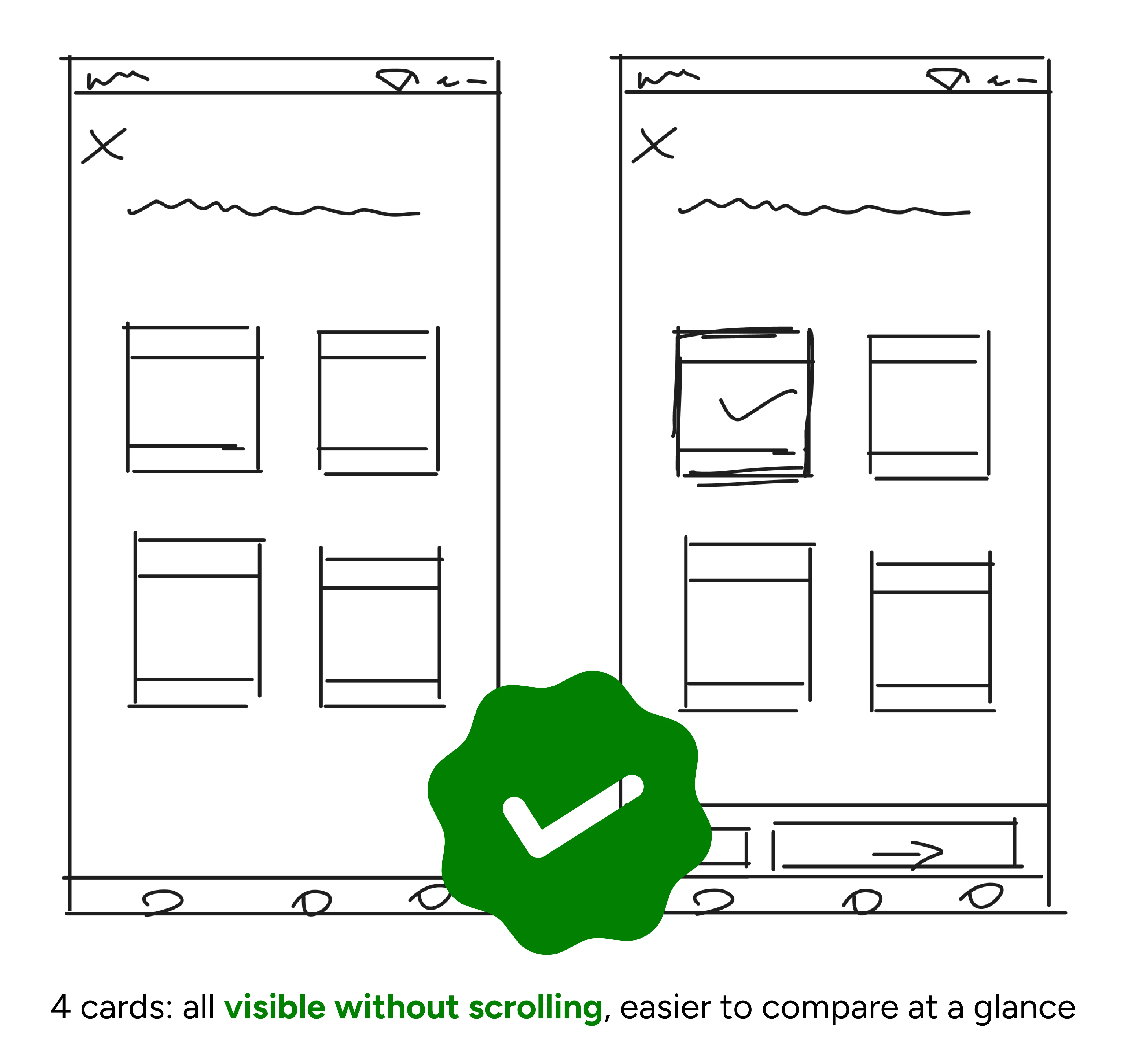
I started mobile-first, then scaled up to desktop. I explored layouts with 4 and 6 cards per round and went with 4 to keep all cards visible without scrolling, which was critical for seniors who may not instinctively scroll to discover hidden content.
Using AI for Culturally Accurate Imagery
Stock imagery didn't represent our users.
We needed photorealistic images of Indian professionals aged 50+ that visually conveyed specific values like confidence, family, and learning.
I used MidJourney to generate all 32 card illustrations, choosing it over alternatives for its strength in lifelike human figures. This involved significant prompt iteration to overcome demographic biases and achieve stylistic consistency across the full set.
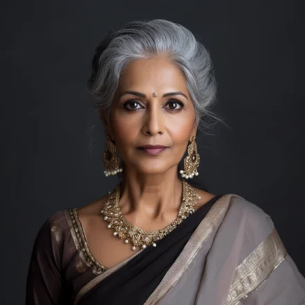
Self Assured / Confidence

Family Centric / Family Focused

Learning / Understanding

Relaxation / At Ease
Iterating on card designs
The card needed to work as both a visual representation of a value and a tappable selection element. I iterated on image treatment, text placement, and selection states across four versions based on stakeholder feedback.
Final design with clear hover states and selection feedback
Recreating the Physical Card Experience
Beyond individual card design, I needed to make the overall game space feel familiar.
I focused on two areas: how unselected cards are presented for choosing, and how selected cards stack up visually, mimicking the feel of a real card game. I iterated on layout, animation, and stacking behavior based on feedback.
Final layout with card dealing animation and organized stacking of selections
Designing for Intuitive Gameplay
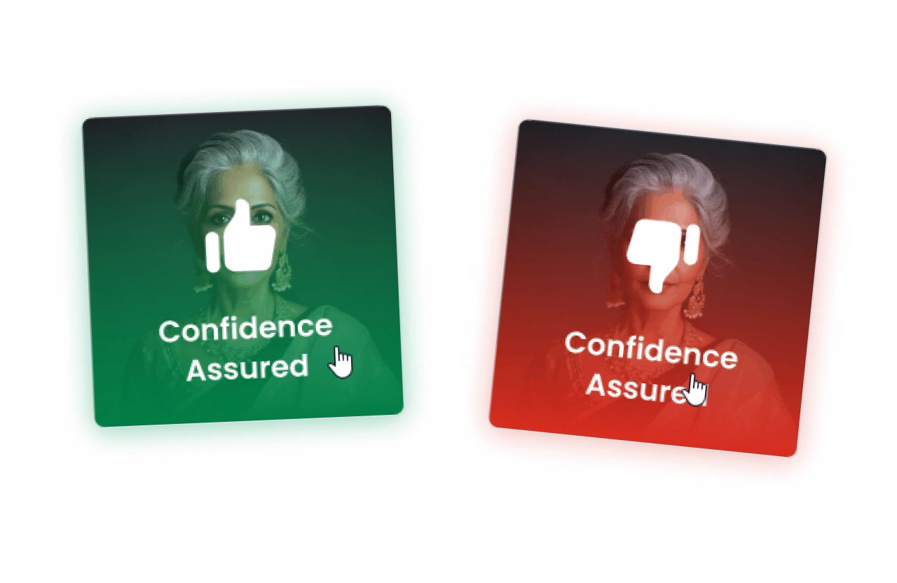
Visual cues over text
Gradients and thumbs-up/down icons replaced written instructions to signal most and least resonated selections, reducing cognitive load across rounds.
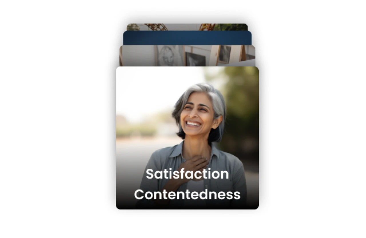
Organized card stacking
Selected cards stack in an ordered pile mimicking a real card game. A disorganized stack was tested but caused confusion, so I reverted to a clean arrangement.
Restricting Navigation
During testing, I observed that once a card was selected, users rarely changed their choice. I removed the back button, reducing total clicks per game by 50% from 32 to 16.
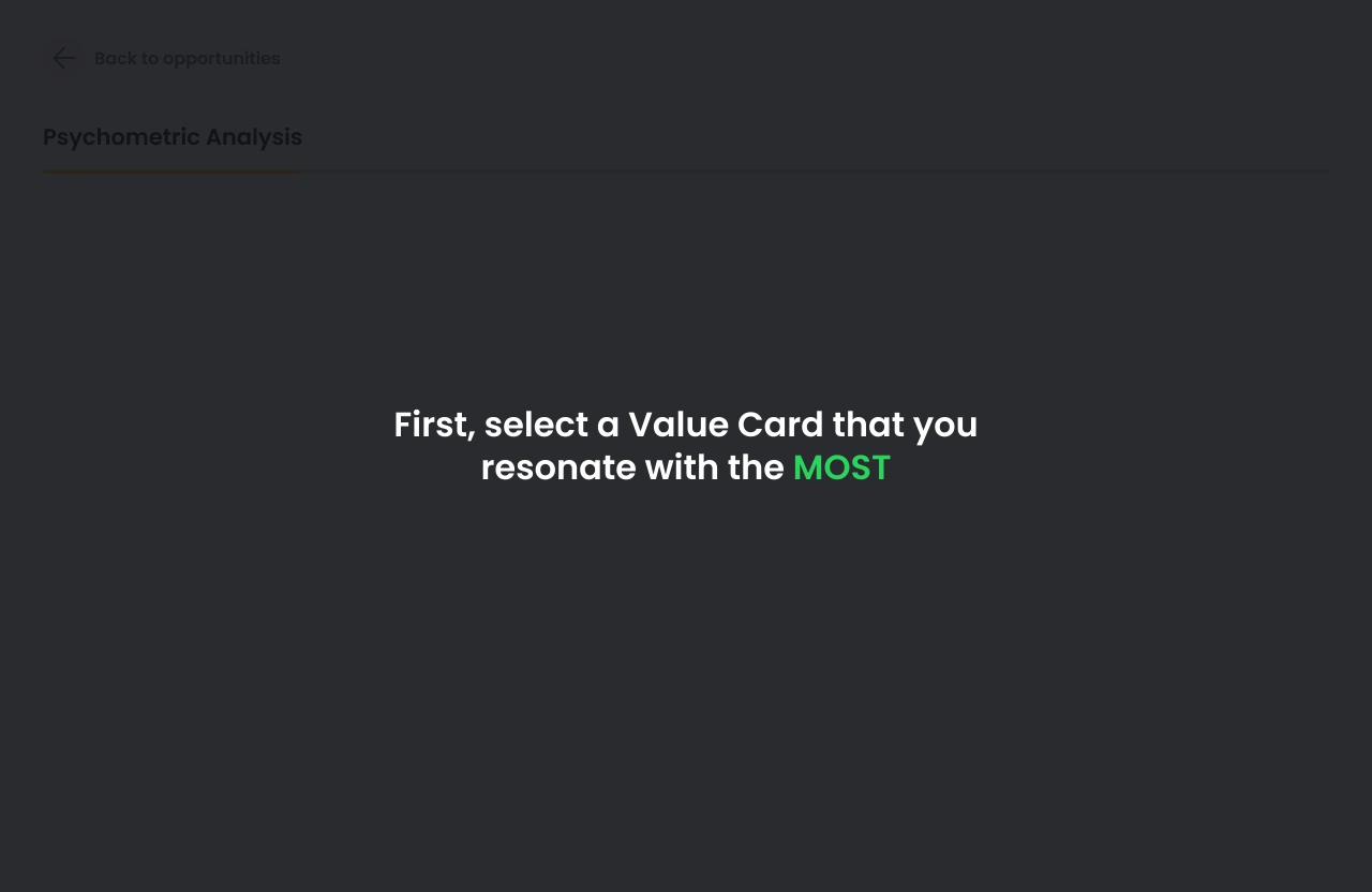
Full-Screen Instructions
The first round uses full-screen instructions so users learn the pick-most, pick-least pattern before cards appear. Subsequent rounds reduce the instruction to a smaller prompt since users have already learned the flow.
Improvements Based on User Feedback
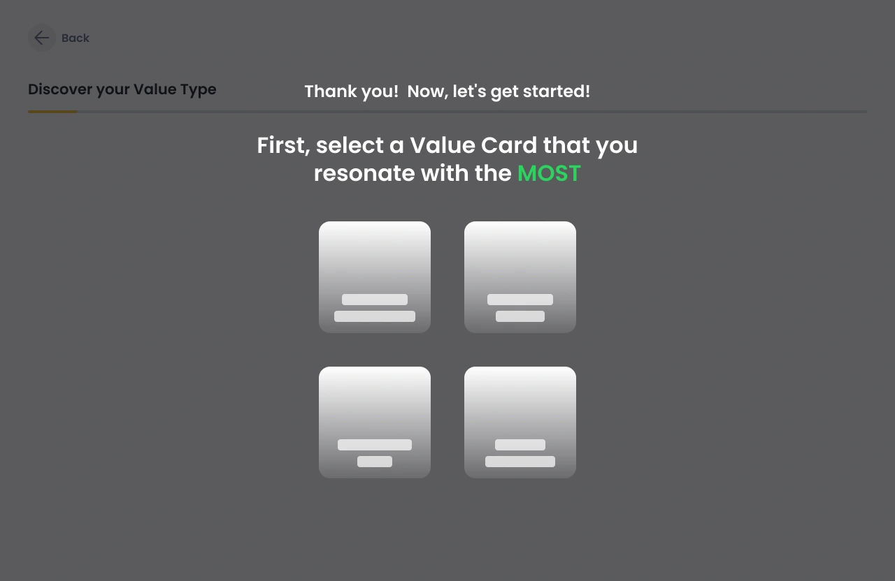
Fixing Layout Issues Across Screen Sizes
During testing, I discovered an edge case that 14" Windows laptops defaulting to 150% zoom caused users to miss half the card options below the fold. I added a skeleton layout on the instruction screen to preview the card arrangement, so users knew what to expect regardless of screen size.

Reviewing Imagery for Inclusivity
All 32 card illustrations were reviewed to ensure characters appeared age-appropriate, reflected gender diversity, and visually aligned with the intended values.
Usage so far
In a post-launch qualitative survey, the game received an average rating of 4/5 for overall experience.
"The whole game was easy to understand and play. Even the navigation was simple to use."
HR Professional, age 57
"I wasn't stuck anywhere. I would rate it 4 out of 5."
General Manager, age 63
"Most of the analysis resonated with me. I would rate the overall experience as 4."
Global Marketing Product Manager, age 51
Reflections
Motion for meaning
I initially treated animations as polish to add at the end. Working with the developers changed that. They pushed me to use motion as a functional element, like the card dealing animation that replaced a written instruction. That reframed how I think about animation in my design process.
MidJourney is a skill
Generating culturally accurate imagery of Indian seniors required significant prompt iteration to overcome demographic biases baked into AI tools. What started as a quick asset solution became one of the more challenging parts of the project.
Thank you for reading <3
Like this project
Posted Aug 22, 2026
Translated a physical personality assessment into an accessible digital game using MidJourney for culturally accurate illustrations and improving usability.
Likes
0
Views
1