Case Study: Ragnar Candles eCommerce UI/UX design
Project Overview

Ragnar is an eco-friendly candle brand that aims to provide sustainable and transparent alternatives to traditional candles. As a UX designer, I was tasked with creating a user-friendly e-commerce website that aligns with Ragnar's brand values and enhances the customer experience.
User Research
To better understand the target audience, I surveyed 43 participants interested in eco-friendly candles. The findings revealed a growing demand for sustainable candle options and a strong desire for ingredients and manufacturing processes transparency.
User Persona
Based on the survey results, I created a user persona named Sarah. Sarah is a 32-year-old environmentally conscious professional who values quality, sustainability, and aesthetics in her home decor. She is actively seeking candle brands that align with her values and provide a positive shopping experience.
Design Process
To create a user-friendly website that meets Sarah's needs, I followed a user-centered design process:
Information Architecture
I developed a clear and intuitive information architecture, organizing the website's content into logical categories and ensuring easy navigation for users.
User Flows
I mapped out user flows for critical tasks, such as browsing products, adding items to the cart, and completing the checkout process to ensure a seamless and efficient user experience.
Wireframing
I created low-fidelity wireframes to explore layout options and test the information architecture. This allowed me to iterate and refine the design quickly based on user feedback.
Usability Testing
I conducted usability testing via Zoom with five participants, gathering valuable insights into the website's navigation, product information, and checkout process. The feedback was incorporated into the final design.
Final Design
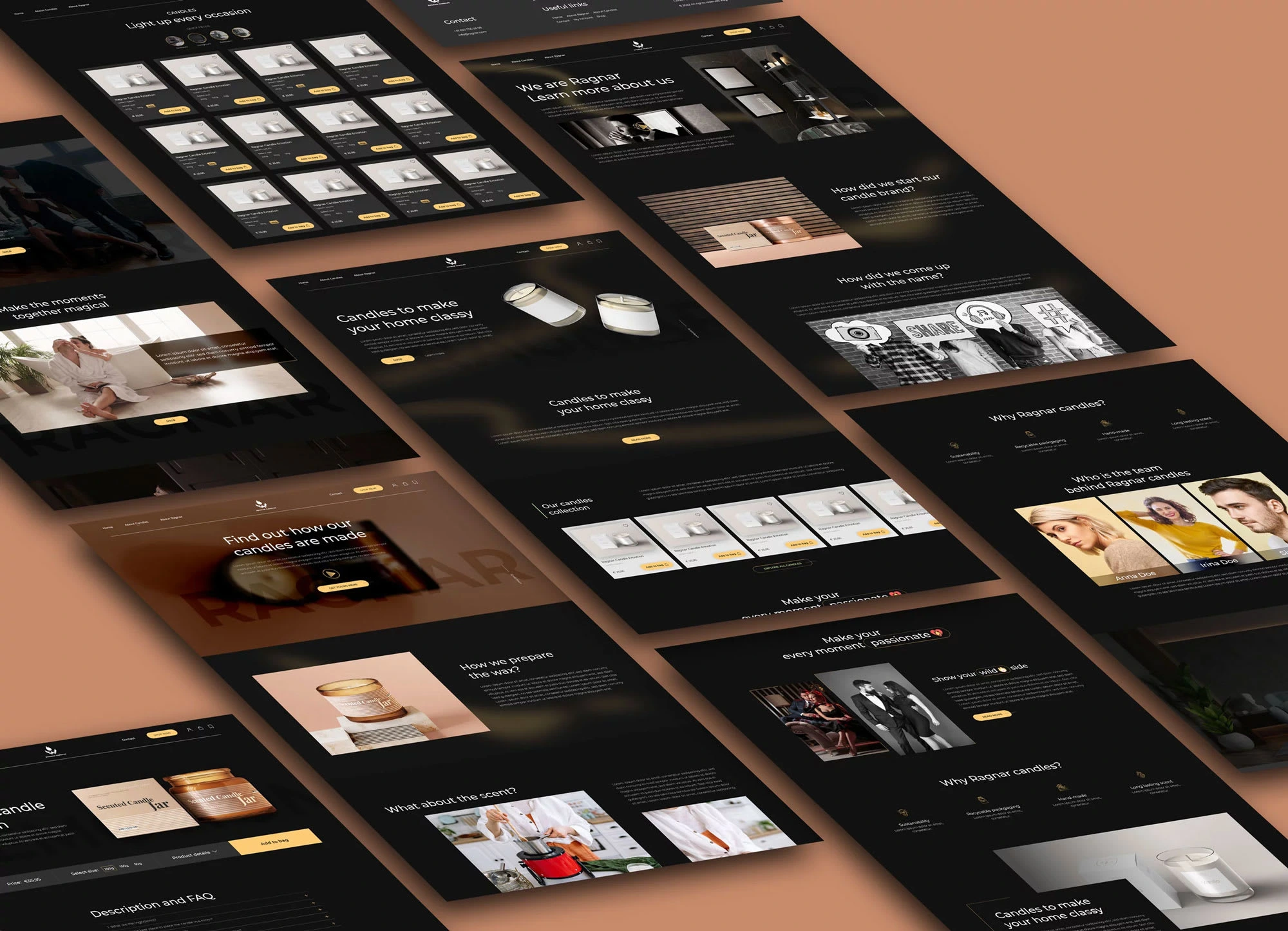
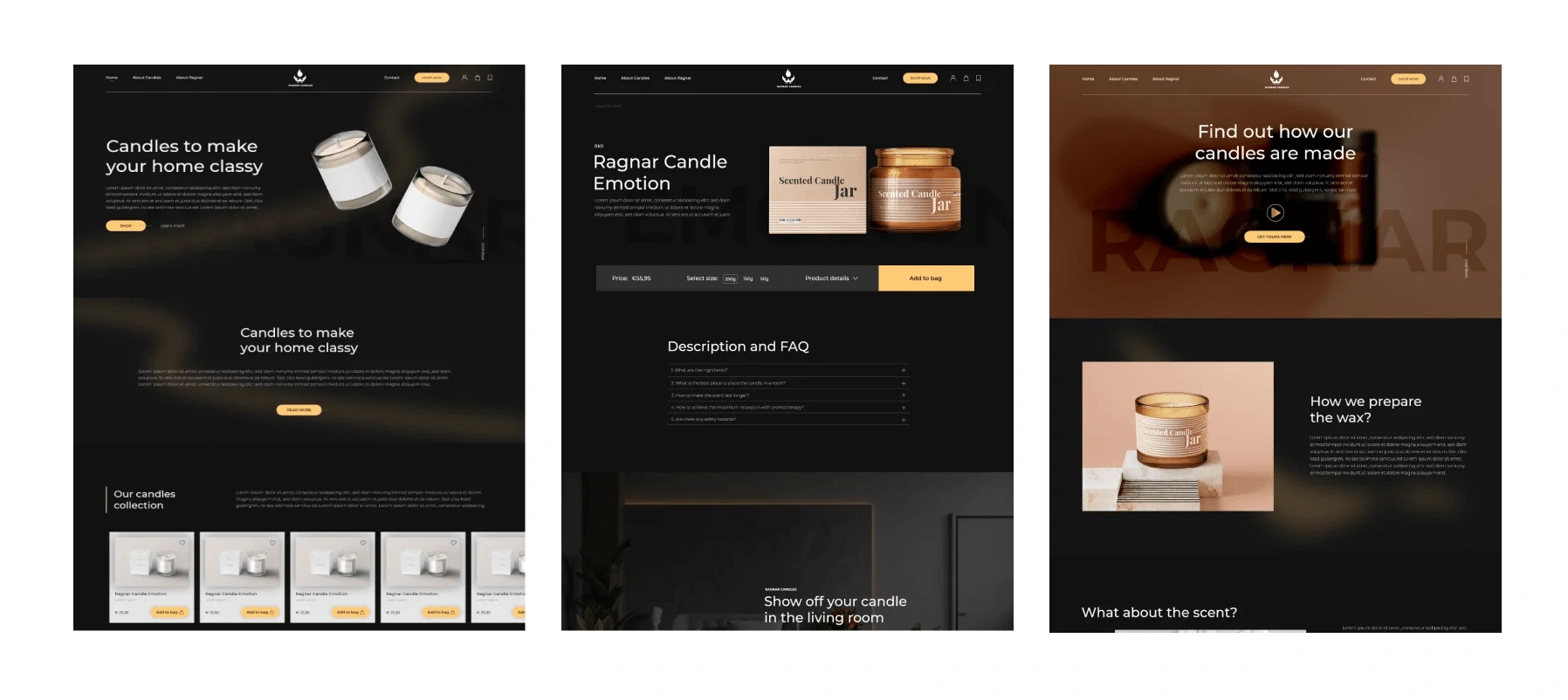
The final design features a clean, modern aesthetic reflecting Ragnar's brand identity. Key features include:
A prominent search bar and filters to help users quickly find products
Detailed product pages with high-quality images, descriptions, and ingredient lists
A user-friendly checkout process with secure payment options
A dedicated sustainability page highlighting Ragnar's commitment to eco-friendly practices.

Ragnar Candles eCommerce Design
Lessons Learned
Throughout the design process, I gained valuable experience in user research, information architecture, and iterative design. I learned the importance of placing the user at the center of the process and continuously testing and refining the design based on user feedback.
Storytelling
The story of Ragnar's website redesign is one of collaboration and user-centered design. By conducting thorough user research and incorporating user feedback, we created a website that meets the needs of environmentally-conscious customers like Sarah. The results speak for themselves: a significant increase in conversion rates and customer satisfaction.
Empathy and Emotion
Throughout the project, I kept in mind the emotional aspect of the user experience. I aimed to create a website that met the user's functional needs and resonated with their values and emotions. By doing so, we made a website that performs well and inspires loyalty and trust.
Authenticity and Transparency
I was transparent about our challenges during the design process, such as balancing aesthetic appeal with user functionality. By being open about our approach and our decisions, we built trust with the client and the user.
Like this project
Posted Jul 20, 2024
Ragnar is an eco-friendly candle brand that hired me as a UX designer to create a user-friendly website aligned with their sustainable values.
Likes
0
Views
11


