
VITAME — Energy Drink Branding & Packaging
Project Overview
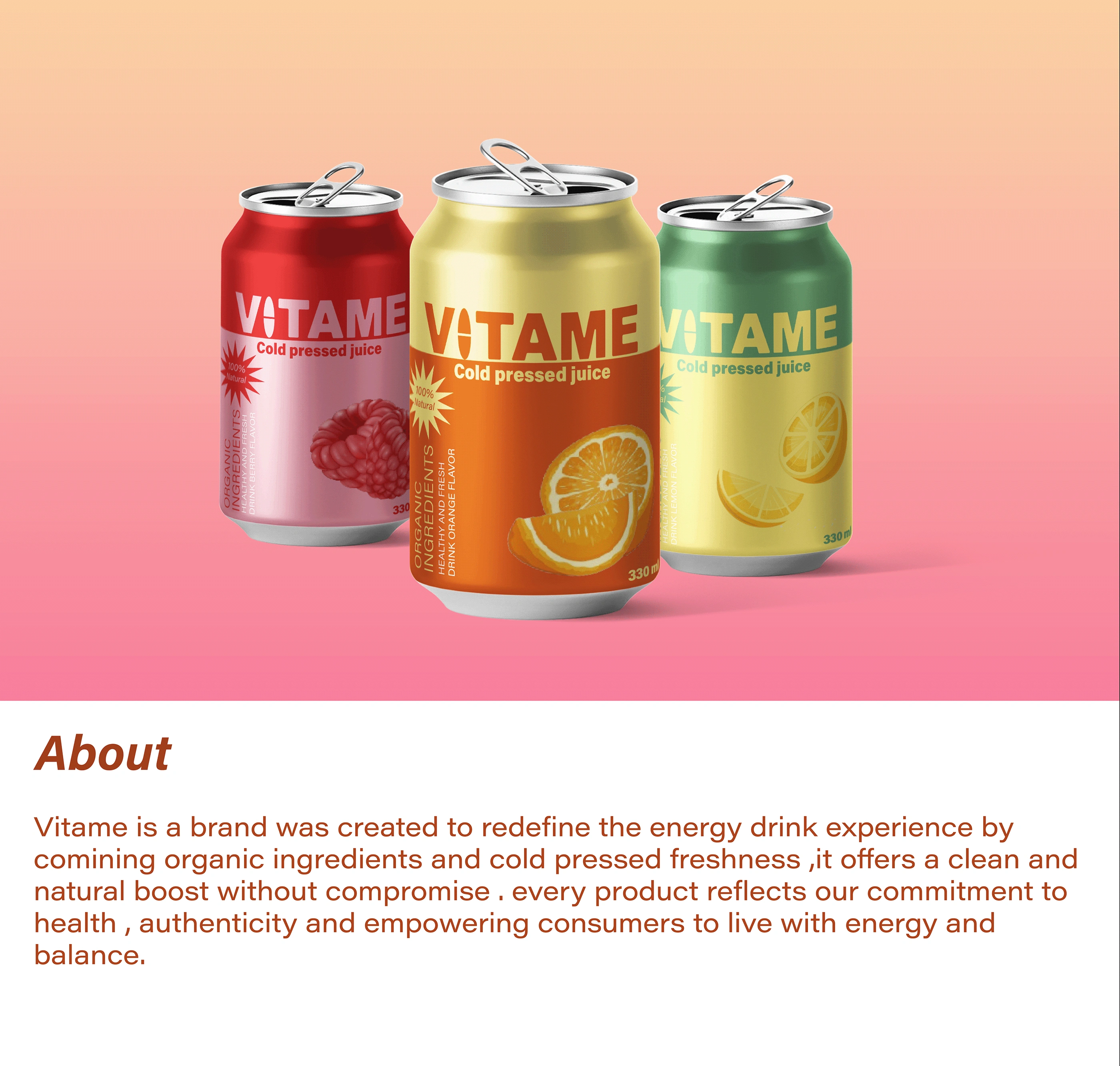
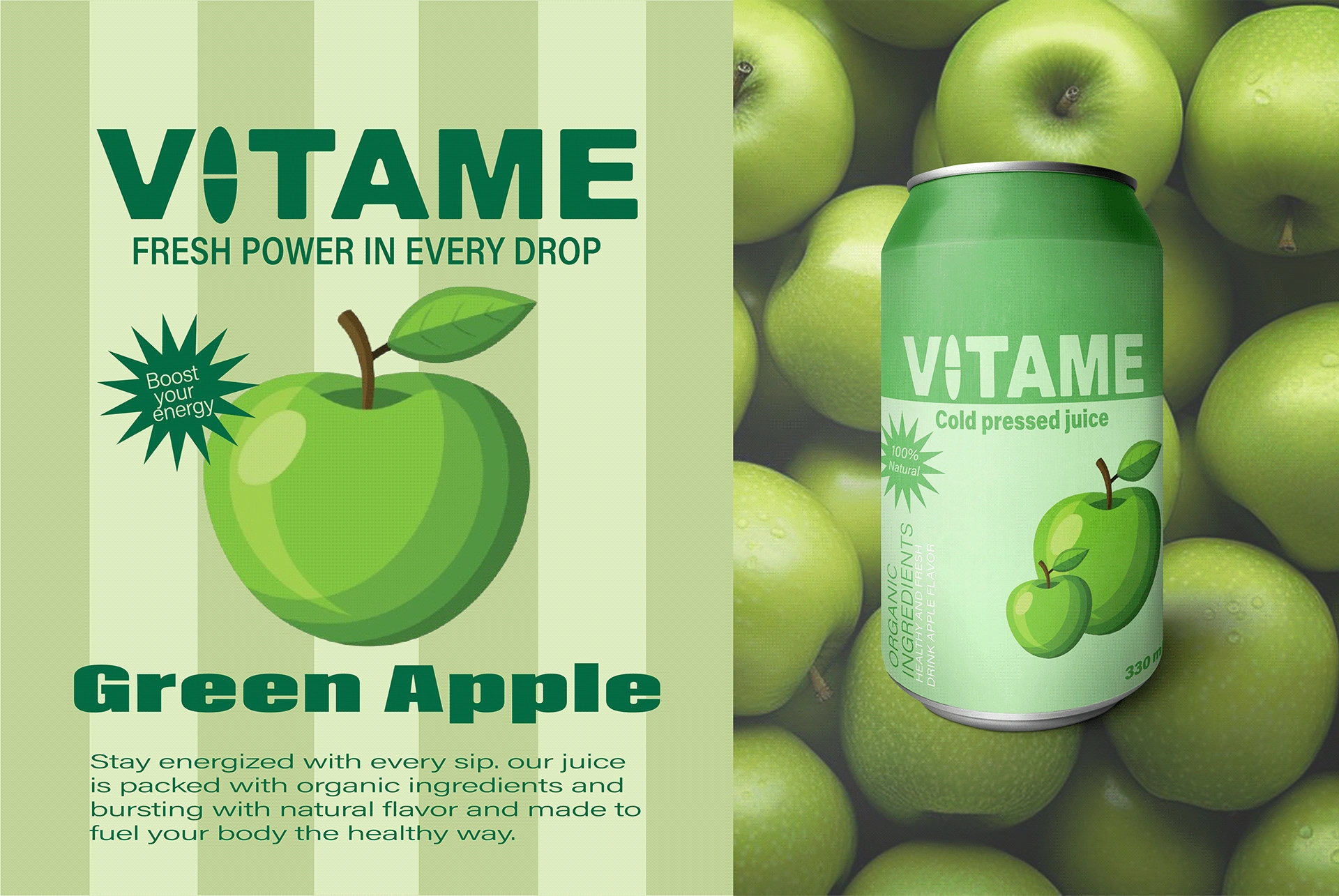
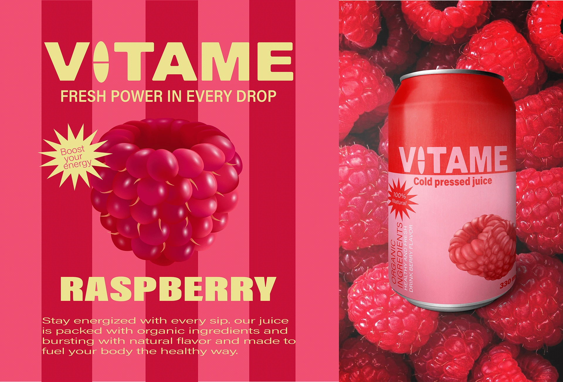
VITAME is a fruit-inspired energy drink brand developed to bring together natural freshness, vitality, and contemporary beverage culture. The project focuses on creating a distinctive identity that communicates energy, balance, and an uplifting drinking experience.
Creative Concept
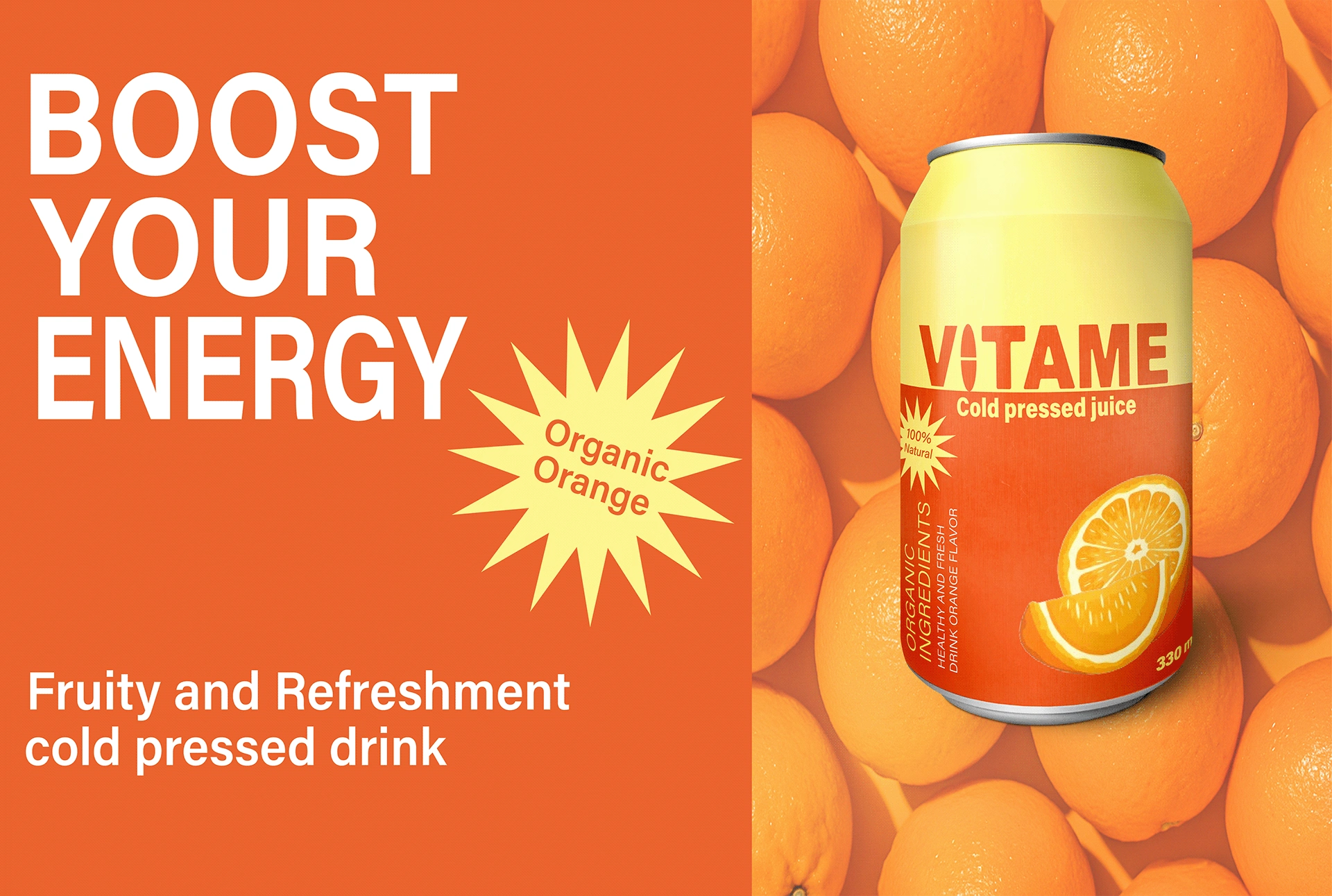
The creative direction combines the dynamic character of energy drinks with the refreshing appeal of fruit-based ingredients. Bright colors, expressive compositions, and energetic typography establish a bold yet approachable brand personality.
Logo & Typography
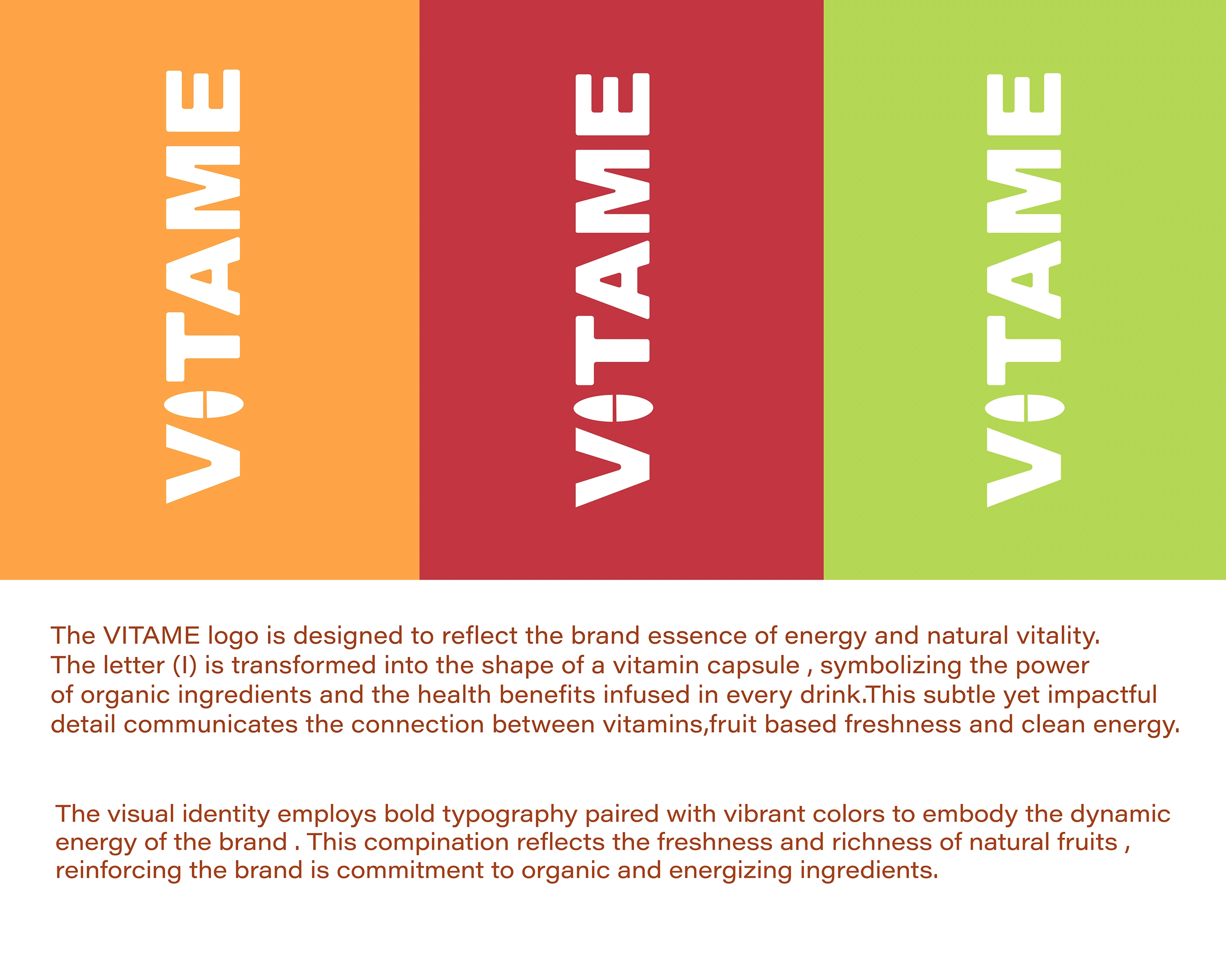
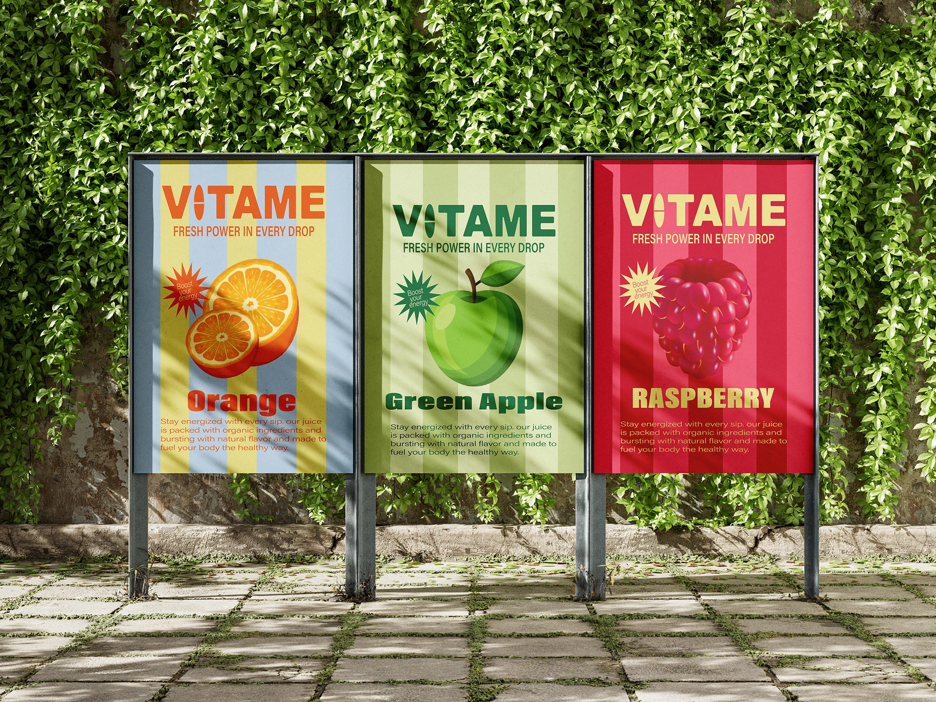
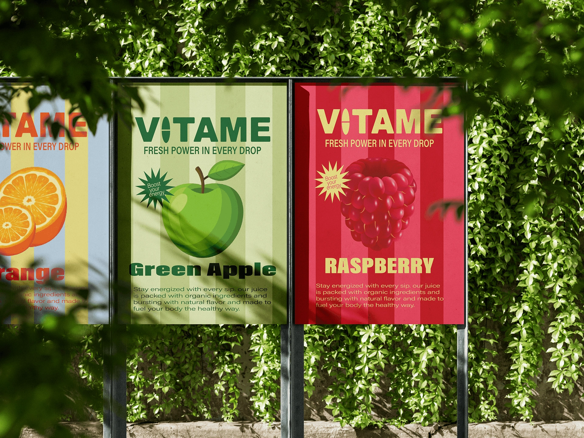
The VITAME wordmark uses strong uppercase typography to establish an instantly recognizable visual signature. The letter I is transformed into a vitamin-inspired capsule, reinforcing the brand's connection to vitality and energy.
Color Palette
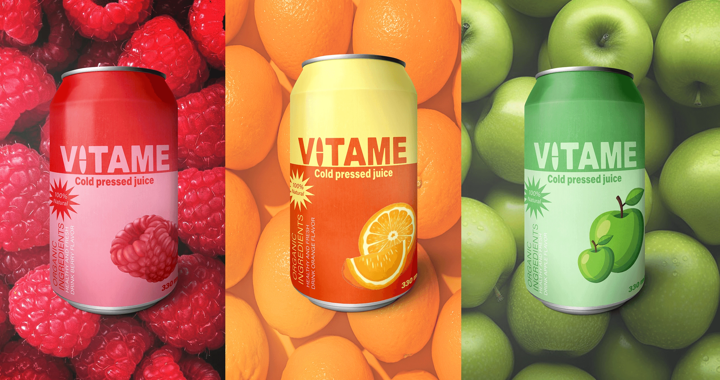
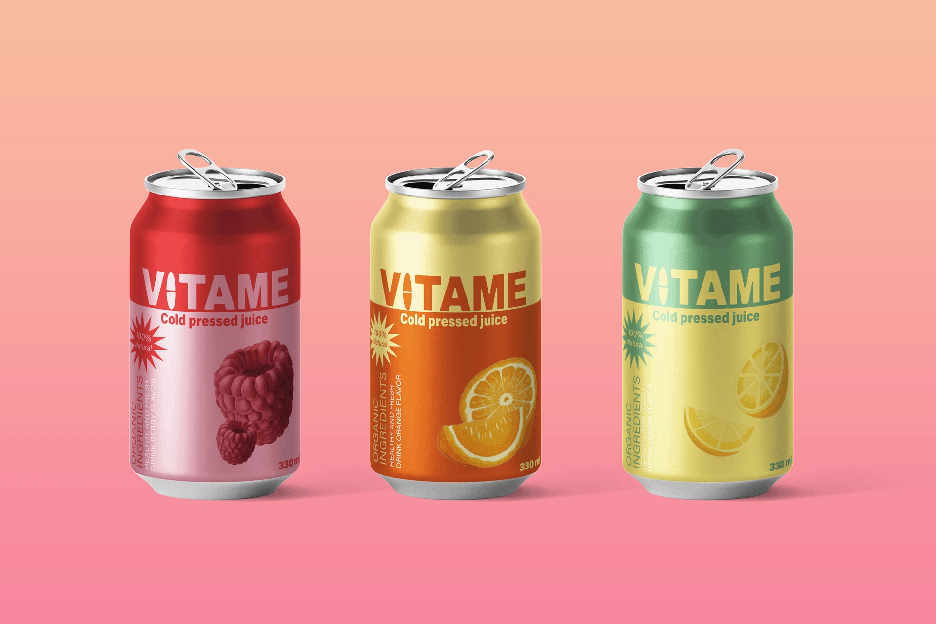
The identity features a vibrant combination of citrus orange, raspberry red, and refreshing green, supported by softer complementary tones. Each color helps differentiate the beverage varieties while maintaining a unified brand appearance.
Packaging Design
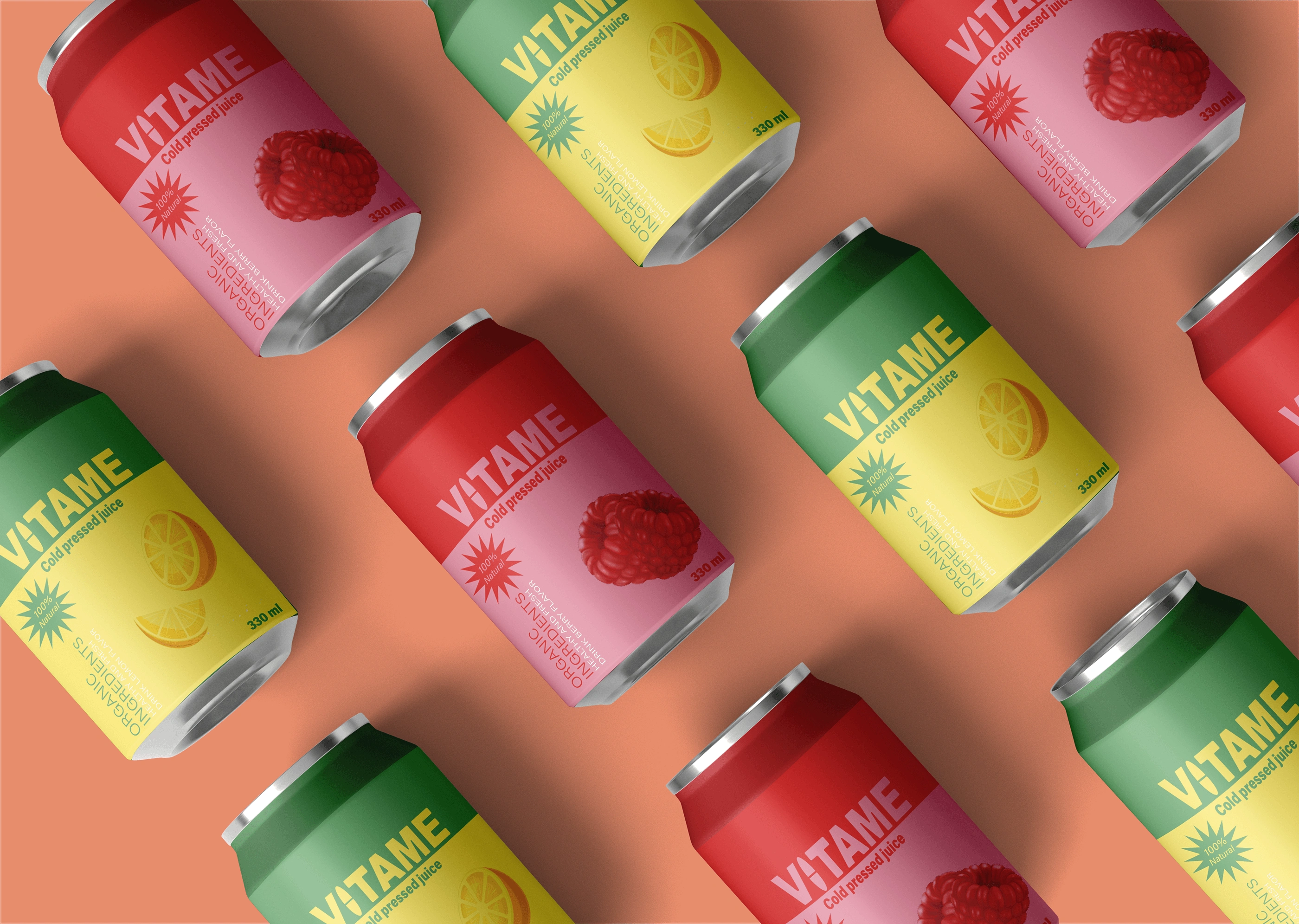
The packaging system brings the identity to life through colorful aluminum cans, bold vertical typography, and fruit-inspired illustrations. The design creates strong shelf visibility while making each flavor easy to recognize.
Visual Identity System
A flexible graphic language combines vivid backgrounds, minimal layouts, expressive typography, and fruit imagery. These elements work together to create consistency across different products and promotional formats.
Final Outcome
A fresh, contemporary, and energetic beverage identity that combines distinctive packaging with a cohesive visual system, helping VITAME establish a recognizable presence in the competitive drinks category.
0 likes · 0 views · Nov 19, 2026
VITAME is a vibrant energy drink brand identity inspired by natural ingredients, fruit freshness, and everyday vitality.


